
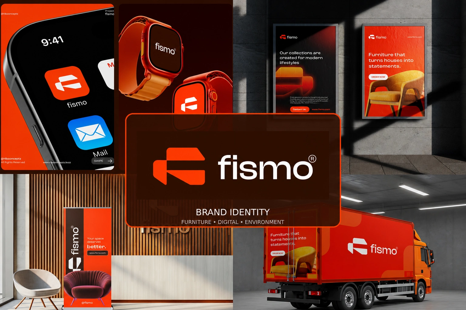
MORE THAN FURNITURE
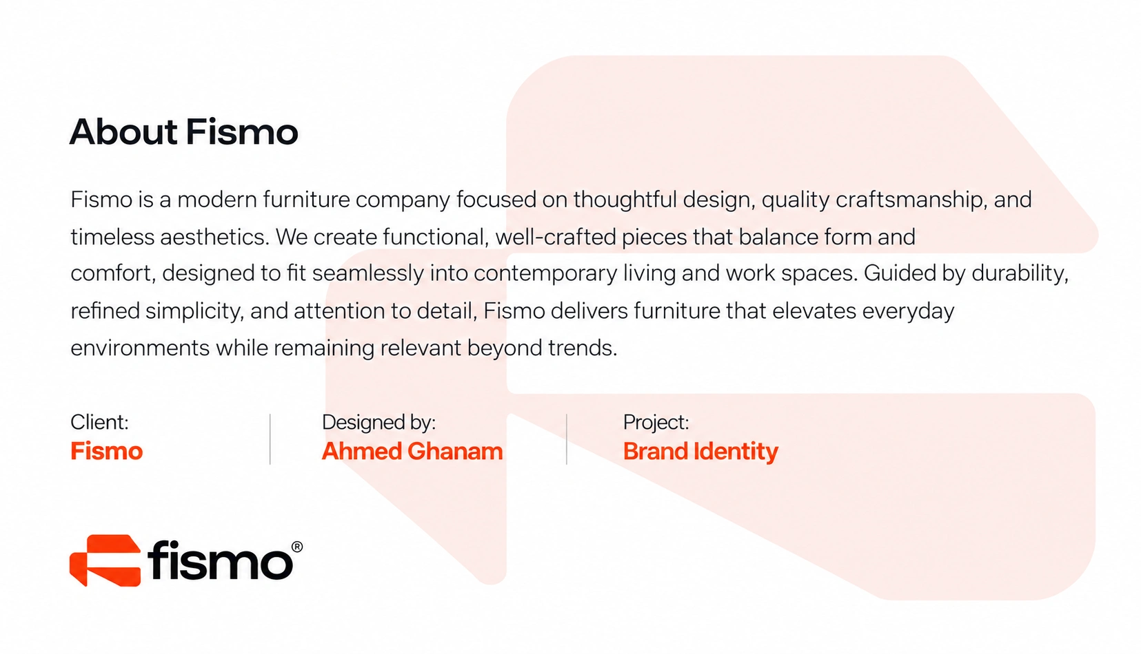
Fismo is a contemporary furniture brand created around the idea that furniture should do more than simply fill a space. It should contribute to the way people live, work, relax, and connect with their surroundings.
The brand brings together thoughtful design, everyday functionality, comfort, and lasting visual appeal. Every piece is intended to feel considered and purposeful, balancing contemporary aesthetics with the practical needs of modern environments.
The visual identity was therefore developed to reflect the same philosophy: simple, confident, functional, and distinctive, creating a brand experience that feels relevant today while remaining flexible enough to evolve over time.
THE IDEA BEHIND THE MARK
The Fismo symbol was designed as a compact and memorable visual signature that could represent the brand even without the full wordmark.
Its geometric construction gives the identity a strong architectural character, connecting naturally with the world of furniture, interiors, and spatial design. The form is deliberately simple, allowing it to remain recognizable whether it appears on a large showroom wall or as a small digital icon.
The symbol creates a sense of movement, structure, and balance, reflecting the relationship between furniture and the spaces it occupies while giving Fismo an ownable visual asset that can grow with the brand.

ONE IDENTITY. MULTIPLE EXPRESSIONS.
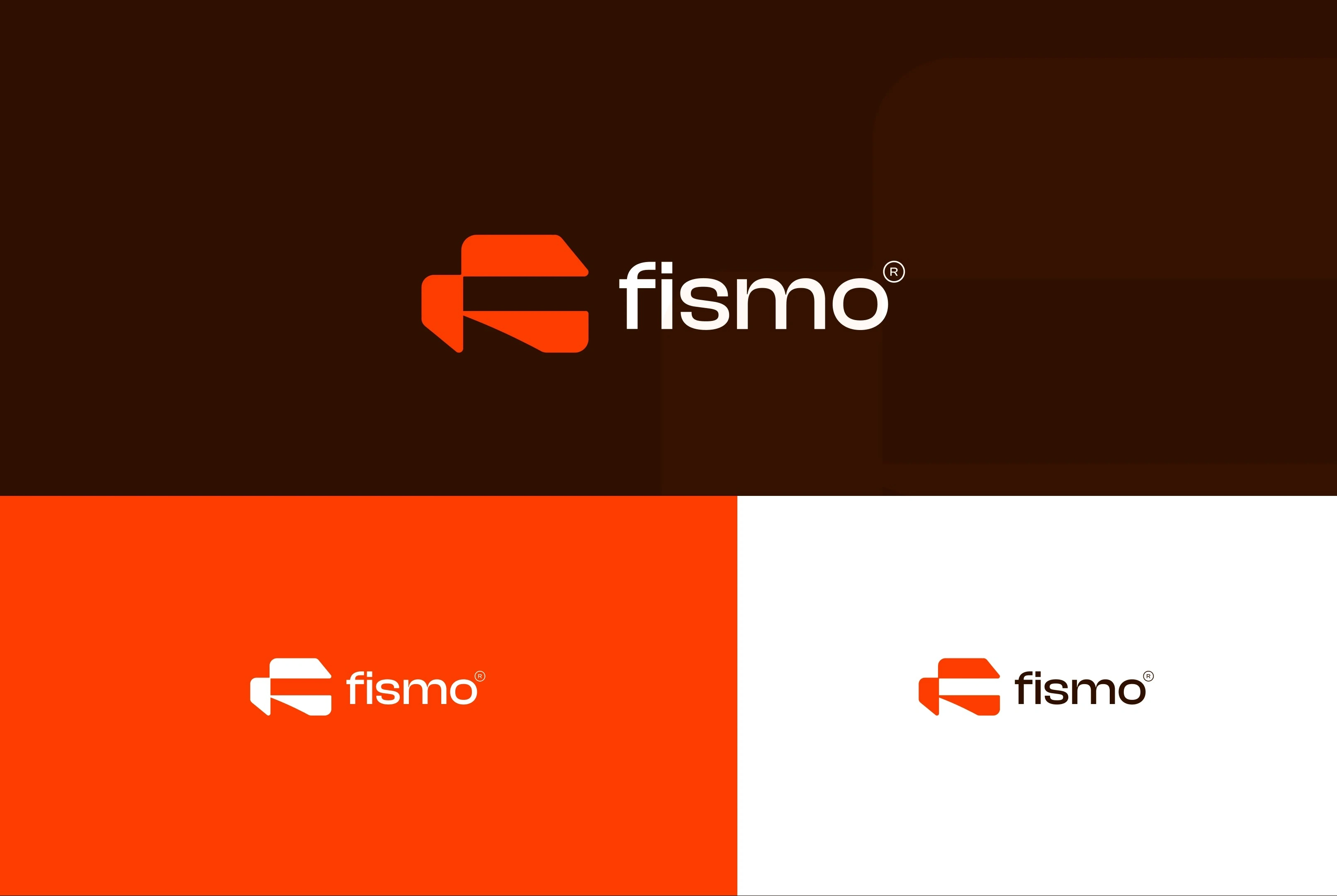
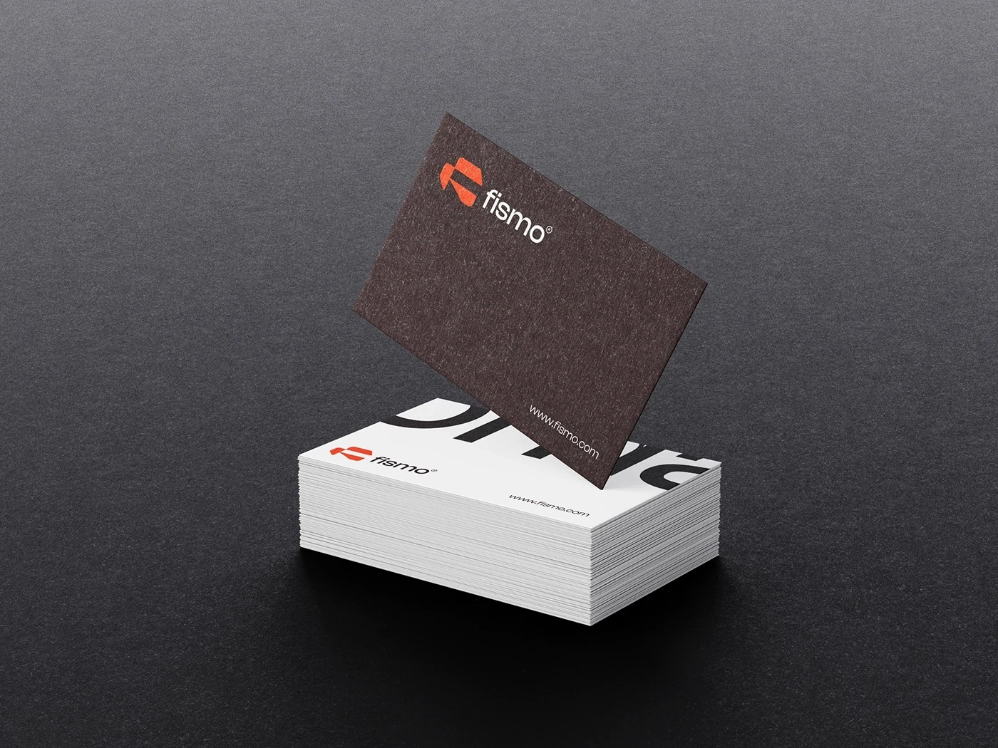
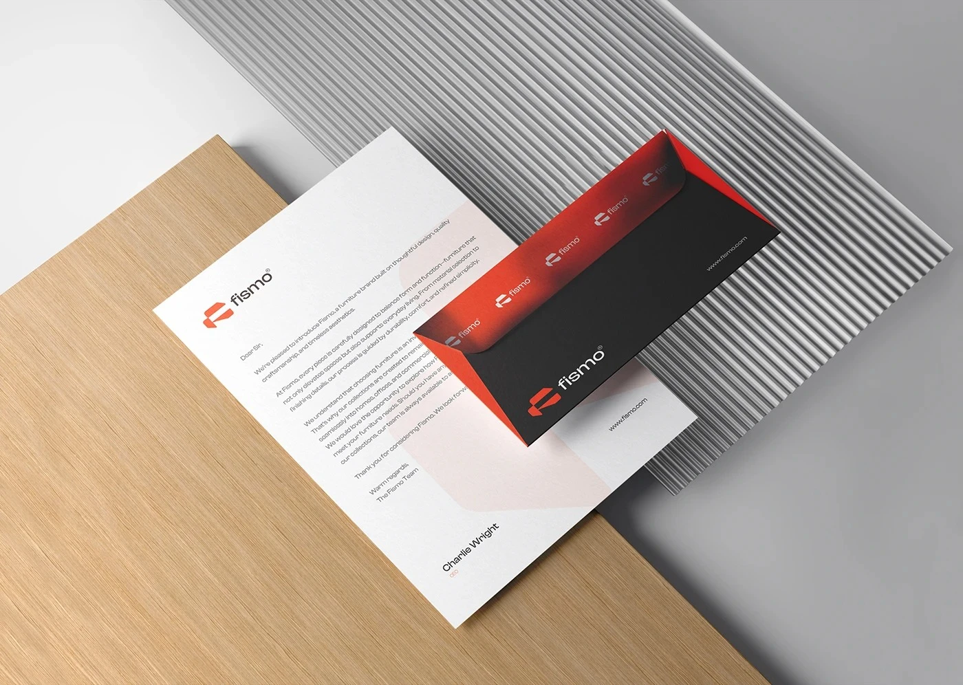
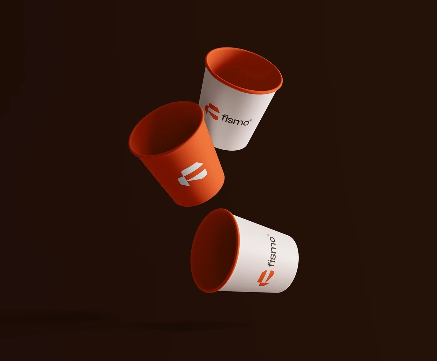
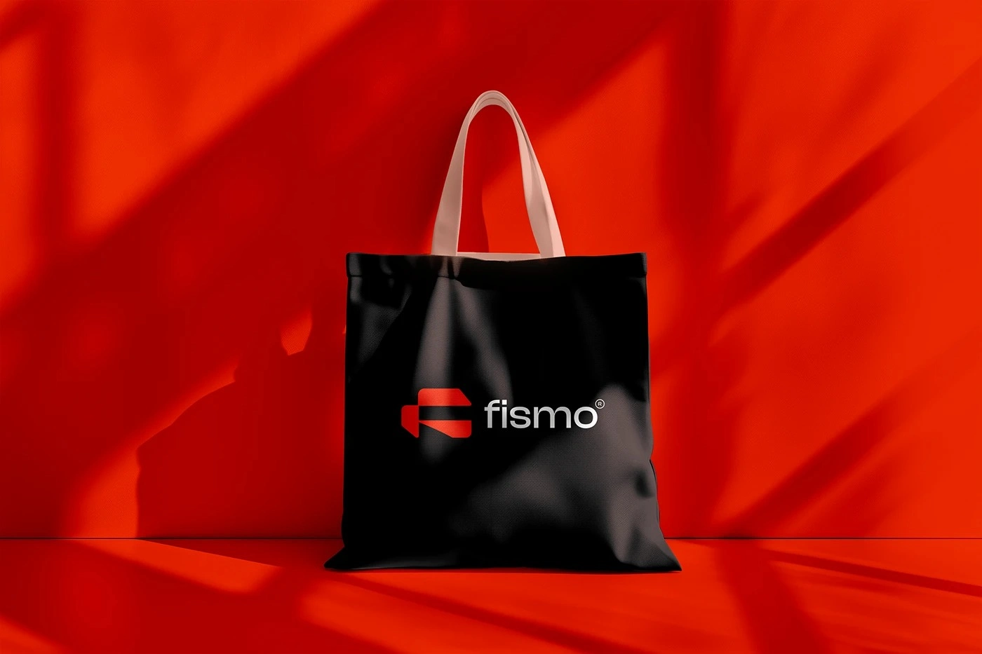
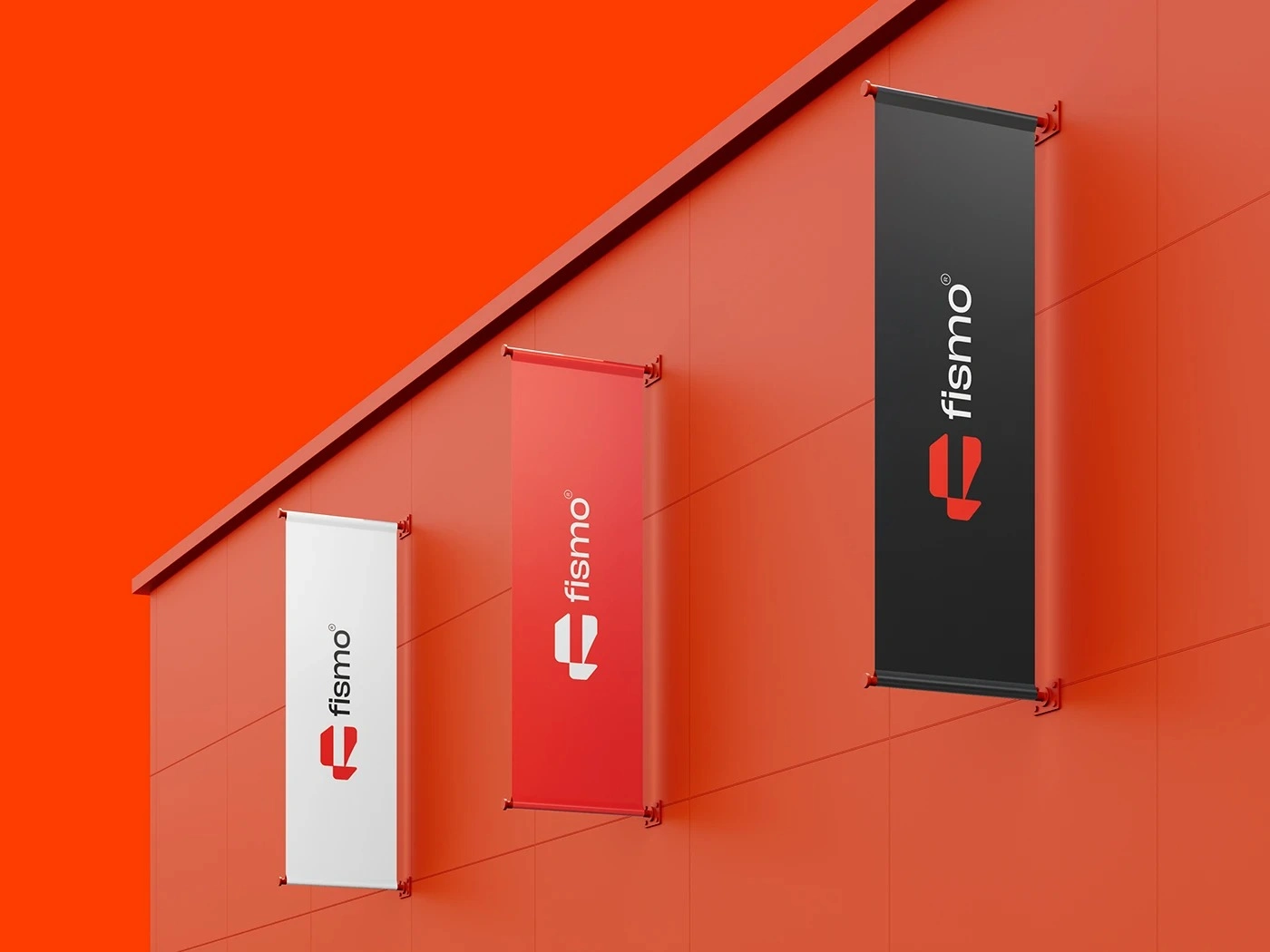
The logo system was designed to remain consistent across very different environments. The primary lockup combines the Fismo symbol with the lowercase wordmark, while simplified configurations provide additional flexibility for smaller or more restricted applications.
Orange, dark brown, black, and white variations allow the identity to adapt naturally to light and dark backgrounds without losing recognition.
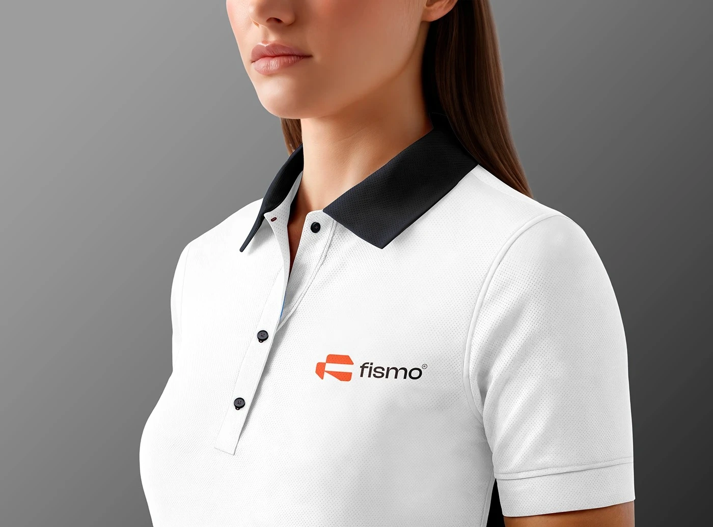
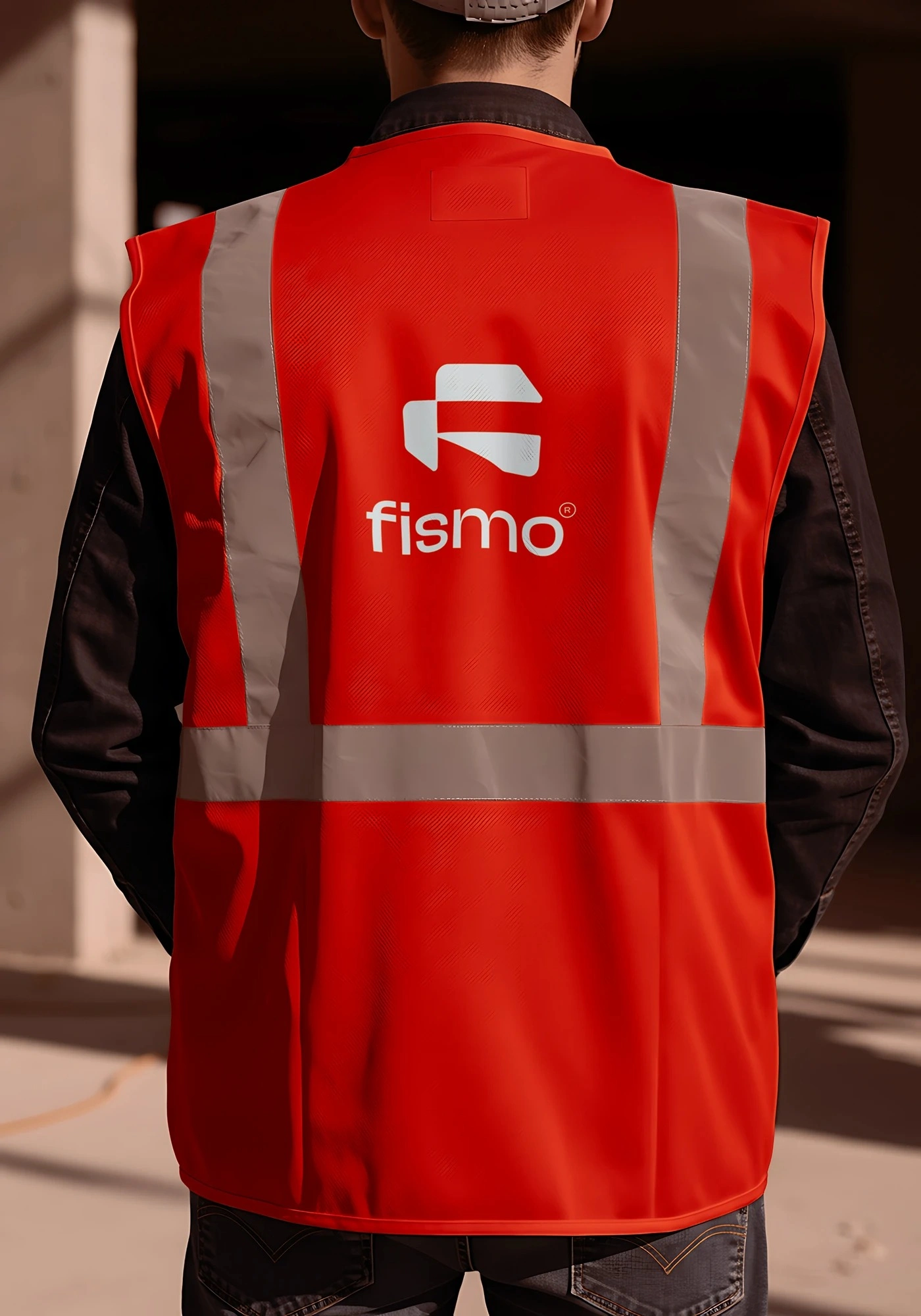
This flexibility is an important part of the system. Whether the logo appears on packaging, advertising, signage, digital interfaces, workwear, or transportation, its proportions and visual character remain consistent, helping every touchpoint feel unmistakably connected to Fismo.
COLOR WITH PURPOSE
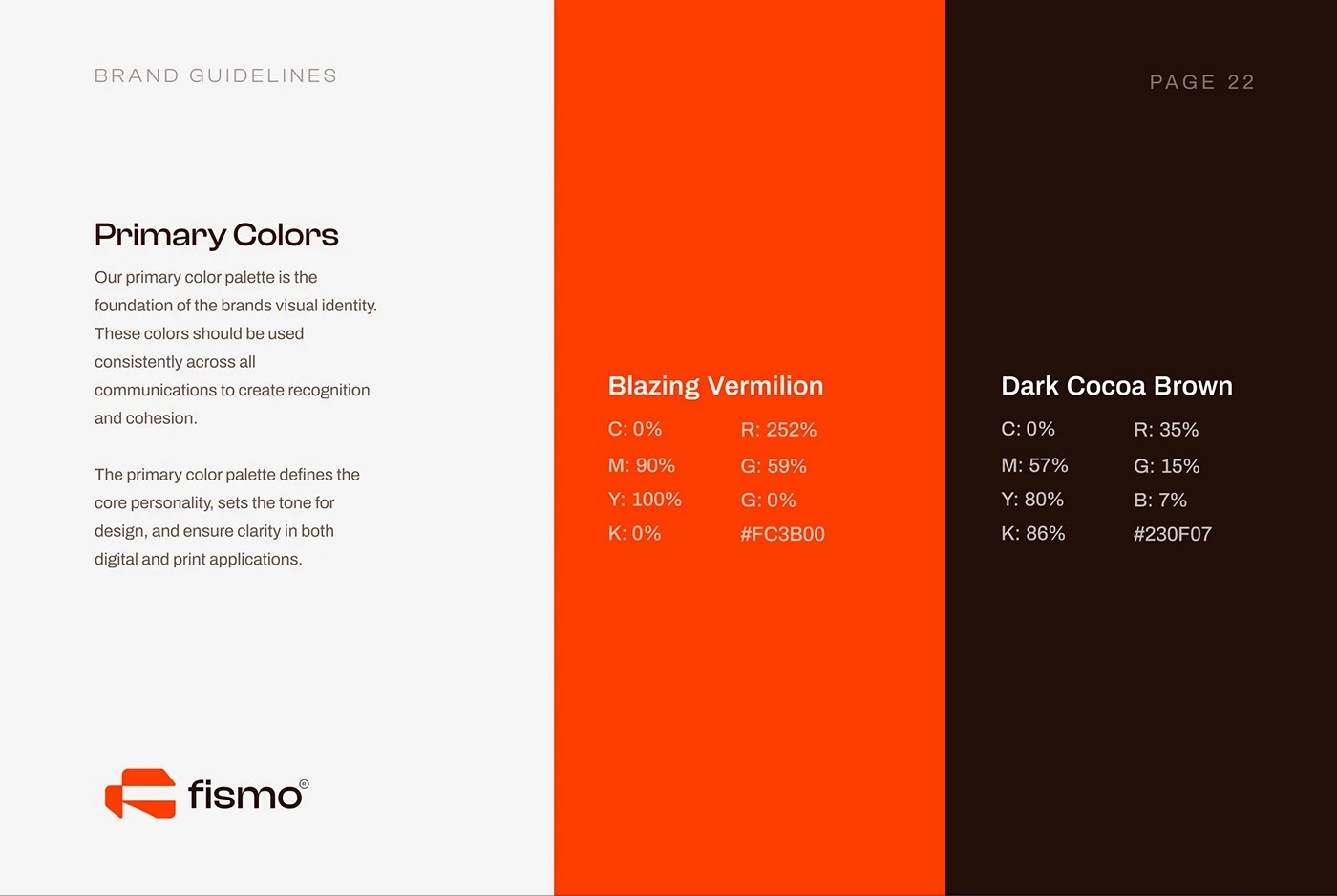
Color plays a central role in making Fismo recognizable. The signature orange creates energy, warmth, and immediate visual impact, giving the brand a confident presence within a furniture category often dominated by neutral palettes.
A deep brown provides contrast and sophistication, while white and lighter neutral tones create breathing room and maintain a clean contemporary character.
Rather than using color decoratively, the system uses it strategically. Orange attracts attention, dark tones create depth, and neutral space creates balance. Together, these elements allow the furniture and photography to remain the hero while still making every communication instantly identifiable as Fismo.
A CLEAR VOICE FOR A MODERN BRAND
Color plays a central role in making Fismo recognizable. The signature orange creates energy, warmth, and immediate visual impact, giving the brand a confident presence within a furniture category often dominated by neutral palettes.
A deep brown provides contrast and sophistication, while white and lighter neutral tones create breathing room and maintain a clean contemporary character.
Rather than using color decoratively, the system uses it strategically. Orange attracts attention, dark tones create depth, and neutral space creates balance. Together, these elements allow the furniture and photography to remain the hero while still making every communication instantly identifiable as Fismo.
EXTENDING THE SYMBOL
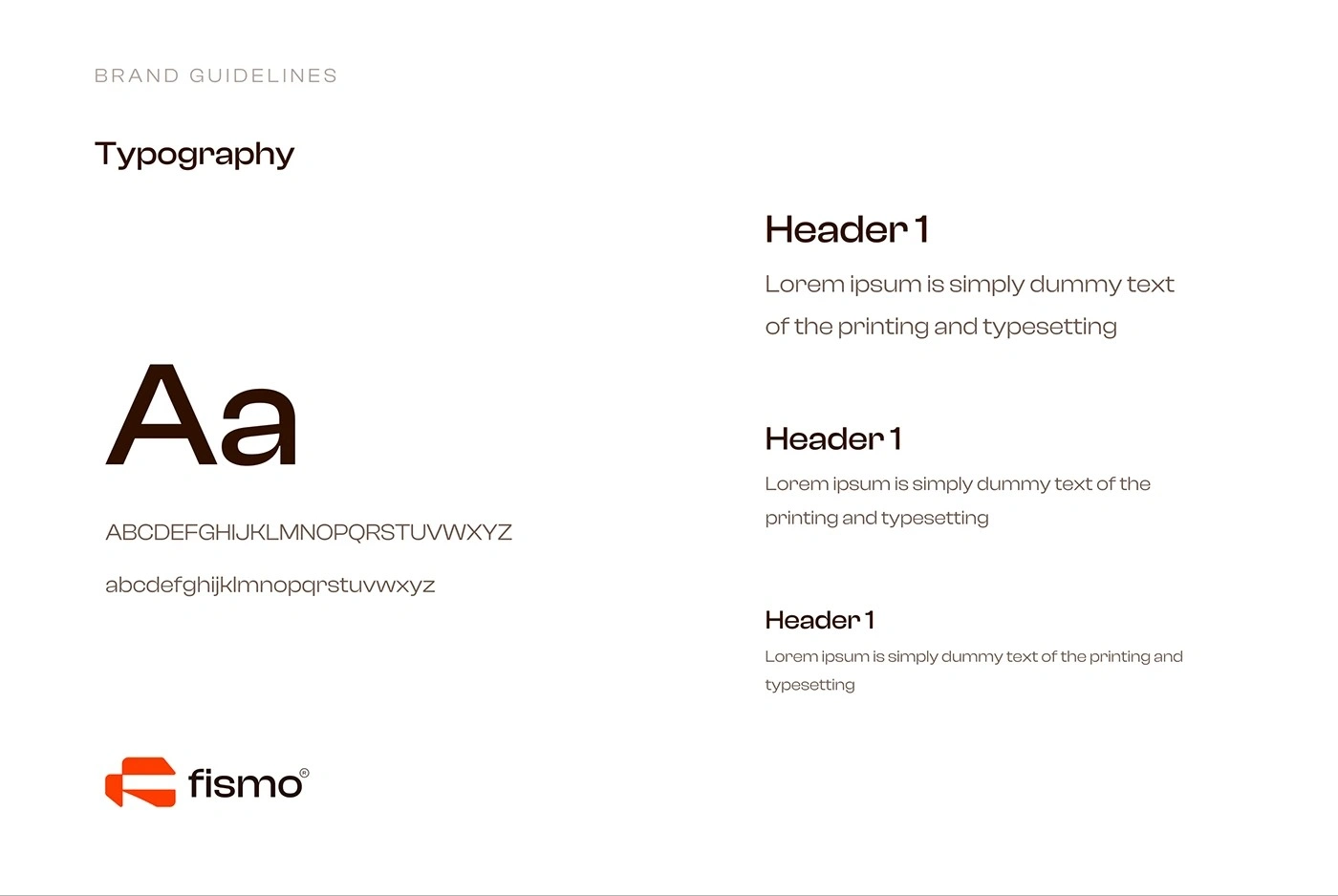
The Fismo pattern expands the visual language beyond the logo itself. Built from repeated geometric elements derived from the brand mark, it creates rhythm and movement while reinforcing recognition in a more subtle way.
The pattern can function as a supporting background, a graphic texture, or a distinctive surface treatment across printed and digital applications.
Its modular construction gives the system additional flexibility without introducing unrelated visual elements. This means that even when the full logo is not dominant, the identity can still feel unmistakably Fismo through shape, repetition, color, and rhythm.

TURNING PRODUCTS INTO A STORY
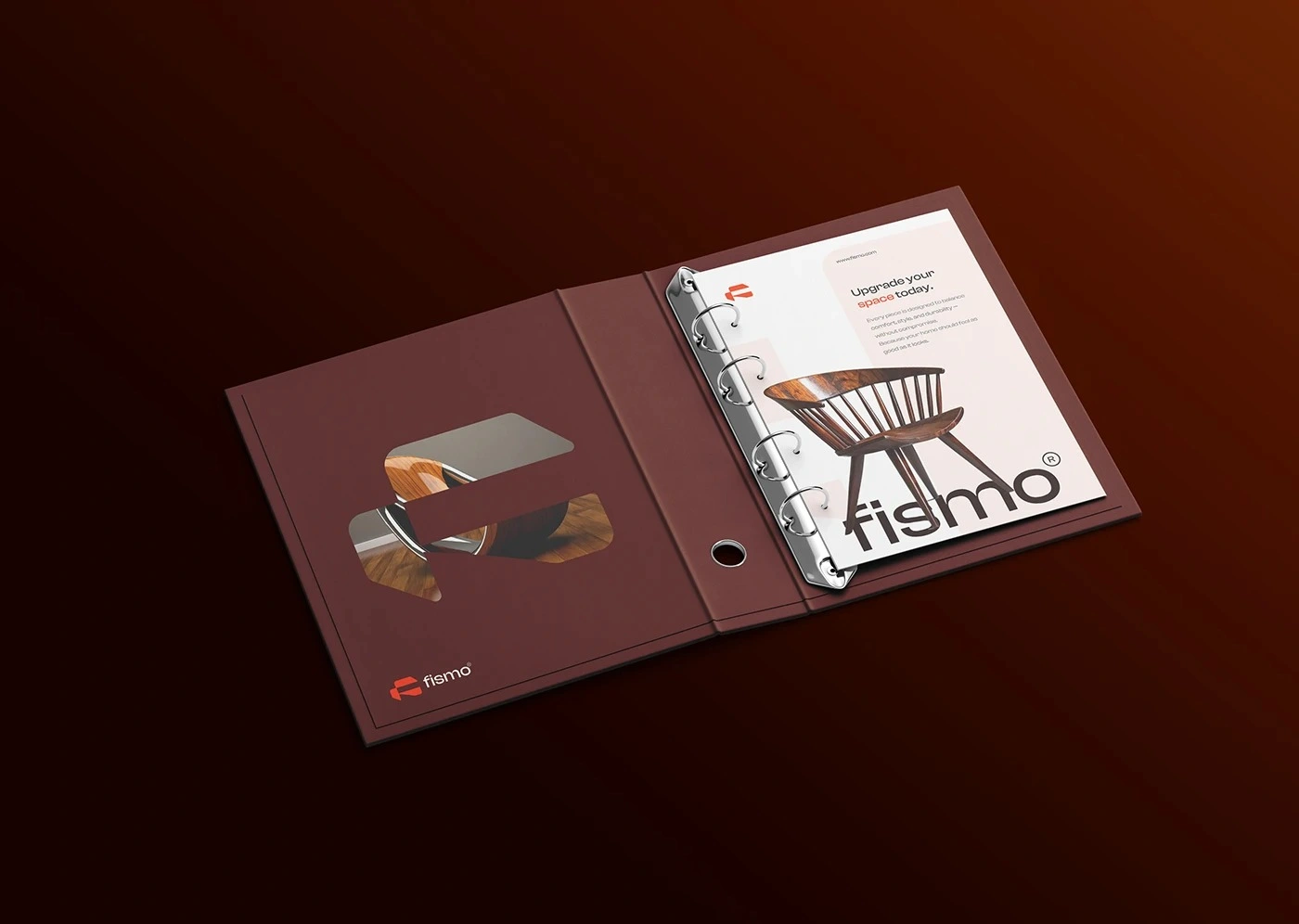
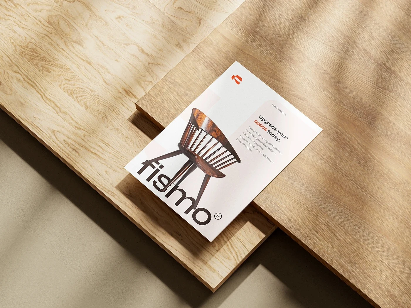
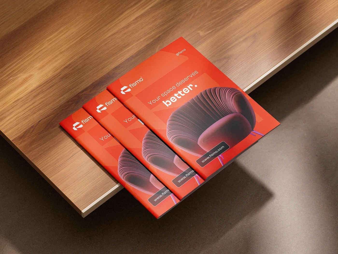
The editorial system was designed to present Fismo furniture as part of a complete living experience rather than as isolated products.
Product photography, typography, color, and whitespace work together to create a structured but visually engaging layout. The goal is to give every piece enough space to communicate its form and material qualities while maintaining a strong connection to the wider brand identity.
This approach allows catalogues, brochures, presentations, and product publications to feel informative without becoming technical, and premium without relying on excessive decoration. The furniture remains central, while the identity provides structure and personality around it.
DIGITAL HOME FOR FISMO
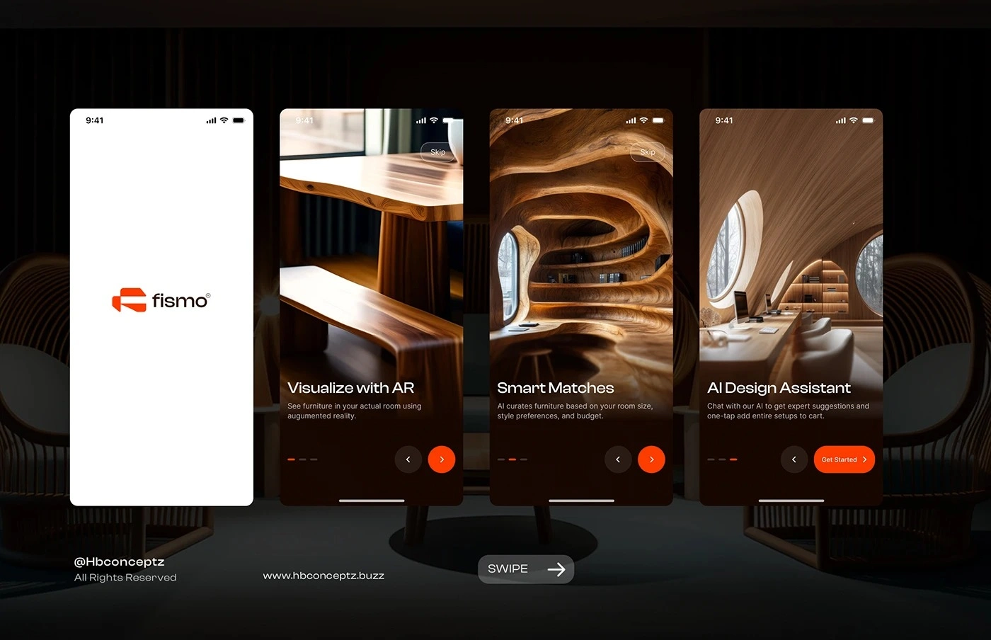
The digital experience translates the physical character of Fismo into an interface that feels clear, contemporary, and product-focused.
Large furniture imagery takes priority, while the brand colors and typography provide navigation, hierarchy, and recognizable visual cues. The interface is intentionally restrained so users can explore products without unnecessary distraction.
Across desktop and mobile formats, the system maintains the same balance between visual inspiration and practical information. This ensures that the online experience feels like a natural continuation of the showroom and advertising identity rather than a separate digital language.
FURNITURE THAT MAKES A STATEMENT
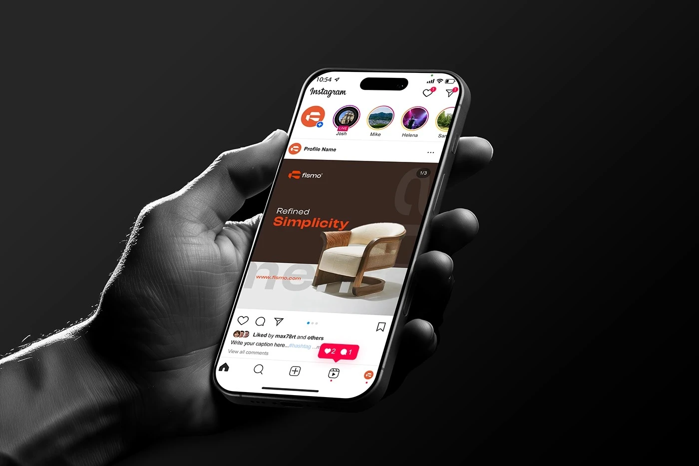
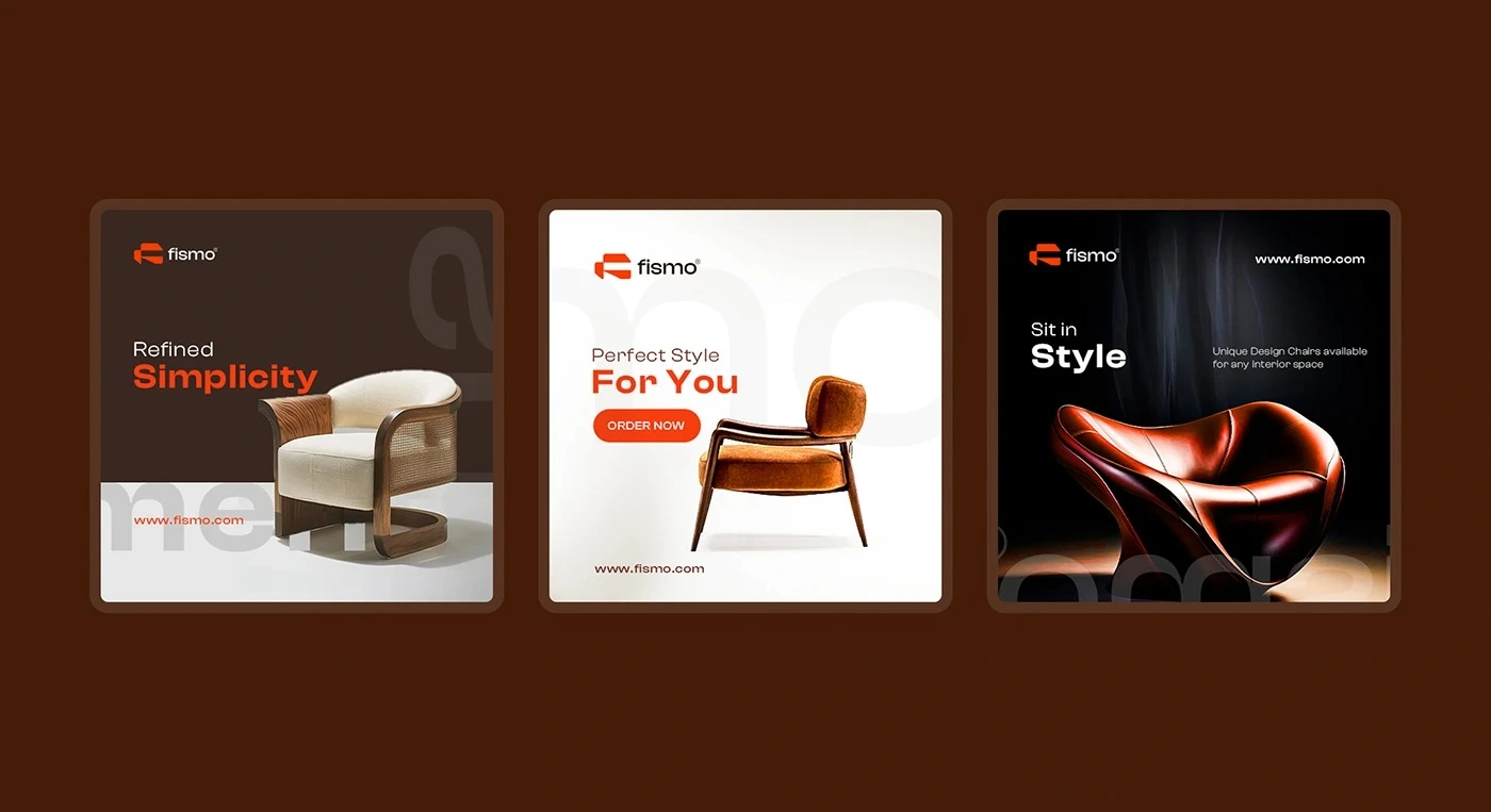
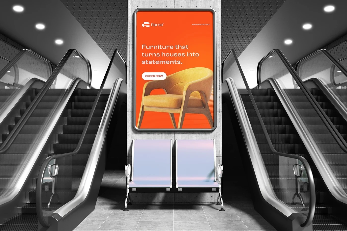
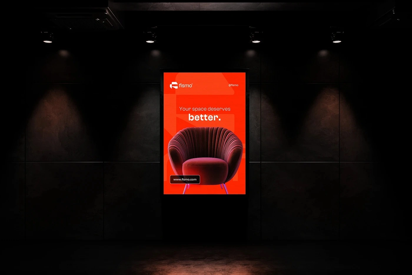
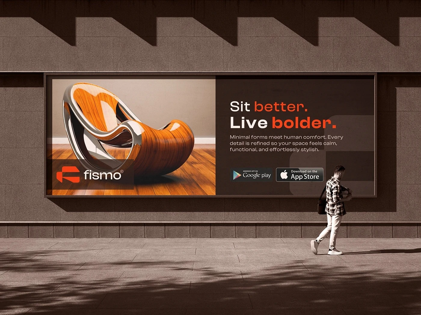
The advertising direction positions Fismo as a bold contemporary furniture brand with a clear point of view.
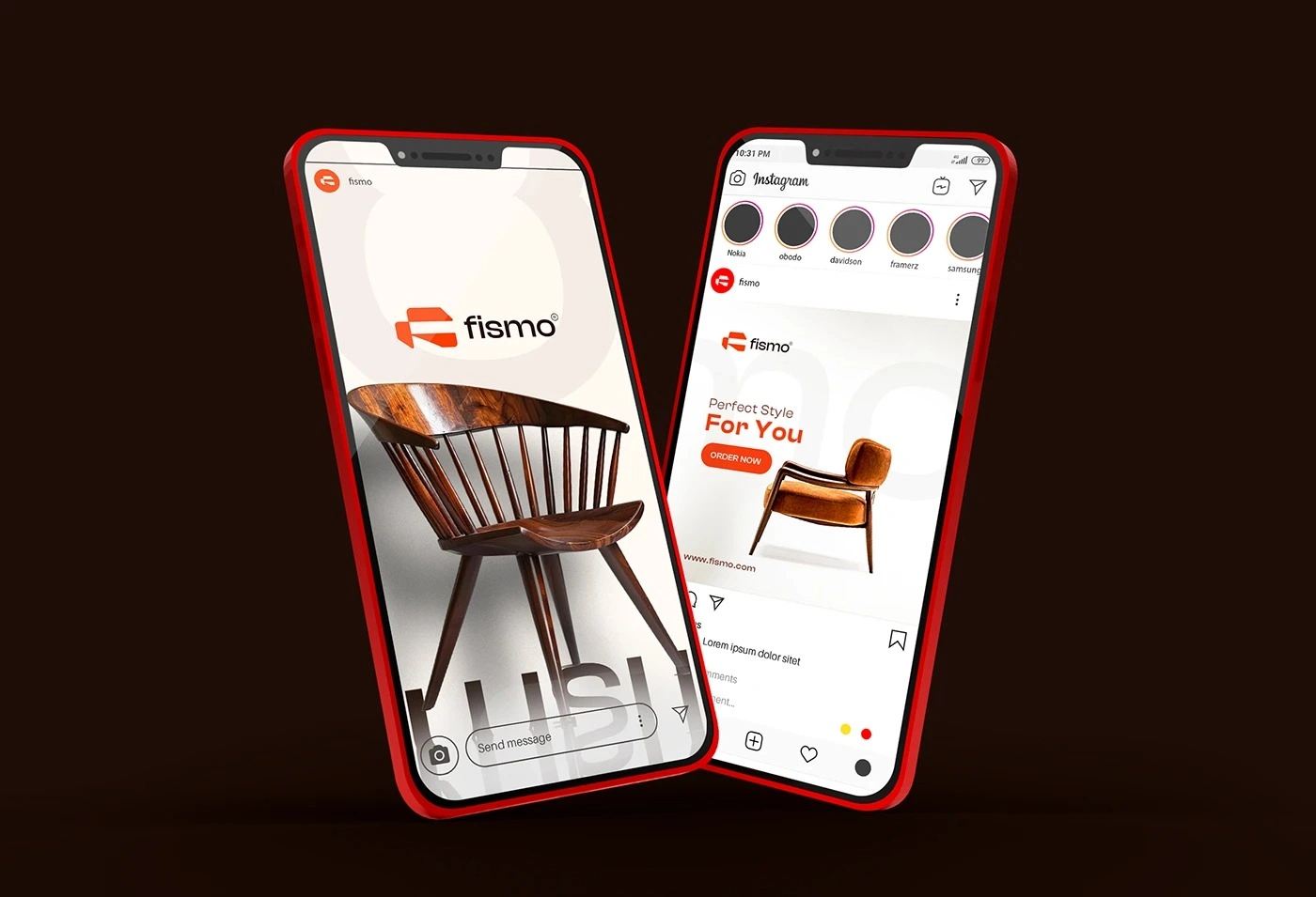
Campaign layouts use high-contrast compositions, confident headlines, signature orange, and focused product imagery to create communication that can be understood quickly from a distance.
Rather than overcrowding each advertisement with information, the system allows a strong product image and a short message to carry the idea. This creates a more memorable visual experience and gives individual furniture pieces the presence they deserve.
Across posters, outdoor advertising, social campaigns, and retail communication, the same principles create a consistent and scalable campaign language.
WHERE THE BRAND BECOMES A SPACE
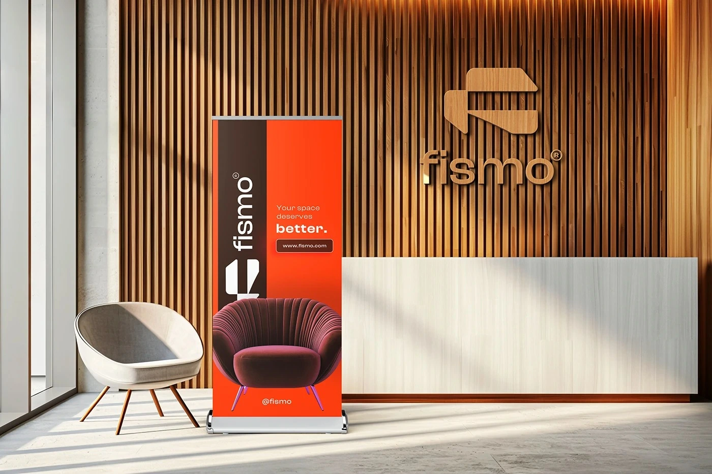
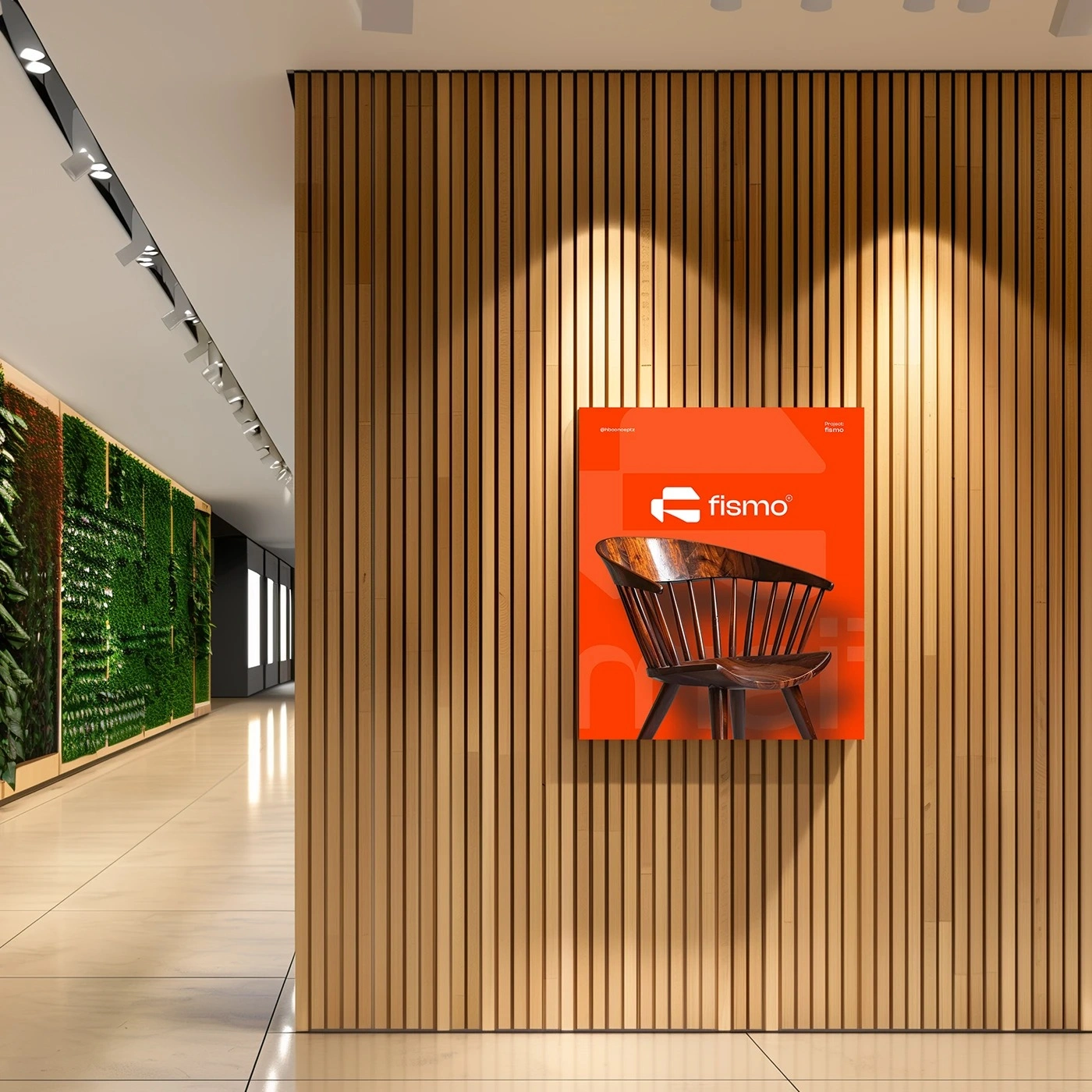
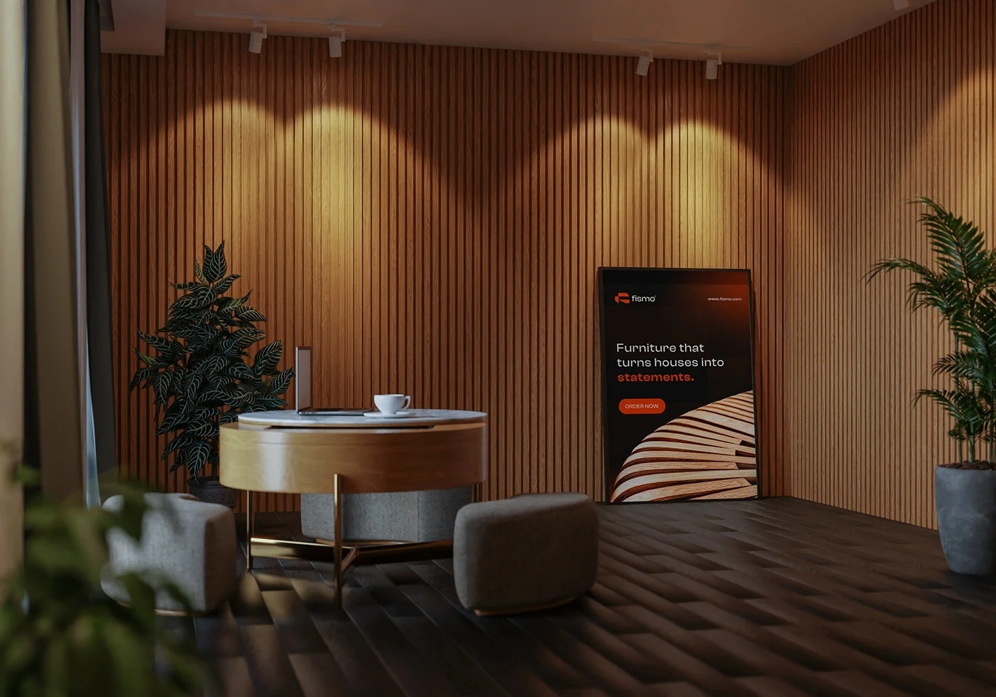
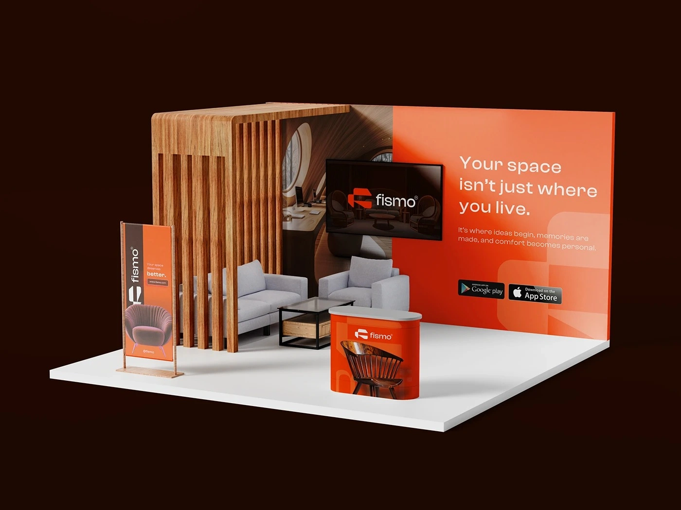
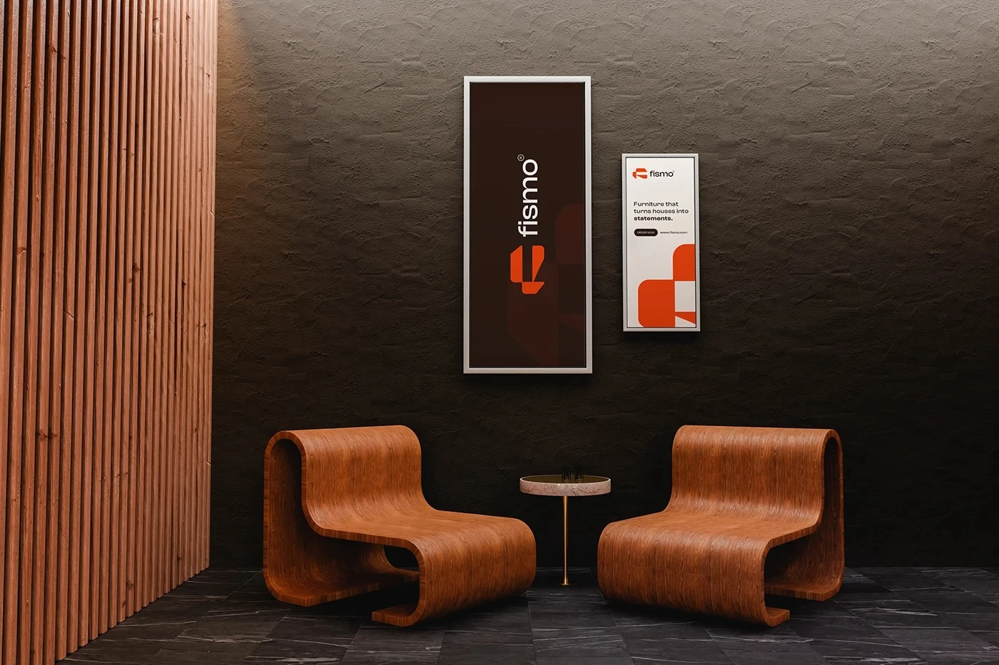
The showroom is where the visual identity moves from graphic communication into a complete physical experience.
Brand signage, furniture, architectural materials, lighting, and display elements are designed to work together rather than compete with one another. Warm wood and neutral interior surfaces provide a refined setting, while the Fismo orange introduces clear focal points throughout the space.
This relationship between brand and environment helps customers experience Fismo as more than a logo attached to furniture. The identity becomes part of the architecture, guiding attention and creating a consistent atmosphere from the moment someone enters the showroom.
DESIGNED TO BE SEEN
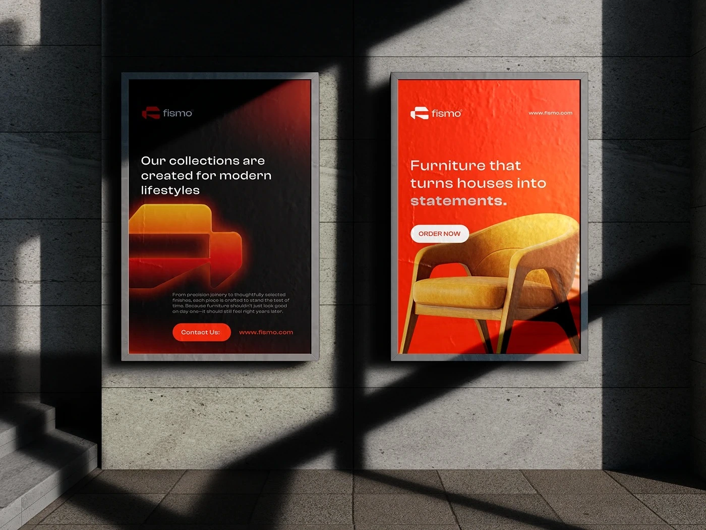
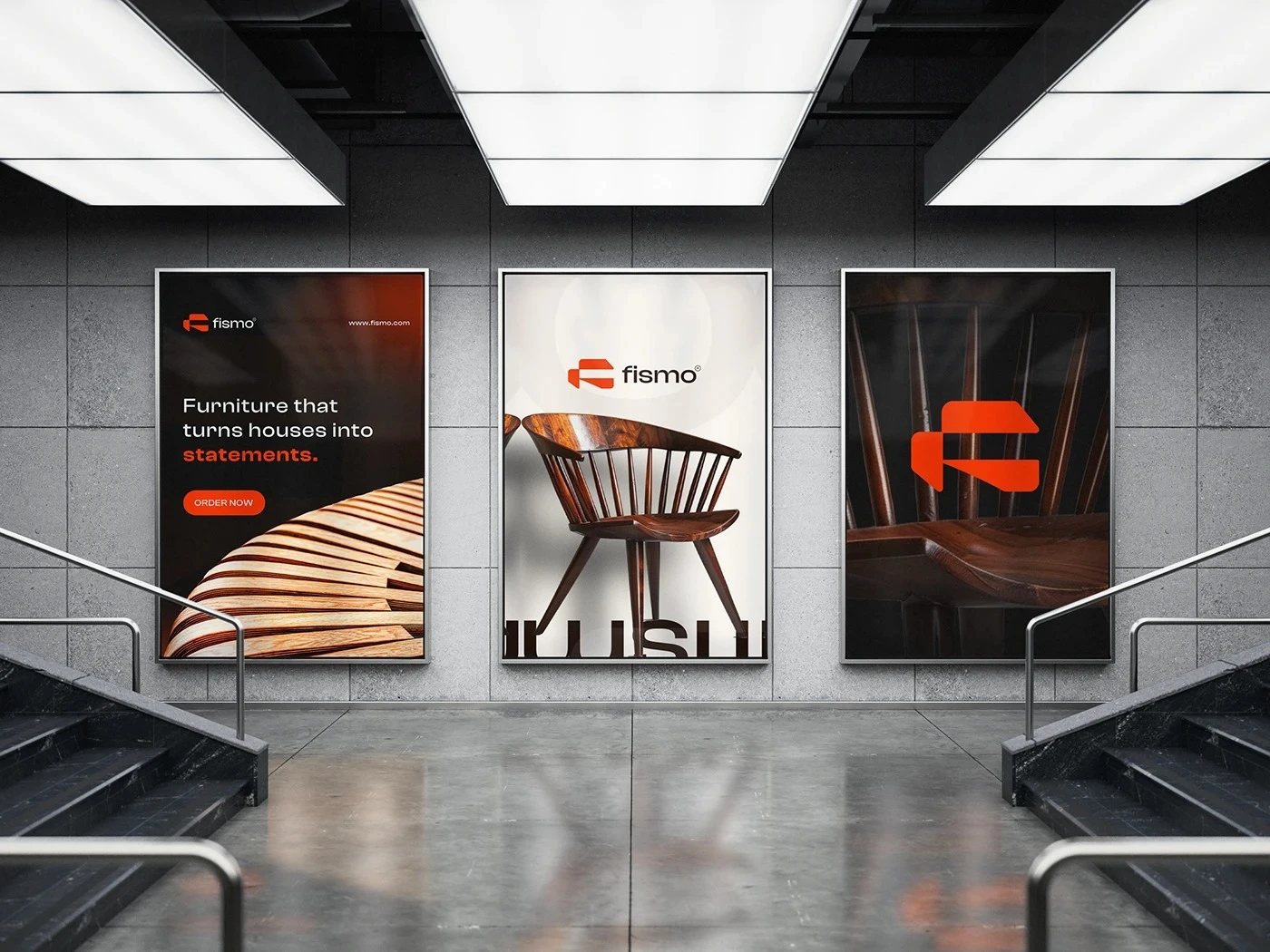
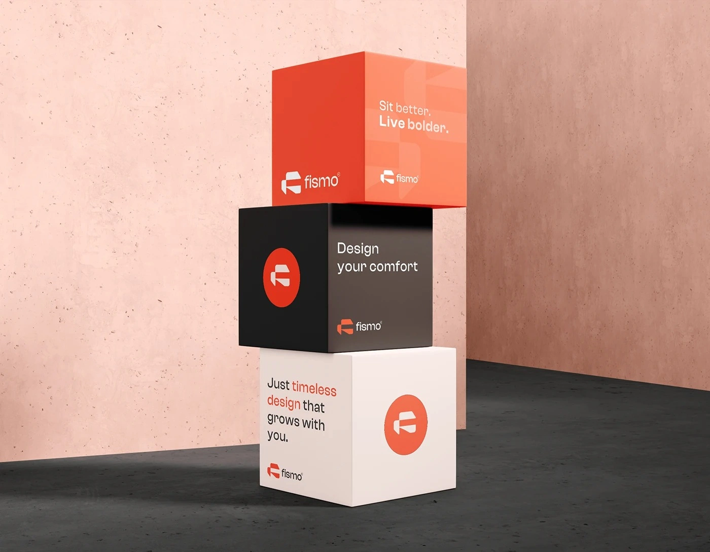
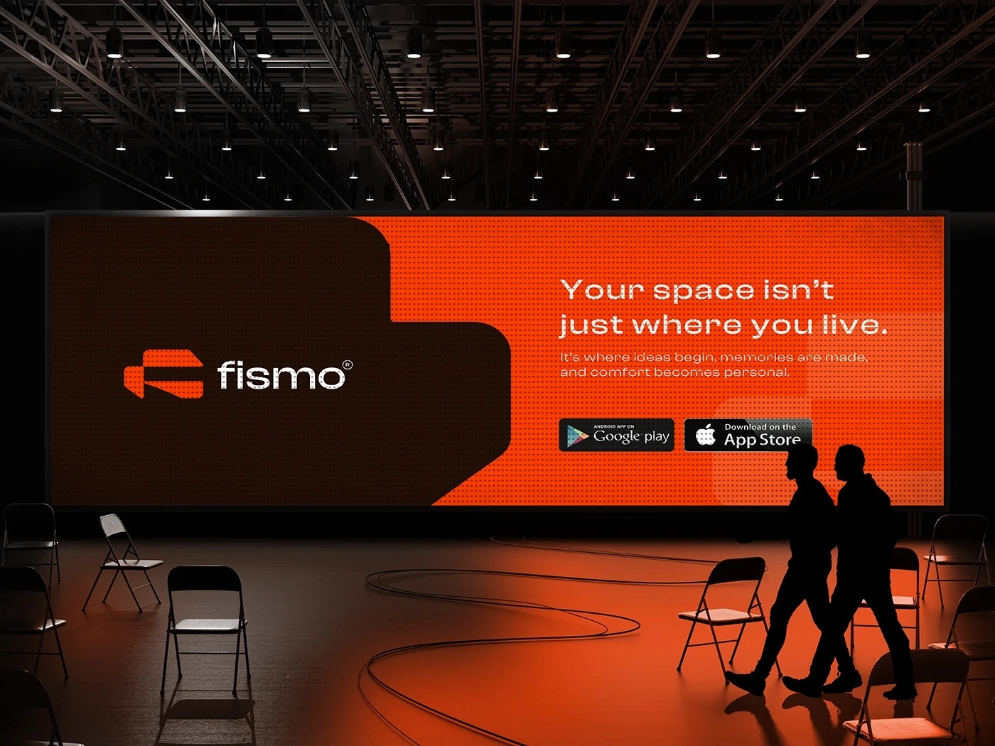
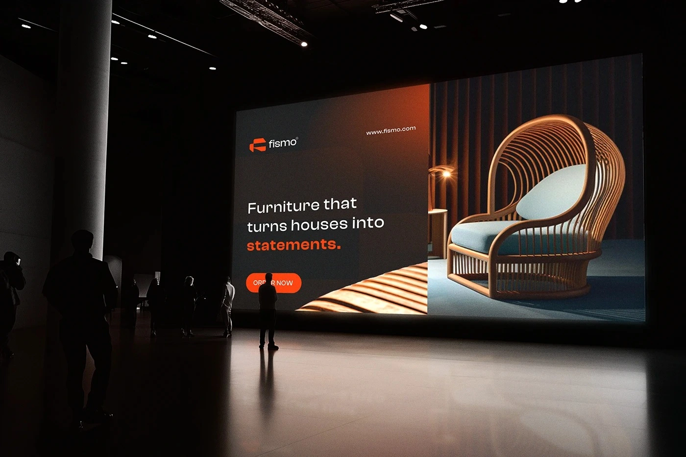
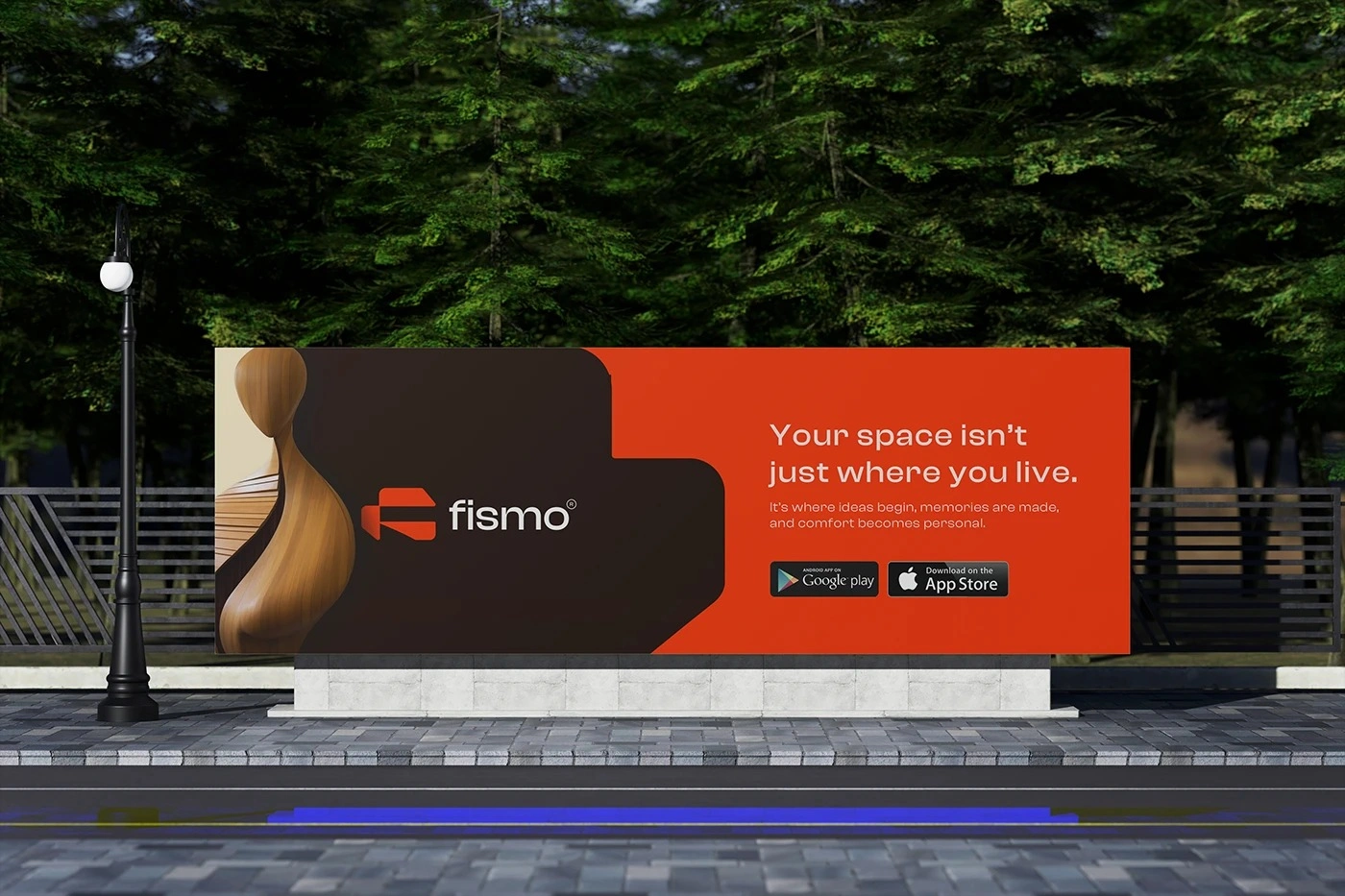
At large scale, the identity becomes more direct and expressive.
Outdoor campaigns rely on a limited number of elements: a strong furniture image, a clear headline, recognizable brand color, and confident logo placement. Reducing visual noise ensures that the message remains effective even when viewers only have a few seconds to engage with it.
The system is flexible enough to accommodate different products and messages while preserving a recognizable Fismo structure.
This creates advertising that is bold without becoming aggressive, contemporary without becoming temporary, and branded without allowing the identity to overpower the product itself.
A BRAND IN MOTION
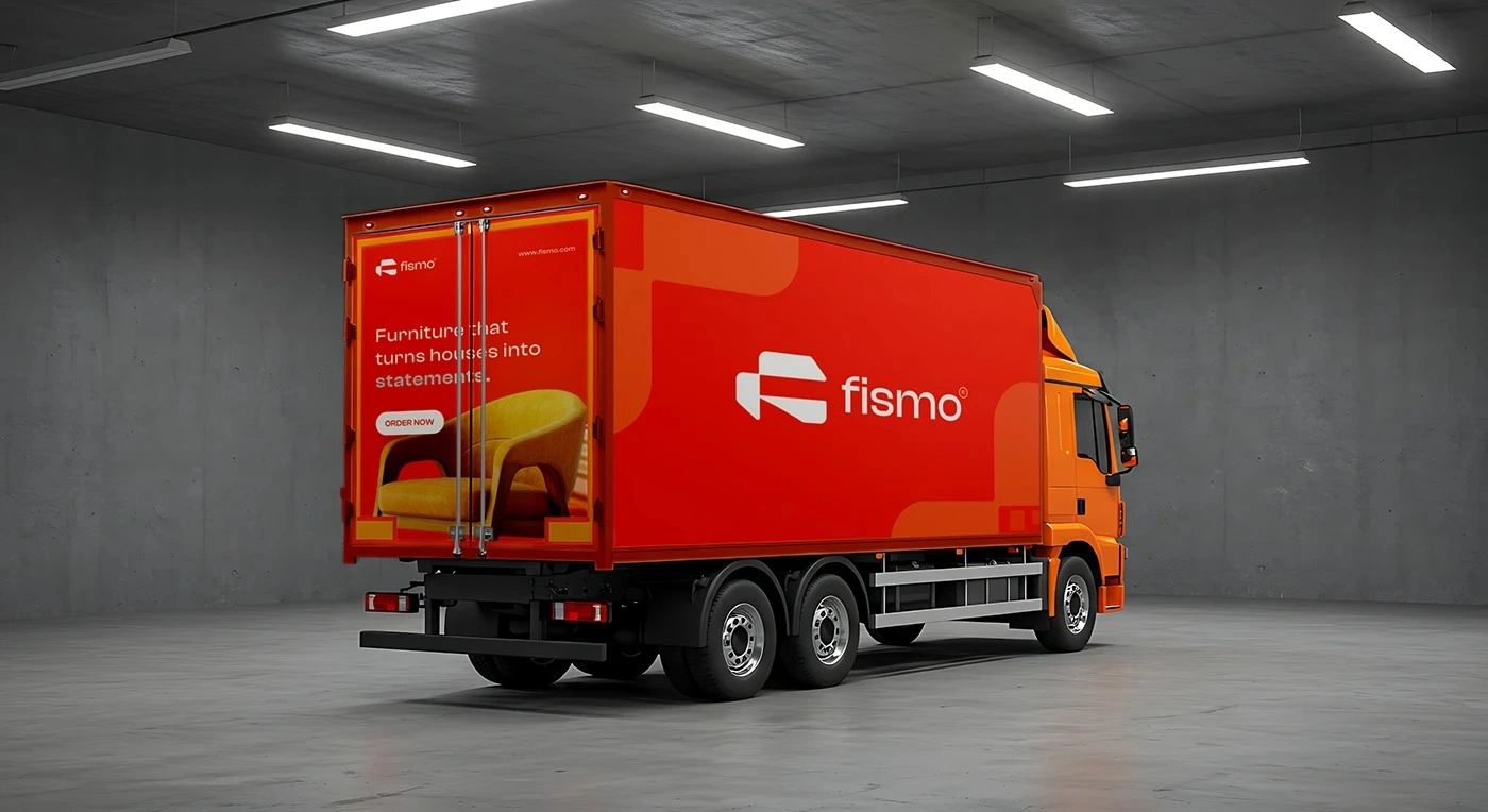
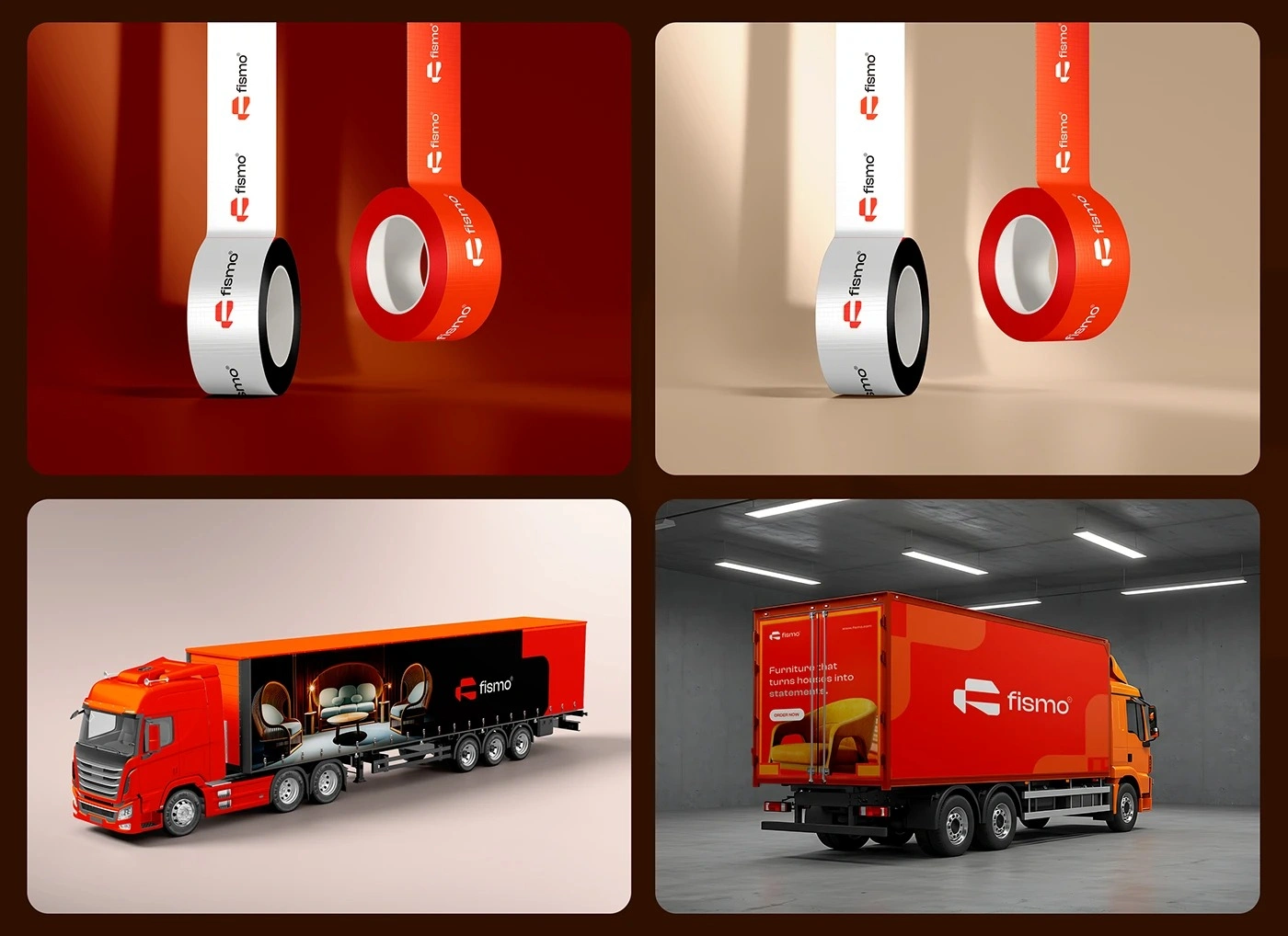
Fismo's delivery fleet extends the visual identity beyond traditional advertising and transforms an operational necessity into a moving brand asset.
The large orange surfaces create immediate visibility, while the simplified logo and graphic system ensure recognition from different distances and viewing angles. The design intentionally avoids excessive information so the vehicle remains bold and easy to identify while moving through busy environments.
By applying the same visual principles to transportation, the brand remains present throughout the entire customer journey—from discovering Fismo online or through advertising to the final delivery of the furniture itself.
FISMO — MADE FOR MODERN LIVING
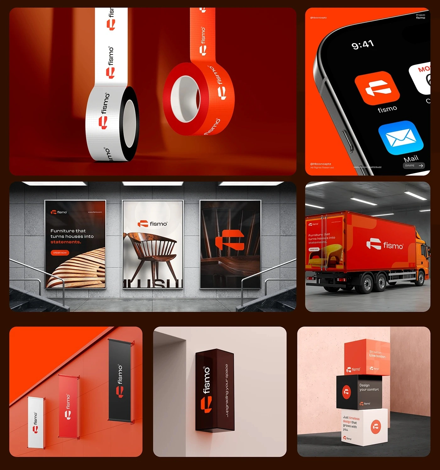
Fismo was built as a complete visual ecosystem rather than a collection of disconnected applications.
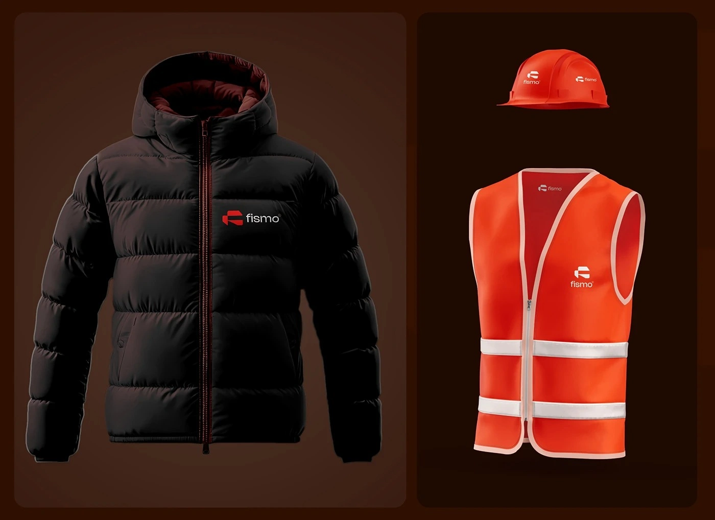
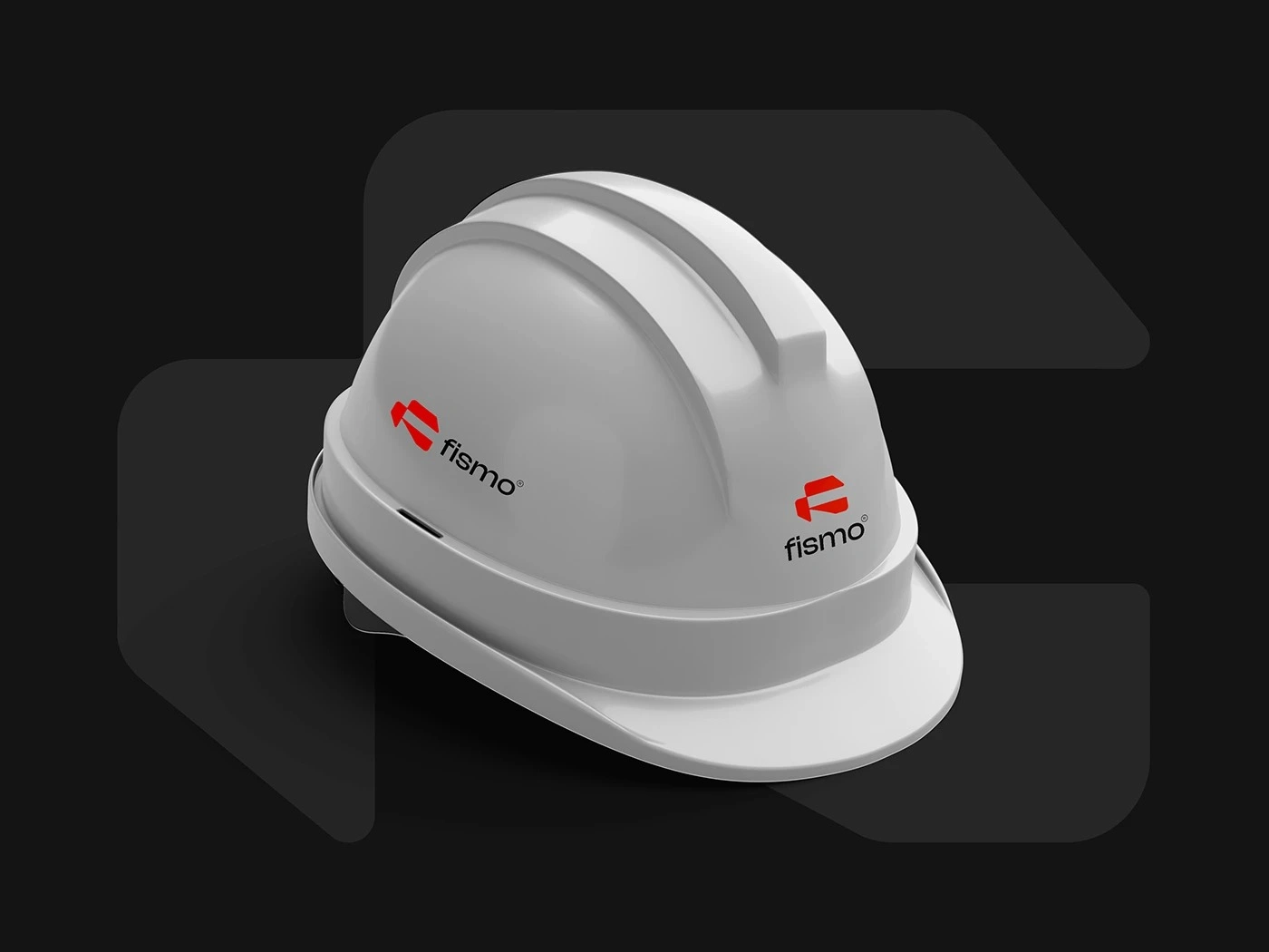
From the logo and typography to editorial design, digital interfaces, advertising, showrooms, uniforms, environmental graphics, and transportation, every touchpoint follows the same underlying principles: clarity, confidence, functionality, and contemporary character.
The result is an identity capable of adapting to different scales and environments while remaining consistently recognizable.
Just like the furniture itself, the Fismo brand is designed to become part of everyday spaces—functional when it needs to be, expressive when it matters, and always built around modern living.
DESIGNED BY AHMED GHANAM
1 like · 3 views · Nov 8, 2026
Fismo is a contemporary brand identity project built around the concept of flexibility, connection, and modern living. The visual identity combines a distincti


