Brand Identity|Volnat — Premium French Walnuts by Qaasim AprilBrand Identity|Volnat — Premium French Walnuts by Qaasim April

Brand Identity|Volnat — Premium French Walnuts

Qaasim April

Qaasim April
Volnat Est Né De La Terre
[ eng. Volnat was born from the land ]
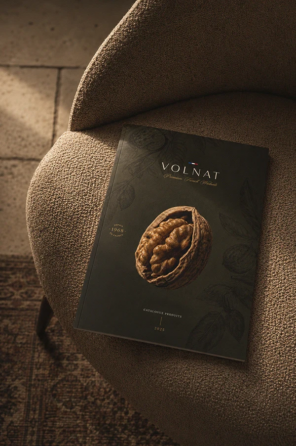
A premium French walnut brand built for the wholesale fine food market. The brief was precise: create an identity that could hold its own against the visual language of luxury European food—communicating provenance, craft, and grade to discerning buyers, without defaulting to the usual rustic clichés.
Une Marque Née D’un Territoire
[ eng. A brand born from a territory ]
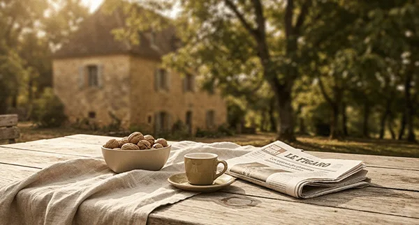
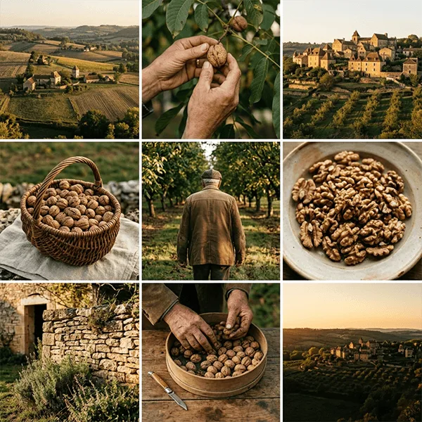
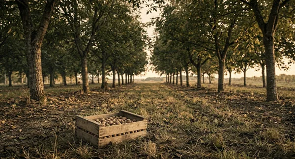
The Périgord. A region that has grown walnuts for centuries—not as a commodity, but as a matter of regional pride. That relationship between land and product is the foundation everything else is built on.
La Stratégie
[ eng. The strategy ]
One idea: Provenance as premium.
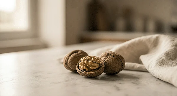
French produce carries an implied contract of quality—one built over centuries of cultural association. Rather than explain this, the brand needed to embody it. Every touchpoint had to feel like it was made by people who understood craft: from the way the logo sits on a page, to the way light falls on the product in photography.
Volnat is what the French countryside tastes like.
La Direction Créative
[ eng. Creative direction ]
The creative direction drew from two worlds that rarely meet: classical French typography and the raw, textural detail of the walnut itself.
The shell—with its unpredictable pattern of thick and thin—became the philosophical lens for the entire visual language. It informed the logo’s character, the illustration style and the photography direction. Everything carries the quality of something that took time and knowledge to produce.
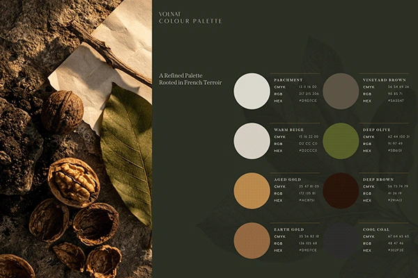
The palette was drawn directly from the walnut’s natural environment.
Deep olive. Warm parchment. Aged gold. Near-black. Couleurs qui ne s’imposent pas—elles s’accumulent (colours that don’t announce themselves—they accumulate) into something that feels expensive and inevitable.
Le Logo
[ eng. The logo ]
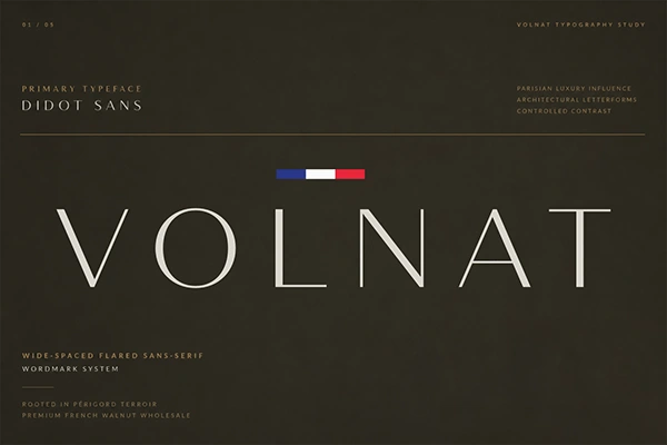
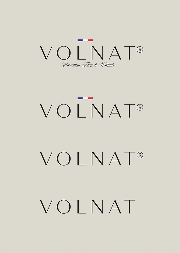
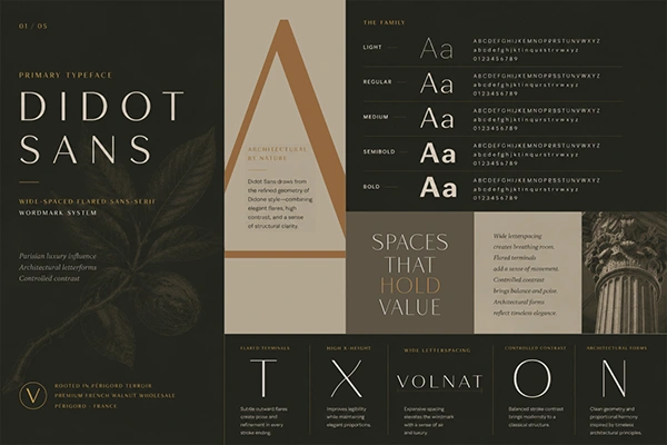
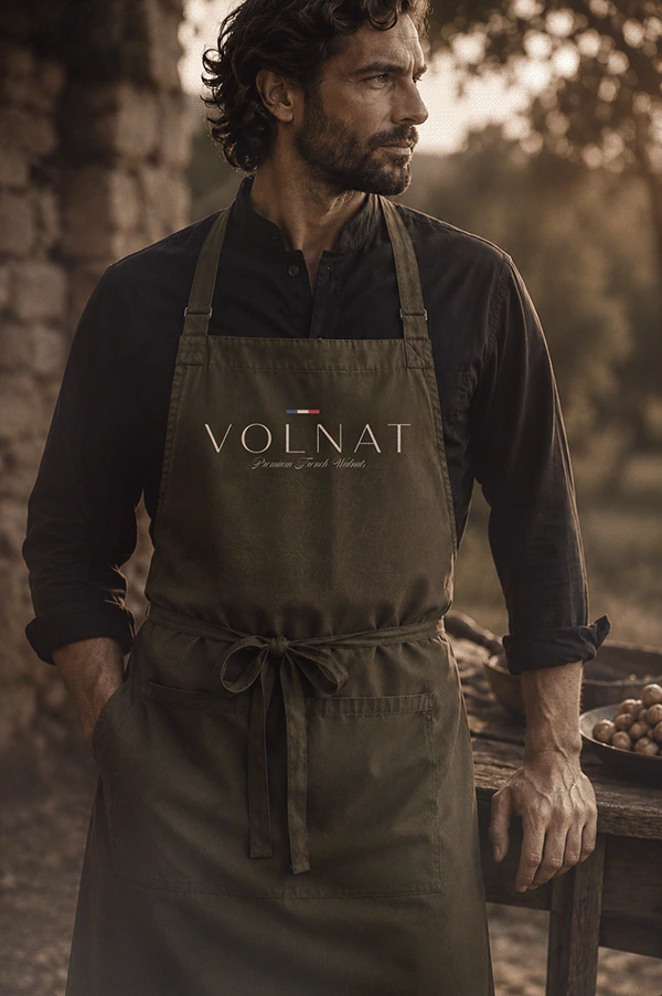
The primary lockup—VOLNAT, Premium French Walnuts—draws from the elegant flared sans-serifs prominent in classical French typographic treatments. Wide-spaced. Deliberate. The French tricolour above the “L” and “N” is restrained. It doesn’t shout. It confirms.
Every variation earns its place. Nothing decorative. Nothing that couldn’t survive being printed at 10mm or scaled to billboard. The identity holds across every surface it touches.
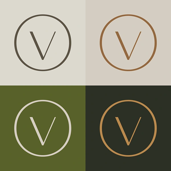
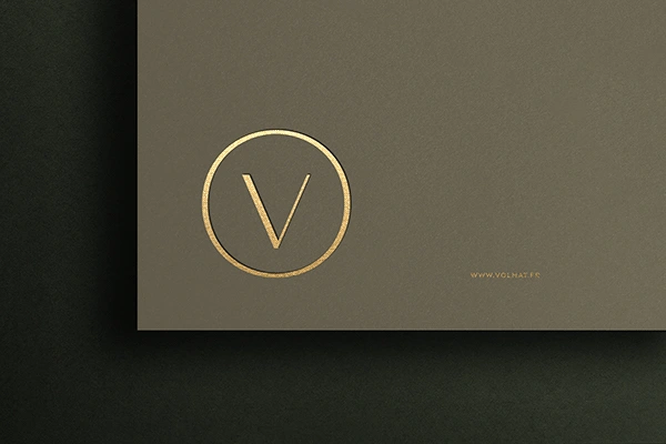
The icon—the geometric V derived from the logotype locked within a flared circle following the same visual language—functions as the brand’s secondary identifier. Used where the full wordmark is too large or too formal. Same DNA. More compact.
Le toucher compte autant que le regard (touch matters as much as sight).
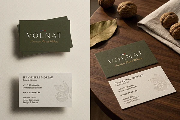
Premium brand identity isn’t only visual. The weight of a card. The depth of an emboss. The grain of a surface. These are the details a buyer notices before they've consciously registered the logo.
La Typographie
[ eng. Typography ]
Five typefaces. Five registers. One conversation between formality and humanity.
Didot Sans: The display serif. Classical French editorial weight. The wordmark’s backbone.
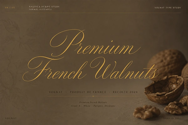
Nautica: Accent. Circumstantial elegance. Tagline.
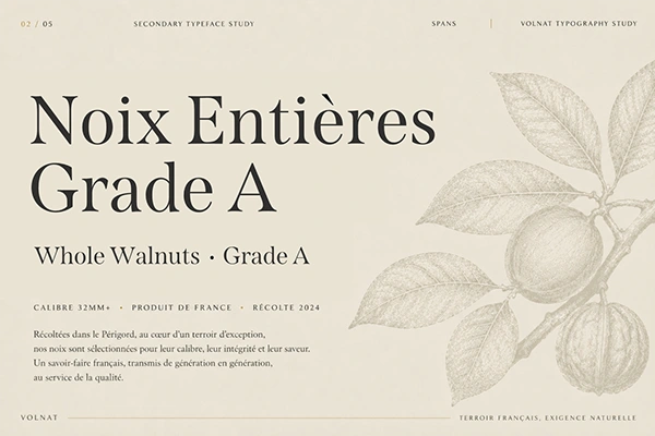
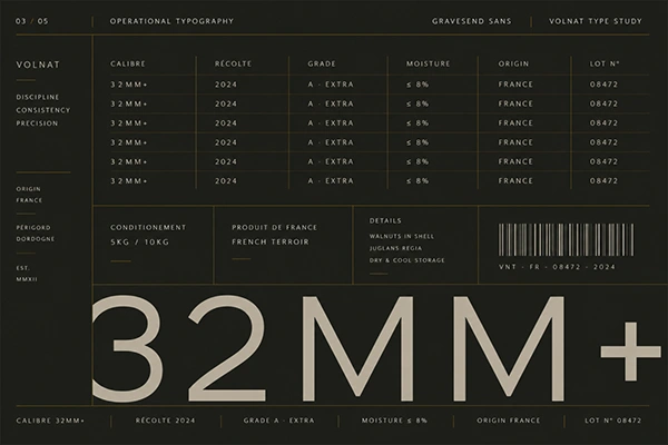
Spans: Structural, architectural elegance. Formal communications and operational text.
Gravesend Sans: The workhorse. Clean, reliable, no ego.
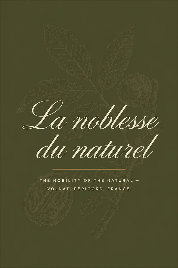
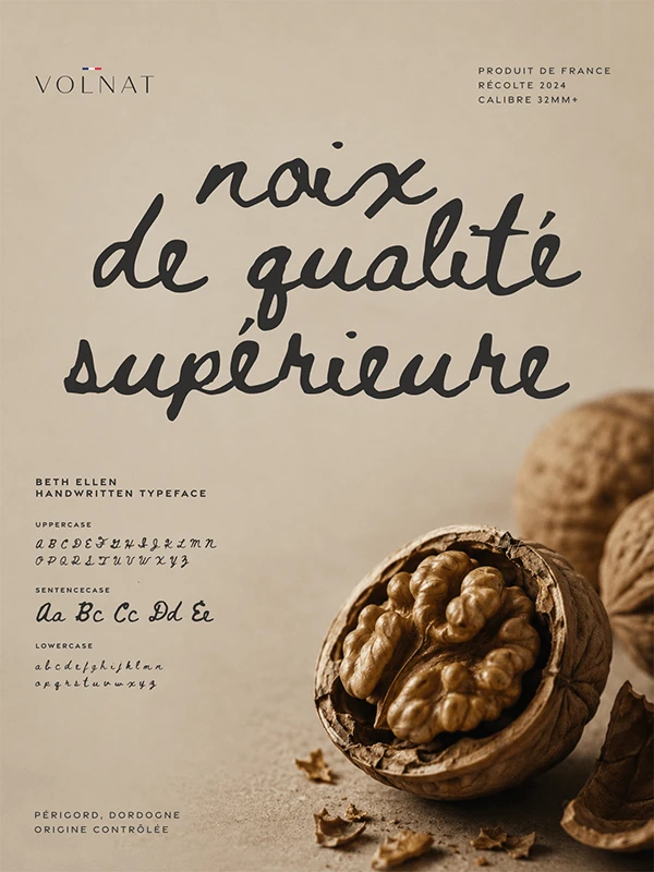
Beth Ellen: The script voice. Expressive, handwritten, warm. Reserved for the moments that need to feel like a person wrote them.
Le détail fait la différence (the detail makes the difference).
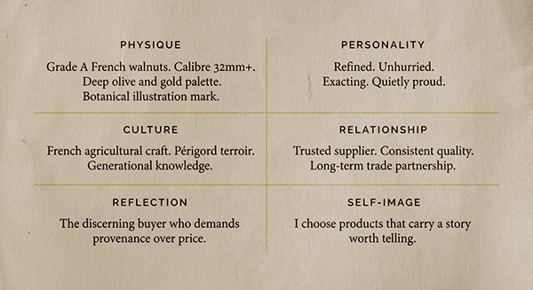
Grade A. Calibre 32mm and above. Moisture below 8%. Broken kernel tolerance under 5%. These aren’t footnotes—they’re the brand promise made measurable. The identity system was designed to carry this specificity without losing its elegance.
Script callout noix de qualité supérieure (walnuts of superior quality).
L'Illustration
[ eng. The Illustration ]
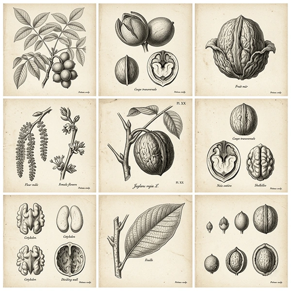
The botanical engravings—detailed, layered, légèrement fantomatiques (slightly ghosted)—create context around the product without competing with it. Archive as atmosphere. They suggest heritage, craft and a kind of patient attention to nature that the brand values.
Les Communications Formelles
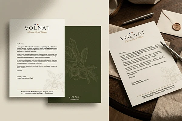
[ eng. Formal communications ]
The identity applied to trade communications. Every surface reinforces what the brand stands for—that the people behind Volnat attend to detail the way a grower attends to a crop.
L’Affiche
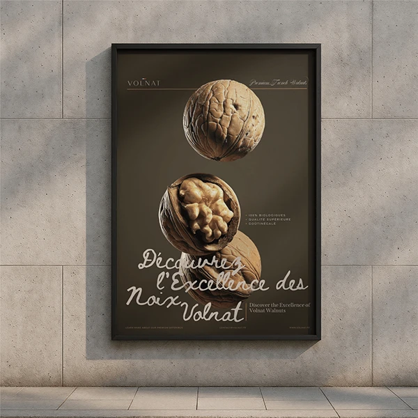
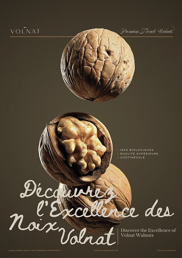
[ eng. The poster ]
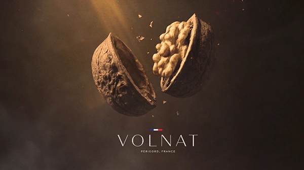
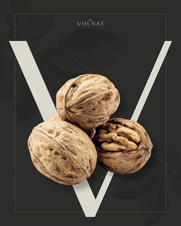
Built around a single compositional idea: levitation.
Two walnuts—one whole, one cracked open—suspended against a deep olive ground. The opening of the shell becomes a reveal. Inside this modest exterior, something extraordinary. The script callout runs large across the lower third: Découvrez l’Excellence des Noix Volnat. A discreet English translation sits beside it—because this brand speaks to the world, not just France.
Le Social
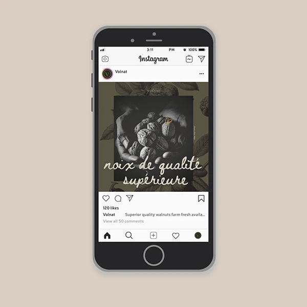
[ eng. social ]
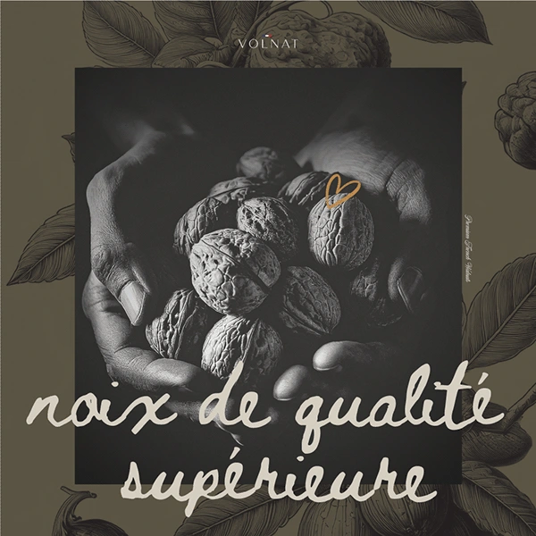
The brand’s textural language compressed into a square.
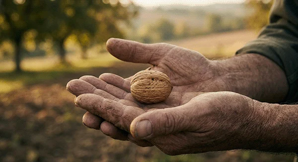
Botanical illustrations frame the edges. A darkened photographic centre draws focus to hands cradling walnuts—intimate, almost ceremonial. The script overlay lands as both headline and feeling: noix de qualité supérieure.
L’Emballage
[ eng. The packaging ]
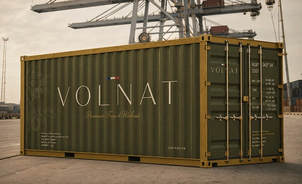
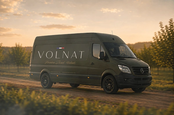
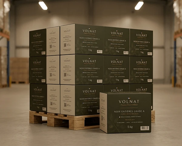
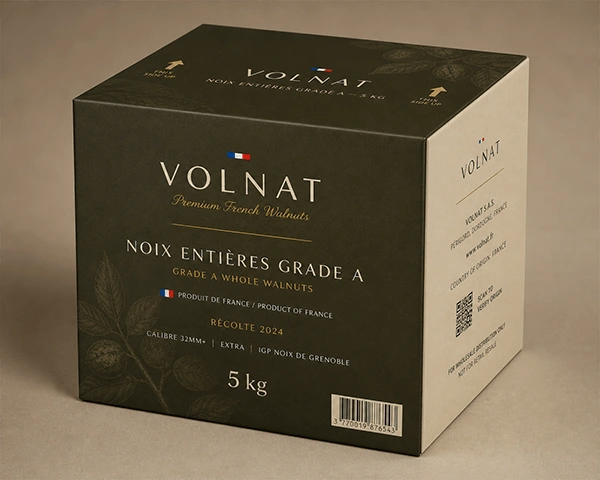
The container, vehicle livery and wholesale transport box extends the brand into the supply chain.
The full identity—the logo that includes the tagline and sometimes extending to the origin statement, harvest year, grade specification and commercial trade codes—is mostly led by the deep olive swatch with ghosted botanical illustration. From the coast already, what a buyer receives isn’t just a box of walnuts. C’est une première impression (it’s a first impression). One that arrives before the product does.
Une Marque Qui Existe Dans Le Monde
[ eng. A brand that exists in the world ]
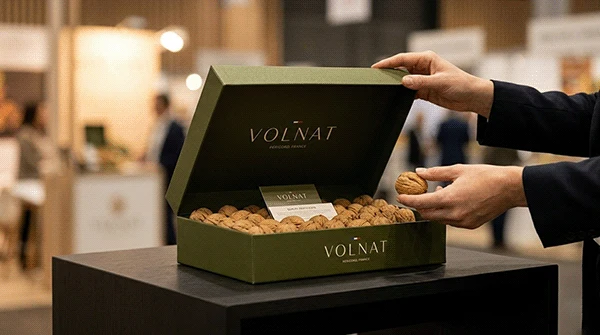
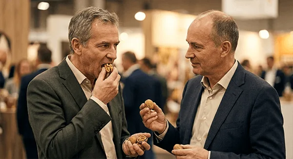
Not just on a mood board—in the hands of buyers, on the tables of fine food distributors, in the conversations that happen at Sial Paris and Anuga where decisions about quality are made quickly and trust is built slowly.
From French soil to discerning hands. That journey—from orchard to trade table—is what every design decision was built to honour.
Sur Le Processus
[ eng. On the process ]
Photography sourced from Magnific, ChatGPT and Gemini provided the foundational product imagery. Adobe Firefly, ChatGPT and Affinity were used to generate and extend key visual elements—atmospheric backgrounds, compositional extensions. This was an AI facilitated process—from research and strategy work to conceptualization and execution. Claude AI and ChatGPT integration helped form the research and strategy. Wireflow AI and Claude AI with UX, UI, flow logic and systemization. Claude AI storytelling and presentation design. RawPixel, Magnific and Mockey AI aided the mockup logic and design. Integrating AI into the workflow was a way of achieving visual control and speed that freed focus for the craft decisions that actually define a brand: strategy, creativity, creative direction, art direction, composition, typographic hierarchy, colour and emotional register.
Brand Strategy, Creative Direction, Art Direction & Design – Qaasim April · Photography – Magnific (former Freepik) / ChatGPT / Adobe Firefly / ChatGPT / Gemini · Typography – Didot Sans, Span, Gravesend Sans, Nautica, Beth Ellen · Tools – Affinity Suite / Claude / ChatGPT / Gemini / Magnific / Wireflow AI / RawPixel / Mockey AI
Like this project

Posted Sep 26, 2026

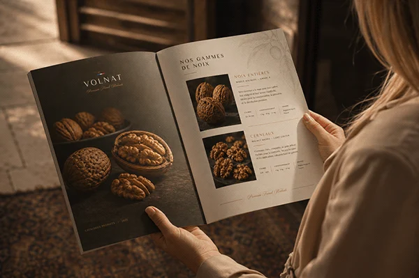
Volnat is a premium French walnut brand built for the wholesale fine food market—an identity that holds its own against the visual language of luxury European food, communicating provenance and grade to discerning buyers. The strategy: provenance as premium. French produce carries an implied contract of quality built over centuries. Rather than explain this, the brand needed to embody it. The visual language draws from classical French typography and the walnut's own texture. The palette—deep olive, warm parchment, aged gold, near-black—was drawn from the walnut's natural environment. Deliverables: logo system, brand poster, social creative, wholesale packaging, product catalogue, and animated digital banner. Brand Strategy · Creative Direction · Art Direction · Design — Qaasim April Photography — Freepik / Adobe Firefly Tools — Affinity Suite · Claude · ChatGPT · Gemini · Magnific