Motion & Print | AGS Group by Qaasim AprilMotion & Print | AGS Group by Qaasim April

Motion & Print | AGS Group

Qaasim April

Qaasim April

AGS Group moves people. 
Literally and logistically.
With 147 offices across 100 countries, more than 2,400 employees worldwide, and 40,000+ relocations handled every year, AGS is one of the most operationally complex organisations in the global mobility space. The challenge isn't what they do—it's communicating all of it, clearly and compellingly, to corporate clients who have neither the time nor the patience for confusion.
The brief: make complexity feel like confidence.
The Client
AGS Group operates across four continents under one philosophy: You deserve the best. From immigration administration and destination support to records management and heritage preservation, their 360° service model is built for multinational organisations managing the movement of people at scale.
This project required two distinct executions—a corporate overview video and a print flyer redesign for the Cape Town hub—each demanding a different discipline, the same standard.
The Corporate Overview Video
A corporate video designed to carry the full weight of the AGS service offering without losing momentum.
The structure follows a deliberate arc: global scale first, then service specificity, then values. Eight screens. Six service categories. One throughline—that no matter the size of your business, AGS has a tailored solution for it.
The motion of every screen was animated from scratch: icon animation, typography sequencing, transition design, service section builds and video integration. Background footage was timed and layered to each service context—a family approaching an airport desk for Immigration, a couple viewing a new space for Relocation, a business meeting for HR Consultancy. The motion language stays consistent throughout: clean, purposeful, no excess.
The logo animation was provided. Everything else in motion was built and timed by hand.
The messaging was also refined in places—not just animated. Where the original copy was functional, the reframed lines were built to land. The sustainability screen—We prioritise sustainable business—closes with We prioritise you enlarged and pulled into focus. The pivot from company value to client value, in a single typographic gesture.
The Cape Town Hub Flyer
The existing flyer had the right ingredients. It needed a sharper eye.
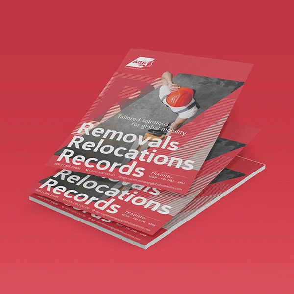
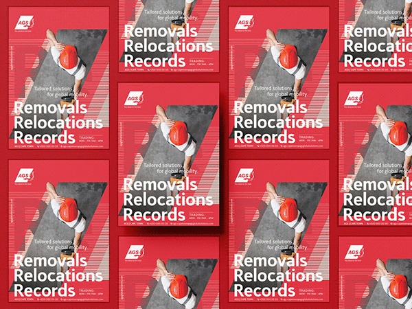
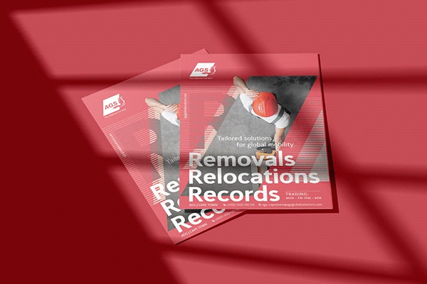
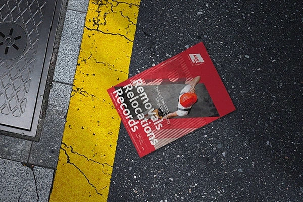
The redesign kept faith with the brand—red (#DC3545), black, white, the angular geometry that gives AGS's visual language its energy—and pushed the balance further. The diagonal structure was retained and refined. The image was sourced and chosen to carry both movement and authority. The three service headlines—Removals. Relocations. Records.—were set with more deliberate weight and rhythm.
The copy was written afresh. The hierarchy rebuilt from the contact line up. What remained was the brand. What changed was everything the eye actually reads first.
Role: Motion Design, Animation & Video Editing, Print Design, Image Direction & some Copywriting | Provided by AGS Group: Brand Assets such as their Logo, Logo Animation, Icons and Stock Images [ AGS Group | ags-relocation.com ]
Like this project

Posted Sep 26, 2026

AGS Group is one of the world's leading global mobility providers—50 years of growth, 147 offices across 100 countries, and more than 40,000 relocations handled annually. The brief called for two deliverables: a corporate overview video communicating the full breadth of AGS's services—Immigration, Relocation, HR Consultancy, Moving, Records Management and Heritage Preservation—and a flyer redesign for the Cape Town hub, requiring a fresh, balanced execution within strict brand guidelines. All motion graphics, animation, and video editing produced by Qaasim April. Flyer—layout, image sourcing, copywriting, and visual hierarchy—designed from the ground up. Motion Design, Animation & Video Editing—Qaasim April Print Design & Copywriting—Qaasim April Client — AGS Group