Pesa mobile app redesign
Ola Adedamola
Pesa mobile app redesign
The Pesa mobile app enabled Migrants across Canada, the UK, India, the US, etc. to send money to over 35 countries
Pesa users didn’t find the product intuitive, with complaints such as not understanding the onboarding process, finding it hard to reach out to customer service through the app
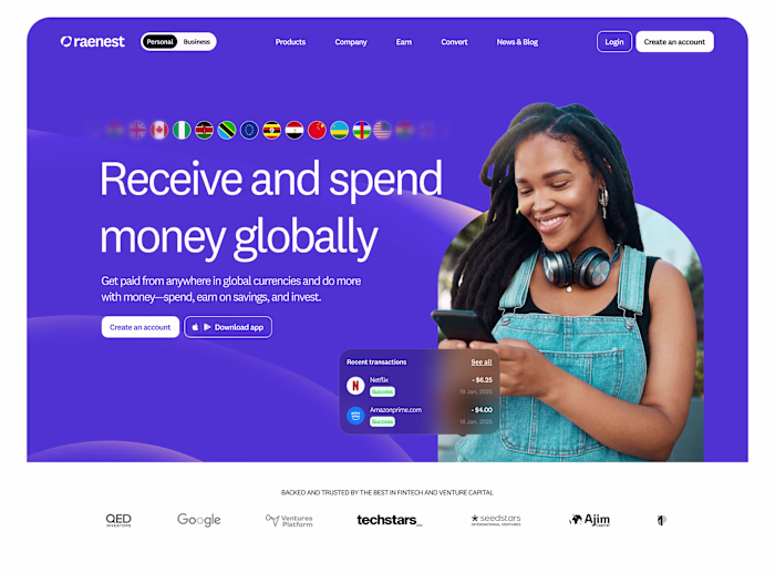
African migrants want to send money back home and receive money from their loved ones in or outside Africa. The problem is these migrants don’t have a way to do this because existing products such as Wise, Revolut, etc, are not available to Africans, especially in countries like Nigeria, Ghana, etc.
Initially brought in as a contract product designer and later transitioning to a full-time role, I collaborated with the team to redesign the Pesa mobile wallet app. The goal was to align the app with the new brand identity while seizing the opportunity to enhance its user experience.
This redesign centered on a user-focused approach, leveraging cognitive science principles to improve usability, foster intuitive interactions, and deliver a more seamless and efficient experience.
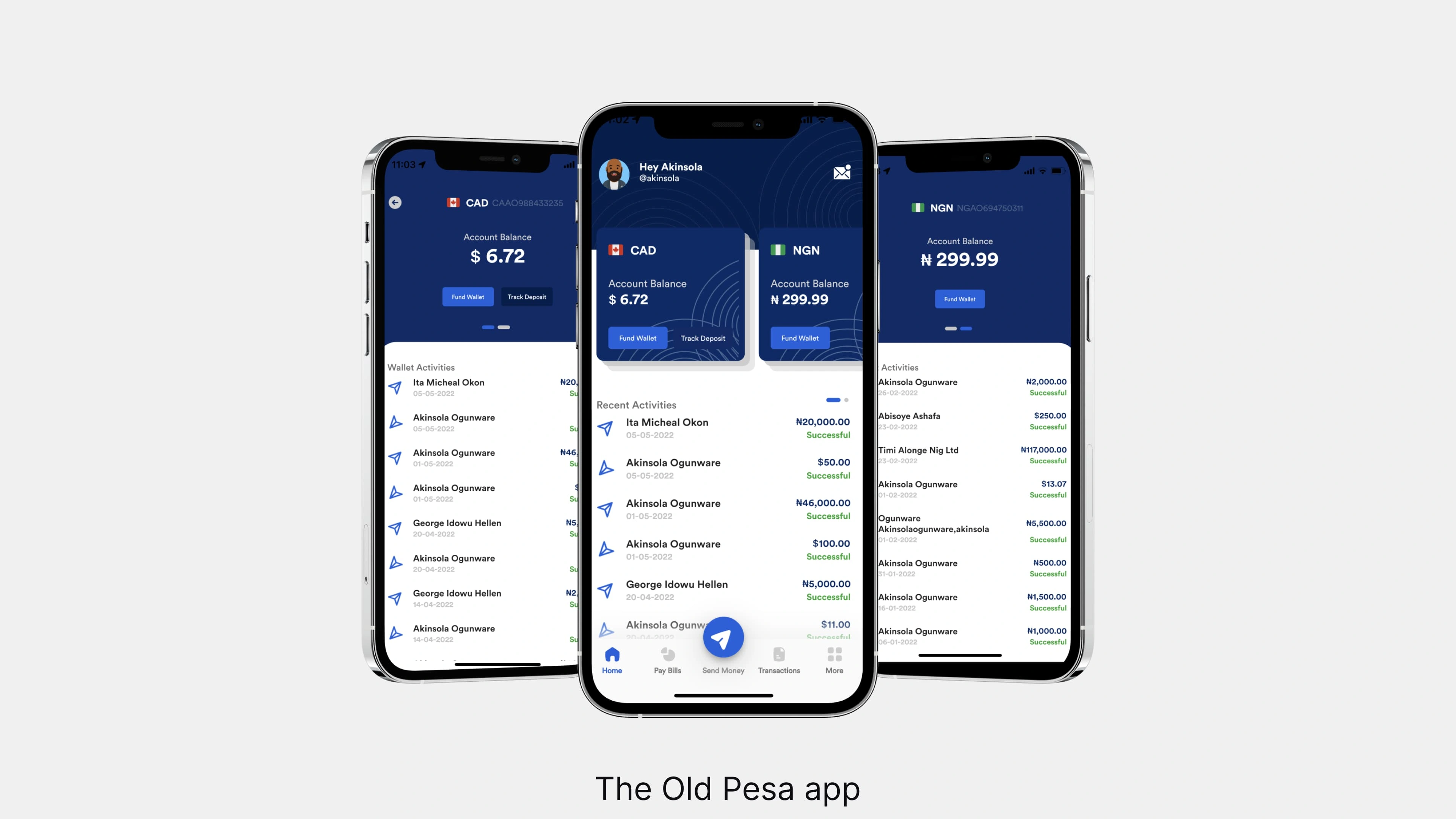
The Old Pesa app
Getting feedback from existing users of the product
Reaching out to these users and asking questions about what they think should be improved on the product
Taking a look at user complaints through the app/Google stores, TrustPilot, & even X (Twitter)
Taking a look at industry standards and learnings, we can use this to improve the product
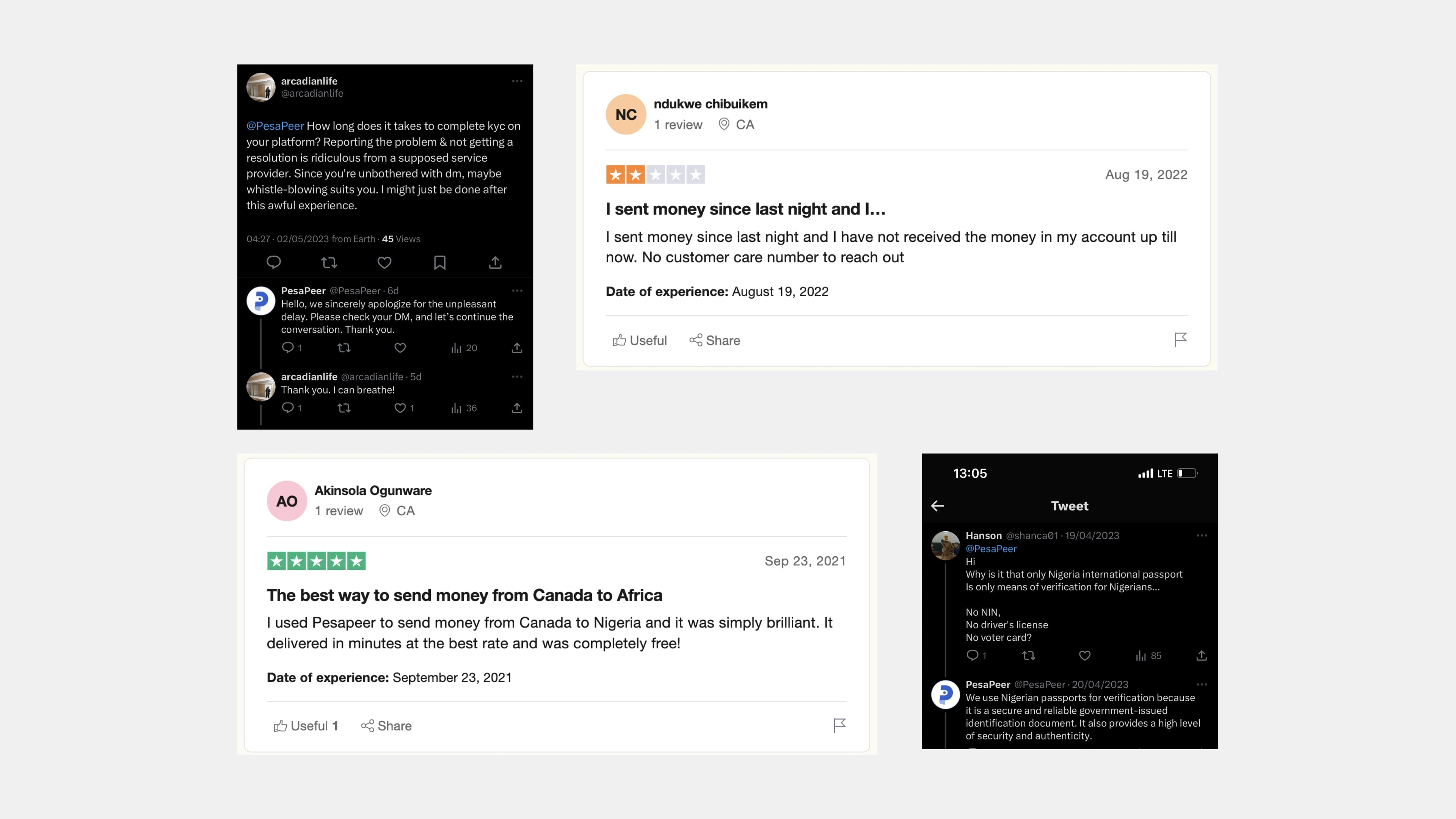
Feedback from some current users of the product
Some other screens from Pesa old app
Key findings
Most users are big on comparing exchange Rates
Users want to know the rates that your product is providing, to compare to other competitors, with Pesa having the best rate, we need to capitalize on that
Unable to find key action buttons
We realized that it took that for some users to find key action buttons such as send money, Fund wallet, etc
The onboarding process is not seamless/simple
Most users find the product onboarding stressful. They could not easily understand the requirements when creating an account
How did I achieve the final designs?
I took the approach of first redesigning each existing component across the design system after first defining the colors, typeface, iconography, and spacing. The rebrand already helped with the majority of these foundations' needs for the new design system. For iconography and illustrations, I also collaborated with the in-house brand team to develop icons that align with the new identity, specifically the Navigation tab icons.
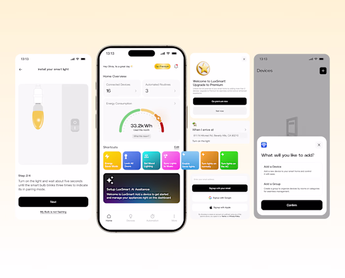
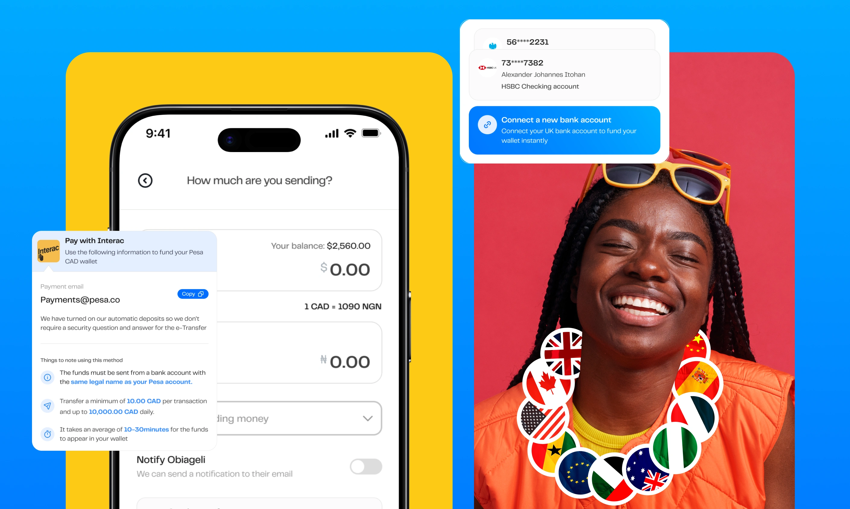
The Redesign showing some screens such as the Home screen, transaction history and send money screen
Executing the new design pattern
I went ahead to design with the new design pattern, this is to ensure consistency between all screens, and to make sure the user experience across all screens is not far apart
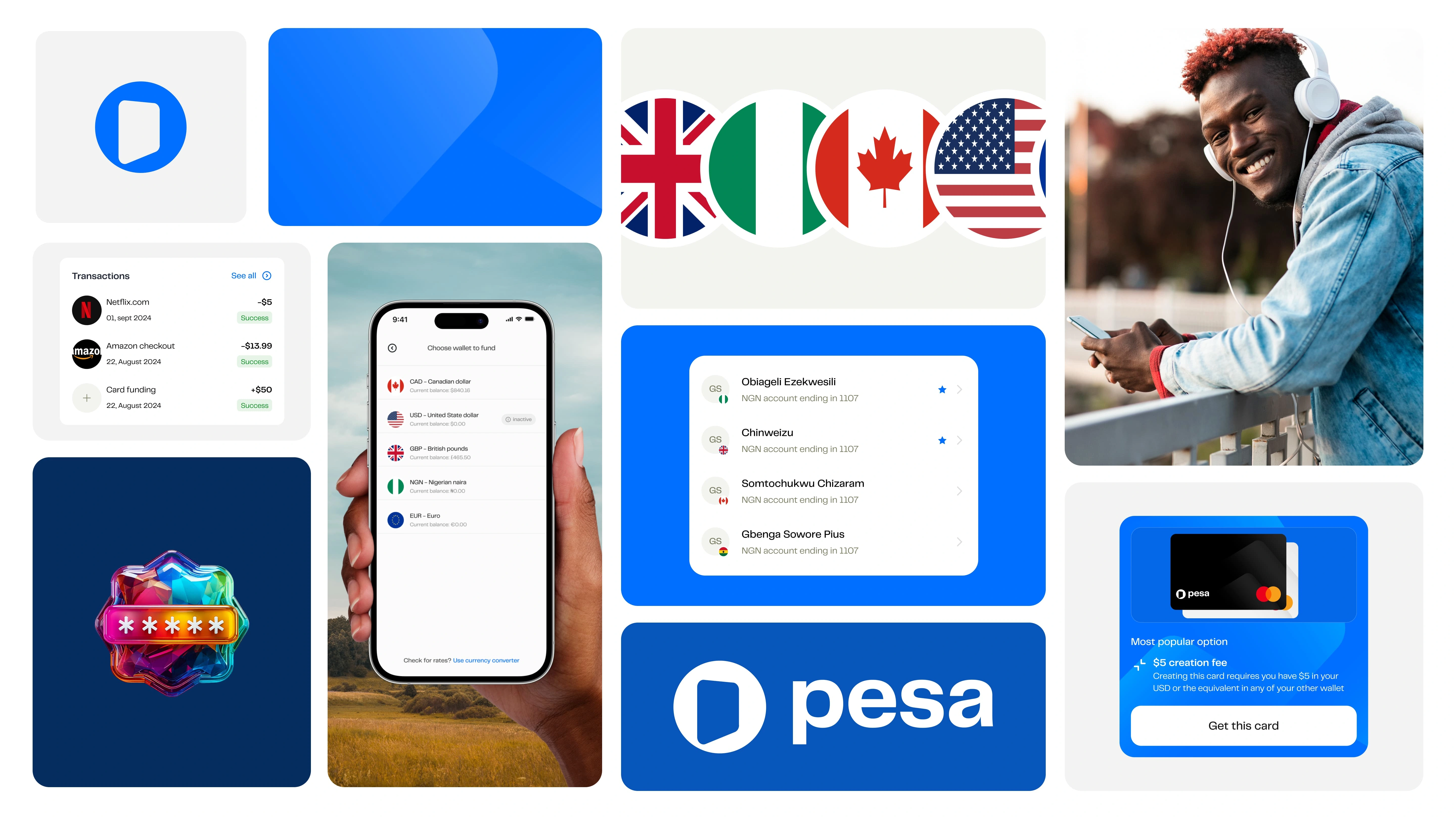
The Pesa app with some modern UI
A Refreshed, More Modern Interface
We refined the overall design to give the app a cleaner, more modern look. From typography to spacing and iconography, every detail was thoughtfully updated to make the interface easier to navigate and more enjoyable to use.
The Rates screen
One of the things users prioritized was the exchange rates. A screen we previously had, but wasn't seeing a lot of user engagement. I refreshed the UI and also introduced the currency converter to ensure the user can see how much their recipient will receive when they send them a particular amount
Like this project
Posted Mar 21, 2025
The Pesa mobile app enabled Migrants across Canada, UK, India, US, etc. send money to over 35 countries