Raenest Website Redesign for Series A Transition
Ola Adedamola
Led the redesign of Raenest’s website during its transition into a Series A fintech, elevating clarity, credibility, and storytelling to better communicate its product offerings and traction.
To ensure a seamless shift into the new brand direction, I translated the updated visual identity across the entire site. This included redefining layout, messaging hierarchy, and user flows to create a cohesive and intuitive experience that fully reflects Raenest’s next stage of growth.
Image showing the toggle option for users with different use case
A website user could still easily navigate to their specific use case
Raenest offers two distinct product lines, one for individual users (B2C) and another for businesses (B2B). Previously, each existed on separate websites. With the rebrand, both offerings were unified under a single identity: Raenest.
This introduced a key UX challenge: how do we guide two different audiences seamlessly within one website?
To solve this, I designed a simple Personal/Business toggle placed prominently beside the Raenest logo in the top-left navigation. This allowed visitors to clearly identify their product path and easily switch between the two experiences whenever needed. The solution ensured smooth navigation while reinforcing the unified brand.
Image showing the two different landing pages for both use case
Differentiating User Paths While Preserving a Unified Brand
Another challenge was helping users clearly distinguish between the Personal and Business experiences while still reinforcing that both offerings belong to the same Raenest ecosystem.
Collaborating with the brand team, we introduced a dual-color system using two distinct shades of purple — one lighter for Personal users, and one darker for Business users.
This visual differentiation wasn’t limited to the landing pages; it scaled across all page layouts within each experience. The result was a cohesive design system that maintained brand unity while creating instant clarity for users navigating their respective paths.
Some other sections from the website
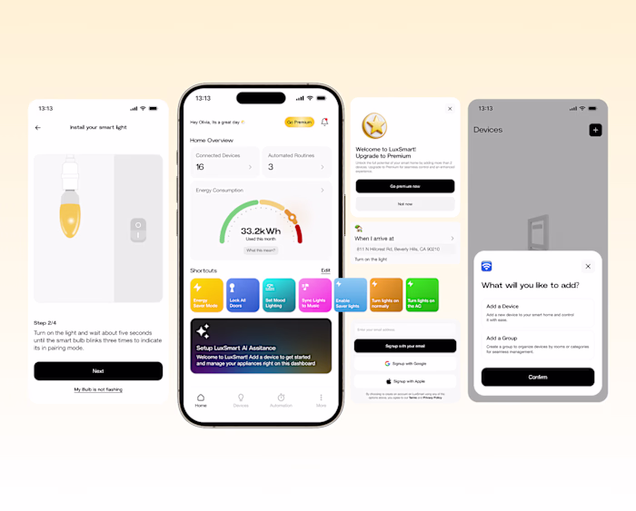
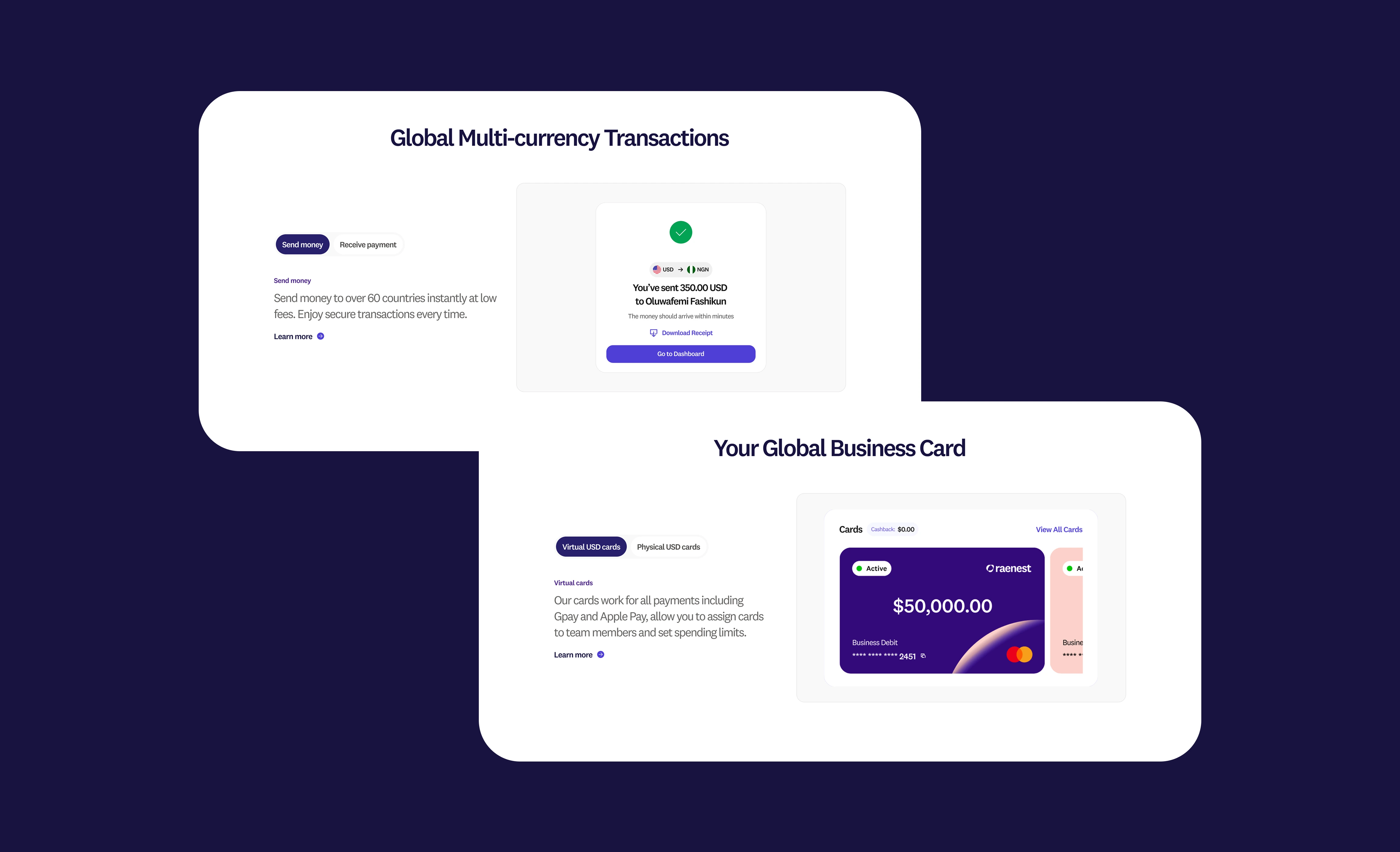
Showcasing the Product Experience Before Download
It was important that users could understand what the app looks and feels like before deciding to download it. To improve product visibility and build confidence, we incorporated key mobile screens and interactive components directly into the website experience. This allowed visitors to preview core features and better grasp the value of the app from the start.
Some other sections from the website
Improving engagement on the website
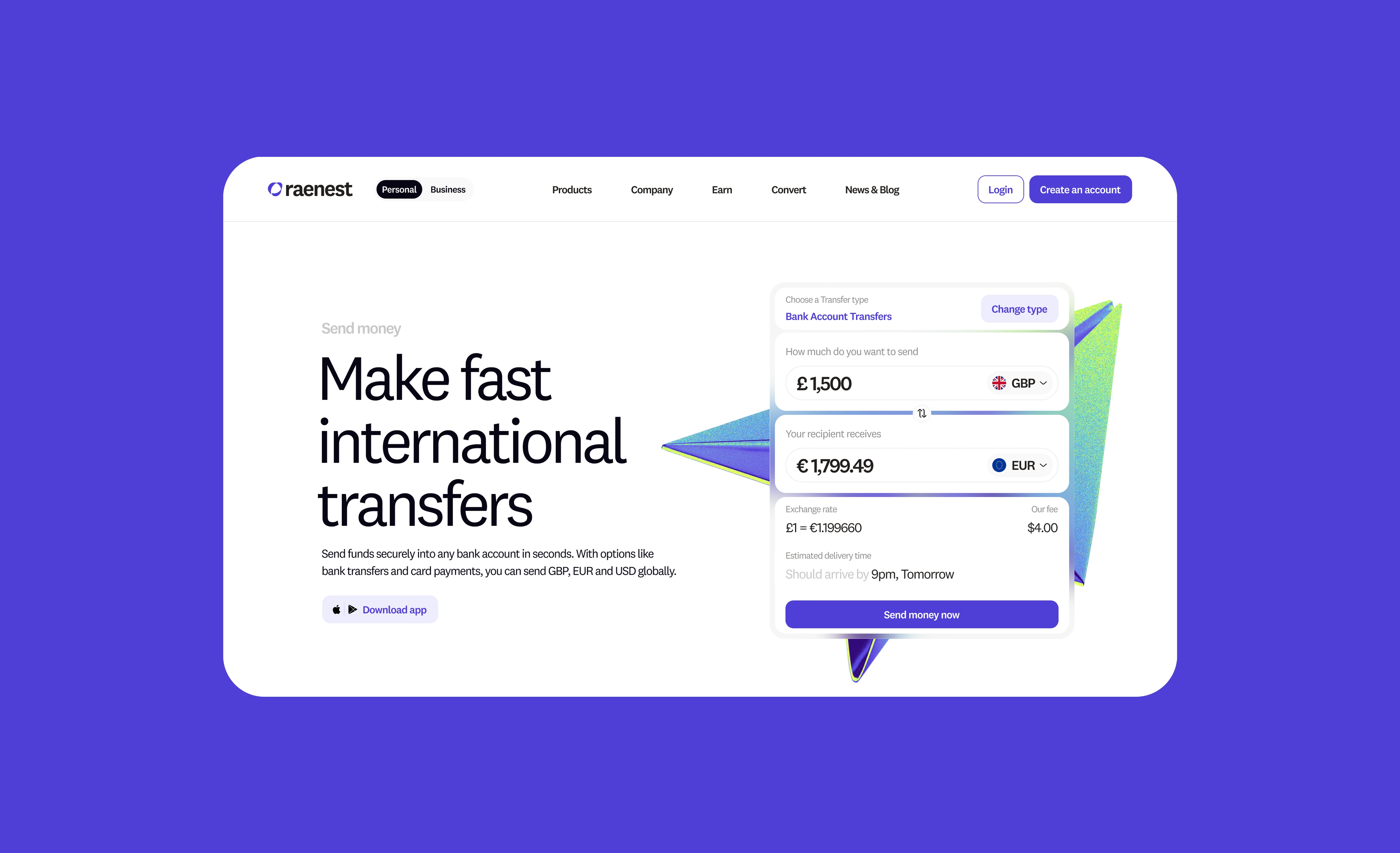
One of the most important metrics for the team was to increase engagement across the entire website, particularly when it came to ensuring users know how great their rating is.
I designed a simple calculator that users could easily understand. With this, users could easily know what their recipient will get when they send money and also find out how good the Raenest rate is, right on the website.
Like this project
Posted Oct 28, 2025
Interactive Raenest's website design for its Series A fintech, enhancing engagement, clarity, and user experience.