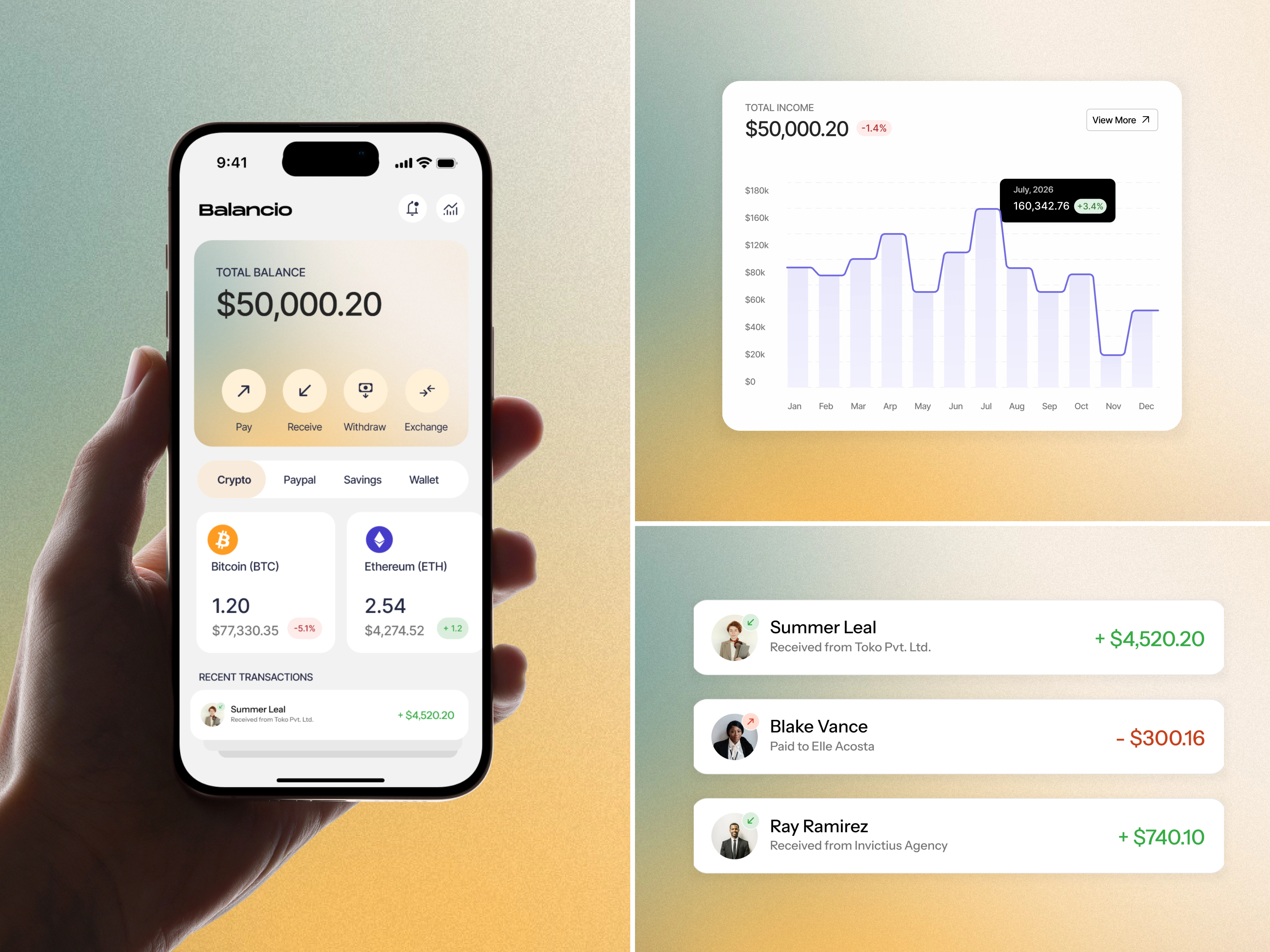
Balancio Payment Tracker App UX/UI Design
Pooja Pawar
Balancio | Fintech | Payment Tracker | Mobile App | UX & UI
Overview
Balancio is a mobile payment tracker designed to make everyday financial interactions feel calm, clear, and trustworthy. The project focuses on reducing anxiety around money by simplifying how users view balances, complete transactions, and understand their financial activity.
Problem
Most payment and finance apps overwhelm users with:
Dense layouts packed with information
Aggressive color usage that signals urgency or loss
Unclear transaction states and delayed feedback
This creates anxiety around basic actions like sending or receiving money. Users are often left wondering:
Did my payment go through?
Is this amount updated?
Where is my money right now?
Instead of feeling in control, users feel uncertain especially during frequent, everyday transactions that should feel instant and safe.
Design Goal
To design a payment experience that:
Reduces stress around money visibility
Makes transaction status immediately clear
Feels reliable, human, and emotionally neutral
Supports fast actions without sacrificing clarity
Approach
The product was built around one guiding principle:
Financial clarity reduces stress.
Rather than showing everything at once, Balancio prioritizes what matters most in the moment. Each screen is designed to answer the user’s primary question quickly What’s my balance? What can I do right now? What just happened?
Unnecessary elements were intentionally removed to keep the interface light, predictable, and easy to scan.
Key Design Principles
1. Hierarchy First
The total balance and primary actions are always placed at the top of the screen, ensuring users instantly understand their financial state.
2. One-Tap Actions
Core actions pay, receive, withdraw, and exchange are accessible within a single tap to reduce friction and hesitation.
3. Progressive Disclosure
Detailed information appears only when needed, preventing cognitive overload while still allowing deeper exploration.
4. Emotional Neutrality
Design avoids dramatic visuals or alerts that could trigger unnecessary concern during routine actions.
UI & Visual Language
Soft gradient backgrounds blend warm and cool tones to create a sense of calm and trust
Neutral card-based surfaces keep focus on financial data
Green and red accents are used sparingly to indicate gains or losses without alarm
Rounded cards and buttons reinforce approachability and ease
Generous spacing and subtle shadows improve scanability and reduce mental effort
The visual system supports clarity without calling attention to itself.
Outcome
Balancio delivers a stress-free payment experience that feels transparent, human, and controlled. Users can send and receive money confidently, always knowing where their finances stand.
Result:
Payments that feel calm, trustworthy, and effortless by design.
Like this project
Posted Feb 2, 2026
Balancio is a mobile payment tracker designed to reduce money anxiety through clear hierarchy, simple actions, and calm, trustworthy UI.
Likes
1
Views
7
Timeline
Jan 25, 2026 - Feb 1, 2026