Mora Skin | Brand Identity, Packaging & Launch

Eduardo Ramos

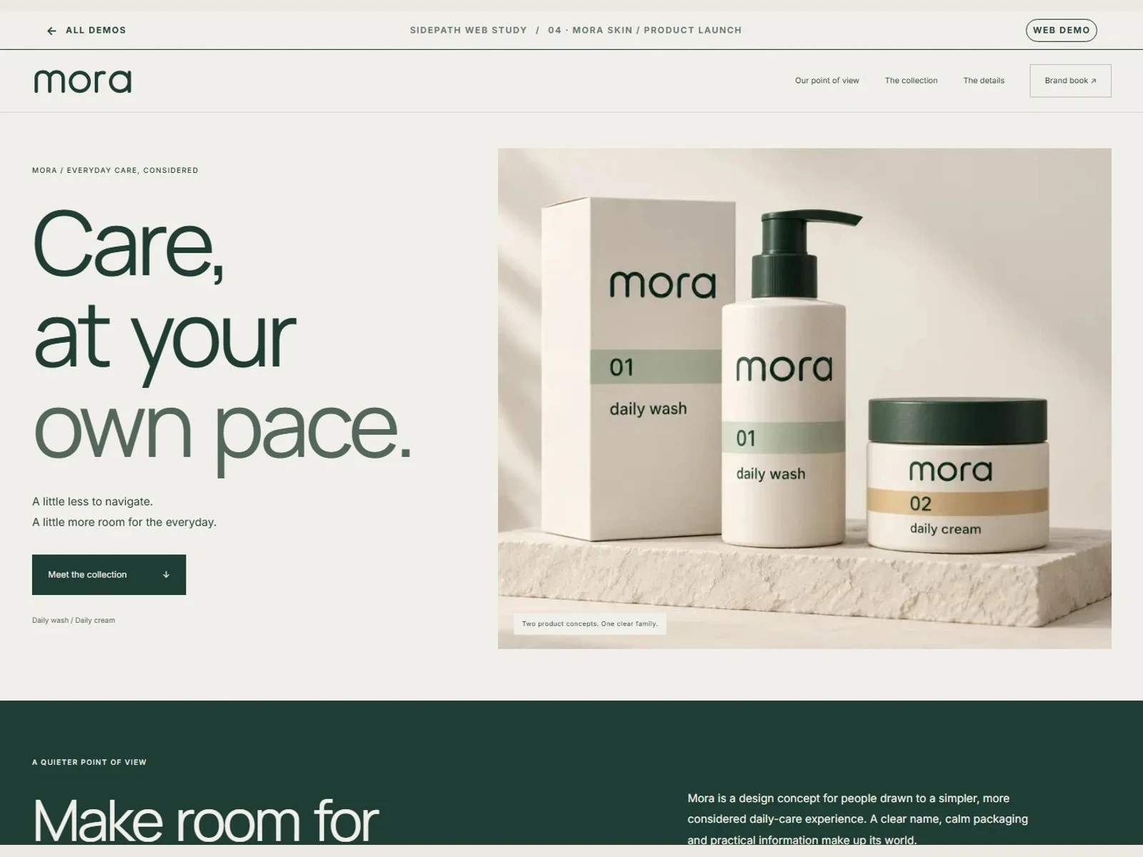
Independent concept · Brand identity, packaging & web
The brief
Create a coherent visual identity and launch experience for a two-product skincare line.
The approach
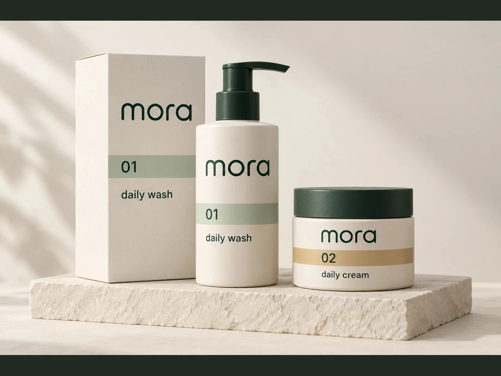
I designed a lowercase wordmark and a compact M symbol, then carried the restrained type and color system across the product family. The launch page brings the same hierarchy into a product explorer and explains the collection without adding visual noise.
What I made
Custom wordmark and symbol, coordinated packaging studies, brand book, and a responsive launch page.
Like this project
Posted Nov 5, 2026
Independent concept for a skincare line, with a custom identity, coordinated packaging and a responsive product launch page.
Likes
0
Views
3