Brand Identity & Web Design for a Wellbeing Brand | ALMÆ

Fanny Tesmoingt
1 collaborator


ALMÆ brings physical and mental health programmes directly into the
workplace — twenty-minute sessions, on site, designed to break the stress
cycle without touching the operational schedule.
They came to us with a name and a thesis: corporate wellbeing should stop
being an optional perk and start being a performance lever. Everything
else was still to build.
The category has a credibility problem. Corporate wellness is sold in soft
language, pastel blues and stock photography of people meditating — so
decision-makers file it under "nice to have" and the budget never moves.
ALMÆ needed to look like something a CFO signs off on.
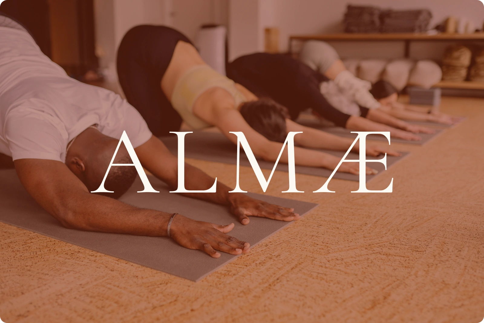
ALMÆ Brand logo
BRAND
Direction : we built the identity against the category. A mineral
palette instead of the clinical blue-and-green everyone else uses:
sienna red for grounding and human vitality, cream white for space,
deep clay for the institutional weight the audience needs to see.
The Æ ligature : the centrepiece. Two letters fused into one form,
holding the two connections the whole business rests on: body and mind,
employer and employee. Drawn with thin strokes and open counters, so the
mark breathes rather than fills — the visual equivalent of the pause
they sell.
Type : Cormorant Garamond for the logotype and headlines: serif,
statutory, credible in front of a board. Be Vietnam for everything else:
clean, legible, contemporary. Heritage and efficiency, held in tension.
Applications : logo variations down to favicon, business cards using
a giant serif A as a watermark, LinkedIn banners, and a full brand book
so the client can brief a printer or a developer without calling us.
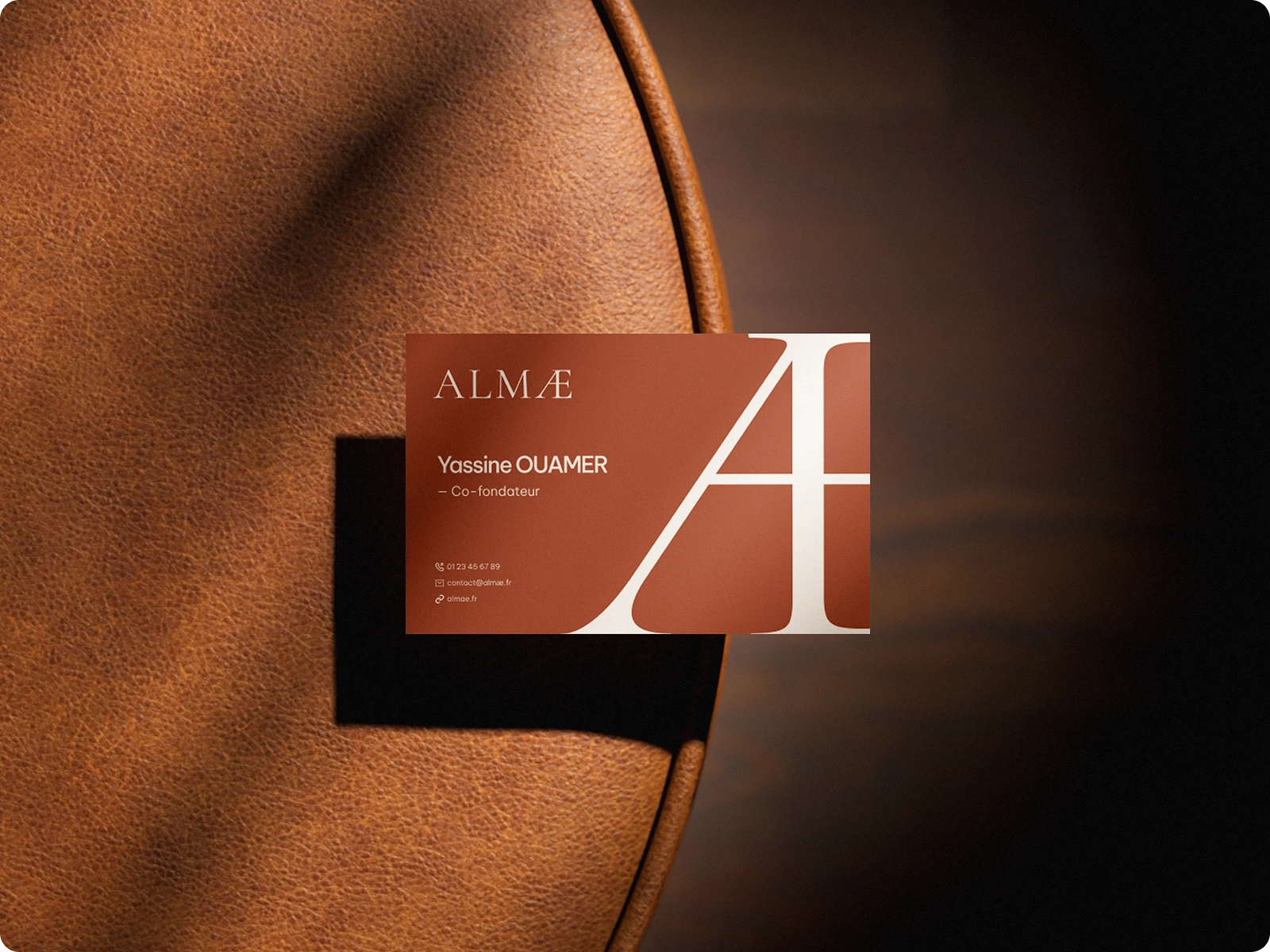
ALMÆ Business card
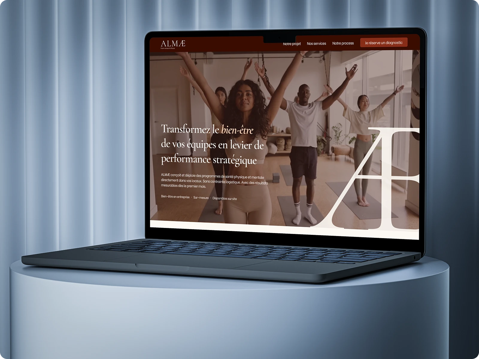
ALMÆ Homepage
WEB
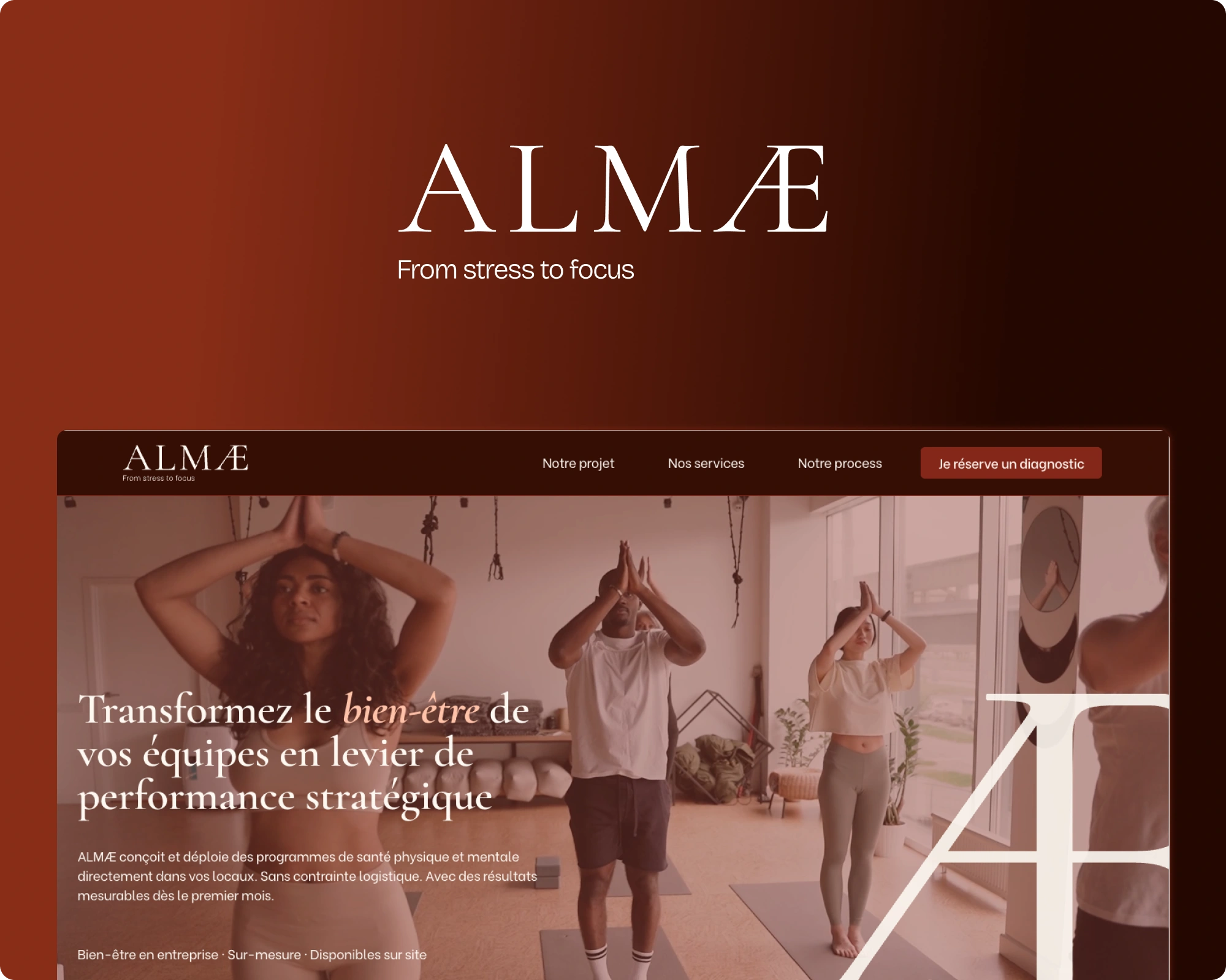
Structure : the page opens on the cost of doing nothing, then goes
straight to proof. A full-width results grid puts every metric on screen
at once: cost per employee, absenteeism, sick days, satisfaction, ROI
multiple. No scrolling to find the argument.
Design : the Æ returns at full page height as a recurring anchor.
Warm enough to feel human, structured enough to survive procurement.
Conversion : one diagnostic form as the single endpoint. Every
section funnels there.
The result is a brand that opens the door and a site that does the first
half of the sales call before anyone picks up the phone.
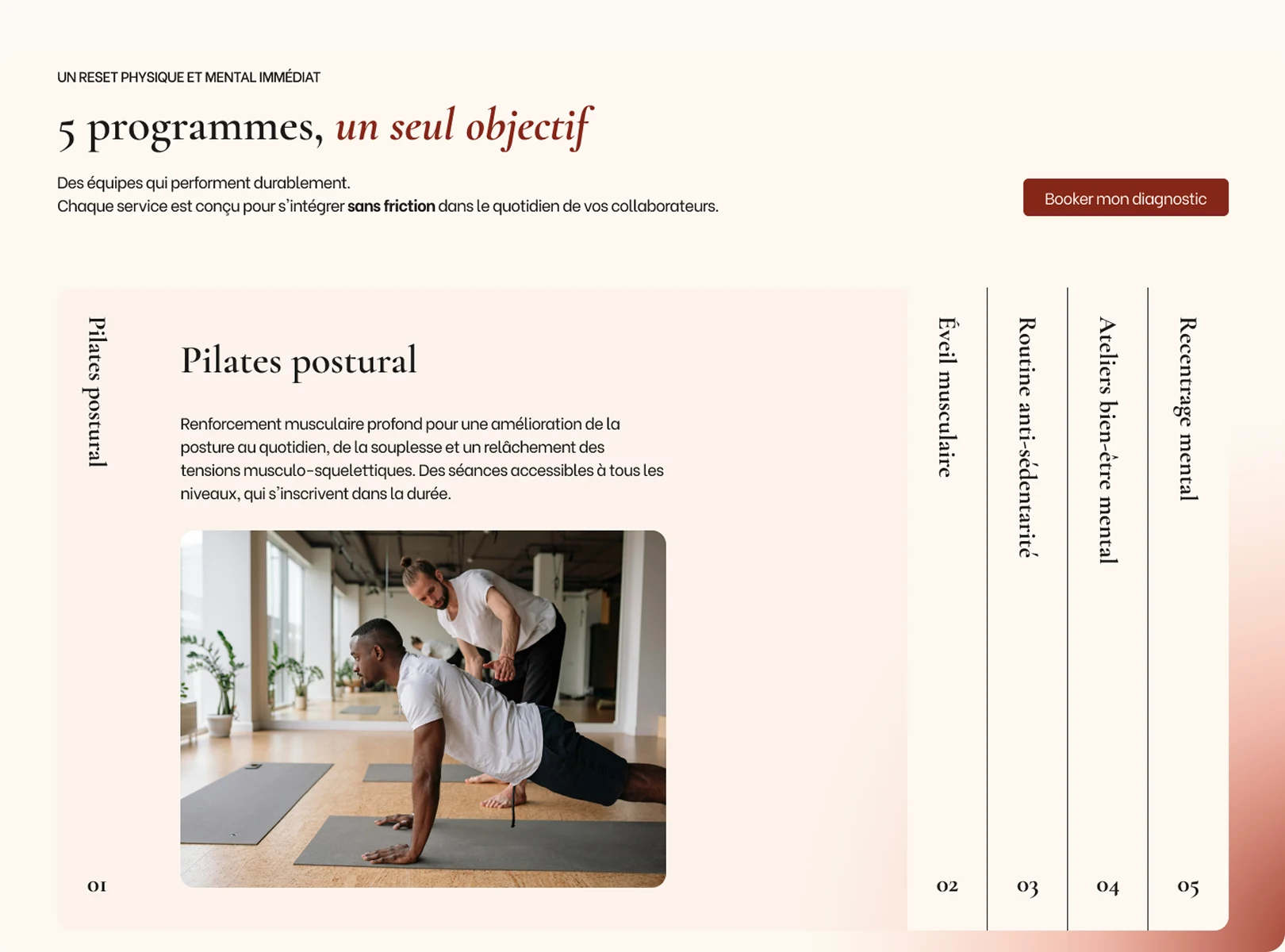
ALMÆ website screenshot
Live → almae-france.fr
Brand and website by Margin Agency — a two-person studio building
identities and high-converting sites for ambitious brands.
Like this project
Posted Jul 29, 2026
Brand identity and website for a corporate wellbeing company : logo, guidelines, and a B2B site built to prove ROI.
Likes
1
Views
4
Timeline
Apr 1, 2026 - Apr 21, 2026
Collaborators