Logo & Brand Identity for a Home Cleaning Company | Loumenage

Fanny Tesmoingt
1 collaborator

Loumenage is a professional cleaning company that comes to you : carpets,
rugs, sofas and vehicles, cleaned on site with equipment most people would
otherwise have to rent and haul home themselves.
Cleaning is a trust purchase. You are letting a stranger into your house
with a machine. Loumenage had the service and the equipment, and a brand
that gave a prospect nothing to hold onto.

Azulejos palette
Positioning : professional-grade results, delivered at home, without
the hassle. Serious, not clinical.
Direction : the palette comes straight from Portuguese azulejos, the
blue-and-white tiles, as a nod to the founders' heritage. It reads as
freshness and craft, and blue is the colour people trust with their homes.
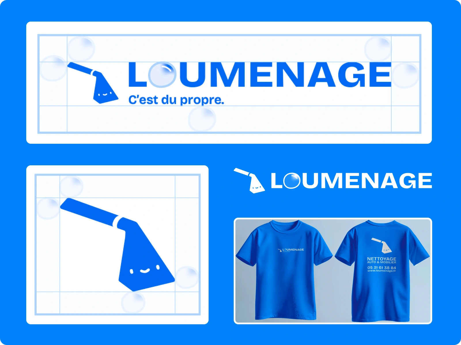
Logo & application
The System
Logo : the pictogram is the extractor tool itself, drawn minimal and
given a face. The O in the wordmark is a soap bubble. The baseline —
C'est du propre — carries the whole positioning in three words.
Type : Bricolage Grotesque for headlines, Lato for body.
Colour : Azulejo Intense #226ff9, Azulejo Doux #BBD7FF, Blanc Éclat,
plus four secondary blues for depth.
Applications : full van wrap, uniforms, four logo lockups down to a
16px favicon, with clearance rules, minimum sizes and misuse guidelines.
Delivered as a complete brand book, so the client can brief a printer, a
signwriter or a developer without ever calling us to ask.
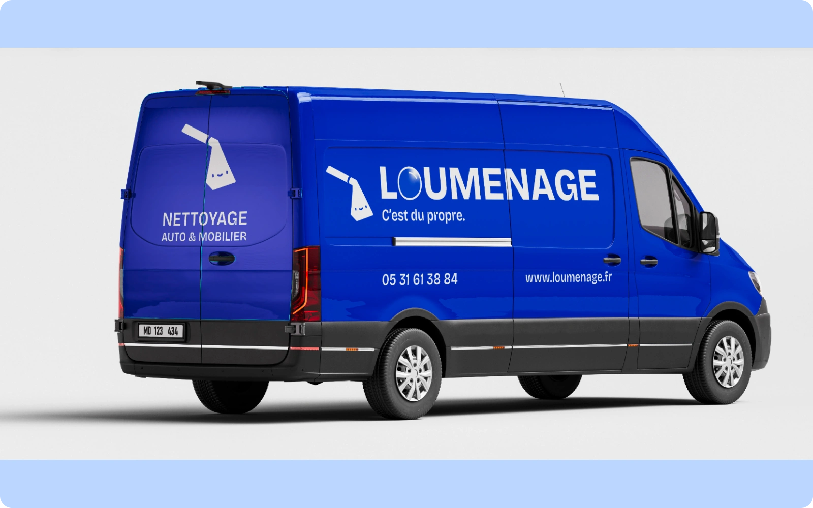
Van wrap
Brand Designer · Logo Designer · Graphic Designer · Visual Identity ·
Brand Guidelines · Brand Strategy · Figma · Adobe Illustrator ·
Adobe Photoshop · Typography · Art Direction · Print Design · Design
Designed by Margin Agency.
Like this project
Posted Jul 29, 2026
Full brand identity for a home cleaning company : logo, azulejo-inspired palette, guidelines, van livery and uniforms.
Likes
0
Views
4
Timeline
Sep 15, 2025 - Sep 20, 2025
Collaborators