UX Design for AERENA Analytics Module
Charles
Empowering airline teams to uncover passenger sentiment trends and drive smarter decisions with clarity and speed
To comply with non-disclosure agreement, I have omitted and obfuscated confidential information in this case study. All information in this case study is my own and does not necessarily reflect the views & facts of the company.
AERENA is a modular digital platform developed by AERQ to transform the in-flight experience through digital engagement, operational empowerment, and data-driven intelligence. It offers airlines tools to manage media, apps, UI customisation, fleet health, and more.
Within AERENA, I led the UX design for the Analytics module—a core product empowering airlines to gain actionable insights from passenger sentiment data. The Analytics module supports stakeholders including airline operations managers, customer experience analysts, and marketing leads in transforming feedback into strategic decisions.
Airlines gather vast amounts of feedback across flights, classes, and timeframes, but traditionally struggle to translate this data into clear, actionable insights without heavy analytical effort.
How might we help airline teams quickly understand passenger sentiment trends?
Prioritise clarity, actionability, and usability.
Create a modular, scalable dashboard experience.
Reduce cognitive load while preserving analytical depth.
Through domain research and interviews with internal experts and airline stakeholders, I identified key user needs:
The Analytics experience was divided into two key layers:
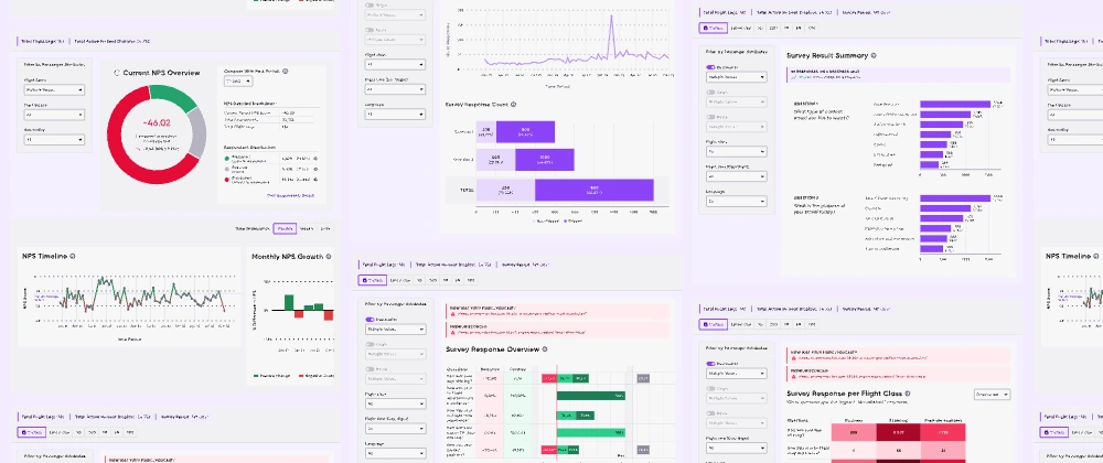
Overview: High-level KPIs, current NPS scores, quick trends.
Deep Dive: Sentiment breakdowns, per-class analysis, detailed survey feedback.
Wireframes & Interaction Models
Initial wireframes focused on modular layouts, progressive filtering, and contextual drill-downs. Particular care was given to the positioning and clarity of filters affecting global and local views.
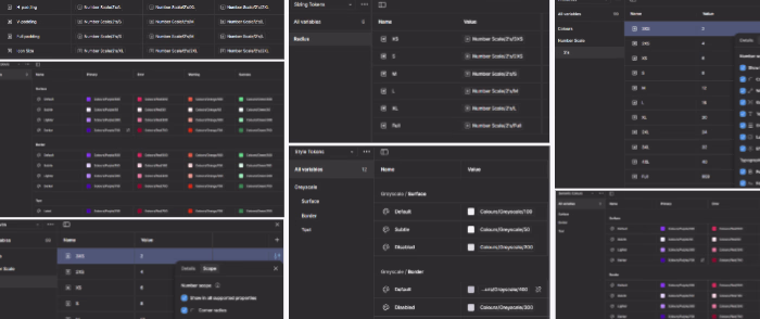
I developed a system of reusable UI components, including filter panels, NPS visualisations, sentiment trend graphs, and survey breakdowns. Special attention was given to scale and consistency across use cases.
Donut charts: For NPS summaries and comparative deltas.
Stacked bar charts: For class segmentation of sentiment categories.
Trend lines and growth bars: For historical NPS performance.
Donut visual summarising current NPS with past-period comparison.
Flight Route, Trip Purpose, and Nationality filters clearly scoped.
Timeline and growth views enabling granular exploration.
Customer Sentiment Categories over time (Promoters, Passives, Detractors).
NPS per Compartment view highlighting Business, Economy, Premium Economy.
Response volume and response quality breakdowns.
Survey result summaries linked to key entertainment and travel satisfaction areas.
Visual alerts for dissatisfaction hotspots.
Detailed insights per question, per flight class, and comparative analysis tools.
Global vs local filter clarity to manage scope.
Intuitive hierarchy balancing KPIs with drill-down opportunities.
High-contrast visual cues for critical insights.
Tooltips and microinteractions enhancing discoverability without noise.
Surfaced compartment-specific issues, enabling targeted service improvements.
This project solidified key lessons in:
The critical importance of progressive disclosure in data-heavy environments.
Designing for both strategic decision-making and operational actionability.
By shaping AERENA Analytics, I contributed to AERQ’s broader mission of digitally transforming the in-flight experience and empowering airlines to operate smarter, faster, and closer to their passengers.
Like this project
Posted Sep 7, 2025
I led UX design for an Analytics module, turning complex passenger survey data into clear dashboards that cut time-to-insight by 66%.