Ads Management Tool for Airlines
Charles
Context & problem
Airlines were managing in-flight ad campaigns with fragmented tools, weak targeting, and limited analytics—slowing decisions and hurting ROI. My brief was to design a unified, intuitive platform that streamlines campaign creation, improves targeting, and surfaces real-time insights for IFE managers and advertising partners.
Role, scope, and team
Sole UX Designer on a 3-month MVP (2024). I owned problem definition, proof-of-concept flows, user testing and synthesis, high-fidelity prototyping, MVP documentation, and QA—working closely with a product owner and senior engineers.
Research & insight
I ran stakeholder interviews (n=5) and 1:1 user interviews (n=6) across two core groups (IFE managers and ad partners). Key needs emerged: real-time performance feedback, customizable dashboards, richer metrics, faster campaign creation, and deeper post-campaign analysis. I organised findings with persona work and a rainbow-sheet analysis to prioritise experience goals.
Experience strategy & IA
We set design goals around real-time feedback, configurability, and decision support. The information architecture made the dashboard the central hub for monitoring and action, with clear flows for Create Campaign and Manage Campaigns.
Solution highlights
Campaign wizard with guided inputs (targets, frequency/capping, global targeting, watch tags) and media upload flow to reduce setup friction.
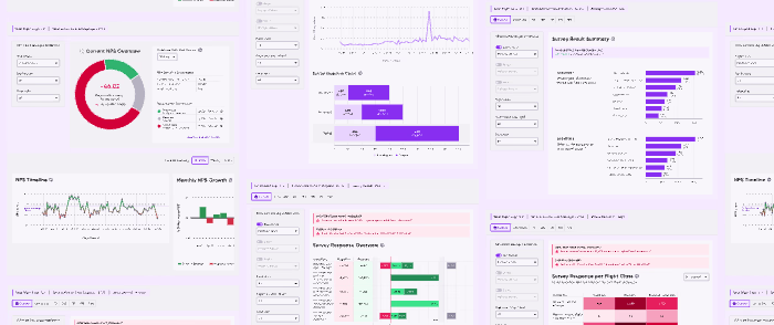
Monitoring & insights: iterative redesign of the overview and campaign insights screens—streamlined layout, clarified colour semantics, and added trend visuals (e.g., area charts for banner vs. video). Summary cards were replaced with totals for flight legs, passengers, and sessions for faster situational awareness.
Flexible analysis: comparative graphs and toggleable views (e.g., passenger type, language) to support different analysis lenses without overwhelming users.
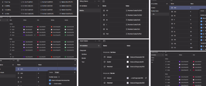
Design system contribution
I audited the existing system, identified inconsistencies, and designed new atom/molecule/organism-level components to improve scalability and handoff; alignment with engineering ensured feasible integration.
Impact & validation
Unmoderated user testing (Useberry) showed a ~20% reduction in task completion time and notable gains in perceived usability and efficiency for the MVP. Further iterations are planned around advanced customization and real-time data integration as production usage scales.
What this demonstrates (and what you get if we work together)
Turning complex, multi-stakeholder workflows into guided, low-friction journeys.
Building decision-support dashboards that prioritise the right KPIs and trend comparisons.
Establishing a scalable component library so teams can ship consistently and faster.
A research-through-design approach (personas, rainbow sheets, iterative testing) that ties every UI change to a user or business need.
Typical deliverables for similar SaaS projects
Interactive prototypes; dashboard & analytics UI; research insights & recommendations; design-system components with usage guidance; flows and IA; handoff notes aligned with your engineering practices.
Like this project
Posted Sep 7, 2025
I designed a B2B Ads Management Platform with a guided campaign wizard, calendar scheduling, and dashboards—cutting campaign setup time by 50%
Likes
0
Views
12
Timeline
May 1, 2024 - Jul 31, 2024
Clients

Lufthansa
AERQ