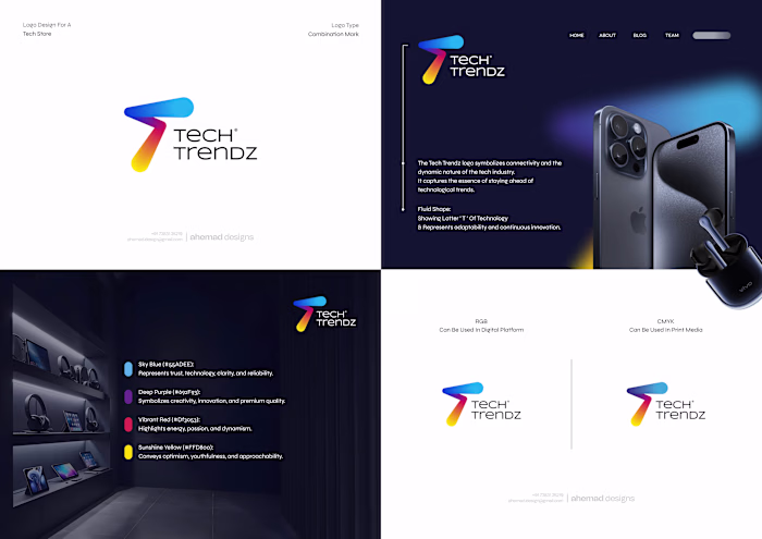
UCB Solar – Renewable Energy
Ahemad Raza
UCB Solar – Renewable Energy Brand Identity
The logo was built by simplifying the idea to its core:
solar panels + electricity.
The angled forms come directly from the structure of real solar panels — flat, aligned, and efficient by design.
Green communicates clean energy, while the deeper tone adds trust and reliability.
When these elements come together, the mark clearly represents conversion:
sunlight → power → impact.
A practical, logic-led identity designed to perform across digital platforms, signage, and infrastructure touchpoints.
Built for a growing renewable energy brand that values function as much as form.
Ahemad Designs
Brand Identity & Logo Designer | Solar, Energy & Infrastructure Brands | India
Like this project
Posted Feb 5, 2026
UCB Solar – Renewable Energy Brand Identity The logo was built by simplifying the idea to its core: solar panels + electricity. The angled forms come directl...