Skillwise - E-Learning Landing Page
Cansaas Agency
Overview
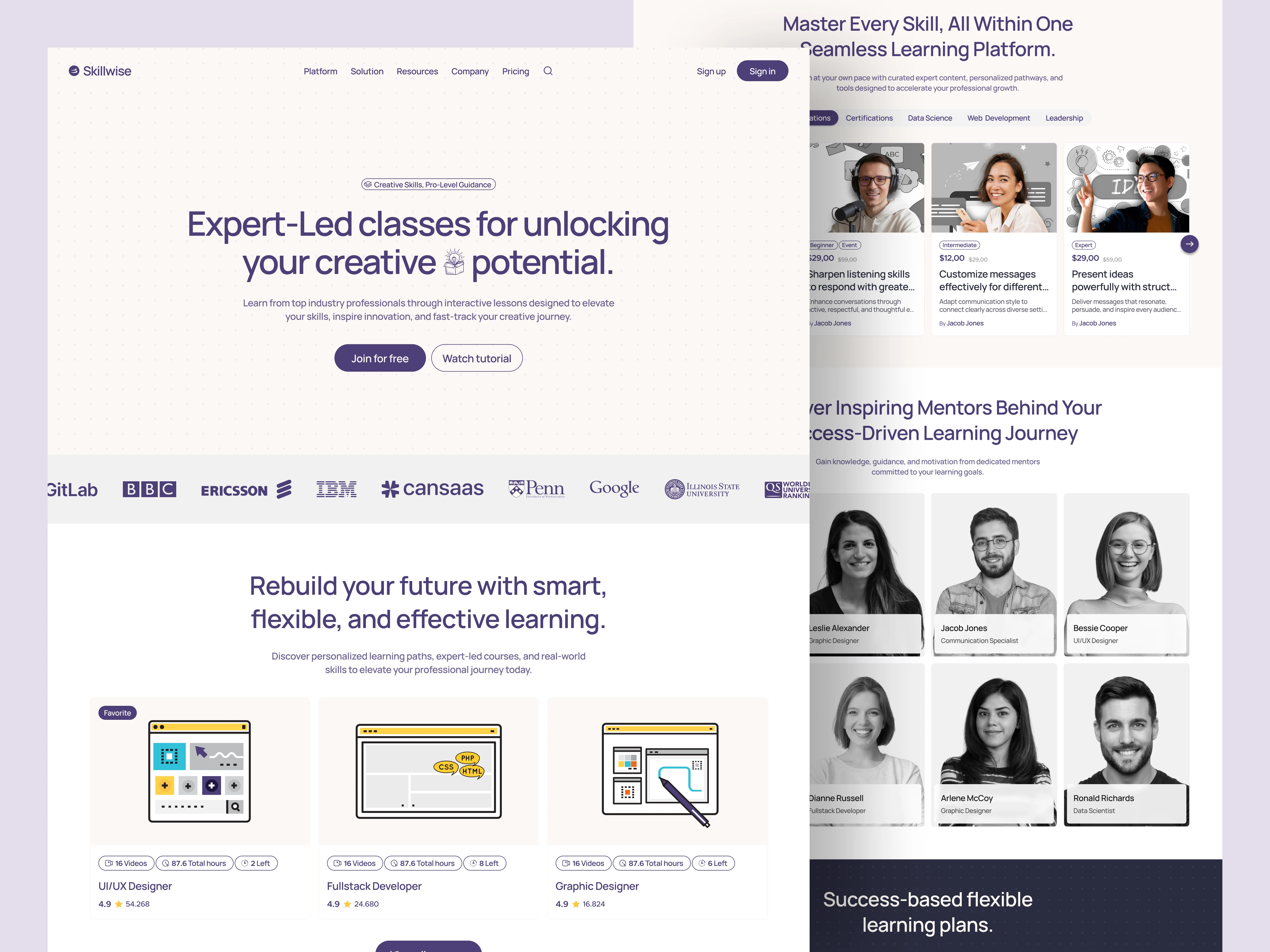
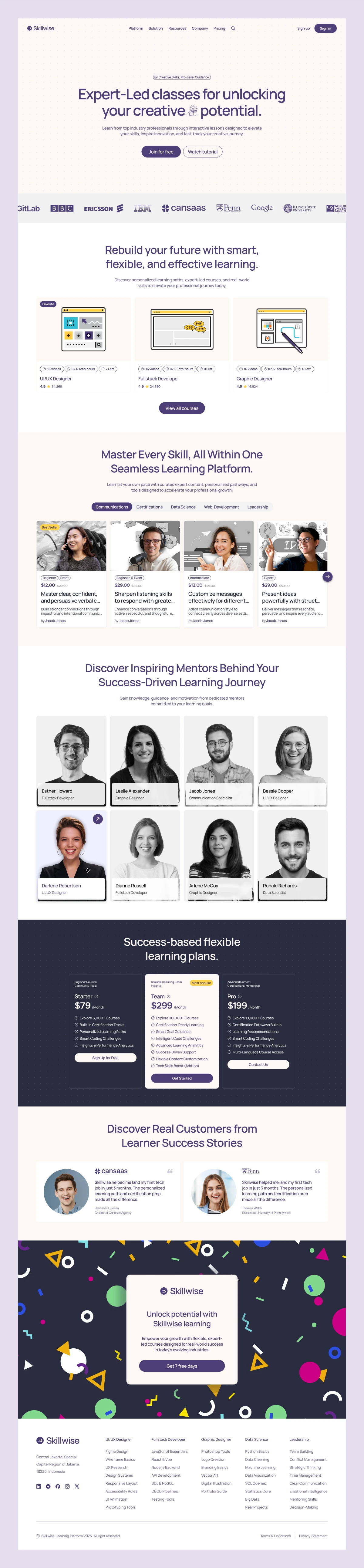
This redesigned landing page for Skillwise is crafted to inspire trust, boost engagement, and convert visitors into active learners. With a clean, modern layout, compelling hero messaging, and strategic use of white space, the design creates a smooth browsing experience that aligns perfectly with the platform’s mission of delivering expert-led creative education. The visual language blends professional typography with subtle brand accents, resulting in a page that feels approachable yet authoritative.
The Problem
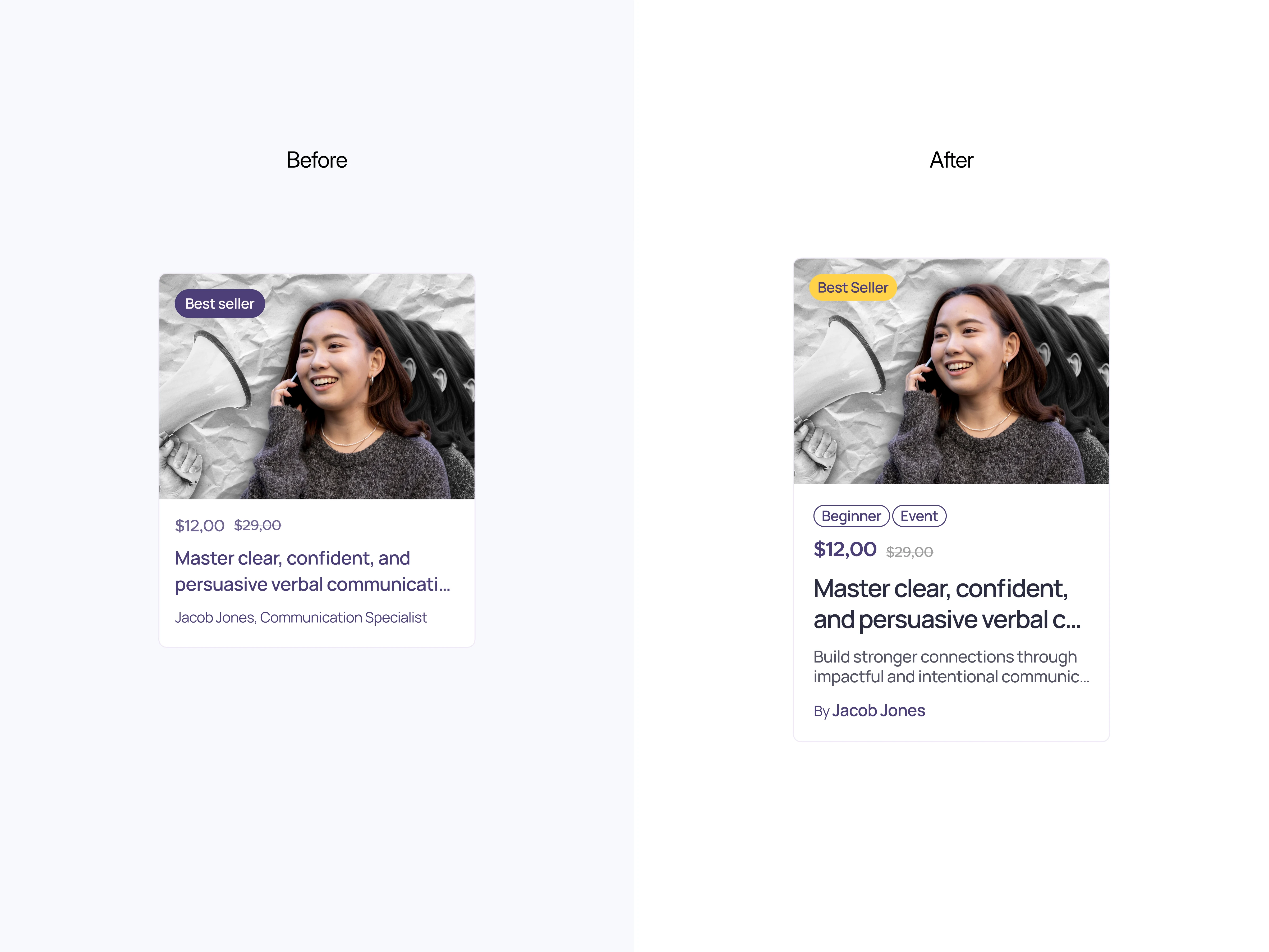
The previous design lacked a clear content hierarchy, causing users to skim without engaging deeply. Pricing information was buried, calls-to-action lacked emphasis, and course offerings were not visually compelling enough to drive clicks. This often resulted in high bounce rates and lower course sign-ups.
The Solution
The new design is more effective due to its enhanced user experience, driven by a clear visual hierarchy, prominent pricing, and strong action cues. Larger, legible labels help users quickly grasp key information, while visible pricing and discounts support faster course selection. High-contrast, well-defined buttons highlight key actions, guiding users intuitively and boosting usability and conversions in line with GoodUI principles (src: goodui.org). The result is a layout that makes it easier for users to understand information, make quicker decisions, and move confidently toward desired actions such as signing up or exploring courses.
Results
By pairing strategic visual design with persuasive content placement, the landing page creates a natural flow that captures attention, communicates value quickly, and drives conversions. The balance of aesthetics and functionality ensures that Skillwise not only looks credible but also delivers a frictionless path from curiosity to commitment.
Like this project
Posted Aug 8, 2025
This clean, conversion focused layout features expert led courses, mentor showcases, and modern aesthetic that invites users to explore and engage.
