Practix
Practix, a UK-based learning centre dedicated to preparing students for the future, stands out as a catalyst for personal and academic growth. By offering supplementary classes to enhance students’ existing knowledge, Practix fosters not only academic excellence but also the development of well-rounded individuals.
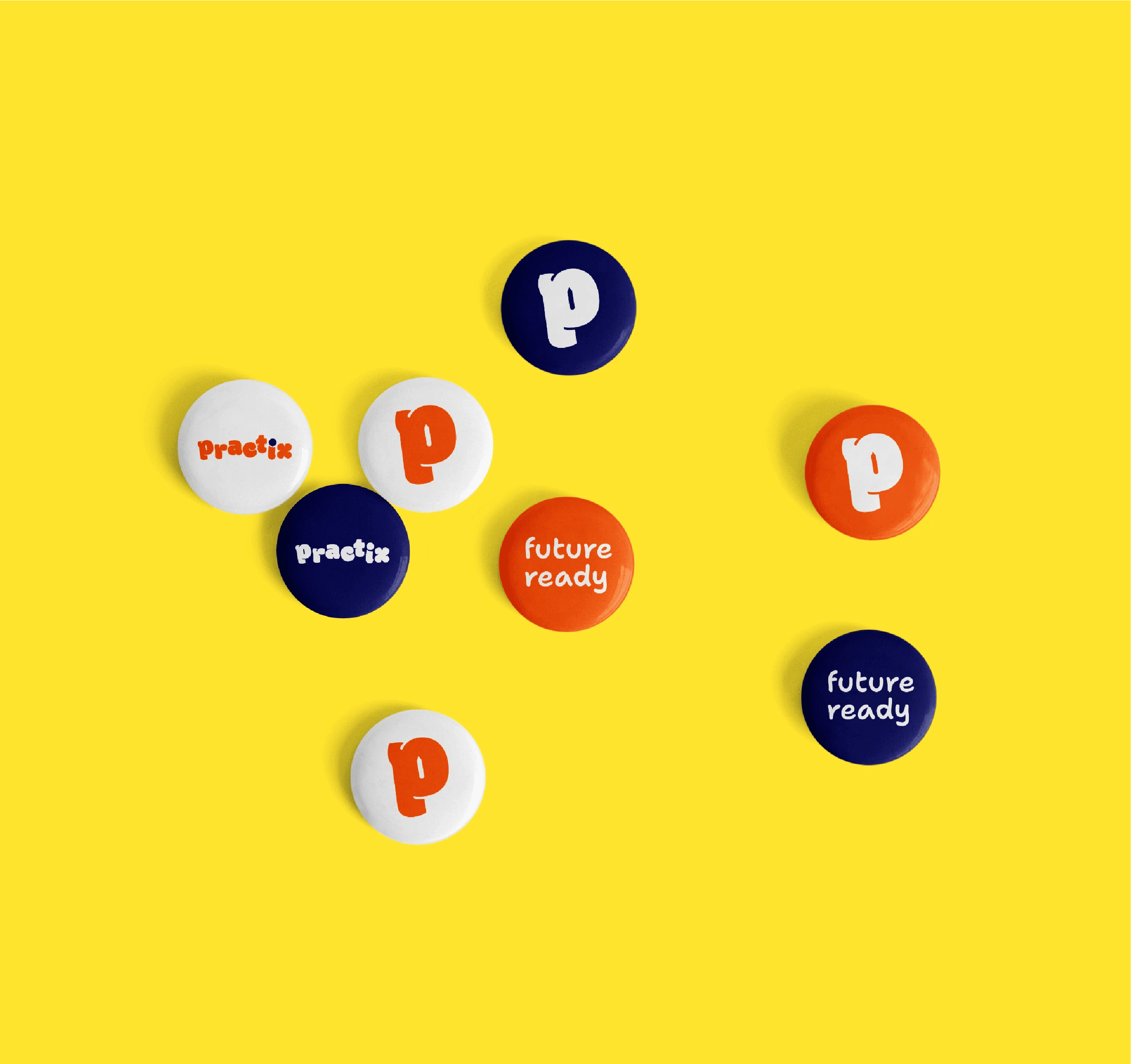
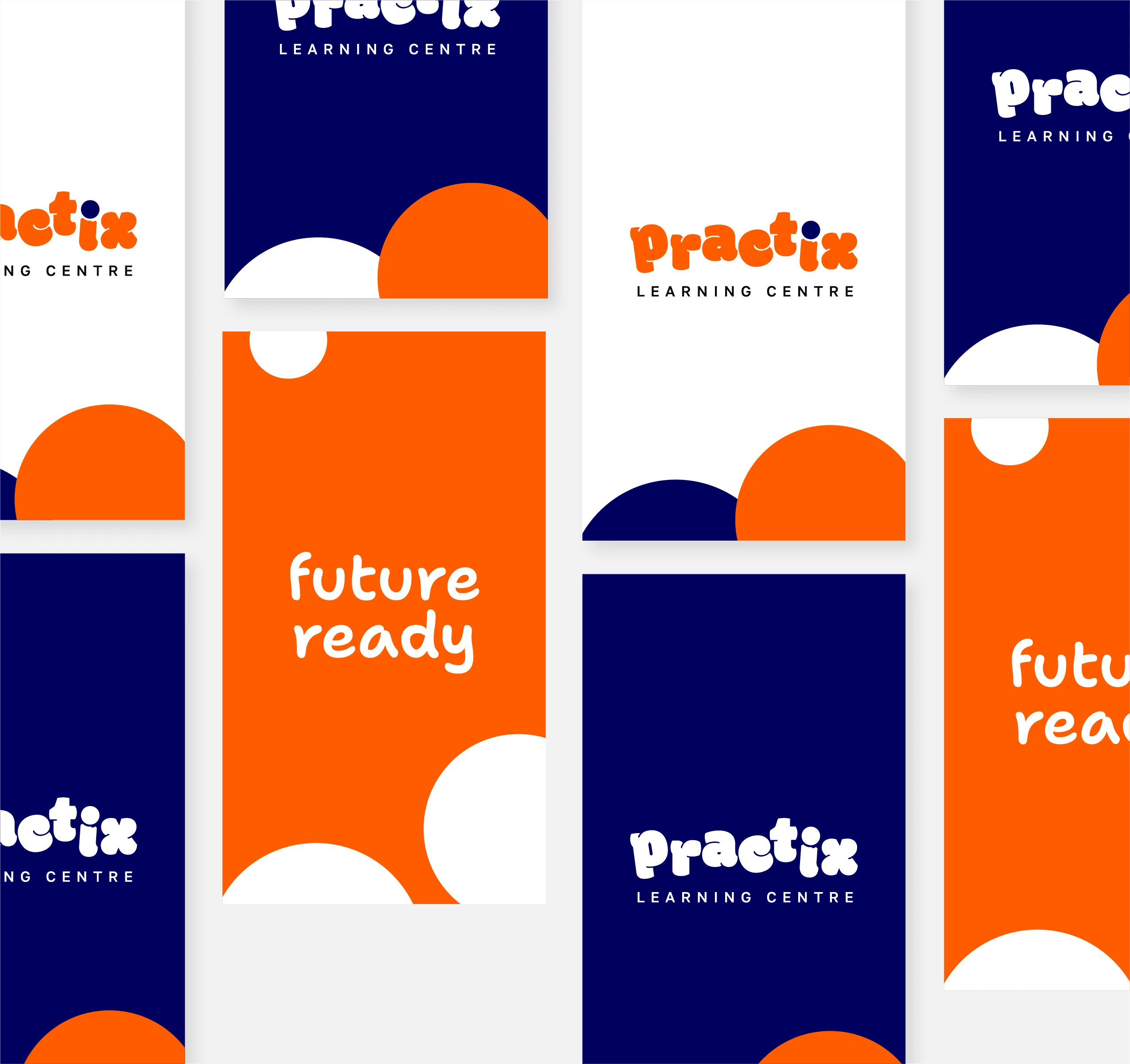
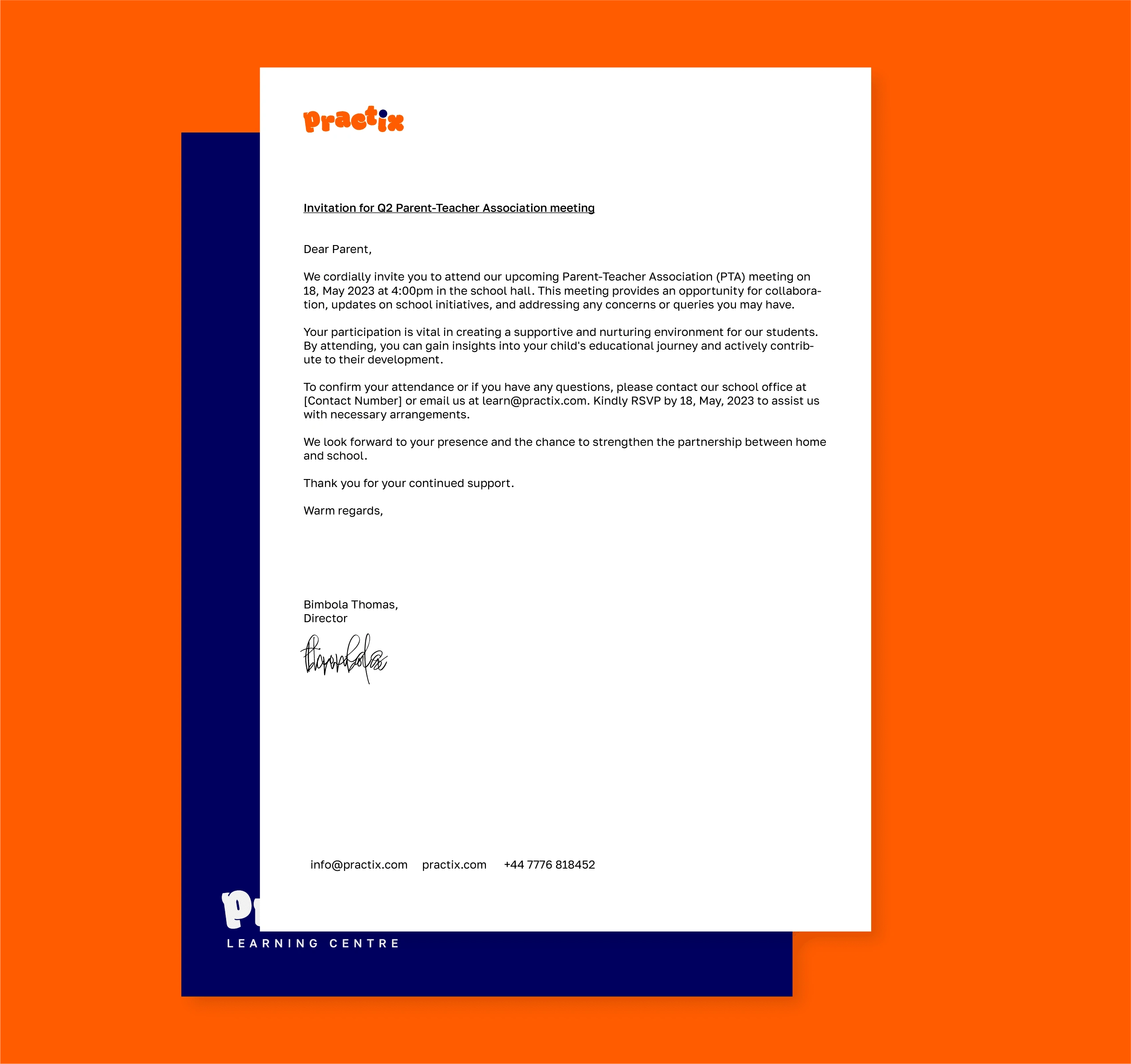
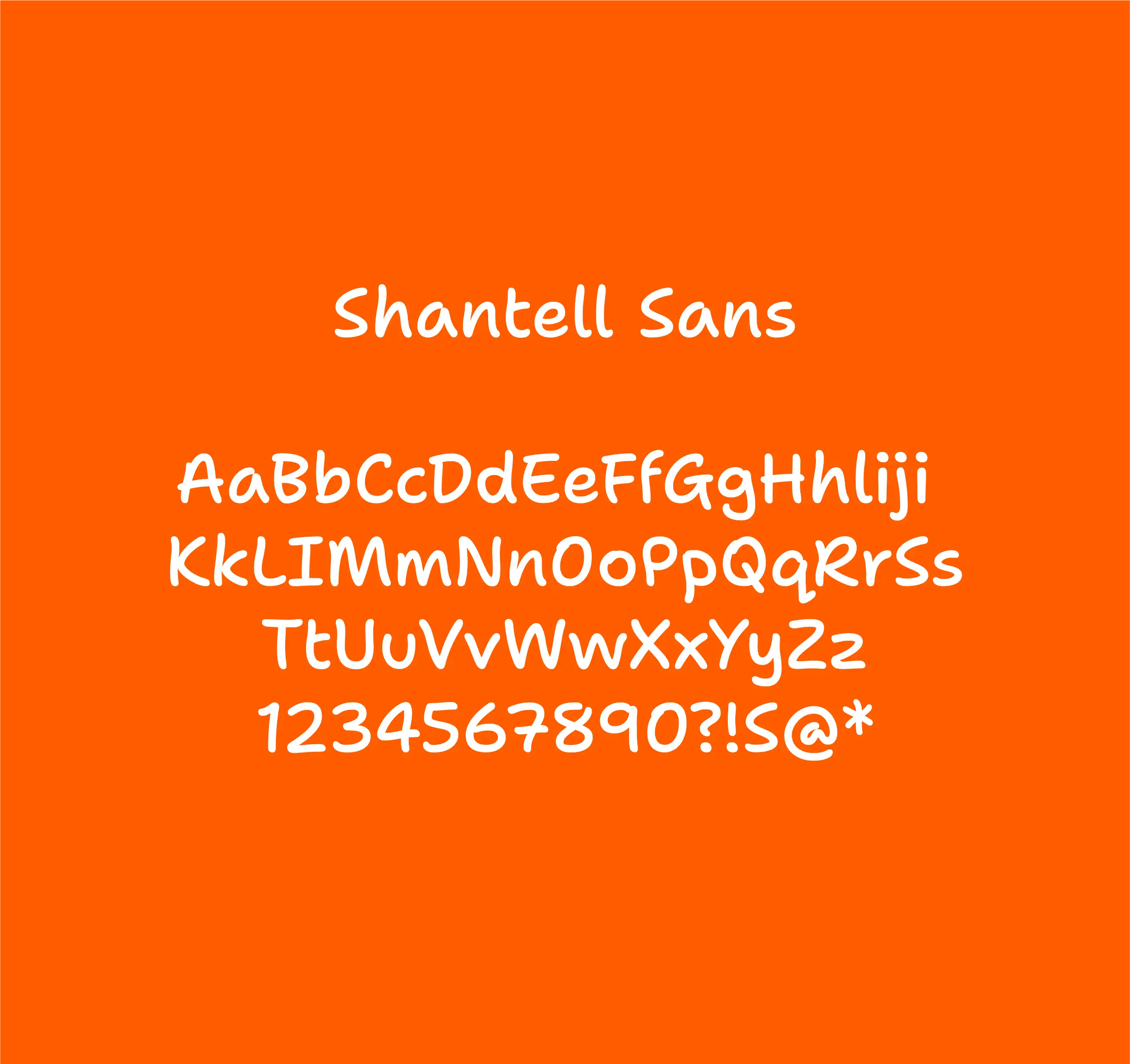
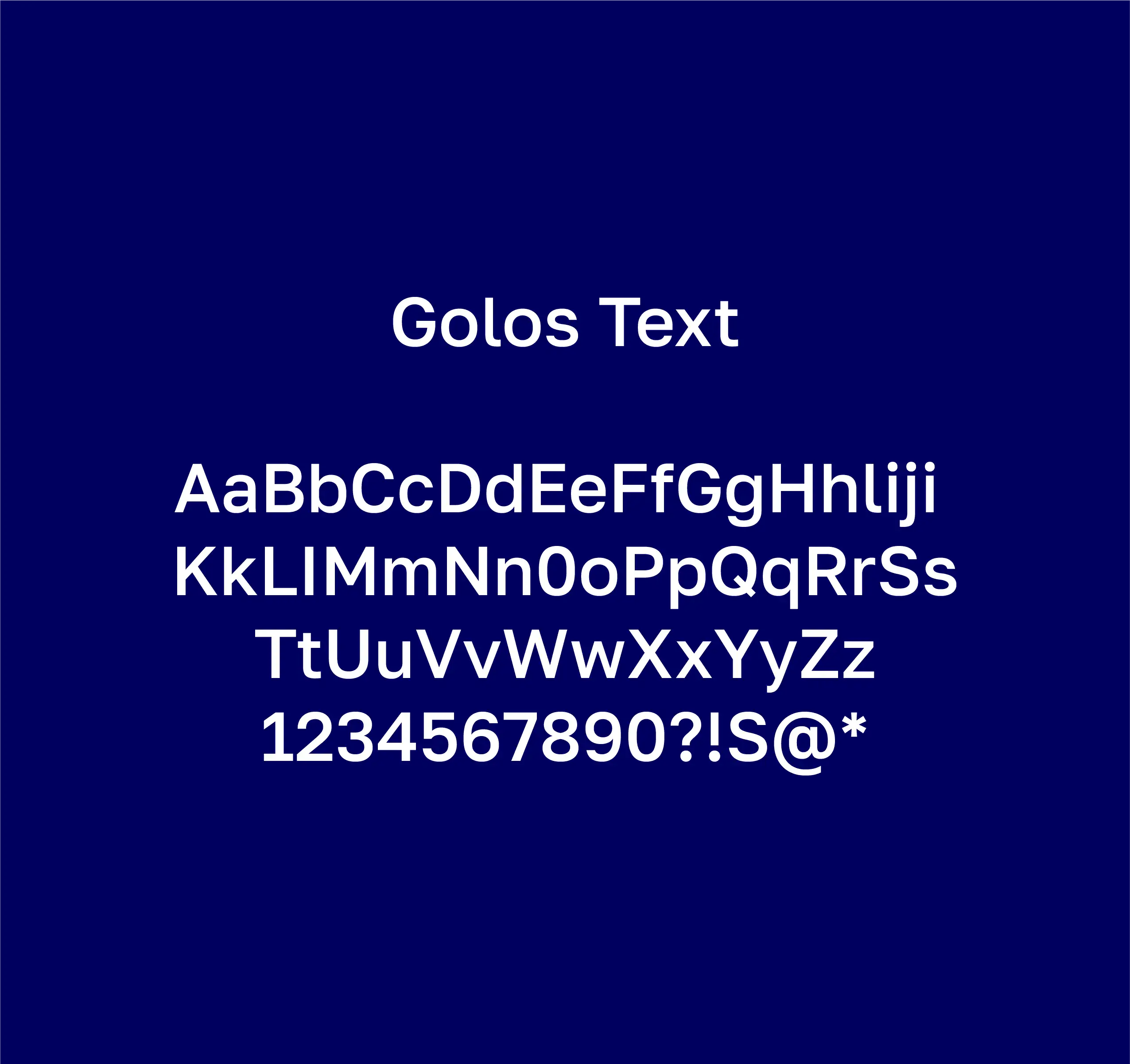
To capture the essence of Practix, we crafted a visually compelling and vibrant identity system. The logotype exudes boldness, symbolising the seriousness of academic pursuits, while incorporating a playful staggered arrangement that reflects the element of fun inherent in the learning environment. The selection of fonts aligns with this vision, with a primary font exuding a sense of professionalism and a secondary font adding a touch of playfulness.
The dot positioned on the letter “I” in the logo serves as a visual device, embodying the notion that learning should be an enjoyable experience. The primary colours, orange and blue, were thoughtfully chosen to represent creativity, energy, socialisation, and trust. To further enhance the impact of these bold primary colours, we introduced a selection of vibrant secondary colours, complementing and supporting the overall visual identity.
Through this comprehensive visual identity system, Practix now possesses a compelling brand image that captures the blend of seriousness and fun at the heart of its teaching philosophy.





Like this project
Posted May 28, 2023
Brand identity design for Practix, a UK-based learning centre dedicated to preparing students for the future.

