Portfolio Website Design with Framer
Mar Leaño
Overview
This project documents the design and build of my first portfolio website using Framer. Treated as a product rather than a static showcase, the site was designed with a primary user in mind: recruiters and hiring managers quickly scanning for fit.
As a designer transitioning from graphic design into UX/UI, the goal was to clearly communicate my focus, skills, and thinking within seconds, while remaining flexible as my UX work continues to evolve.
The Challenge
How might I design a portfolio that communicates relevance, clarity, and credibility, while being easy to maintain and scale over time?
Key constraints included:
First-time use of Framer
A limited number of UX-focused projects
The need to avoid overstating experience during a career transition
Project page structured like an article, combining visuals and design thinking in a clear reading flow.
Design Direction
The visual direction was intentionally minimal and stripped back. The interface prioritizes hierarchy, spacing, and readability, allowing case studies to speak for themselves without visual noise.
A single-column project layout was chosen to support linear scanning and reflect the current scope of my UX work, with a maximum of four highlighted projects on the homepage.
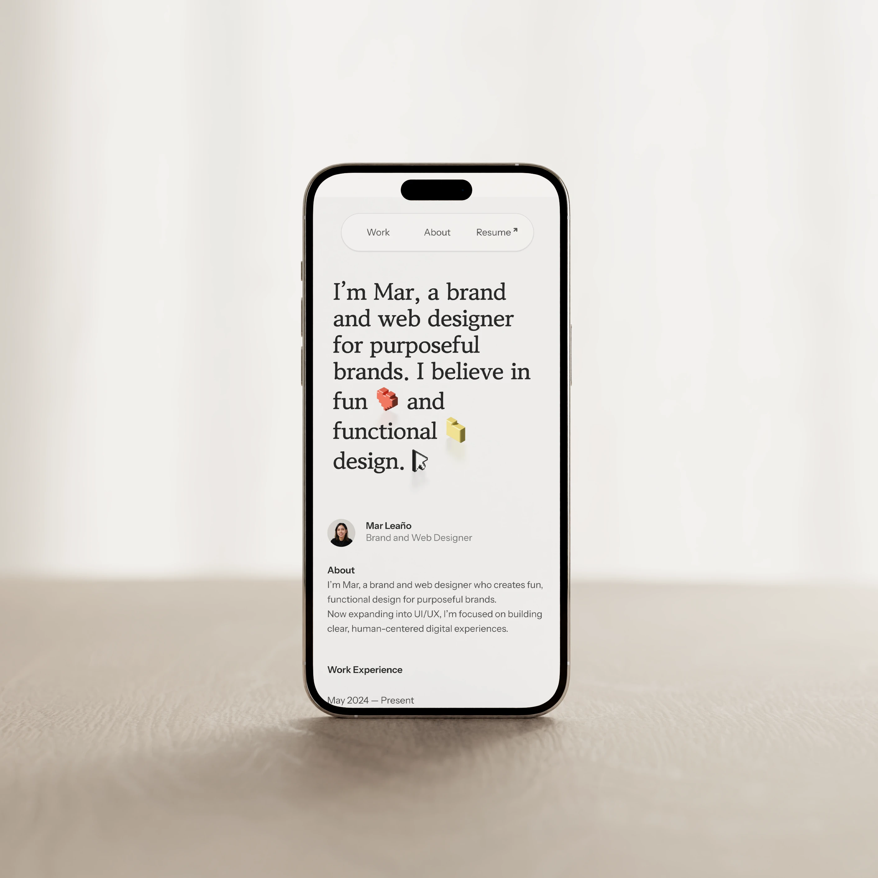
Mobile homepage in light mode with a minimal, content-first layout.
Designing for Recruiter Behavior
After consulting with a peer product designer who has experience reviewing designer portfolios, I made several structural decisions to reduce friction for recruiters:
Moved a short About summary to the top of the homepage so visitors can quickly assess fit
Created a dedicated About page to share deeper experience and personality outside of work
Repeated a brief About summary at the end of each case study, reinforcing identity after reading
These changes ensure key context is visible even during quick scans.
Mobile flow surfacing quickly: homepage summary, project context, and a dedicated About page.
Building a Scalable System in Framer
This project was an opportunity to apply system thinking using Framer’s tooling:
Variables for light and dark mode
Shared styles and reusable components
Responsive breakpoints for mobile, tablet, and desktop
CMS collections to easily add or update projects
SEO best practices, including page titles, descriptions, and structure
Subtle hover states, cursor effects, and animations were added to guide interaction and add polish without distracting from content.
Light and dark mode driven by shared variables across pages.
Hover and drag interactions adding clarity and personality to the About page.
Outcome & Learnings
Designing my portfolio in Framer helped me bridge visual design with UX strategy, interaction design, and system-level thinking.
Key takeaways:
👩💼 A portfolio is a UX product with real users and goals
🔬 Designing for clarity often means removing, not adding
🧩 Building systems early makes future iteration significantly easier
This project reinforced my shift toward designing clear, human-centered digital experiences, both in my work and how I present it.
Like this project
Posted Feb 24, 2026
Designing and building a recruiter-focused portfolio as a scalable UX system
Likes
0
Views
4
Timeline
Jan 9, 2026 - Jan 30, 2026