Brand Identity & Web Design

Artur Mikhov


Bronco: Brand Identity
Bronco is a CTV advertising company helping brands run video ads across Netflix, Hulu, Amazon TV, and other premium streaming platforms. While building toward a self-serve SaaS platform, they currently operate as a media partner — managing campaigns end-to-end and delivering transparent, measurable results.

The problem
CTV advertising is a crowded, jargon-heavy space where most brands look identical — dark tech aesthetics, abstract data visuals, generic "performance" messaging. Bronco had a clear product and a genuine edge: direct access to premium publishers, clean supply paths, and honest attribution. The brand didn't reflect any of that confidence.
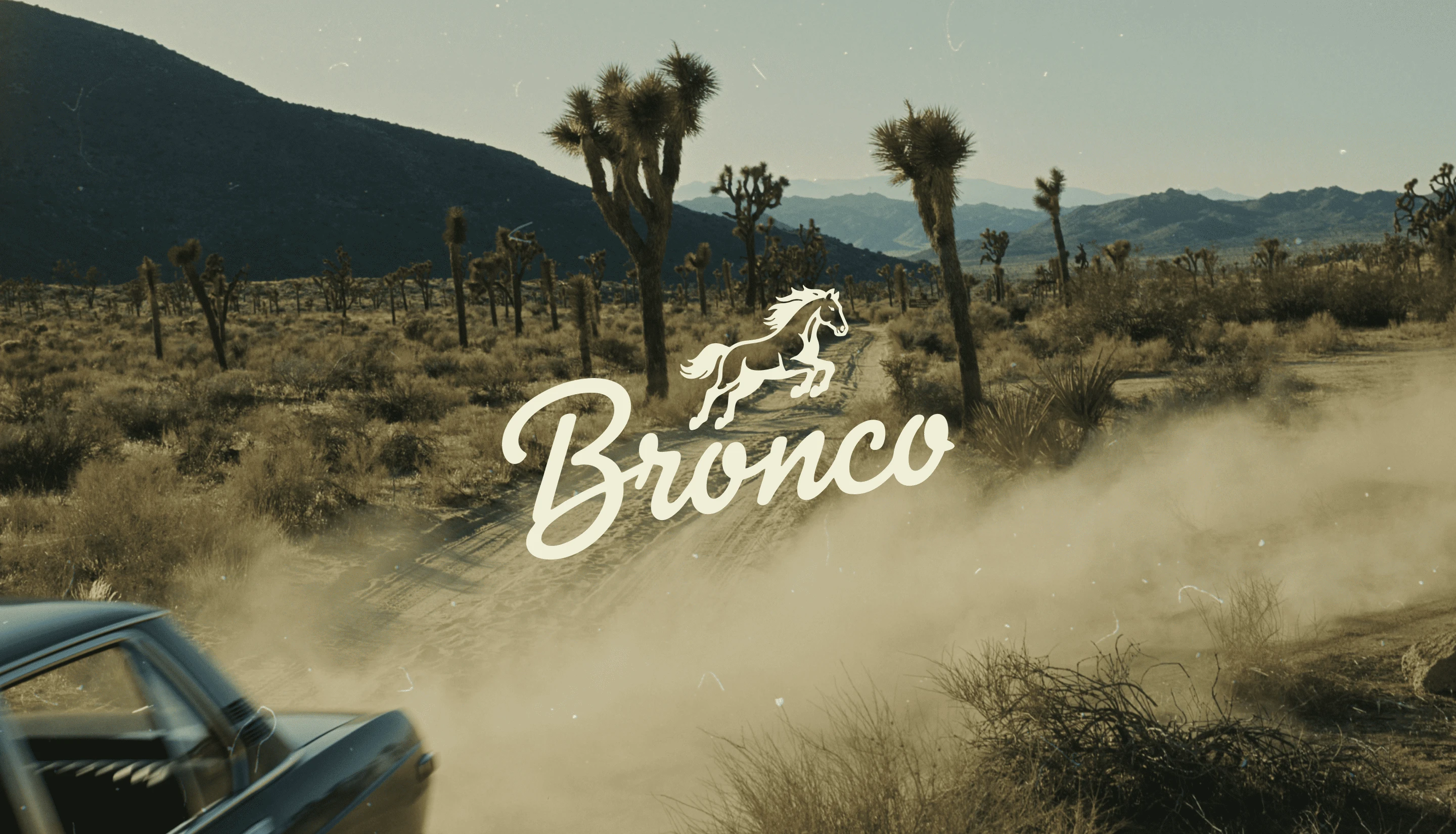
They needed to stand apart — not just from the noise, but from the category itself.
The approach
One decision shaped everything: lean into the American West, not into ad-tech.
The brief called for bold, reliable, and straightforward. The spirit of the frontier — confidence without pretension, performance without the spin. Not a tech startup trying to look approachable. A partner that makes complex CTV buying feel like something you can actually trust.
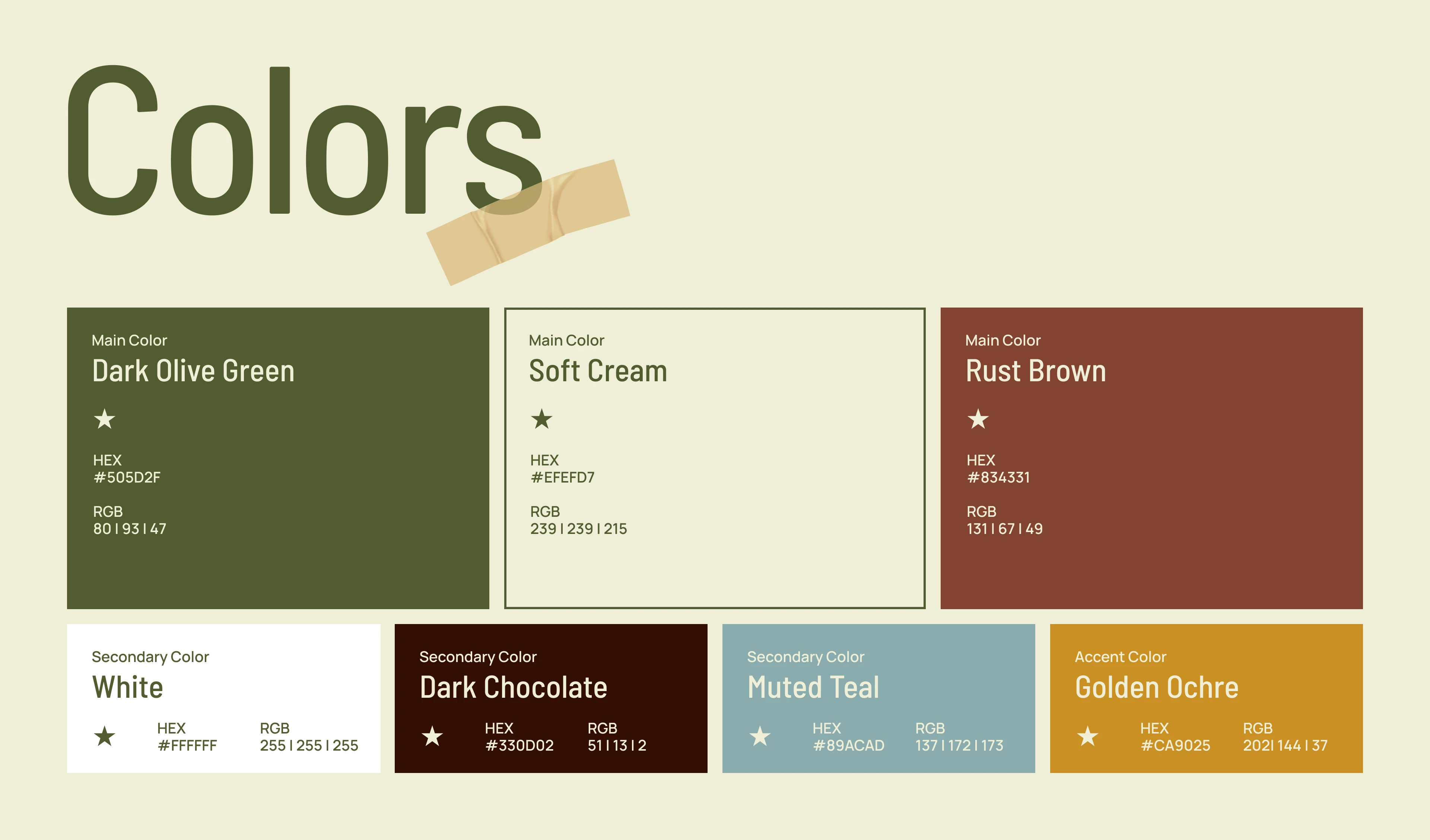
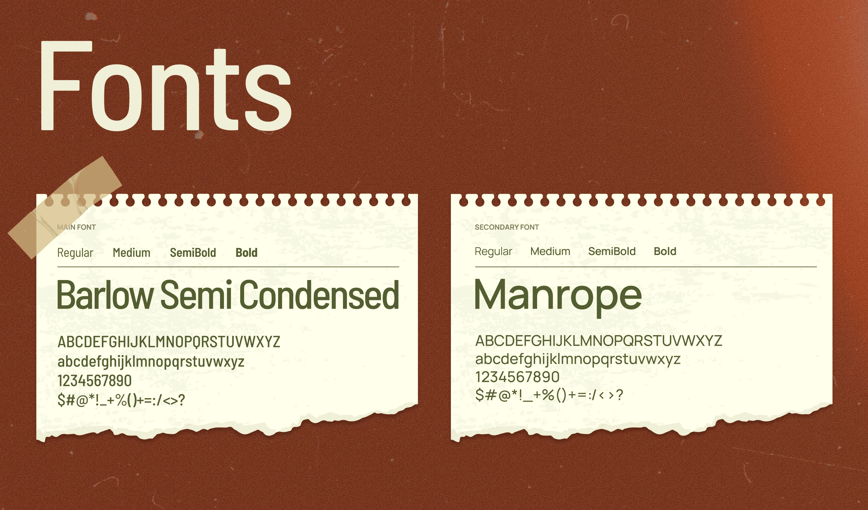
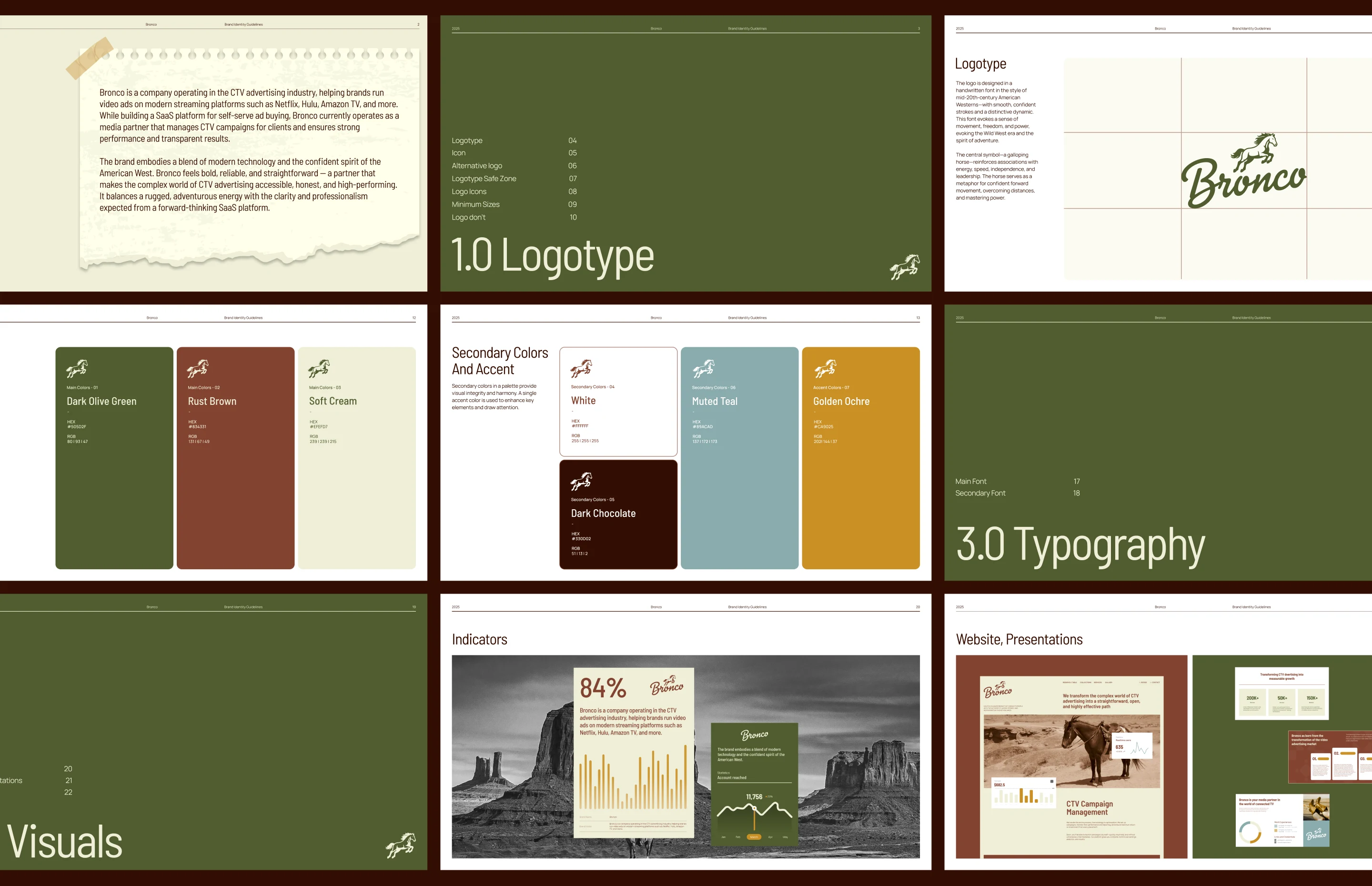
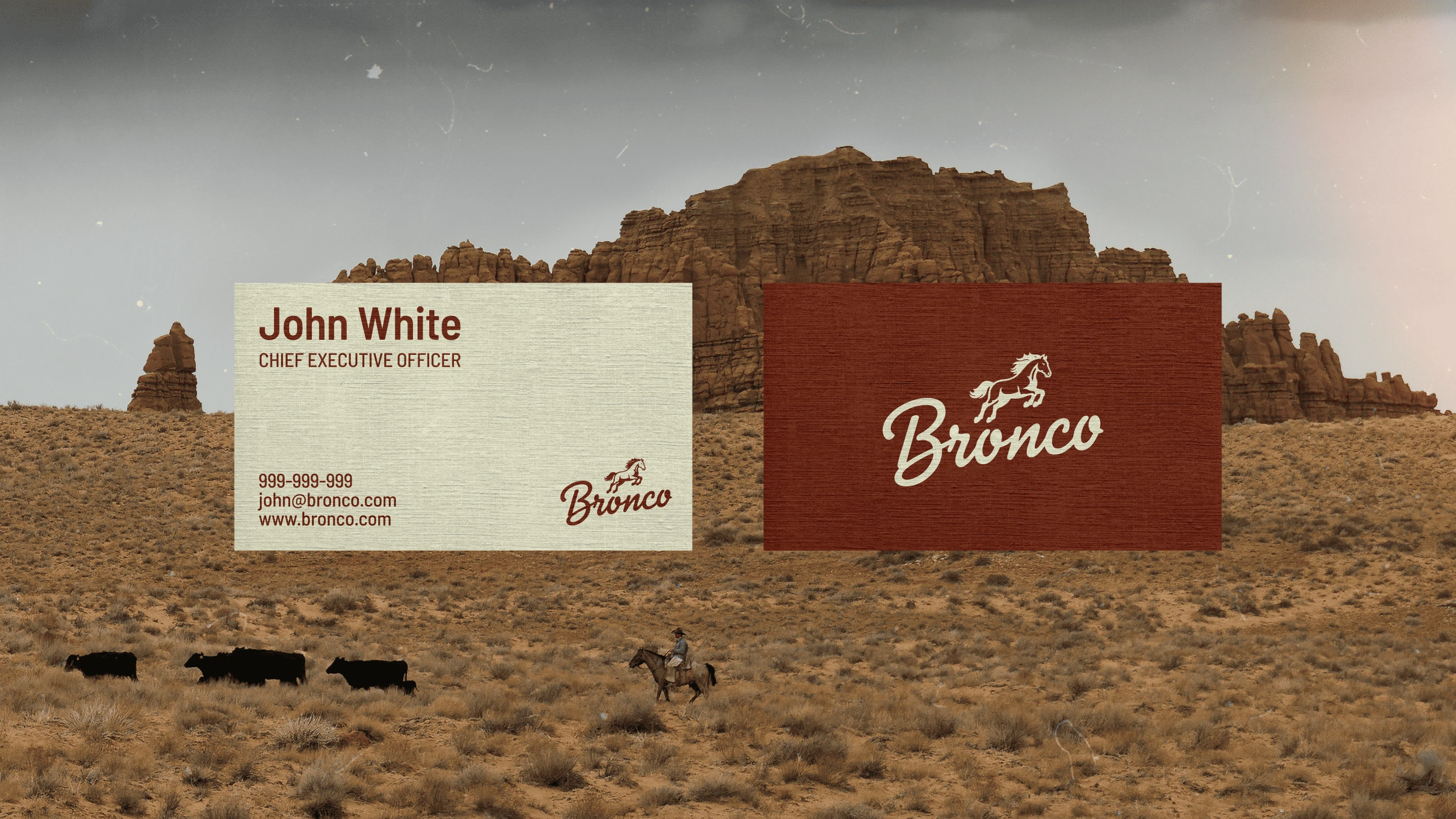
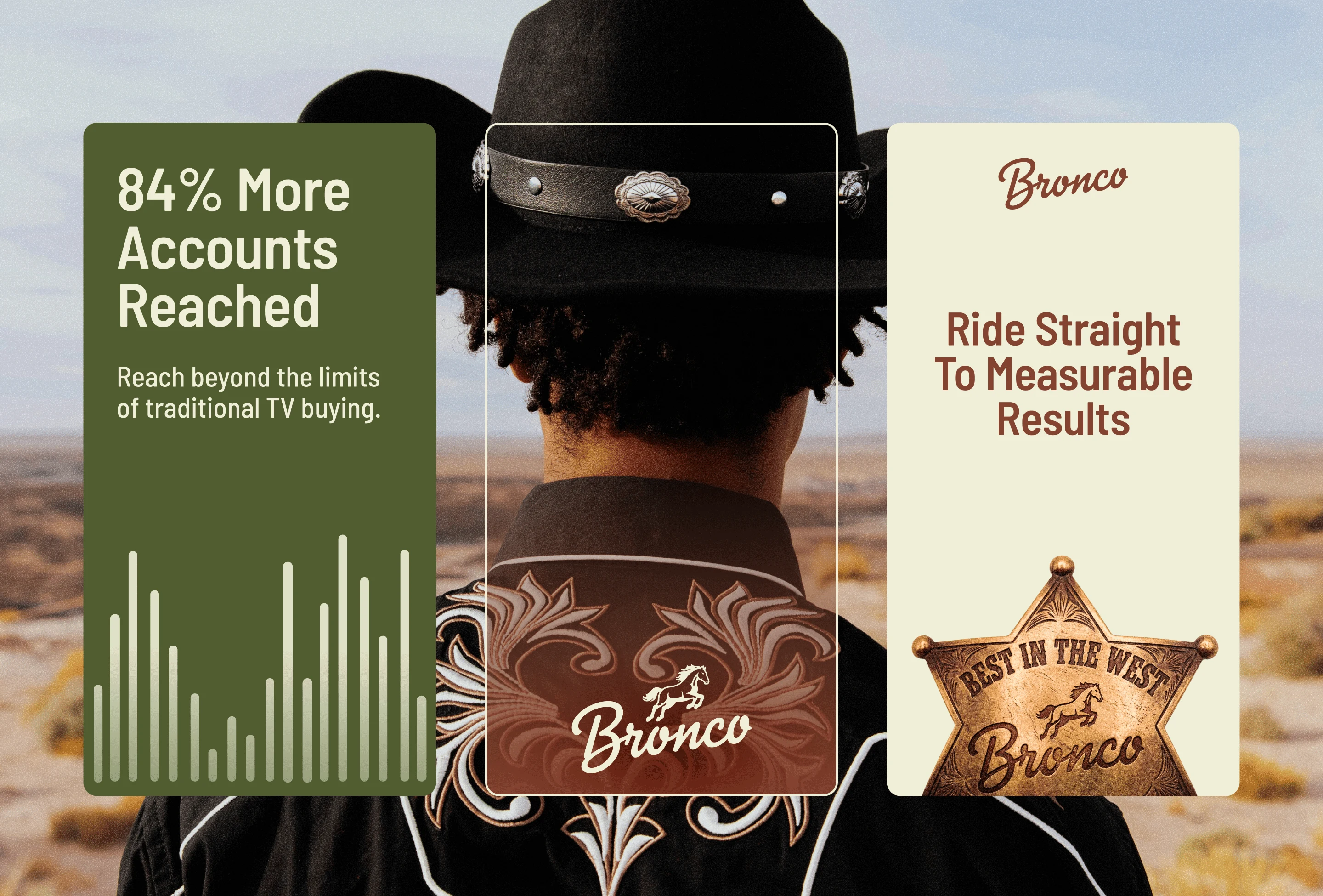
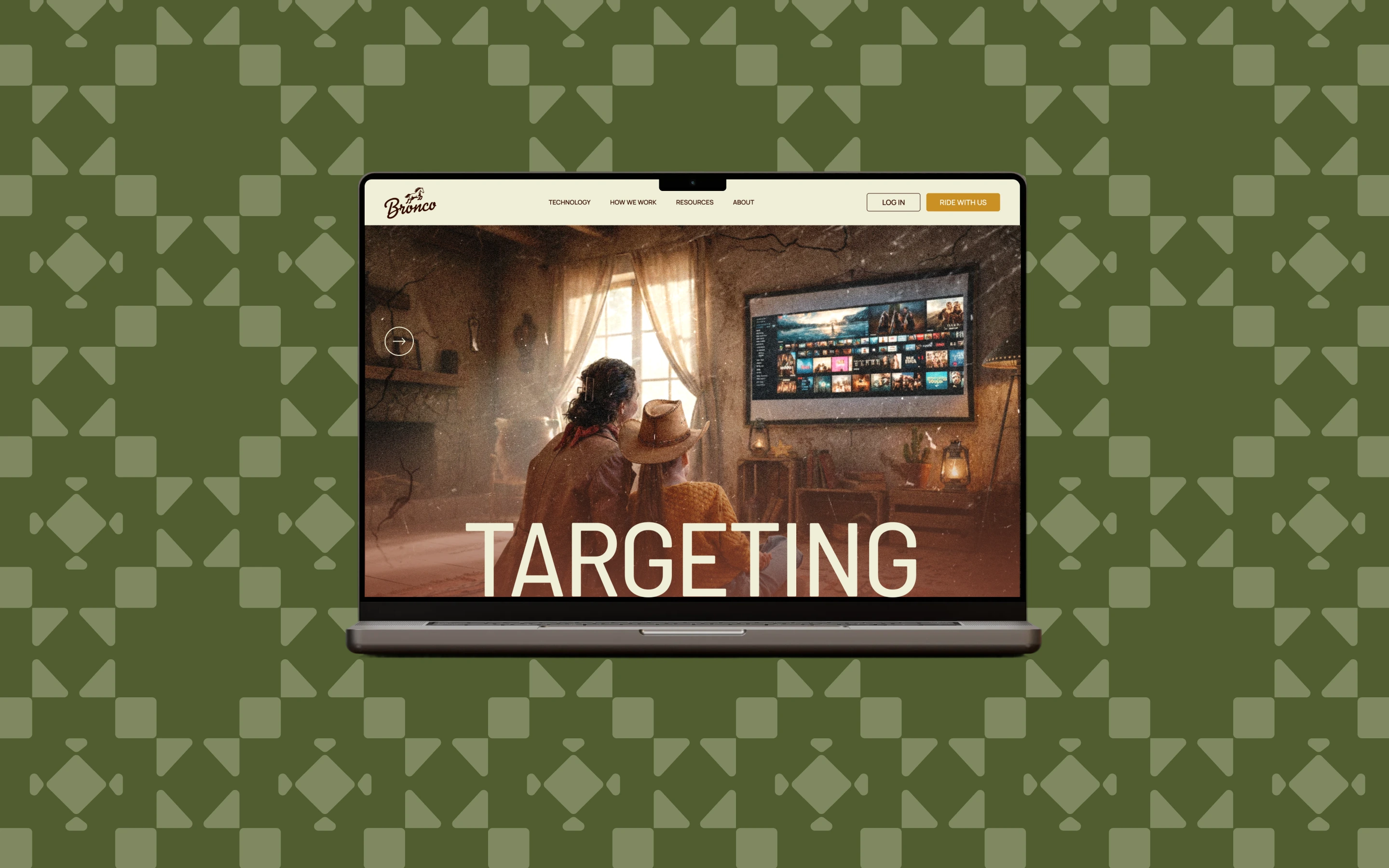
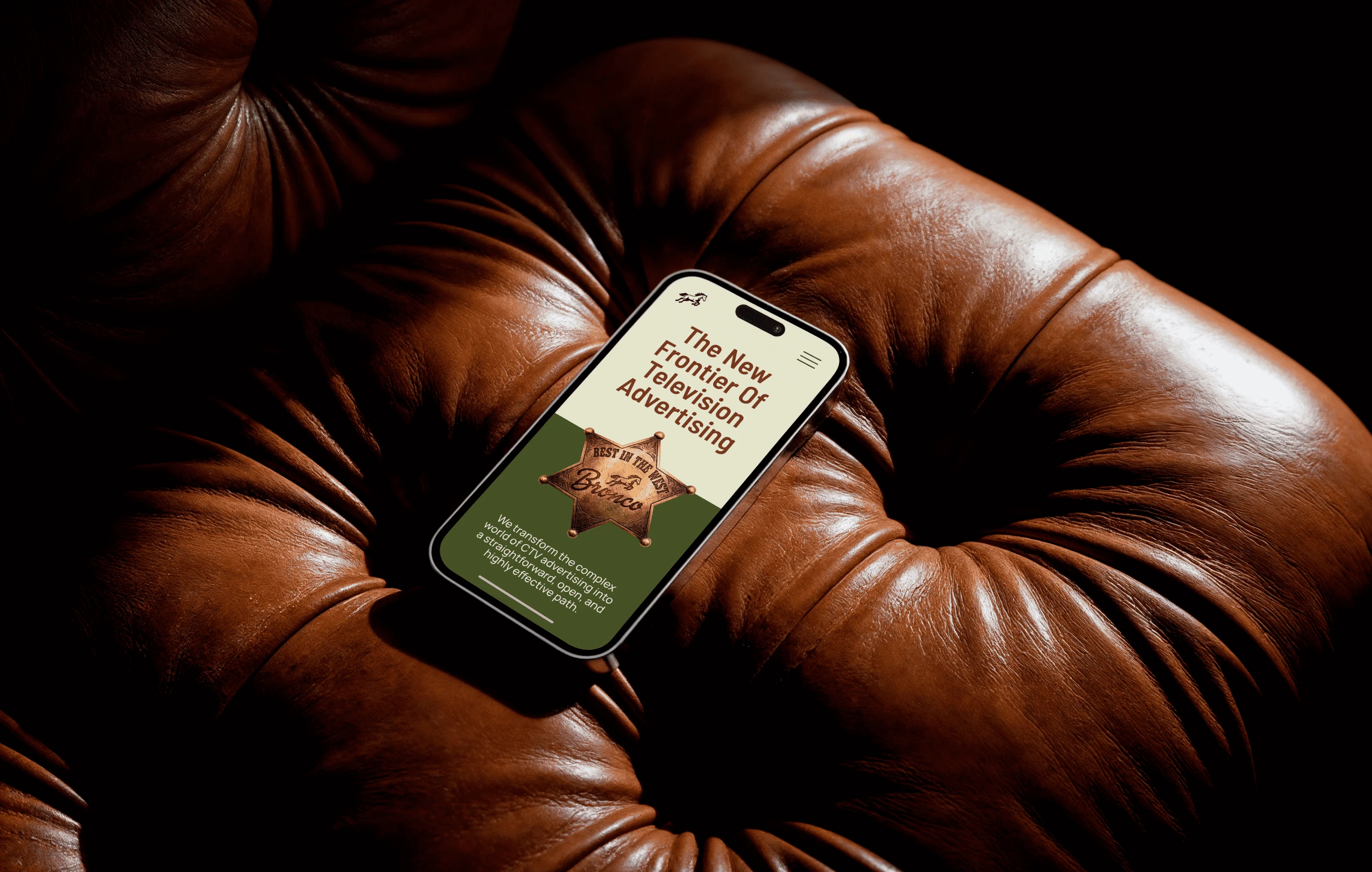
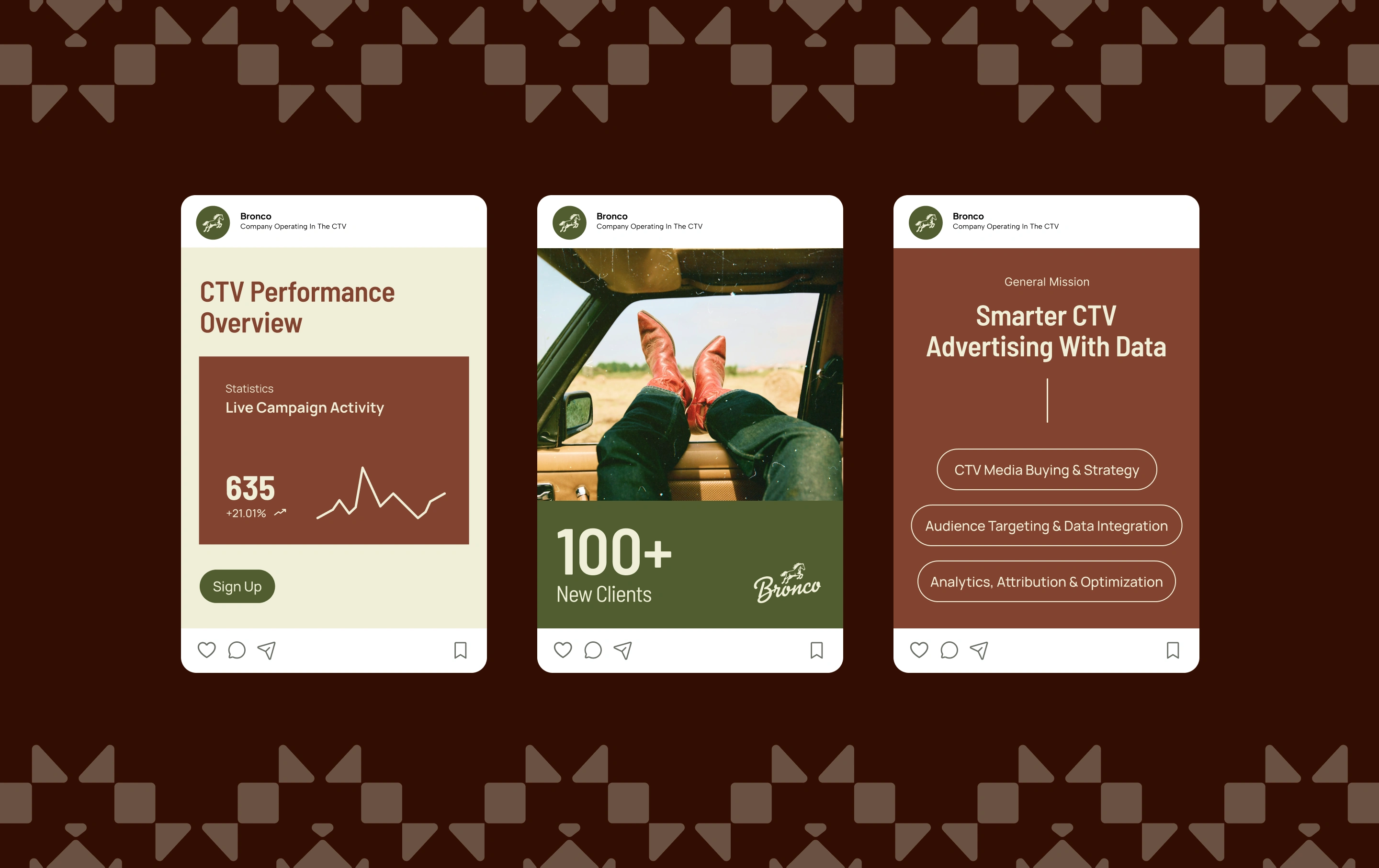
Visual identity. We built the system around a running horse mark — a symbol of momentum, freedom, and the West that Bronco's name already implied. The palette moved away from every ad-tech convention: warm terracotta, olive green, and aged cream over cold blues and gradients. Typography mixed editorial serifs with strong utility grotesques — authoritative without being stiff.
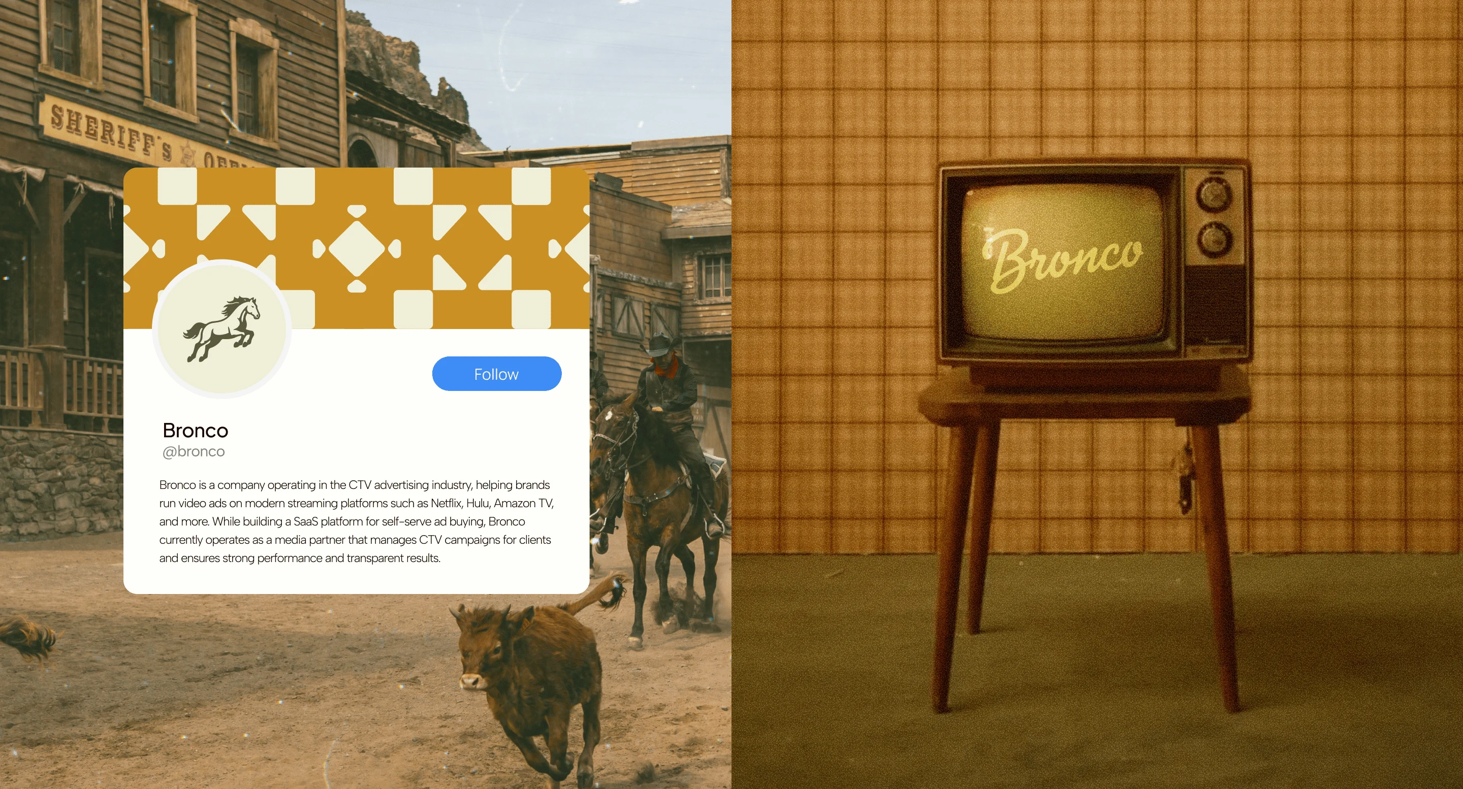
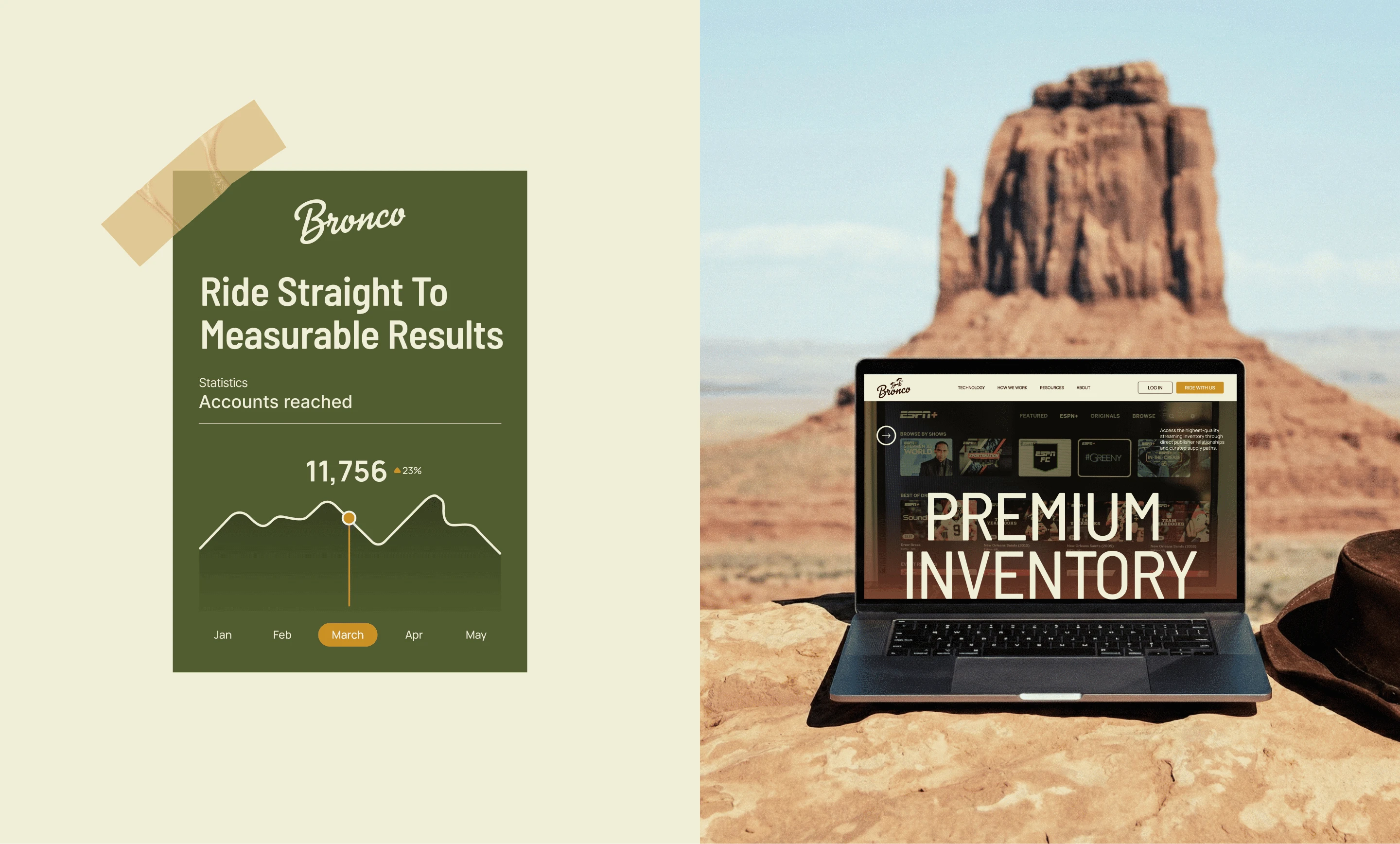
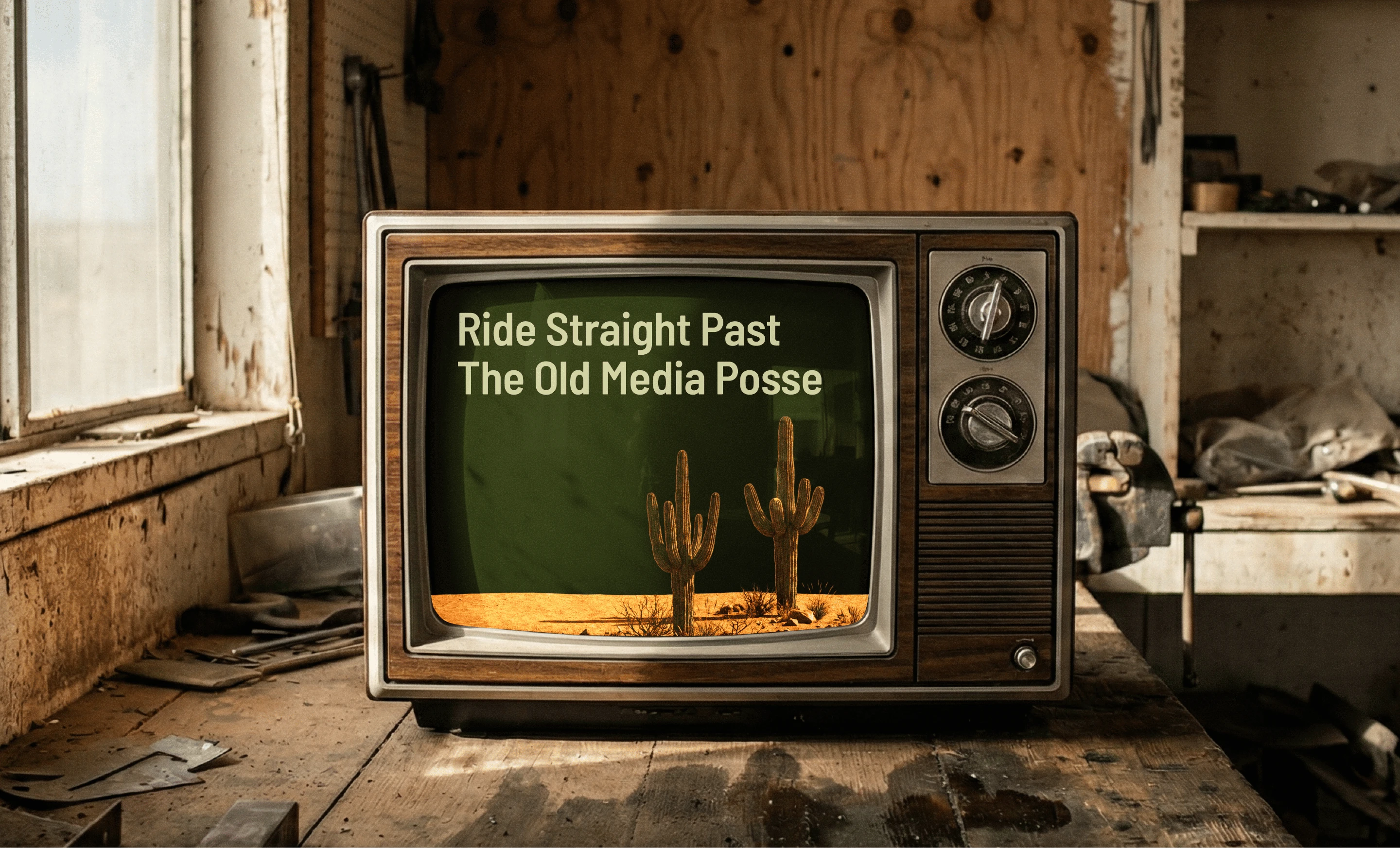
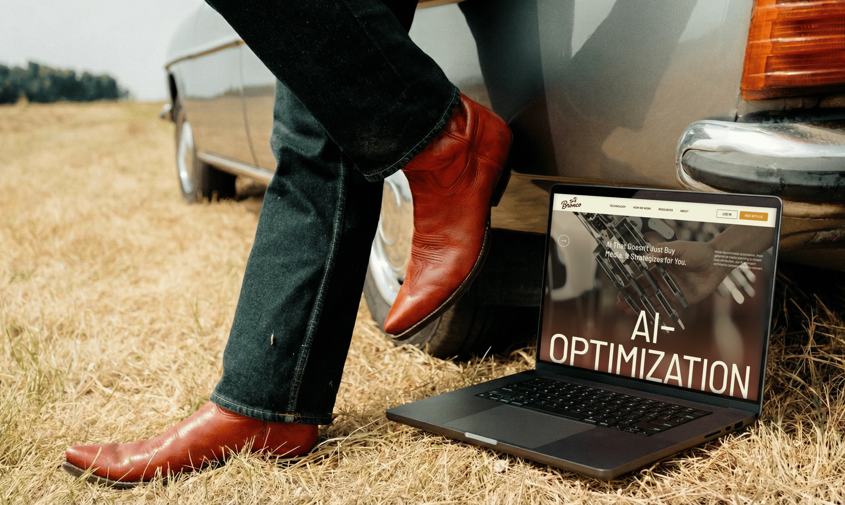
Texture and tone. Vintage grain, American landscape photography, hand-drawn star motifs. The visual language borrowed from print design and frontier heritage — then pushed it into a modern context. The result feels like something that's been around long enough to be trusted, and new enough to be sharp.
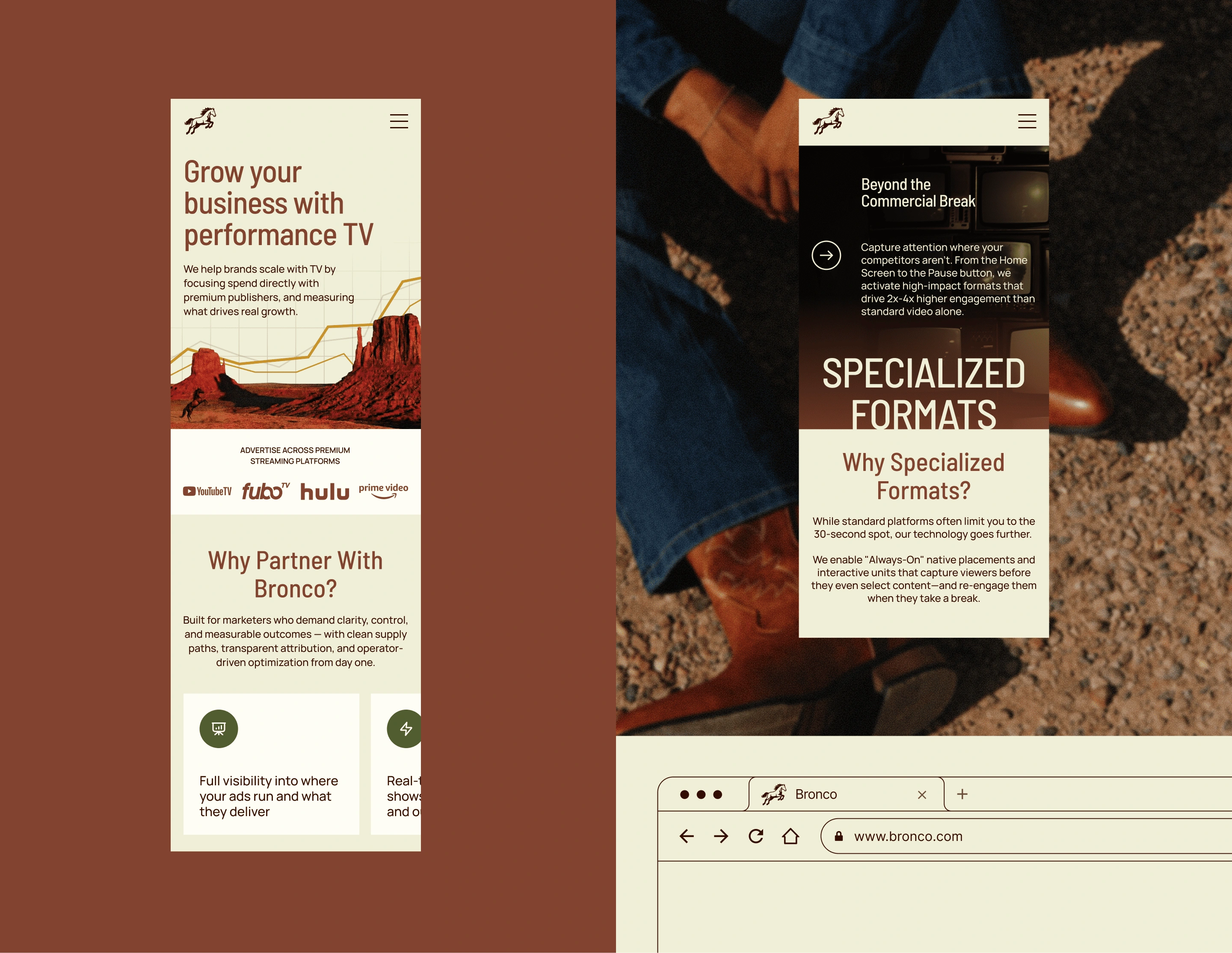
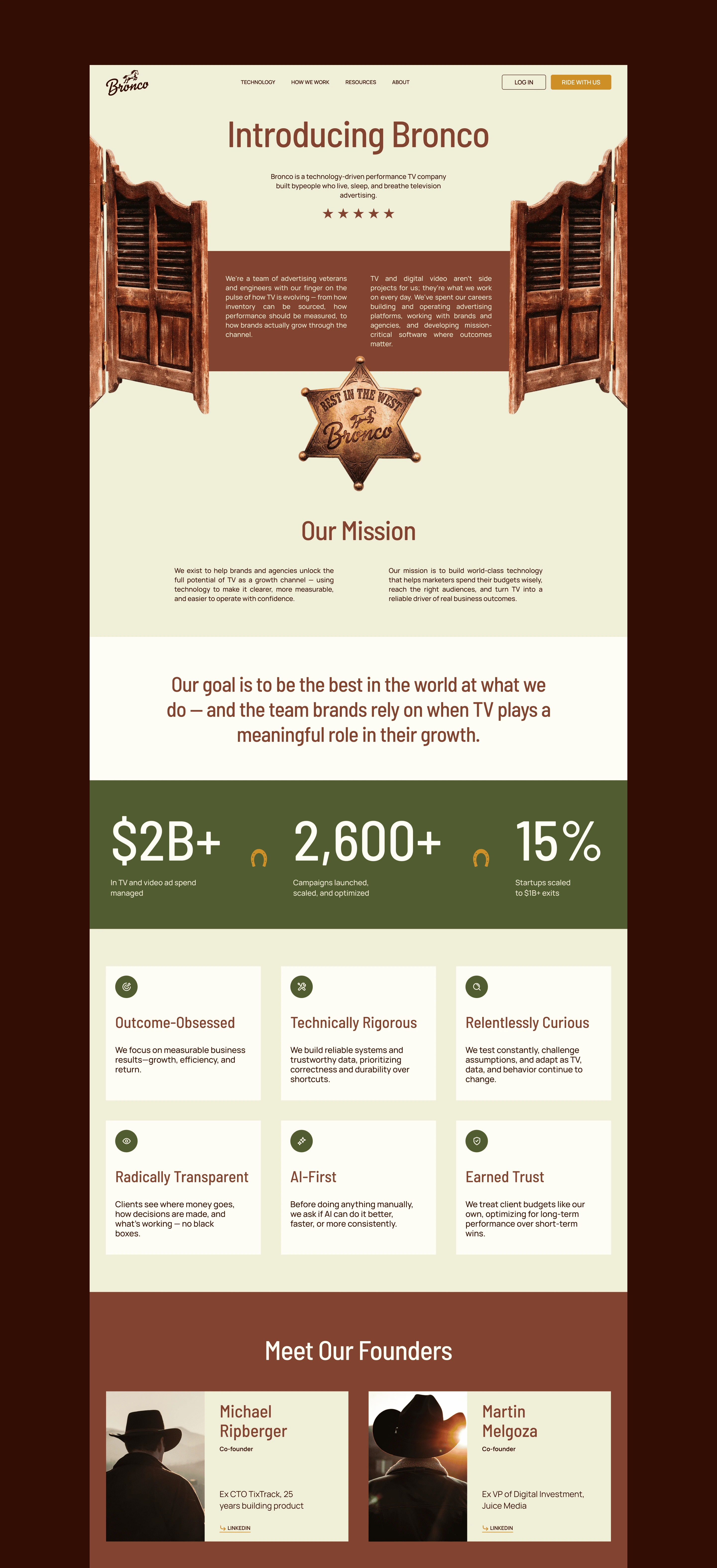
Application. The identity was carried through the full system — logo variations, color rules, typography hierarchy, graphic elements, and into the website design itself. Every touchpoint reinforces the same idea: this is performance TV advertising, built by people who actually understand what brands need.
The outcome
Bronco now looks like the only CTV company in the room that isn't trying to look like a CTV company. The brand does the positioning before anyone reads a word — bold, honest, and unmistakably American. A media partner marketers can put their name behind.


Like this project
Posted Aug 7, 2026
Brand identity for Bronco, a CTV advertising platform helping brands reach audiences across modern streaming services through smart, scalable ad solutions.
Likes
9
Views
45