Enhancing Business Account Workflow through Spend Card Feature
Handaru
Enhancing Business Account Workflow through Spend Card Feature
Role
UI/UX Designer, Card Design
Industry
Accounting, Fintech
Timeline
1 month, 2024
Prompt
Grof's Business Account allowed companies to hold and manage funds, but teams had no way to utilize that money efficiently. The only option: manual bank transfers to personal accounts. This created friction, financial risk, and zero oversight.
I analyzed how competitors (Aspire, Wise, Jenius) handled corporate cards. None of them had approval workflows or role-based access controls. They all treated cards as a commodity feature, not a system for organizational governance.
This gap meant companies couldn't enforce spending policies at the system level. Compliance controls happened outside the platform—or not at all. I recognized this wasn't just a feature gap; it was a genuine market opportunity. By building approval workflows and role-based access, Grof could offer controls that competitors didn't have, which is a defensible advantage for companies with compliance requirements.
Strategic Design Challenge
Create one unified card management interface that serves for both administrative users (Approver and Finance) and Basic users (who need simplicity)—without either feeling restricted or overwhelmed by unnecessary information.
Understanding our System
The design needed to serve three distinct user roles:
Approver – Highest authority. Creates cards, approves card requests from others, adjusts spending limits, manages all company cards. (Approval workflows were designed separately—my focus was the card management interface.)
Finance – Administrative control. Creates and manages cards, adjusts limits, but cannot approve requests. Needs full visibility into company spending.
Basic User – Limited access. Views only assigned cards, makes purchases, adds receipts. No administrative functions.The app had a cluttered interface, making it difficult for users to navigate and find essential features. Users were facing issues with the onboarding process, which was affecting new user adoption rates. The app lacked personalization and customization options, making it less engaging and user-friendly.
The Design Challenge
Create one unified card management interface that serves both administrative users (Approver and Finance, who need oversight) and basic users (who need simplicity)—without either feeling restricted or overwhelmed by unnecessary information.
Design Solution: Adaptive Interface
The Card List – Adaptive Interface for Three Roles
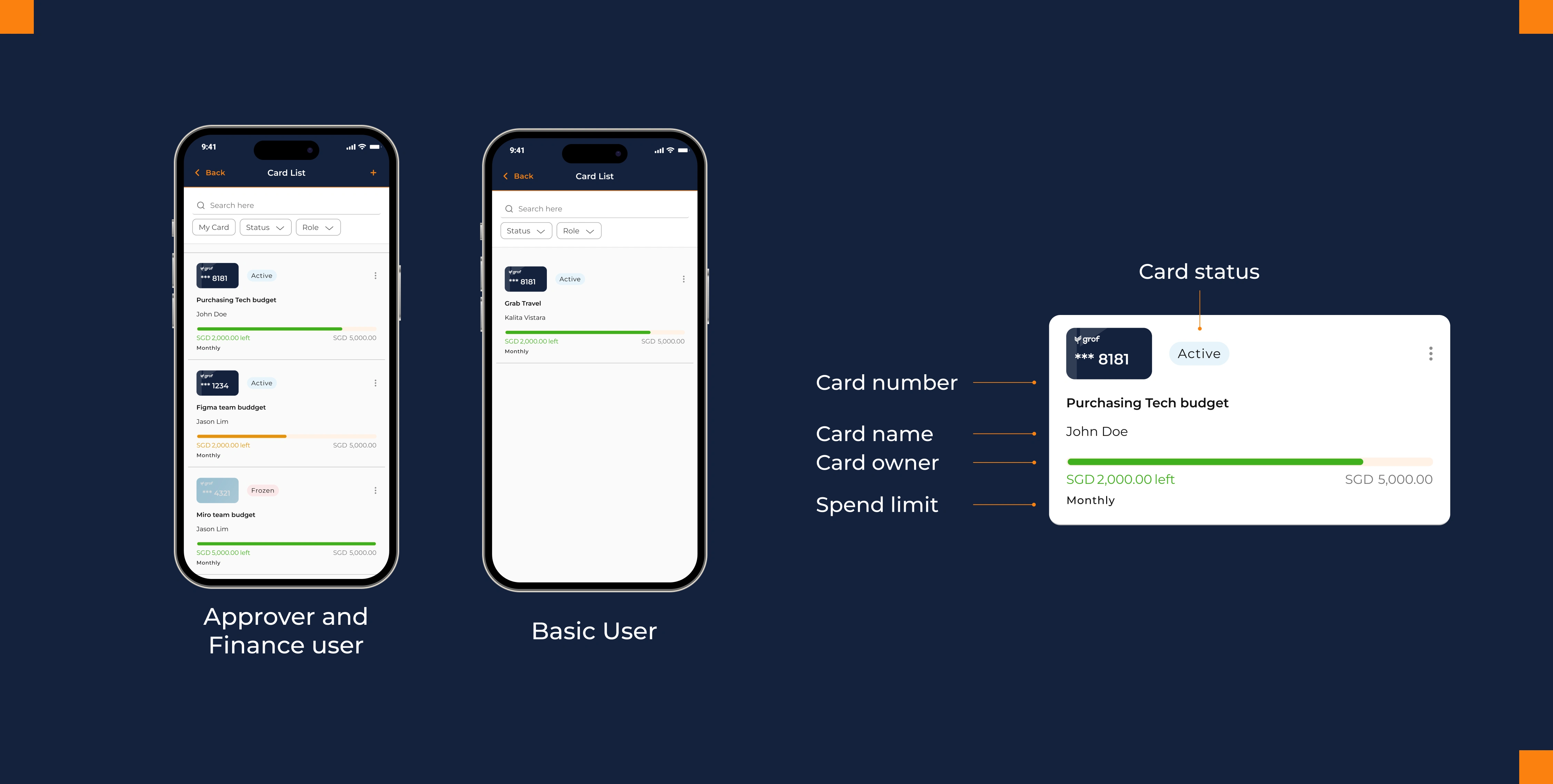
Rather than building separate card lists for each role, I designed one adaptive interface that shows exactly what each user needs.
For Approvers & Finance Users: The list displays all company cards—both their own and those assigned to team members. They see spending status at a glance and can assign new cards. The interface is identical for both roles since the card management experience is the same; the difference (approval authority) lives in a separate flow.
For Basic Users: A simplified view showing only their own assigned cards. No clutter. No disabled buttons. The interface itself communicates their permission level through what's visible.
This approach solves a critical design problem: How do you show permissions without making users feel restricted?
Answer: Don't show restrictions. Show relevance.By displaying only what matters to each role, the same interface feels intuitive for everyone. A Basic User doesn't see a "disabled" Assign Card button—they never see it at all. One adaptive interface scales better than building separate experiences for each role, and it maintains visual consistency across user types.
Card Details – Security Meets Workflow
The card detail page is where design complexity becomes visible. It needed to handle:
Security – Sensitive card data (number, CVV) shouldn't display by default
Accessibility – Users need quick access to this information when they need it
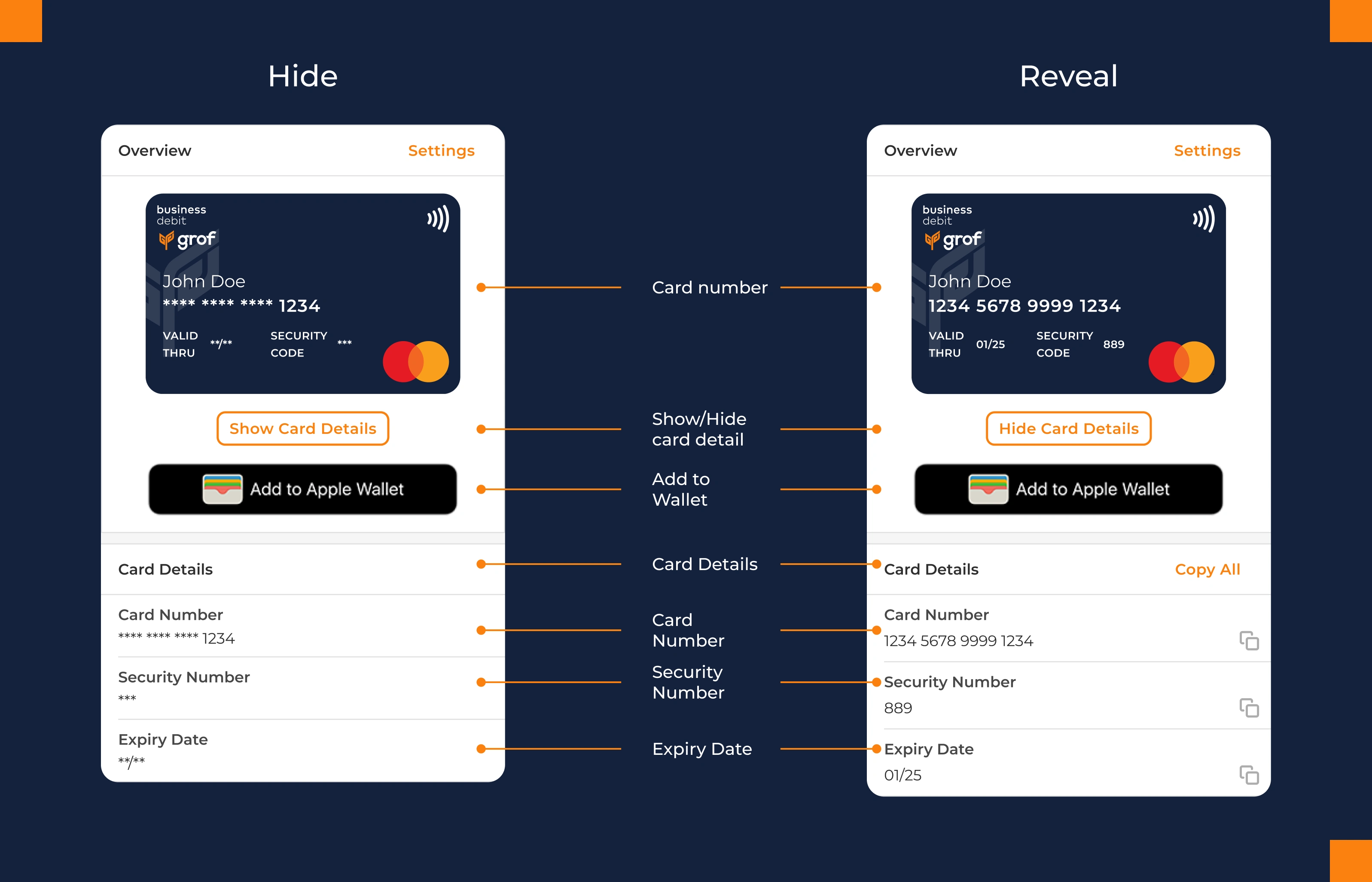
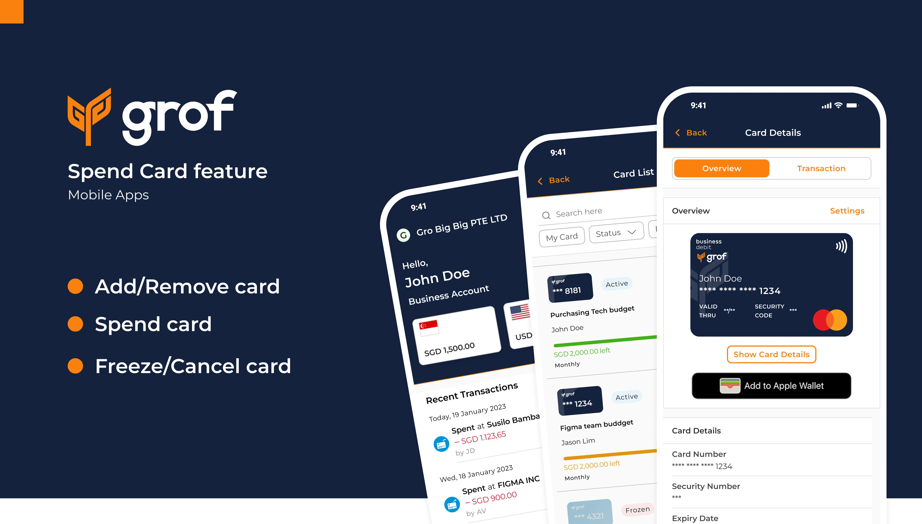
Card information is hidden by default and revealed with an intentional tap. Each field can be copied individually for flexibility. But here's the strategic design choice: a "Copy All" button bundles card details into a formatted string, ready to paste directly into external systems.
Copy All button emerged from observing actual workflows. Finance users frequently need to input card data into accounting spreadsheets—copying field-by-field is error-prone. By designing for observed use cases rather than assumed ones, a small feature becomes significant.
Visual Information Hierarchy
Below the card details, essential information is presented at a glance:
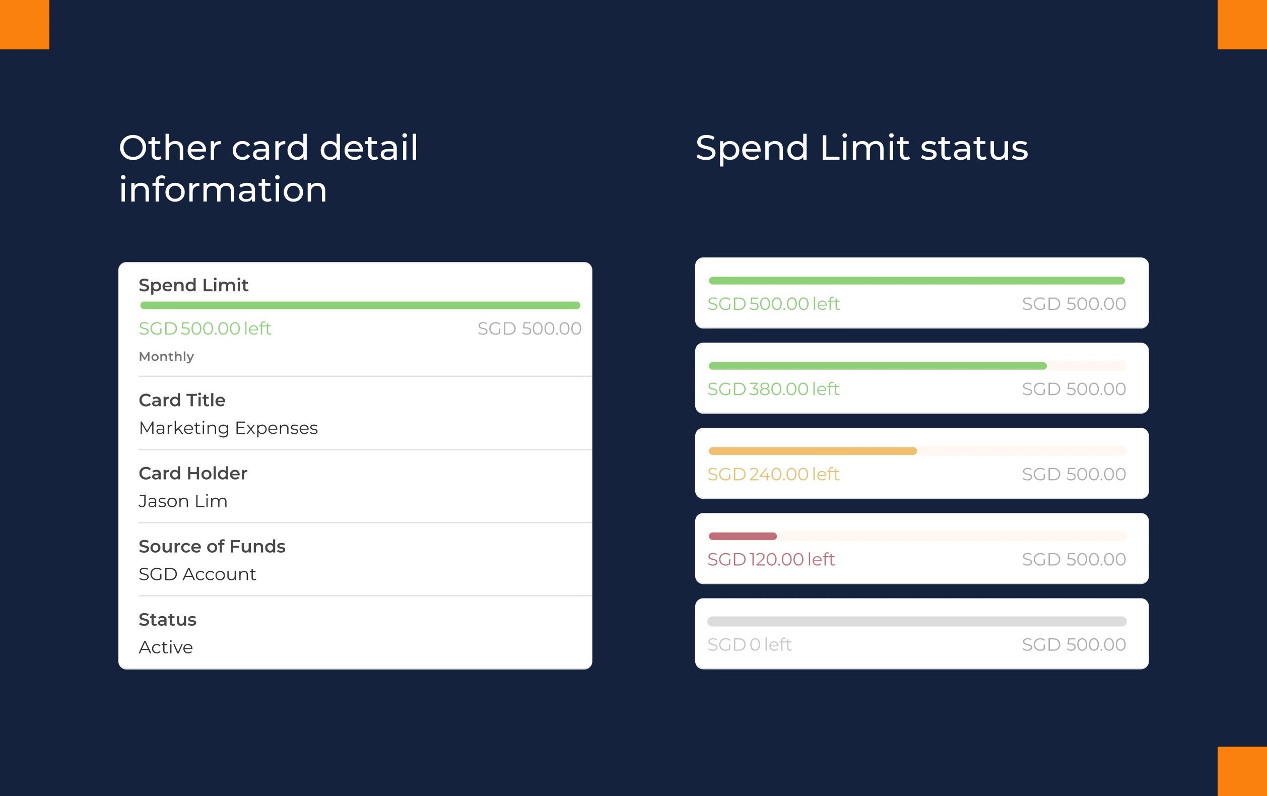
Spend Limit with color-coded progress (Green: healthy | Orange: caution | Red: action needed) – The visual does the cognitive work
Card Title for quick identification
Cardholder Name and Source Account for context
Status (Active, Frozen, Canceled) always visible
This hierarchy ensures users understand the card's state without needing to search for information.
Card Creation: Controlled Flexibility
Only Approvers and Finance users access card creation, enforcing proper oversight through interface-level permissions.
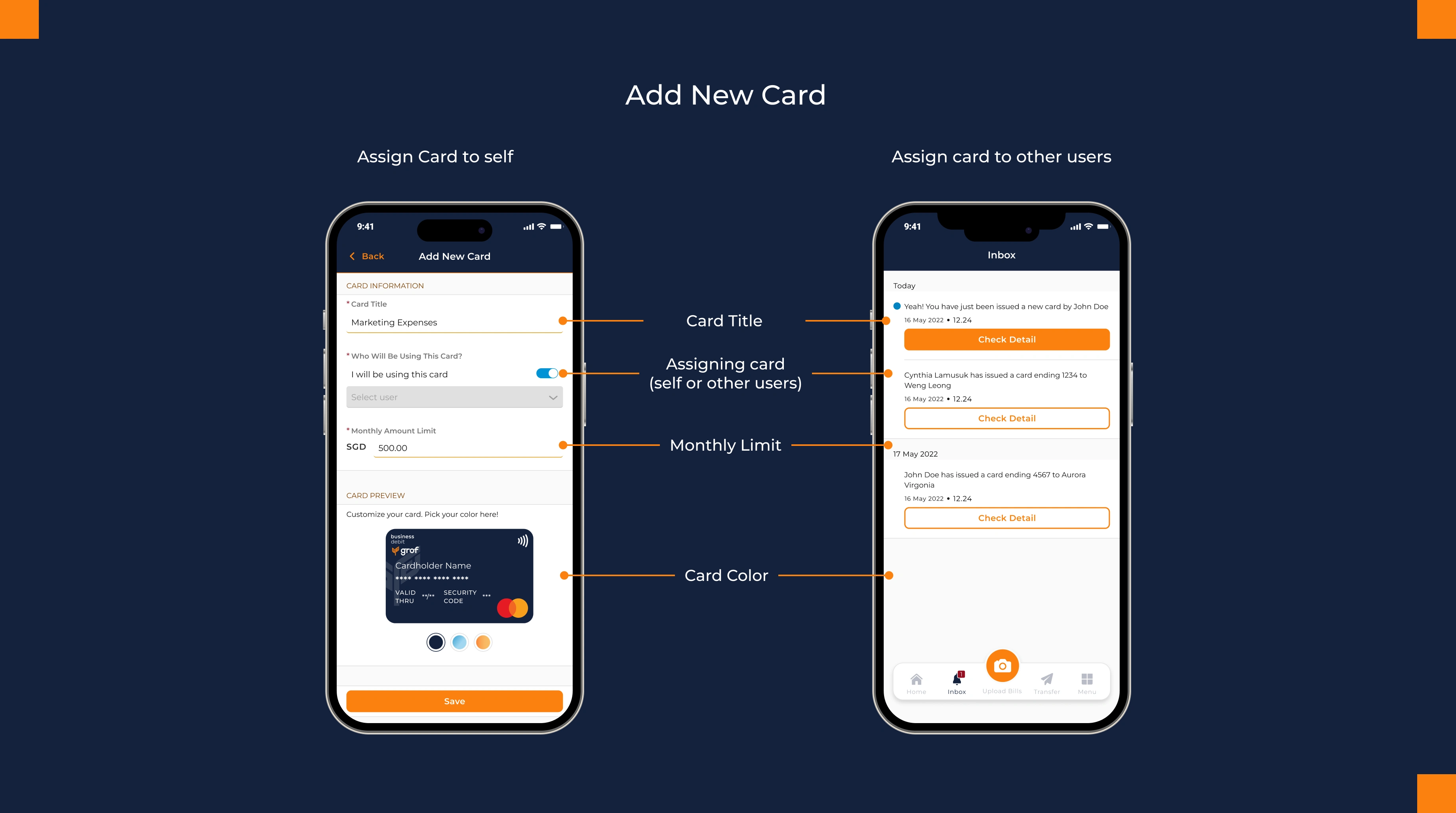
The flow guides users to fill:
Card Title – "Marketing Budget - Q1"
Assignment – Assign to self, existing team members, or invite new users
Monthly Spending Limit – Policy enforcement built in
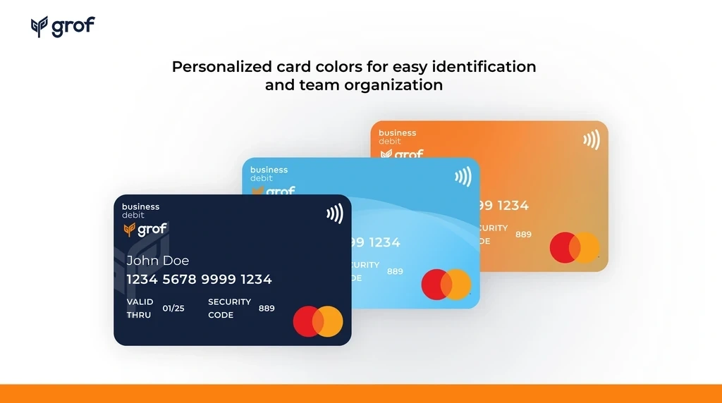
Card Color – Visual differentiation across the card portfolio
Once created, the card immediately appears in the card list, ready to use.
Digital Wallet Integration
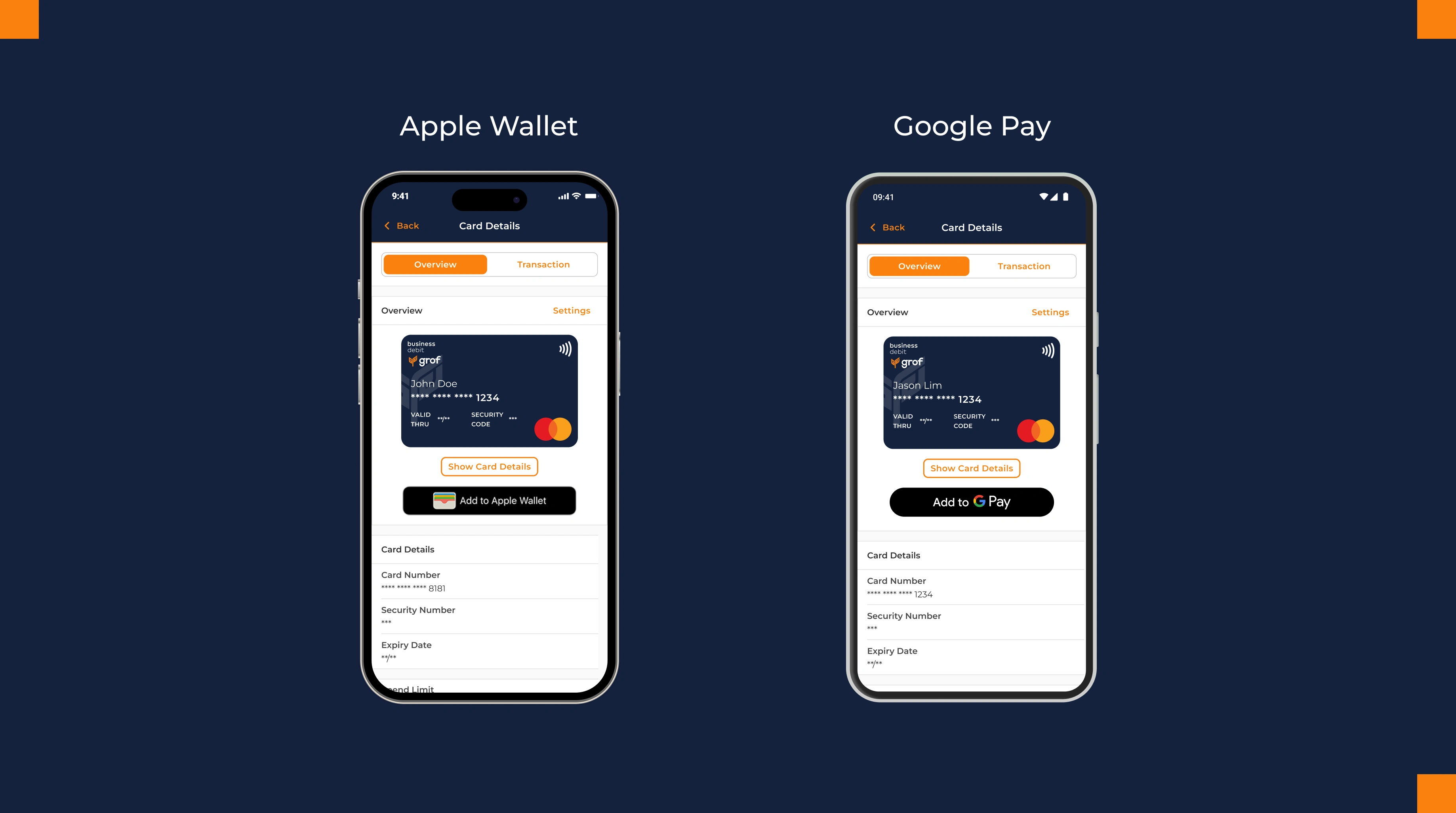
Users add their card to Apple Wallet or Google Pay directly from the detail page, following native platform conventions. This makes cards instantly usable for contactless payments without leaving the app.
The design respects existing user mental models rather than reinventing them—critical for financial products where consistency builds trust.
Card Customization & Ownership
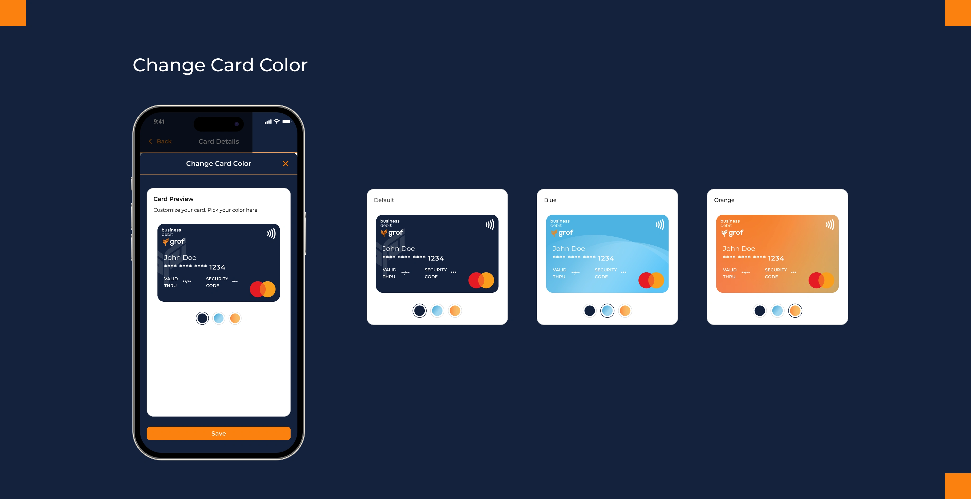
Users can change card colors. This small affordance serves dual purposes: it gives users a sense of ownership over their card, and it helps anyone managing multiple cards visually differentiate between them at a glance. Visual differentiation becomes functional design.
Impact on Existing Feature
Home Page Transaction Feed
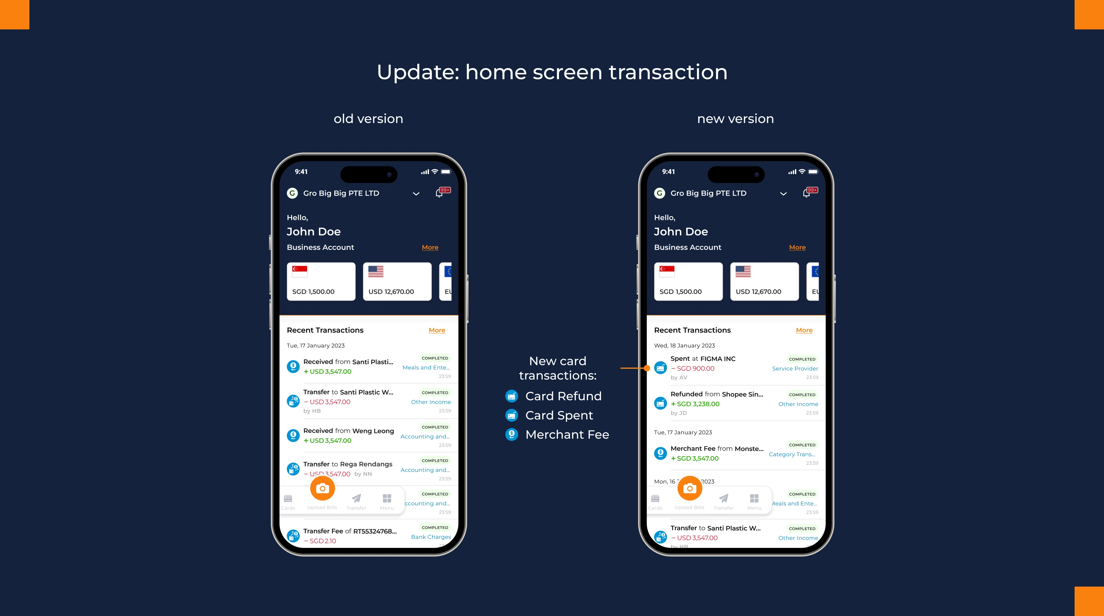
The home page transaction history now displays card spending alongside transfers. "Card Spent," "Card Refund," and "Merchant Fees" integrate into the existing feed, giving users a unified view of all account activity.
Notifications
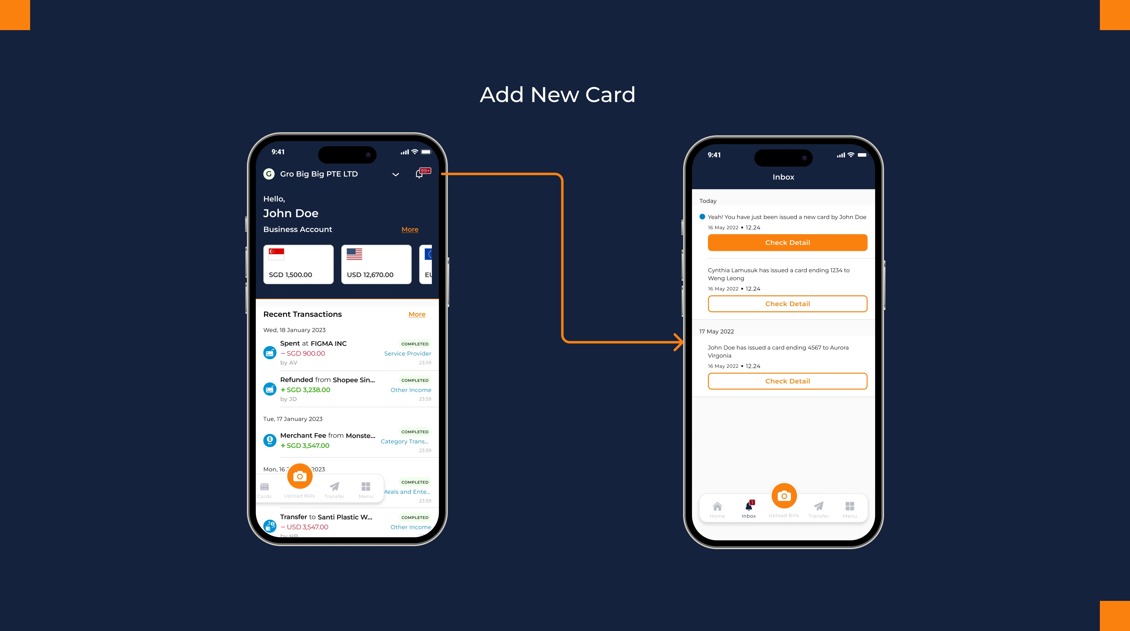
New card assignments, status changes, and spending limit adjustments trigger role-appropriate notifications, maintaining consistency with existing platform behavior.
Impact & Reflection
Why This Matters
This project demonstrates that good design for complex systems is about creating clarity through constraint. Idesigned a system that gave Grof a competitive advantage while making organizational controls feel natural to users.
The smaller details (color-coded progress, wallet integration, Copy All) work together to make the system feel intentional rather than assembled. Each decision serves the larger goal: making organizational controls feel natural and invisible.
Beyond the Feature:
The card I designed became the visual standard for how Grof represents financial products to users. It established a design language for clarity, control, and trust that extends across the platform. The design wasn't just functional; it became the product's signature.
By enabling teams to spend company funds directly with built-in approval workflows and role-based controls, the card feature transformed the Business Account from a holding account into a complete financial operations tool. This became a key selling point for the platform—companies could now see an integrated solution: receive funds, hold them, and operationalize spending with governance built in.
Like this project
Posted Jan 21, 2026
Developed an adaptive card management interface for Grof's business accounts.
Likes
0
Views
18