Financial Planning Through Hands-On Experience
Handaru
Financial Planning Through Hands-On Experience
Role
UI/UX Designer, UX Research
Industry
Fintech
Timeline
1 month, 2025
Prompt
Pittoy is a financial application built on the principles of wealth management with a mission to make financial education accessible and actionable. Rather than offering theory alone, it emphasizes hands-on learning — helping users record income and expenses, set budgets based on their income, plan allocations effectively, and review progress through simple, meaningful reports.
Many financial apps stop at basic logging, leaving users without context or a clear sense of purpose. In designing Pittoy, I focused on the experience before and after the act of recording: guiding users to see how their bookkeeping connects to personalized plans and visualizing how each decision contributes to long-term outcomes.
This gap meant companies couldn't enforce spending policies at the system level. Compliance controls happened outside the platform—or not at all. I recognized this wasn't just a feature gap; it was a genuine market opportunity. By building approval workflows and role-based access, Grof could offer controls that competitors didn't have, which is a defensible advantage for companies with compliance requirements.
Objective
Transform bookkeeping into a learning experience by uniting budgeting, tracking, and evaluation in one hub—helping users understand the 'why' behind their spending and make informed financial decisions
This way, bookkeeping is no longer just a routine activity; it becomes a learning experience that helps users gain a deeper understanding of their overall financial situation.
Challenges
How might we help users easily set up and manage their own financial planning as a form of hands-on learning?
How might we provide clear visibility into users' financial health and spending patterns?
How might enable users to track and understand how their spending aligns with their budget goals?
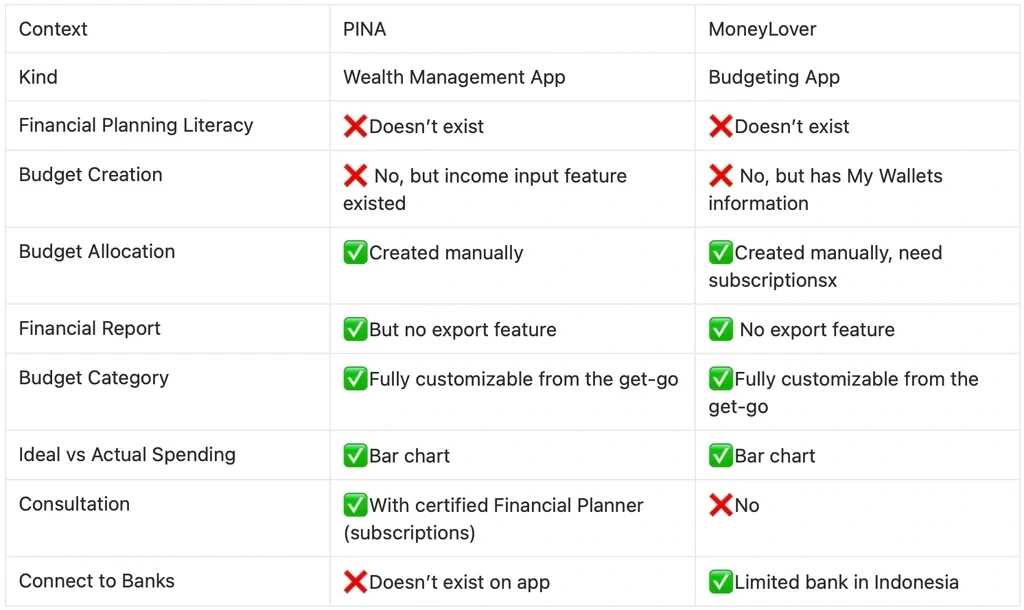
Competitive Benchmarking
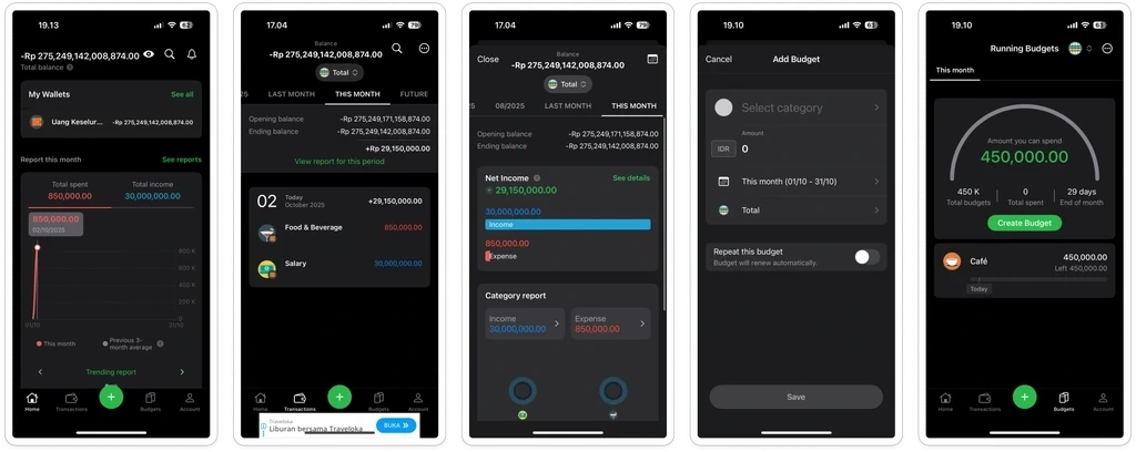
MoneyLover
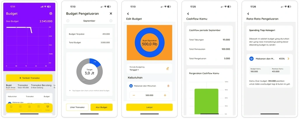
PINA
Based on quick analysis on the feature, we can conclude that:
Both PINA and MoneyLover rely on manual budget allocation - opportunity to differentiate with automated allocation based on salary input. User need to subscribe in MoneyLover f they want to add more than one budget.
Neither competitor integrates financial literacy within their planning flow, creating space for education-driven approach
Current players lack financial report export capabilities, presenting opportunity for comprehensive evaluation and export features
PINA targets premium wealth management, while MoneyLover serves mass budgeting needs - potential to capture middle segment seeking intelligent automation without premium consultation costs
Key Design Decision
Bookkeeping integration with budget tracking
Users can connect planned budgets with actual transactions, with visual comparisons of budget vs. spending that help them understand their financial behavior in real-time.
Monthly evaluation overview with export capability
Users access a visual overview of their budget performance and can export reports for personal records, enabling ongoing financial reflection.
A dedicated Financial Planning feature
This menu introduces a guided onboarding flow where users input their income, learn budgeting basics, and view personalized allocations—making financial planning setup intuitive and educational.
Final Design
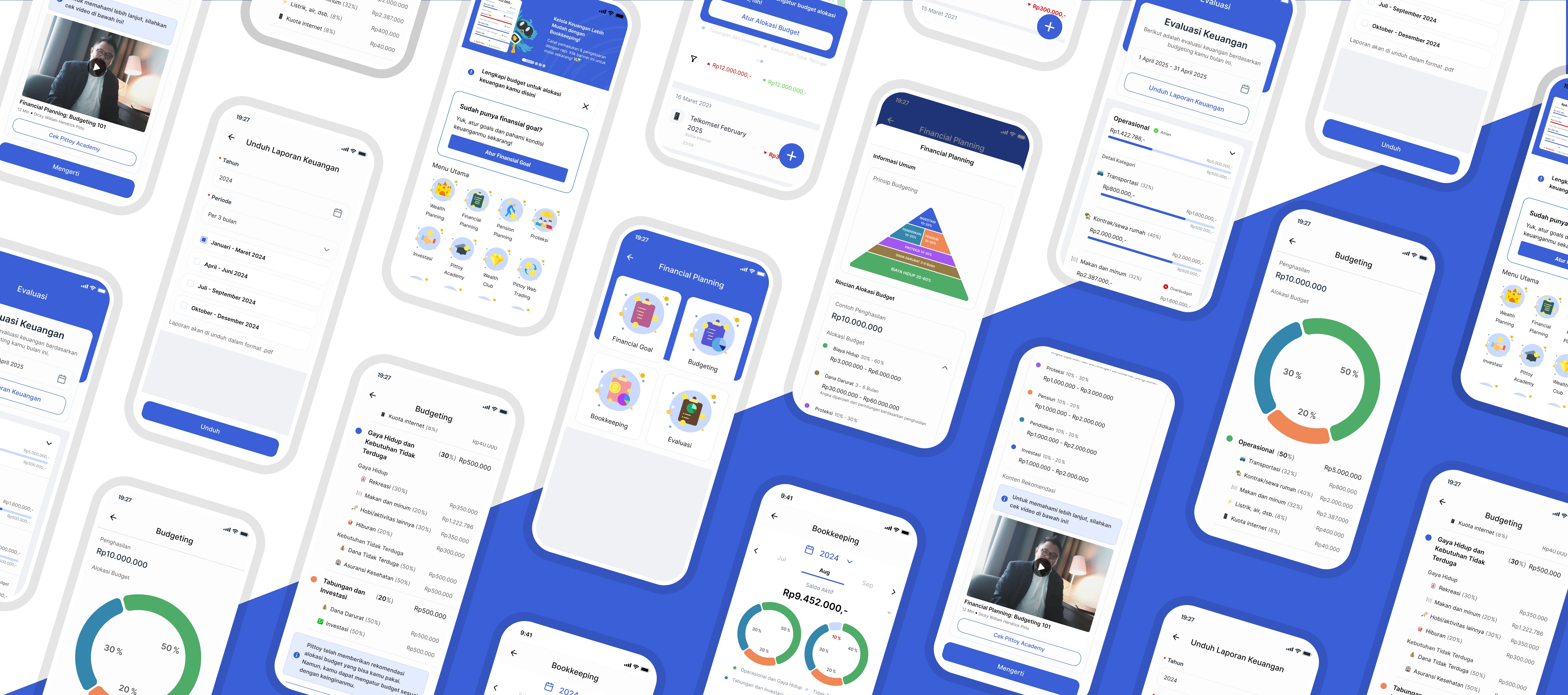
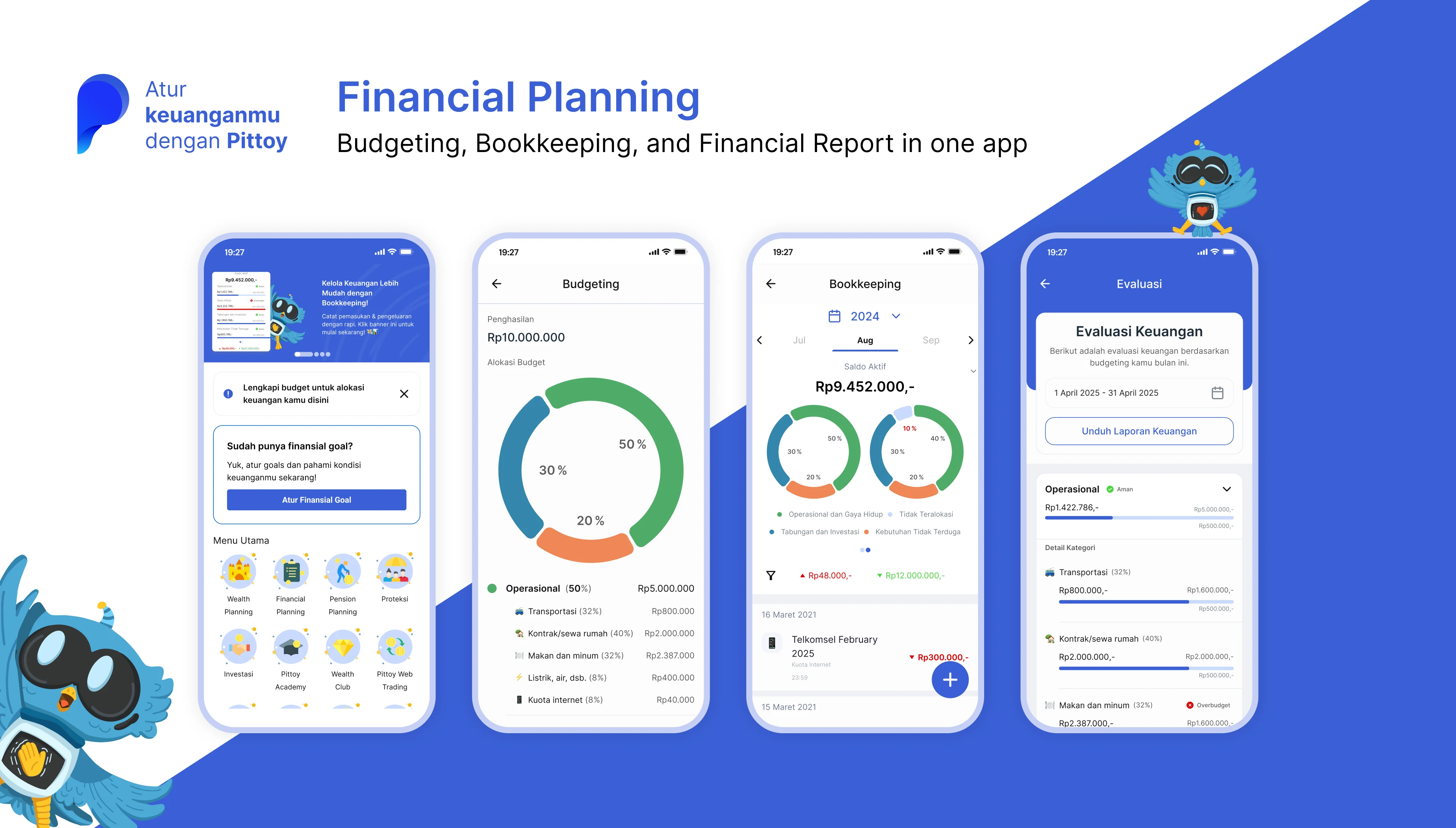
Onboarding for Financial Planning
First-time users see a welcome screen that explains budgeting basics through simple, real-world examples.
The screen shows:
Income section – add your monthly income
Budget suggestions – see how to divide your money effectively
Extra learning – links to helpful articles in Pittoy Academy
This introduction makes financial planning less intimidating and helps users understand the basics before they start creating their own budget.
If user proceed, they will be directed to page where they can input new budget.
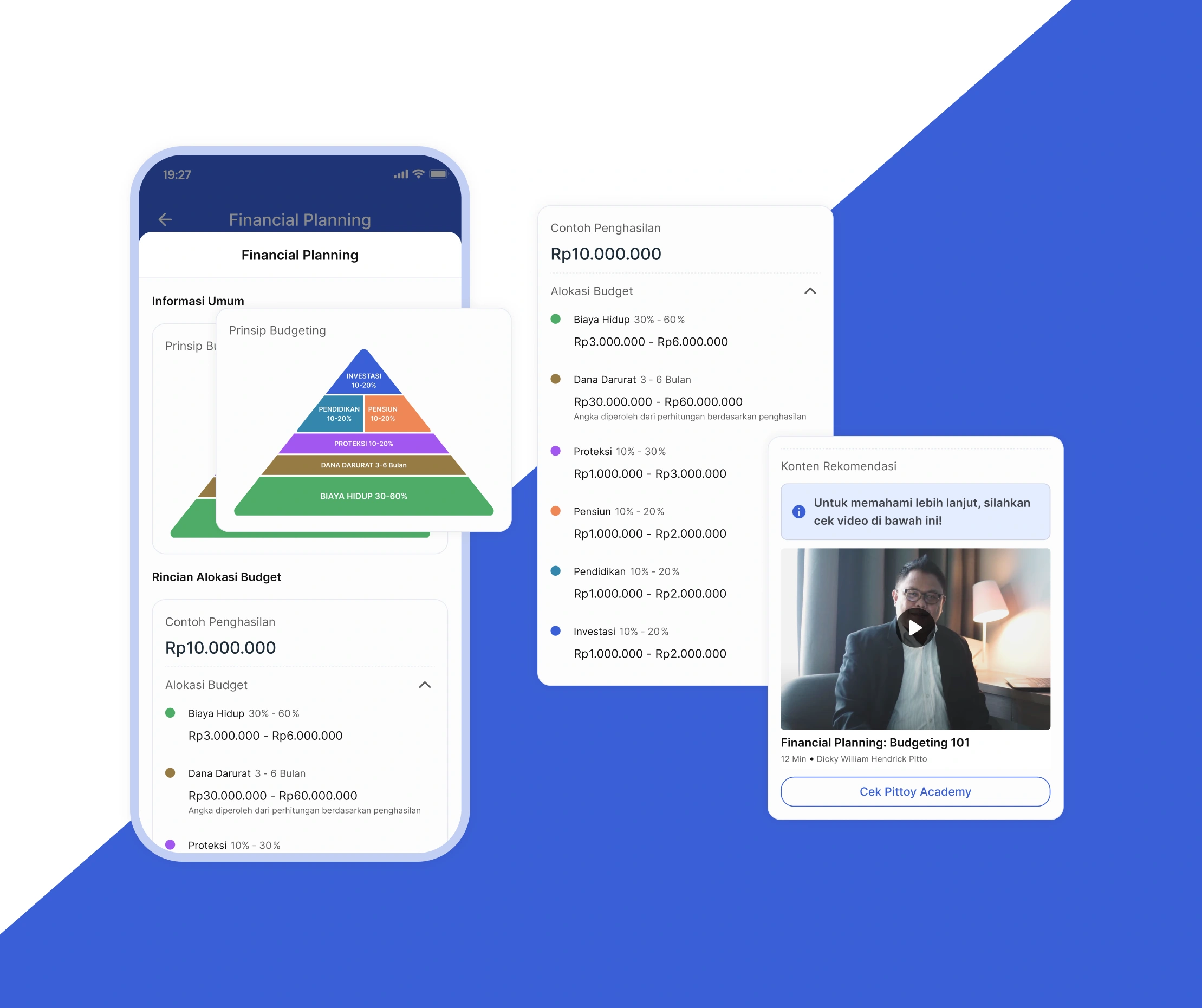
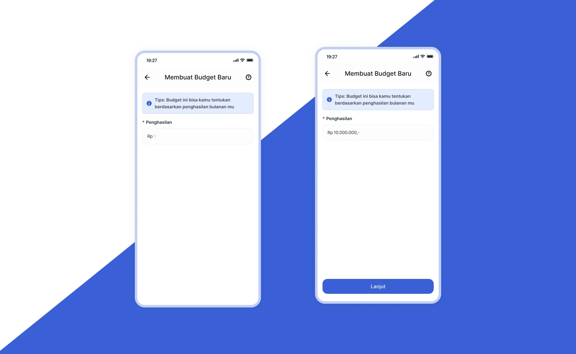
Budget Input
Users start by filling in their monthly income (currently in IDR). After entering their income, they move to a confirmation page where they can review the details before moving forward.
Budget Confirmation
The confirmation page mirrors the onboarding layout, but now displays personalized budget allocations based on the user's actual income input.
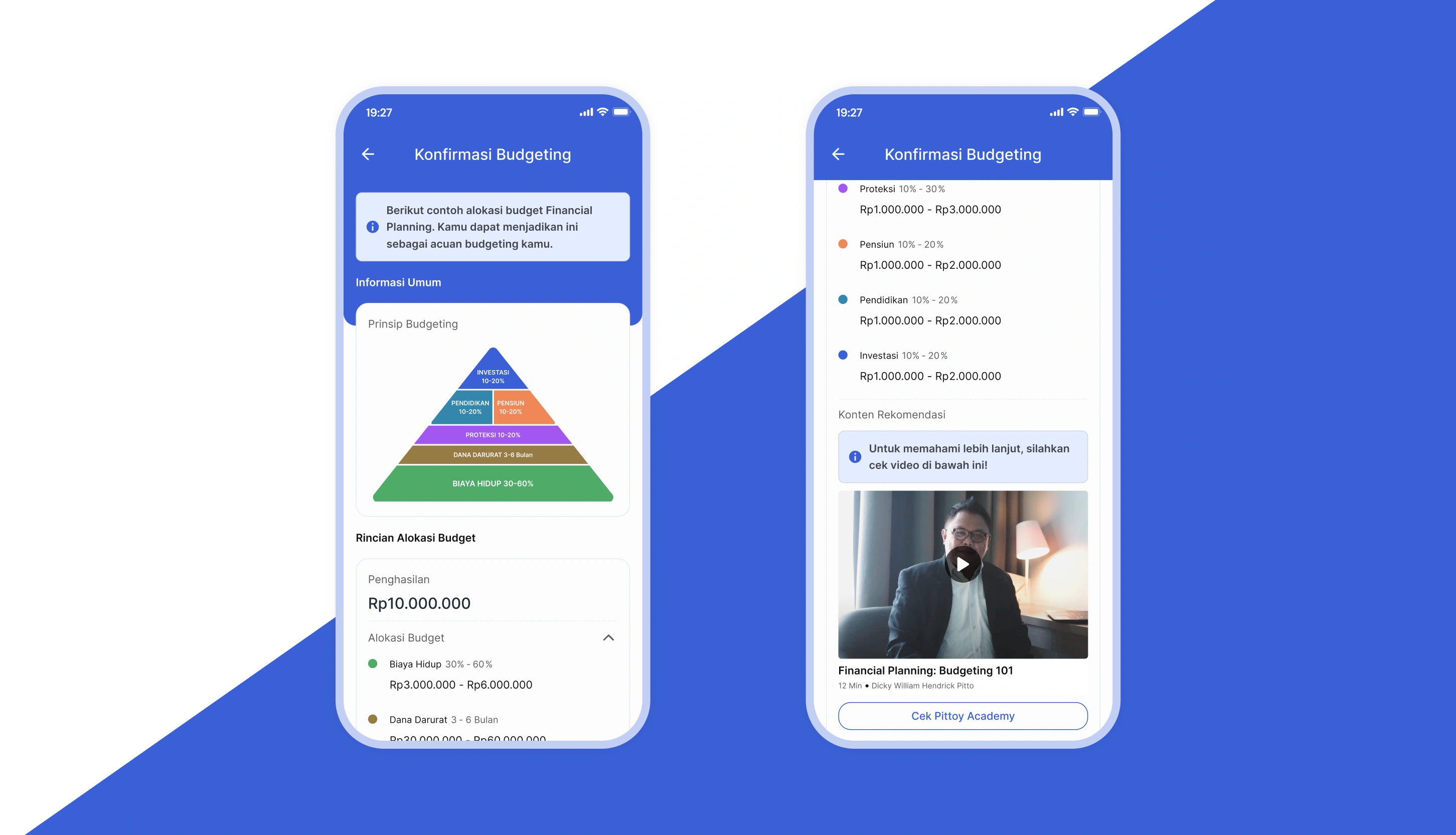
At the top, users see a budgeting pyramid that visualizes financial priorities. The pyramid emphasizes that living expenses (biaya hidup) form the foundation of financial stability—helping users understand that if following the full budget feels overwhelming at first, they can start by prioritizing just the essentials.
Each budget category is color-coded to match the pyramid and shows both a percentage range and amount range (e.g., 50-60% or Rp 3,000,000 - 6,000,000). This flexibility lets users adjust allocations to fit their comfort level while staying within recommended guidelines.
Once confirmed, the budget is saved and users proceed to the main budgeting dashboard.
Budgeting Overview
On this page, users see their complete budget allocation broken down by category.
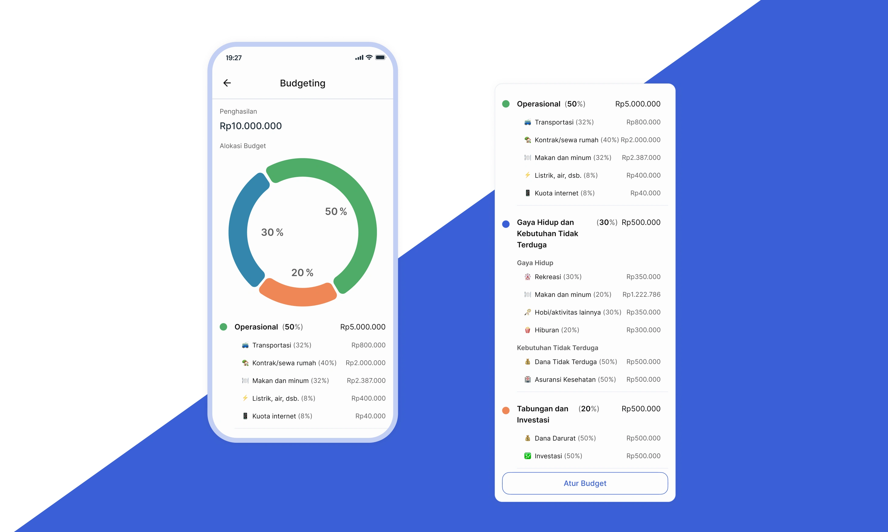
Categories are currently predefined by Pittoy based on financial best practices, ensuring users have a solid starting framework. (In future releases, users will be able to customize these categories themselves.)
Each category group is visualized with a pie chart for quick understanding. Below each chart, users can view:
Individual subcategories within that group
Recommended allocation amounts for each subcategory
Users can adjust their entire budget by updating their income, which automatically recalculates all allocations.
Once the budget is set, users can track their actual spending through the existing Bookkeeping feature. Transactions are automatically mapped to budget categories, with real-time progress visible in both Bookkeeping and the Evaluation page.
Evaluation
Users can access the evaluation menu to review their financial performance and see how their spending compares to their budget.
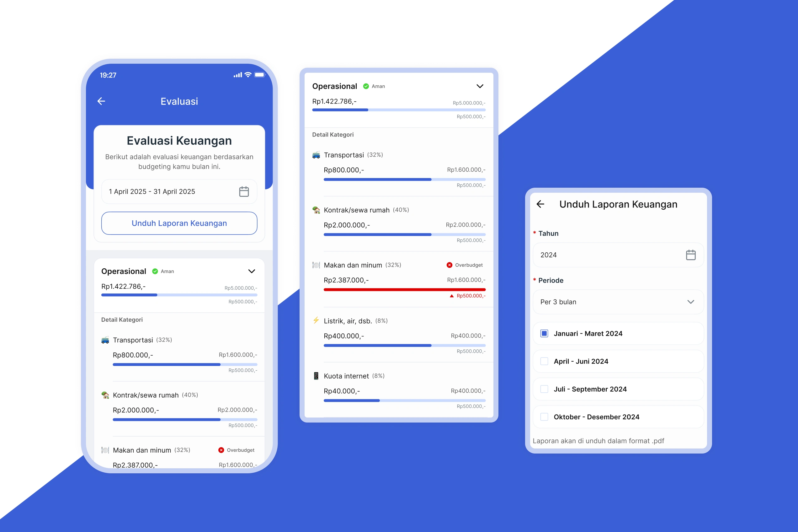
Spending Overview:
The page shows spending by category group with total amounts for the selected time period. Each category displays a status indicator:
"Aman" (Safe) – green chip and standard progress bar when within budget
"Overbudget" – red chip and red progress bar as a warning when limits are exceeded
These status indicators appear at both the category group and subcategory levels, giving users clear visibility into their spending patterns.
Export Options:
Users can export financial reports filtered by year and time period—choosing from yearly, 6-month, 3-month, or monthly views.
Impact on existing feature
Unified Financial Planning Hub
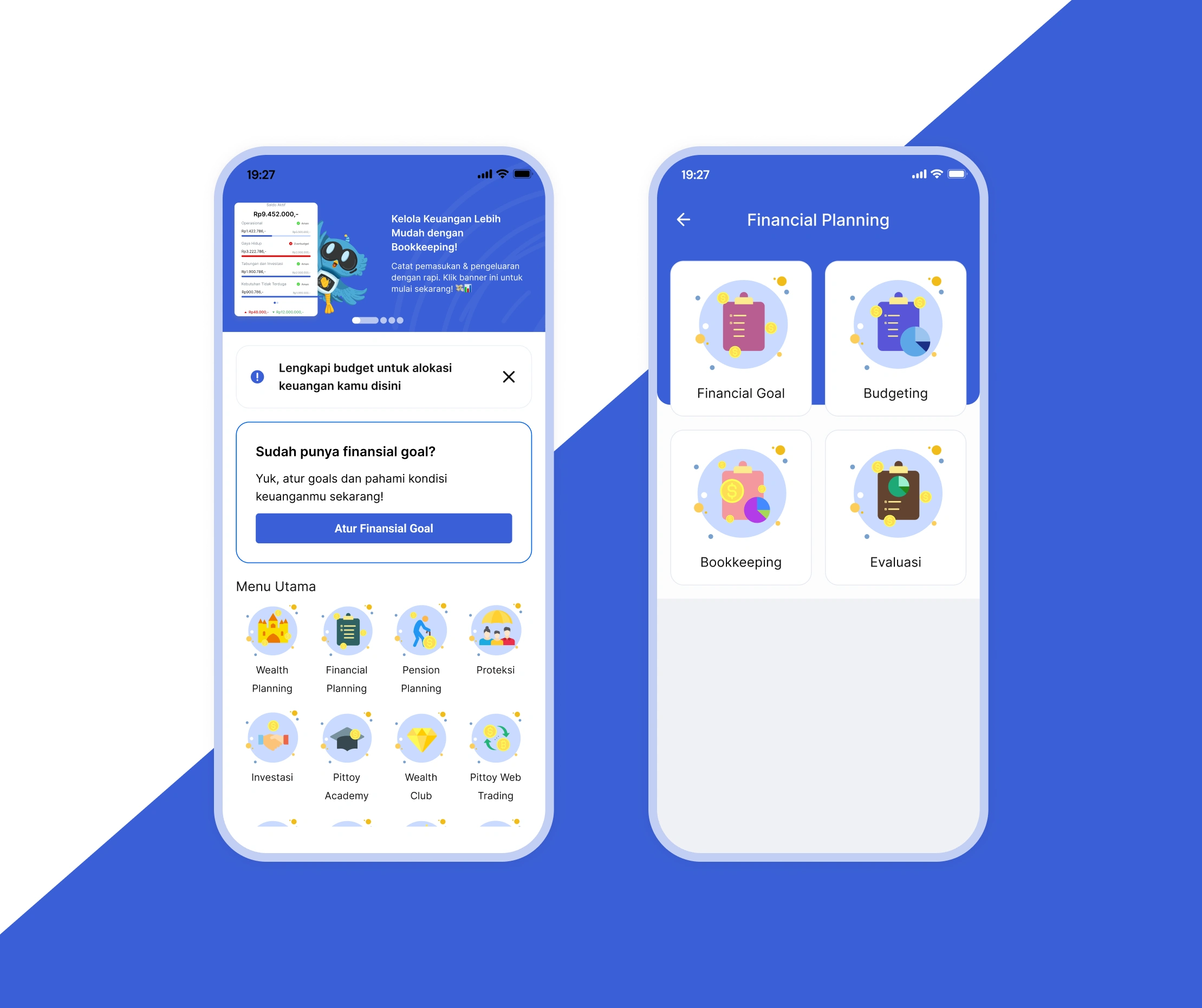
A new Financial Planning menu now appears on the home screen, consolidating budgeting, monitoring, and evaluation features in one accessible location. This reduces navigation complexity and provides users with a centralized hub for managing their financial planning journey—eliminating the need to search across multiple sections.
Enhanced Bookkeeping with Budget Tracking
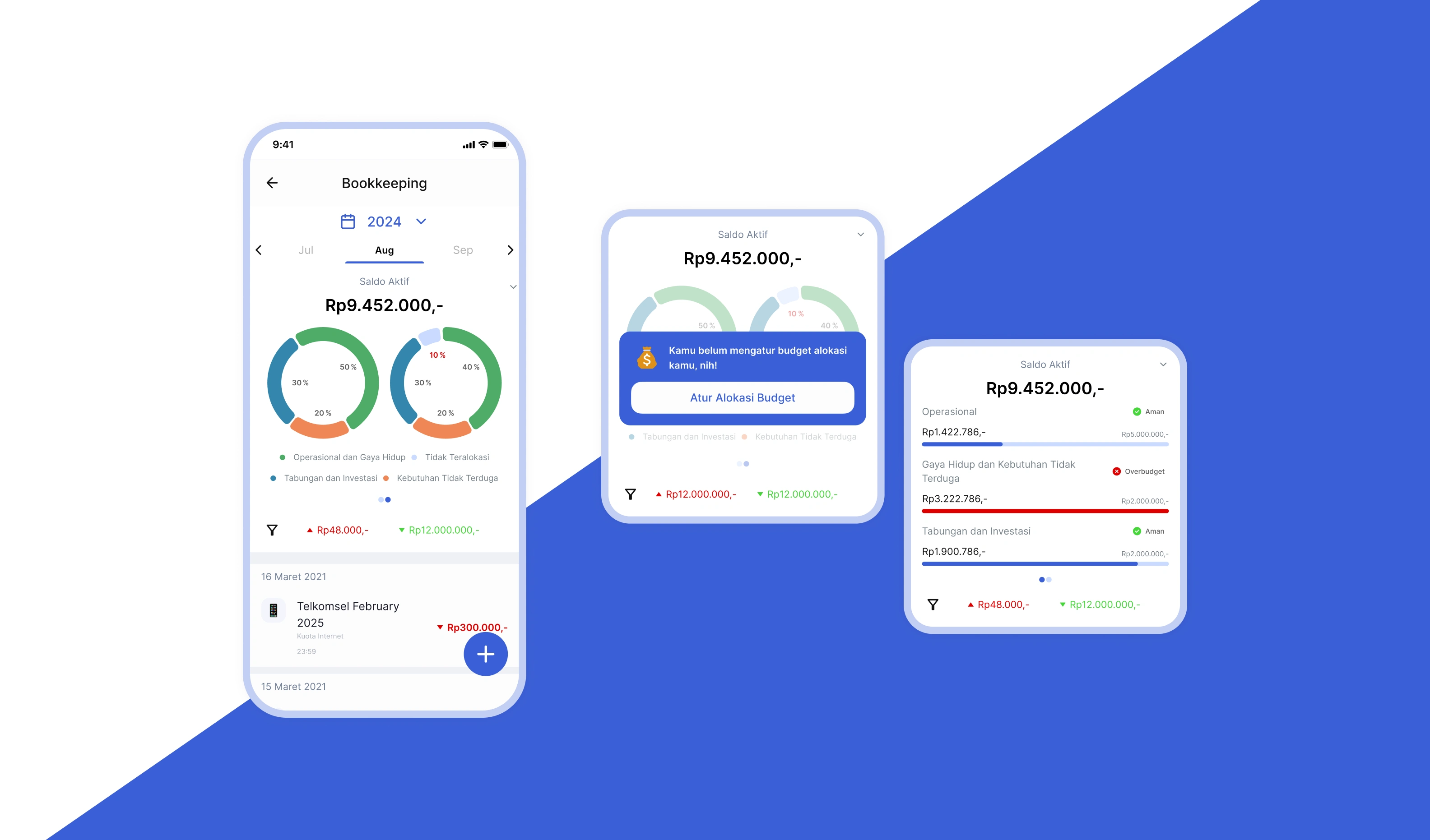
The Bookkeeping feature has been upgraded to connect seamlessly with Financial Planning, transforming transaction logging into active budget monitoring:
Budget vs. actual visualization: Users now see pie charts and visual comparisons showing their spending against budget allocations for each category directly on the Bookkeeping page
Aligned categorization: Category groups now follow Pittoy's standardized budget categories for consistency, while subcategories remain flexible to preserve users' existing organization
Mandatory budget setup: Users without an active Financial Planning budget will encounter a modal prompting them to create one before logging transactions—ensuring every expense can be tracked meaningfully
Real-time evaluation sync: All expense inputs automatically update the evaluation dashboard, with changes reflected in the pie chart and spending status indicators
What do we learn in designing this

Balancing financial education with practical flexibility
Teaching financial literacy through design is inherently challenging—it's rooted in hands-on practice, yet implementation must remain flexible. While users need to understand foundational principles (like prioritizing living expenses), they shouldn't feel locked into rigid rules. Some users may find this balance confusing at first, but that's precisely why the educational layer exists. The design challenge was creating guardrails that guide without restricting, allowing users to learn through doing while maintaining room for personal adaptation.
Designing under time constraints reveals opportunities for iteration
Working within a short timeline meant shipping a strong foundation while identifying clear next steps:
Custom budget allocation: Users should eventually define their own budget breakdowns. This would represent a "leveling up" moment—moving from guided recommendations to personalized financial management as their understanding deepens. This progression mirrors natural financial literacy development.
From menu to dashboard: The Financial Planning menu could evolve into an interactive overview widget on the home screen, giving users instant visibility into their financial health without multiple taps. However, this requires deeper research into usage patterns and information hierarchy—understanding how users engage with the app and what insights they need most frequently. Research first, then design.
Like this project
Posted Jan 21, 2026
Designed Pittoy, a fintech app emphasizing hands-on financial education and user-friendly budgeting.
Likes
0
Views
4
Timeline
Apr 1, 2025 - May 31, 2025