HEADSPACE
A LETTER TO HEADSPACE
How a closer look at your UI could benefit your beautiful mission
Dear Headspace,
While I was walking further down my path of the Ironhack UX/UI Design bootcamp ’23 I thought of you when I faced a new challenge which focused on the visual redesign of a popular and well-loved app.
As a human being who strives to merge intertwined spheres to create innovative digital solutions in mental healthcare I was very excited to take you with me on my journey and with this letter I’d like to tell you about the fruits of our collaboration.
THE DEEP DIVE
Before revealing my recommendations for improving the overall experience of your valuable users that strive to create a blossoming version of themselves by being interested in mindfulness, overall personal progress and ultimately the depths of their being I want to guide you through my conducted heuristic evaluation to give you an opportunity to see your interface through my eyes.
As you probably already assume I ulilized the paradigm and usability engineering method of the Nielsen Norman Group as a oxygen tank in my deep dive into your first-glance-structure. It presented a profound set of evaluators for the examination of your interface and judgement of its compliance with recognized usability principles.
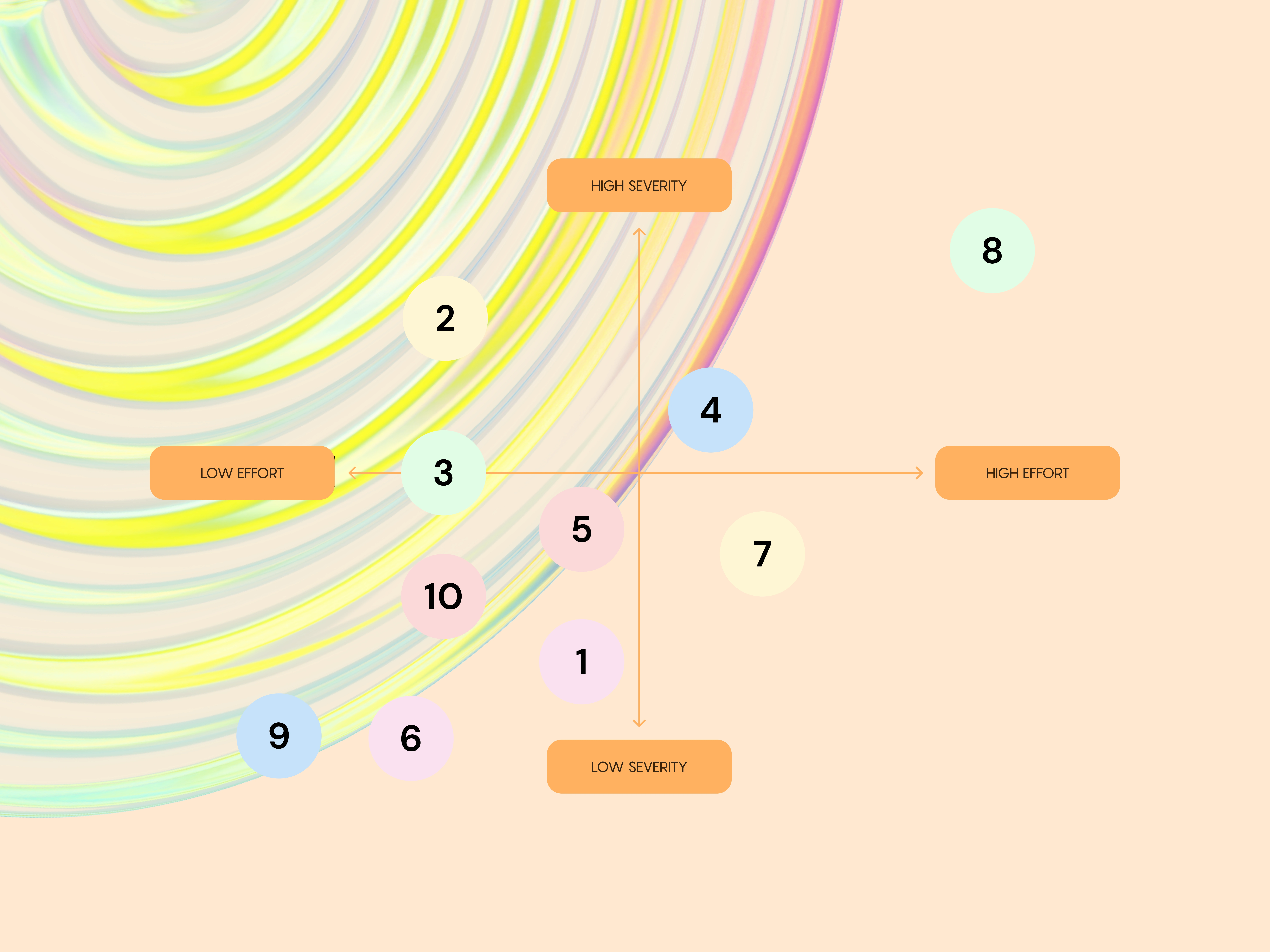
Instead of applying the set onto every facet of your application I refined my overall project scope by focusing on the screens that generate the most traffic and offer me a suitable basis to exemplify our possible extensive interchange [UX-wise]. After organizing the chosen sub-paths and organizing them strategically via their individual heuristical assignment I decided to scrap the usual systematic severity rating because I strived to provide you with an insight into my capacities and willingness to honor your product by optimizing every single one of my discoveries.
THE FIRST TREASURE
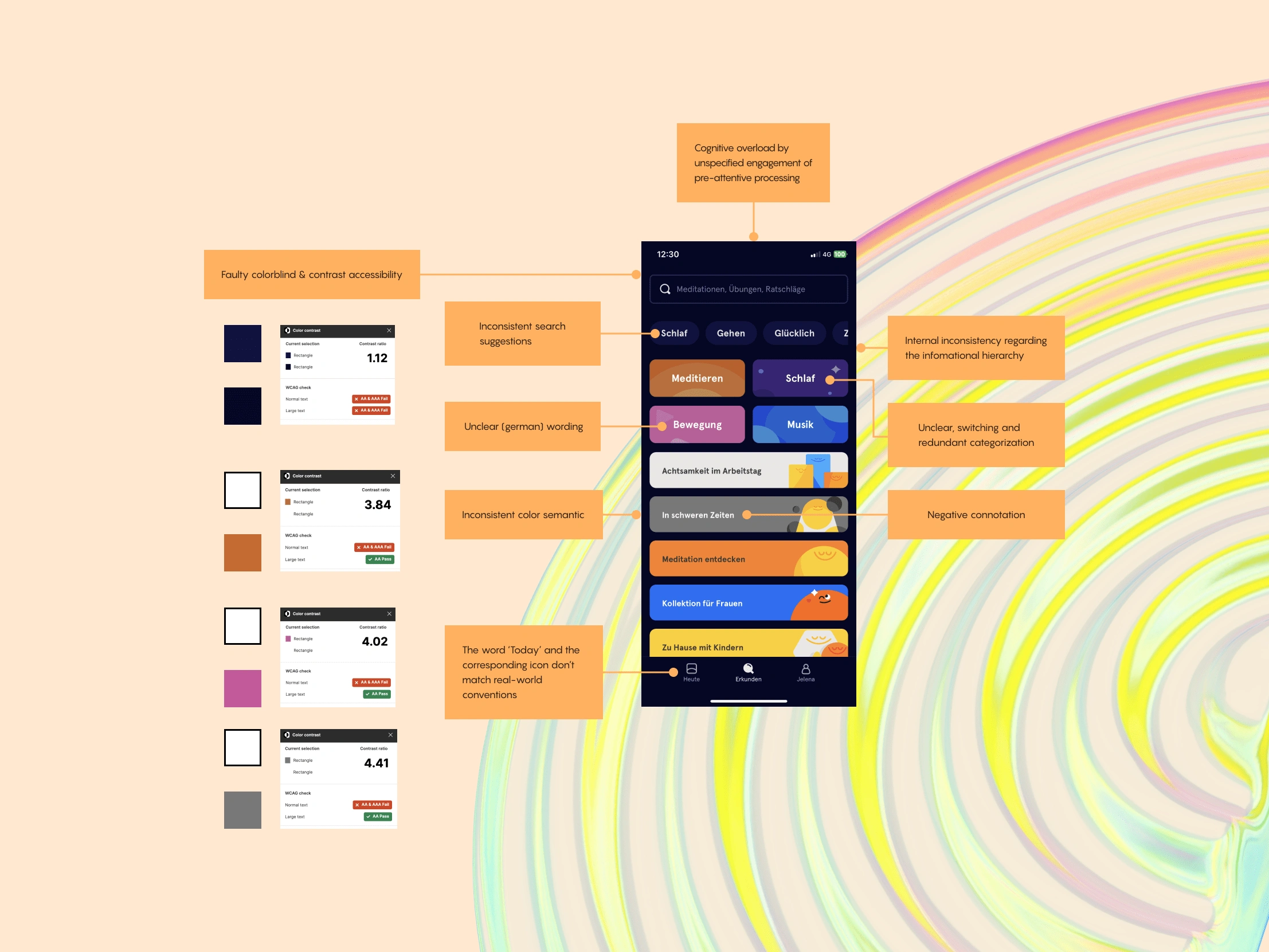
As you can tell I thoroughly dissected your Today-screen and (appreciatively) analyzed and evaluated the most critical parts while letting my cognition and instinct go hand in hand.
At this point I already have to spoiler the main conclusion: the chosen treasure revealed a definitive cognitive overload by unspecified engagement of preattentive processing which outlines the users’ subconscious accumulation of information from the environment before the consciously pay attention to (turning the sensation into cognitive bits in the form of linguistic knowledge for example). Tied to the eight heuristic named Aesthetic and minimalist design I solved this puzzle by using colors judiciously — where they are relevant but not where they aren’t — and ironed out the faulty contrast accessibility.
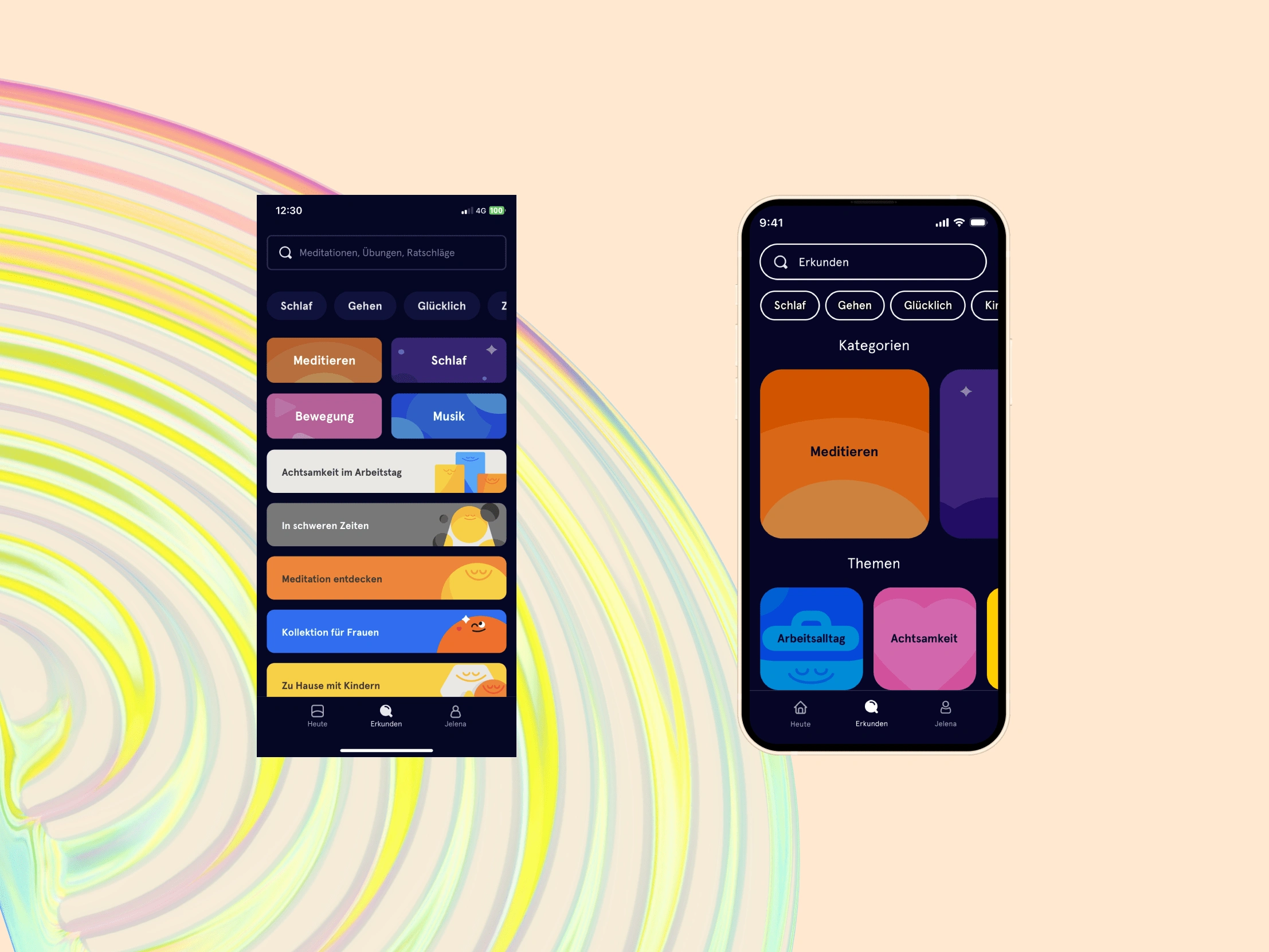
By dividing your extensive content offer into the two compartmentalizing sections categories and topics and changing their color scheme to avoid semantic problems and negative connotations I tackled the internal inconsistency regarding the informational hierarchy which violated the heuristic Consistency and standards.
The minimal change within the interplay between the word ‘Today’ and the corresponding icon which prior didn’t match real-world conventions respected the second item of the paradigm.
THE SECOND TREASURE
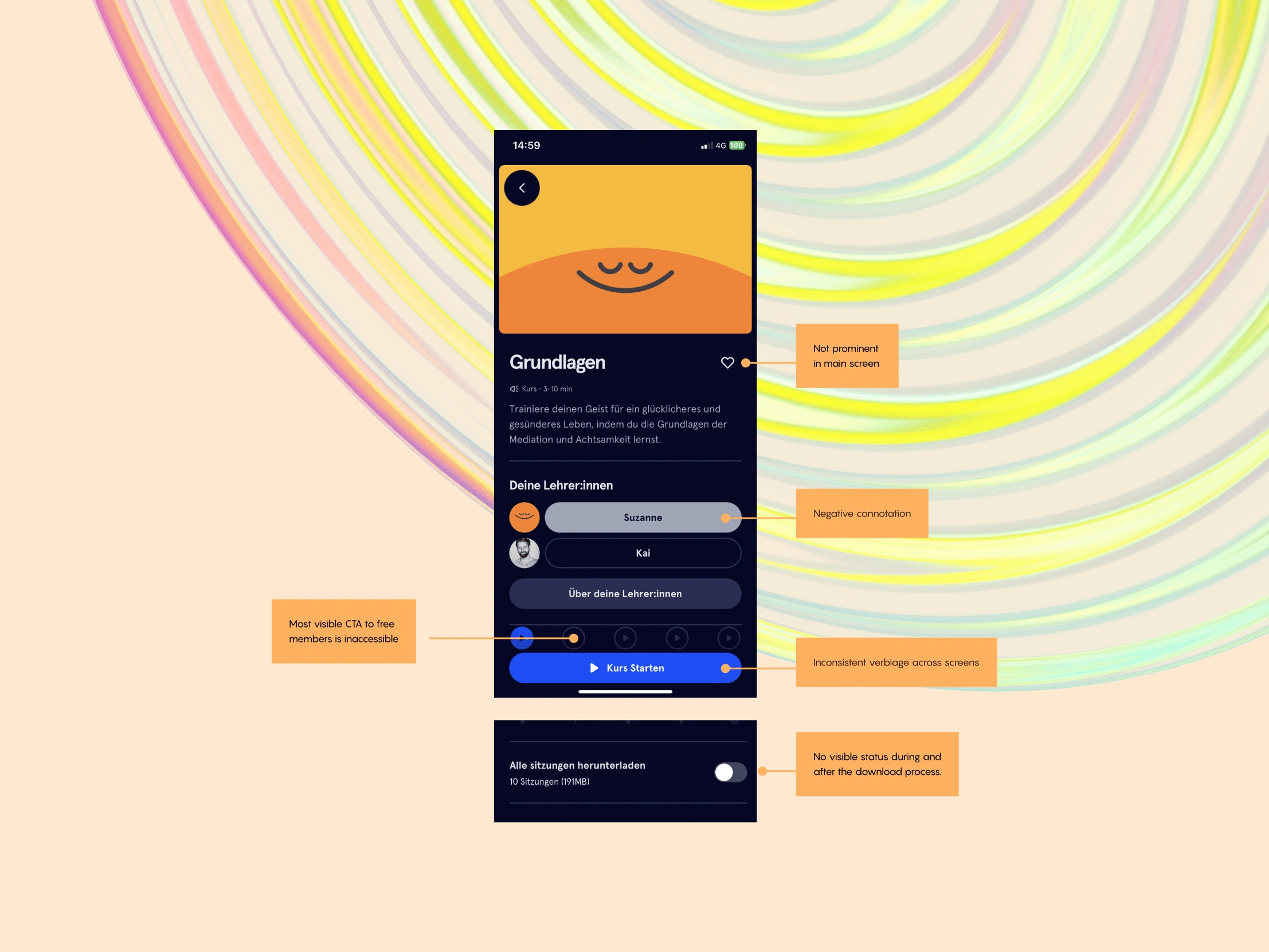
Shortly after resolving the first screen’s mainly aesthetic-bound usability issues I encountered similar hurdles within the Meditation-section.
Again referring to the heuristic Consistency and standards I highlighted the color-connotation-issue and the composition of the content-play-button which is intertwined within the nature of most of your user flow — a constant which I will soon refer back to.
Guided by the principle of Visibility of system status I sketched the recommendation of a download indicator bar that would convey the download status to your users to prevent the problem potential of accidental data overages or incomplete downloads if they intend to download content only over Wi-Fi.
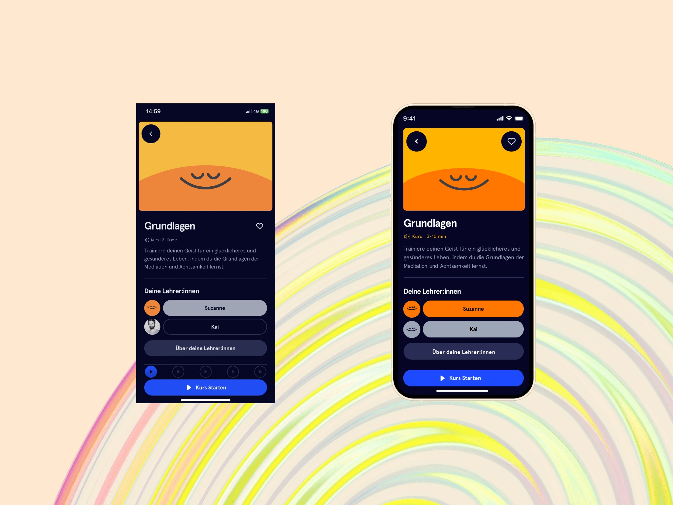
Regarding the overarching aspect of Flexibility and efficiency of use I repositioned the favorite-button to appear more prominent in order to set a cue for the users’ digital muscle memory and formulated an extensive section about the lacking visability of the content-CTA’s to free members because of their inaccessiblity and inbound potential to mark an area where your users would drop off which could be prevented by to allowing the free users the flexibility to tailor their experience and hide unusable content before entering the paywall. Regardless of respectfully understanding the business incentive here I saved this one for the last part of this letter.
THE THIRD TREASURE
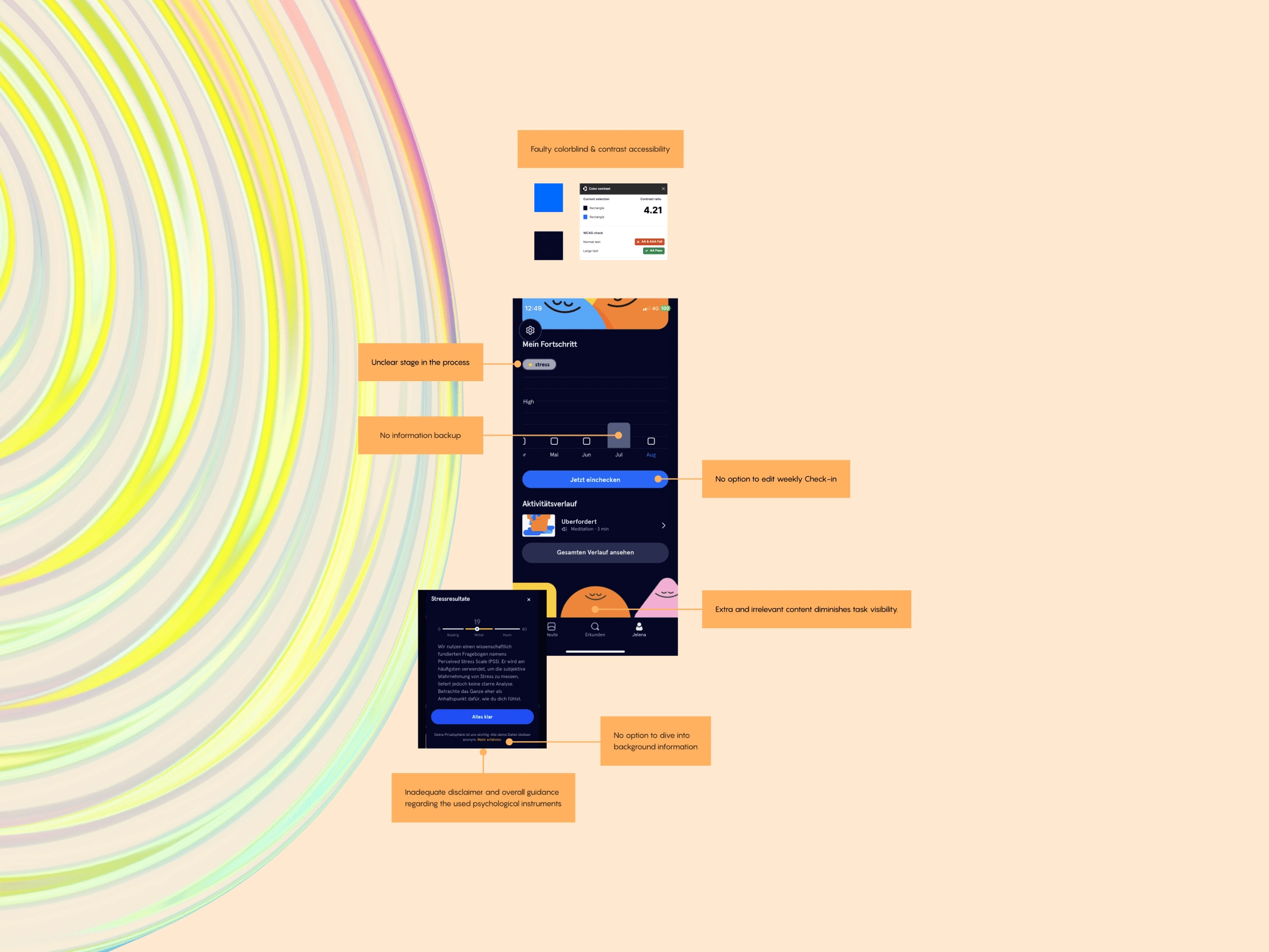
Lastly I want to guide you trough the discoveries within the profile-module which again revealed a broader optimizable pattern.
After I solved the seemingly simple problem of an unclear system status regarding your users’ progress related to their ‘stress level’ I followed my gut tied to my psychological expertise and dug deeper into the complex context of the inadequate disclaimer and overall guidance regarding the used psychological instrument (and further efforts in the sphere of clinical diagnostics). Although at the moment you don’t offer a clear and easily accessible information backup I discovered your long-term research into your role as a self-help mindfulness course for depression and would strongly encourage you to simply add a short disclaimer regarding that the habit of the self-assessment should not be used as a substitute for professional treatment or advice and hightlight the study’s achievements tied to the blended nature of the intervention.
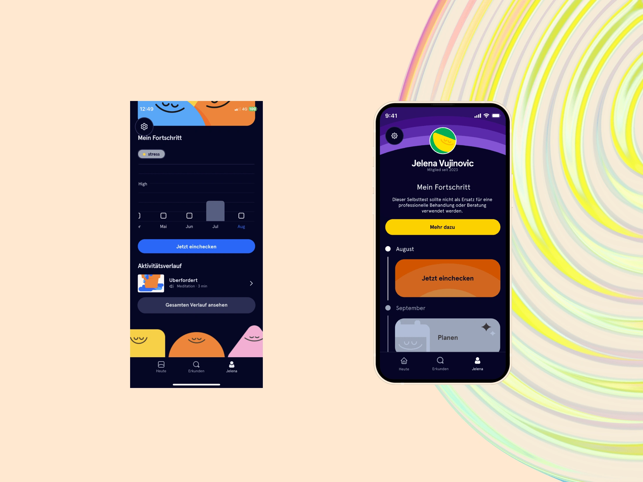
Rounding off the last section I removed the extra and irrelevant content to enhance the task visibility as well as creating the Check-in-sections in a way for your users to gain the option to edit their submitted information afterhand to respect the fifth heuristic named Error prevention.
THE FAREWELL
As you hopefully experienced, Headspace, I tried to guide you through my journey of the exploration of your interface the same cherished way as you offer a helping hand to your user base.
Parallel to keeping the focus on enhancing your overall usability by identifing common / uncommon challenges and creating elevating solutions I created a set of further recommendations regarding your flow viewed from a more holistic viewpoint which I wasn’t able to include into this letter due to the project’s contraints — nevertheless I already teasered I’d gladly introduce you to the rest of the action recommendations if you’re up for it.
Anyways, I hope you never stop to strive for excellence and better yourself for the sake of your company and the people you enrich with your impressive mission.
Kind regards,
Jelena Vujinović
Like this project
Posted Oct 29, 2023
A letter to emphasize how a closer look at the application's UI could benefit its beautiful mission
Likes
0
Views
28
Clients

Headspace
Ironhack


