Hero Redesign for NYSS
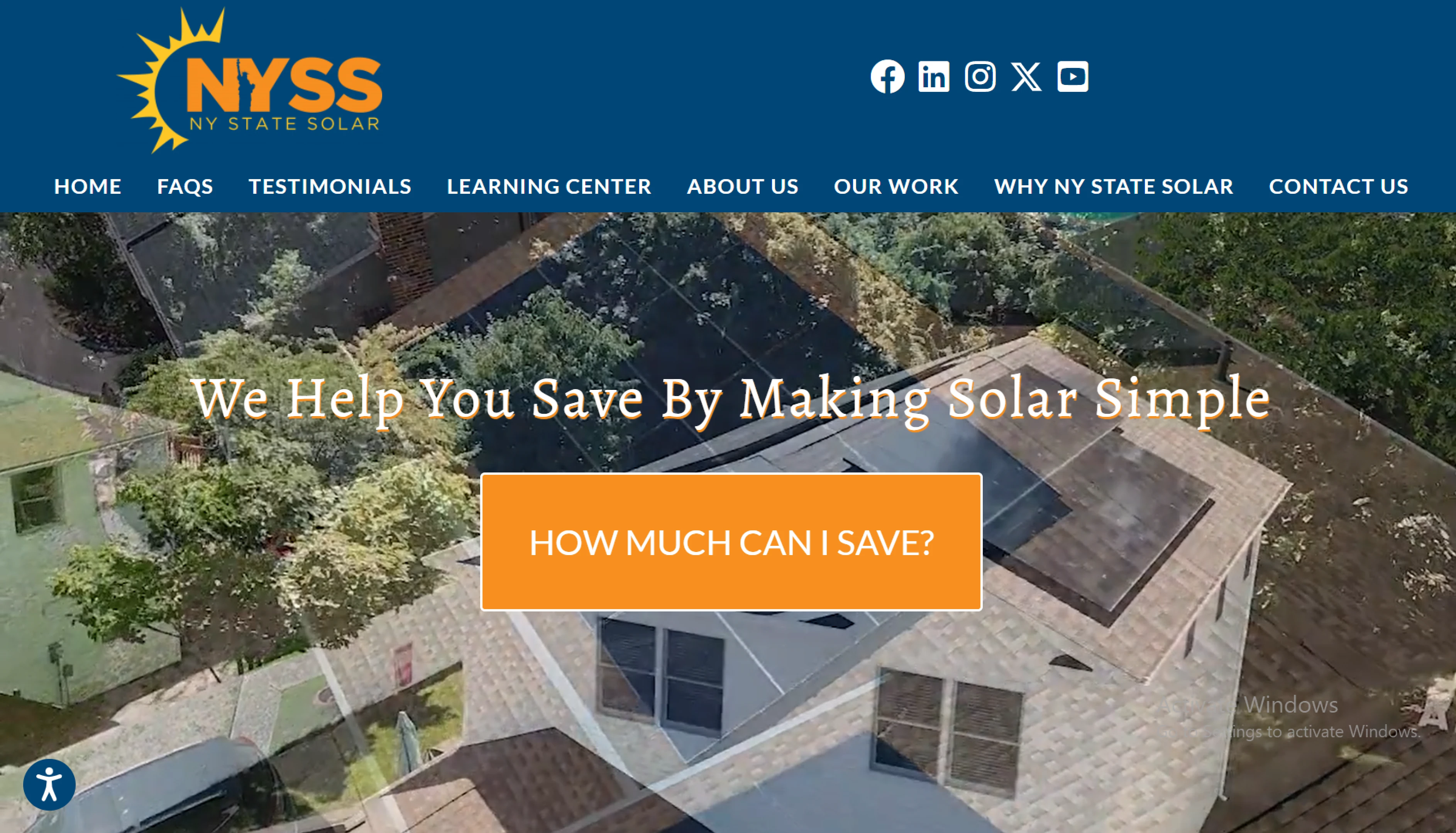
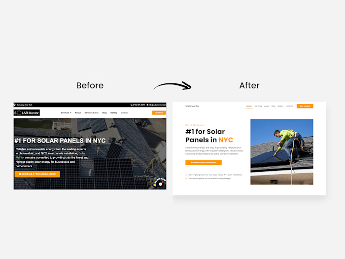
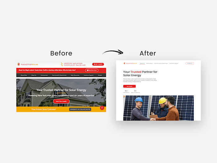
The old design
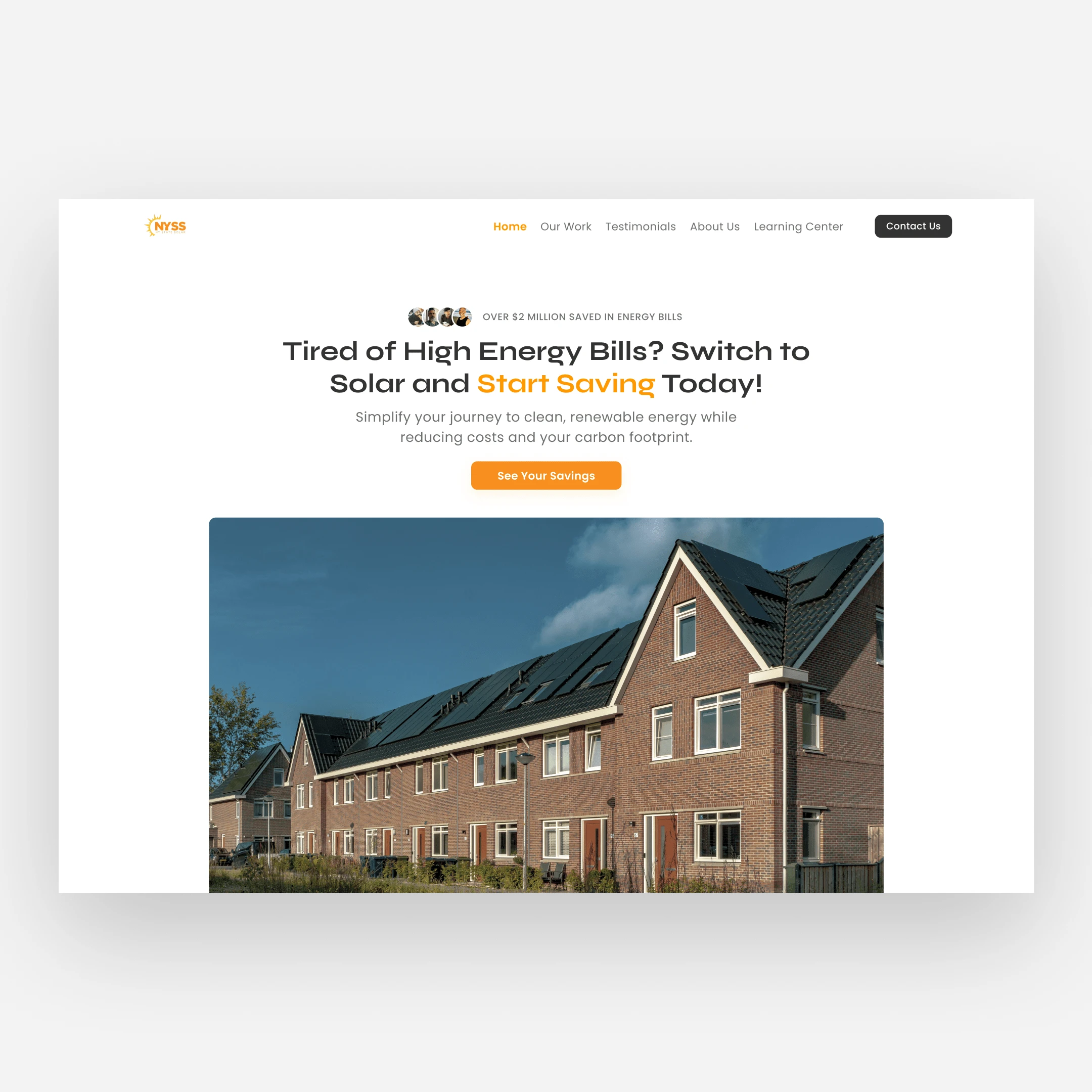
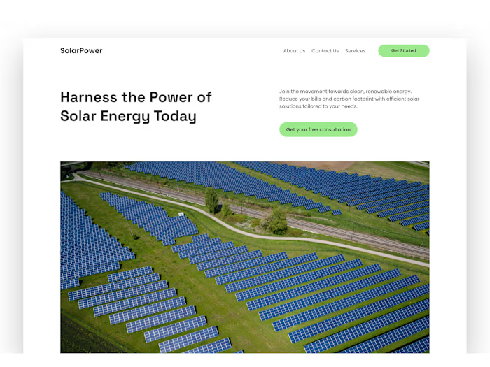
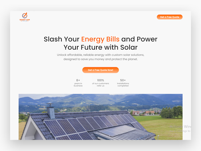
The redesigned hero
Overview
The main goal of this redesign is to effectively communicate the value proposition, simplify the navigation, fix the CTA and increase the visual appeal.
And I did one hell of a fine job, even if I do say so myself.
I effectively communicated their value proposition using a copy that goes from problem to desired outcome via action.
The problem = ”High Energy Bills”
The desired outcome = ”Start Saving”
Action = ”Switch to Solar”
The old navigation takes up too much visual focus, so I replaced that with a more streamlined navigation.
The old CTA button is excessively large and doesn’t drive action. I fixed that with a more action-oriented CTA”See your savings”
And the overall visual appeal is improved with a more, modern layout and has clear visual focus and hierarchy.
The new design drives more conversion. More conversion = more money.
Need a conversion-focused redesign? Send me a DM.
Like this project
Posted Jan 3, 2025
I redesign this hero section to effectively communicate their value proposition, simplify the navigation, fix the CTA and increase the overall visual appeal.
Likes
0
Views
5

