Hero Redesign for Kasselman Solar
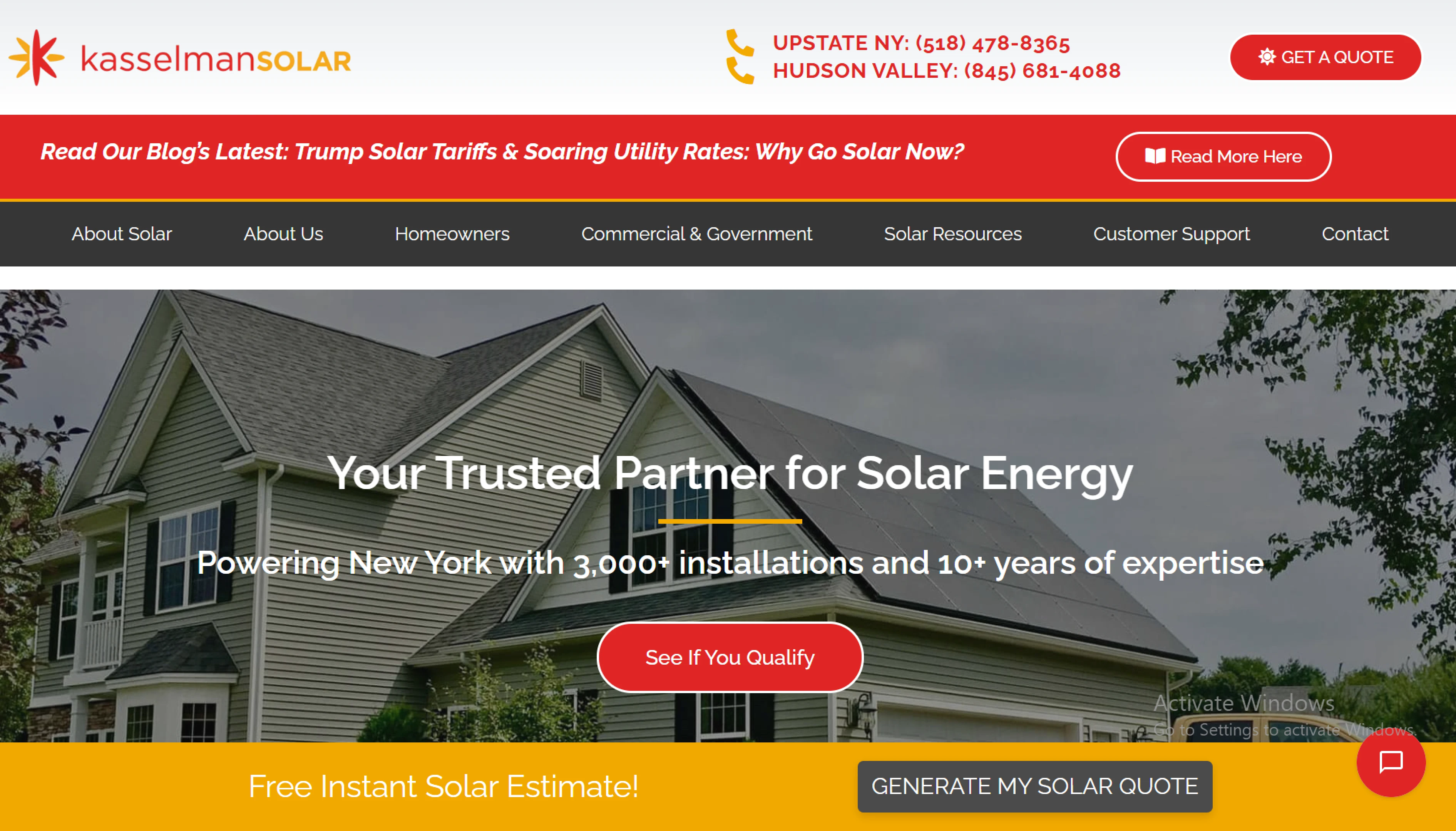
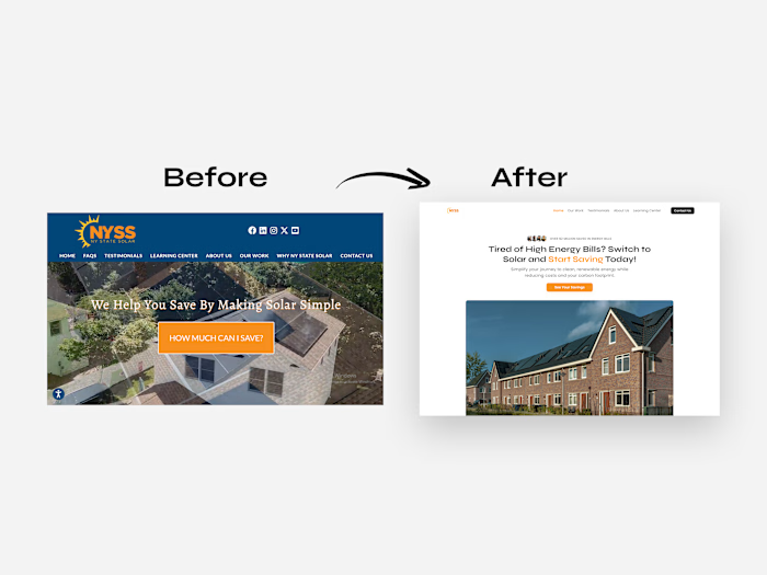
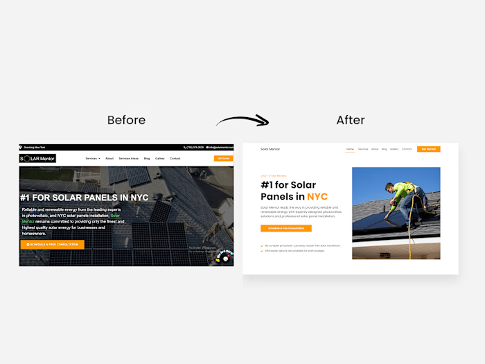
The old design

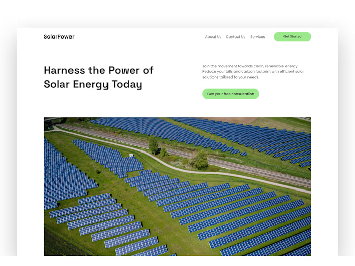
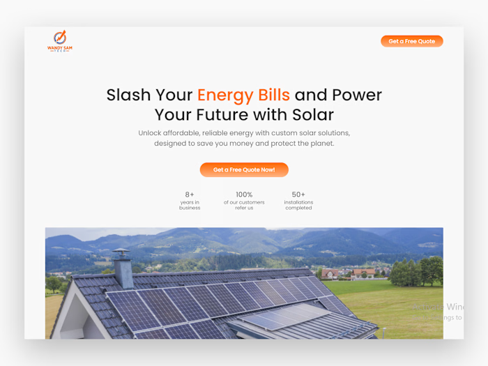
The redesigned hero
Overview
The main issue with the old design is the lack of focus, there’s no visual hierarchy, and all the elements just seem to pull your attention at the same time.
This results in too much cognitive load, essentially making visitors confused and unsure of what to do.
The solution?
A streamlined layout with clear visual focus that directs the users to the most important elements and CTA.
I also used imagery that adds context to the value proposition and builds trust which is essential when you’re designing for conversion especially for a business that comes to your home.
And the stats number below the CTA button adds social proof.
The new design is more conversion-focused and drives bookings.
Need a conversion-focused redesign? Send me a DM.
Like this project
Posted Jan 4, 2025
I redesign the hero section of their website adding visual focus to the most important elements.
Likes
0
Views
3

