Redesigning the API Marketplace Experience for SAP
Background
API Business Hub is a Marketplace platform for different content related to SAP’s products and business processes. The content is accessed by developers, architects and business users from SAP, it’s customers and partners. Users visit the platform to explore or search for content related to the SAP product they are developing. Upon finding, they test and deploy same in their products.
Key Challenges
To adapt the content for diverse users, since the platform was primarily used by developers. SAP intended to expand its user base, enabling business users or architects to explore, discover available content, and utilize what's relevant.
Enhanced search and filter system. The goal was to make this feature user-friendly and relevant, providing content suggestions, easy access to previous searches, and a detailed search mechanism for precise results.
Personalization. Users should easily set preferences based on role, industry, business line, and products. The platform should curate content based on these and allow switching back to all content if desired.
Solution
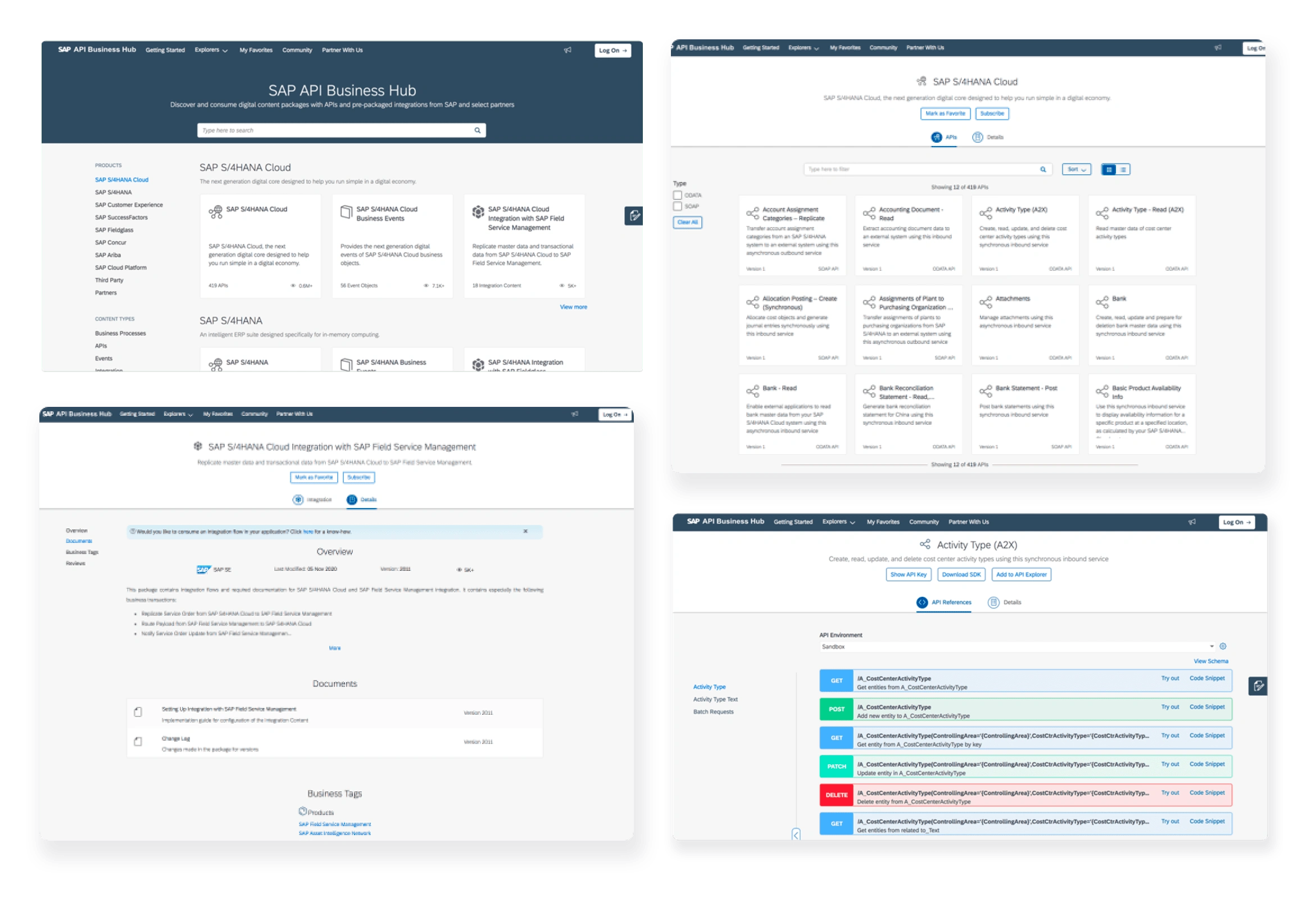
SAP has an online marketplace platform for its developers, customers, and partners to find SAP content. The platform lists artifacts for each of its products, complete with an overview and documentation. SAP developers, partners, and customers can search for and access content, read the documentation, and preview content with viewers. It was crucial to improve the platform's look and feel, as the existing platform was considered too technical.
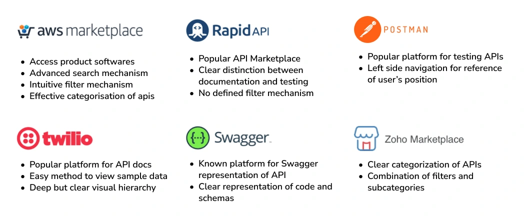
Competitors
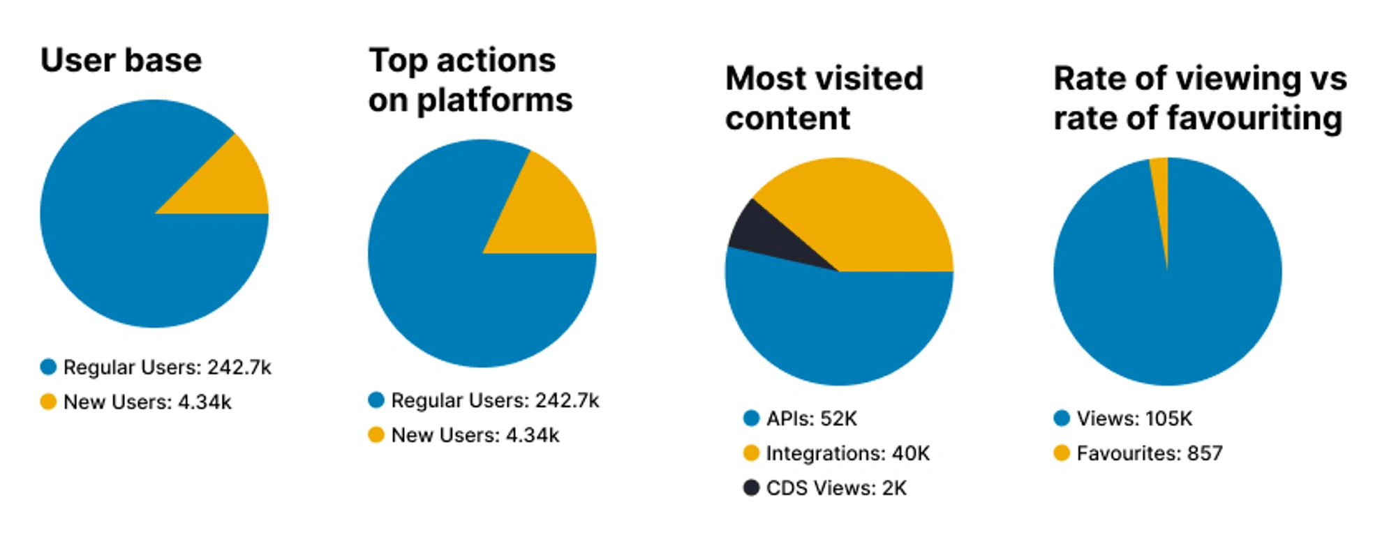
Key metrics
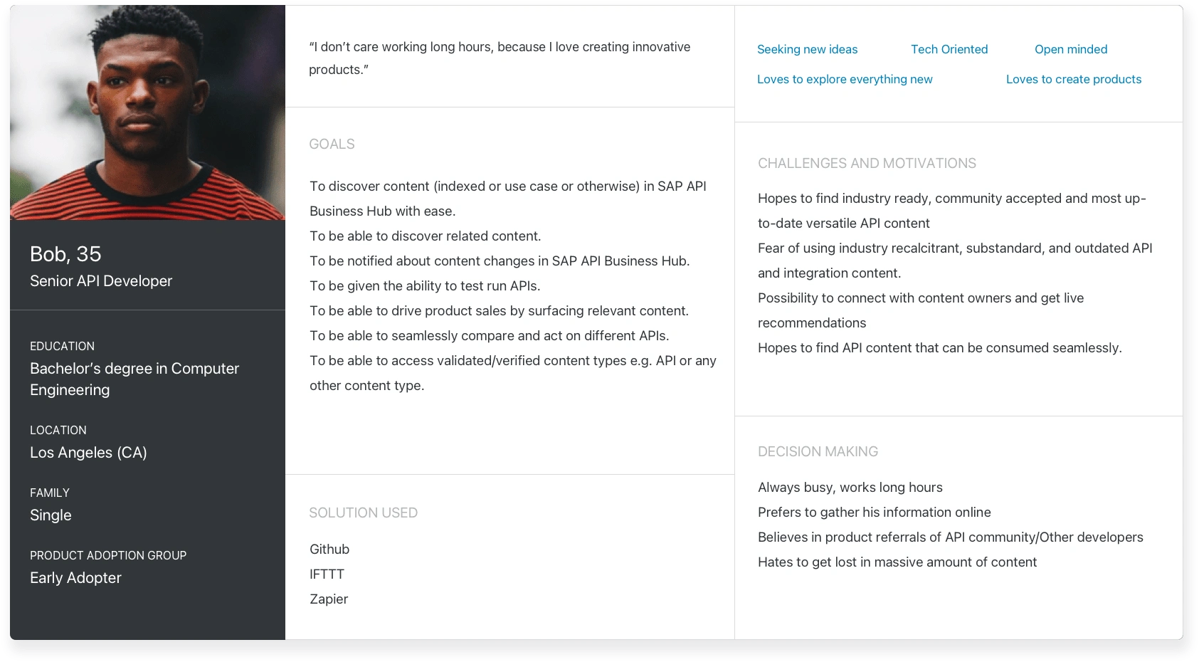
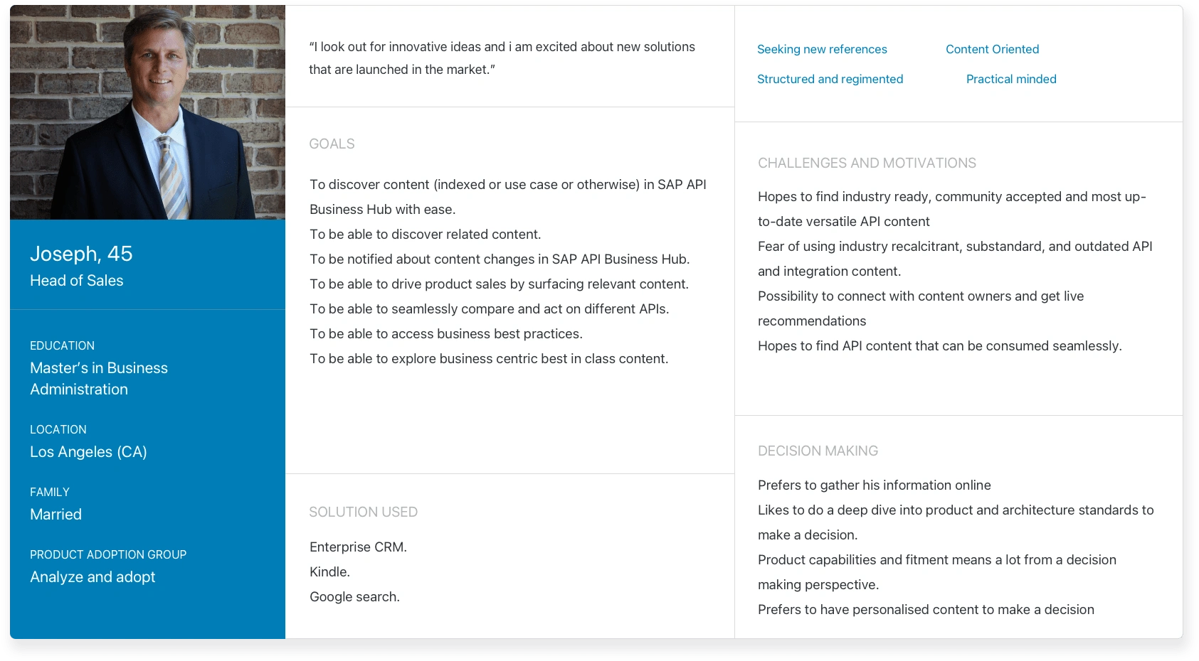
Target Audience
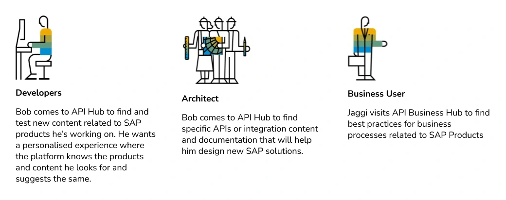
Proto Personas
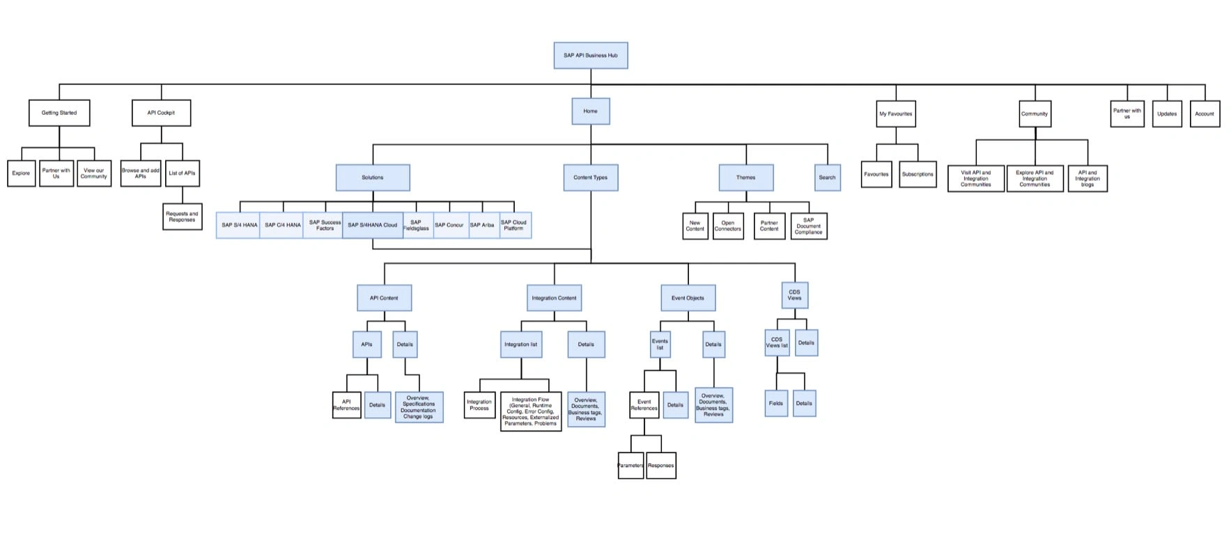
Information Architecture
Key Features
Landing Page
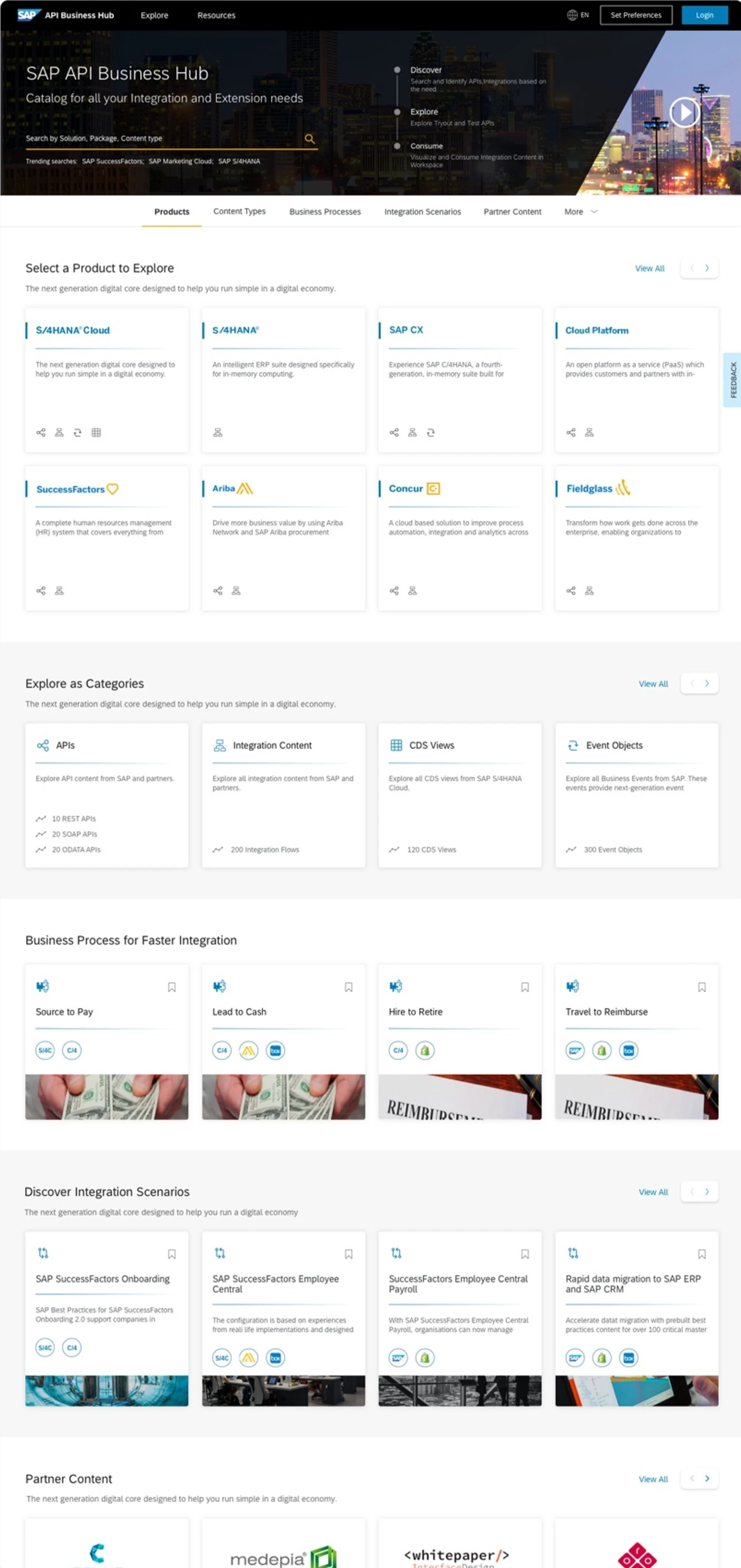
Top Banner
Since the banner was the first thing users saw when they arrived at the API Hub, it was used to provide an introduction to the platform. A key search section was also incorporated to help users quickly find what they needed.
Content
We used an anchor link mechanism that allowed the user to scroll through and explore the different content that was available on API Hub. Each of the content categories had subtle separators between them.
Cards
Since there were different types of content, we had to ensure that the cards for each category were visually different. Existing users of API Hub were accustomed to their icons, so we used that as a key method of indication for the cards.
Search Mechanism
Search Suggestions
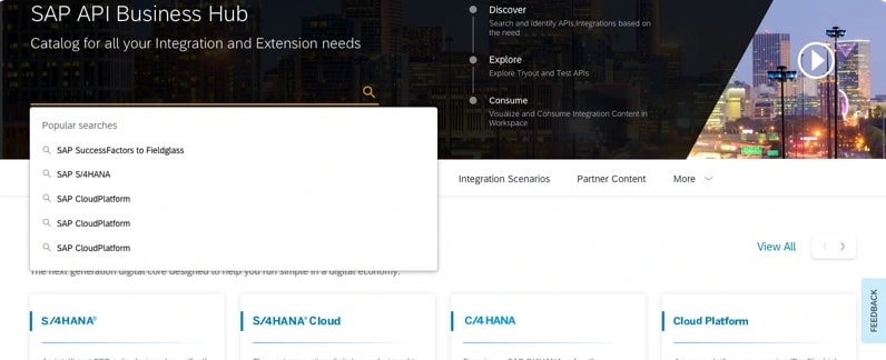
For the search mechanism, it was designed to be similar to the usual search interactions observed. A user would get suggestions upon clicking the search bar, and based on what they were typing, they would receive more contextual searches.
Filters
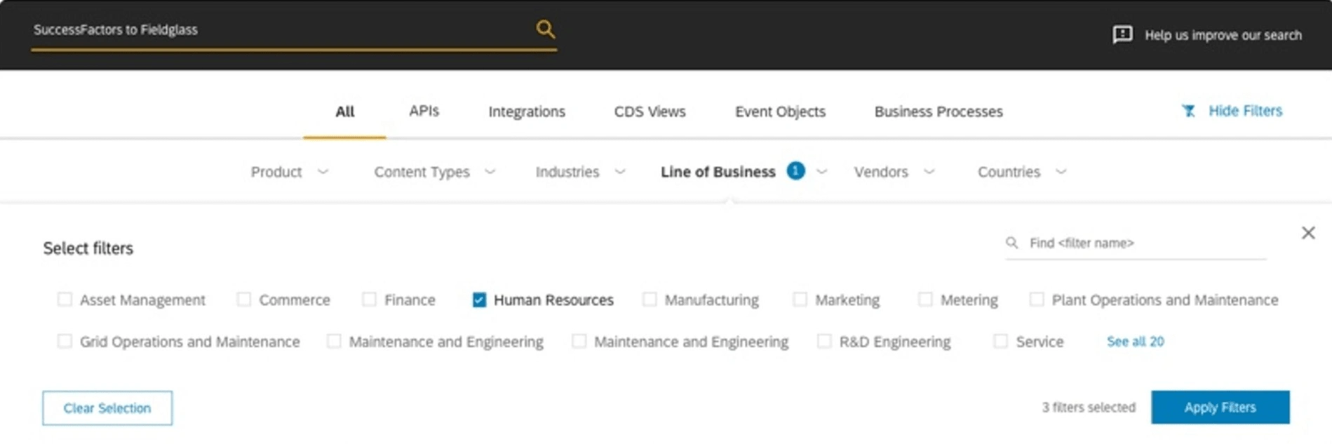
API Hub needed to have had an exhaustive but on-demand filter section. With this in mind, a top filter mechanism was designed which could be shown and hidden when needed. The user could see and select different categories and filter results through a Multi Select option.
Deep Search
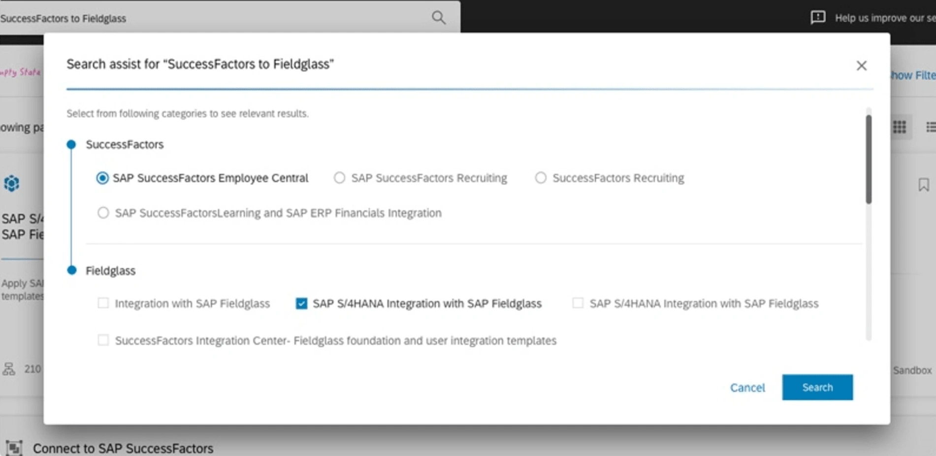
A special requirement had been for users to search for content related to two products or packages, for example: SuccessFactors to Fieldglass. This had been a widely used format, and a mechanism was needed to allow users to drill down their search further. For this purpose, a deep search model was designed. Upon choosing two Products, users could also select which packages they were interested in, all within the search section itself.
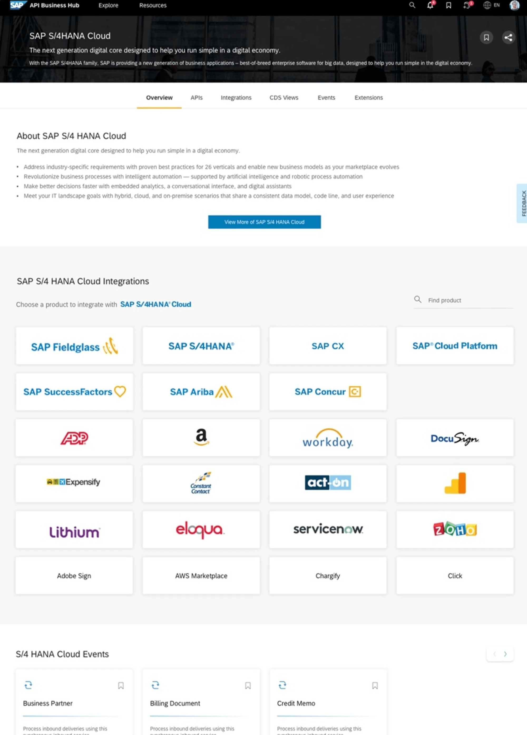
Product and Package Pages
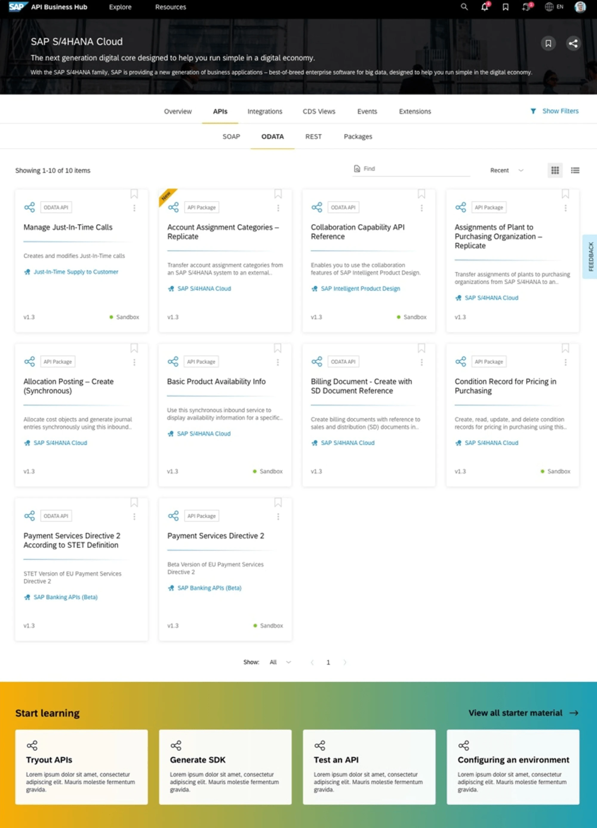
When users visited a Product page, they needed to get an overview of what the product was about, some important specifications, guides for where and how that product/package could be used and other important documentation. To make all these easily accessible to users while they were viewing Artefacts, a tab mechanism was followed. At the package level, a double tab structure was designed for the user to easily drill down into the next section as well. The users were able to see the list of artefacts related to the product or package. They were also able to filter, sort and contextually search by name within the package.
Content Viewers
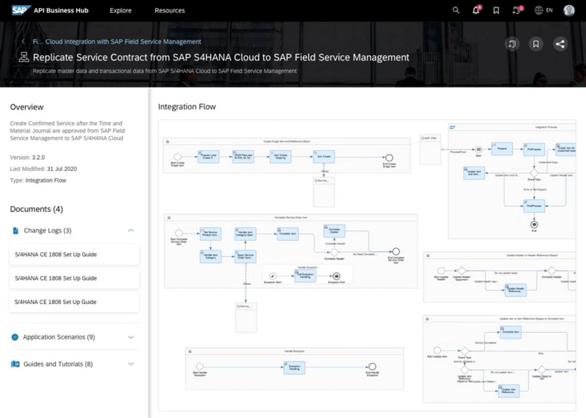
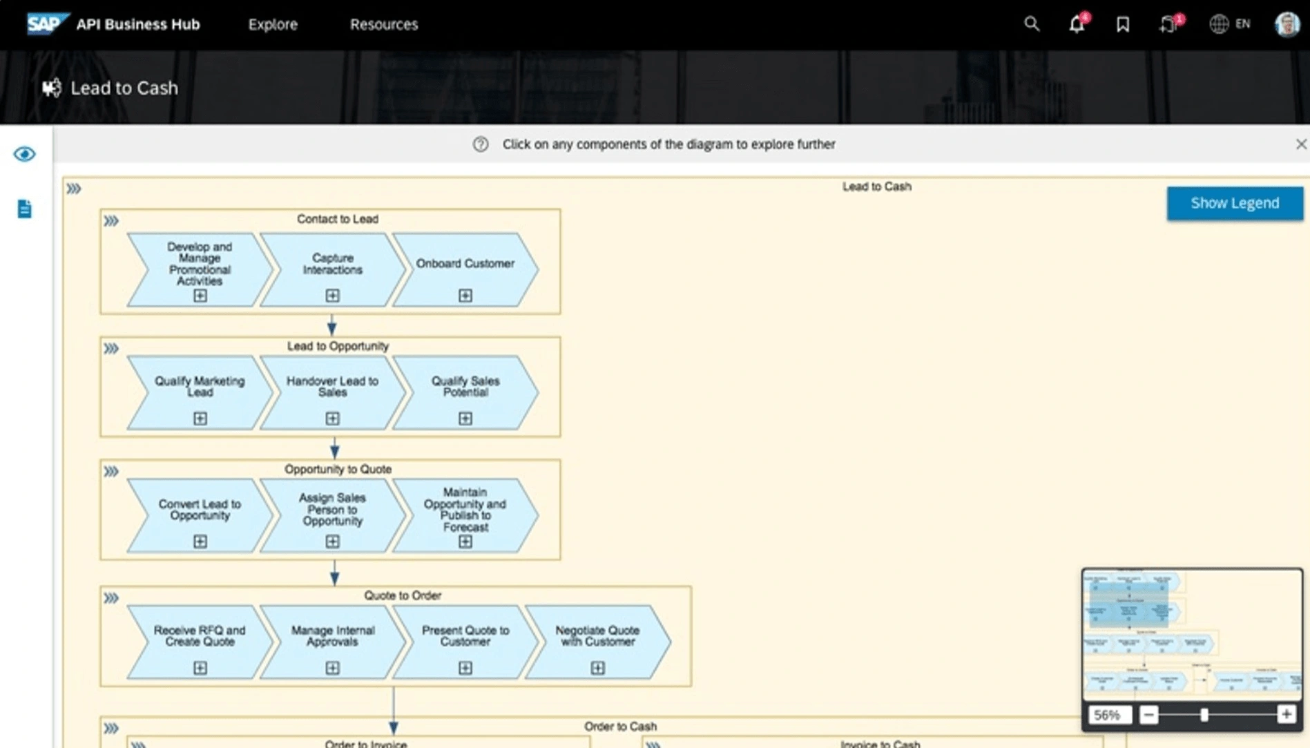
Developers used to come to API Hub to extract content of a certain type and use it in the SAP or SAP related products they were working on. To facilitate this, a structure was designed to make this content easily consumable by both new and regular users. An Overview Section was provided upfront that gave users a basic idea about API Hub, including details like specifications and documentation. A challenge that was encountered was that certain content like Integration flows and Business Processes had a long loading time. In such cases, users would first see a preview of the content which, on clicking, would lead them to the full screen view.
API Viewer
Overview
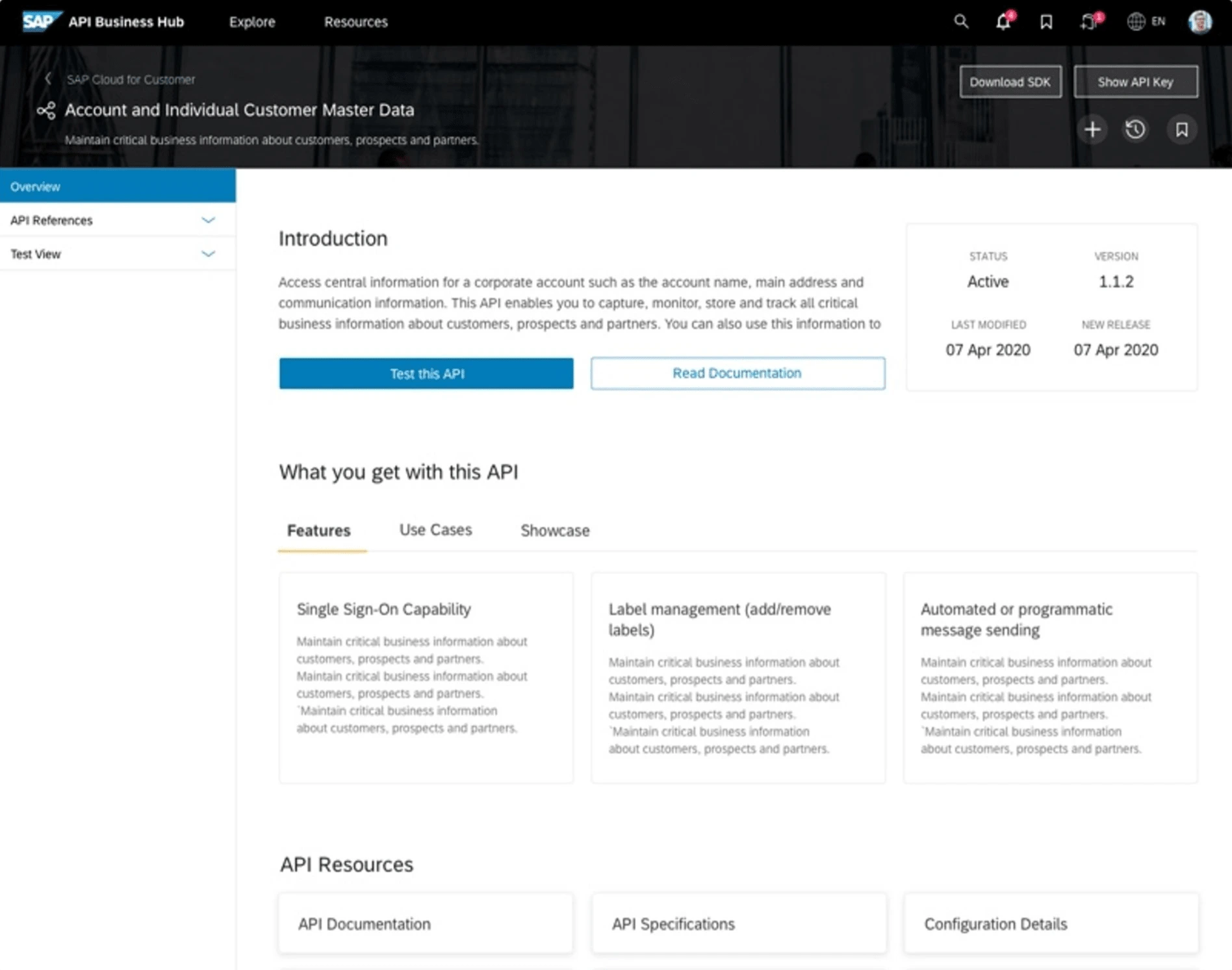
When an API was viewed, the user first gained an understanding of the API, its documentation, features, and use cases, etc., before delving deep into testing or reading about it.

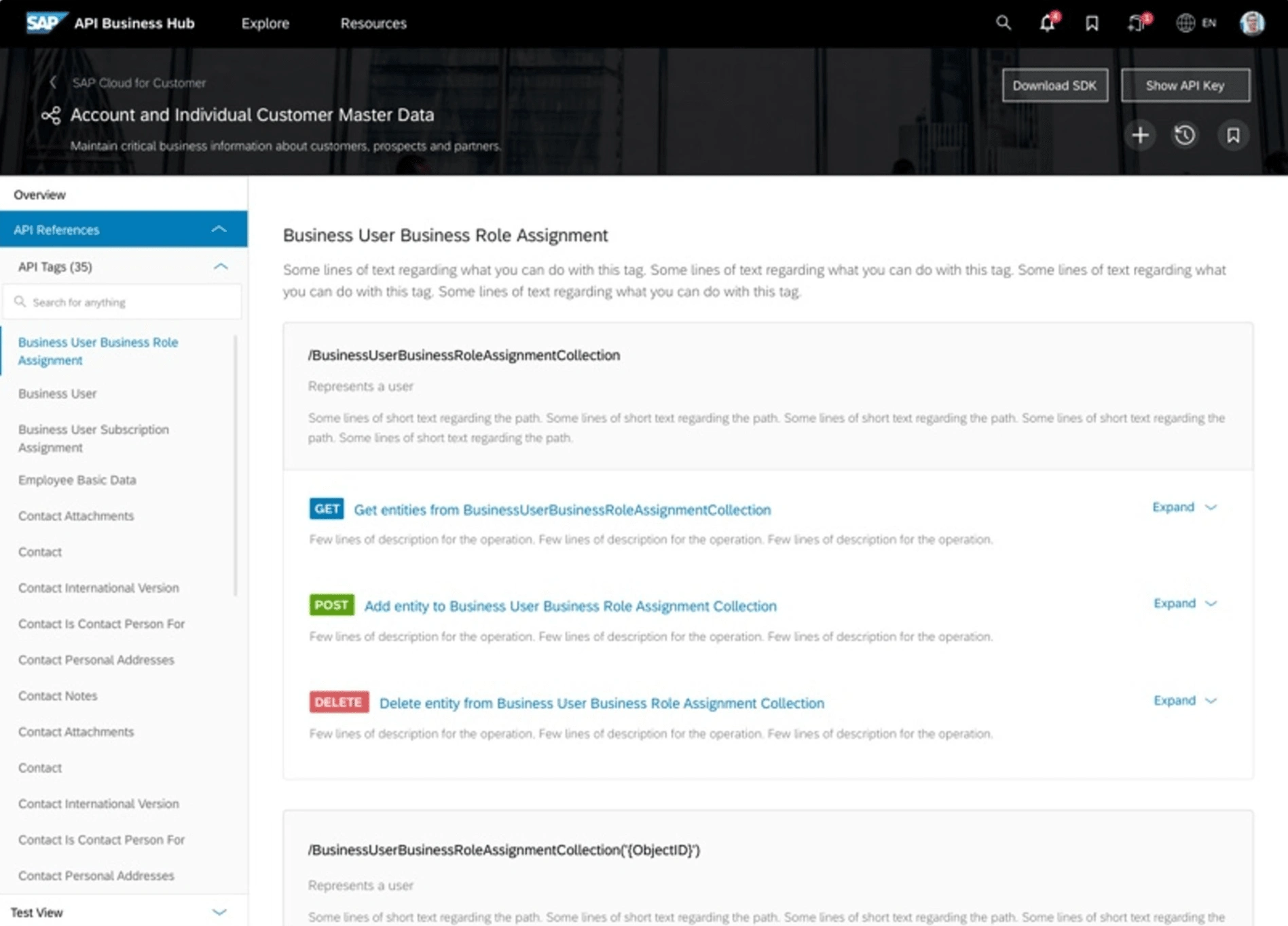
API References
Here, a user could view all the endpoints and operations associated with an API and understand their capabilities. The user could also view example values and responses for different parameters.
Test View
The Test View was where developers would actually test out the API. If it was an API that had been previously tested, they could view those responses. For a new API, they could also add sample data and get results as well.
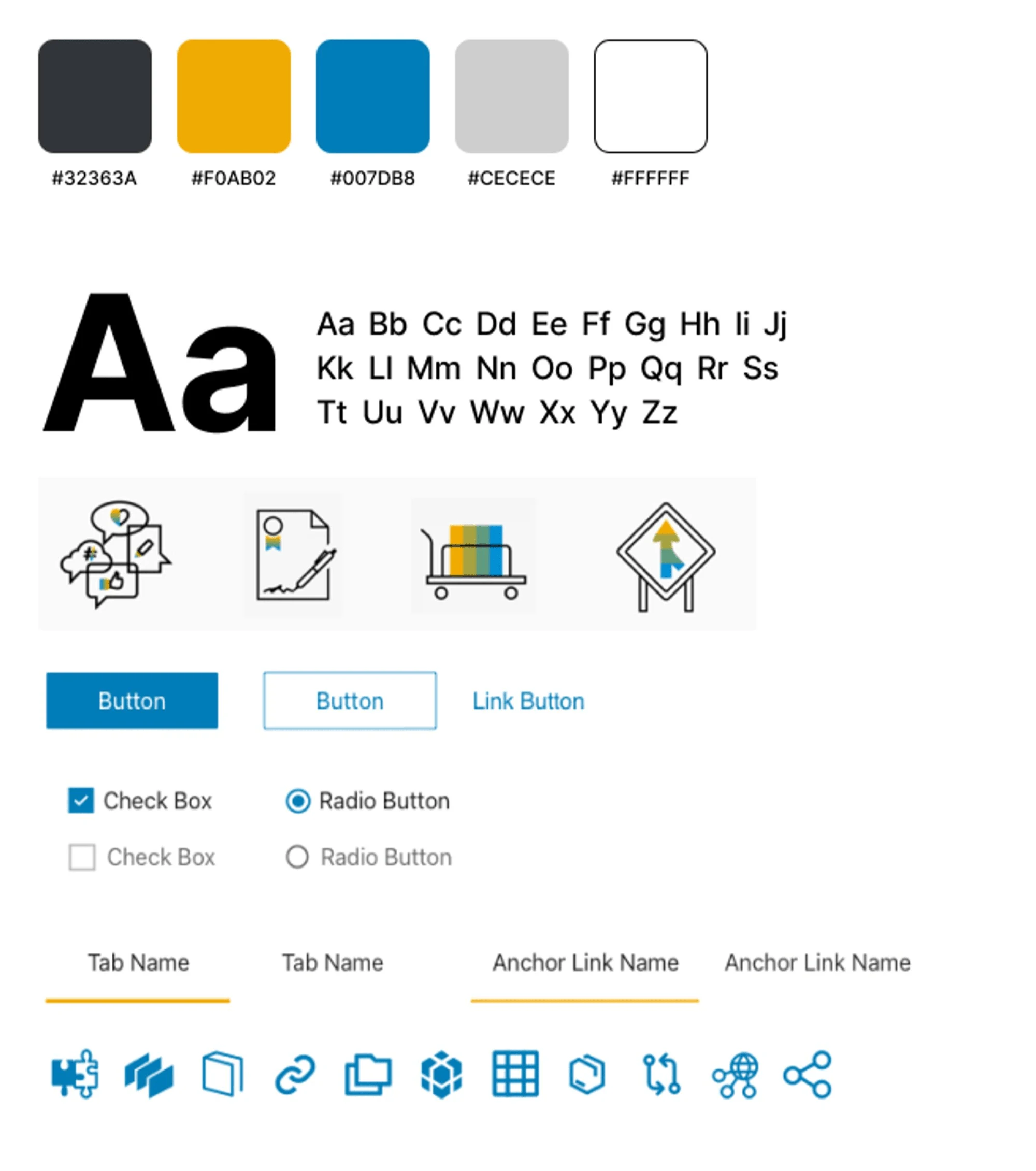
Visual Specifications
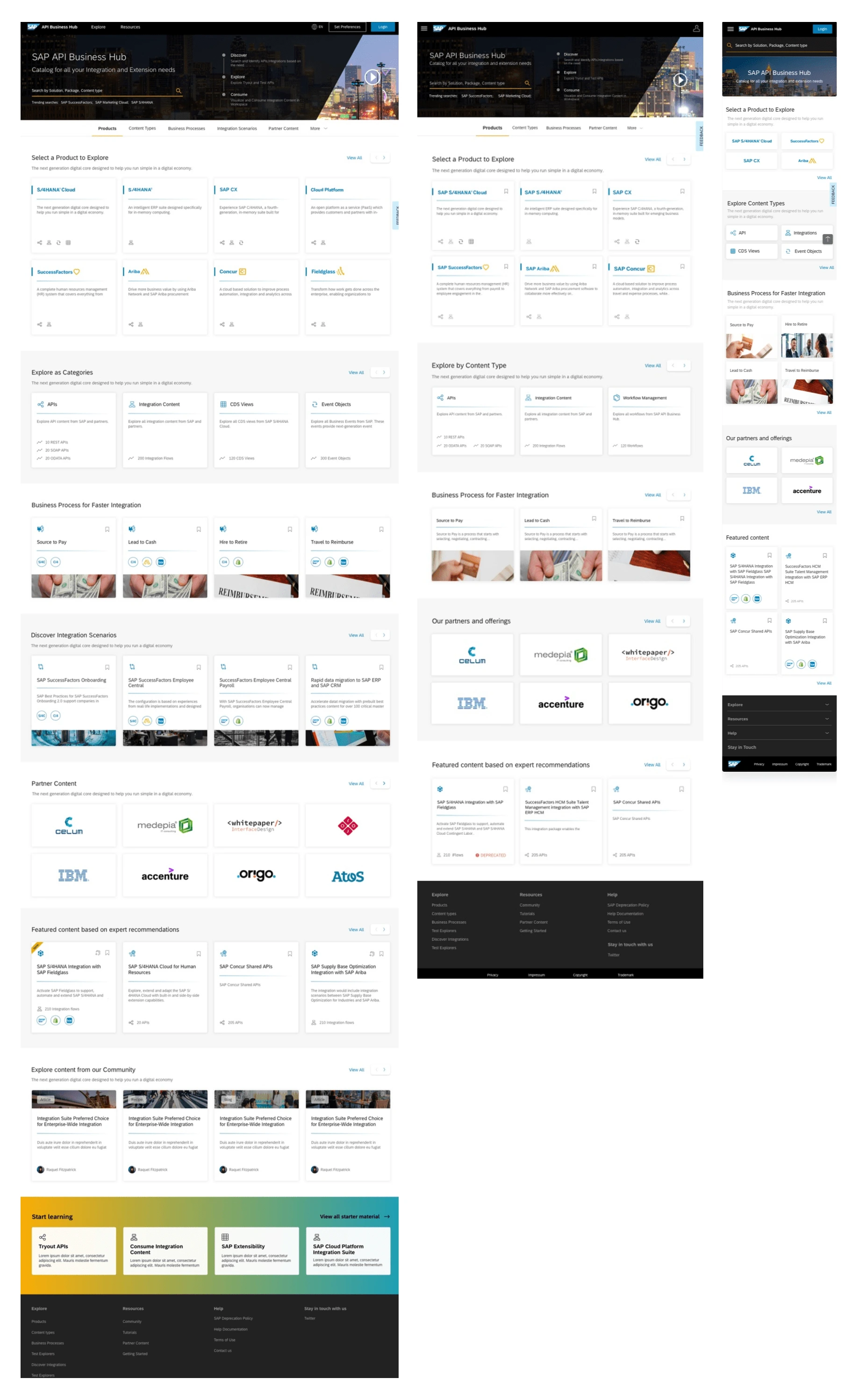
Responsive Design
When the design process began for the Web, it was created with Responsive Design guidelines in mind. However, as time passed it was realized that users interacted with the API Hub differently across various platforms. On the Web, users mainly searched, saved, and extracted code or content. On Tablet and Mobile, they mainly explored API Hub and saved content of interest. This required adjustments to certain interactions for optimal use. On mobile, content was made more concise, with cards only showing names. The viewer section in mobile was also slightly different, featuring fewer actions but more Overviews and Previews.
Like this project
Posted Jun 23, 2024
Partnered with SAP to redefine the user experience for the SAP Business Accelerator Club, enhancing content consumption, driving a 20% traffic increase.

