ButterCookies - Design System for SaaS platform
Background
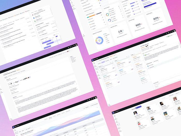
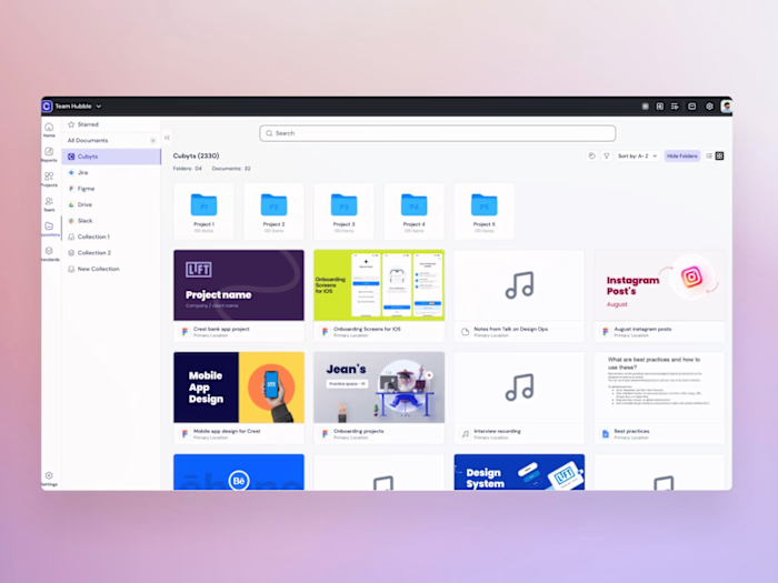
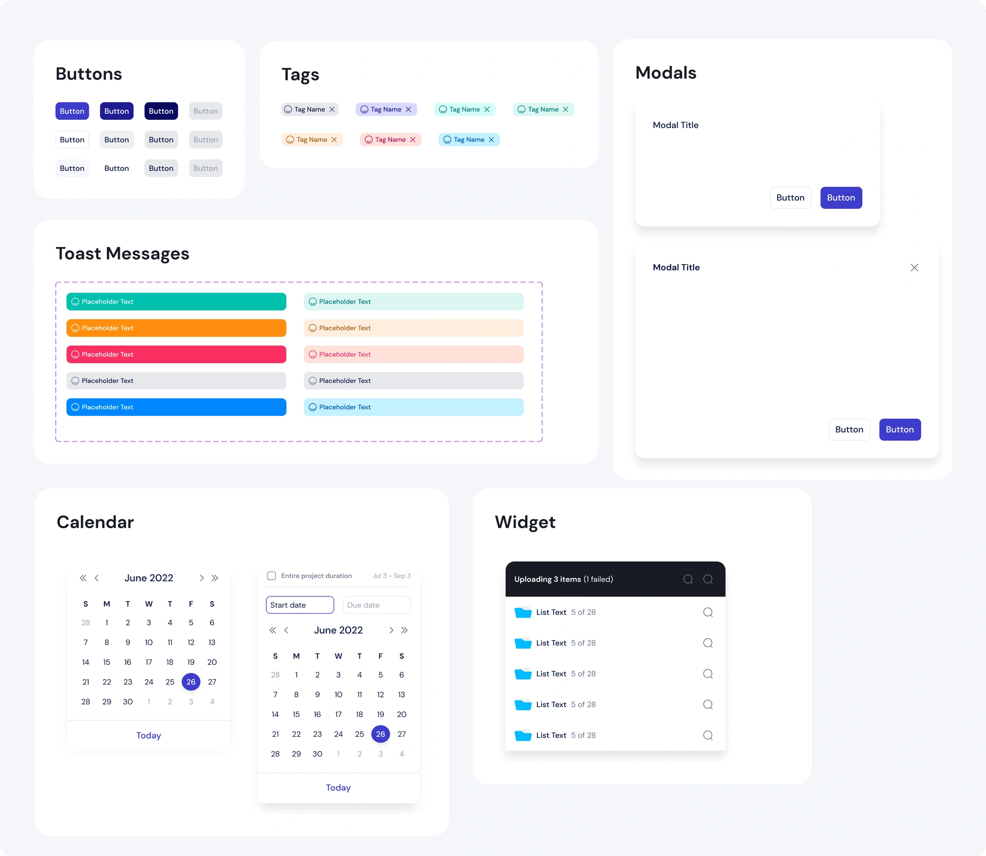
I spearheaded the creation of a design system for two versions of the Cubyts app, a B2B SaaS platform. For version 1, we audited and standardized components in the existing app, improved its visual design, and developed a token system.
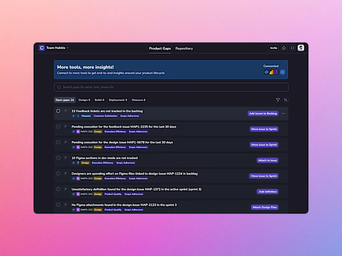
In early 2024, Cubyts shifted its focus to a new product domain. Consequently, version 2 involved the development of a design system for this new product. This process involved the reuse of some components, the creation of a new token system, and definitions for both dark and light modes.
Team
Initially, our team consisted of two designers, two developers, and one product manager. While we all had experience with existing design systems, creating one from scratch using new technologies was a new challenge. Crucially, developing this design system was an extra task on top of our usual roles, and our involvement fluctuated based on our primary duties.
Process
Audit + Research
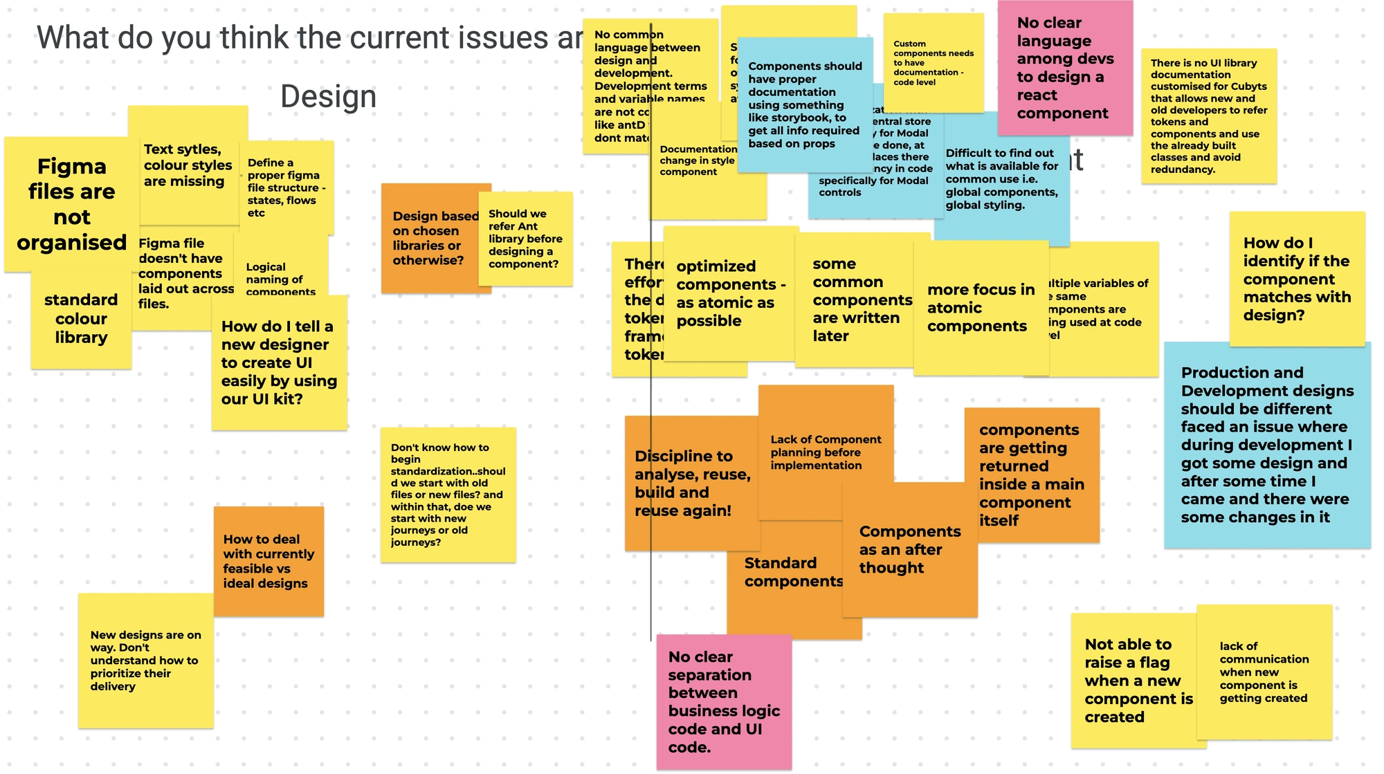
Our design and development team held a workshop to identify issues and define requirements for our design system, which included inconsistent styles, inadequate documentation, and poor communication about component creation. We also studied established design systems like Adobe Spectrum, Lightning Design System, Atlassian Design System, Polaris, and Canvas for reference.
Definition
The design team began by exploring various visual styles and patterns suitable for the product. Once these were finalized, we identified and prioritized the product features for the design overhaul. We then designed both simple and complex components, providing specifications to prepare them for handoff to development.
Collaboration
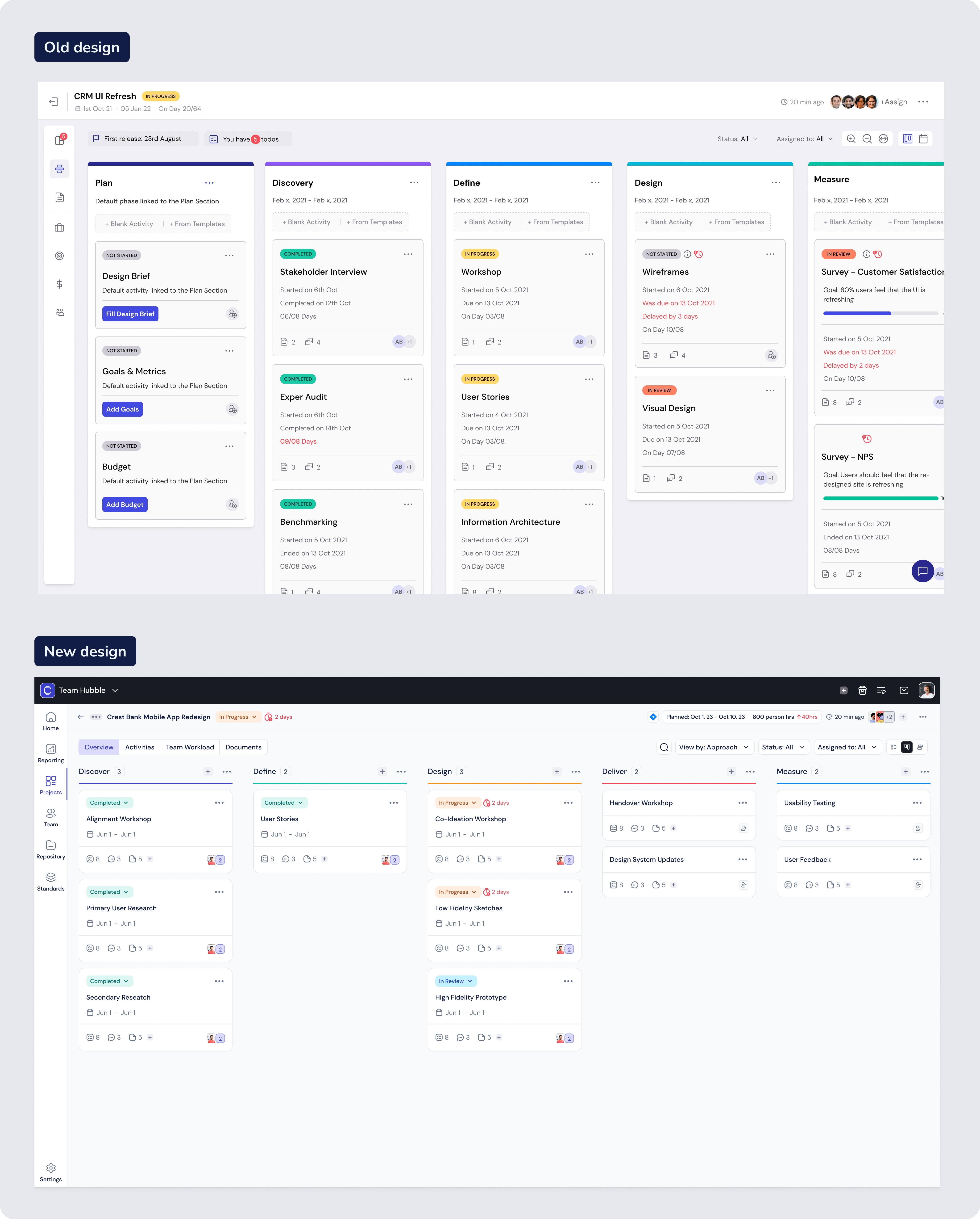
We collaborated with the development team to ensure high-quality specifications and documentation in our system. We updated and replaced old styles and components, creating new ones as necessary. Another team worked on new features, adopting the new system directly. This required strategic delivery of designs.
Implementation
We used Tailwind as our css.library, and created a custom documentation of our own (storybook had errors while calling AntDPro components which had been used earlier). During this process we also used icomoon to move from svgs to icon fonts. Using all this, our first screens with new styles applied, and more importantly standardised styles and code, released on March 6th 2023.
Adoption
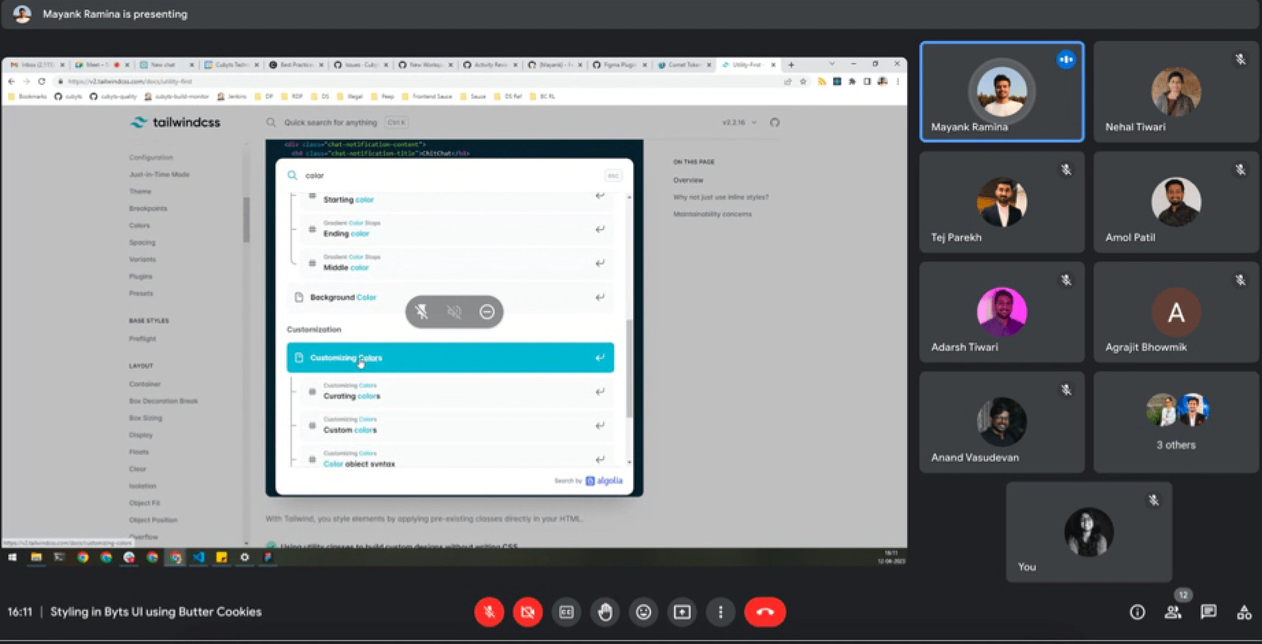
After experimenting with workflows on three features, we held a knowledge transfer session on new standards and procedures on April 12, 2023. The adoption process was gradual, and despite occasional deviations, we ensured high-quality design and code. Over time, this became an instinctive practice for our developers.
Repeat
When Cubyts pivoted from DesignOps to a Product Observability platform, we replicated the process of Audit, Research, Definition, Implementation, and Adoption for the new design styles. As most elements were already componentized, transitioning to the new system only took about a week. This was a significant improvement compared to the previous exercise, which took over six months.
Design System 1
Styles
Components
Tokens
Colour Tokens
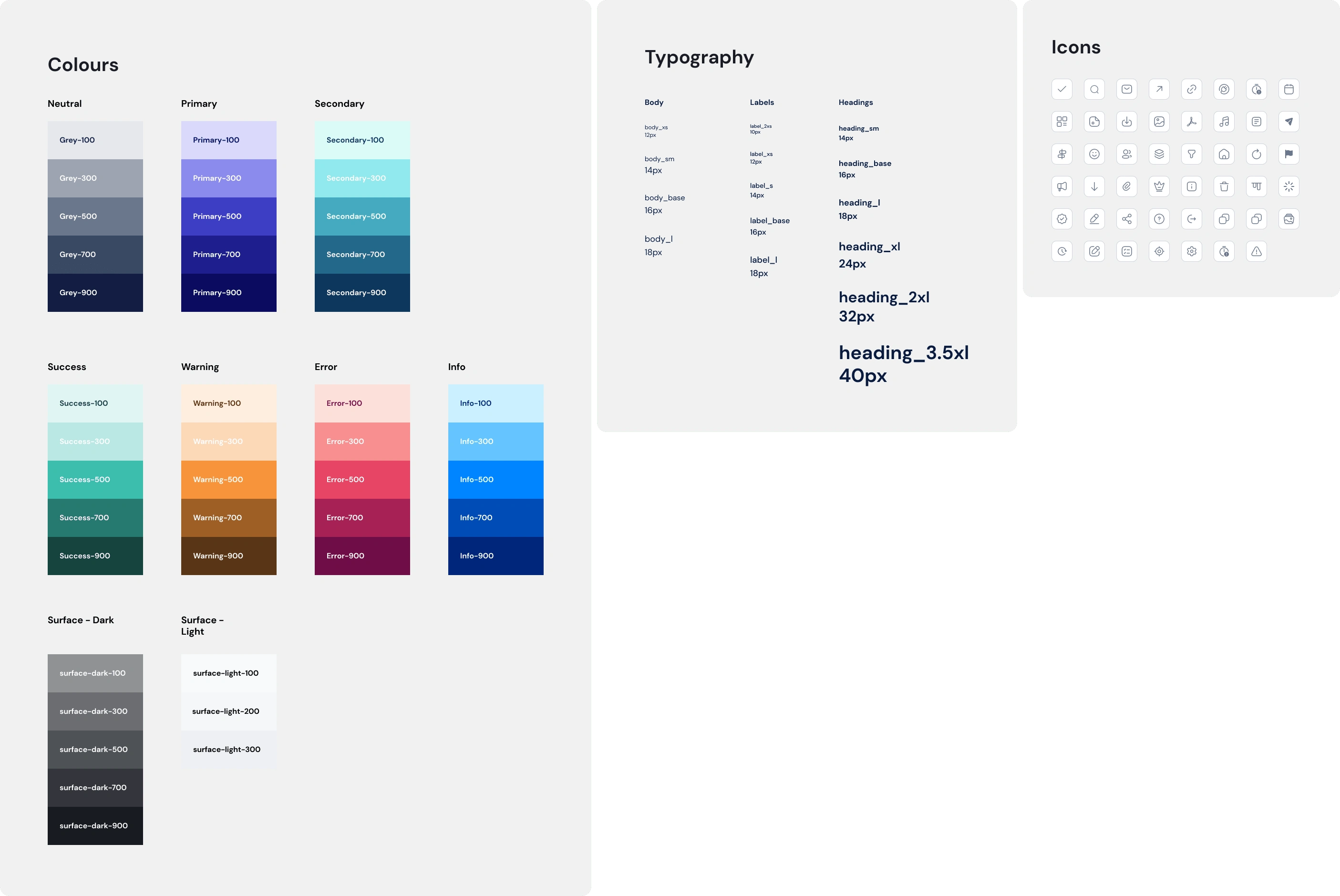
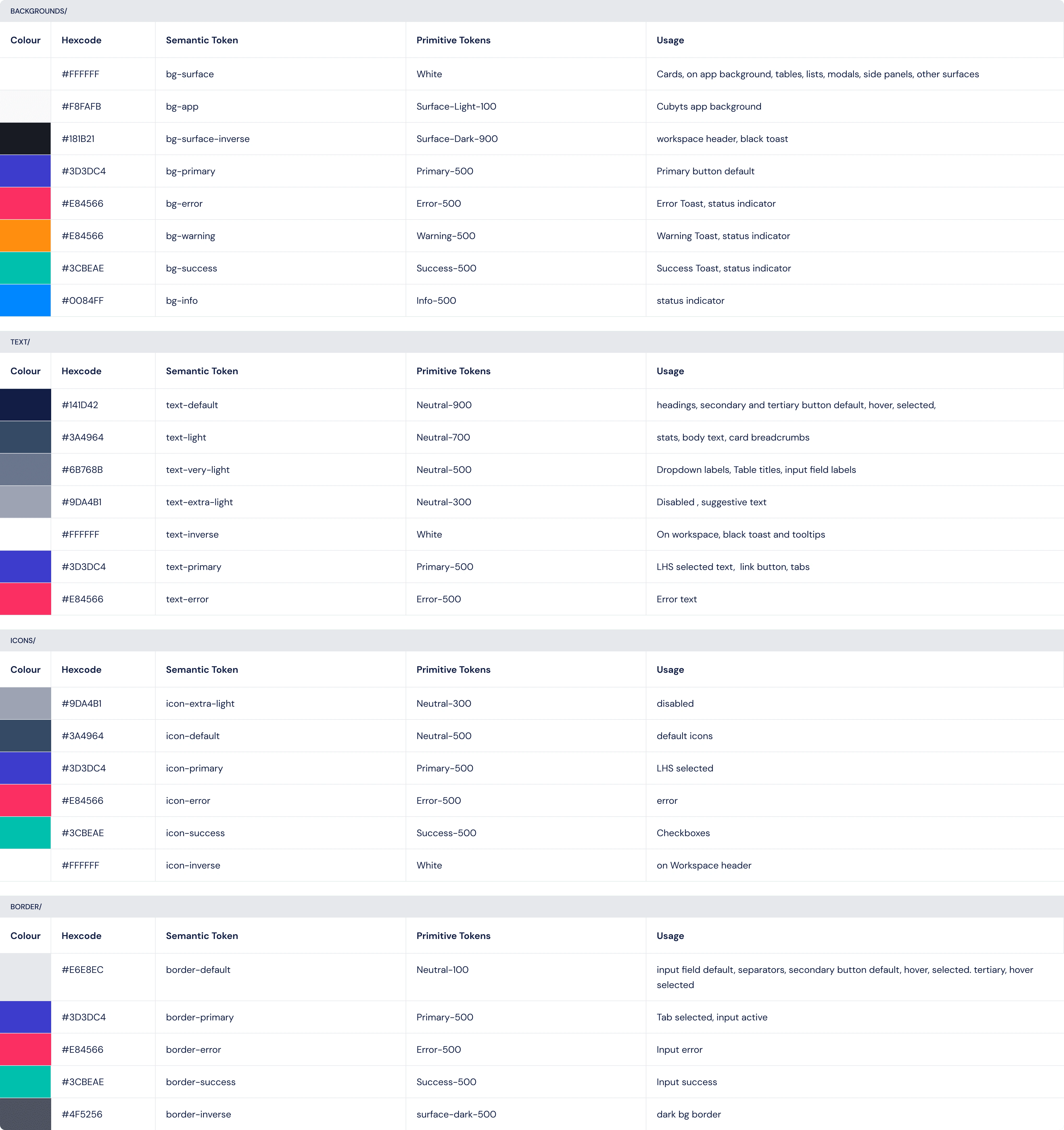
I identified the most common colours and named them according to their usage to define the colour tokens. For text tokens, since we only had three primary colours, we named the tokens based on visual appearance, enabling all members to identify the tokens by simply observing the colour.
Design System 2
Overview
We developed a new system for the second version of the Cubyts app. However, we reused many components from Version 1, applying new styles to them. This version also allowed us to identify and address issues or missing elements from the existing system, improving them for the new app.
Specifications
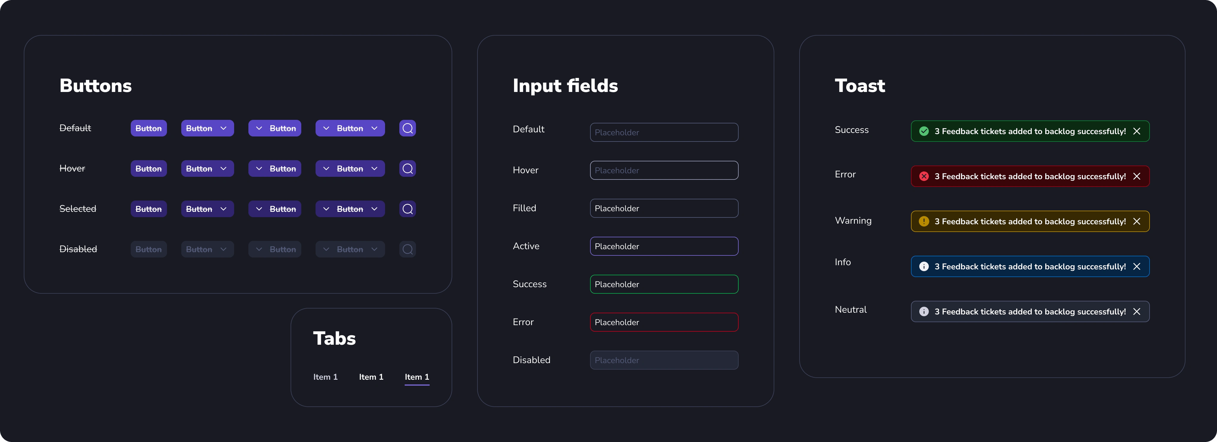
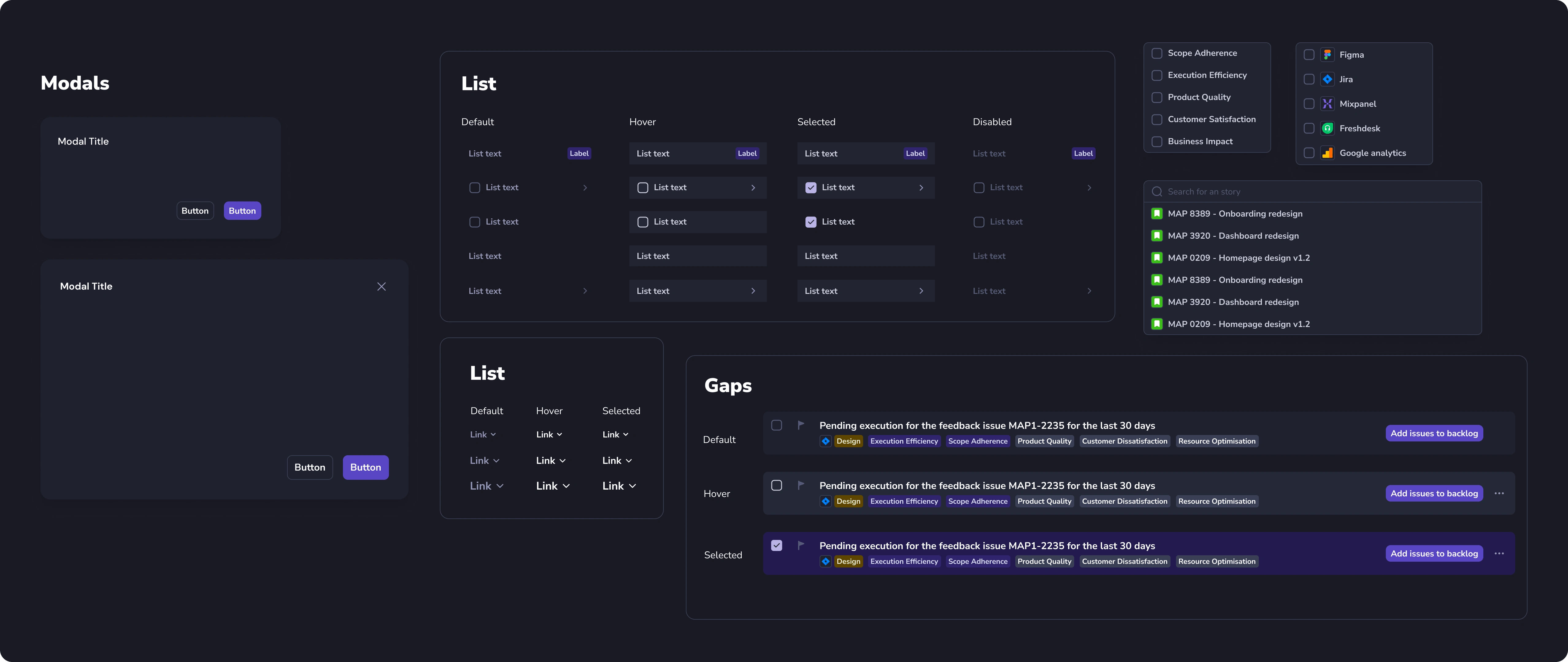
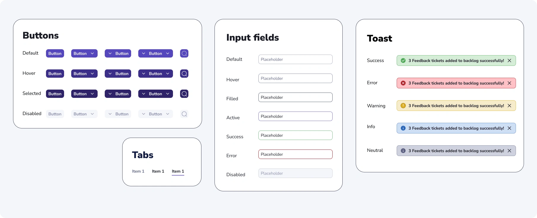
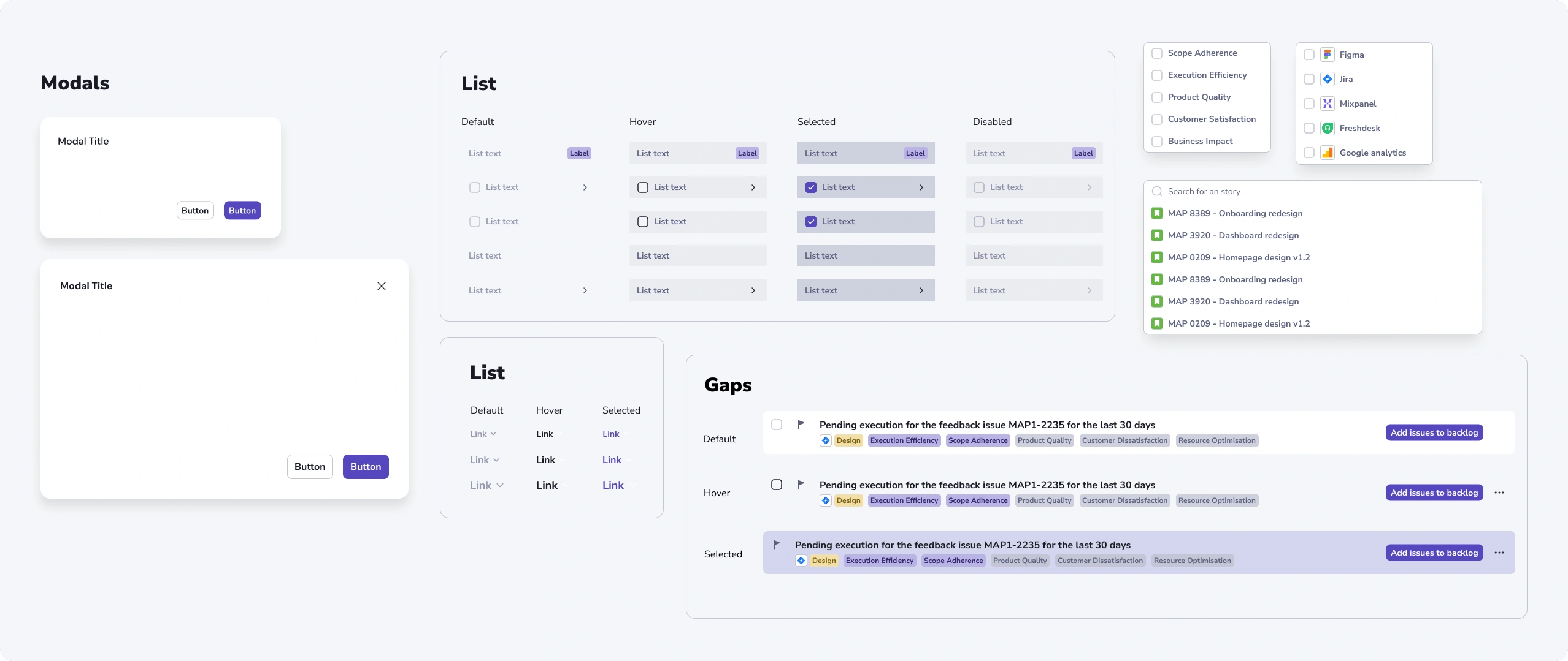
In this version, we introduced both light and dark modes for the app, with the dark mode set as default. We also prioritized optimizing for responsive layouts right from the start, ensuring our components are scalable for the necessary device.
Styles
Components (Dark & Light Mode)
Tokens
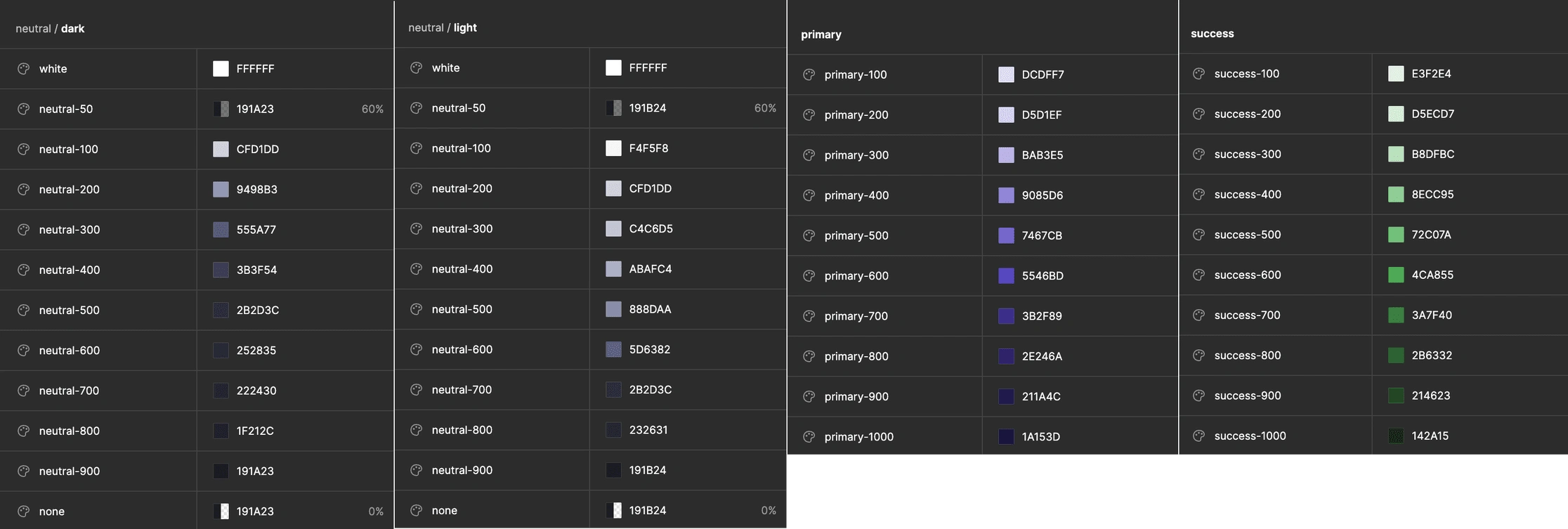
Colour Tokens (Primitive and Semantic)
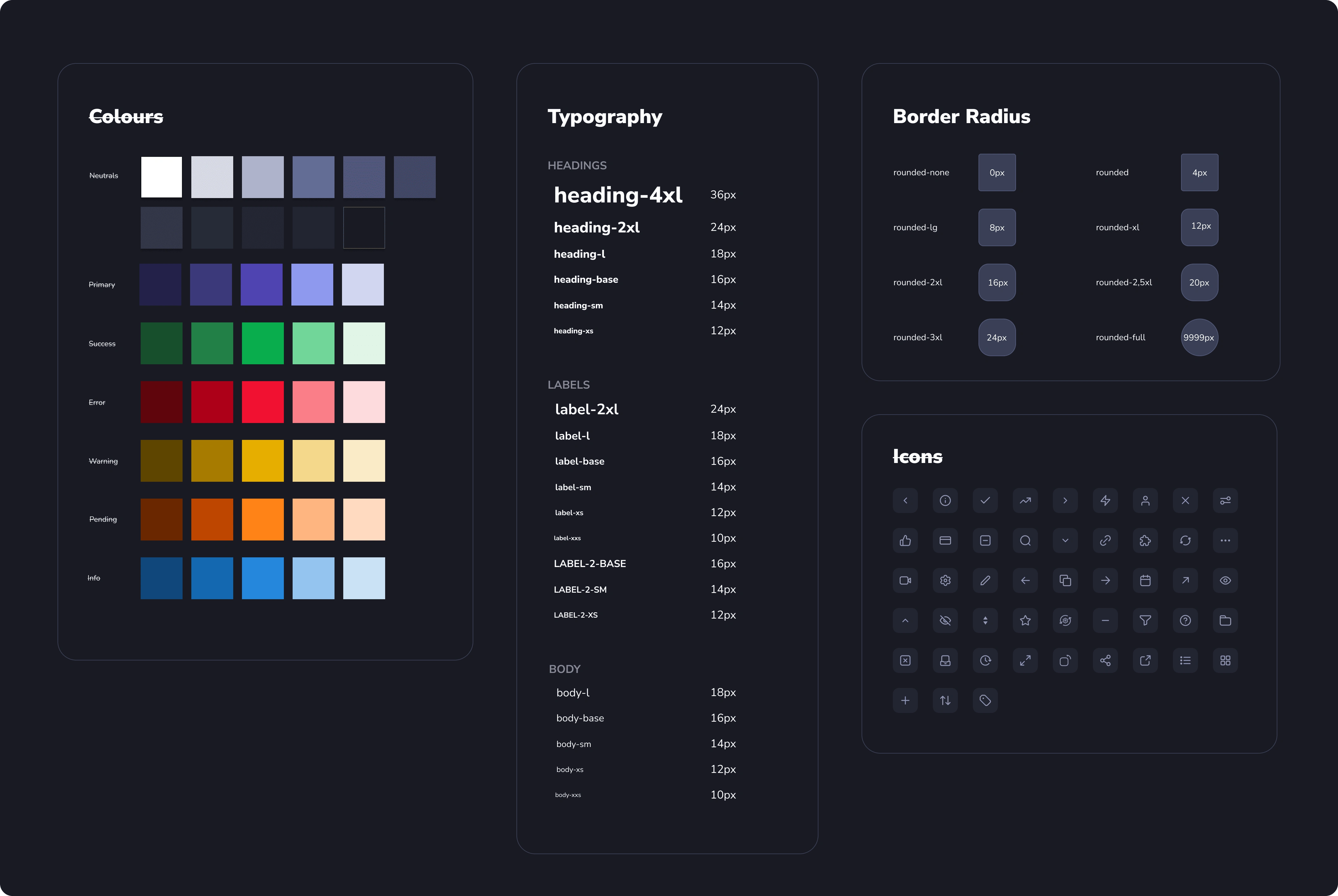
Inspired by Razorpay's Blade Design system, we developed our primitive tokens. All palettes, excluding the neutral one, are common for both light and dark modes. We created separate neutral palettes for each mode, as the number of light and dark colors needed differed significantly.

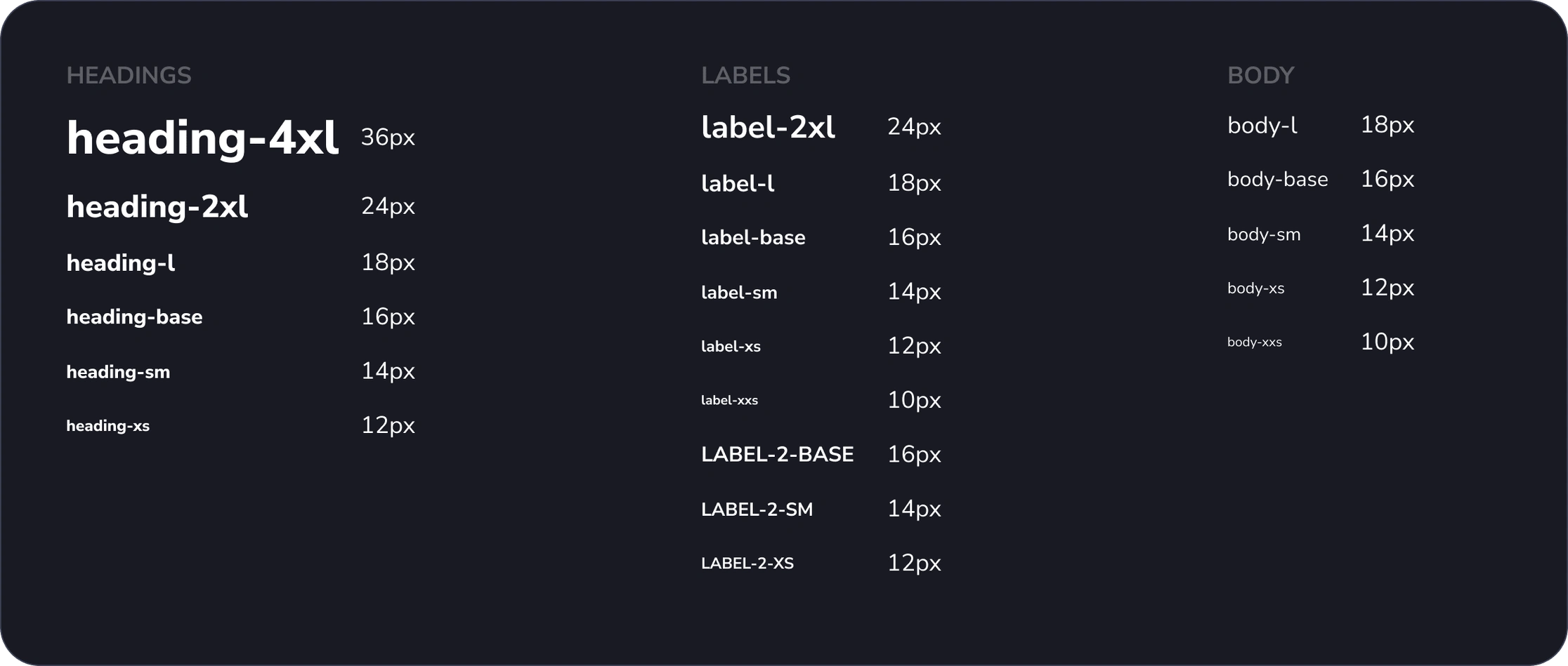
Typography Tokens
Our design system incorporates Tailwind.css as the CSS library, and we've adopted its sizing mechanism to maintain consistency. For instance, 'lg' is always 18px, 'base' is 16px, 'sm' is 14px, and so forth. To accommodate our specific needs, we've used prefixes like 'Heading', 'Label', 'Label-2', and 'Body' for different font applications.
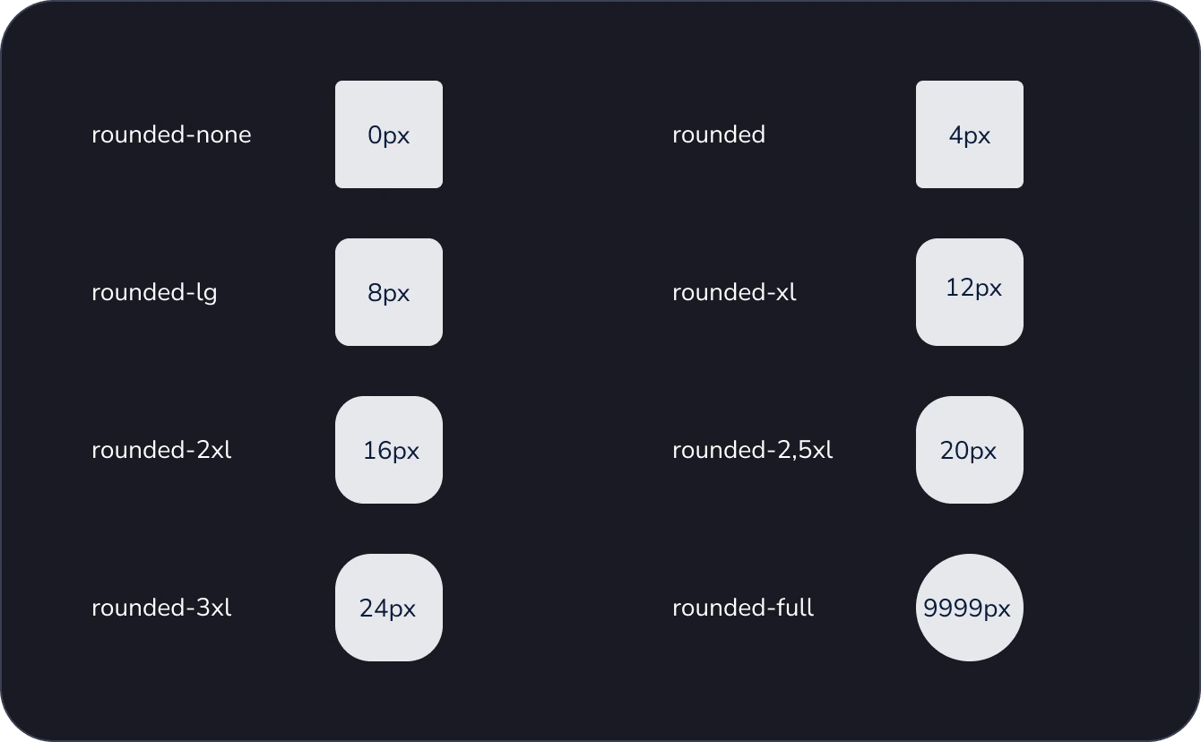
Border Radius Tokens
We used the scale provided by tailwind.css for border radius. However, there were specific sizes recommended by Tailwind that we didn't use and a few that we had to newly introduce. For example, 20px isn't used in the Tailwind library, so we introduced it as 2.5xl. Notably, 20px falls between 16 and 24px, both of which are recommended by the library.
Challenges
Prioritizing design system work amidst other high-priority tasks.
Tackling design system challenges specific to our team's use case, occasionally requiring guidance from other design system stories, with varying outcomes.
Successfully communicating modifications to components within the design system to both design and development teams.
Making difficult decisions, such as choosing to deploy a single new component throughout the product or on a feature-by-feature basis, necessitating careful consideration of potential impacts on the product.
Learnings
A design system fosters collaboration between design and development teams, improving communication about changes and upcoming modules and components.
Once the team began to realize the benefits in standardization and output quality, everyone started contributing proactively to the system.
The time from idea to delivery decreases significantly, allowing for more focus on refining concepts and details.
Basic designs can be created by anyone to communicate their ideas. These concepts are presentable, simplifying the creation of quick prototypes for stakeholder feedback.
Over time, the team's confidence in delivering high-quality work increases.
There is a greater emphasis on improving quality.
Establishing a network of peers for clearing doubts and asking questions can save a significant amount of time.
Initially, the effort-to-benefit ratio may seem unbalanced, but at a certain point, the benefits begin to outweigh the effort.
Like this project
Posted Jun 21, 2024
I spearheaded the initiative to create a design system for two versions of the Cubyts app, a B2B SaaS platform. This involved auditing and standardizing compone
Likes
0
Views
20

