COBALT — Brand & Website Redesign

Shafaq Taimoor


COBALT — Brand & Website Redesign
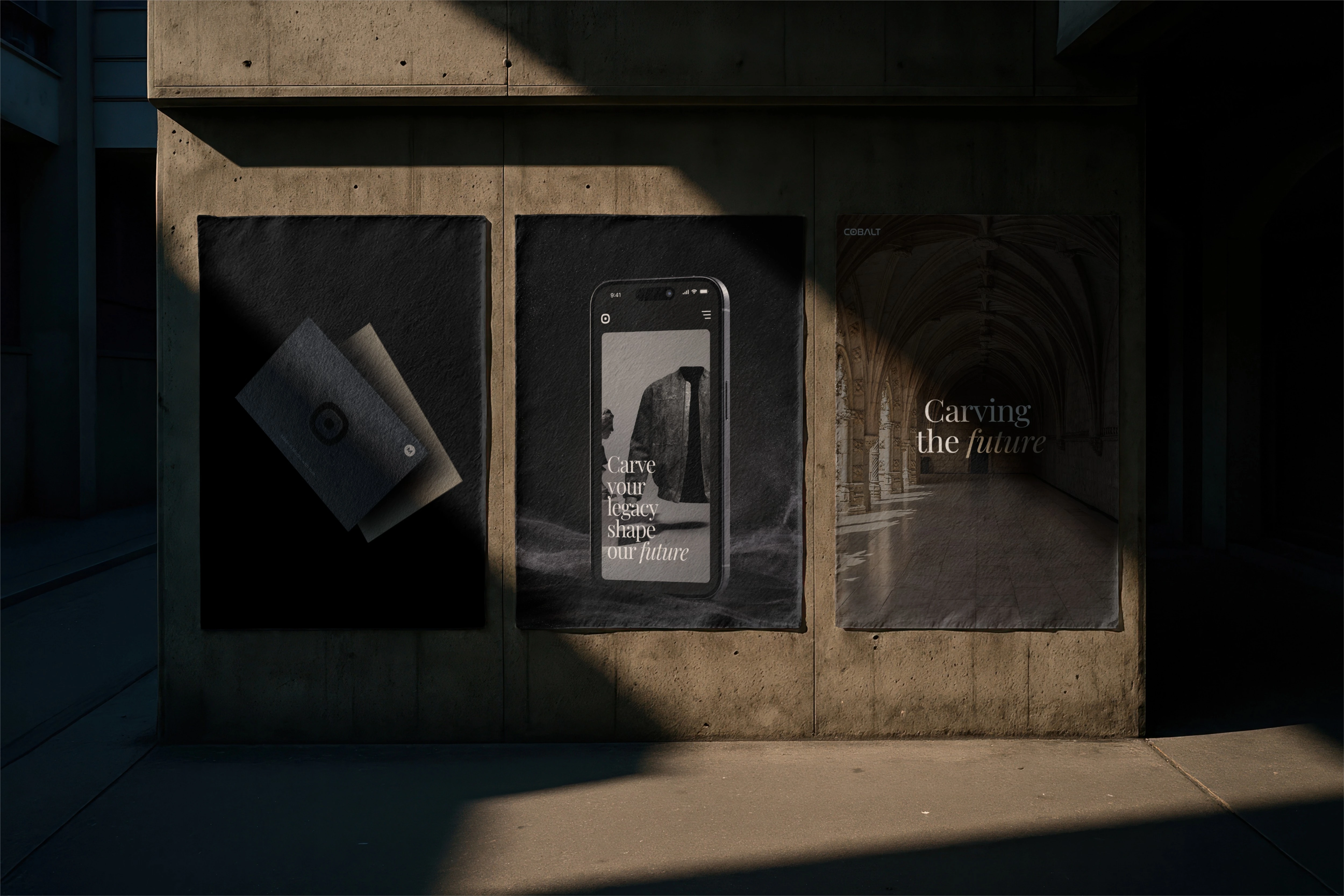
As Lead Brand Designer, I transformed COBALT from a generic Web3 startup into a premium luxury fashion house. By pairing classical Greco-Roman aesthetics with digital fashion under the concept "Carving the Future," I built a cohesive, high-end design system that stands out from standard tech clichés.
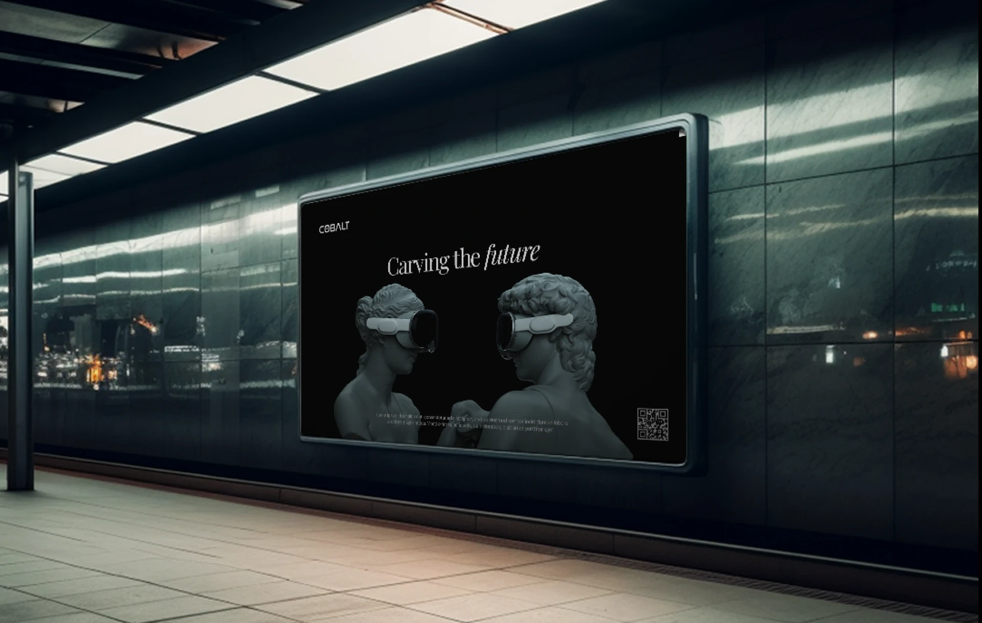
This case study documents a full identity redesign: an existing Cobalt brand guideline already existed, but it read as generic Web3/tech-startup rather than as a credible luxury brand
The project was to tear the identity down to its foundations — logo, color, type, imagery, voice, website — and rebuild it into something that could sit next to a real fashion house.
The Problem / Brief
The original Cobalt identity had all the components of a brand guideline (logo lockups, color system, applications) but none of the point of view that makes a fashion brand memorable:
Generic Web3 Palette: A cobalt blue and electric purple duo that looks like every other tech startup, lacking a unique identity.
Off-the-Shelf Imagery: Relying on basic stock fashion photography with a stamped-on logo instead of custom, brand-specific visuals.
Thin Narrative: Lacked a true brand strategy, missing the core mission, values, persona, and tone-of-voice needed to guide future work.
Template-Style UI: Generic e-commerce layouts, product grids, and social banners that look like any standard sneaker drop site.
Visual Identity & Guidelines
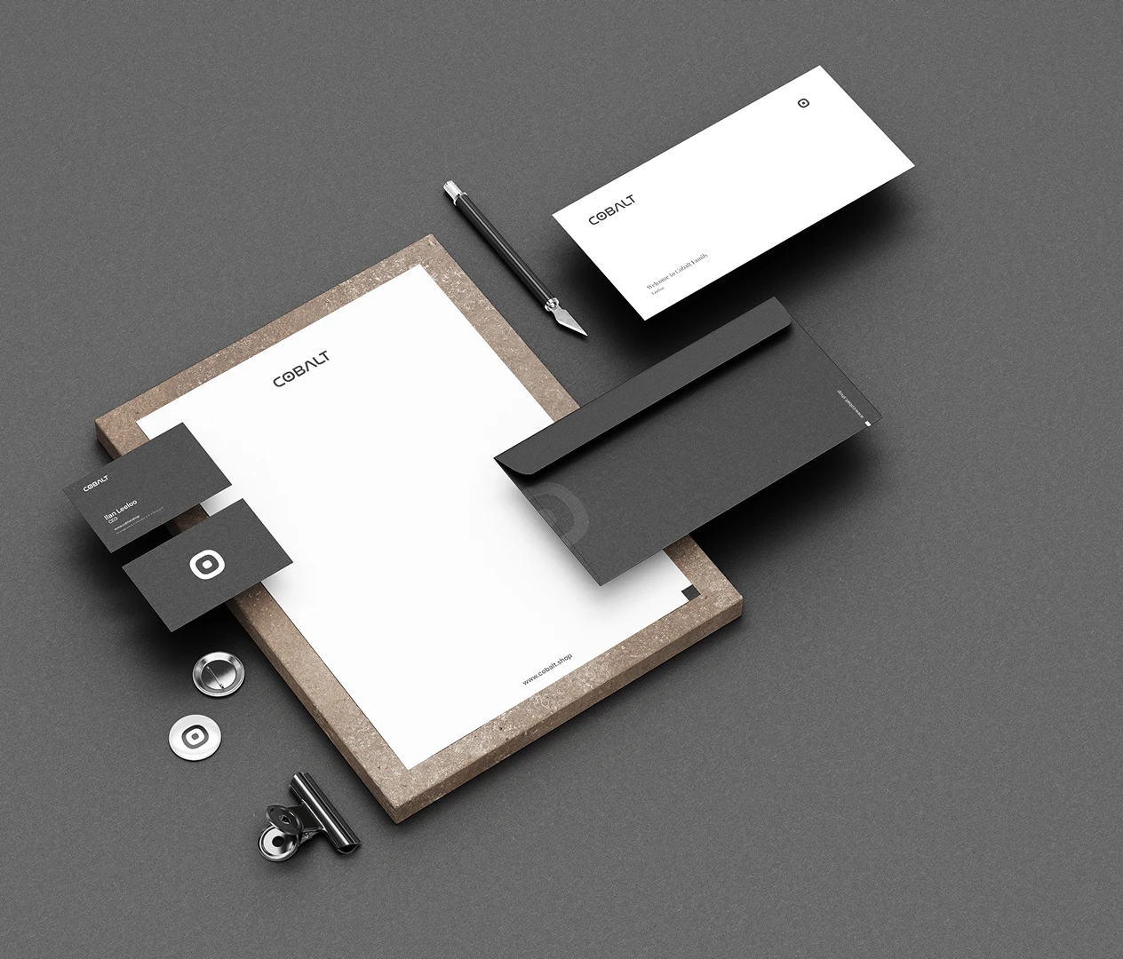
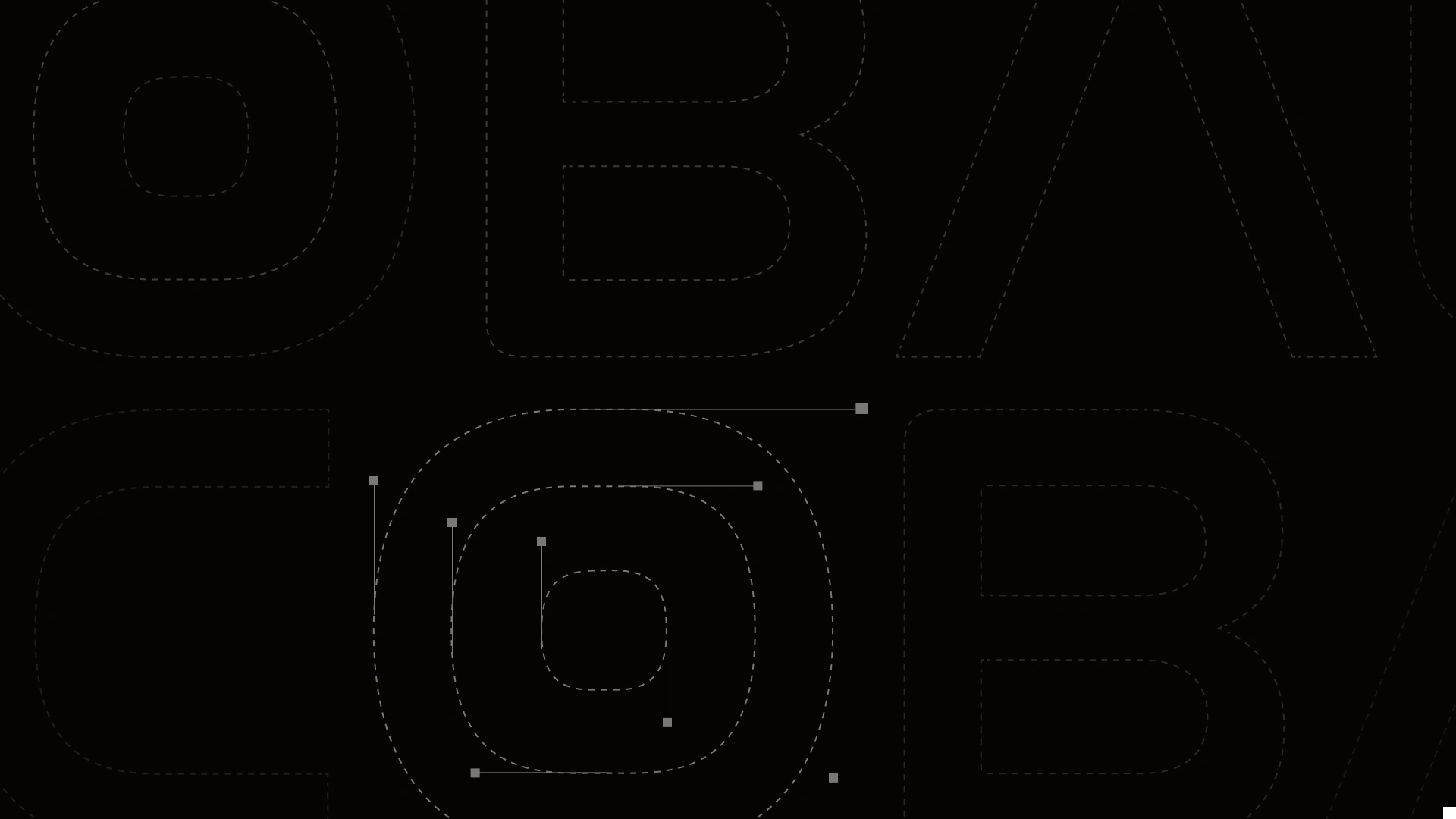
The Logo: Locked in a bold, futuristic wordmark alongside a standalone "COBALT Atom" symbol for compact layouts like app icons and favicons.
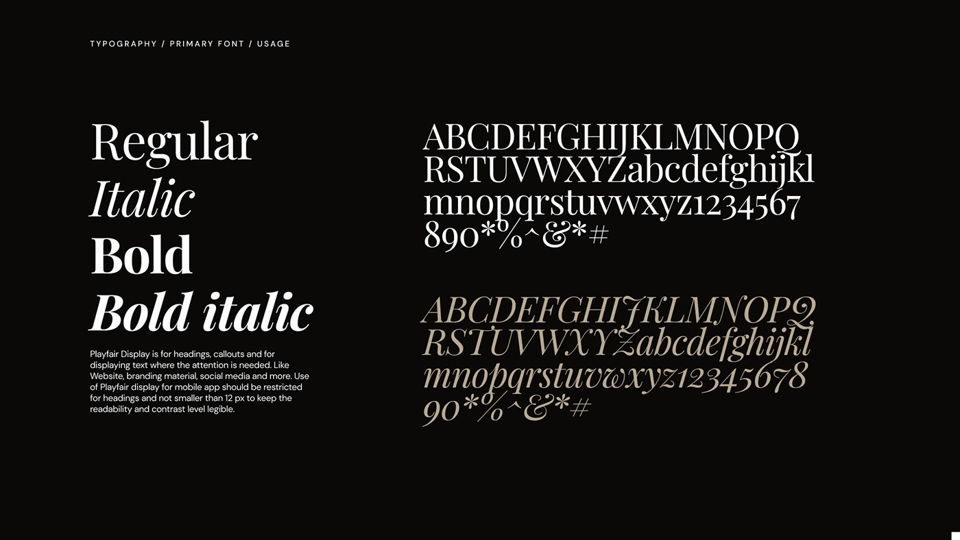
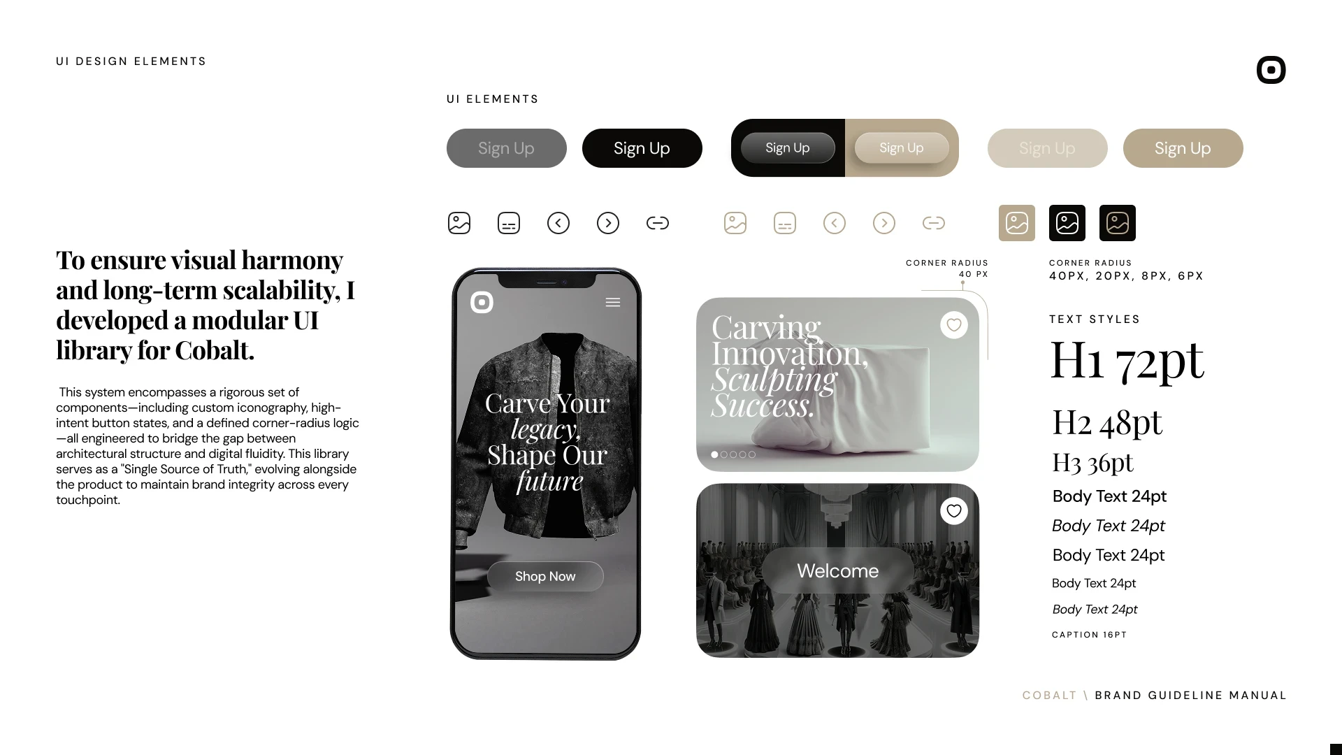
Typography: Paired high-contrast Playfair Display serifs for luxury storytelling with neutral DM Sans for seamless web and mobile interface performance.
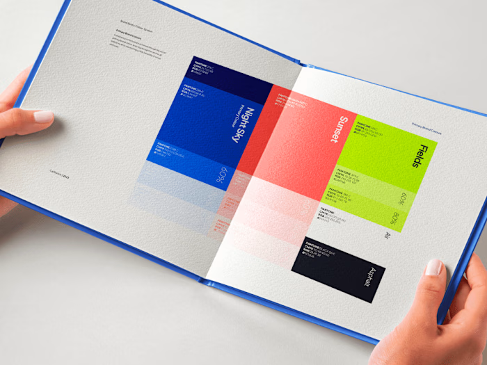
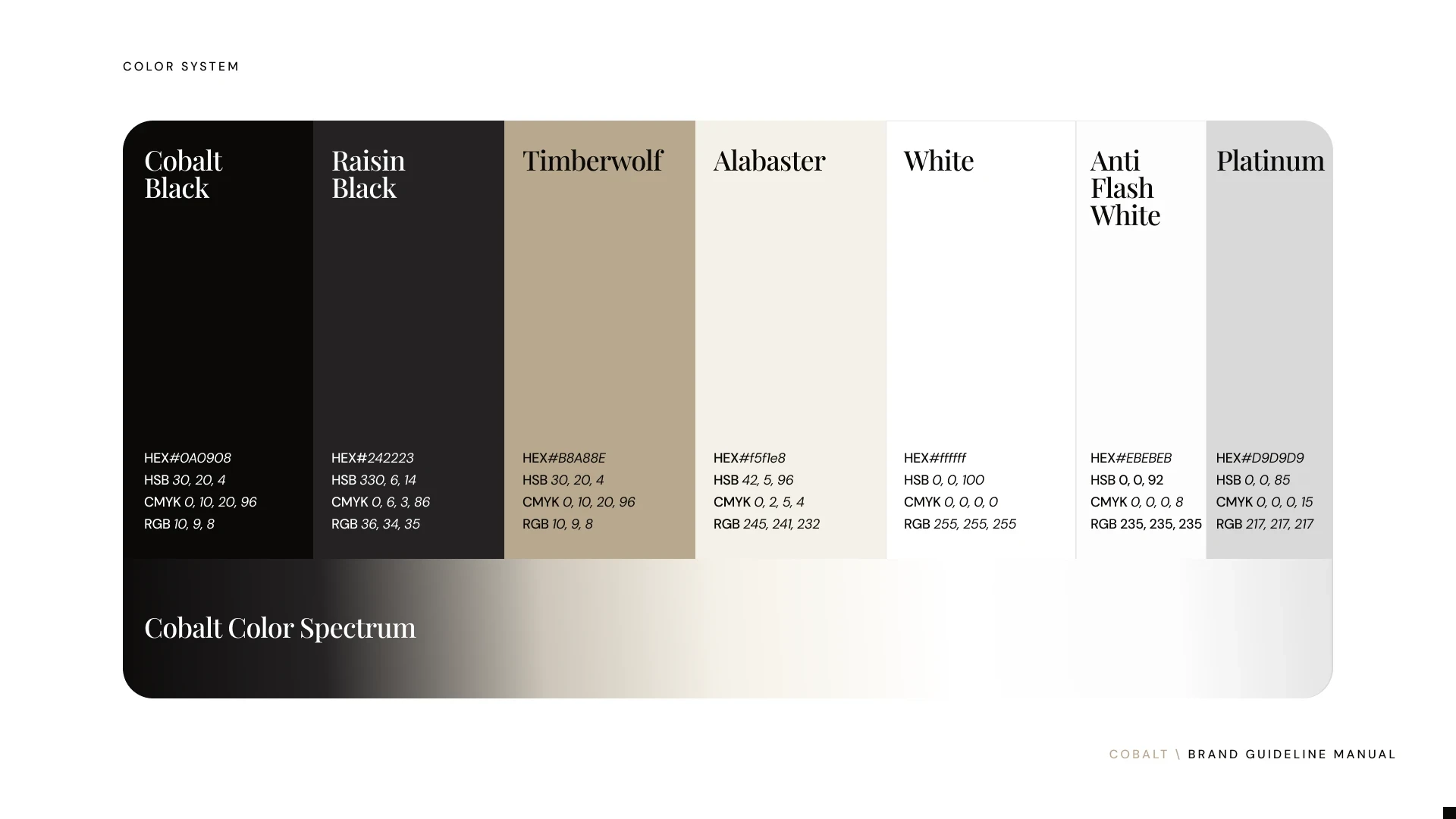
Color System: Dropped the generic Web3 gradients for warm, premium, near-black tones (Cobalt Black and Raisin Black) layered against a clean monochrome spectrum.
Color System: Dropped the generic Web3 gradients for warm, premium, near-black tones (Cobalt Black and Raisin Black) layered against a clean monochrome spectrum.
Signature Graphics: Introduced strict, balanced rules for two visual devices—translucent glass morphism and light-leak prisms—ensuring they are never combined to avoid visual clutter.
Final Results
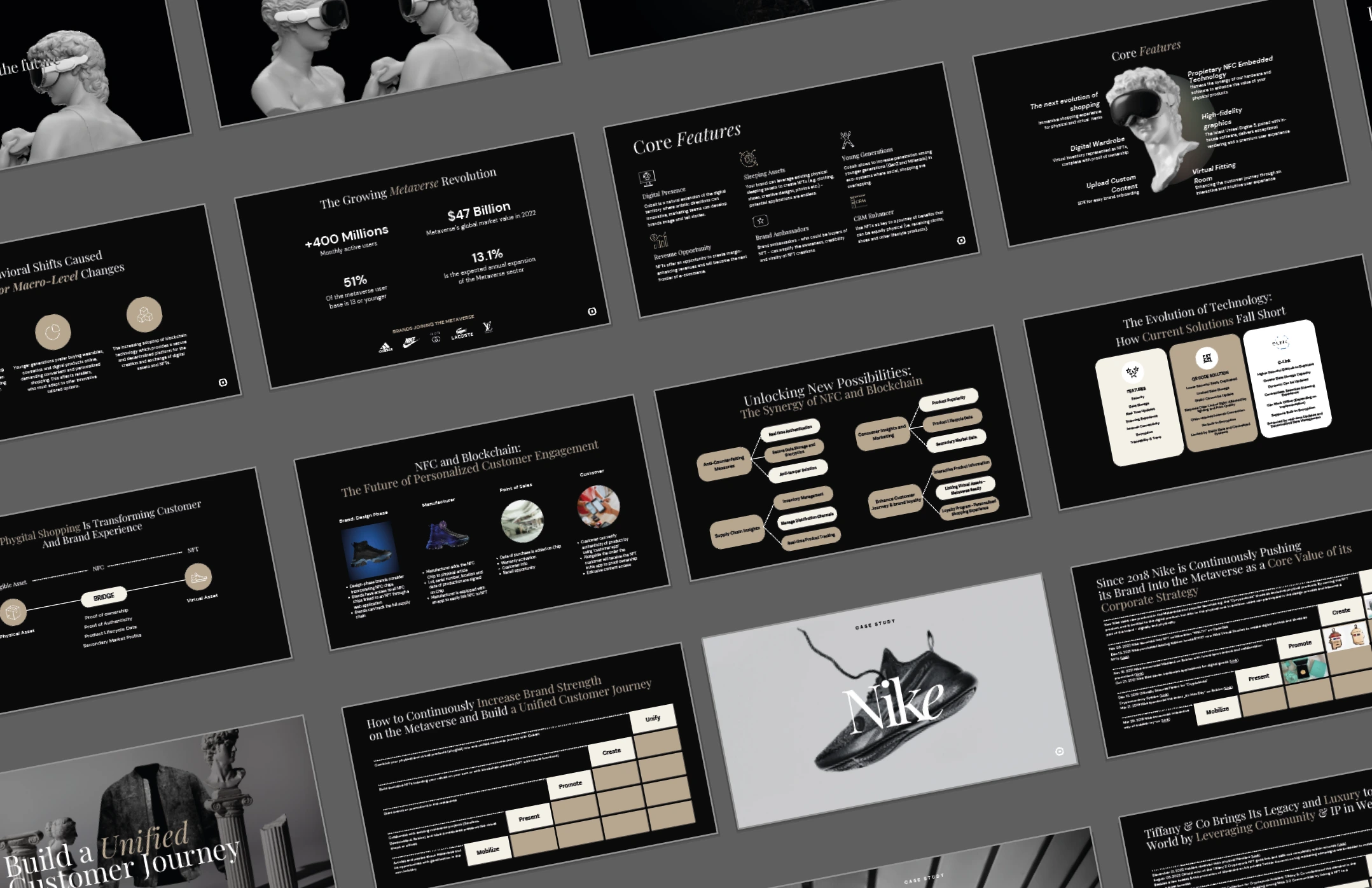
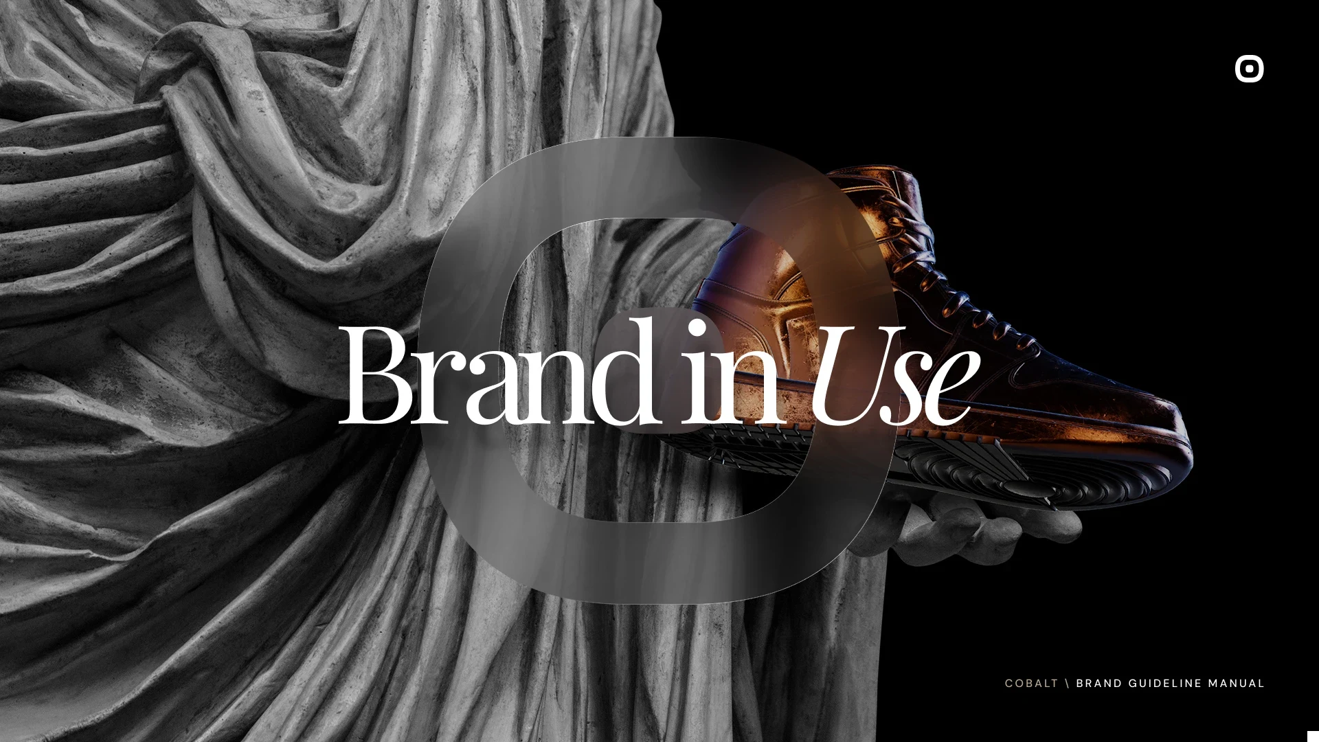
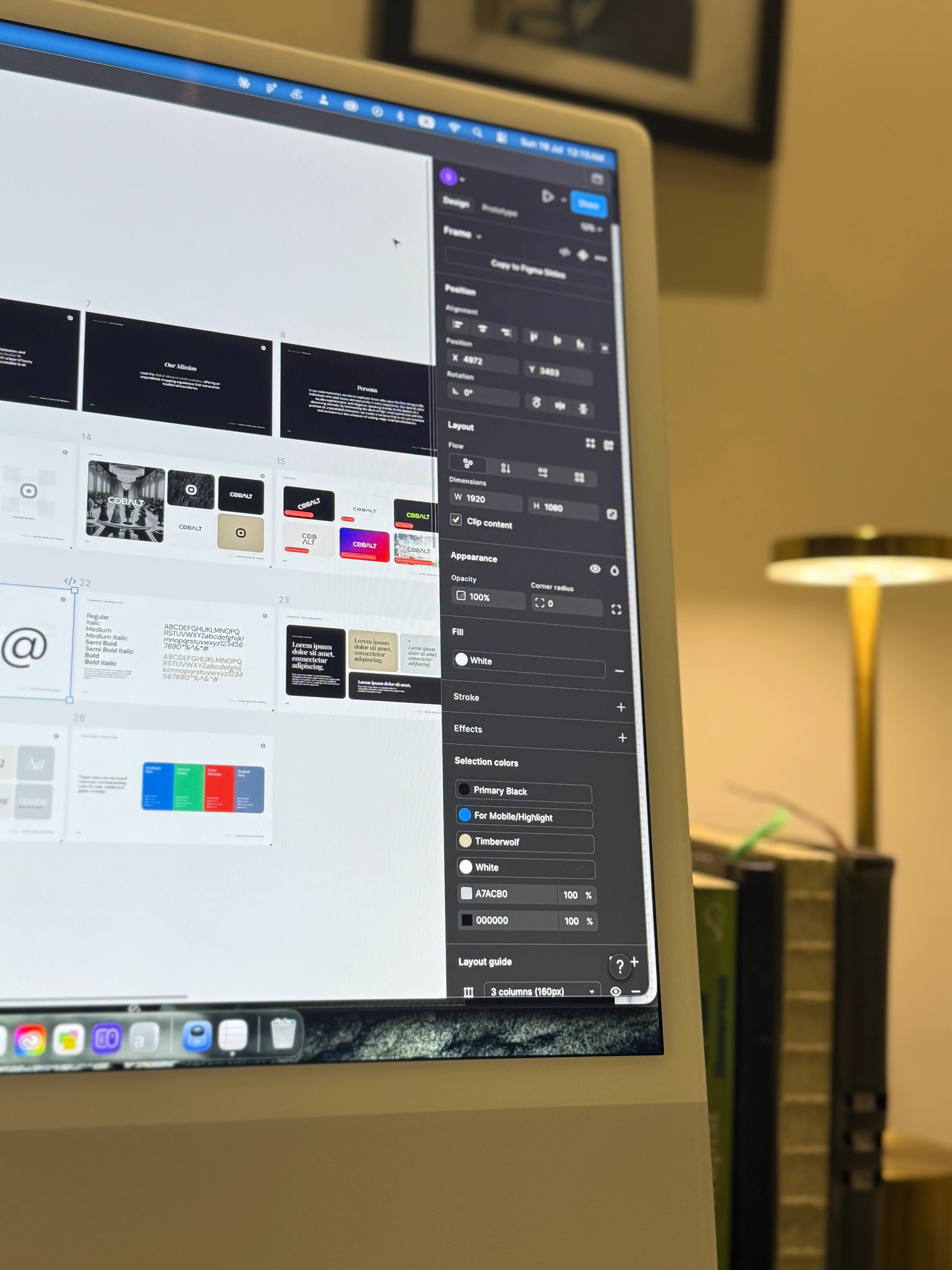
I delivered a comprehensive, 40+ page master Brand Guideline Manual (v.02) that transformed COBALT from a generic startup into an elite digital-physical fashion brand.
Key Takeaways
Choosing a restrained, monochrome palette establishes high-end luxury authority where standard tech brands rely on loud gradients. Bold visual mashups only hold long-term weight when rooted in a deep narrative core, like the precision of physical sculpting.
Deliverables:
Brand Book document
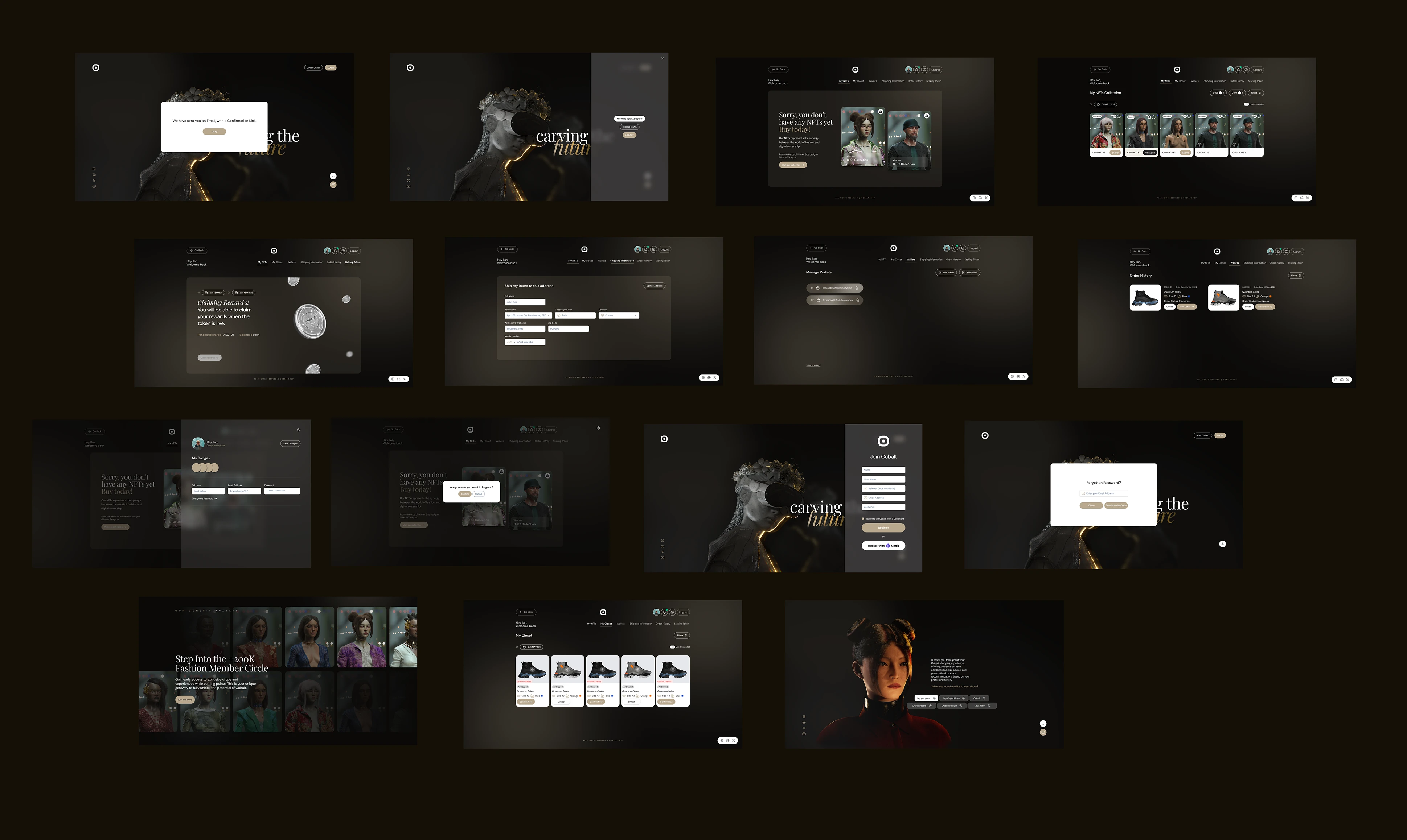
Website Design
Cobalt Account Space
Social Media Design
Like this project
Posted Apr 29, 2026
I reimagined Cobalt by bridging classical craft & digital innovation. I evolved the logo, built a scalable UI library, & fused luxury with tech-forward design.
Likes
0
Views
13
Timeline
Oct 29, 2023 - Mar 30, 2024