LEAN App Redesign & Design System

Ily Ameur


Project overview
Client: LEAN by Lilly Sabri
Role: Product Designer — Sole designer on the project
Timeline: June 2025 – August 2025
Platform: Cross platform Mobile App
Business Need: LEAN is a fitness platform built around UK-based trainer Lilly Sabri. It covers workouts, nutrition, guided programmes, and community. The app had been live for years but the UI hadn't kept pace with Lilly's growing brand or her audience's expectations.
Problem Statement
The existing LEAN app had three core problems:
1. Outdated visual identity: The UI was generic, flat, and disconnected from Lilly Sabri's elevated personal brand — creating a credibility gap between her content and her product.
2. No design system: The app had no coherent foundation underneath it. No tokens, no component logic, no scalable structure. Every screen was effectively a one-off.
3. Aesthetic mismatch with the audience: LEAN's users expect a premium, editorial experience. The old app looked like every other fitness app from 2019.
Without a full visual overhaul, users would continue experiencing a product that felt beneath the brand they'd subscribed to. And the app would remain impossible to scale or maintain consistently without a proper design system underneath it.
Project Goals
🎨 For the Visual Identity
Rebuild the UI from scratch with a warm, editorial aesthetic, premium without being cold
Establish a clear typographic system and colour palette that could carry across every screen
⚙️ For the Design System:
Build a full design system from zero : tokens, components, spacing, colour, and typography
📱 For the App:
Restructure navigation around what users actually do daily not a feature dump
Introduce Progress & Habits tracking to transform the app from a workout delivery tool into a holistic lifestyle platform
Surface Nutrition as a first-class feature, not a buried tab
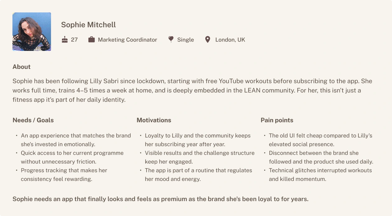
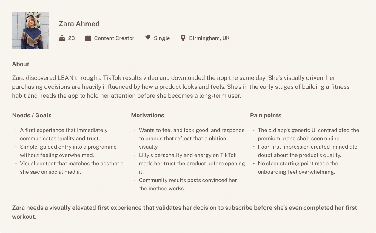
Understanding the Users
LEAN's user base is almost entirely women. No formal research was conducted for this project, the direction was PRD-led, but the audience is well-documented across App Store reviews, TikTok, and Instagram. Two distinct profiles emerged.
Defining the Strategy & Solution
Rebuilding the Visual Identity
The Problem
The old LEAN app had no coherent visual language. Pink header, flat cards, generic nav it looked like a template, not a brand. There was nothing in the UI that reflected Lilly Sabri's editorial, elevated aesthetic.
The Shift
The new identity is built around warmth, not whiteness. Muted chocolate as the primary brand colour, Pearl Beige backgrounds, full-bleed editorial photography, and tight typographic hierarchy using Public Sans across every scale.
Key Changes
Replaced cold whites with warm neutral surfaces (
#fcfbf8, #f7f4ee)Full-bleed photography as a design element, not decoration
Consistent typographic scale from text-xs (12px) to display-2xl (72px)
Dark, warm UI language that matches Lilly's brand across every screen
Expected Impact :
Users opens the app and it finally matches the brand they're loyal to
First screen passes the visual trust test
The product stops undermining the brand it represents
Building the Design System
The Problem
There was no system. Every screen was patched independently — inconsistent spacing, ad hoc colours, no shared components. In a Genflow context running multiple creator brands, that's not just a design problem. It's a business problem.
The Shift
Built a full design system from zero. Three token layers: primitives feed into semantics, semantics feed into component tokens. Swap the primitive layer and the whole brand updates. That's how you run LEAN, Shreddy, Bare, and Kinobody from one system.
Key Changes
Full colour token architecture:
Primitives/Charcoal → Semantics/Brand/primary → Semantics/Components/button/primaryTypography system: Public Sans, 4 weights, 8 size steps, semantic naming
Spacing tokens from 0–80px, 8 steps
Shadow scale from shadow-xs to shadow-3xl with skeuomorphic variants
Every component built from tokens — reusable, swappable, scalable
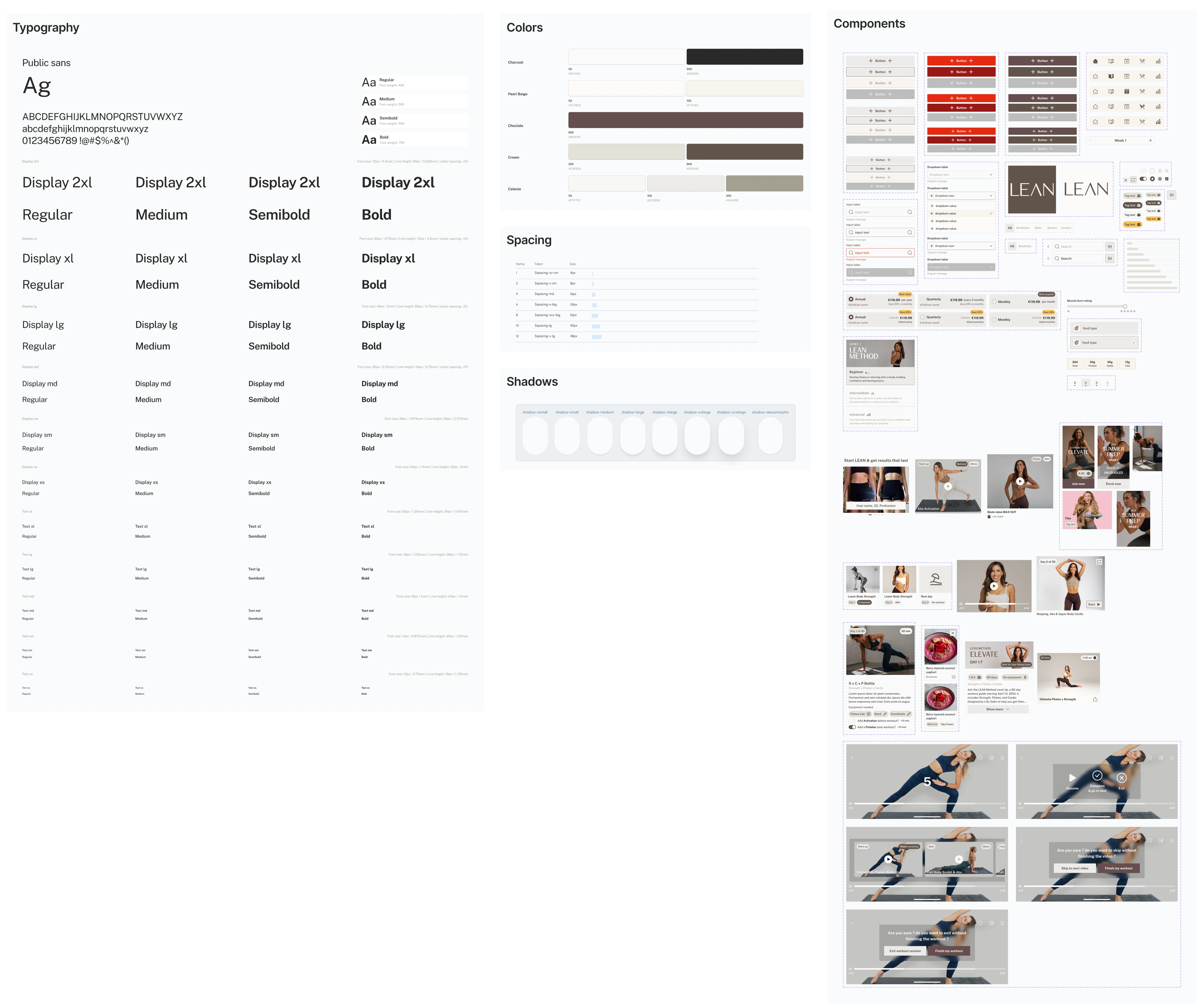
Expected Impact
Future screens built in minutes not hours
New Genflow brands onboarded by swapping one token layer
Dev handoff with zero ambiguity
Redesigning the Core App Flows
The Problem
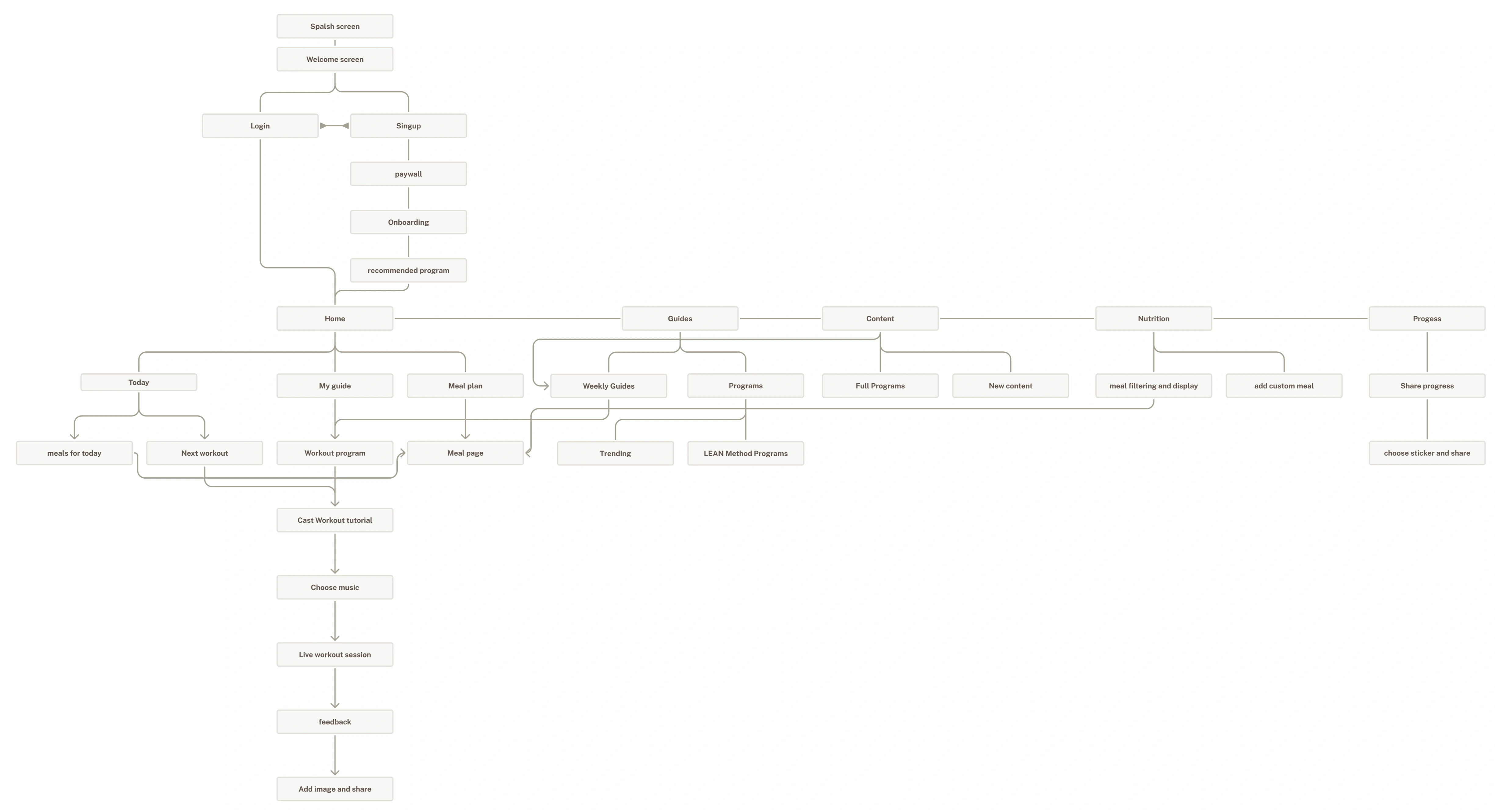
Navigation was a feature dump five tabs with Store and Community competing for space alongside core daily actions. No progression logic, no tracking, no hierarchy. The app had no opinion about what mattered.
The Shift
Every screen rebuilt around one question: what does this user need to do right now? Navigation restructured, home became a daily dashboard, workouts became structured briefings, nutrition moved front and centre, and progress became a reason to open the app on rest days.
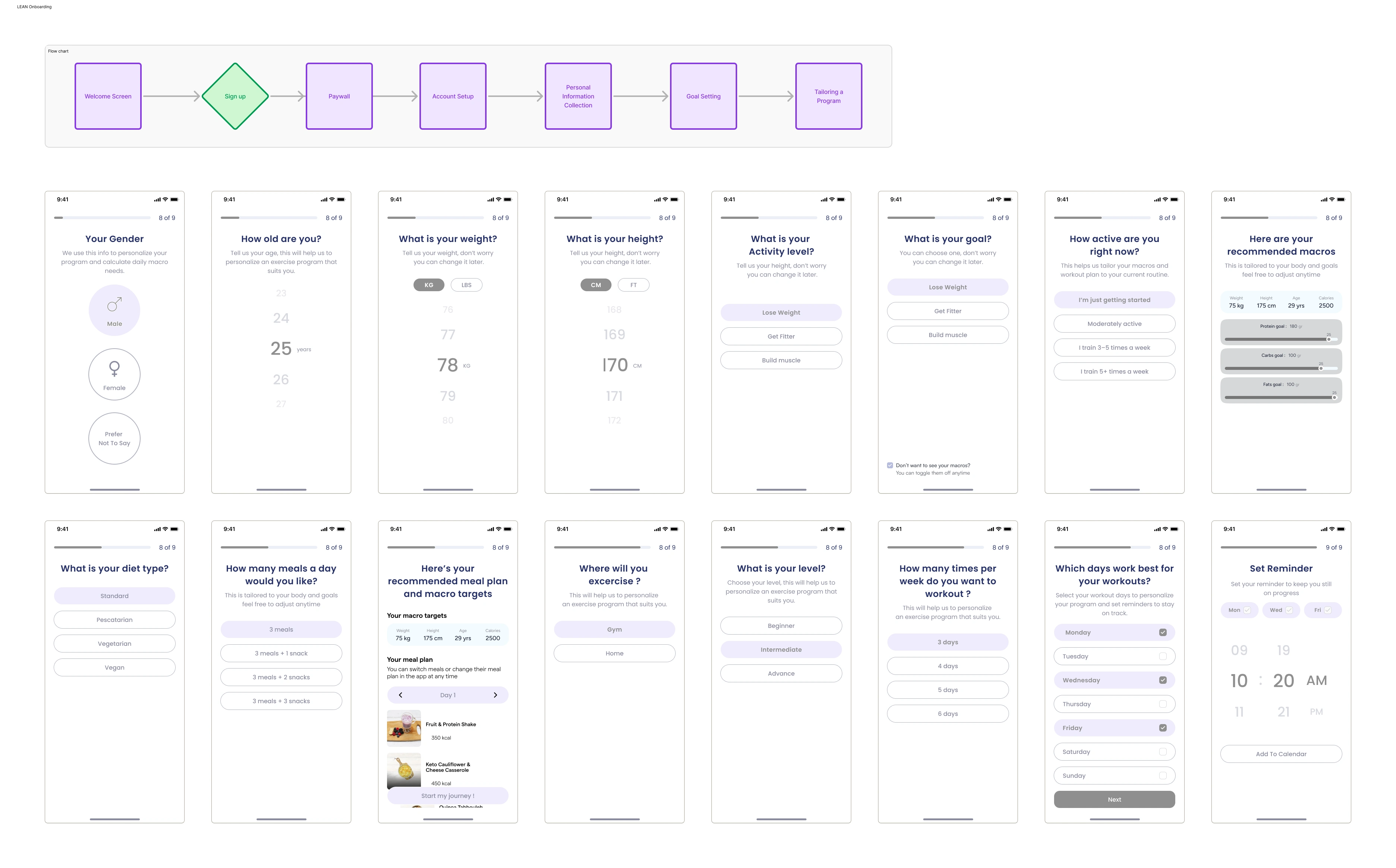
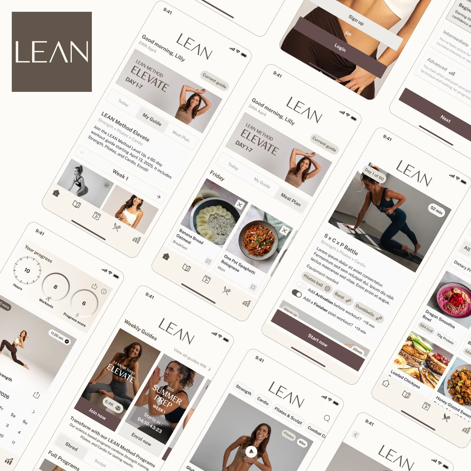
Onboarding Flow
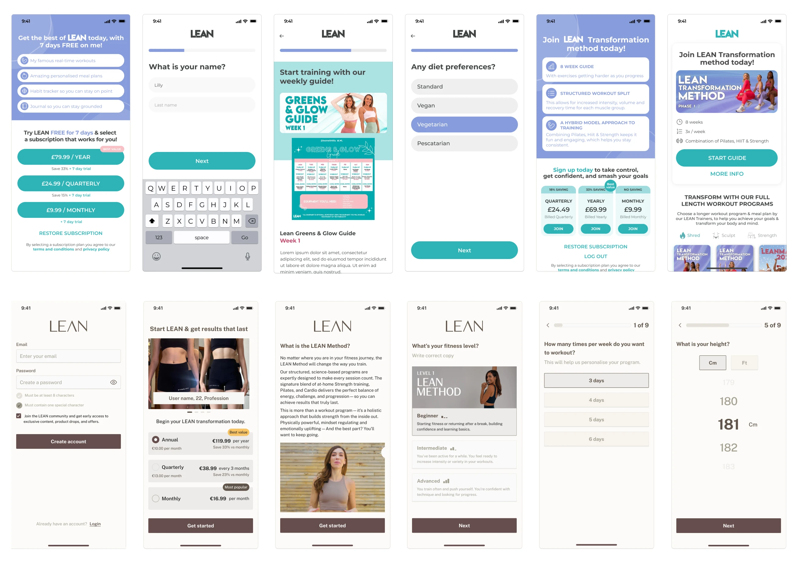
Old: Pink splash screen, teal buttons, dense sign-up forms, cluttered paywall with no clear hierarchy, and a guide selection screen overloaded with imagery and competing options. Multiple versions patched on top of each other with no consistent logic or visual language.
New: Clean editorial splash — Lilly full-bleed, warm neutrals from screen one. Structured step-by-step flow: account creation, personalisation questions, plan selection, guide discovery. Every screen has one job. The paywall is calm, clear, and confident. The brand registers immediately.
Delta: Chaotic multi-version patchwork → single coherent onboarding journey that reflects the brand from the first tap.
Home Screen
Old: Two tabs, greeting, hero banner, stacked cards, no context, no progression logic. Five-tab nav cluttered with Store and Community.
New: Three tabs (Today / My Guide / Meal Plan). Date visible. Day counter ("Day 2 of 35"). Persistent current guide shortcut. Meal plan as a first-class feature. Nav reduced to four focused tabs.
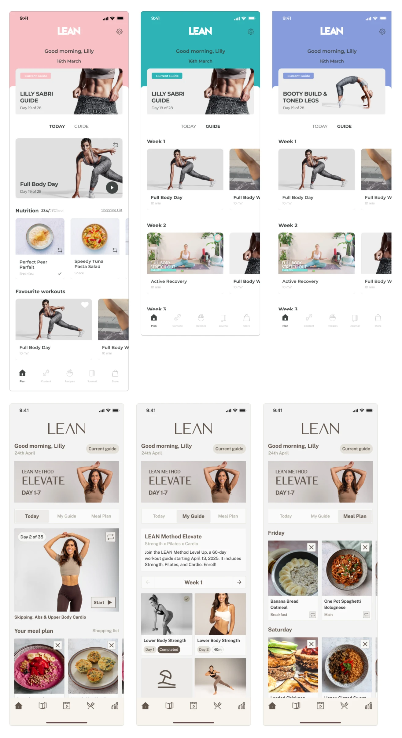
Delta: Content dump → structured daily dashboard. User lands knowing exactly where they are in their journey.
Guides & Programmes
The decision level. Choosing and committing to a programme.
Old: Pink and teal hero banners, countdown timers plastered on cards, cluttered guide detail pages with prize info, meal plan previews, and enrolment CTAs all competing on the same screen. Felt like a sales page, not a product.
New: Editorial programme cards with clean metadata. level, duration, trainer. Guide detail screen shows week structure, content previews, and a single enrolment CTA. The commitment decision is calm and clear. No noise around it.
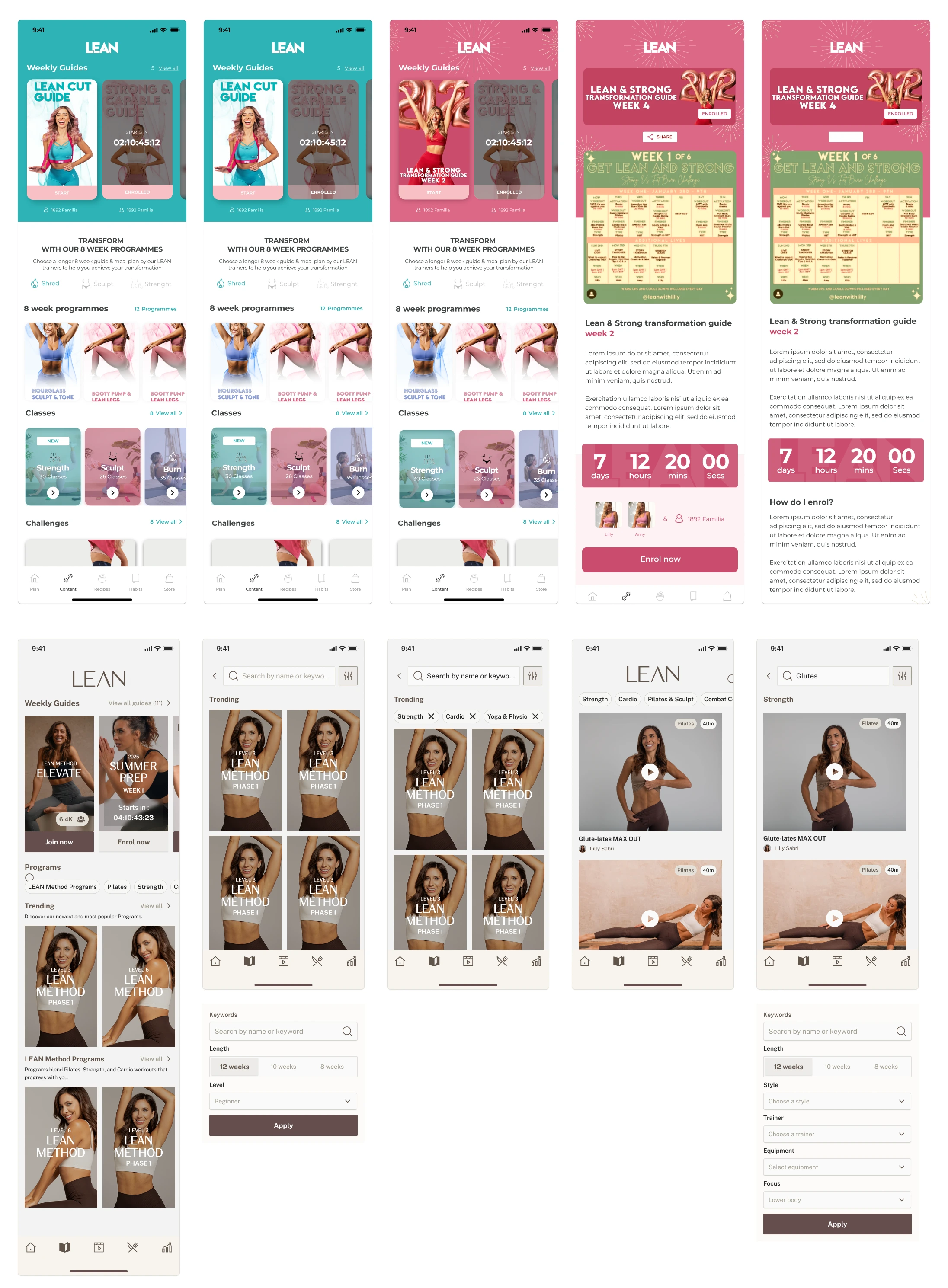
Delta: Visual noise → structured content discovery. Users find what they need without being shouted at.
Content
Old: Exercise list with small thumbnails, teal progress indicators, Spotify/Apple Music integration floating awkwardly at the top, flat completion screens. Multiple patched versions with no visual consistency. The tab felt like a workout log, not a content destination.
New: Dedicated content hub with clear hierarchy — Weekly Guides at the top, Full Programs below, New Content, Studios & Classes, and Challenges. Each tier has its own visual treatment. Guide detail drill-down shows programme metadata, week structure, countdown to start, and optional add-ons inline. The content tab is now a proper destination with a logical browsing journey from discovery to session start.
Delta: Patched exercise list → structured content destination with a clear hierarchy from programme to session.
Meals & Nutrition
Old: Teal-accented recipe cards, flat grid layout, basic category tabs, minimal metadata. Recipes felt like a static library no dietary context, no personalisation, no connection to the user's programme.
New: Warm editorial food photography. Dietary preference filters (Standard, Pescatarian, Vegetarian) applied inline. Macro breakdown visible on every card kcal, protein, carbs, fats. before you even open a recipe. Full recipe detail with method and ingredients tabs. Custom meal builder for users tracking their own food. The nutrition section now functions as a genuine daily tool, not a recipe blog.
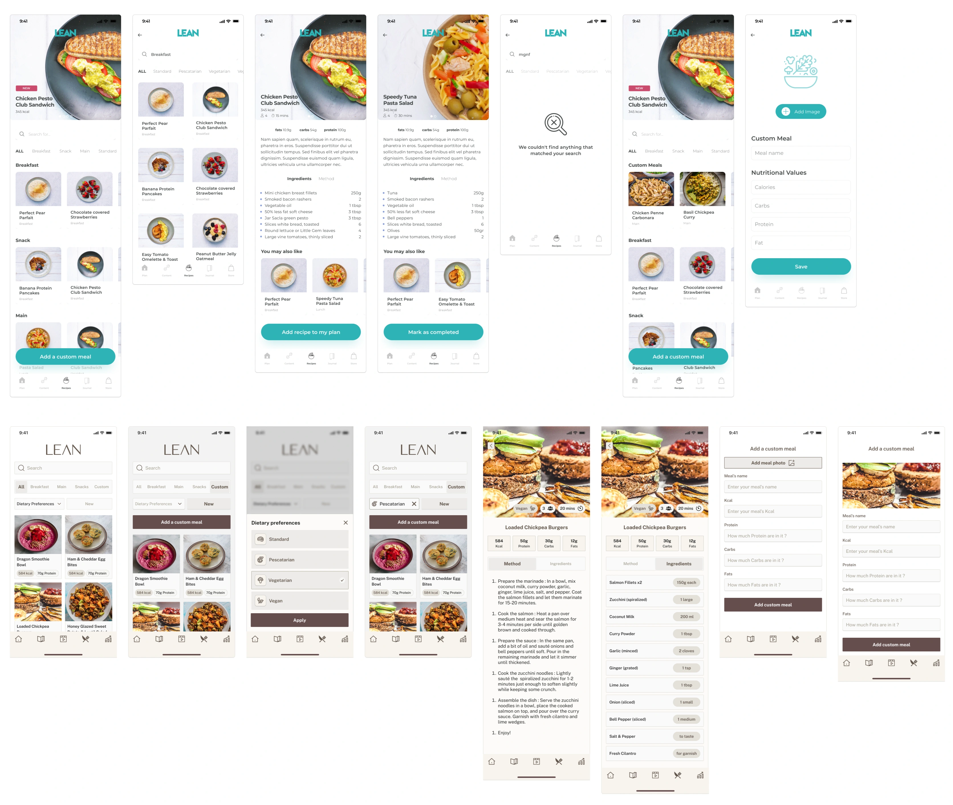
Delta: Static recipe library → personalised daily nutrition tool with macro tracking and custom meal logging.
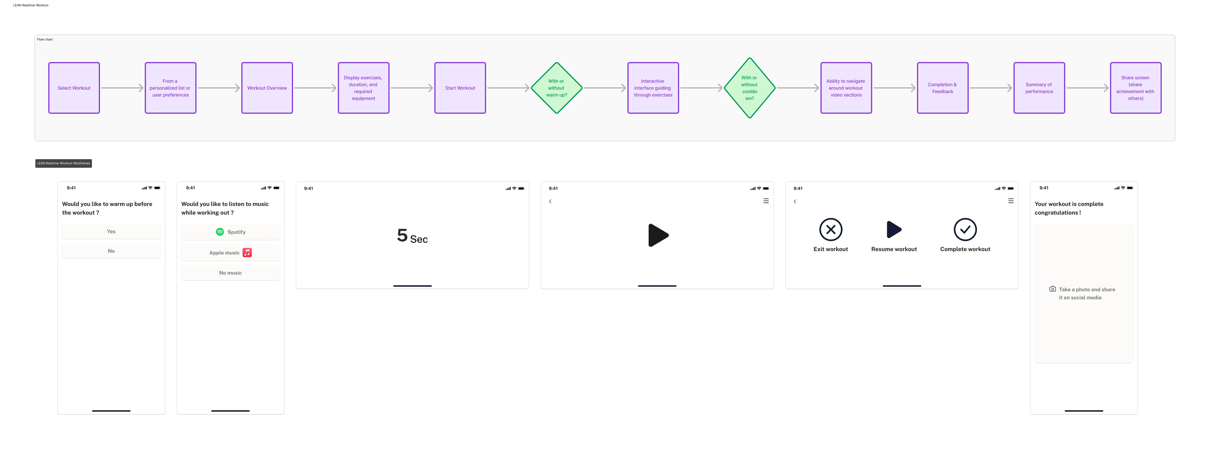
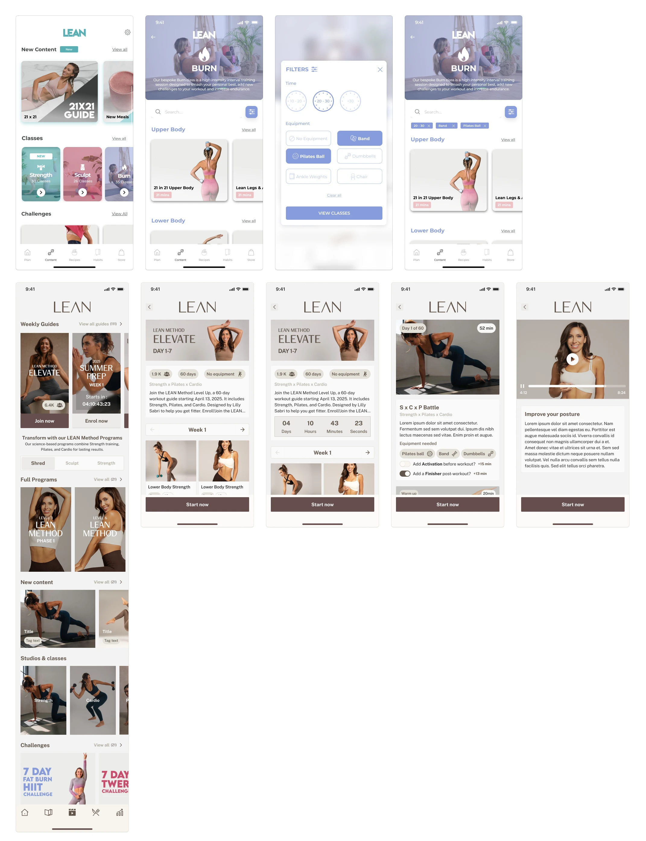
Workout Player
Old: Exercise list with small thumbnails, teal progress toggle, Spotify/Apple Music integration floating at the top, cast to TV banner, flat completion screen with a "Well Done" overlay and star rating. Functional but clinical — no sense of momentum or brand presence during the session.
New: Full-bleed video player with clean overlay controls. Exercise progression visible throughout. Countdown between exercises. Post-workout completion screen with calm, warm tones consistent with the rest of the app. The session feels like part of the same product — not a different app bolted on.
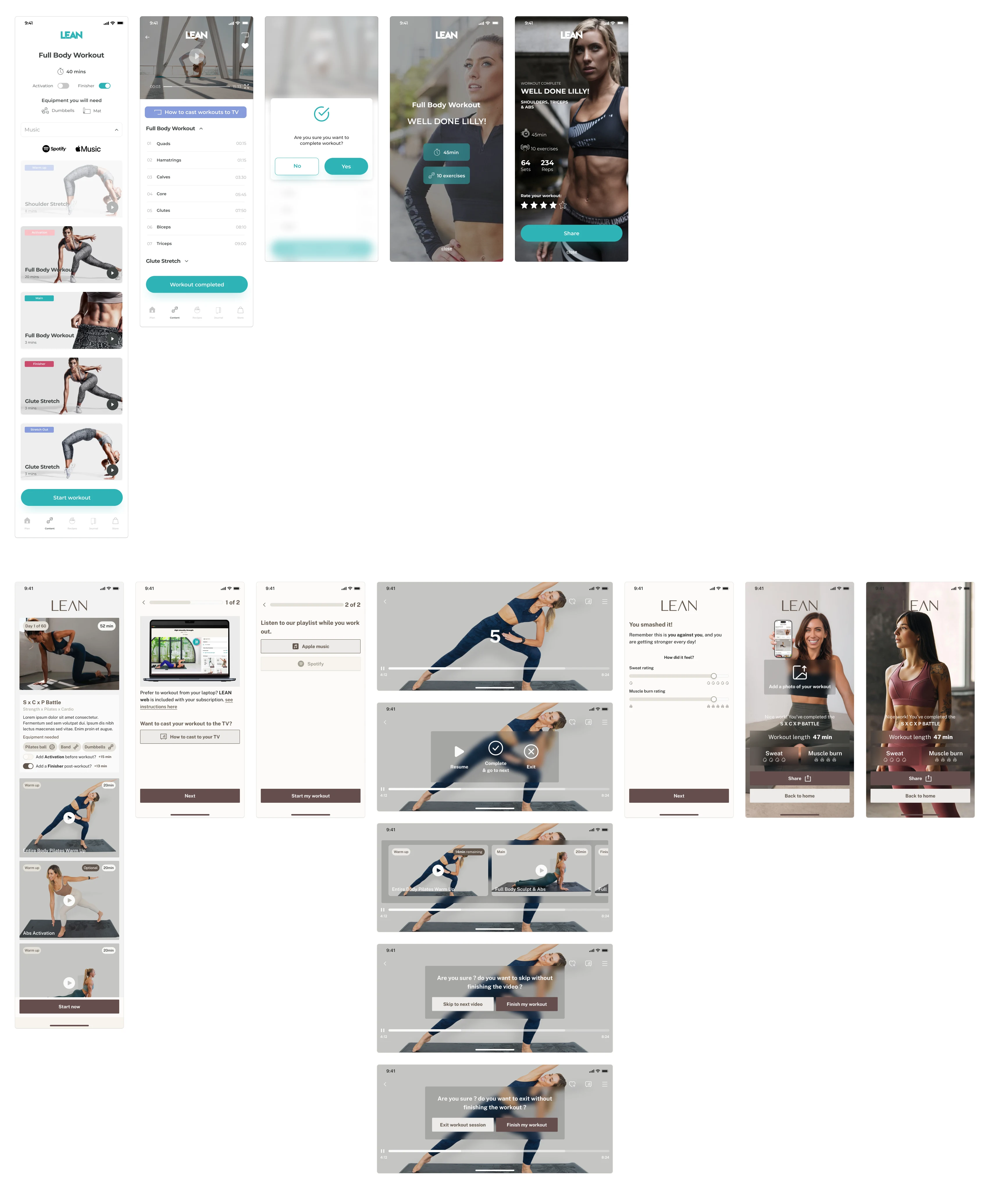
Delta: Disconnected session experience → cohesive in-workout UI that feels like the same product from first tap to last rep.
Progress & Habits — New Feature
This didn't exist in the old app at all.
New: A dedicated Progress screen with three core metrics Hours, Workouts, and a Progress Score built on consistency over time (the more you show up, the higher it climbs, up to 10). Weekly day tracker showing completion across the week. Monthly calendar with dot markers on completed sessions. Shareable progress cards branded LEAN stickers with your stats, weekly view, monthly calendar, and all-time summary all tagged with #LEANProgress and #LEANEmpower for social sharing.
The social sticker system is smart. It turns personal progress into branded content without asking users to do any extra work. User shares a stat card, LEAN gets organic reach. Everyone wins.
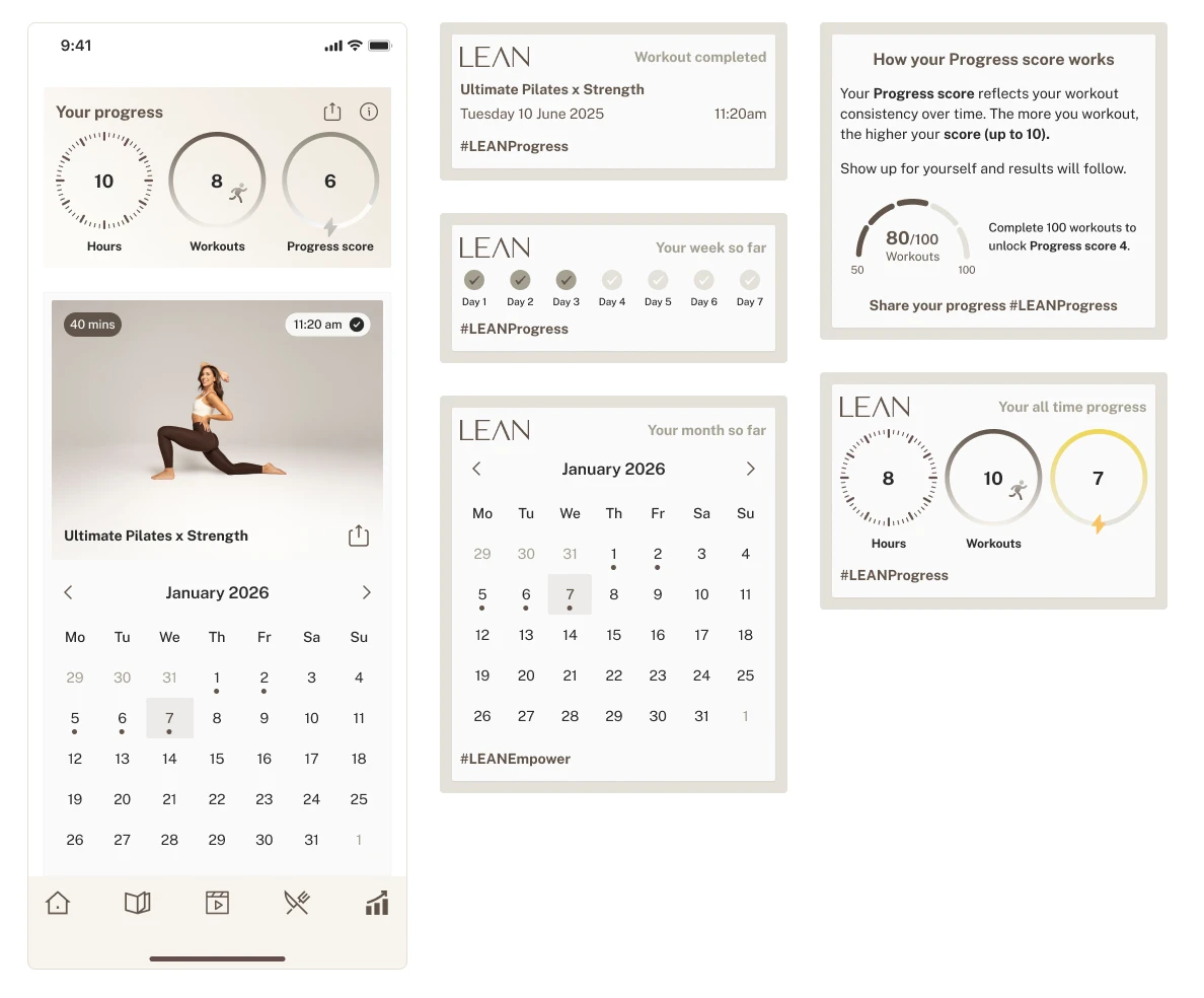
Delta: No tracking → full accountability layer covering fitness, nutrition, and daily habits in one place.
Outcome
Delivered a complete redesign of the LEAN app new visual identity, new design system, restructured navigation, and a new Progress & Habits feature built from scratch. The design system was built to Genflow's multi-brand standard, making it directly reusable across their portfolio of creator brands.
The product went from a generic fitness app that looked five years behind Lilly's brand, to an editorial, premium platform that matches the audience's expectations and gives the business a scalable foundation to build on.
Thank you for Swinging by ✌️
Like this project
Posted Mar 10, 2026
Rebuilt LEAN's UI from scratch, new visual identity, design system, and features for Lilly Sabri's fitness platform.
Likes
1
Views
2
Timeline
Jun 2, 2025 - Aug 15, 2025