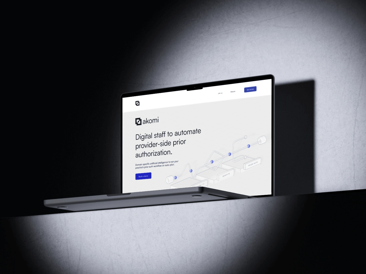
Built with Spline
Akomi Branding and Web Design
Gabor Molnar
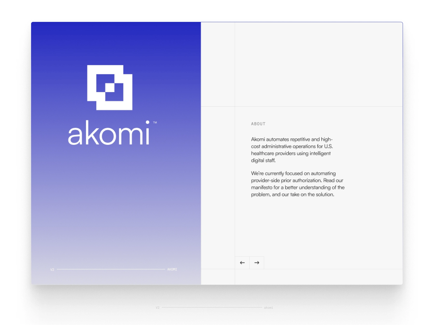
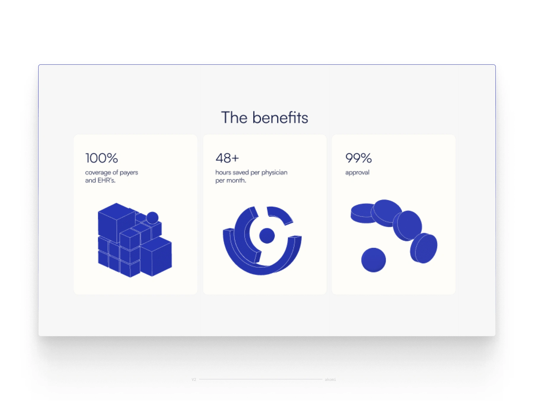
Core Concept: Automation Meets Simplicity
Akomi’s identity is rooted in automation, streamlining complex workflows. The brand design reflects clarity and precision while maintaining a warm, human touch necessary for healthcare communications.
Typography: Satoshi Font
The choice of Saatoshi font was deliberate. Its modern, clean lines convey sophistication and professionalism while maintaining readability across digital platforms. This font choice reflects the efficiency of automation while providing a subtle humanistic feel, ensuring accessibility for all users.
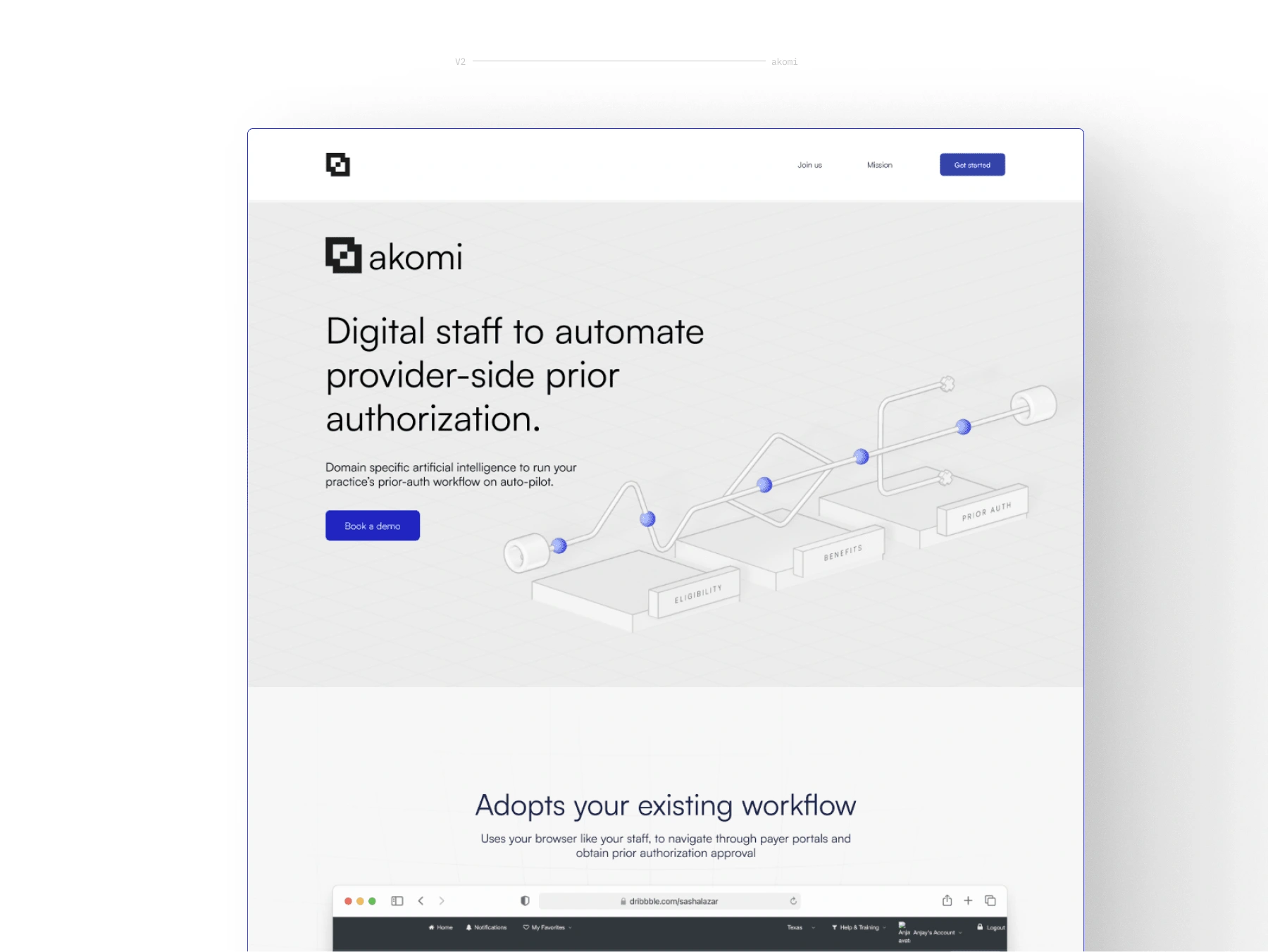
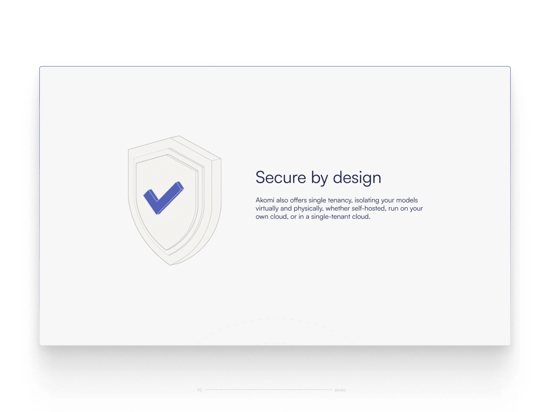
All the illustrations are made with Spline.
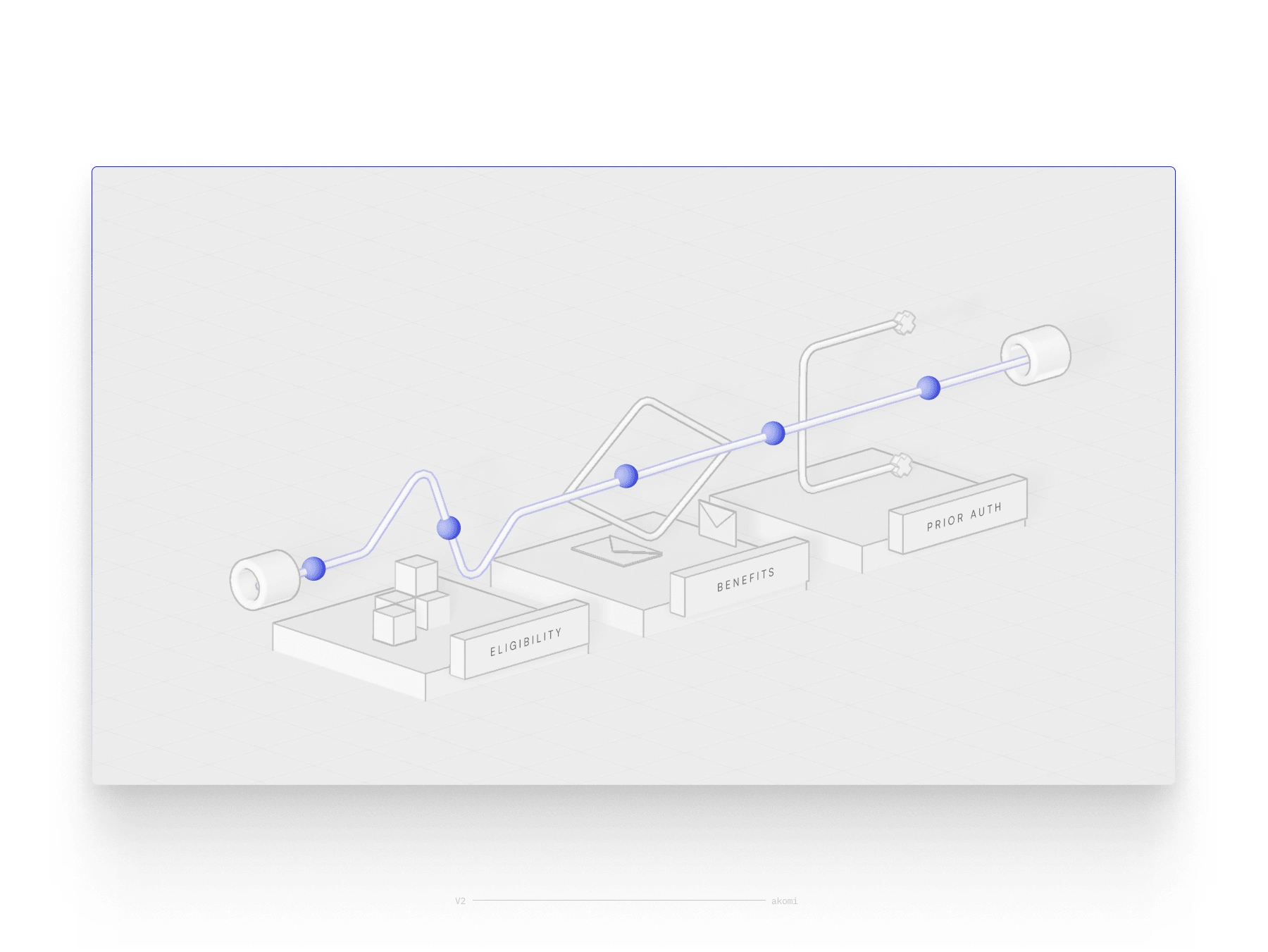
hero illustrations
Like this project
Posted Dec 10, 2024
Gabor integrated machine learning algorithms into a mobile app's UX/UI design, resulting in personalized user experiences and improved retention metrics.