Brand Design for Social Media Manager Life Flow by Lo
Destinee Rosemurgy

May 2025
Life Flow by Lo
Life Flow by Lo was created to support women-led brands in showing up online with more ease, confidence, and alignment. Instead of chasing trends, Lo helps her clients create content that feels real, grounded, and sustainable—so they can build trust and grow their presence without the overwhelm.
Scope of Work:
Brand Essentials
Photography: Ember + Birch
Creative Direction:
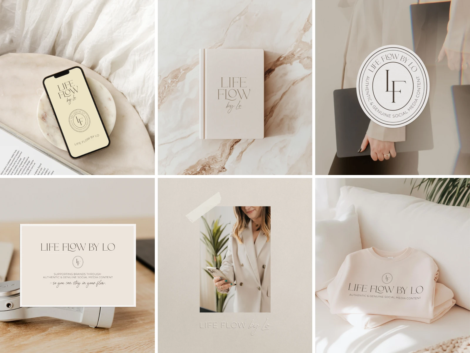
Life Flow by Lo’s branding was built to reflect Lo’s approach to content—thoughtful, genuine, and quietly confident. The visual identity embraces softness without feeling overly delicate, using a palette of warm neutrals, soft whites, and a gentle pop of buttery yellow to bring a sense of warmth and ease.
The logo suite combines refined typography with subtle custom details, including a flowing “L” that nods to the idea of movement and personal connection. Every element was designed to feel calm, clear, and aligned—supporting a brand that helps others show up online in a way that feels good.
Like this project
Posted Nov 5, 2025
Developed a brand identity for Life Flow by Lo, focusing on genuine and sustainable content creation.
Likes
0
Views
0
Timeline
Apr 30, 2025 - May 30, 2025