Brand Identity Design for Housepadi
Bolutife Awakan
HousePadi is the modern property management solution whose mission is to empower landlords to manage their rental properties seamlessly and tenants to enjoy a stress-free renting experience.\
\
It strives to achieve this by providing an intuitive platform that streamlines communication, payments, and maintenance requests.

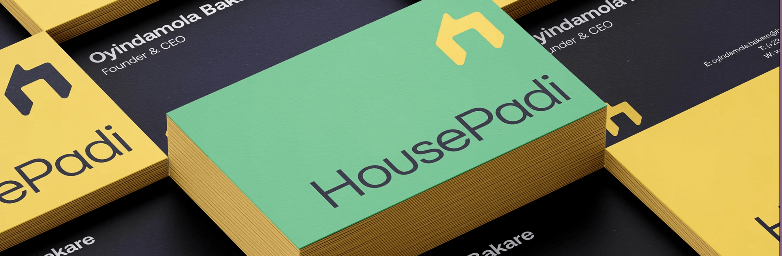
The symbol is a simplified perspective building slightly stylized into the shape of an 'H’ The use of bold, angular lines creates a strong and modern visual identity, lighter logotype adds a touch of approachability and friendliness. The logo is symbolic, impactful, and timeless. We perfectly aligned all the details for a harmonious and balanced look.
The identity system is used across a variety of mediums, including posters, flyers, banners, social media, and the product website. The wordmark and visual elements are used consistently throughout these materials, ensuring a strong and consistent brand presence.
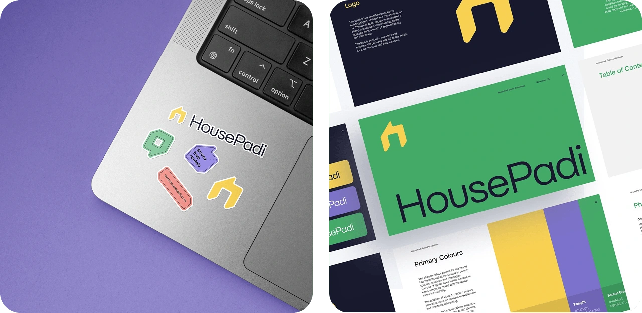
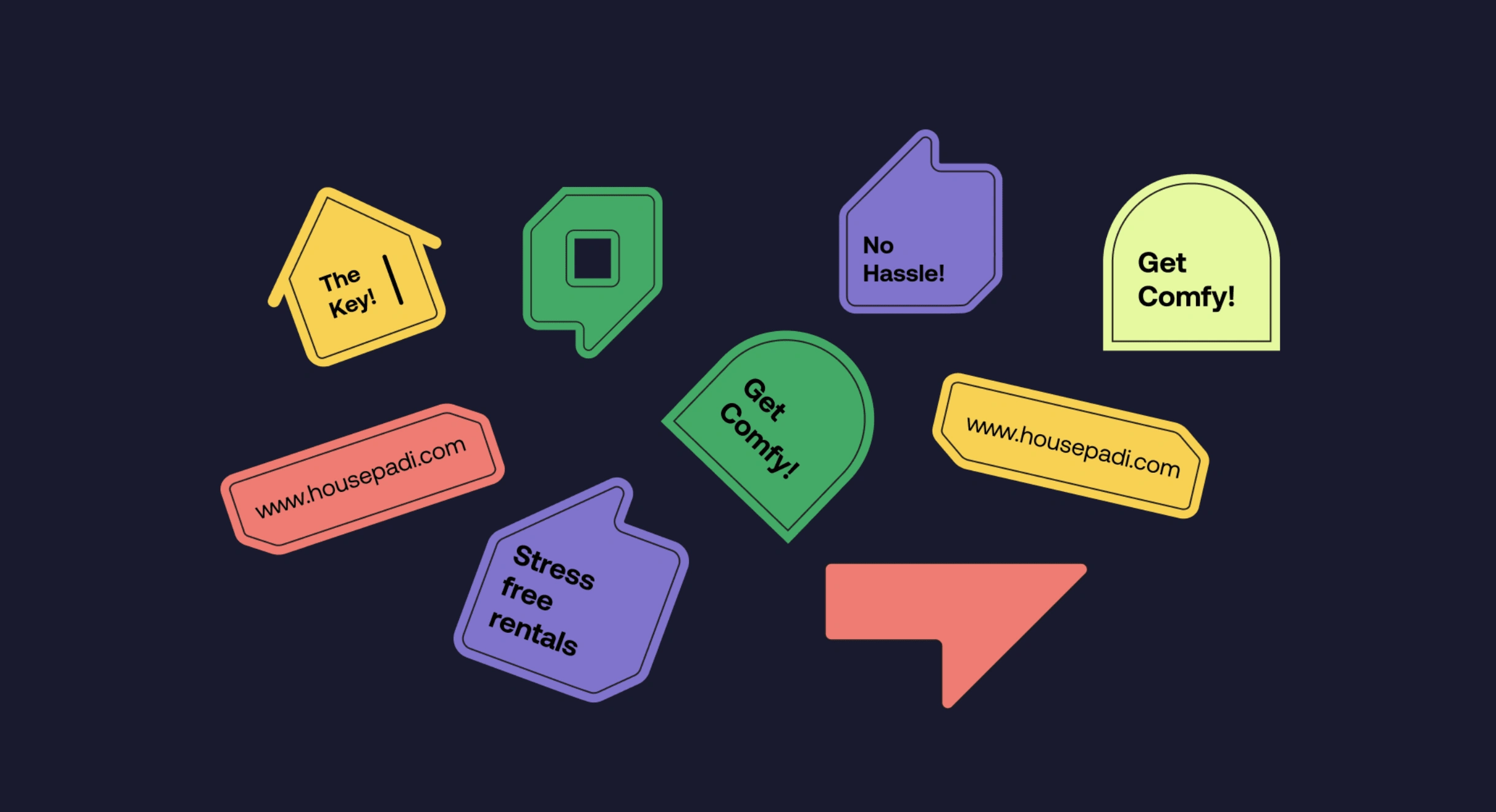
This balanced colour palette creates a unique and memorable brand identity, ensuring that HousePadi stands out as a trustworthy and dynamic solution in the property management industry.

Reactions were over the roof and the the brand got these milestones 1 week away from launch. So many customers applauded the brand and design system.

Like this project
Posted Feb 14, 2025
A comprehensive brand identity design
Likes
0
Views
8