Braumanufaktur redesign
Maria Cuervo
Overiew
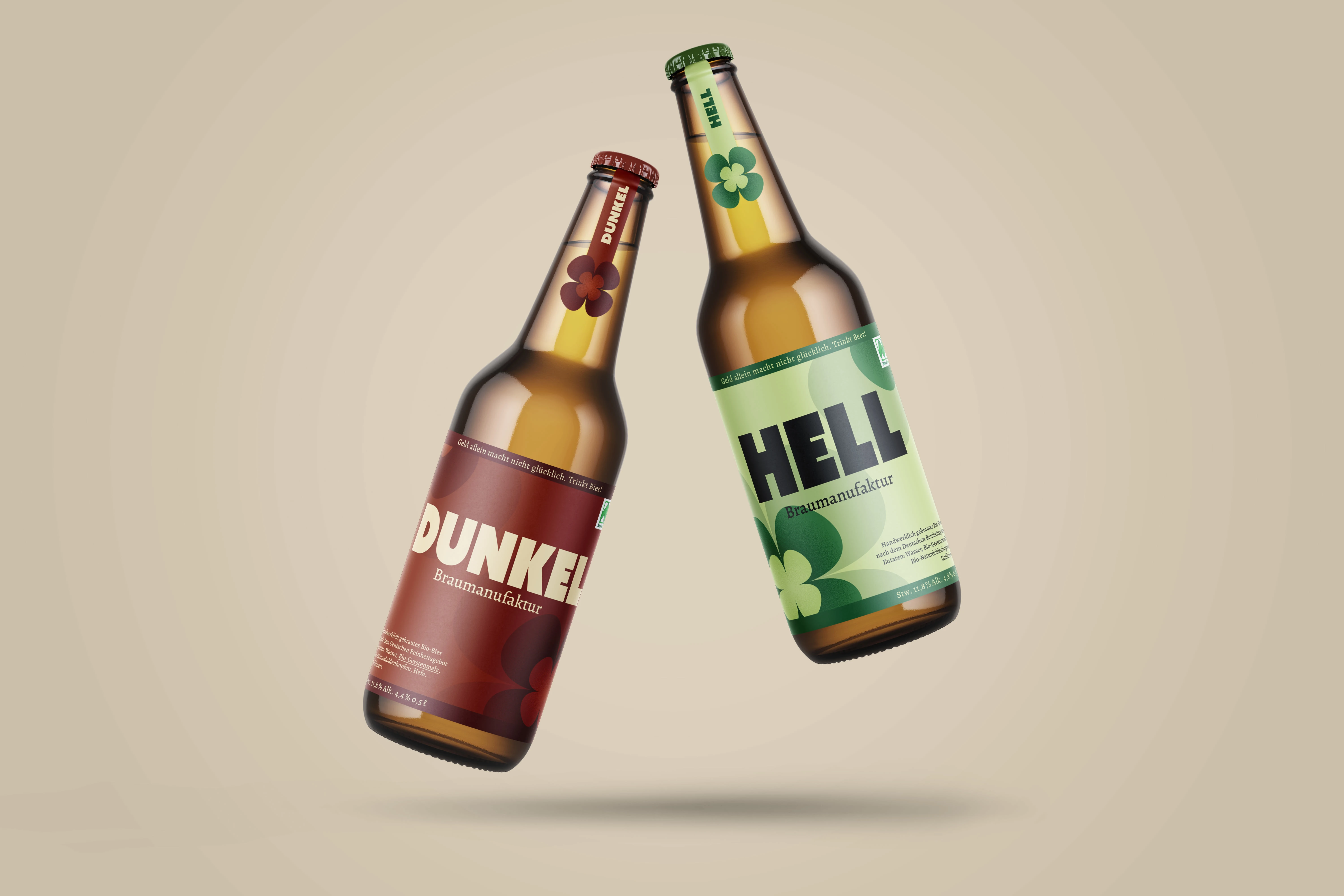
In this project we redesign the local Potsdammer brewery that specializes in brewing craft beer with bio and regional products. With lots of character, one of their slogans says ‘Geld allein macht nicht glücklich. Trinkt Bier!’. And it was with this quirky attitude that I redesigned the beer, still keeping in mind its core values. I wanted a happy-go-lucky feeling.
First sketches
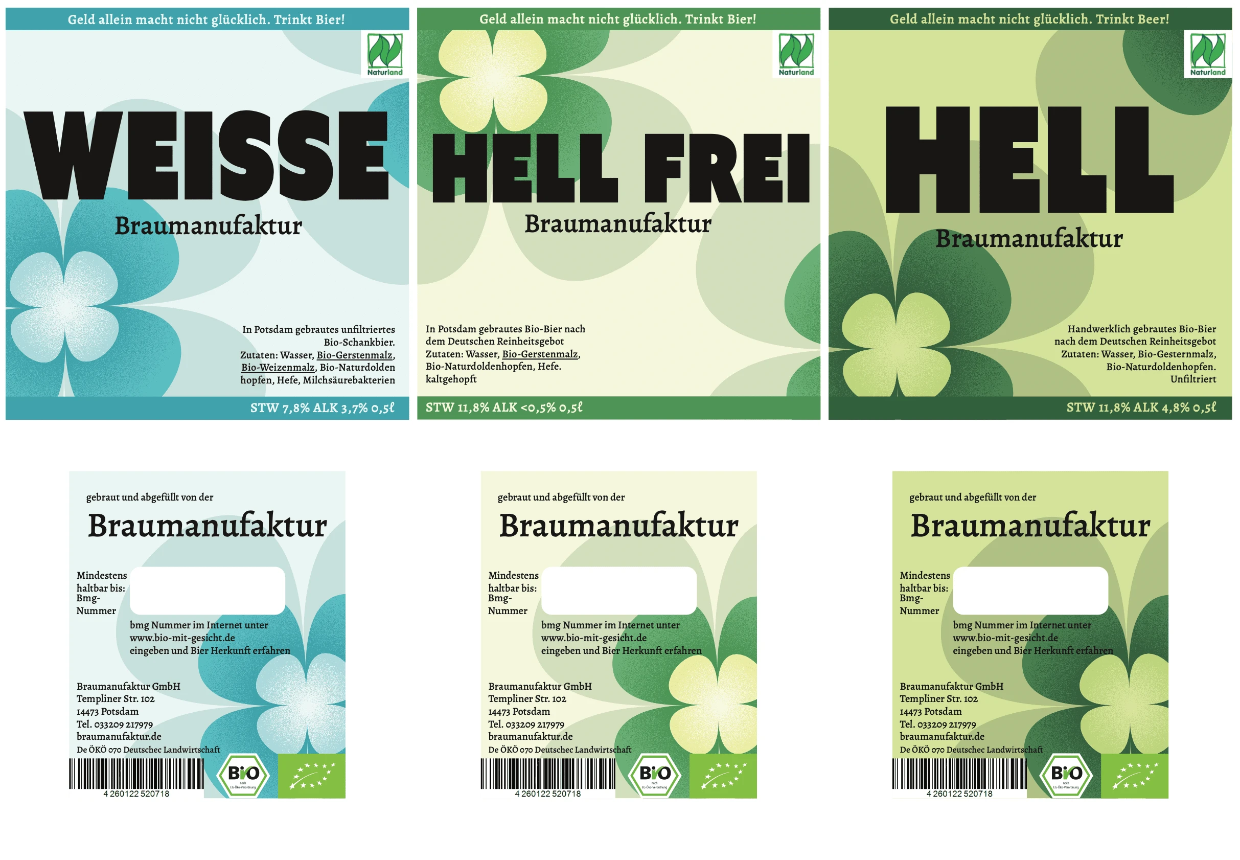
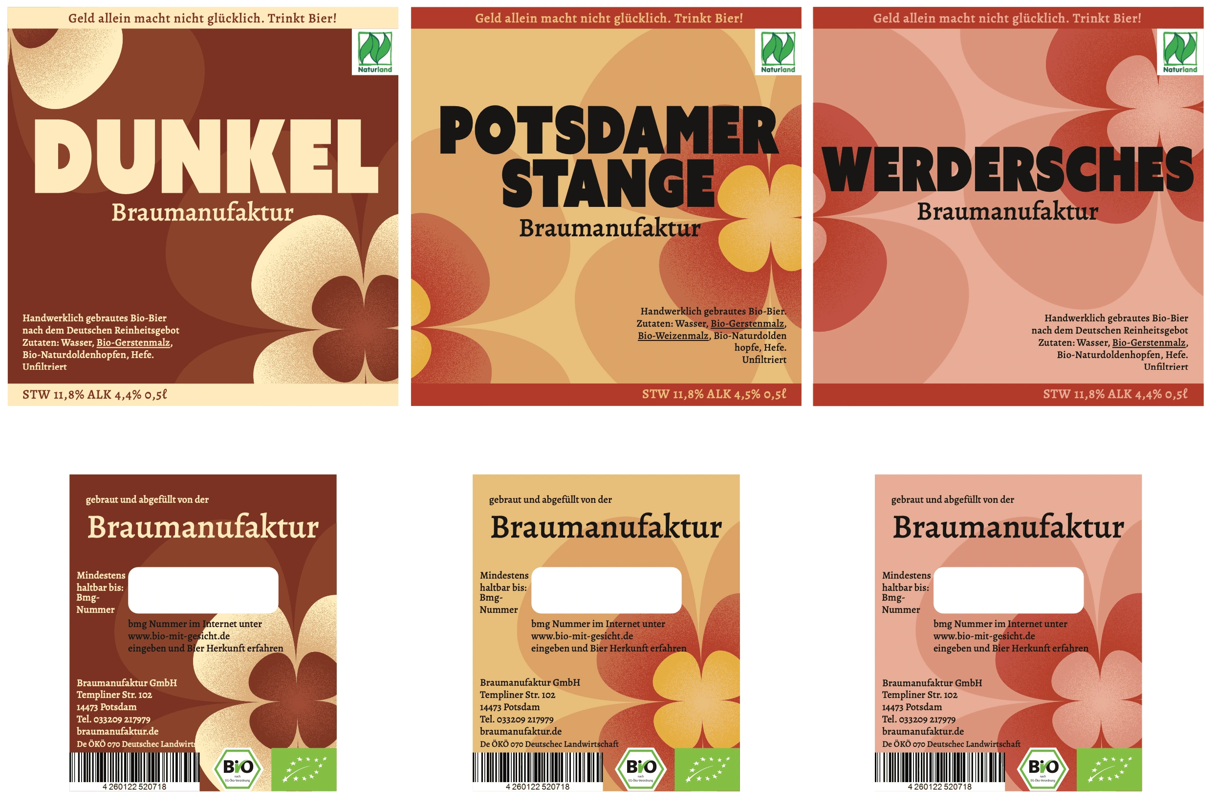
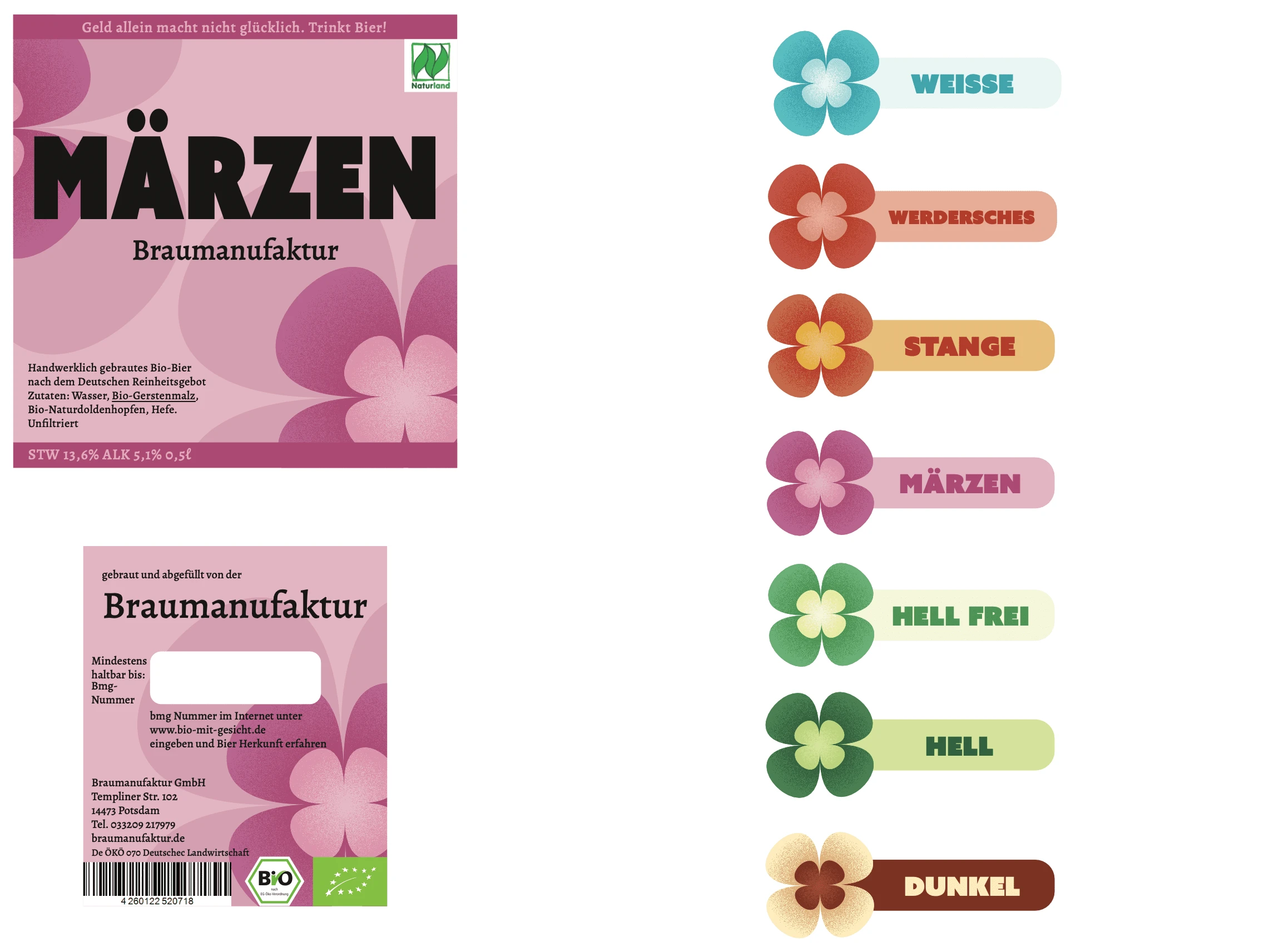
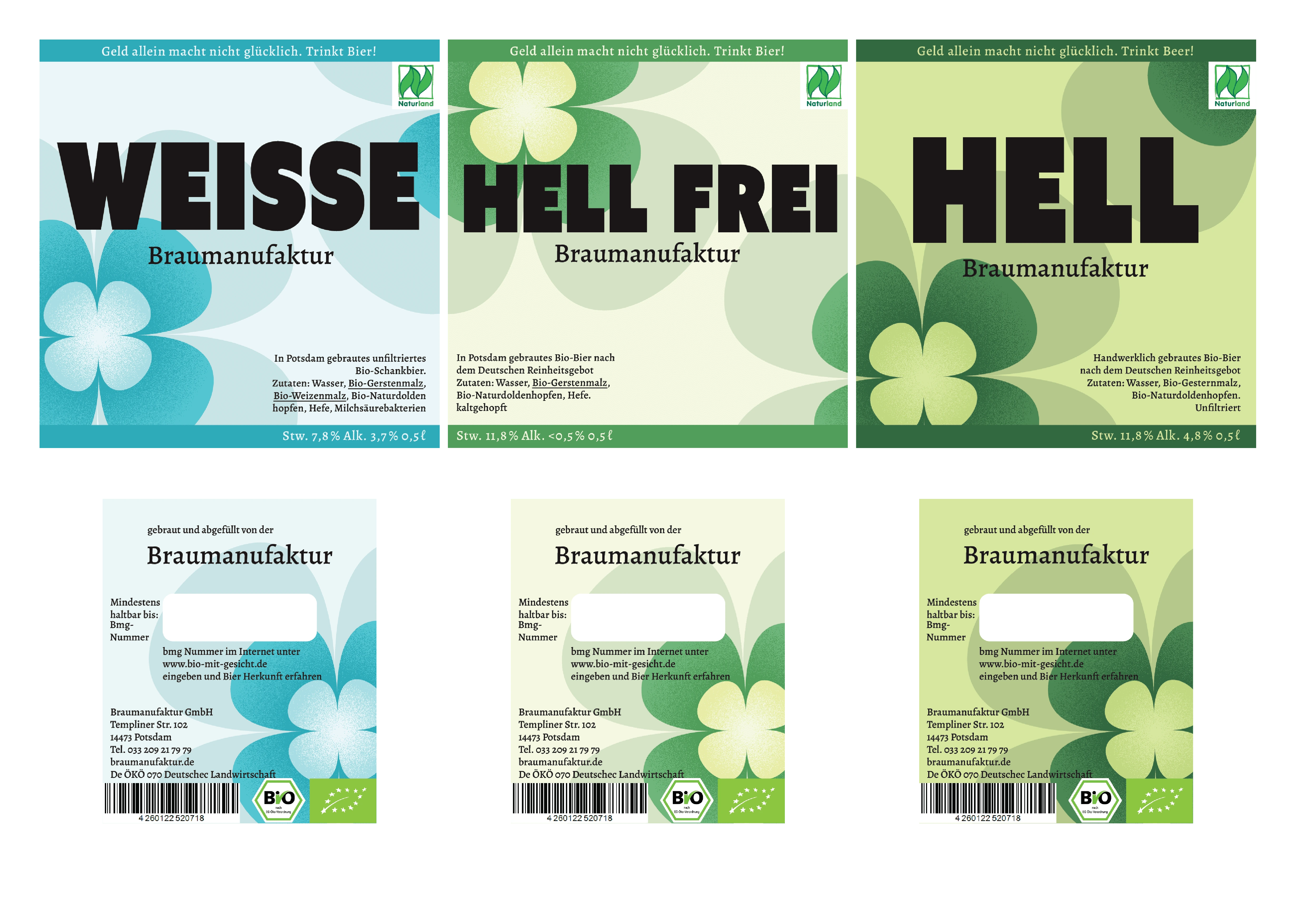
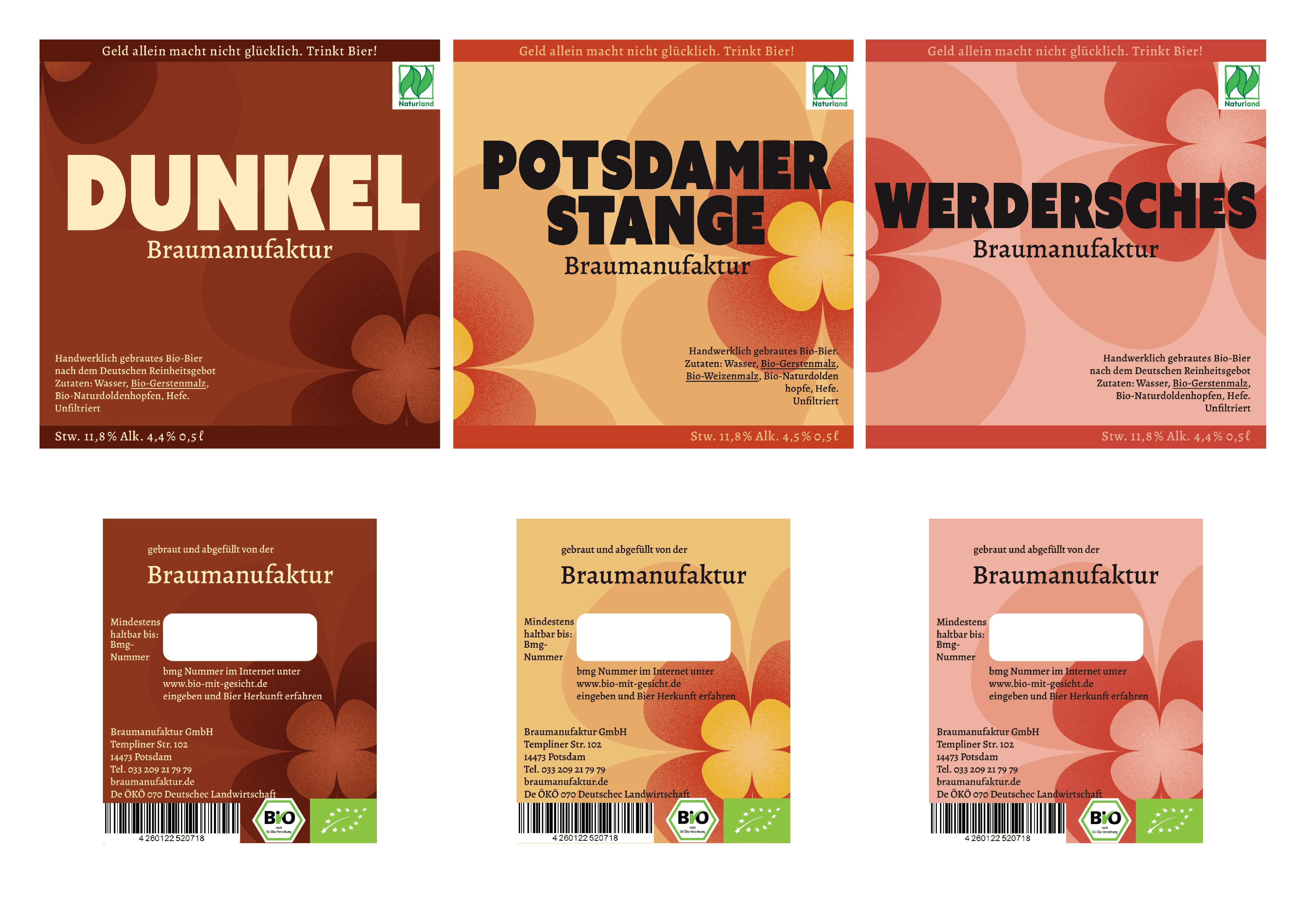
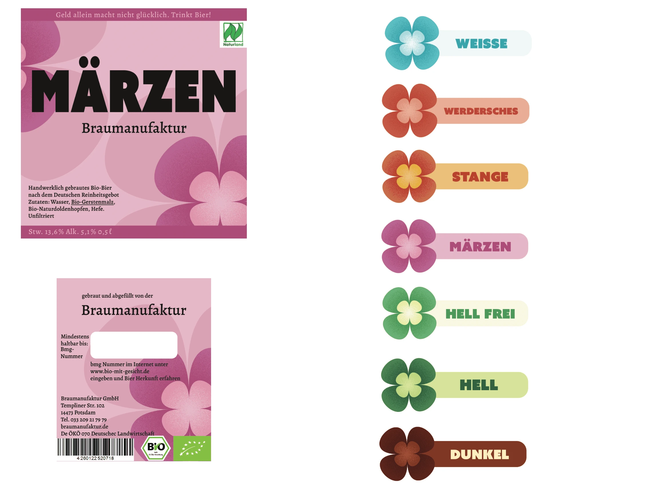
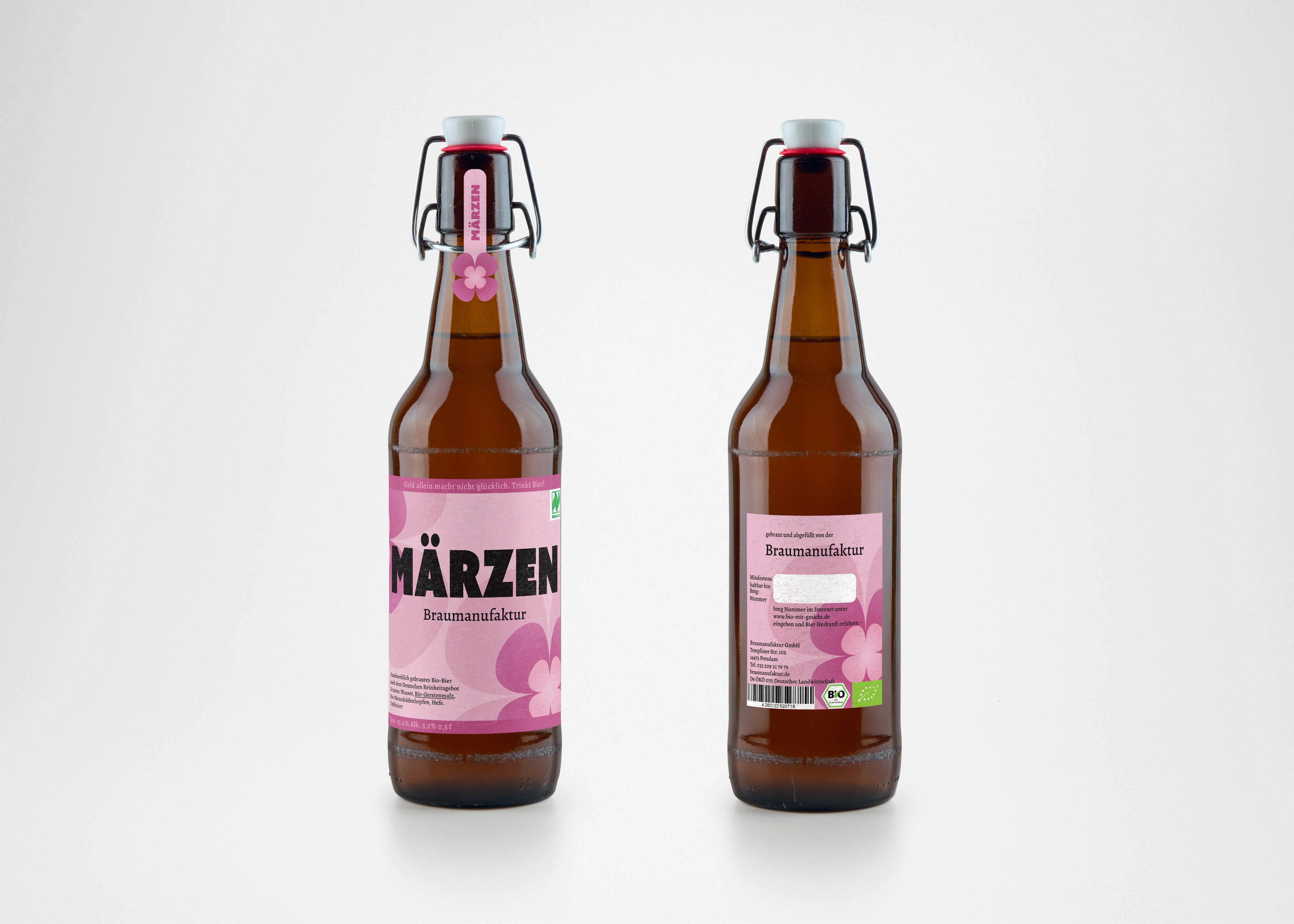
I played with the symbol of a 4 leaf clover to represent the brand due to various reasons. Firstly, it is known as a lucky charm and glücklich in german also has gluck (luck) in the word. In addition, clovers are part of nature and I wanted to emphasize the artisanal and bio aspects of the brand. The clover will act as the symbol of the brand making the brand instantly recognizable next to its peers.
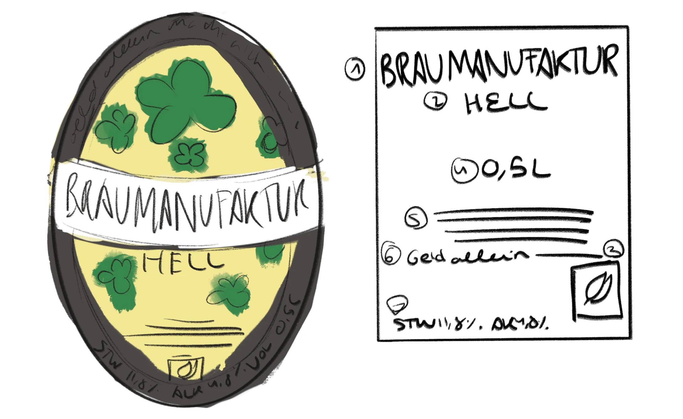
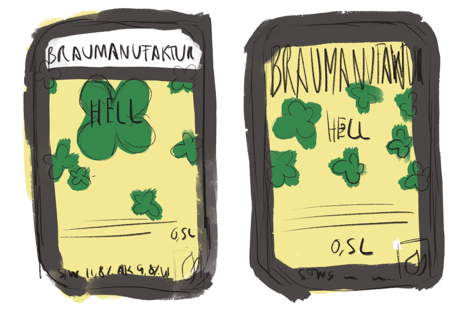
The 4 leaf clover is the main protagonist of the label and has an added texture in its leaves to help it stand more as well as adds a more organic feeling.
Concept development
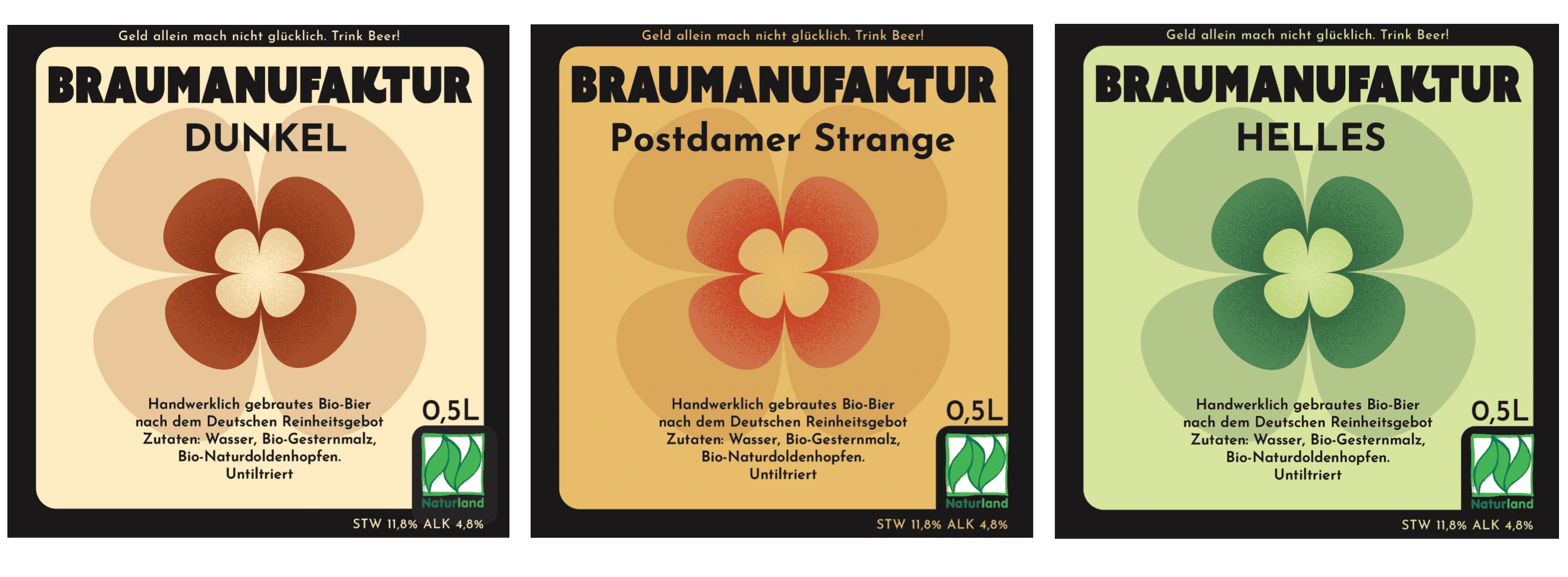
As for typography, at first, I used 3 different typographies that were competing for each other so I reduced it to 2. A fun bold typography for the type of beer and a more traditional font that had more of a hand made feeling. Having a clear difference between both typographies helps bring more attention to the type of beer that would help catch the eyes of customers when deciding which beer to get.
The first designs were still really static and not really fun, so I had to further play with the elements for it to have a more playful nature and to achieve the happy-go-lucky feeling I wanted to transmit.
In the developments I focused on rearranging the clover in not as obvious place, having more fun with it. I also did several hanges to the border as at first it felt as it was restricting the design in the label, however I still wanted to mantain it as it helped with arranging information in the label and separating it form the rest.
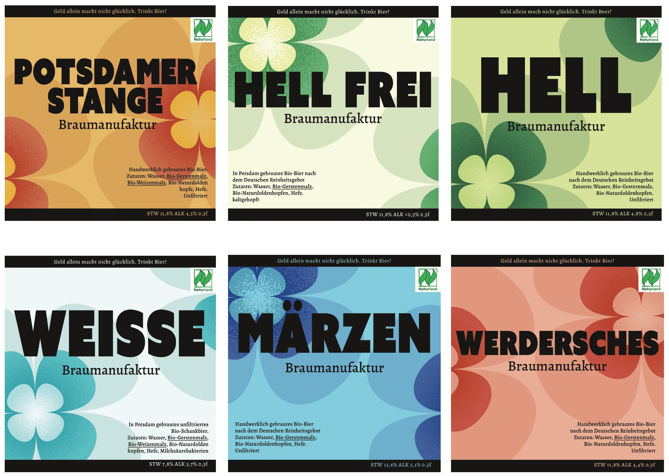
After further development of the concept, with a more fun layout of the clovers and a colorful non-restricting border, I was able to communicate the happy-go-lucky feeling I was going for.
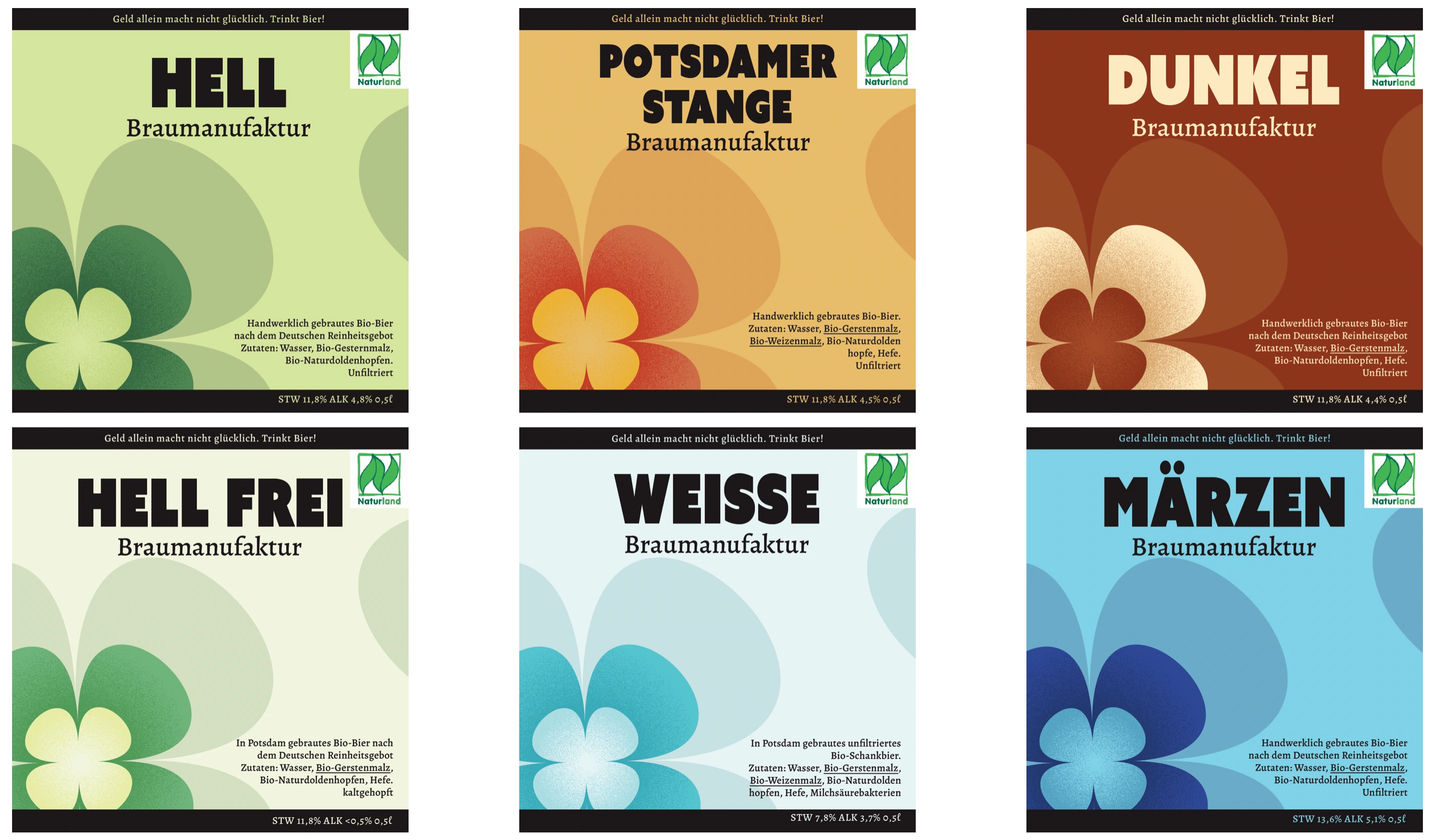
The clovers were arranged in fun layouts and with the possibility of joining the beer labels in order to complete the clover image. This added a collectible feature to the drinking experience, promoting the customer to try all the different sorts of beers the brand has to offer.
For the final edits, I changed the colors of the “Dunkel'' type for it to be more coherent with the other beers, fixed some colors based on printing, as well as fixed the back label. In the back label ”Braumanufaktur '' appeared bigger than in the front label, so it was fixed so both had the same size. I also fixed some typographical errors as well as helped with the readability of some information in the back label specially.
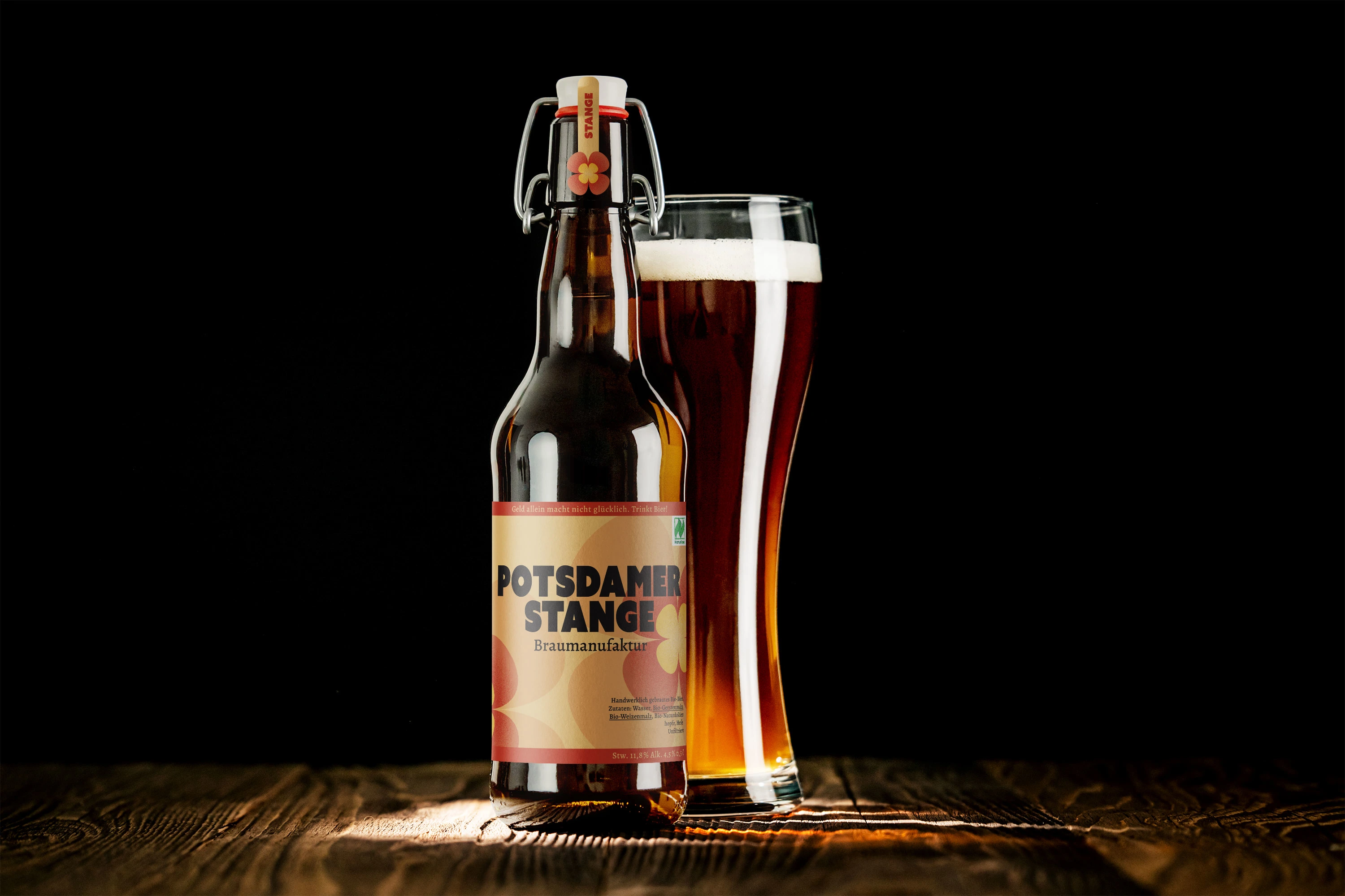
Final Design
Like this project
Posted Feb 19, 2023
Redesigning a craft beer into a more moder happy-go-lucky beer, still mantaining the BIO aspects as its core.
Likes
0
Views
13