'Can you afford to be an individual?' AR poster series
Maria Cuervo
Overview
This project was heavily inspired by the lyrics of the song “Can you afford to be an individual” from Nothing But Thieves. This song deals with how social media and the internet has shaped our society in a way that we are no longer individuals thinking for ourselves and how our perception of the self has been lost. There is a incongruity between our own individuality and how we present ourselves to the outside world causing a distorted perception of reality and identity.
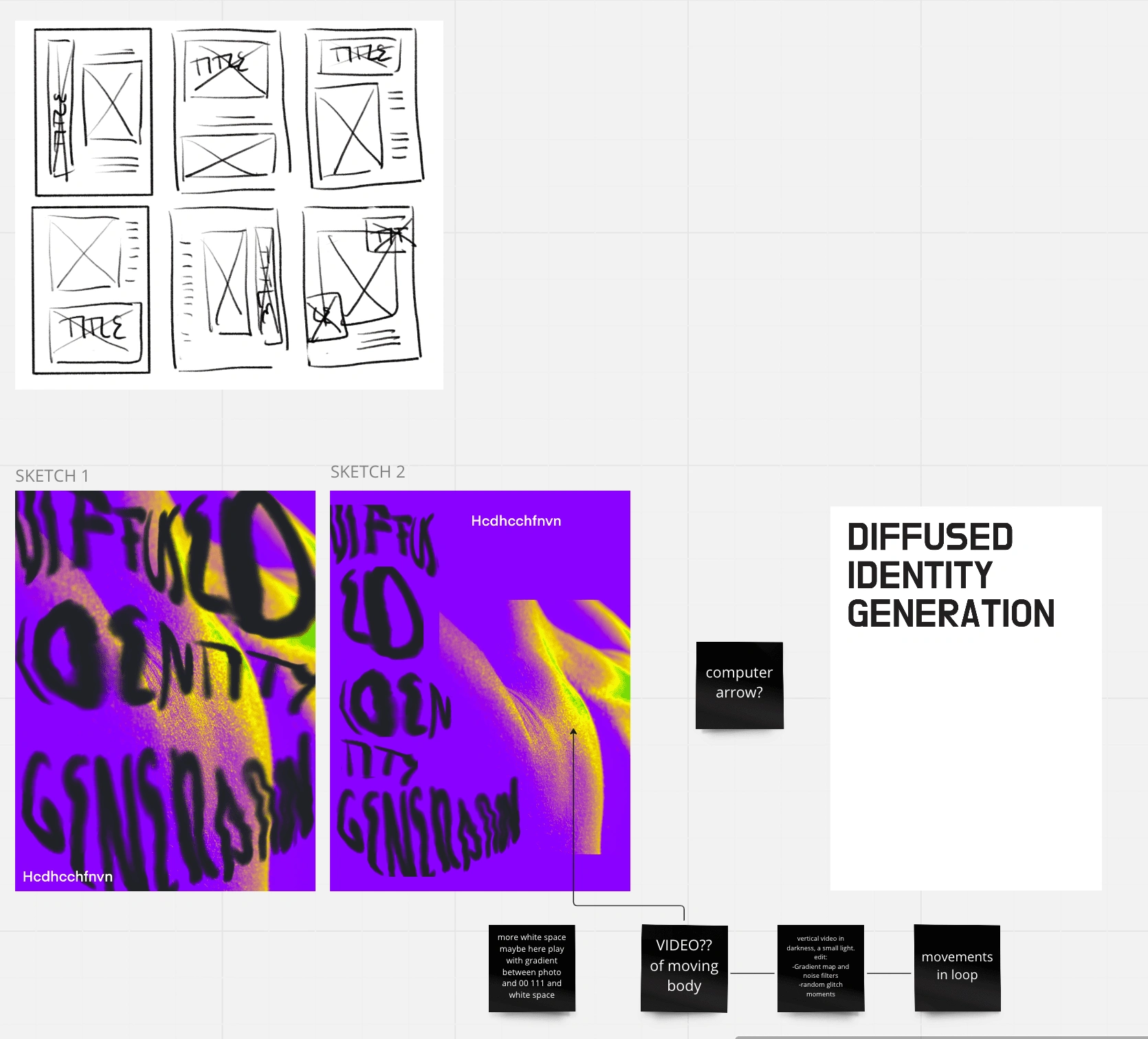
First Sketches
Fair to say I didn't even finished polishing the poster or continue with it as I hated it. From my point of view it looked cliche and boring, however there were some element I actually liked that stayed for the other designs.
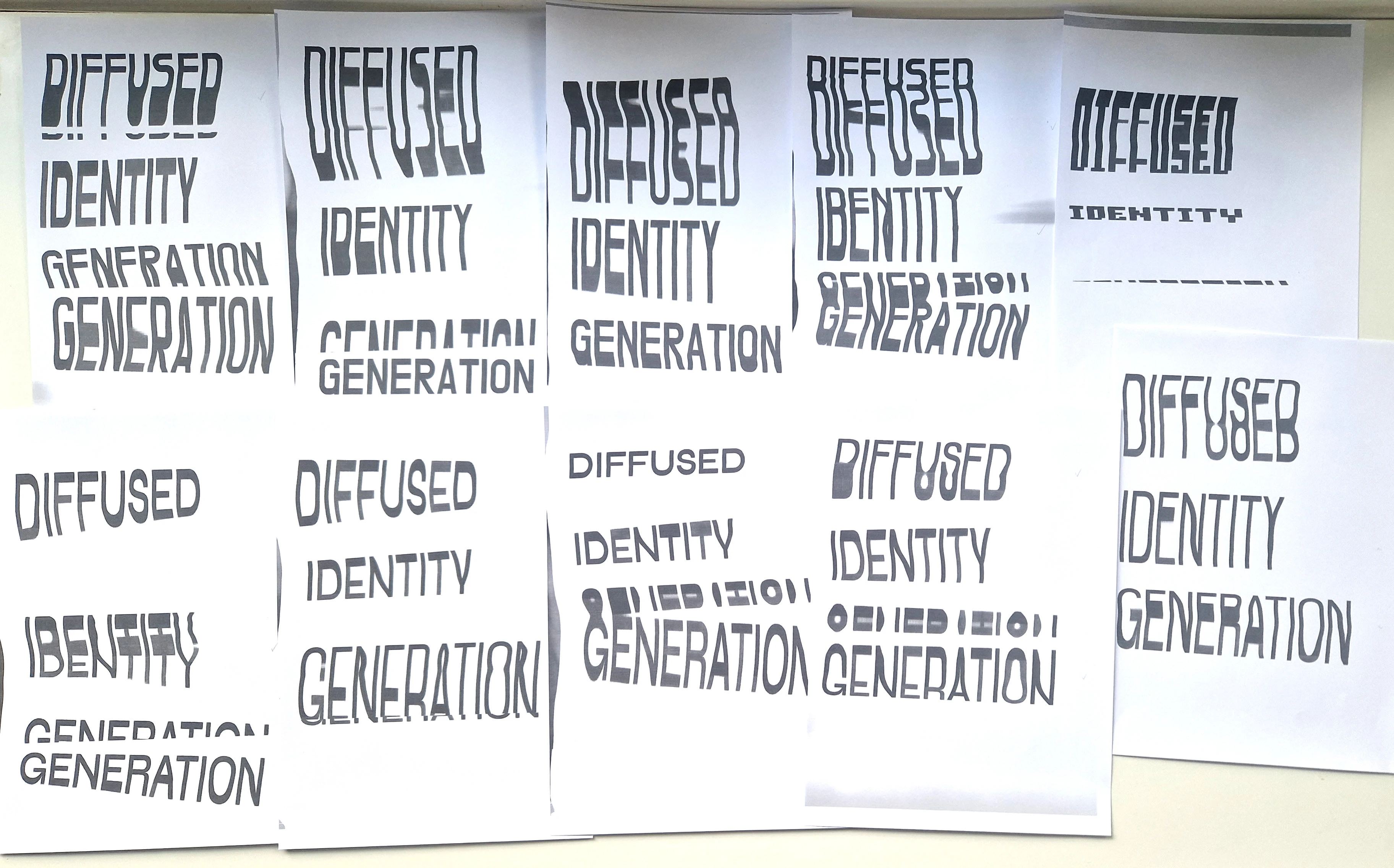
Concept development
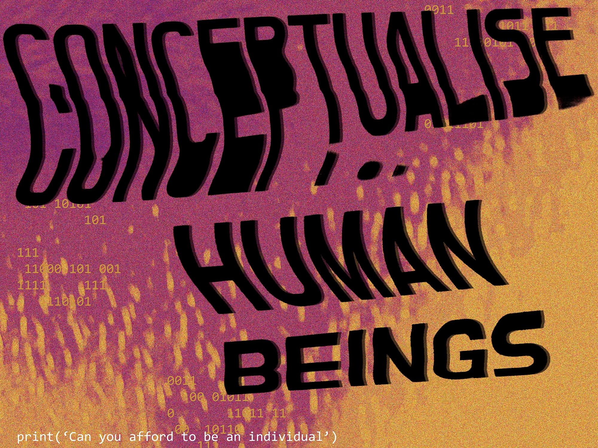
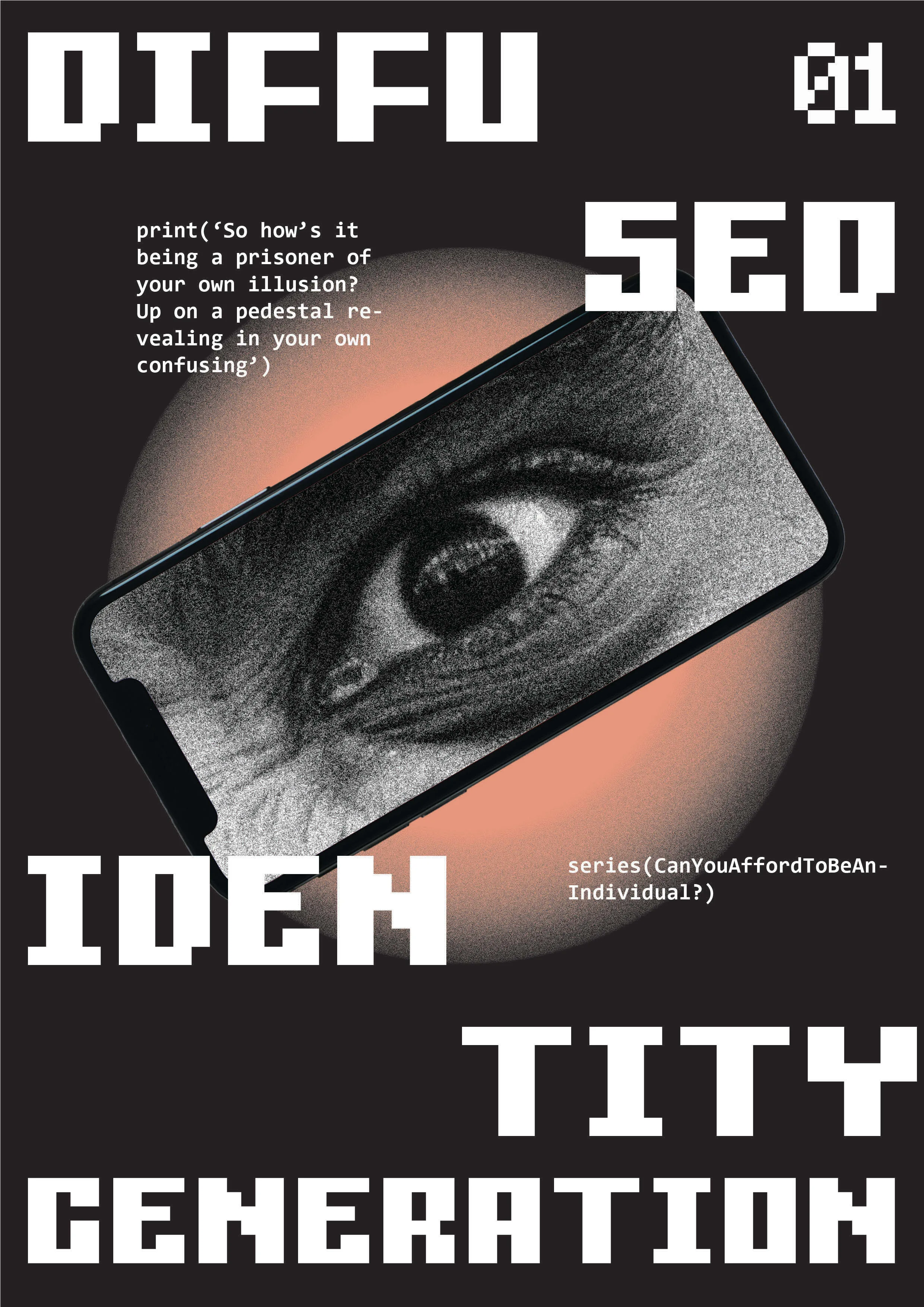
With what I mainly wanted to play was with the concept of distorted perception of the self. For that, distorted typography for the main tittle really helped convey that message. Also it provided further information of technology distorting the reality we see, as I wanted to distort the text with a scanner (hence the technological distortion). Furthermore, the only text not distorted is the one written as if it was code, emphasizing more the distortion of the tittle. An aspect that I found interesting from the first design sketch, was the addition of 0's and 1's (binary code) as a resource for texture intertwining human body with code and technology.
The abstraction of the human body was also really important as I wanted to play with perception here. For that I chose videos of human body parts and scaled them in a way that you don't really recognise which part of the body it is, further more, using gradient maps and noise to change the color of the skin making it look totally unnatural and making it even harder to recognize that it is indeed the human body. In this way I was able to create something similar to mesh gradients and their flowy diffused essence but truly it's just the human body. However, it is only through AR that you can actually see the body moving and it is here that your perception of the whole poster changes recognizing the human hidden in it. Playing with perception through the use of mobile phones to further point into the concept I was hoping to convey.
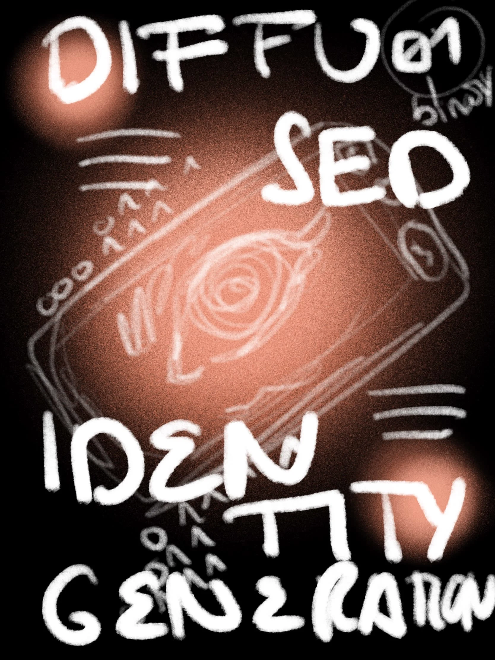
Distorted text by scanner
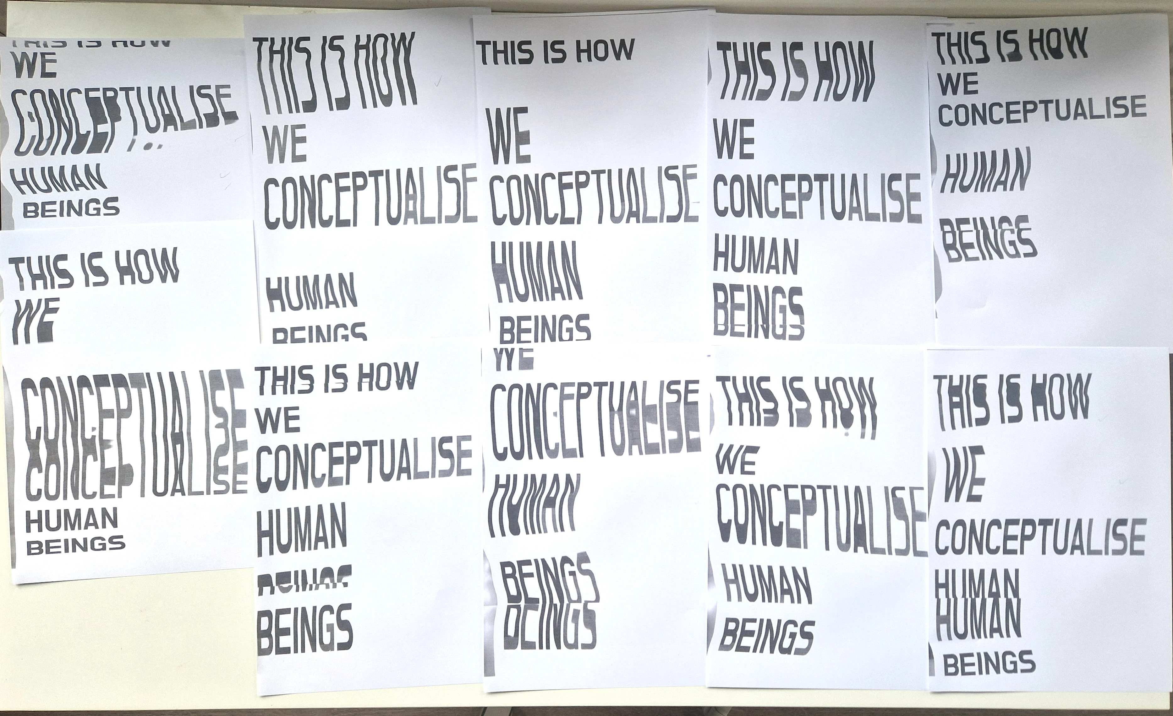
More distorted text by scanner
In the animation, the text had the illusion of maybe starting to move but then it wasn't animated, creating tension. Therefore, I tried different versions animating the text in the poster, one with a wavy effect and another with a glitchy effect. They both sort of worked but constant tension created between the non animated text (that gave the illusion of being the object that would be animated), and the animated background (that didn't give any expectations of being the animated part) was missing. I kept thinking back on this tension which helped bring more attention to both the tittle and the moving human body in the background creating a bigger contrast. Consequently, I kept the static tittle version as the final one.
Animation variants
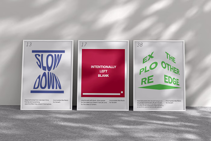
Final designs
The final posters are recognised by the app Artivive and work as AR posters.
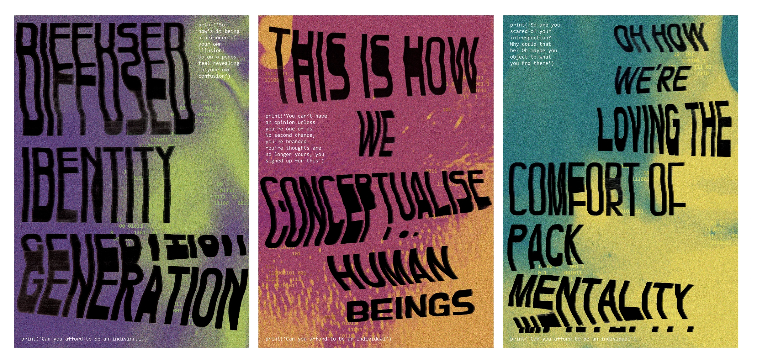
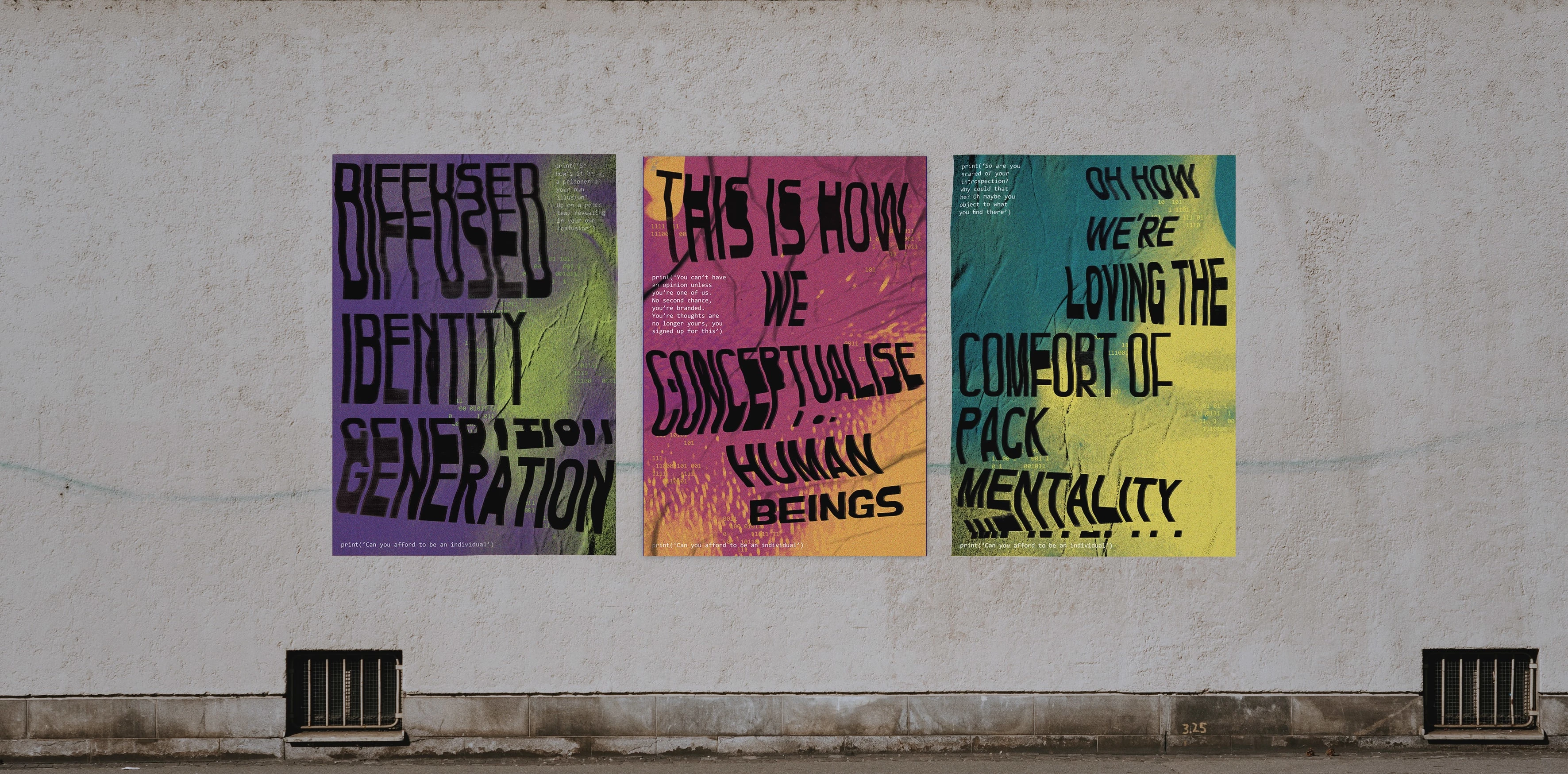
Image by antonioli on Freepik
Like this project
Posted Feb 20, 2023
A series of AR posters based on the distorted perception of the self through the new technologies
Likes
0
Views
13