BALANCE CLUB
Halie Fortson
Behind "Balance Club" Process
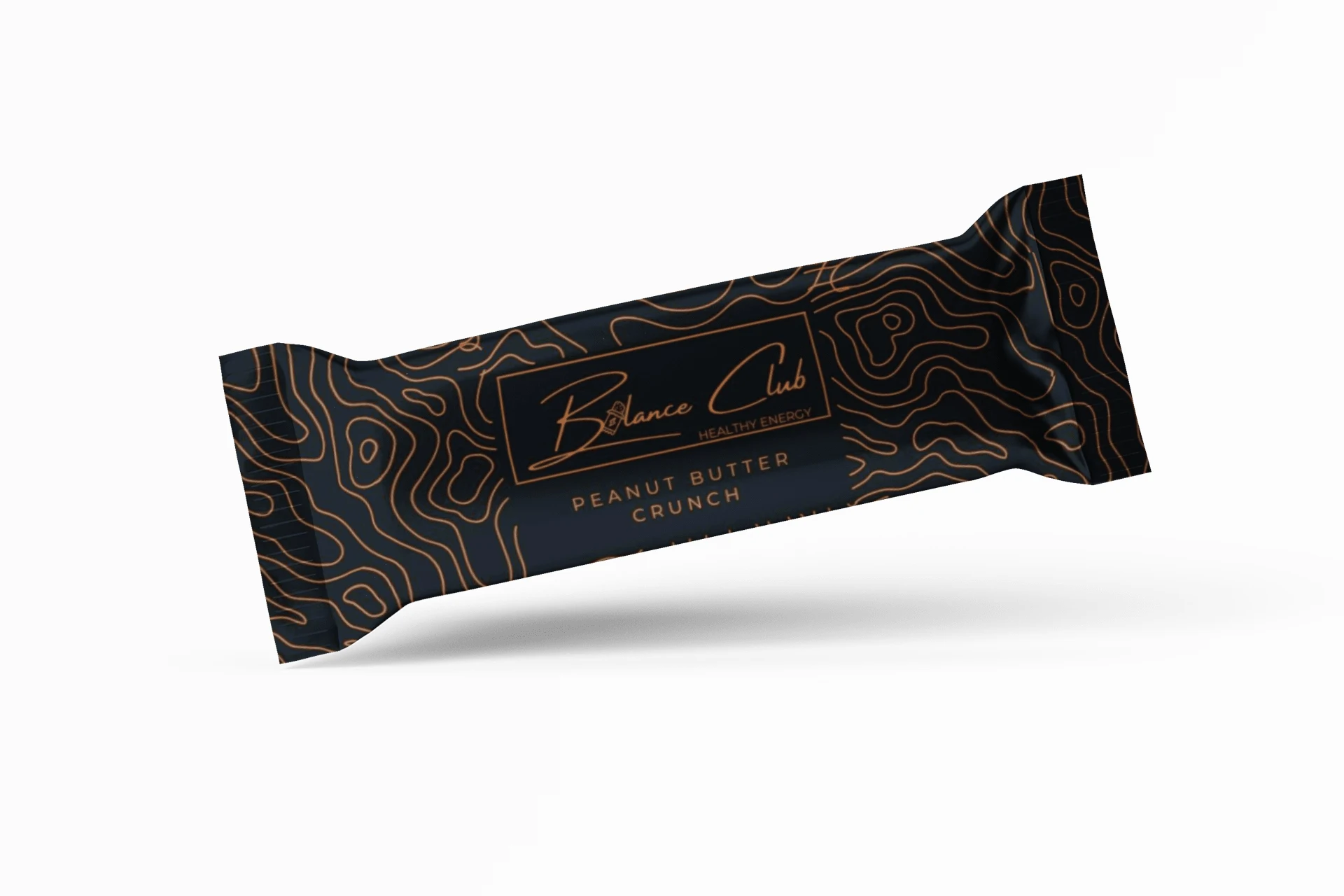
For this project, I wanted it to have a modern, minimalistic look while still having a fun icon. I added a protein bar for the A in "Balance". I felt like the orange was a warm welcoming and also represents energetic in the branding world. Above is a package design for a protein bar.
Tip: Try to keep this description brief and under 150 words by highlighting the best parts of this project— recruiters don’t spend much time reading detailed descriptions! 💪
Like this project
Posted Sep 28, 2022
this is a little passion project I did. This is a protein bar to promote healthy energy, whether you are on the go or working out.
Likes
0
Views
10
Tags