Email Action – Email Automation & Inbox Management Platform

Akhdiyat Restu Fiqih

Overview
A cluttered inbox is rarely caused by one big email. It’s caused by hundreds of small ones arriving continuously: promotions, newsletters, app notifications, recurring bills. Most people deal with it the most exhausting way possible, clearing them one by one, over and over, never actually finishing.
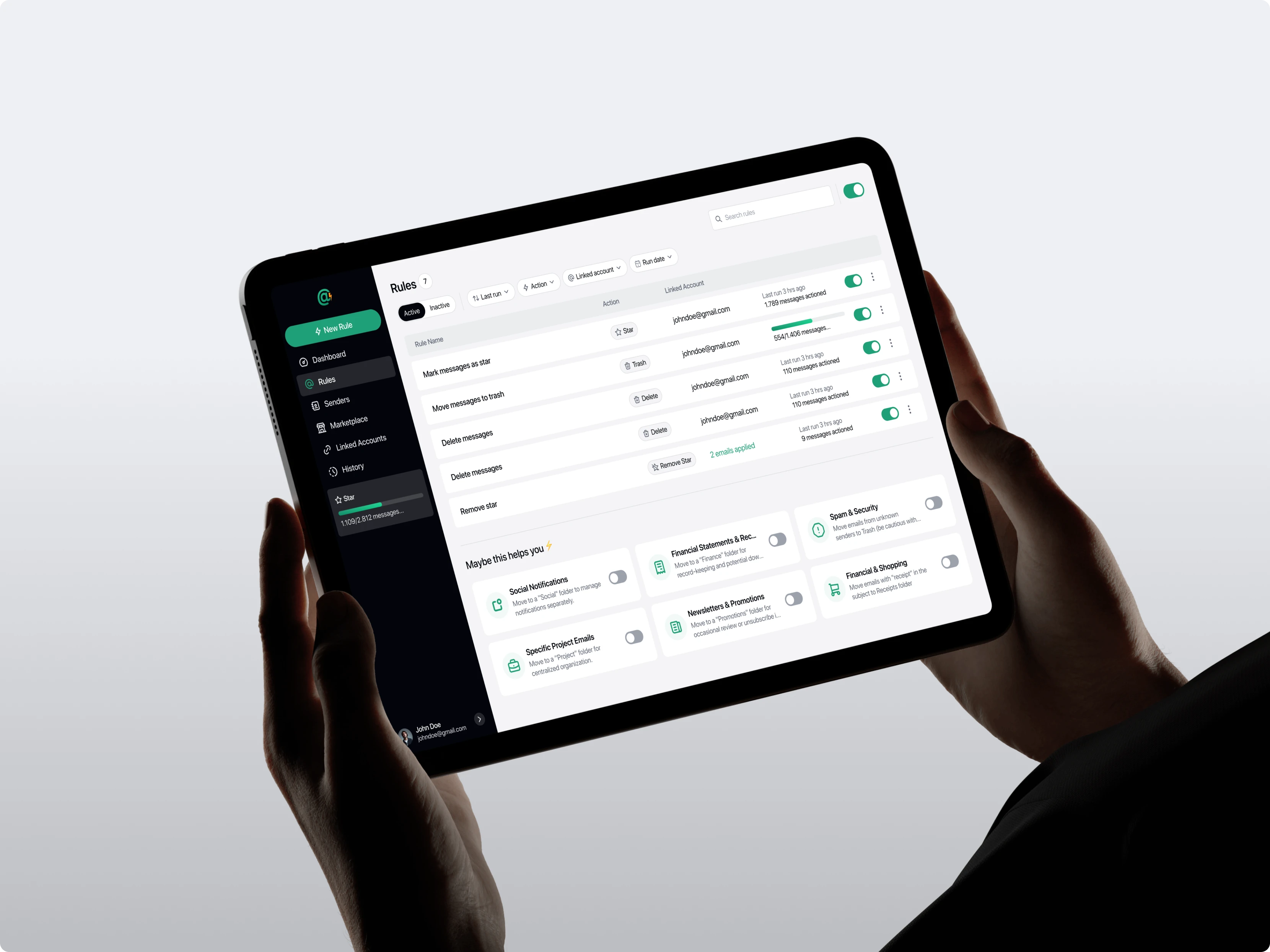
Email Action was designed to break that cycle. Instead of cleaning up email that has already piled up, users set rules that work automatically on everything arriving next. They connect an email account, see who sends them the most, then decide what should happen to mail from those senders.
The Goals
Shift how users handle email, from manual cleanup to setting rules that run on their own.
Make automated rules understandable to ordinary users, not just those comfortable with email filters.
Give users a clear picture of what’s actually filling their inbox, along with the control to act on it.
User Persona
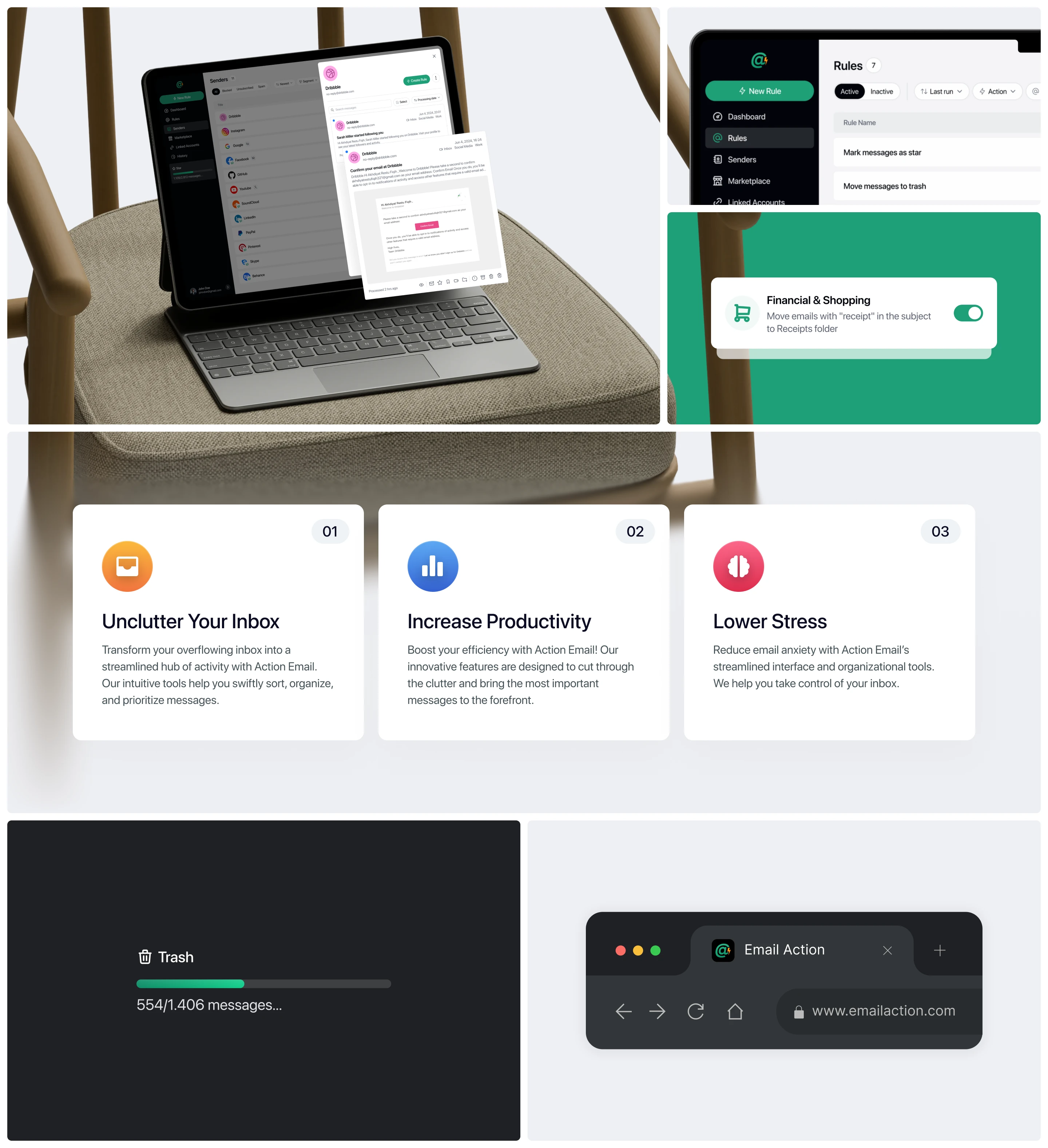
Research narrowed down to two user profiles with different sources of the same problem.

The Challenge
From research and competitor analysis, three core problems needed to be addressed:
Inbox cleanup is work that never ends. However many emails get deleted today, more arrive tomorrow. Users need something that works forward, not just clears what’s already there.
Built-in filters are too technical. Nearly every email provider already offers rules, yet they go unused because the interface feels like assembling logical conditions. Users give up before finishing their first rule.
Users don’t know what’s filling their inbox. Without a view of who sends the most and how much arrives from each, there’s no obvious place to start.
The key insight from this research: users have no trouble understanding automated rules; they have trouble creating them. The problem lies in how rules are assembled, not in the concept itself.

User Flow
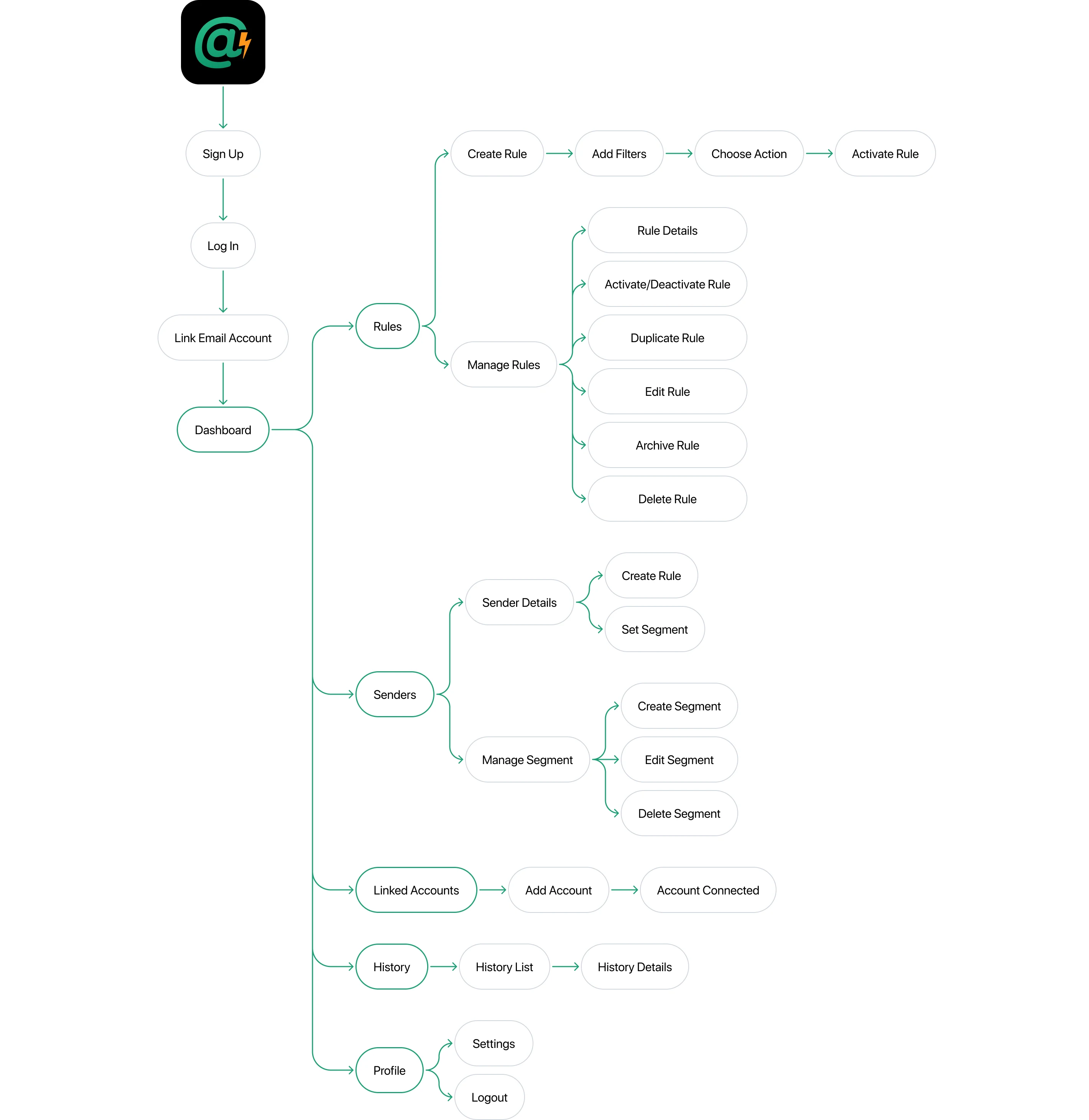
All user flows were mapped before moving into design. This mapping determined where the process could be trimmed and where users actually needed confirmation.
Wireframe
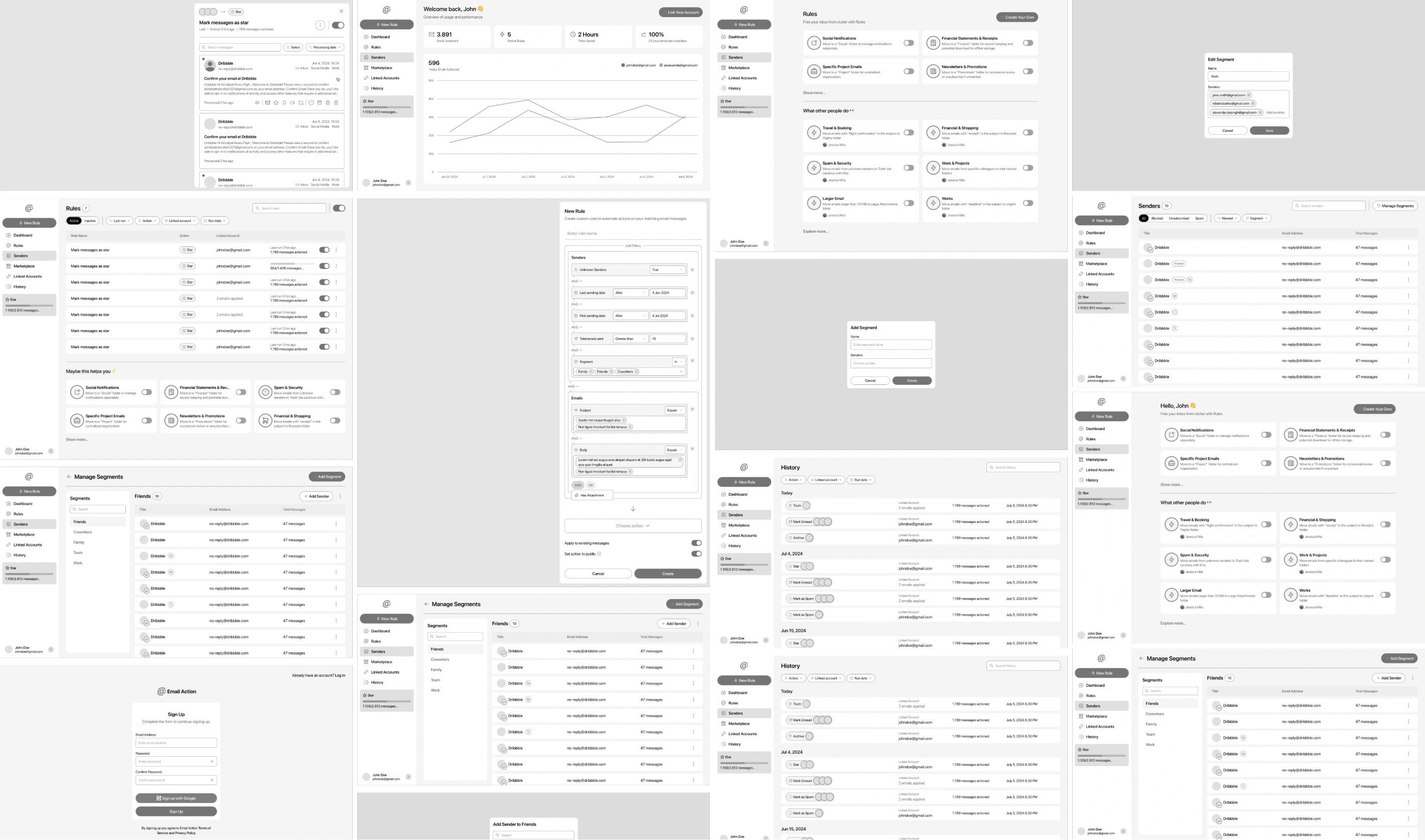
Once the flows were agreed on, every screen was laid out as wireframes to test information hierarchy before moving into the final interface. The most attention went to data-dense pages like the sender list and rule details, keeping them readable even when holding many rows at once.
The Solutions
Since the problem lies in how rules are assembled rather than in the concept itself, the solutions focus on lowering the barrier at three points: how a rule gets built, where users begin, and how they come to trust the result.
Rules as Guided Steps. Rule creation was broken into sequential steps rather than one long form of conditions. Users answer one question at a time, so a technically complex rule feels simple to assemble.
Senders as the Starting Point. Instead of asking users to imagine a rule from nothing, the product starts from the real senders already in their inbox. Rules emerge from something concrete rather than a blank page.
Visible Consequences. Every automated action leaves a trace users can inspect through History. This matters because people only trust an automated system with their inbox once they can see what it has actually done.
Sign Up & Log In
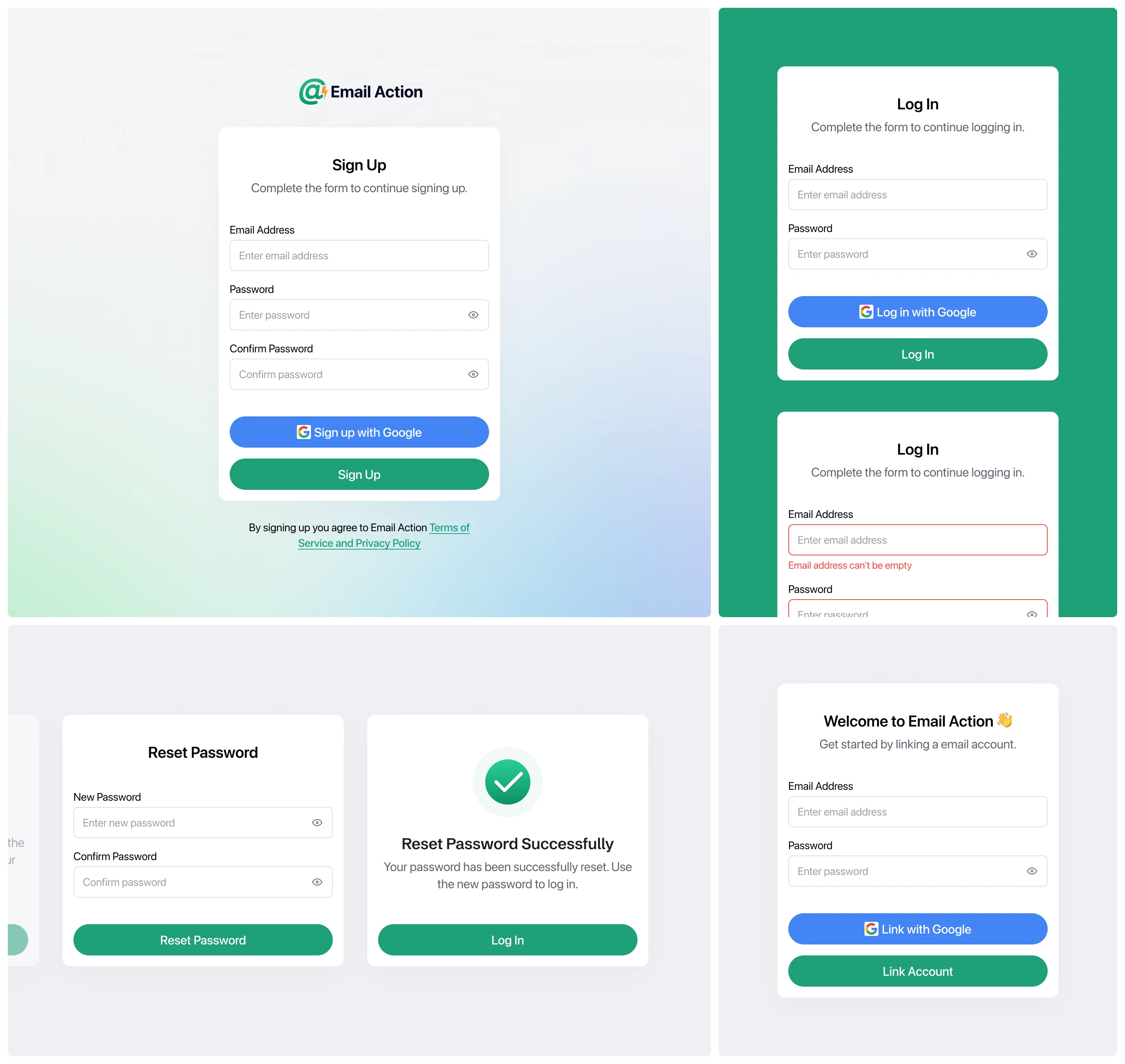
Registration was designed to merge with linking the first email account, since the app isn’t useful until an account is connected. Beyond standard flows like signing in and password recovery, every possible failure is handled with a specific message, from malformed email addresses and mismatched passwords to IMAP configurations that fail to connect.
Dashboard
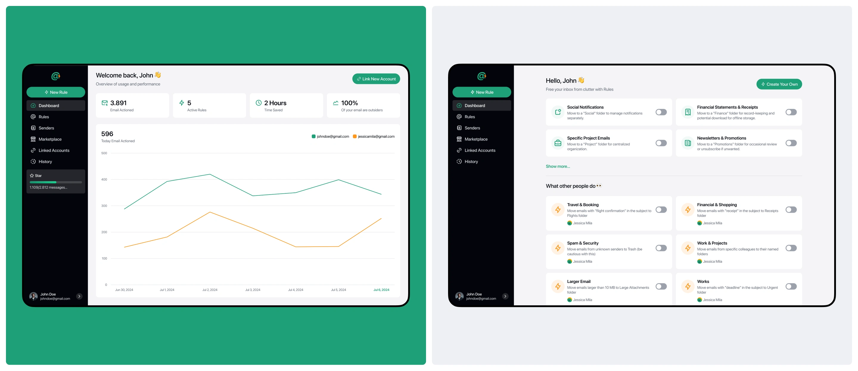
Before taking action, users need to know what’s happening. The dashboard shows an overview of connected inboxes, and for users with several accounts, the data can be filtered per account. For new users with no data yet, the view points them toward the first step they need to take.
Rules
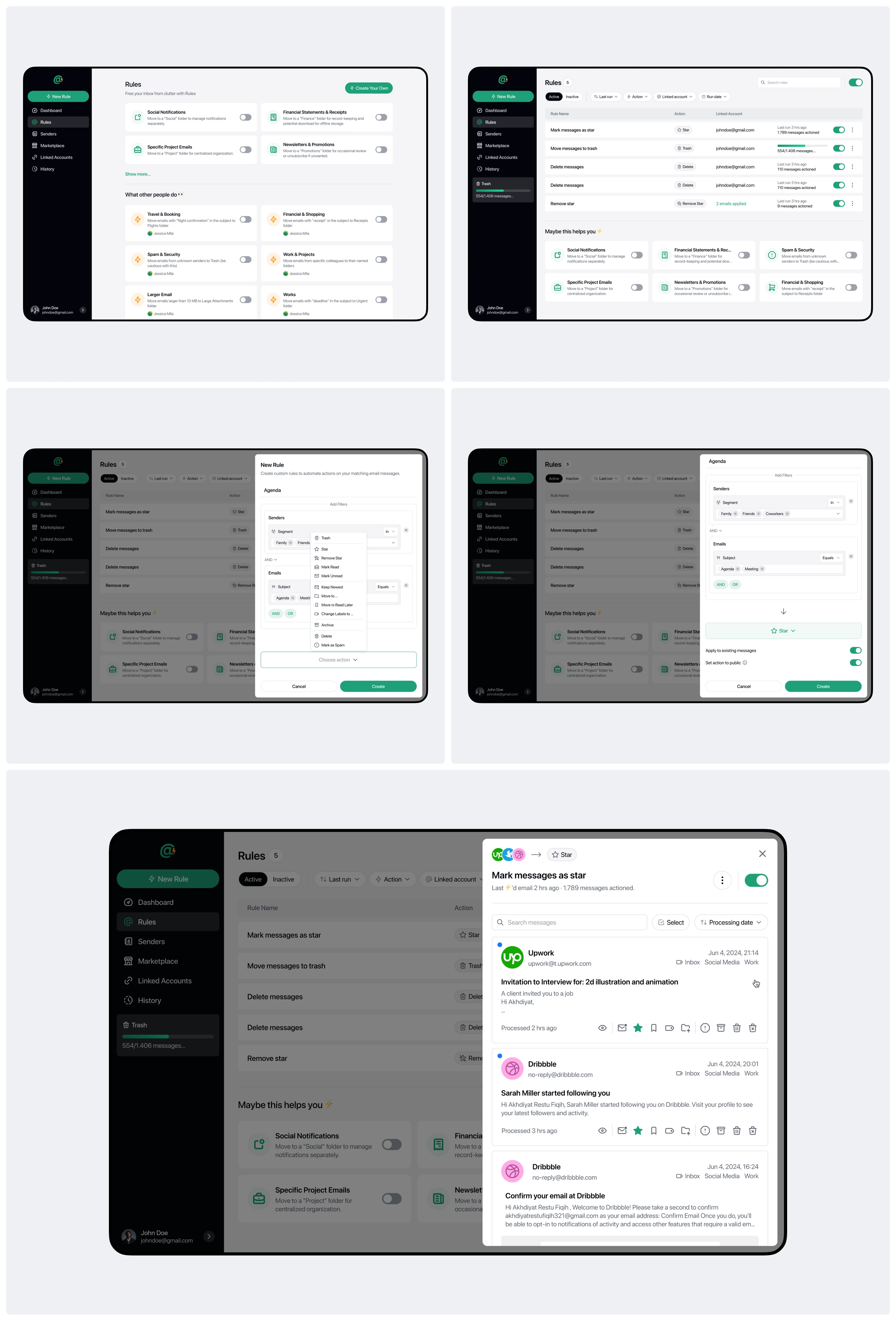
This is what stops the work from repeating. Users define once what should happen to mail from a given sender, whether moved to a folder, labeled, archived, or deleted, and the rule then runs on its own for everything that follows. Rules can be deactivated temporarily without deleting them, so users can experiment without losing their configuration.
Senders & Segments
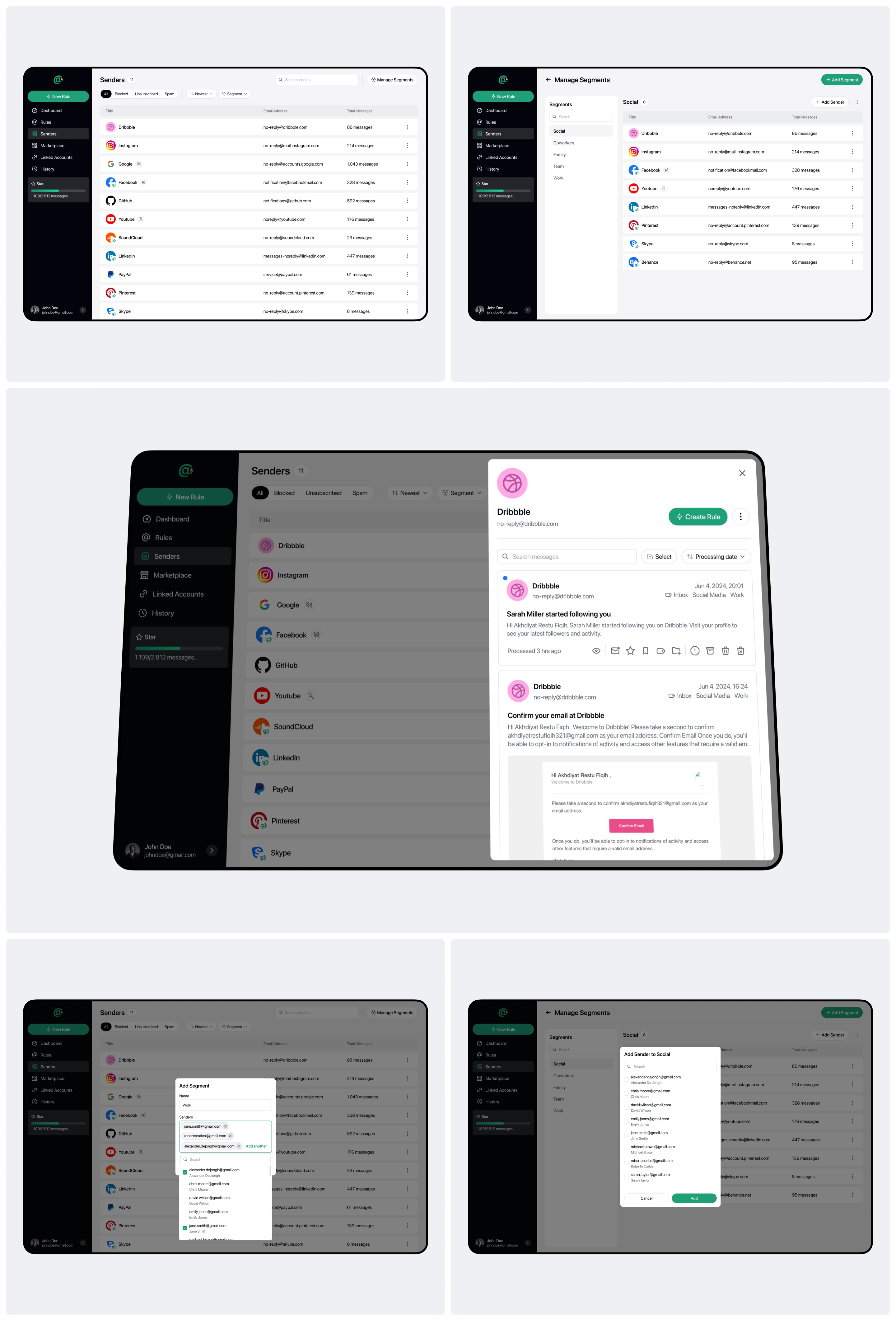
The root of a cluttered inbox is senders, not individual emails. The Senders page shows exactly who is sending mail, turning a pattern that was previously invisible into something obvious. Senders can be grouped into segments so a set of similar senders is handled at once, or acted on directly through unsubscribe.
History
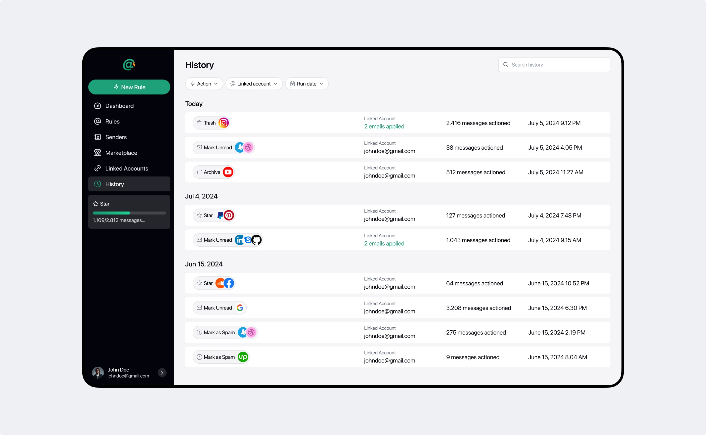
Handing the inbox over to automation requires trust, and that trust only grows when users can check the results. History records every action carried out along with its details, letting users confirm their rules are working as intended.
Visual Direction
An app that handles someone’s inbox needs to feel trustworthy without feeling tense. SF Pro Display carries the interface on a tight scale, from small supporting data up to headings, keeping hierarchy clear on data-dense pages.
The palette rests on black for text and primary elements, giving the interface a firm, legible base that holds up across information-heavy views. Pastel green works as the accent, marking actions and running states, soft enough to keep things light without losing its function as a signal.
Every visual decision was structured as a design system rather than applied page by page. Color, typography, and corner radii were defined as tokens with structured naming, so a single change propagates across the entire app. On top of that sits a set of reusable components, from input fields and tables to dialogs and navigation, each with its full range of variants. This mattered because the product was built by several designers at once: a shared system kept the output consistent across many hands while speeding up handoff to the development team.

The Result
The complete app design was delivered in under one month. Its coverage went beyond the happy path: every module includes empty states, loading states, empty search results, and error states specific to each type of failure, so the development team never had to guess when encountering conditions outside the main scenario.
But what matters more is the shift in working method it offers users. Inbox cleanup that used to be endless repetitive work is now settled once through rules that keep running. Senders that were only ever felt as noise are now visible as a list that can be acted on. And every automated action leaves a trace that can be inspected, so users keep control of the inbox they’ve handed over to the system.
Like this project
Posted Oct 9, 2026
Web application that helps users take control of their inbox through automated rules.
Likes
0
Views
1