Jett Plasma – Website for an Eye Care Medical Device

Akhdiyat Restu Fiqih

Overview
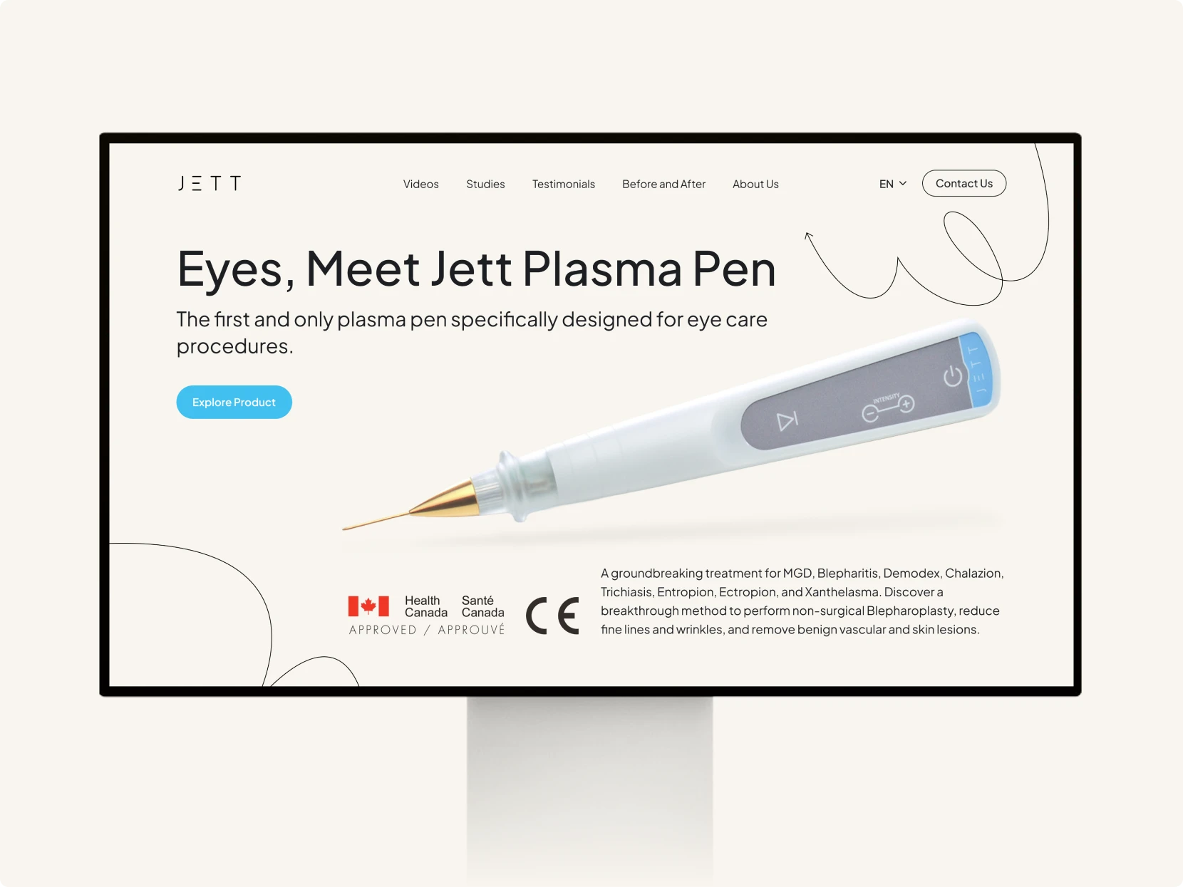
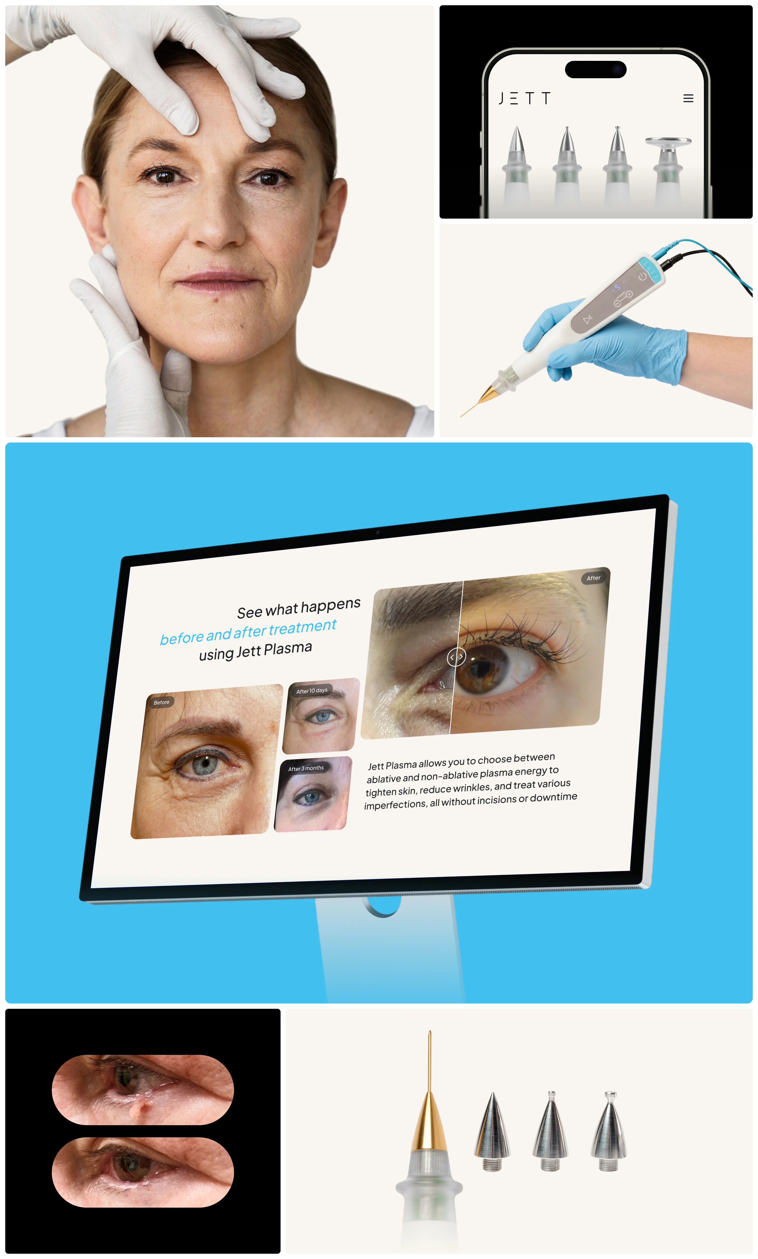
Jett Plasma is a medical device that uses direct current plasma technology for a range of procedures around the eye, from non-surgical blepharoplasty to treating MGD and Blepharitis and removing benign skin lesions. What sets it apart from similar devices is its use of DC, which produces a more stable and controlled energy output than the AC current most competitors rely on.
The problem is that this advantage is technical and invisible from the outside. The client needed a site that could explain why the difference in current matters, show real patient results, and ultimately move medical professionals to get in touch. Beyond the main page, dedicated pages were needed for clinical studies, a treatment results gallery, a video library, testimonials, company background, and contact.
The Goals
Translate dense technical material into a readable flow without losing its scientific credibility.
Present treatment evidence convincingly, since this is what weighs most heavily for buyers in a medical field.
Guide visitors toward the same clear action from any page: contacting the team for further consultation.
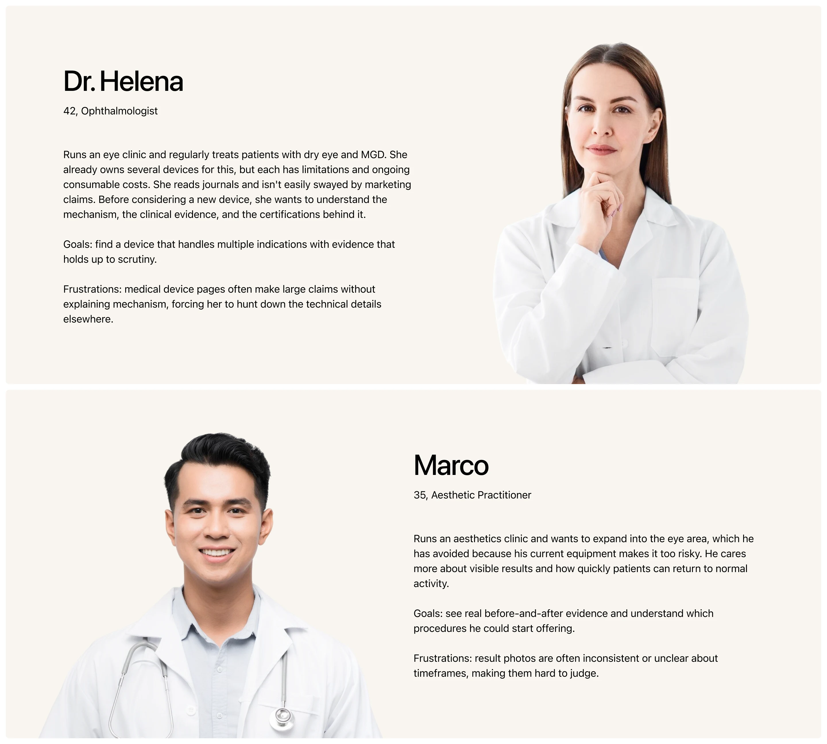
User Persona
Visitors here aren’t general consumers. They’re practitioners weighing an equipment purchase for their clinic.
The Challenge
From research and competitor analysis, three core problems needed to be addressed:
The technical content is too dense to stack in one place. The client’s material covered plasma physics, DC versus AC comparison, physiological effects on tissue, medical indications, clinical studies, a results gallery, a video library, and testimonials. Left unsorted, visitors would give up before reaching whatever they came for.
The audience is skeptical of marketing language. Medical professionals judge claims by mechanism and evidence. The persuasive tone typical of landing pages risks undermining credibility with them.
Visual evidence is hard to present fairly. Before-and-after photos are the strongest proof available, and also the easiest to doubt. Placed side by side, they make it difficult to compare the exact same area with any precision.
The key insight: this audience doesn’t need to be convinced, they need to be informed. The page’s job isn’t to sell, but to explain until readers reach the conclusion themselves.
Sitemap
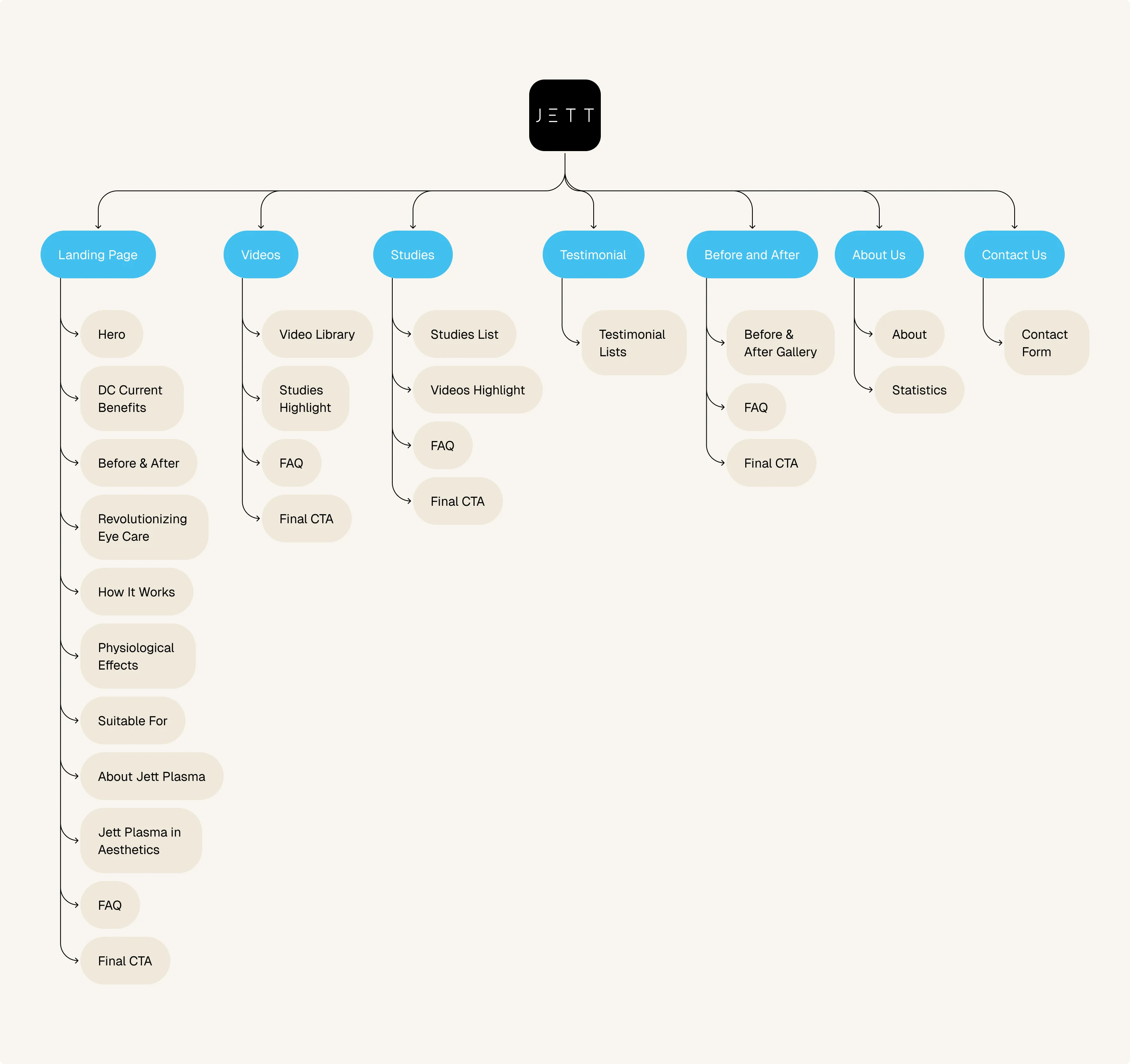
Before touching layout, all client material was mapped and sorted into seven pages. The main page follows the questions forming in a reader’s head: what is this device, how is it different, what’s the proof, how does it work, what can it be used for, and who is behind it. Material too long to live there was given its own page: Videos, Studies, Testimonial, Before and After, and About Us, plus Contact Us as the final destination.
This sorting also set two things that repeat across the site. The FAQ and the call to get in touch appear on every page carrying long-form material, so visitors landing from search on any page still find answers and a way forward. Studies and Videos point to each other as well, since both address the same doubt from different angles.
The Solutions
Because this audience judges by mechanism and evidence, the solutions focused on how the material is delivered: how easily the technical explanation can be followed, how convincingly the evidence is presented, and how comfortably material this dense holds up to the end.
Explain, Don’t Sell. The DC advantage isn’t listed as a feature but unpacked for what it means to the practitioner: lower complication risk and more predictable results in sensitive areas. How plasma works is broken into stages, each paired with a visual.
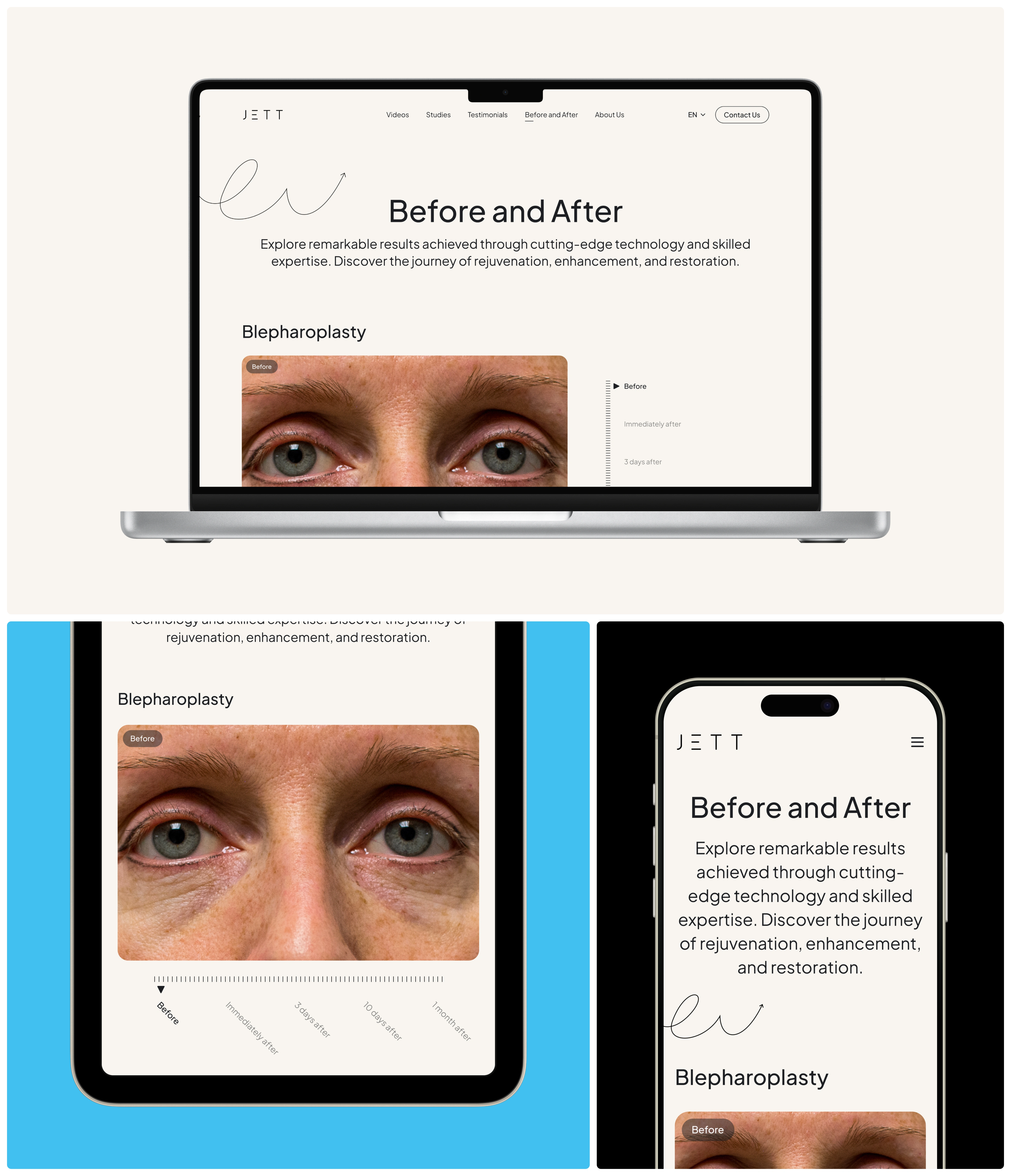
Evidence as the Centerpiece. Treatment results occupy a primary part of the page, with a slider for examining the exact same area and a staged sequence running to three months. Each addresses a different doubt: precision of comparison, and consistency of results.
Rhythm Over Density. Long text blocks are always broken by visuals, indications are split by procedure type, and overly specific questions moved into an accordion. Material still too long after that was given its own page.
One Destination. All five pages funnel toward the same action: contacting the team. That call repeats at the close of every page, so visitors landing anywhere still have a way forward.

Responsive & Interaction
Every page was built at three screen sizes: 1440px, 744px, and 390px. Keeping them readable on small screens takes more than narrowing the columns. Layouts that alternate between text and image on desktop were restructured into vertical stacks, while the physiological effects that spread across the desktop as a cluster of pills became a stacked list. The before/after slider, FAQ accordion, mobile menu, and English/Czech language switcher were documented separately as interaction components so their behavior was unambiguous for developers.
Visual Direction
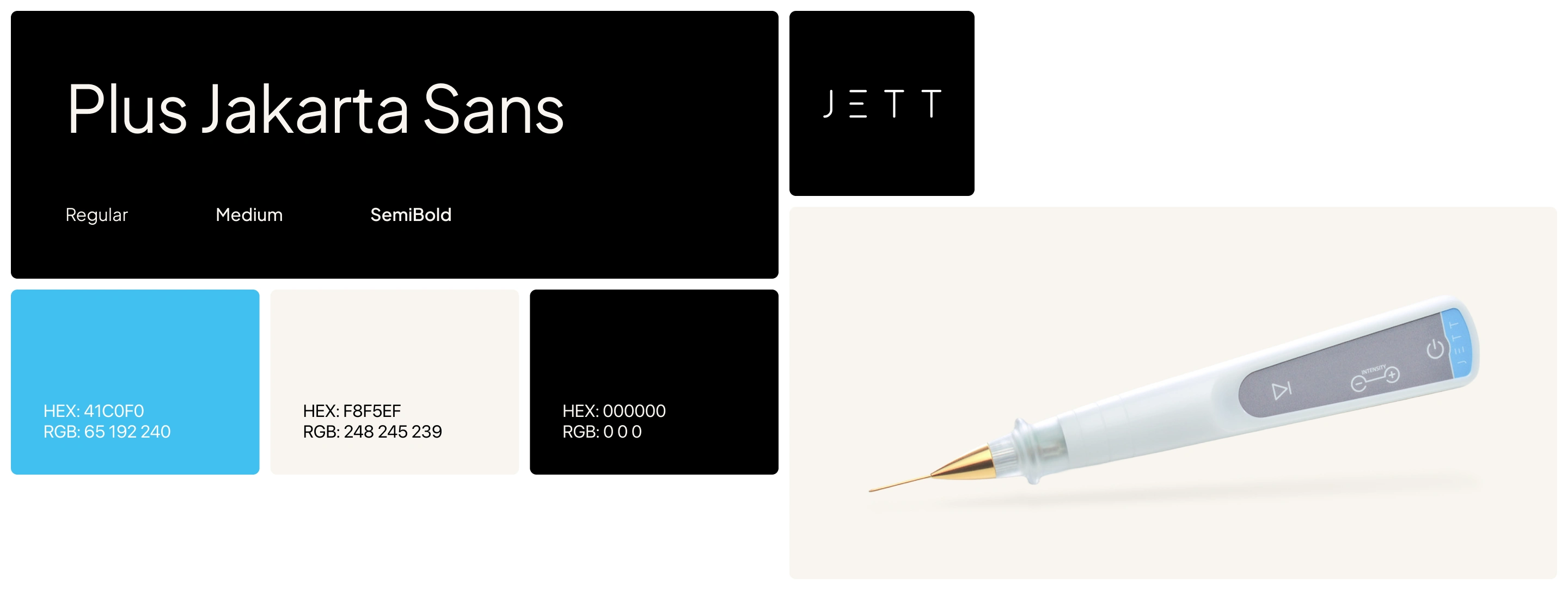
This page delivers medical material, so it needed to feel clean and trustworthy without turning sterile. Plus Jakarta Sans carries the typography across a wide range, from 70px for the main headline down to 18px for body text, creating firm contrast between big statements and long explanations. The palette rests on a deep charcoal for all text, comfortable to read over long stretches, with a bright light blue as the primary used sparingly on buttons, markers, and accents. A recurring curved line pattern adds character without interfering with legibility.
The Result
Seven full pages across three breakpoints, along with all their interaction components, were delivered in under two weeks. Raw material that started as a collection of technical explanations became a structure that answers visitors’ questions in sequence, with supporting material too long to sit inline given a page of its own.
But what matters more is the shift in how that material reaches readers. Explanations that previously required working through a technical document can now be followed while scrolling. Treatment evidence that usually amounts to photos placed side by side can now be compared precisely on the same area. And practitioners arriving with different questions, some looking for mechanism, some for clinical proof, some wanting to see results firsthand, each have a place to go rather than one long page to dig through.
Like this project
Posted Oct 9, 2026
This website introduces the technology to professionals working in ophthalmology, dermatology, and aesthetics.
Likes
0
Views
0