Penske Used Trucks | Website Redesign
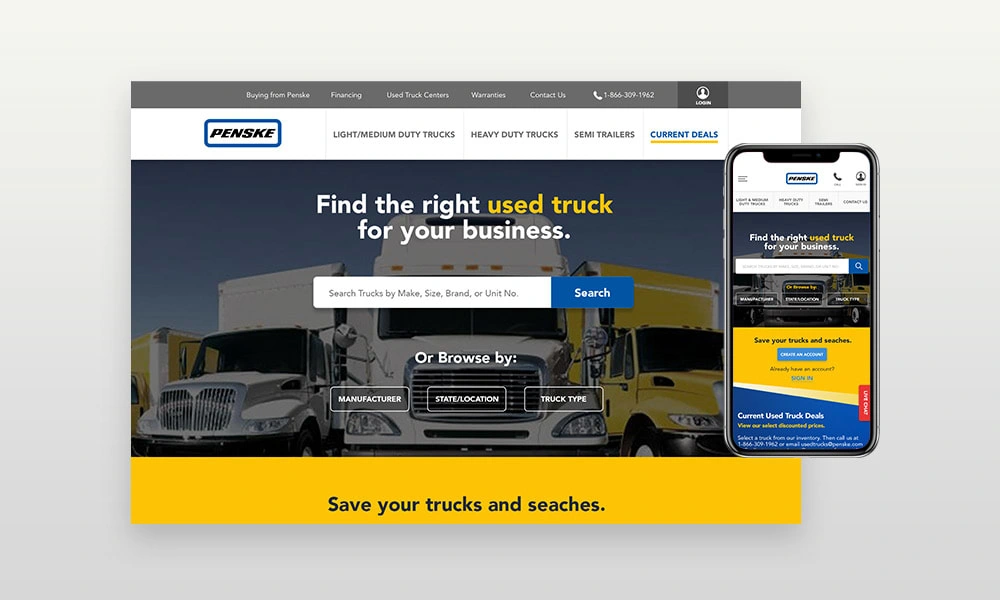
New Penske Used Trucks Website
Introduction
While Penske Used Trucks has been a leader in transportation services in US and Canada, our challenge was to explore different ways to improve their current website user experience and design aesthetics.
This project was full of challenges since we had to reinvent the functionality of the search inventory while keeping the brand essence and other components required by the client. In order for us to be successful on this project we had to make extensive user research that involved user testing, user journey mapping, A/B testing, card sorting, competitor analysis, surveys and usability testing.

Understanding The Problem
One of the most obvious problems was a poor user experience, the lack of website responsiveness and the site aesthetics looked outdated.
Users were unclear on the process for renting or leasing trucks. The first impression above the fold was overwhelming to users because of the lack of content structure, user experience and modern eye-catching designs. The website definitely needed some love.
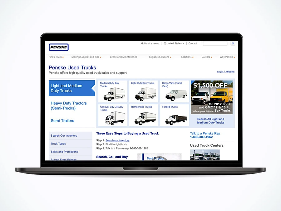
Penske Used Trucks - Old Website
My Role
My role as UX Design Manager was to lead all user experience efforts for this amazing project. I worked along with the Director of UX and Art Director of Liquid Interactive. After a detailed road map and user flow I was tasked to create finished designs based on wireframes. I helped out with some of the user testings, wireframes and as well as interactive prototypes.
I was in-charge of successfully coordinating the design hand-off to the development team that was located in Pune, India and other part in the US.
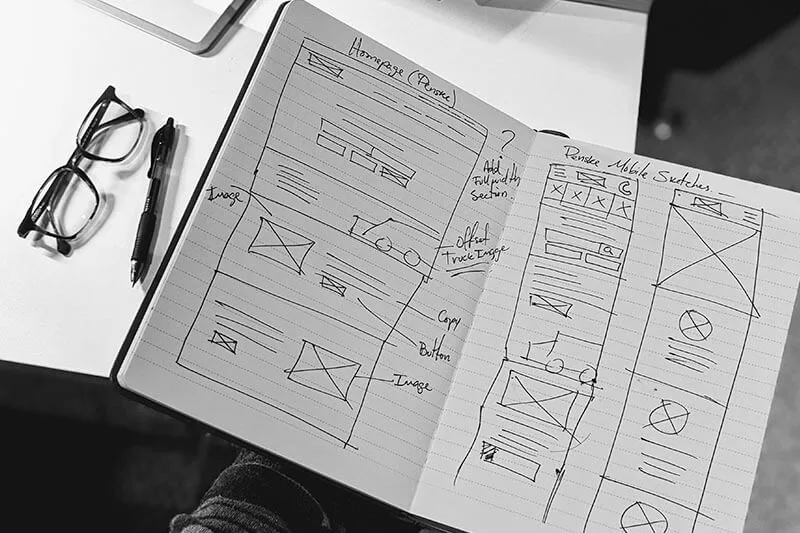
Hand-drawn Wireframes
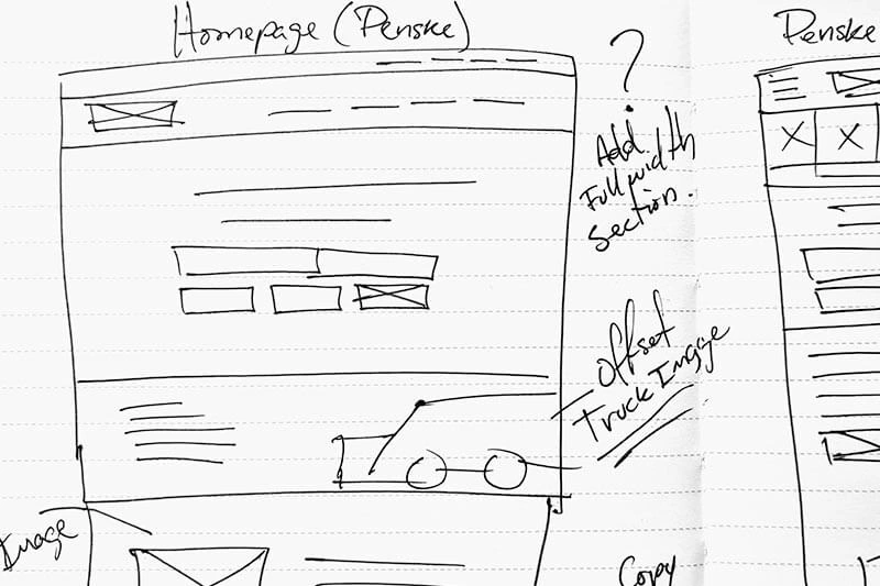
Homepage Hand-drawn Wireframe
The solution
After properly understanding the problem statements, the main goals of the website redesign were established.

Main Goals
The UX Research
An extensive research was made for this project in order to understand the weaknesses of their old site and the search inventory. Some of the methods include:

Research methods we used
Usability Testing
Key findings:
Users were overwhelm with the amount of information presented to them on the homepage.
Users were unable to view their old site in a mobile device. They were frustrated with the lack of website responsiveness.
Users found the truck inventory functionality too complicated.
Users were unclear on the process for leasing a truck.
Many users did not feel like the top navigation was well-structured and were confused with some labels.
Users discovered broken links throughout the website.
Wireframing & Prototyping
Low-fidelity digital prototype that allowed us to take on board significant feedback.
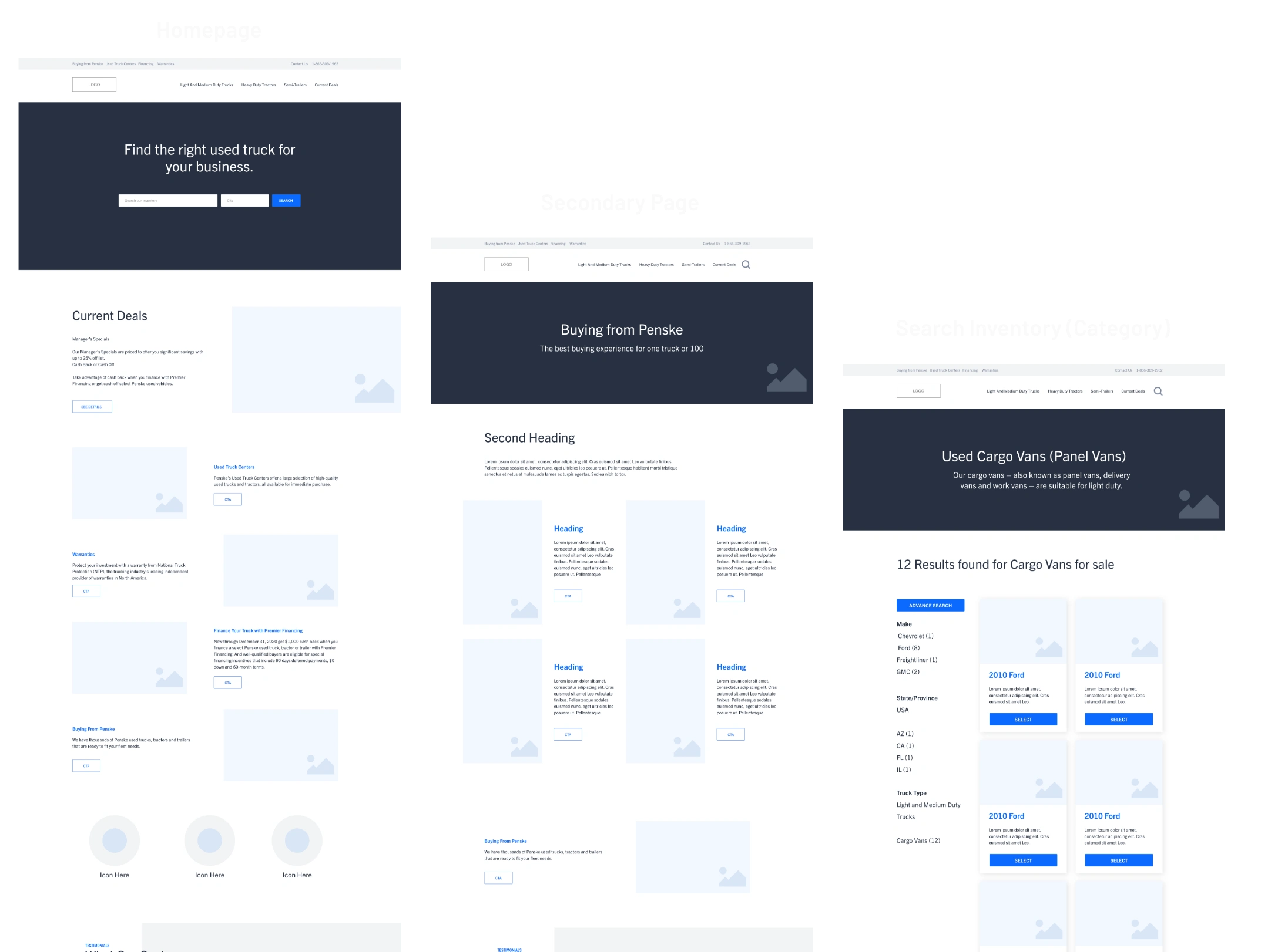
Low-Fidelity Wireframes
Style Guide
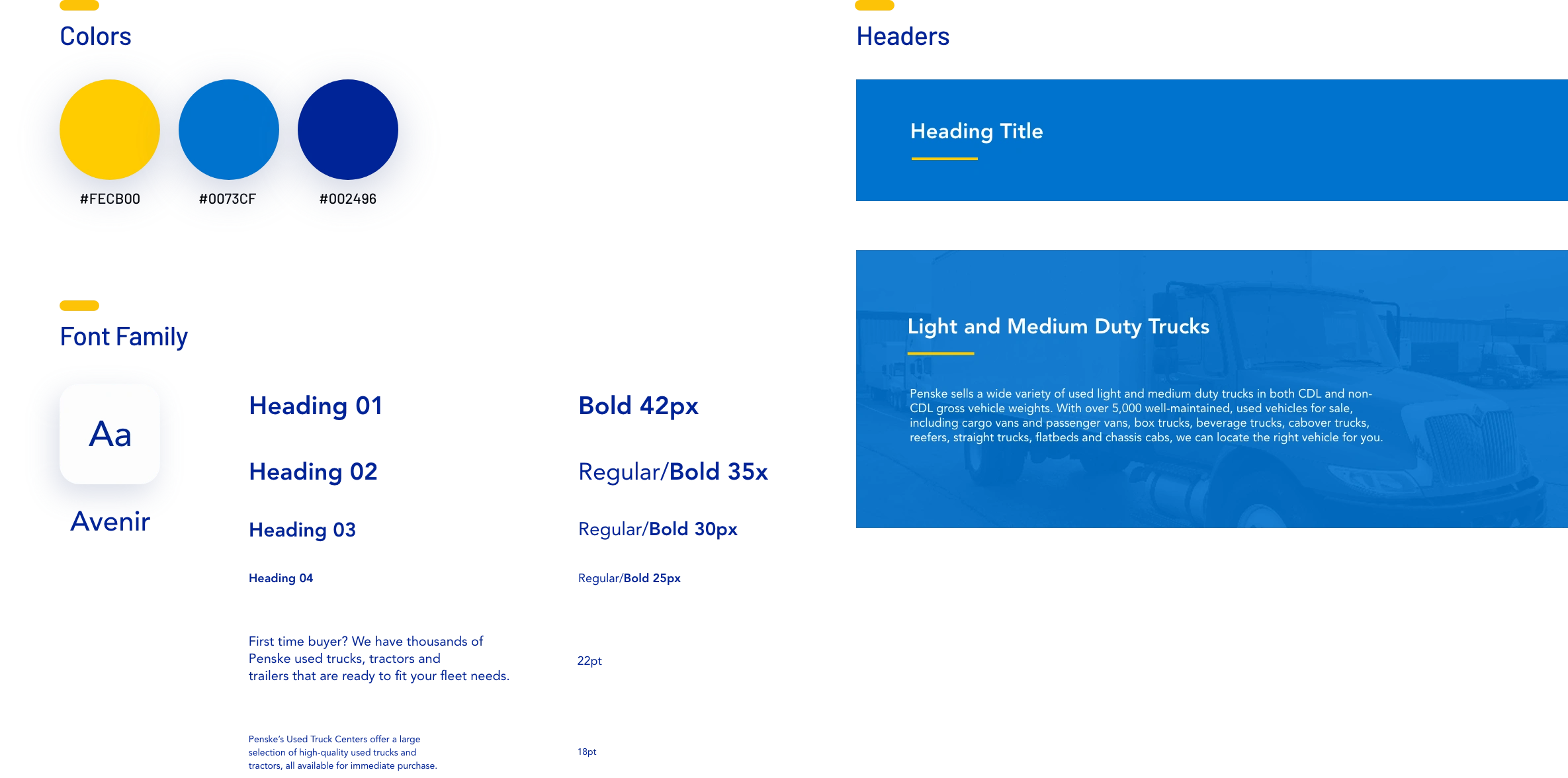
Style Guide
Penske Used Trucks - Web Components
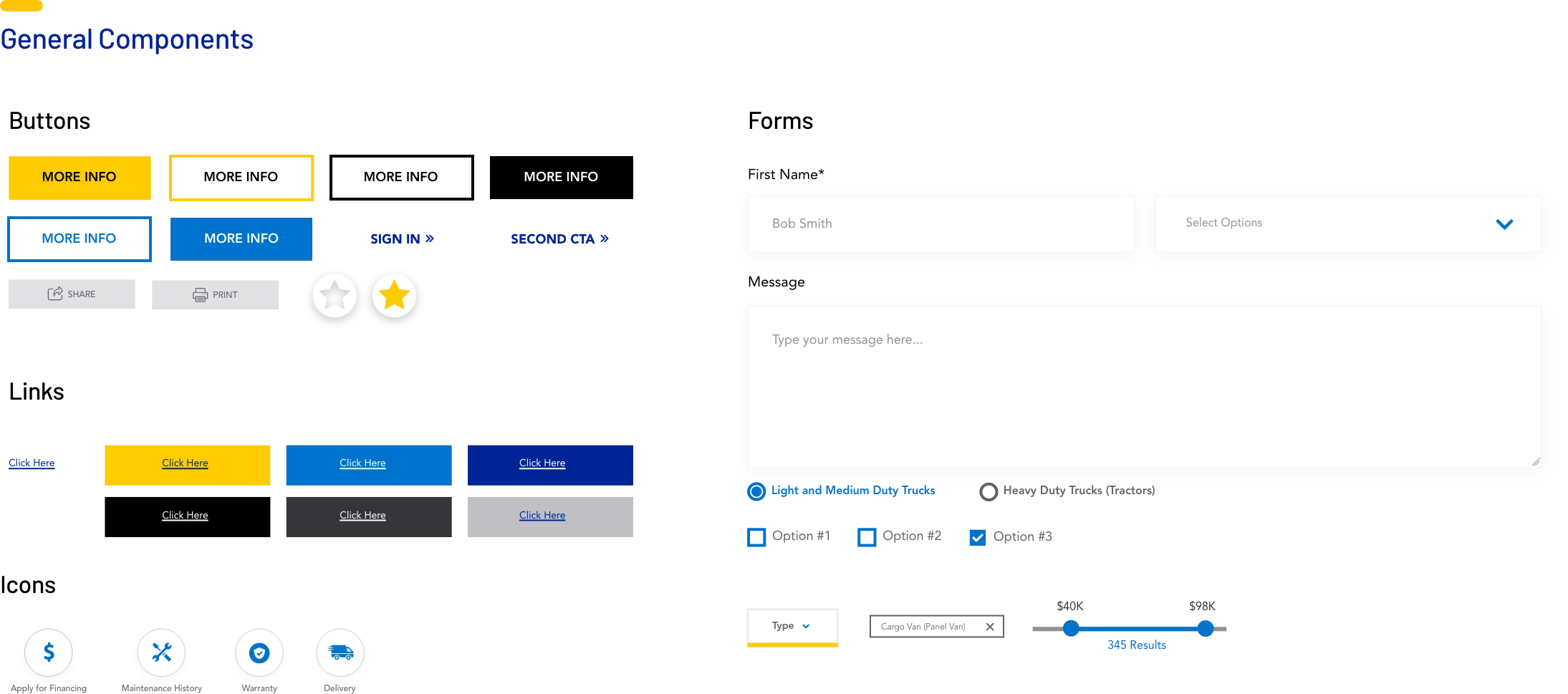
Web Components
Hi-Fidelity Designs
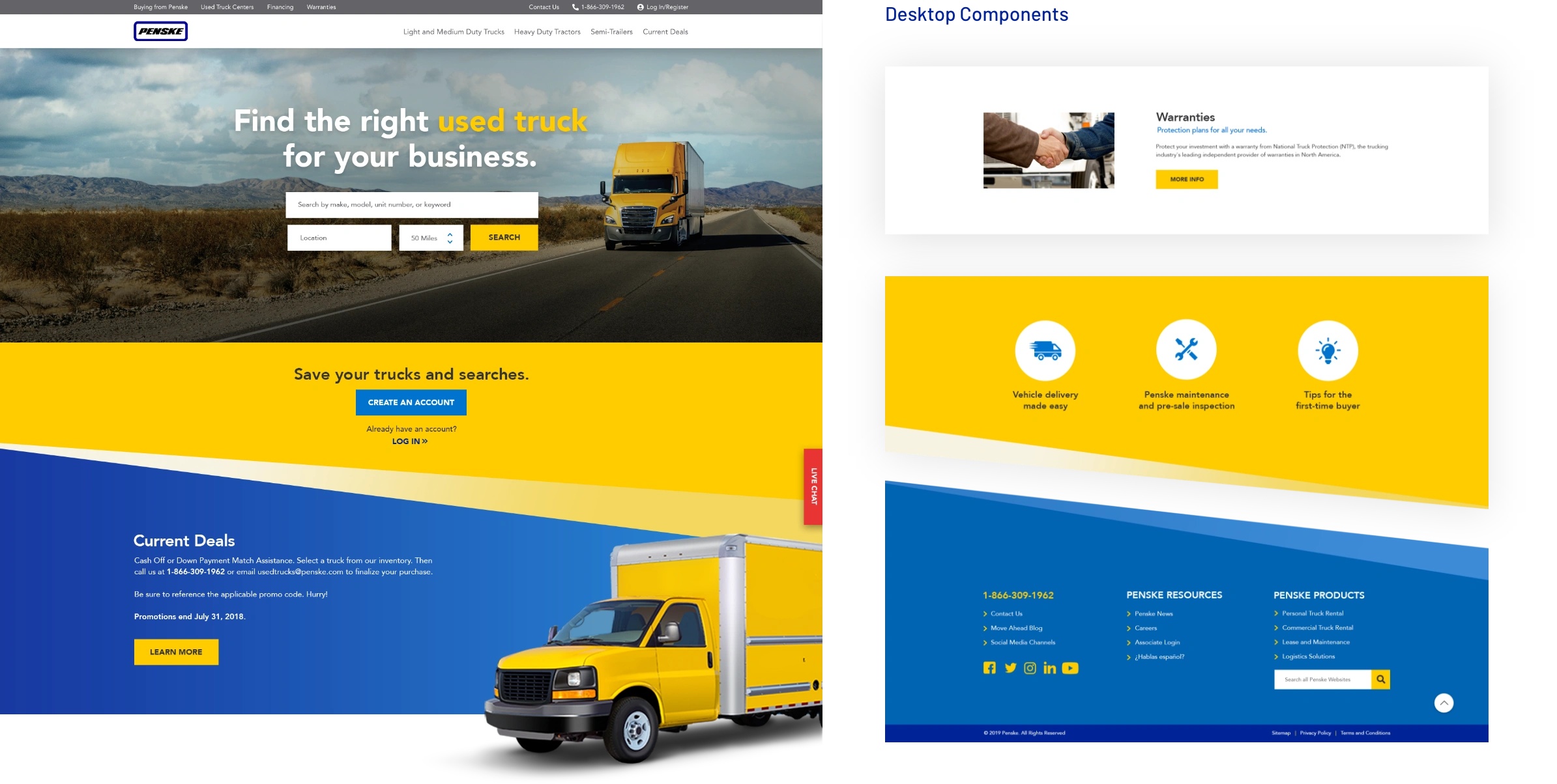

New Penske Used Trucks Website
The outcome
Penske Used Trucks website redesign was a monumental learning experience for all of us in so many different ways. I feel like the overall designs, developers, PMs accomplished and incredible amount of work within the timeline.
I personally learned a lot about inventory functionalities and other complex solutions. I also think collaboration and communication was the key to have a successful project.
Today, visitors to Penske Used Trucks get a better user experience while searching their new and improved trucks inventory and enjoy how the content was strategically structured to find what they are looking for.
Credits
UX & Visual Design: Ruben Cespedes, Andy Walck
UX Research: Jeff Doubek
Agency: Liquid Int.
Like this project
Posted Jan 2, 2024
Revamped Penske Used Trucks outdated site with a sleek, responsive design to simplify truck rental process, ensuring a modern and intuitive user experience.
Likes
1
Views
17
Clients
Penske Truck Leasing

