Dentalink Experience
New design for "Dentalink" a simple dentist landing page features a sleek split-screen layout in the hero section. The right side highlights the title “Smile of Your Dreams” with an "appointment form" for users to enter their "First Name", "Last Name", "Phone Number", and select their "dental issue" from a dropdown. While on the right you can check some highlighted services and with the calming gradient of "white, pink, green, and blue" in the background that enhances the visual appeal.

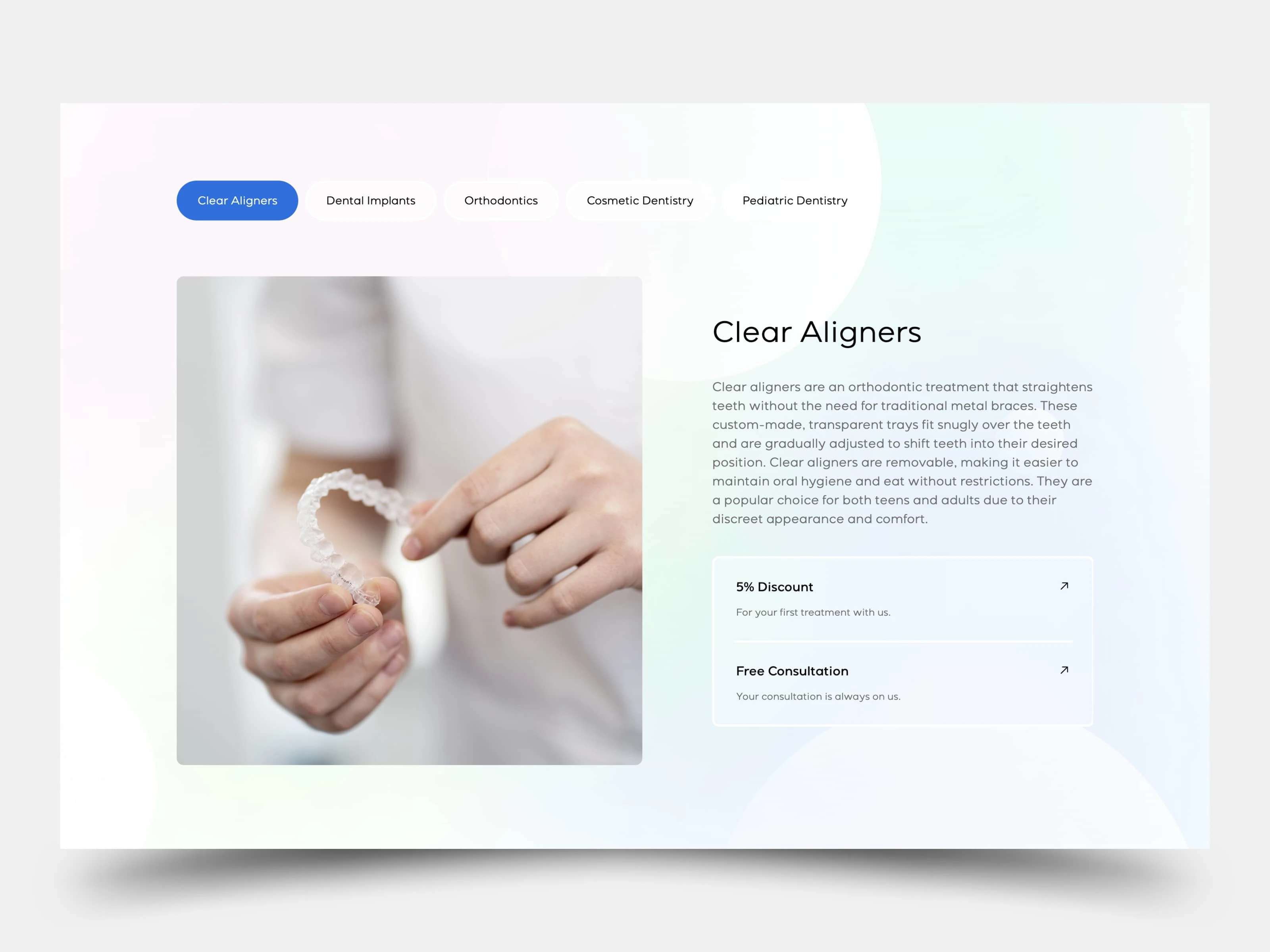
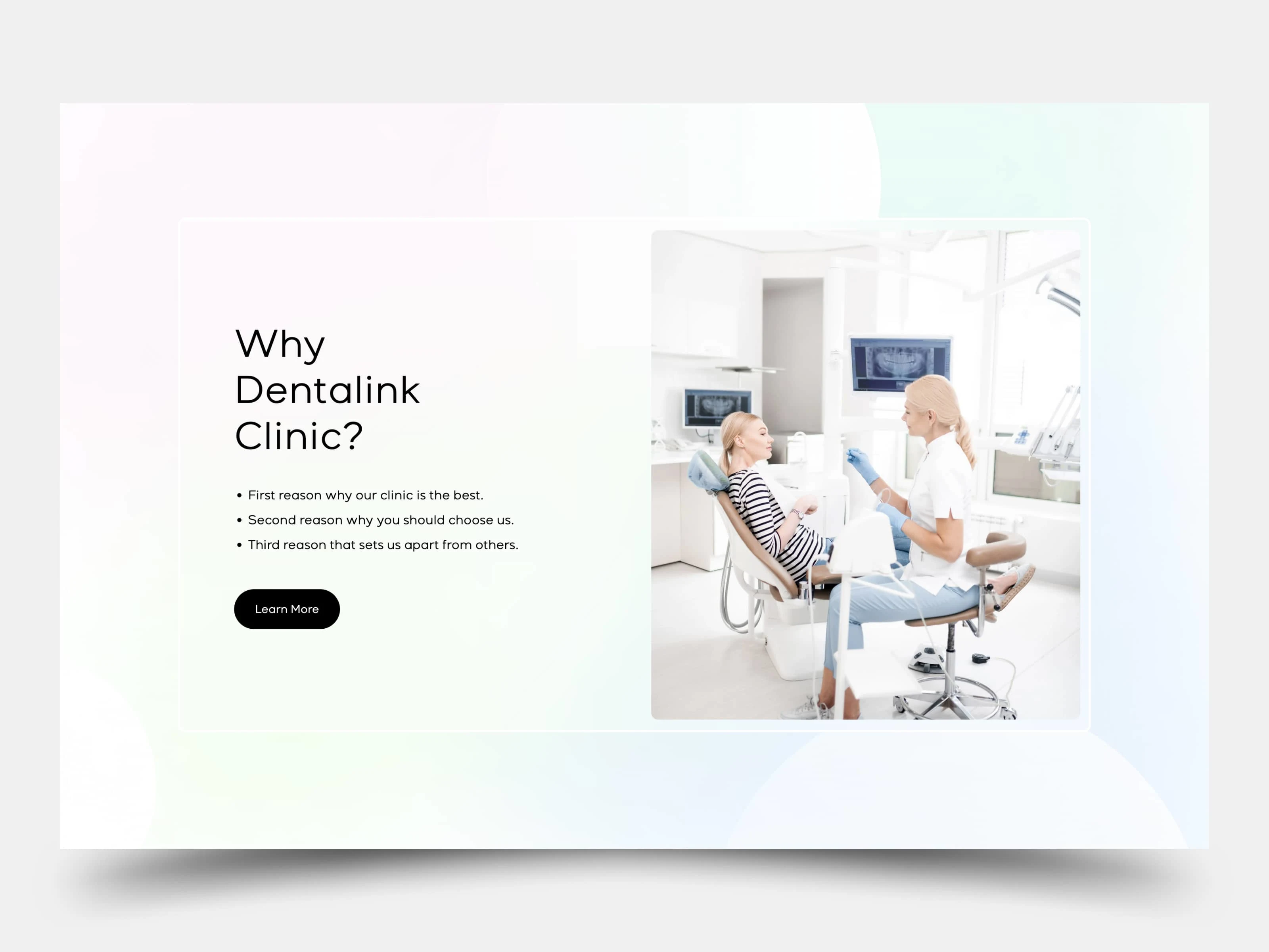
The second section outlines key "Features" with simple, engaging visuals and smooth entrance. The third section is dedicated to “Why Choose Us,” emphasizing Dentalink’s unique strengths. The fourth section showcases "Services" with images, titles, and descriptions for each, giving users a clear idea of what Dentalink offers.
Last thing at the bottom, the "Footer" provides easy navigation and essential information. Smooth animations and transitions between sections, powered by React.js, Next.js, and GSAP, make the experience seamless and user-friendly.

The phase two is still under development but we can say that the phase one captures all the sections concisely while keeping the flow smooth. Let me know your thoughts!
Like this project
Posted Sep 19, 2024
Dentalink – A sleek dentist landing page with appointment booking, service highlights, testimonials, and a mobile-friendly design for a seamless patient experie


