Fitness Video Platform | UX Design Project
Fitness Web App
Introduction
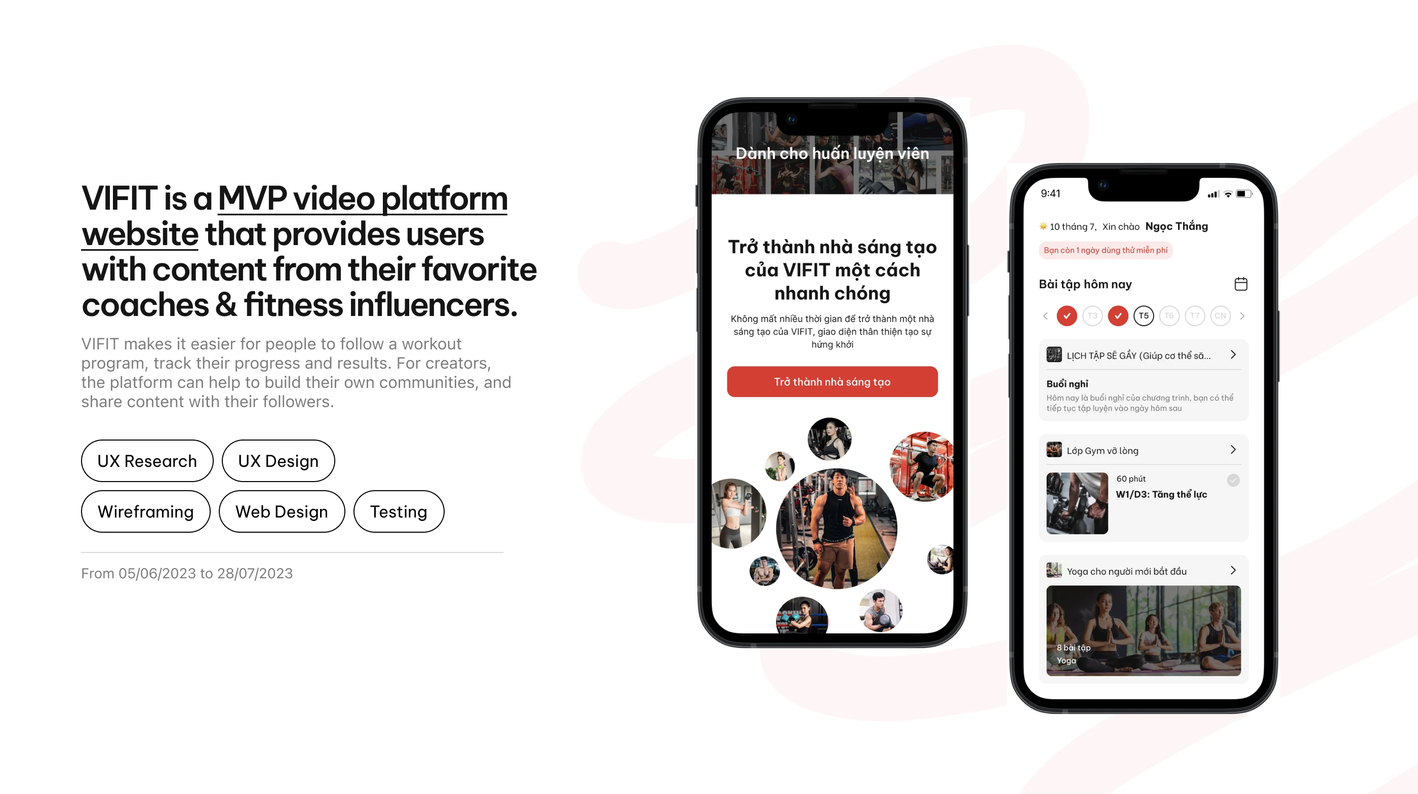
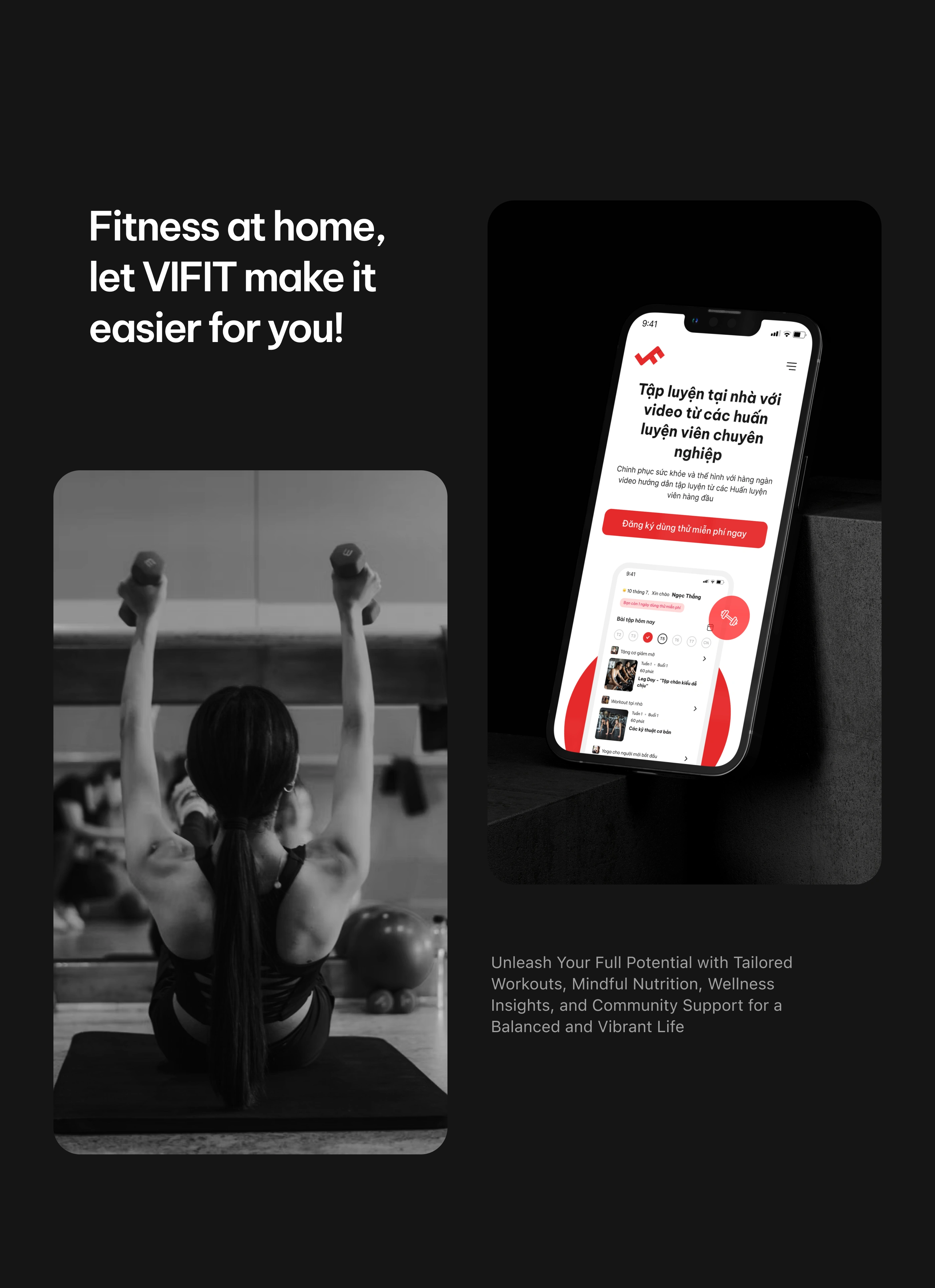
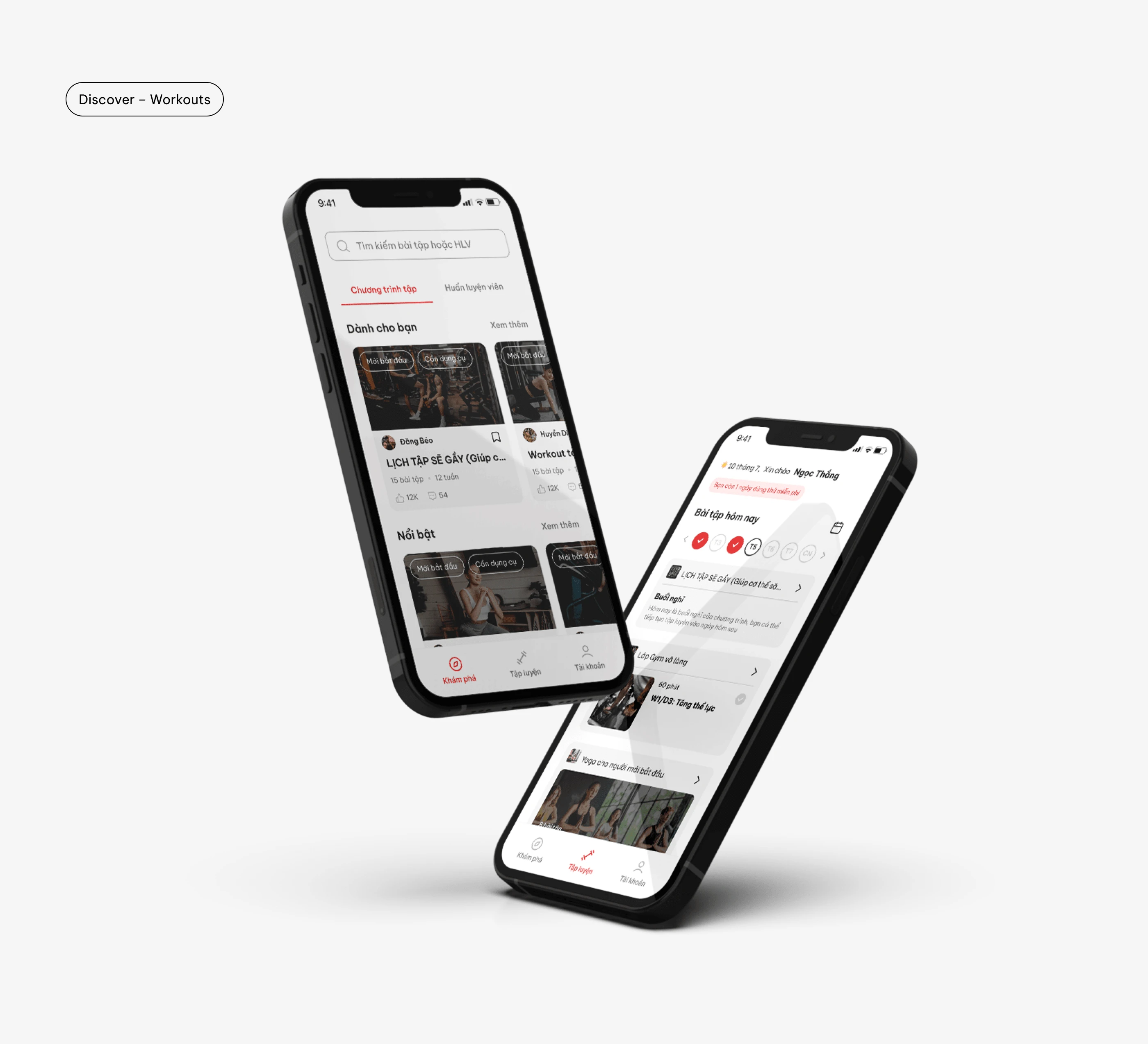
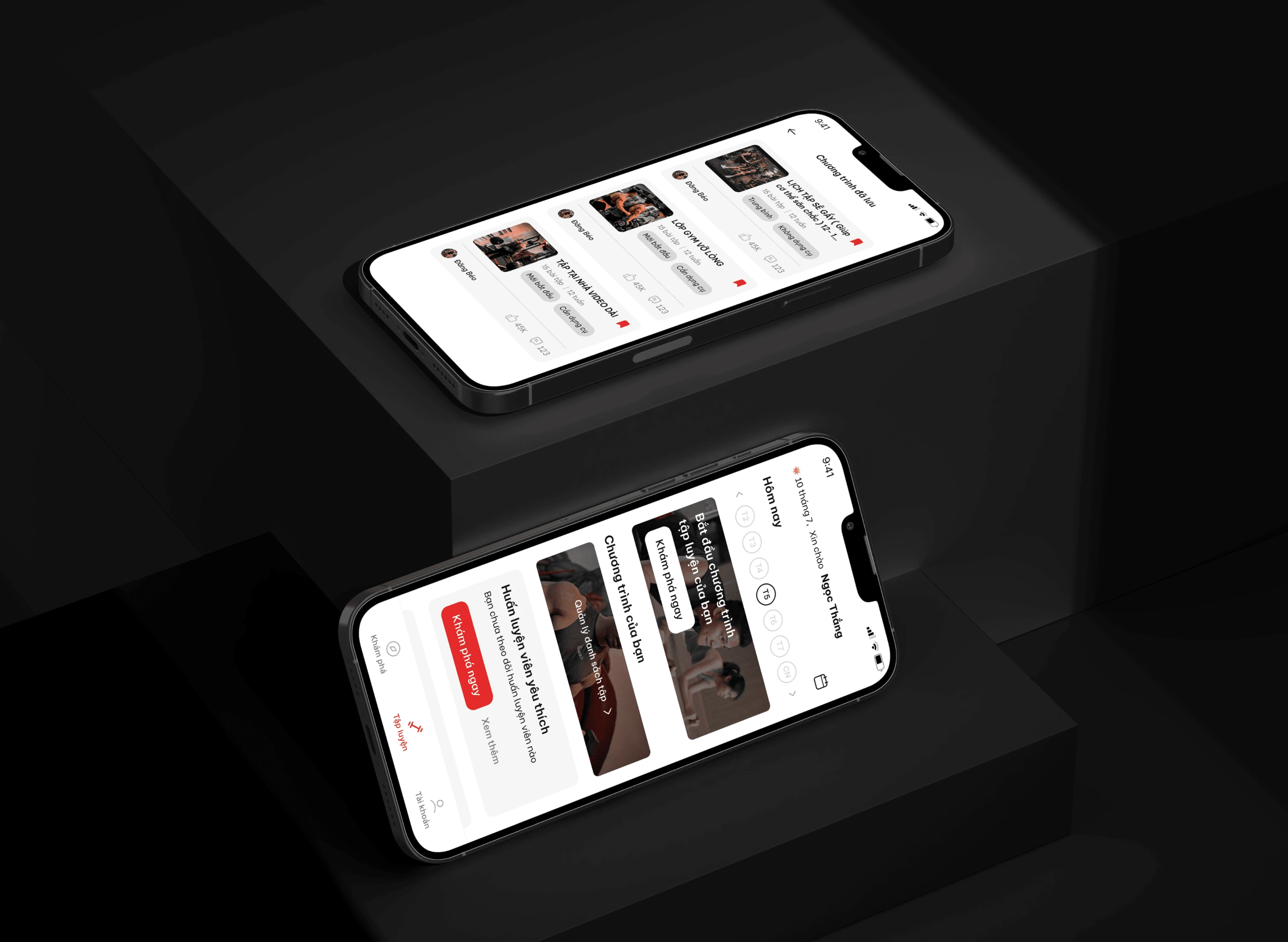
VIFIT is an MVP video platform website that provides users with content from their favorite coaches & fitness influencers.
Fitmi makes it easier for people to follow a workout program, and track their progress and results. The platform can help creators build their own communities and share content with their followers.
VIFIT overview
About Client
VIFIT makes it easier for people to follow a workout program, track their progress and results. For creators, the platform can help to build their own communities, and share content with their followers.
Project Objective
Project's Objective
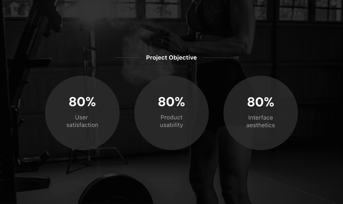
We set the design goal for this project to be entirely user-centric. Inspired by the philosophy of user-centered design, we identified a series of specific metrics we aim to achieve during the project's design phase. We conducted direct interviews with 7 users to measure the project's success and carried out nearly 100 online user surveys.
Project Process
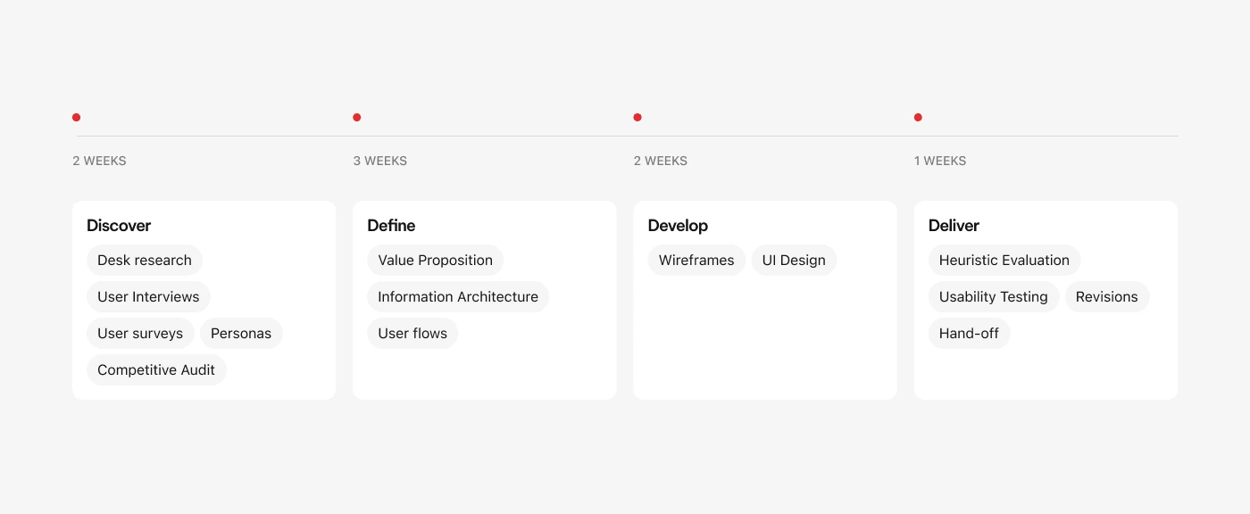
Spanning for around 2 months, our process for this project is based on Double-Diamond framework. We started by researching, which produced results that determined our design decisions; after that, we conducted testing to improve our design for the intended users.
Vifit Design Process
Stage 1: Discover
Desk research
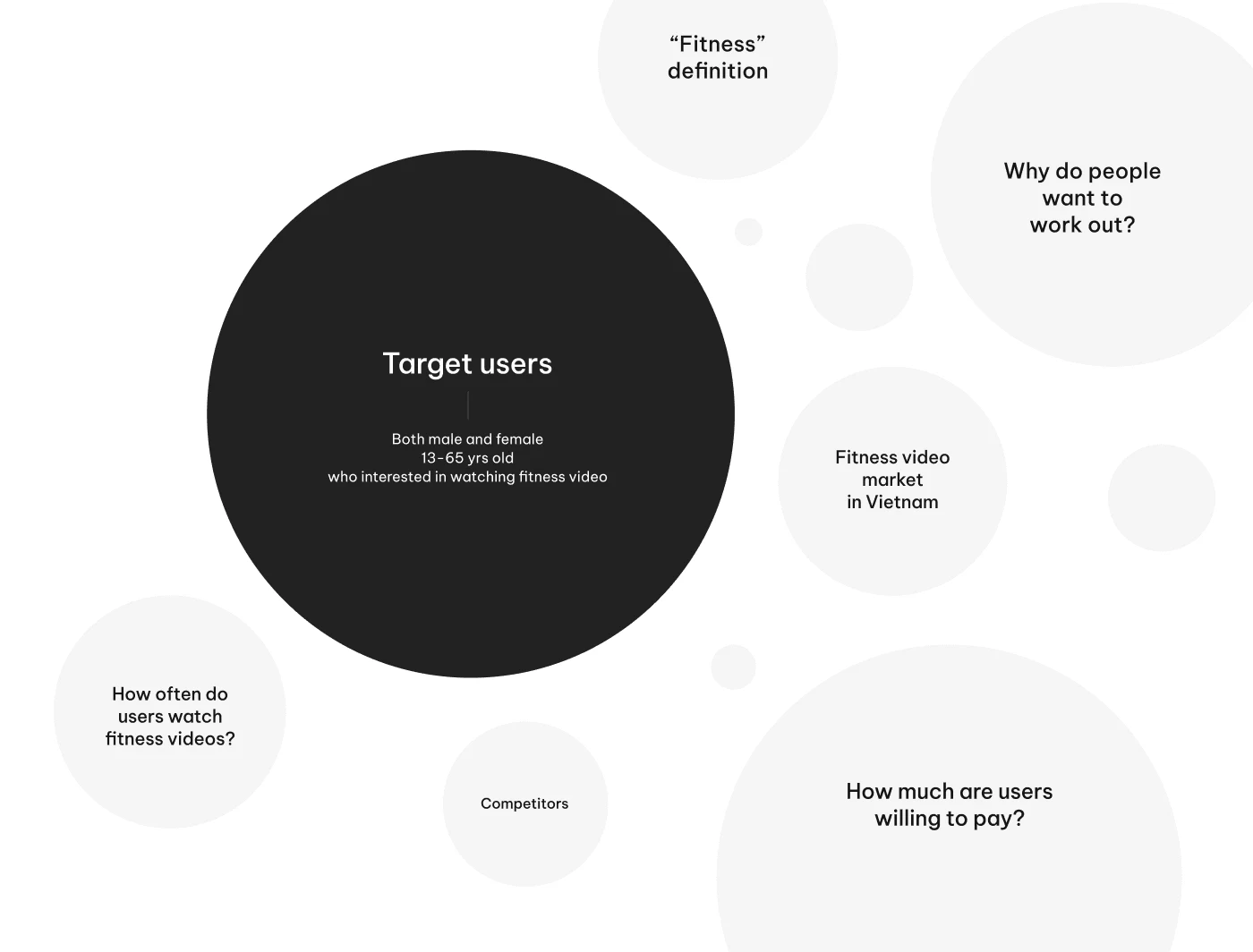
Desk Research Questions
We gathered and analyzed existing data from various sources to get an overview understanding of the market, as well as narrowing down the possible target users.
Competitive Audit
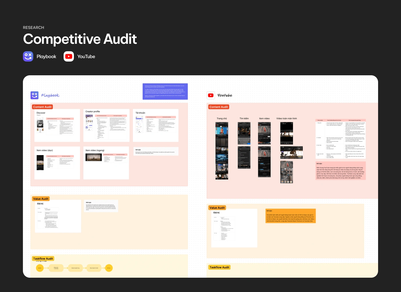
Competitive Audit
We analyzed 2 biggest VIFIT competitors: Playbook and YouTube. For each app, we audited its content, value, branding, task flow, user interface, and user feedback.
We can take inspirations from Playbook’s design style, YouTube’s subscription model, as well as their information architechture. On the other hand, there are a few things we should seek to improve upon, for example, how to simplify the exercising flow, how to help users find their workout statistics, and how we can create an environment that encourage users to interact with both one another and the contents.
User Interviews
7 responses | 2 days

Users Interview
The participants were chosen based on the conclusions we gathered during the desk research phase.
The questions used in our interviews were synthesized to validate some of the previous research findings. They included questions about demographics, user perceptions and habits, as well as how they engage with different platforms.
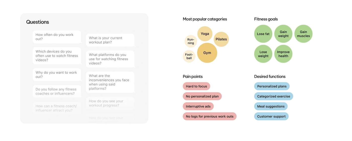
Questions & Result
User Surveys (60 responses | 2 days)
Based on the data gathered from desk research, we dug deeper into user demographics, behaviors, needs & wants, goals & motivations, and pain points.
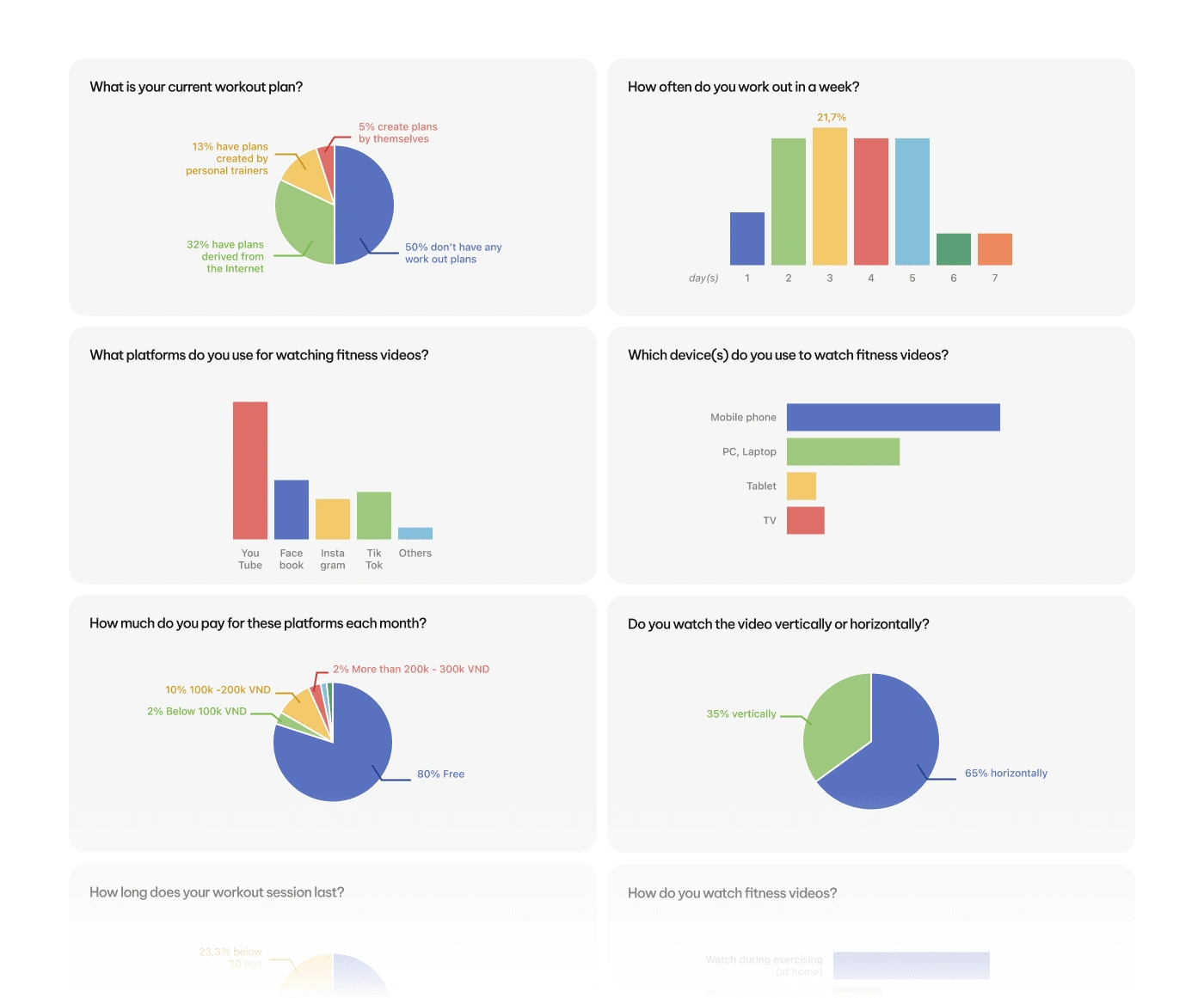
User survey result
How did we capture all insight?
Using the Card Sorting & Affinity Diagram method, all research data were recorded and helped us reach initial conclusions
Pain points
These are the main problems that users are having. Although the pain points vary from respondent to respondent, a lot of them share the same issues.
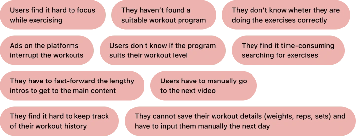
pain points
User Persona
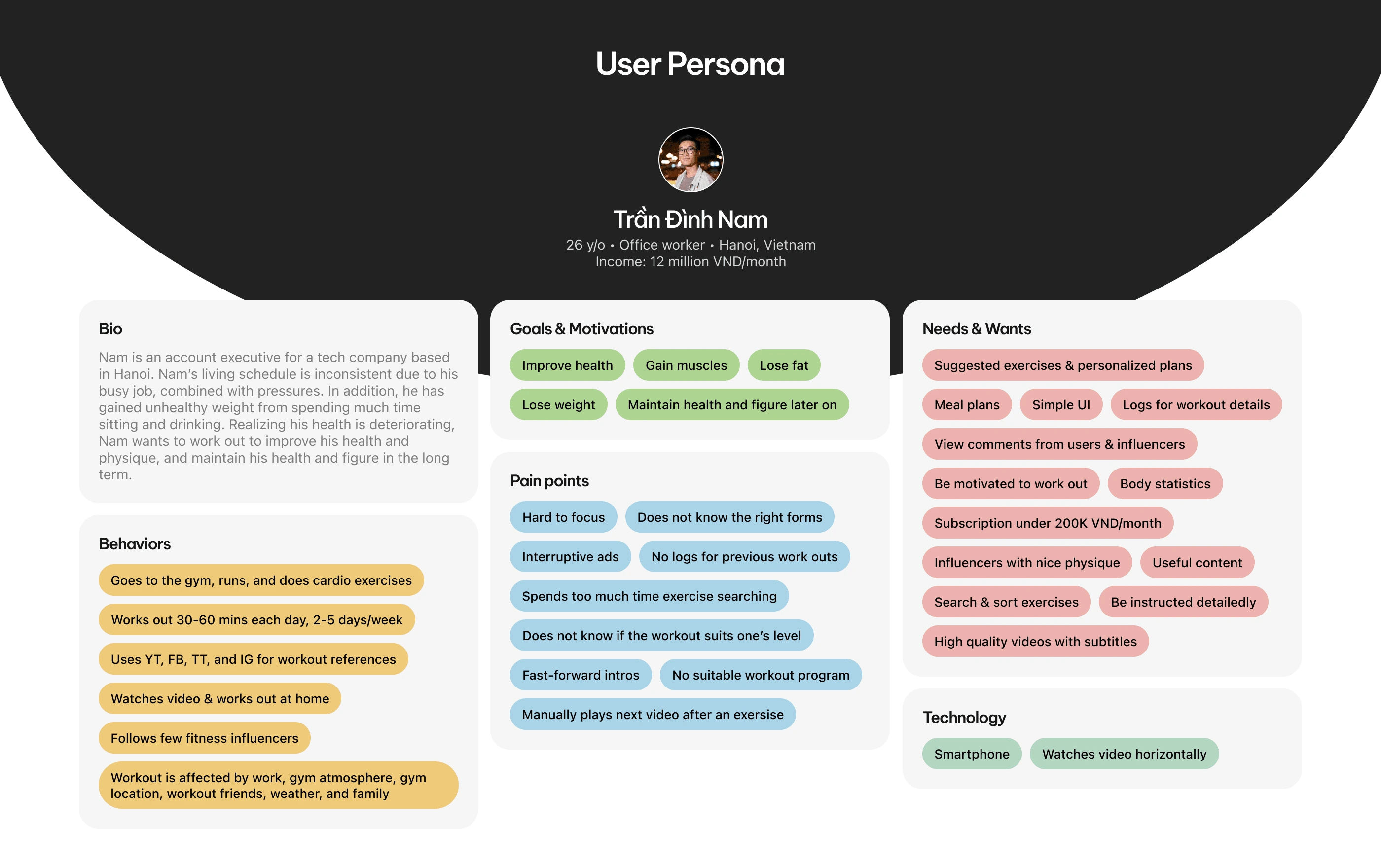
User Persona
Stage 2: Define
Value Proposition
Based on our user persona, we proposed functional and non-functional values. They were grouped into 10 categories, including Search, Subscription, and Workout programs. These values are reviewed and discussed over with the client, and then finalized for the MVP product.
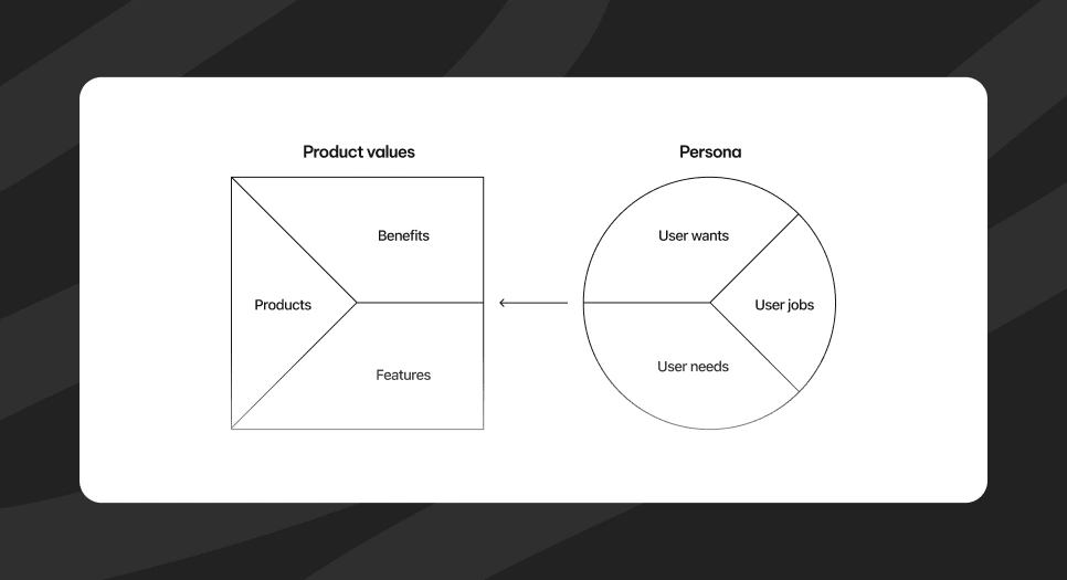
Value proposition canvas
Information Architecture
The decided values above were then placed into suitable screens, which would be used next for building the product sitemap.
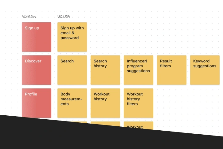
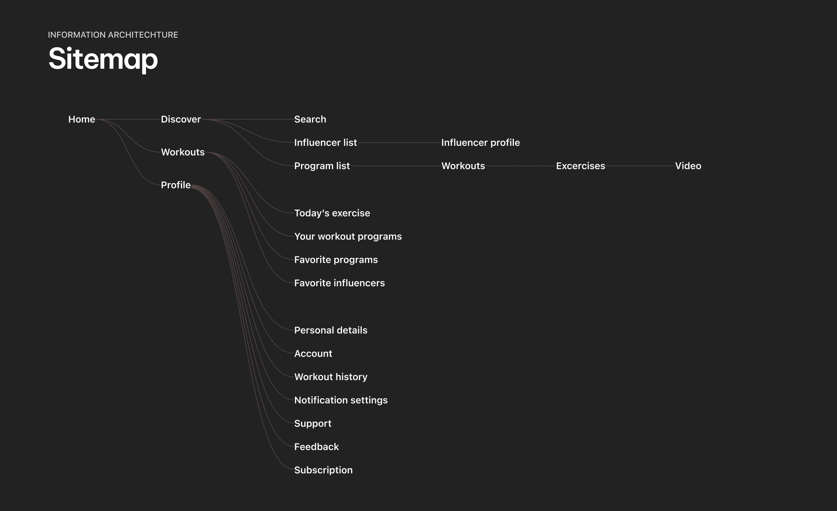
Sitemap
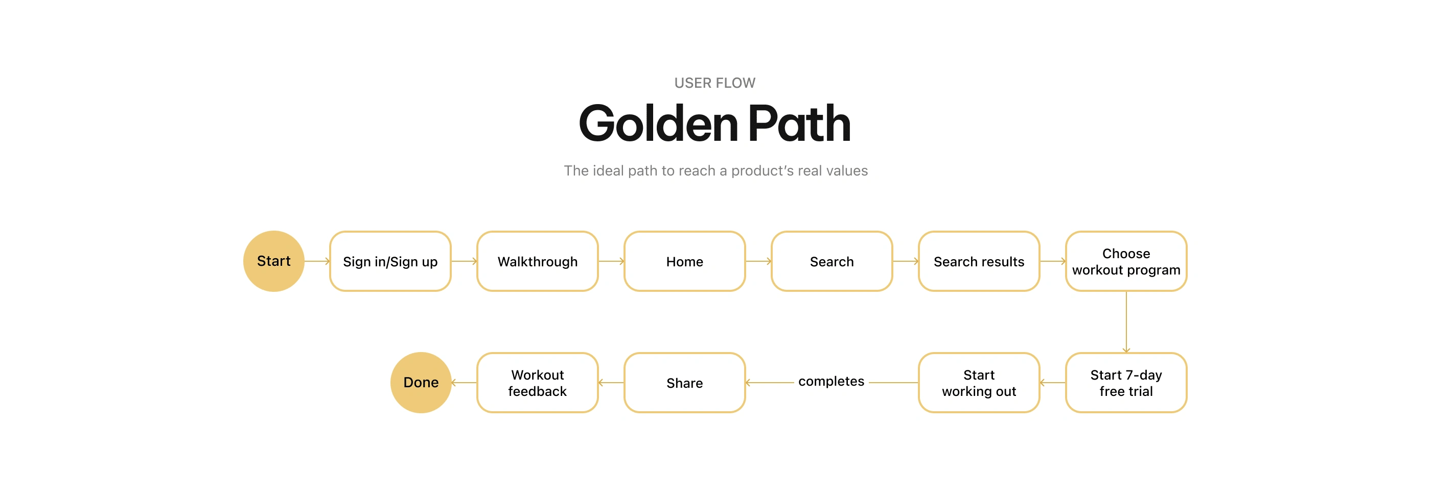
Golden path
Stage 3: Develop
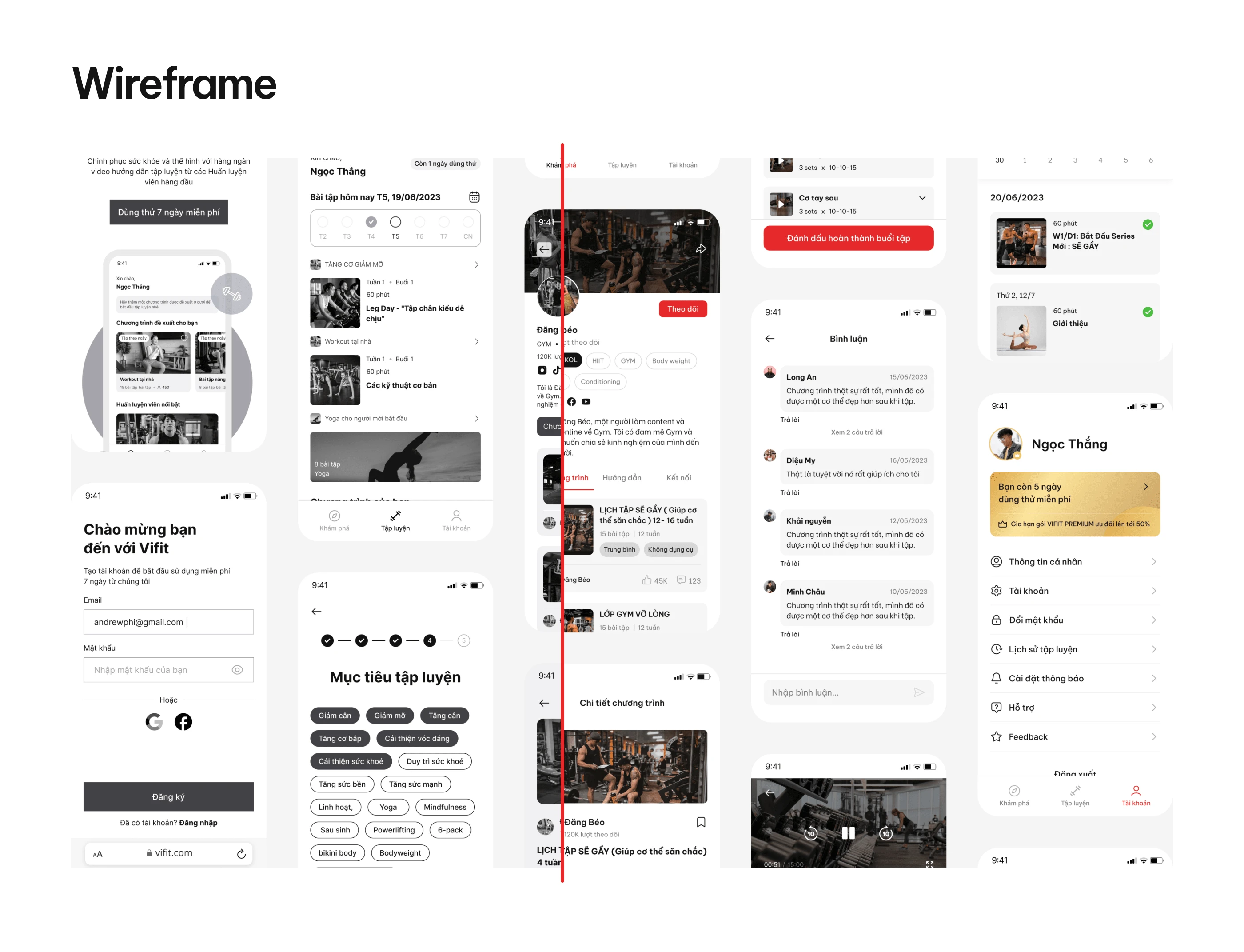
Wireframe
The decided values above were then placed into suitable screens, which would be used next for building the product sitemap.
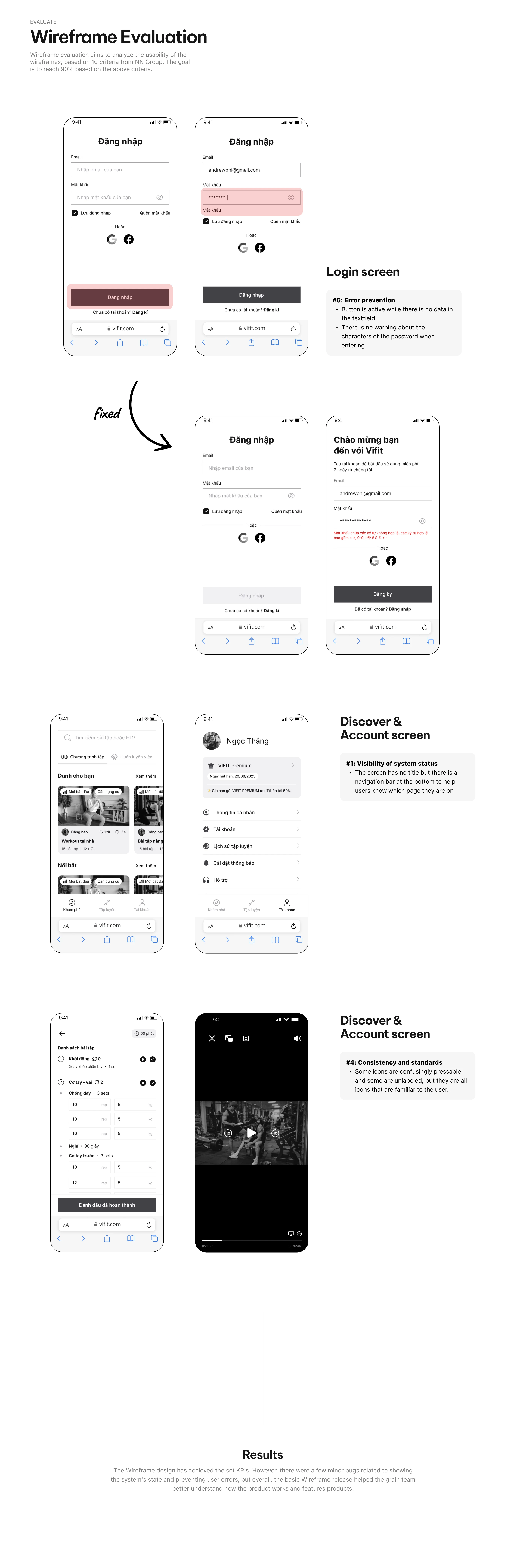
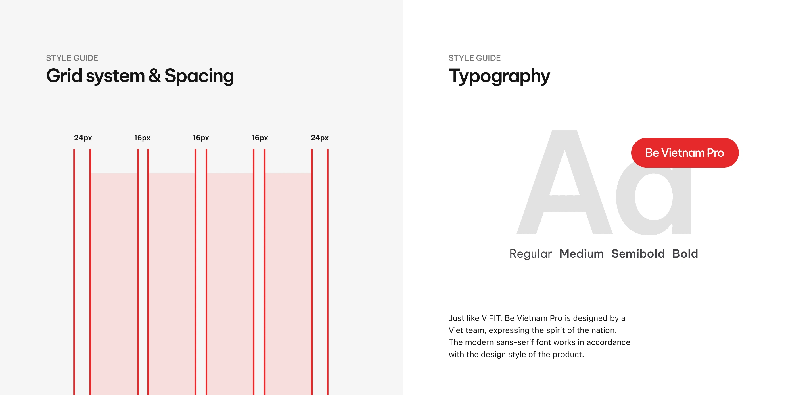
Style Guide
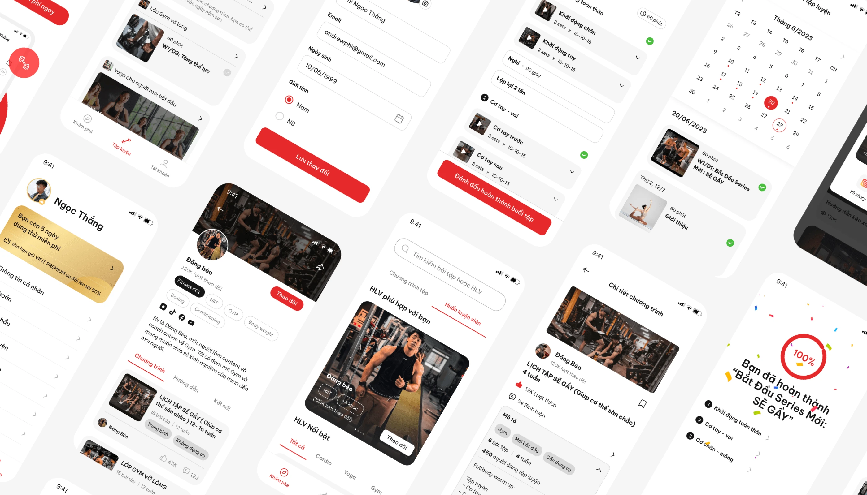
Stage 4: Deliver

Like this project
Posted Mar 12, 2024
VIFIT is an MVP video platform website that provides users with content from their favorite coaches & fitness influencers.It makes things easier for people to …
