MVP for Design Brief Generator Web App

Diana Fabianczuk


I built a web app that provides realistic client briefs for designers looking to practice and build strong portfolio projects.
My Role
I oversaw the entire product lifecycle:
UX research – studied the problem and competitors, developed the brief structure.
UI design – crafted a clean, distraction-free interface for quick generation.
Prototyping & animation – created interactive components, screen variations, and smooth transitions.
Content creation – authored 50+ realistic briefs across various industries.
Essentially, I acted as a product designer, content creator, and prototype developer simultaneously.
App Overview
The Problem
Designers often have trouble landing real projects early in their careers.
Fake or generic portfolio projects fail to impress clients.
Current “brief generators” are random, superficial, and don’t represent real business needs.
Why it matters: Without genuine briefs, designers can’t showcase strategic thinking or problem-solving skills — they can only present visuals.
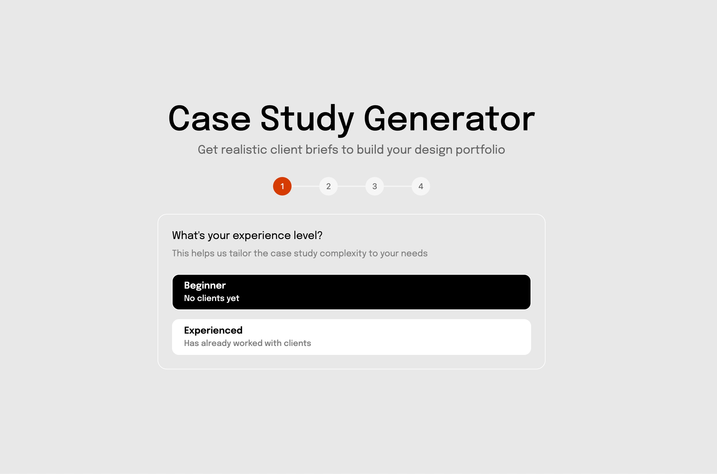
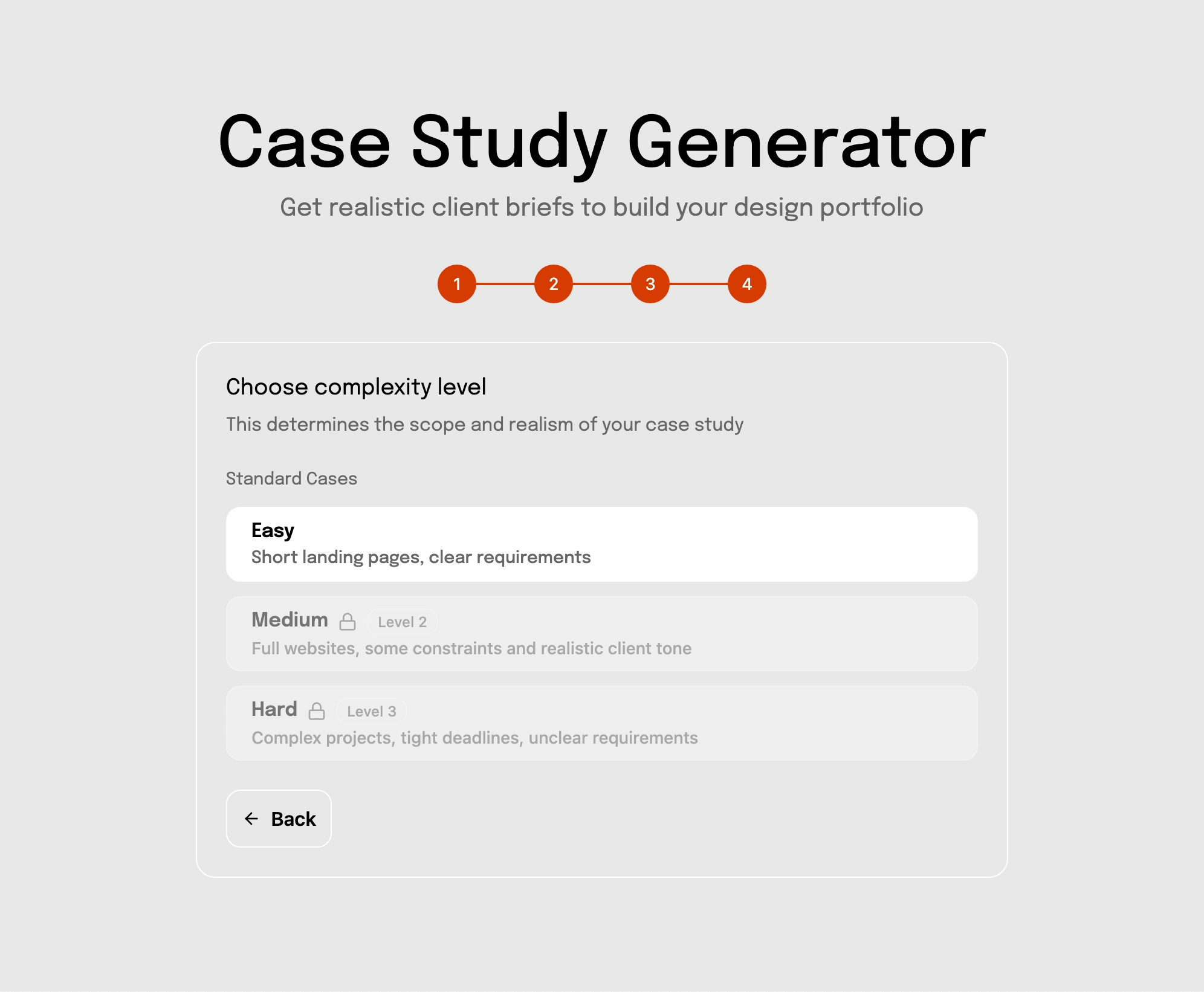
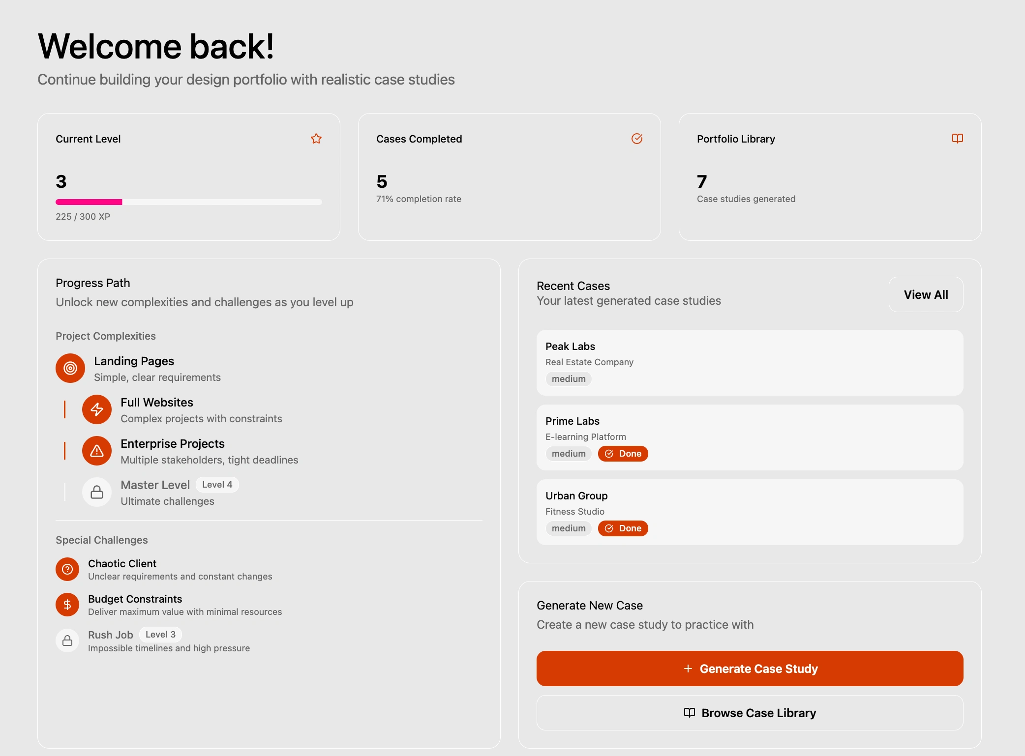
Case Study Generator
The Solution
My app:
Provides structured, realistic design briefs (branding, websites, landing pages, apps).
Each brief is written with real-world business scenarios, including goals, target audience, competitors, constraints, and deliverables.
Simulates client–designer collaboration.
Added briefs not just for beginners but also for professionals.
Added gamification.
Why this is better:
Instead of random “logo for a pizza shop,” my briefs include business context + client pain points + success metrics.
Helps designers practice not just design, but thinking like a consultant.
User Flow
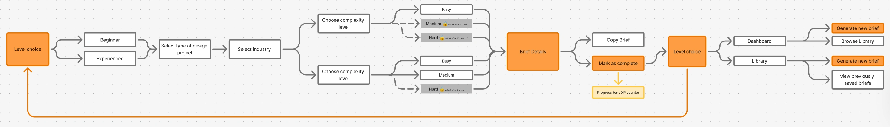
The Process
Research: analyzed how real client briefs are structured and what designers lack when practicing + analyzed competitors where all platforms follow the same scenario.
Content creation: wrote 50+ briefs across industries (SaaS, e-commerce, lifestyle, B2B).
App design: created a clean, distraction-free interface for generating and saving briefs, plus a dashboard to monitor progress. Users can level up and complete special challenges in a gamified experience.
Validation: tested with beginner designers → they said briefs feel “like real clients” and help them build stronger portfolios.
Gamificaion
The Impact
Designers acquire practice material that helps their portfolios stand out.
Clients reviewing these portfolios recognize strategic design thinking, not just attractive visuals.
Your app connects the dots between “student work” and “professional work.”
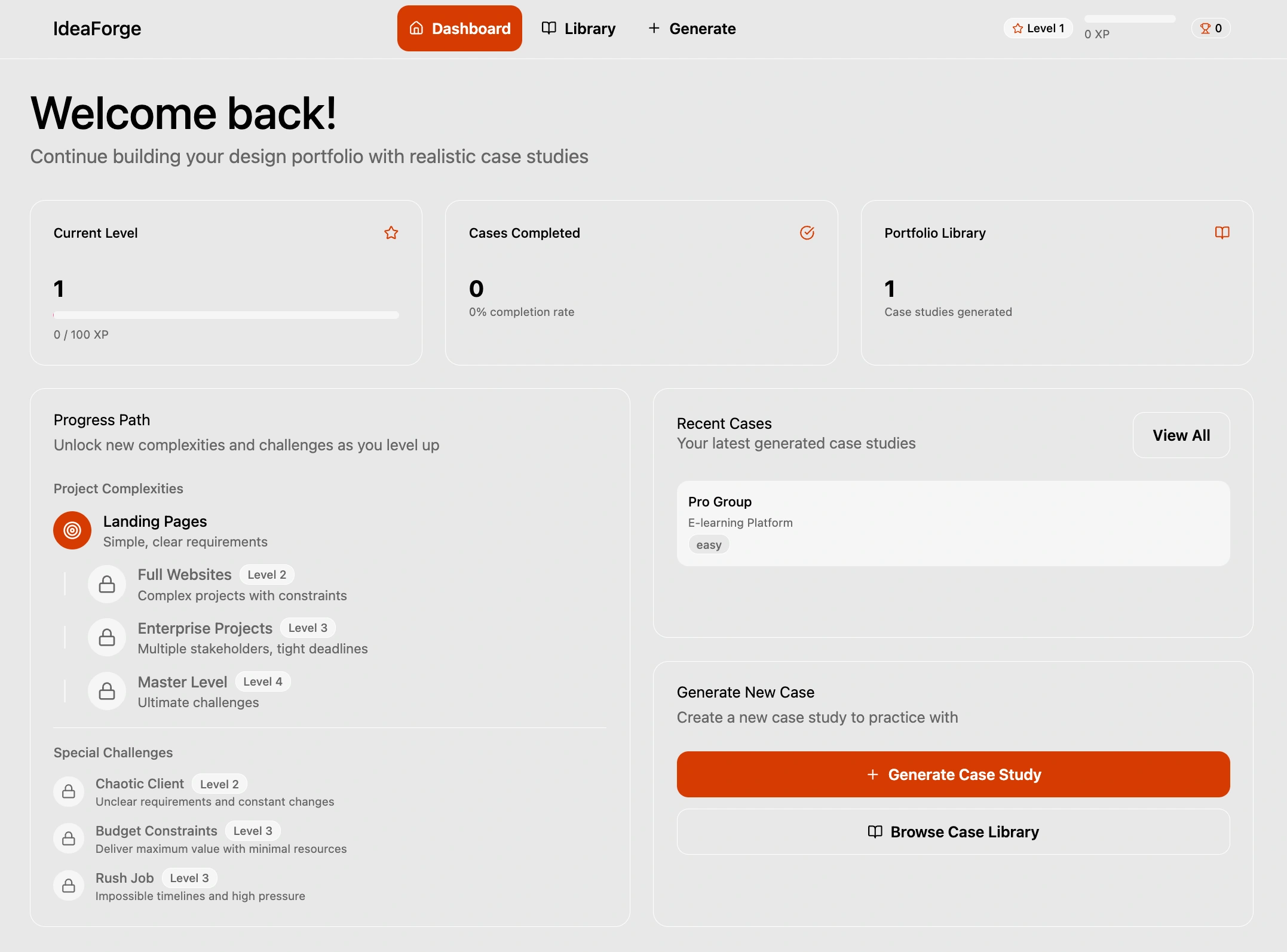
Case Study Dashboard
Why Figma Make
I deliberately chose Figma Make to test a brand-new product and explore its capabilities for building web apps without code.
It let me spin up a functional prototype quickly and share it with the community right away.
I wanted to evaluate how well Make supports interactive flows and whether it could become a real alternative to other no-code tools.
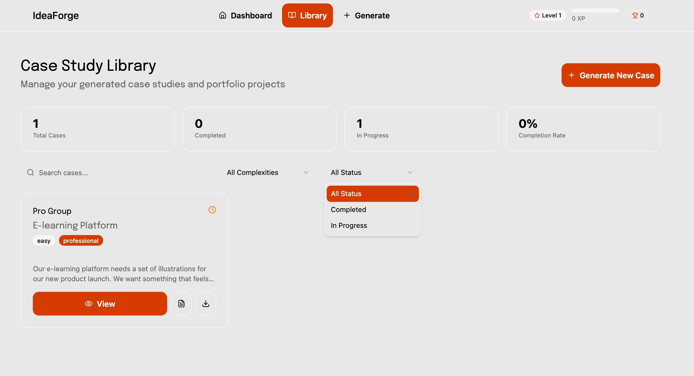
Case Study Library
Why My Builder Is Better Than Others
Realism first: Briefs are based on real business goals, not random prompts.
Variety: Covers SaaS, e-commerce, NGOs, lifestyle brands — not just generic logos.
Practical structure: Every brief includes goals, audience, tone, and deliverables.
Growth-focused: Helps designers practice client communication and strategy, not just visuals.
Polished UX: Unlike clunky generators, it’s smooth, simple, and made for designers’ workflow.
Challenges & Solutions
Since this was my first project in Figma Make, I encountered a few unexpected hurdles.
1. Visual design not matching the prompt After the initial prompt, Figma Make interpreted my overall structure and user flow surprisingly well, but the generated interface didn’t reflect my intended design. Fonts, type sizes, and line-height were all slightly off, even though the underlying code looked correct. Achieving the exact look and feel I wanted took more experimentation than expected.
Solution: I refined the prompts and ran a series of quick tests, gradually discovering which instructions Figma Make responded to most accurately until the layout and typography matched the vision.
2. Interactive flow testing Not a “problem” as such, but every part of the app’s flow needed to be tested manually. Buttons occasionally led to unexpected states or failed to trigger correctly.
Solution: Careful additional iteration and precise prompt writing ensured that each interaction behaved as planned and the full user journey remained smooth.
Next Steps
Potential Extensions:
Integration with a real backend to store data and sync across services.
User accounts and login functionality for a personalized experience.
Mobile version for access on any device.
Additional analytics tools to track user activity and engagement.
Integration with third-party services or APIs to expand functionality.
Try it here: https://brush-cling-68516572.figma.site/
Like this project
Posted Sep 11, 2025
Built a portfolio web app delivering real client-style design briefs, enabling designers to practice, improve UX/UI skills, and land more design opportunities.
Likes
3
Views
46
Timeline
Sep 3, 2025 - Sep 11, 2025