CO Homes | Real Estate Brand Identity

Erica warfield


Colorado Homes by Alicia
A Thoughtfully Crafted Brand Identity
Brief
Alicia, a dedicated real estate agent operating under Coldwell Banker, approached me to create a distinctive brand identity for her new business, Colorado Homes by Alicia. The challenge? Designing a logo that harmonized with Coldwell Banker’s iconic blue branding while standing apart from the saturated market of generic mountain and house motifs. Alicia wanted her brand to reflect her unique personality: approachable, creative, and deeply connected to Colorado’s natural beauty. It was crucial to create an identity that does not blend into the sea of predictable real estate logos.
Design Approach
To craft a brand that truly represented Alicia, we began with an in-depth discovery process. Through mood boards, visual inspiration, and discussions about her client relationships, we pinpointed a style that captured her essence: warm, trustworthy, and refreshingly original.
Alicia’s brand needed to convey:
Authenticity: A down-to-earth, welcoming presence.
Nature-Inspired: Reference to Colorado’s nature without clichés.
Professional Trust: A polished and personable aesthetic.
We landed on a handcrafted paper-cutout and stamp-inspired illustrative style as a nod to a hands-on and artisan approach to her real estate service.
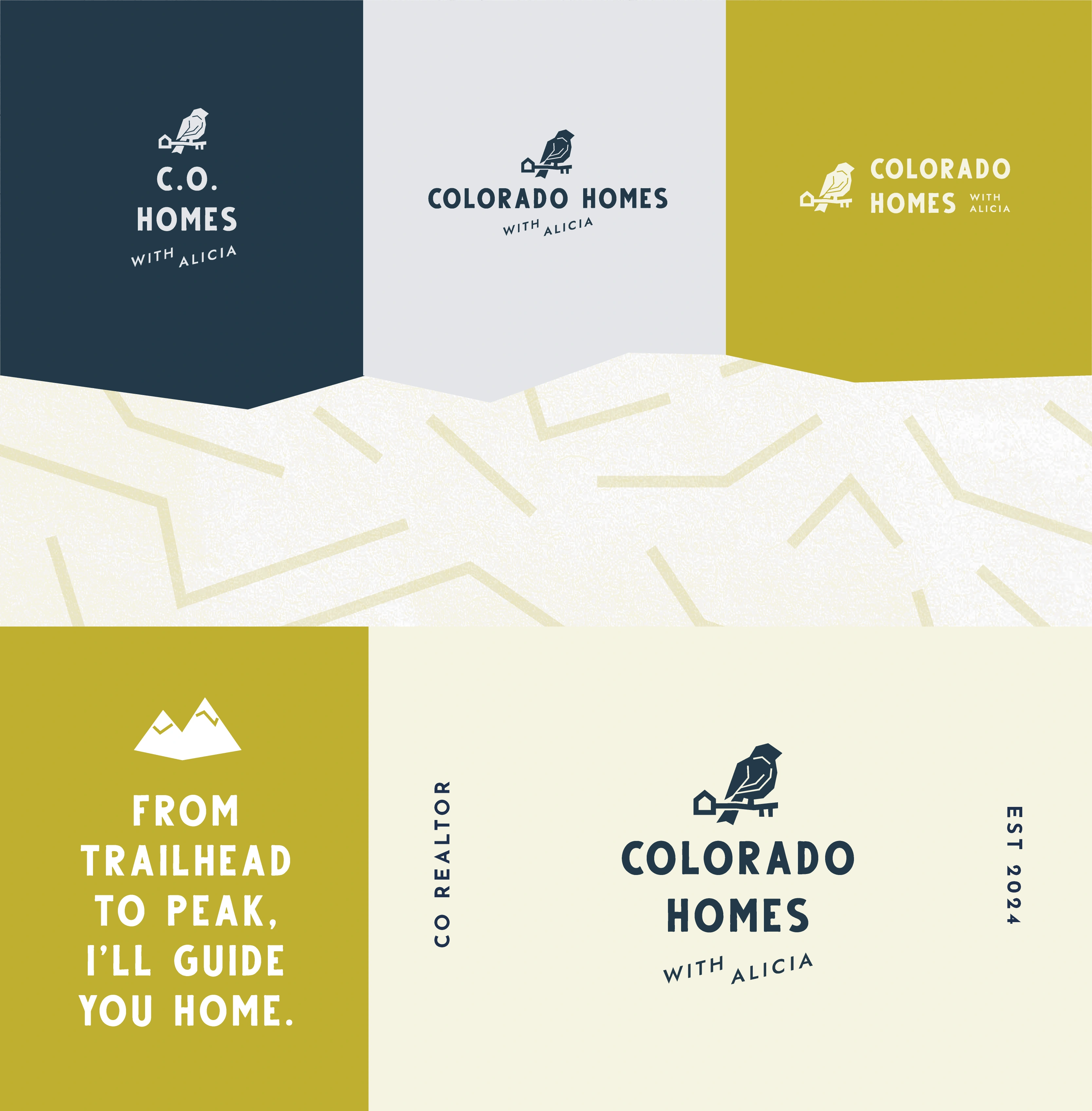
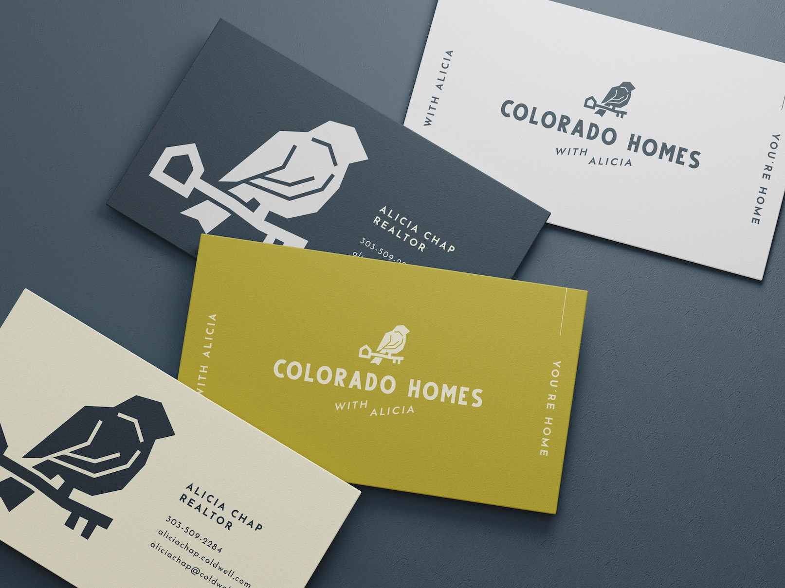
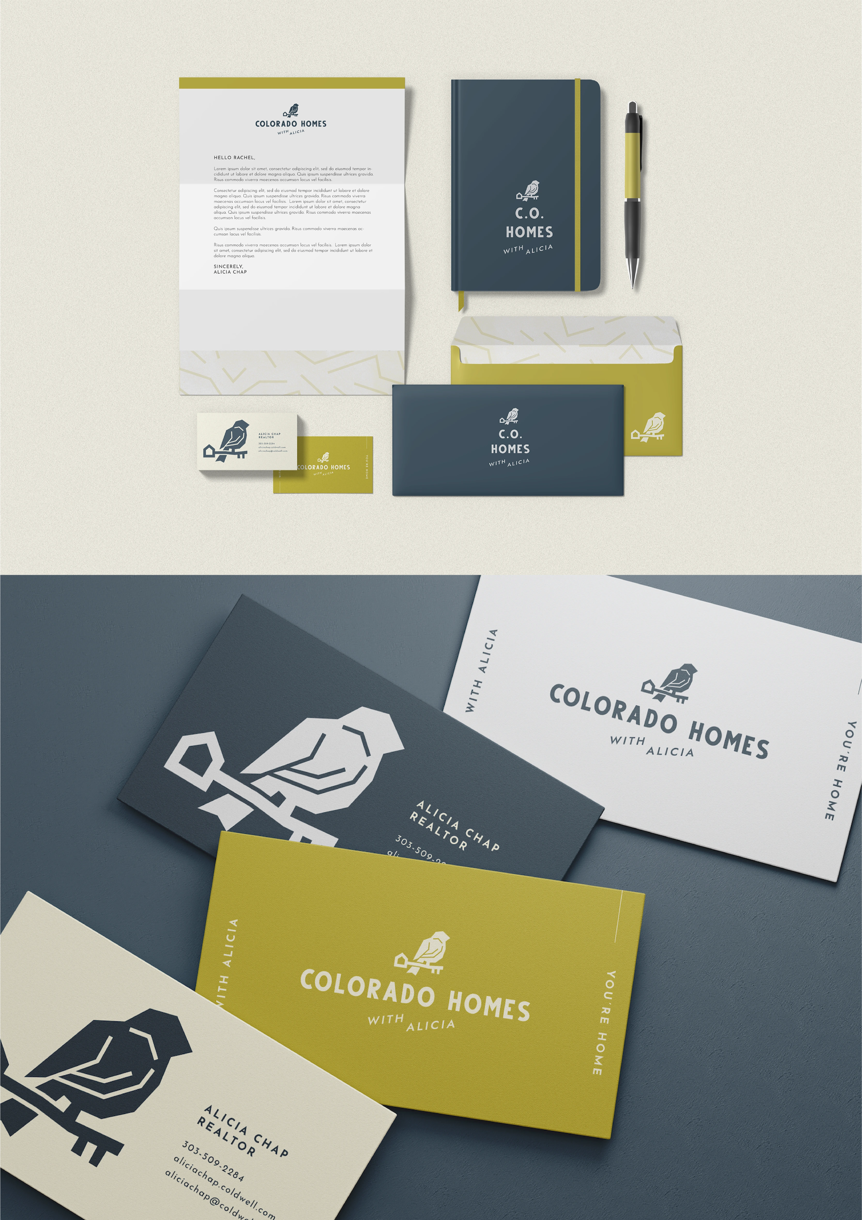
Logo
Rather than defaulting to overused imagery, I explored deeper symbolism tied to homes and Colorado’s identity. The mountain bluebird became the perfect metaphor for representing warmth, opportunity, and the joy of finding home.
The final logo merges two meaningful elements:
A bluebird perched gracefully on a key symbolizing access, security, and new beginnings.
The key’s handle subtly shaped like a house. An elegant, understated nod to real estate without being overt.
This design balances uniqueness and clarity, ensuring instant recognition while standing out in a competitive market.
Color
Since Alicia’s logo would appear alongside Coldwell Banker’s branding, color harmony was essential. We selected:
Deep, muted blue showing trustworthiness and professionalism.
Vibrant olive green as fresh, natural, and inviting energy.
Typography
The bold, spacious, and slightly organic typography complements the logo’s modern yet natural aesthetic. It’s confident yet approachable, just like Alicia’s client interactions.
Success
Since its launch, Alicia’s branding has set her apart from competitors with its distinctive originality, quickly attracting clients through its memorable and trustworthy appeal. The design’s success was so impactful that it inspired one of her colleagues to hire me for their own brand, Ritter Homes, further proving the power of thoughtful, strategic design in driving real business results.
What the client had to say...
"Erica created the most perfect logo for me and my real estate business! She was so easy and fun to work with and her pricing is extremely fair. She knows the importance of brand recognition and has helped my small business tremendously. I look forward to hiring her again for more of her services once my business grows. Thanks again for the wonderful work! Highly recommend!"
– Alicia C.
Your brand is your first impression. Make it unforgettable.
Let’s create something extraordinary together.
Like this project
Posted May 31, 2025
Alicia’s brand wasn’t just designed. It was strategically crafted to resonate with her audience, reflect her values, and drive real business results.
Likes
0
Views
3
Timeline
Mar 5, 2025 - Mar 24, 2025


Forte | Music Startup Web Design & Brand Refresh
Yes And | Personal Development Brand & Web Design
SoulHAVEN | Non-Profit Brand and Website
BOTANIK | Natural Skincare Brand