Shēdo Matcha Brand Identity Development
Maniu Khan
Shedo Project Case- Study
Shēdo is a modern ceremonial matcha brand designed to feel bold, confident, and contemporary.
The project challenges the traditional visual language of matcha by moving away from soft, organic aesthetics and introducing a strong typographic identity with graphic simplicity. The result is a brand that feels equally at home in cafés, design stores, and modern retail environments.
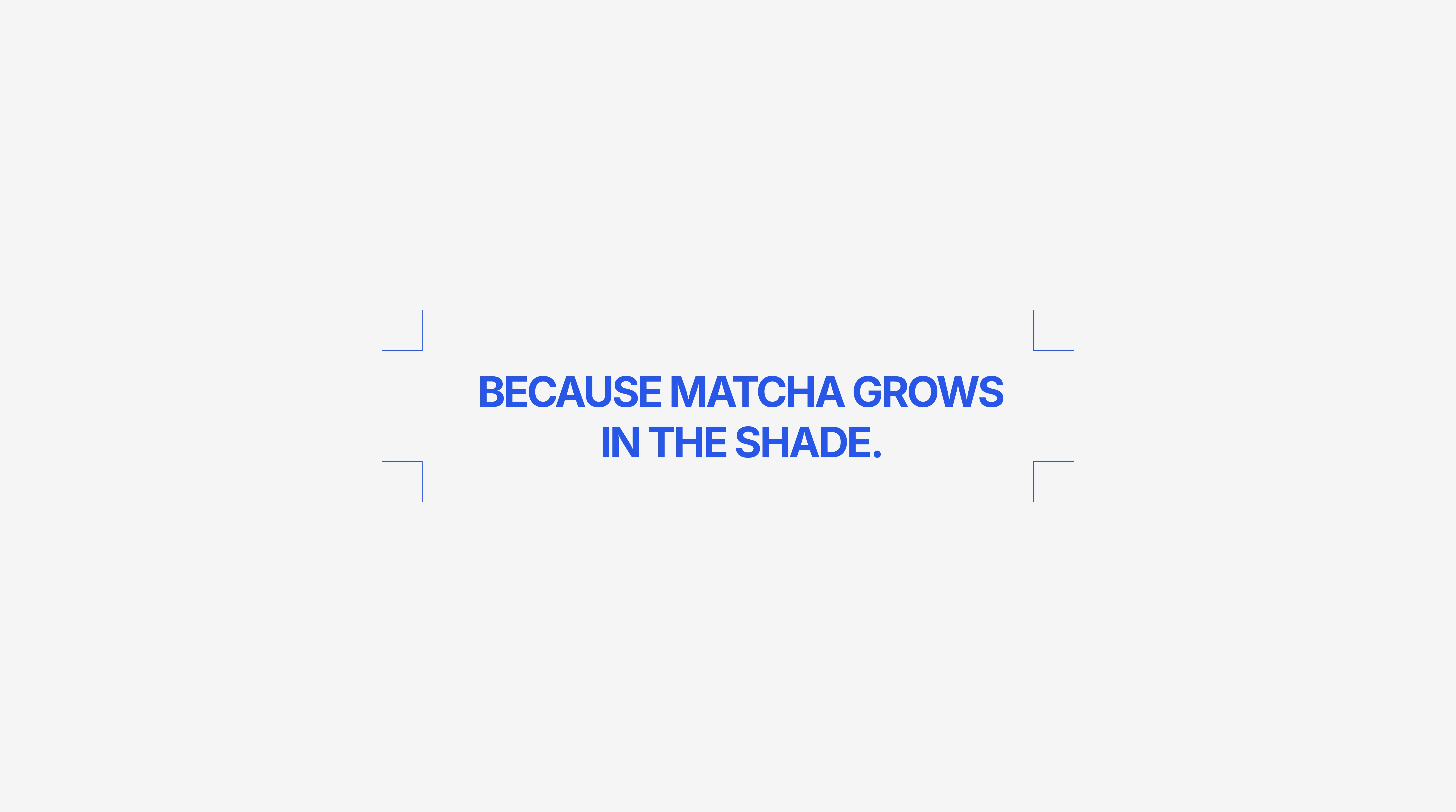
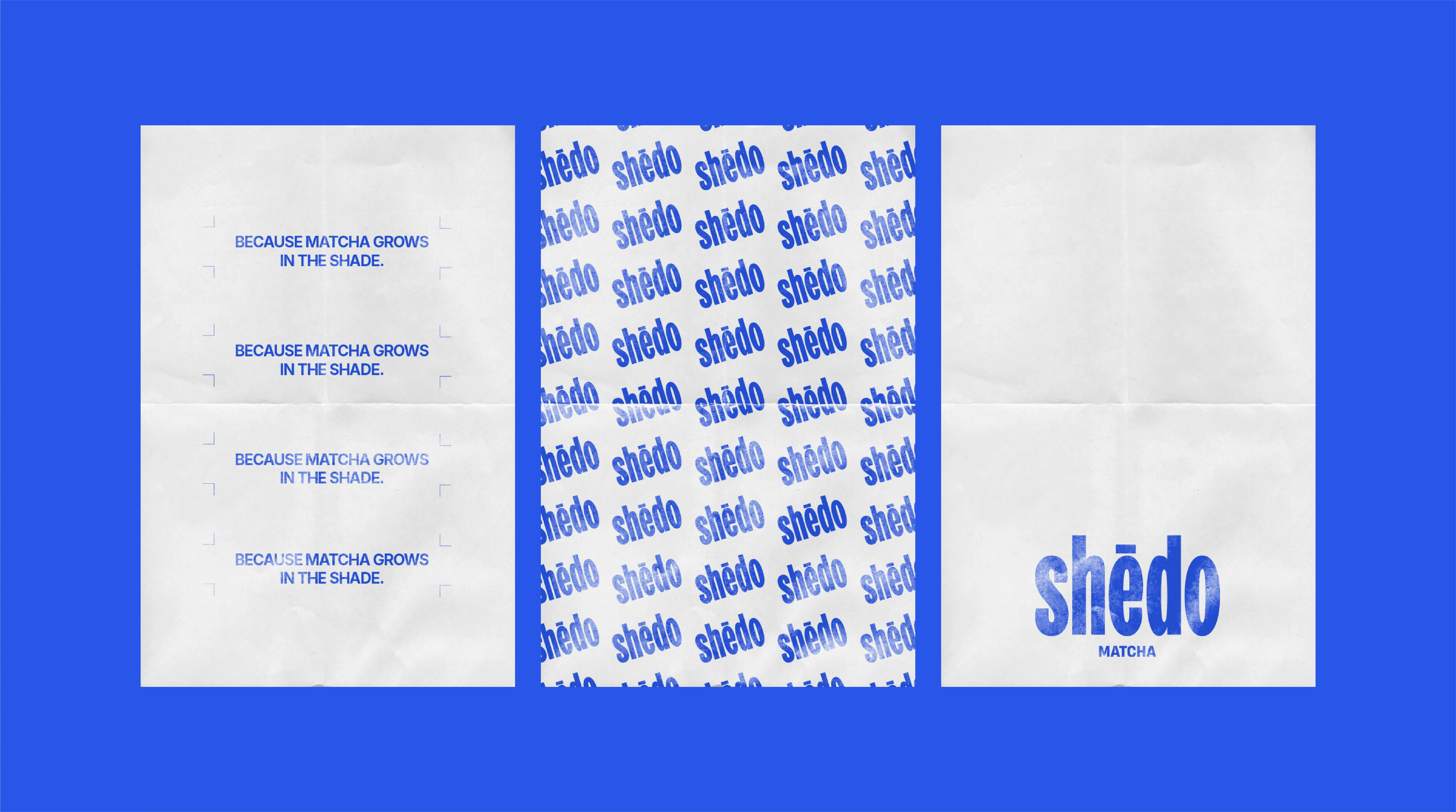
The core idea behind Shēdo comes from a simple truth:
Matcha grows in the shade.
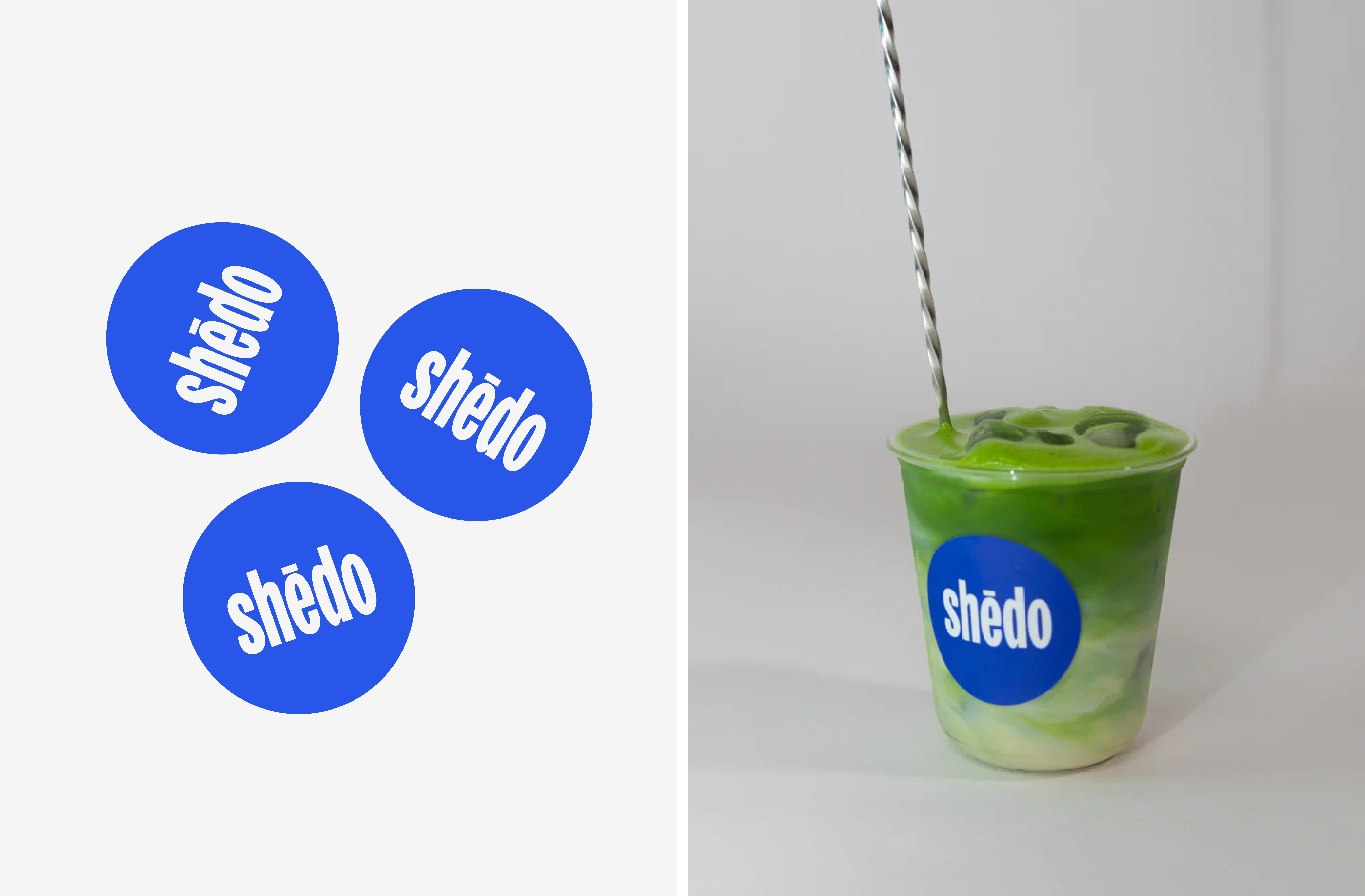
The Shēdo wordmark is the foundation of the brand system.
Tall, condensed letterforms
High contrast and strong vertical rhythm
Designed for visibility at distance
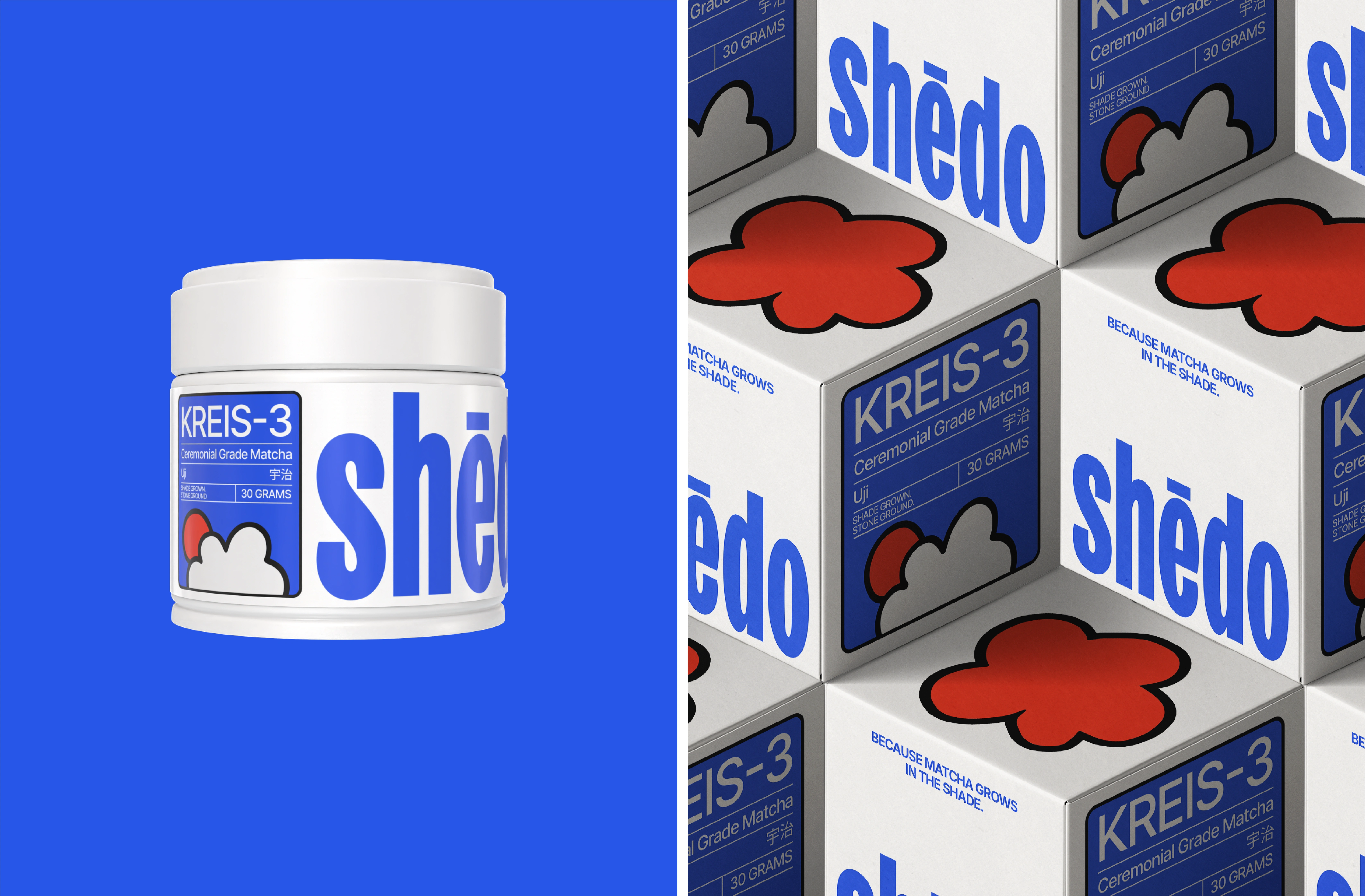
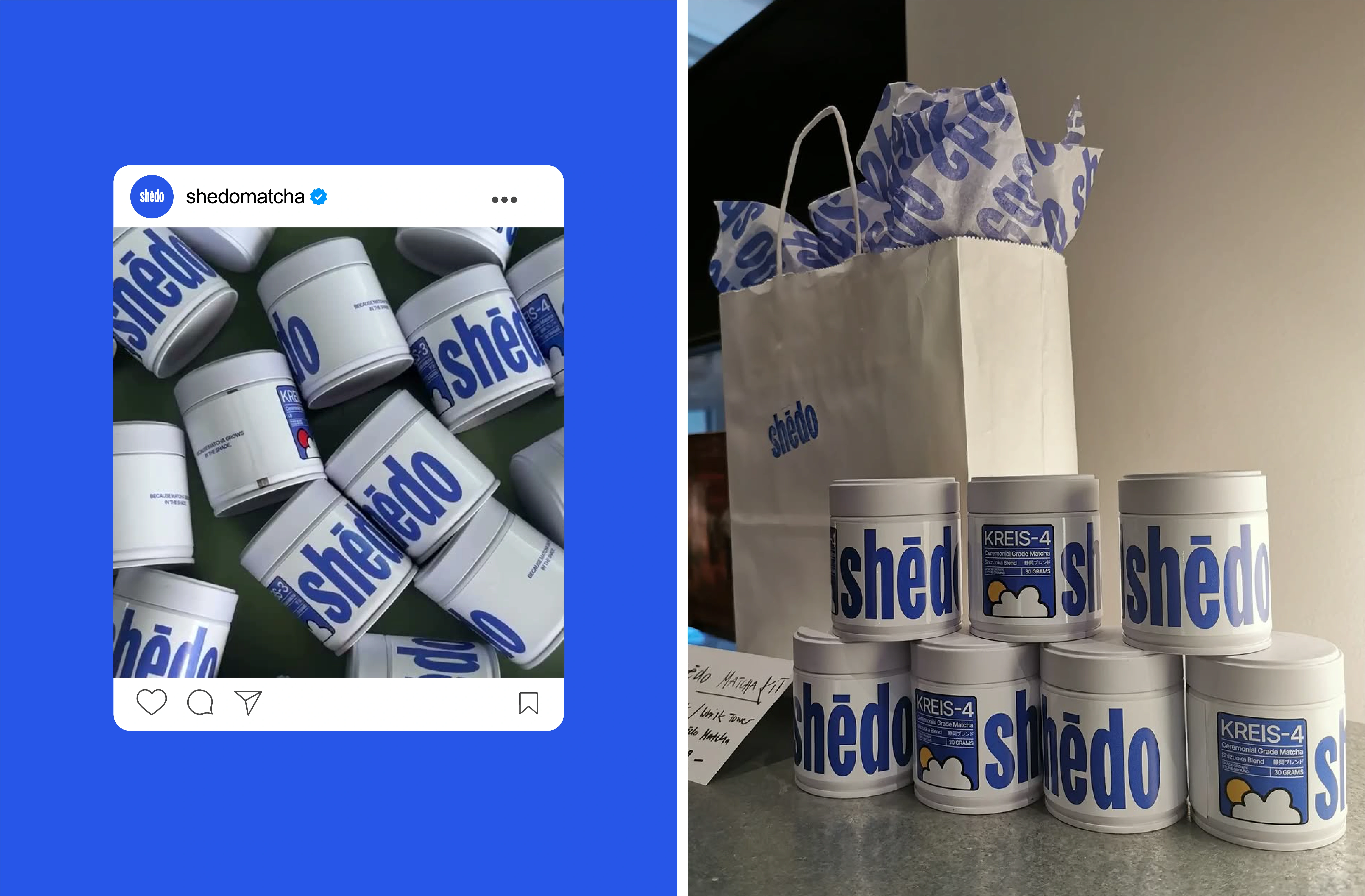
The KREIS system organizes products into clearly defined series, each with its own identity while staying part of a cohesive whole.

Oversized typography wraps around the tins, turning each product into a graphic object. The system scales effortlessly across different SKUs while maintaining strong brand recognition.
Like this project
Posted Feb 12, 2026
Created a bold brand identity for Shēdo Matcha, emphasizing typography and modern design.