
Kōhī is a Japanese-inspired slow coffee bar brand offering cold brew with a modern, minimal identity. The goal was to build a calm yet bold brand that reflects refined rituals of coffee drinking while keeping a contemporary, urban edge.
The process covered logo design, color palette, typography, and a minimal visual system. The identity blends Japanese simplicity with modern coffee culture —clean type, structured packaging, and subtle Japanese characters. The result is a refined, distinctive brand with a strong shelf presence.
A Wordmark Logo
A clean, modern wordmark built around a distinctive rounded “o,” reflecting Japanese simplicity and Kohi’s refined coffee identity.
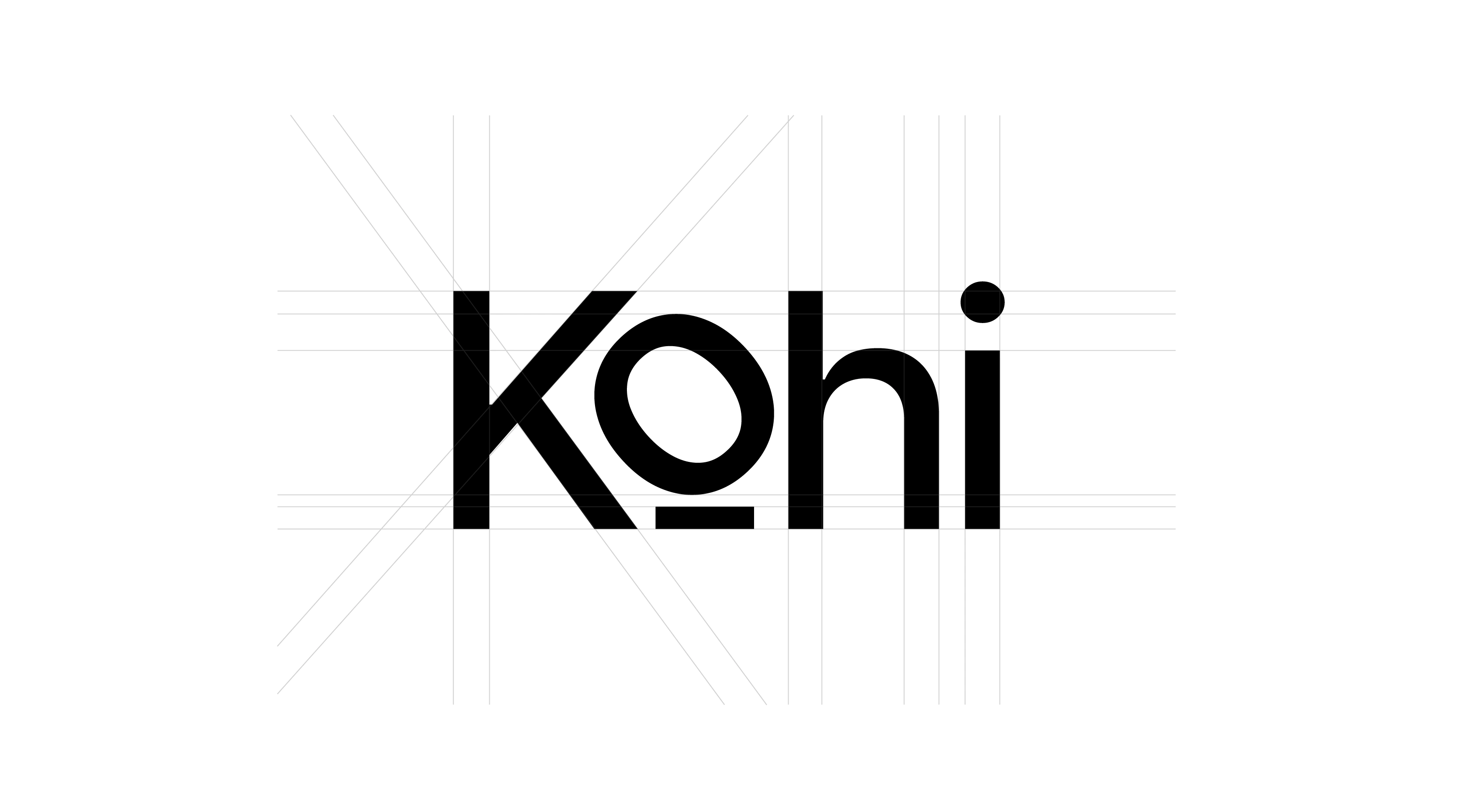
Clear Logo Spacing
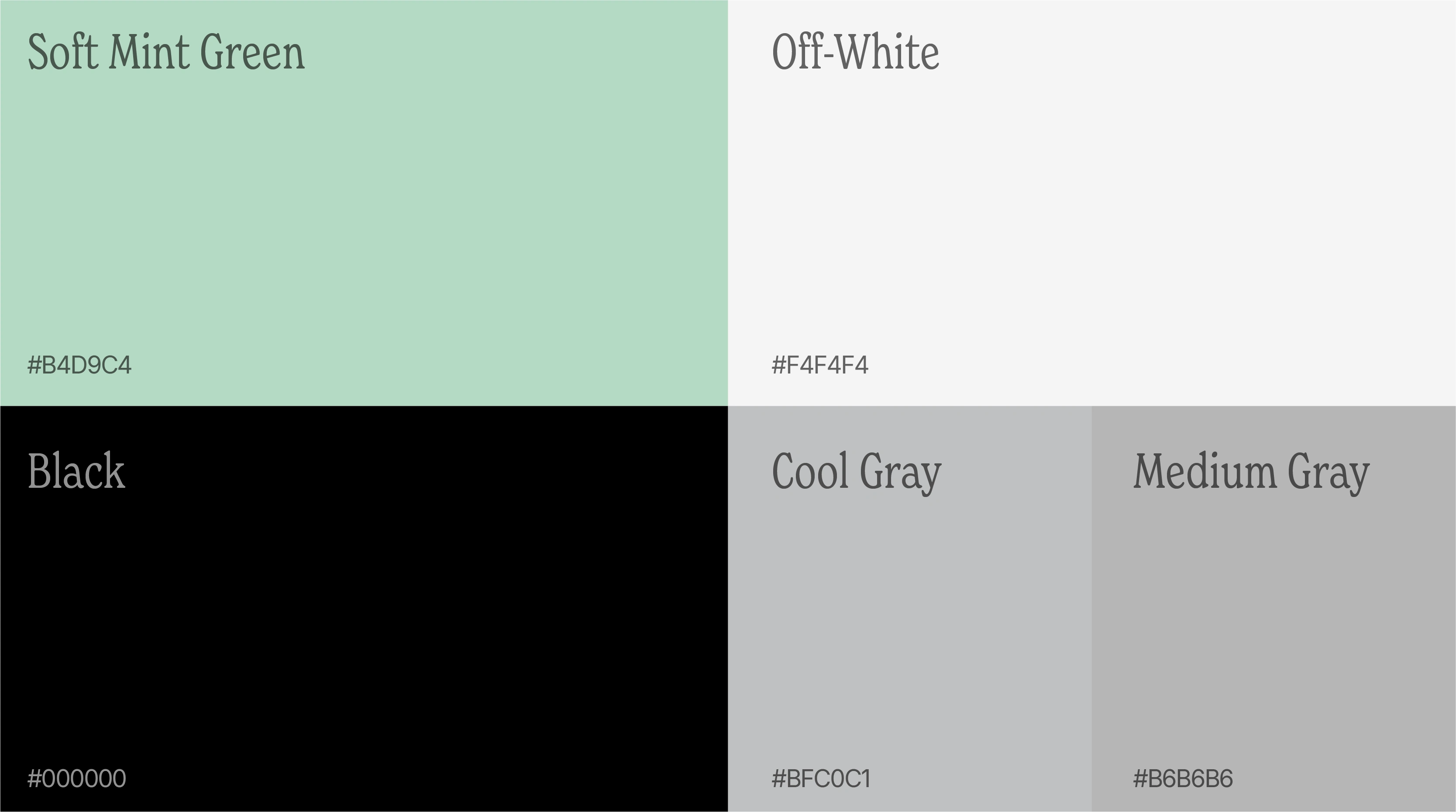
Color Palette
A simple, structured label that highlights key product details with bold type and soft colors.
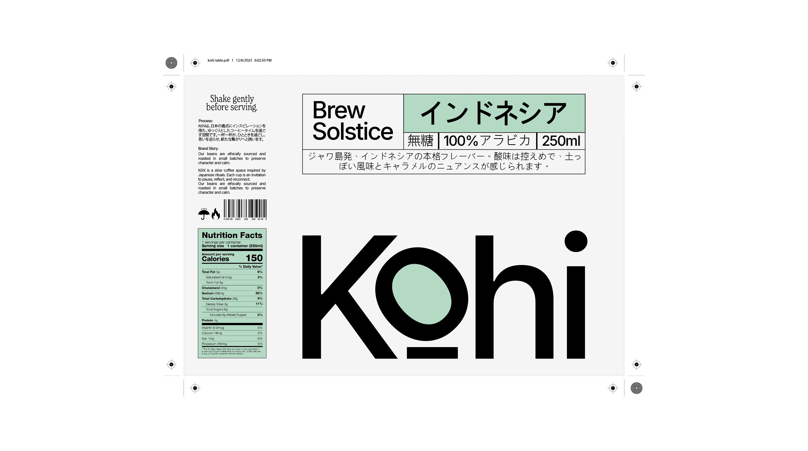
Lable Design
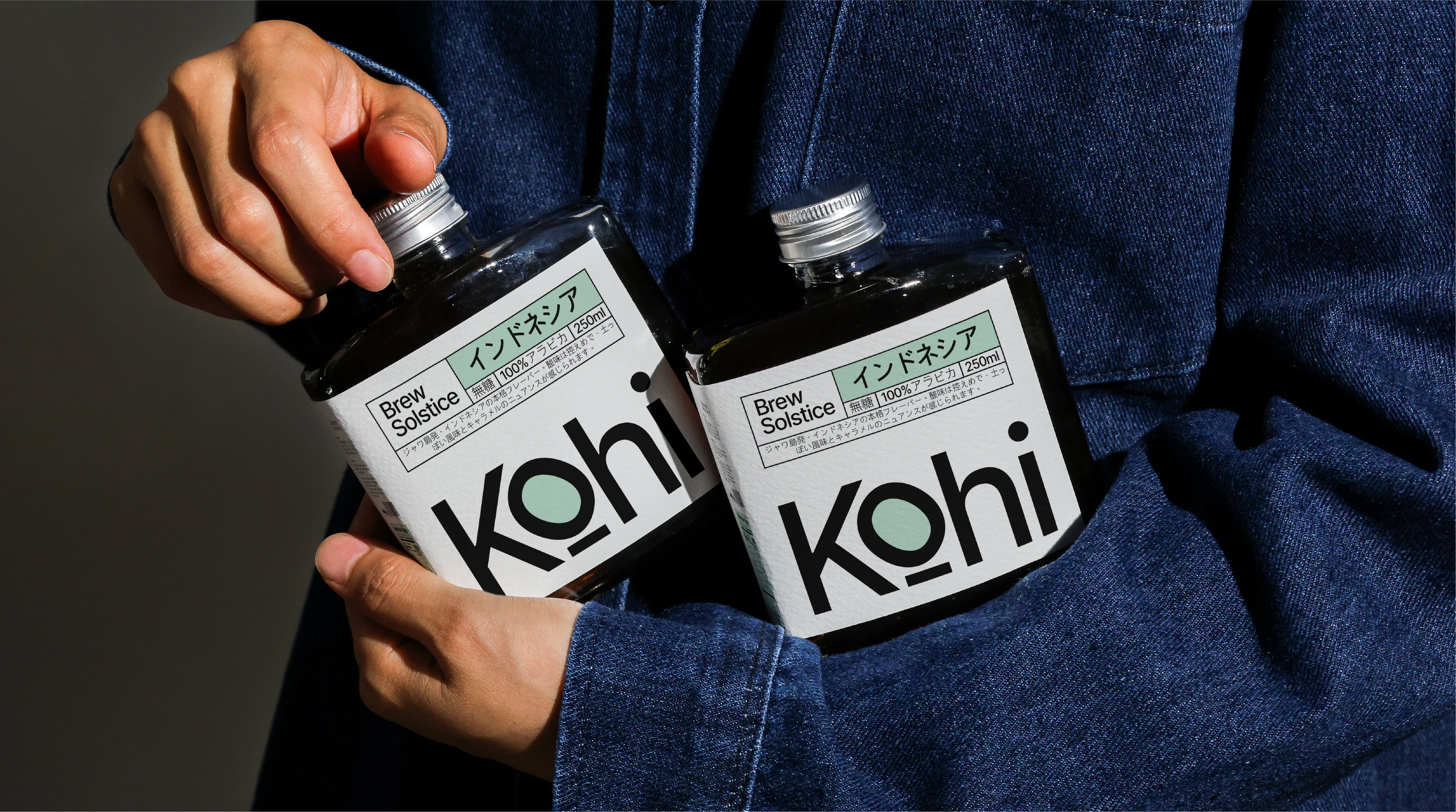
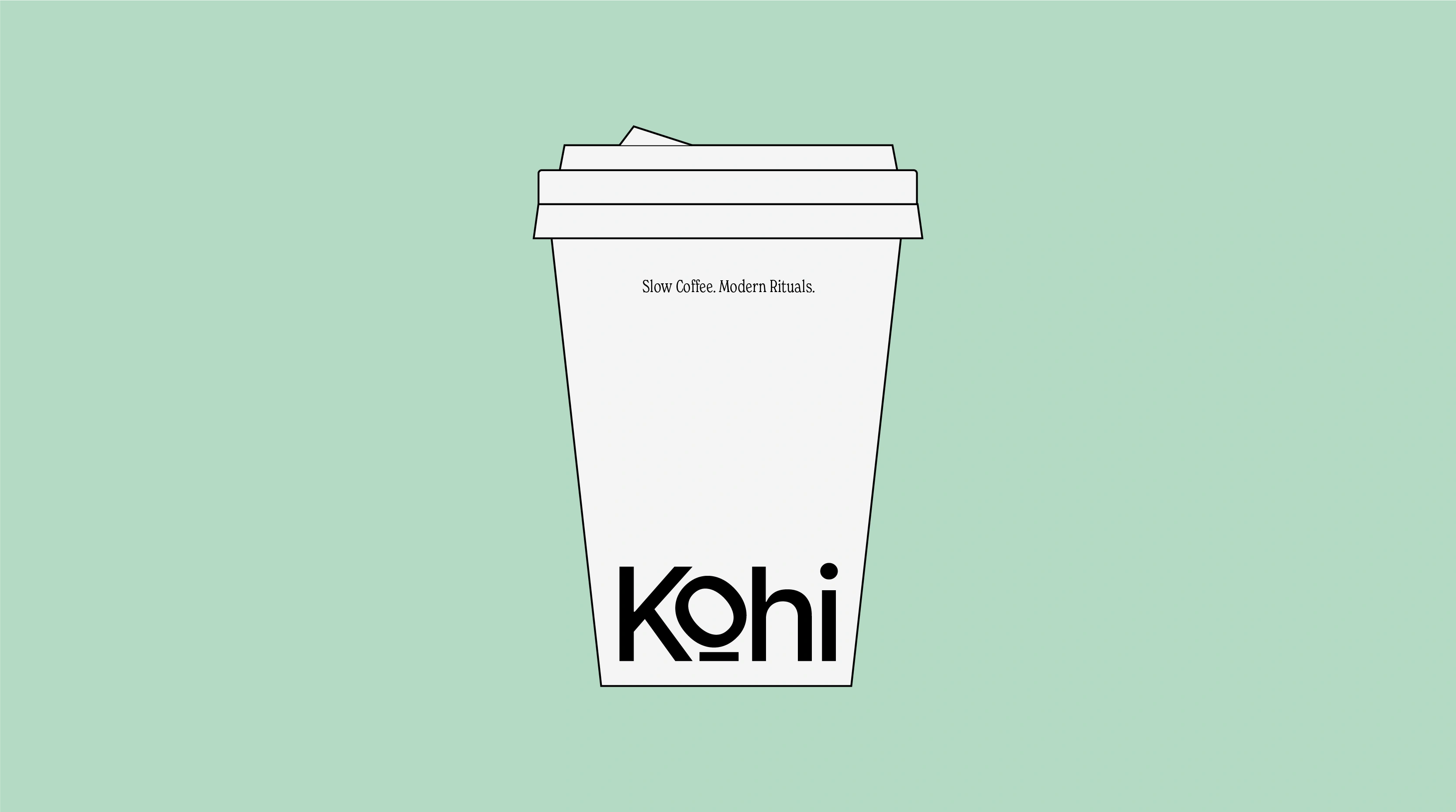
Visual Product Mockup
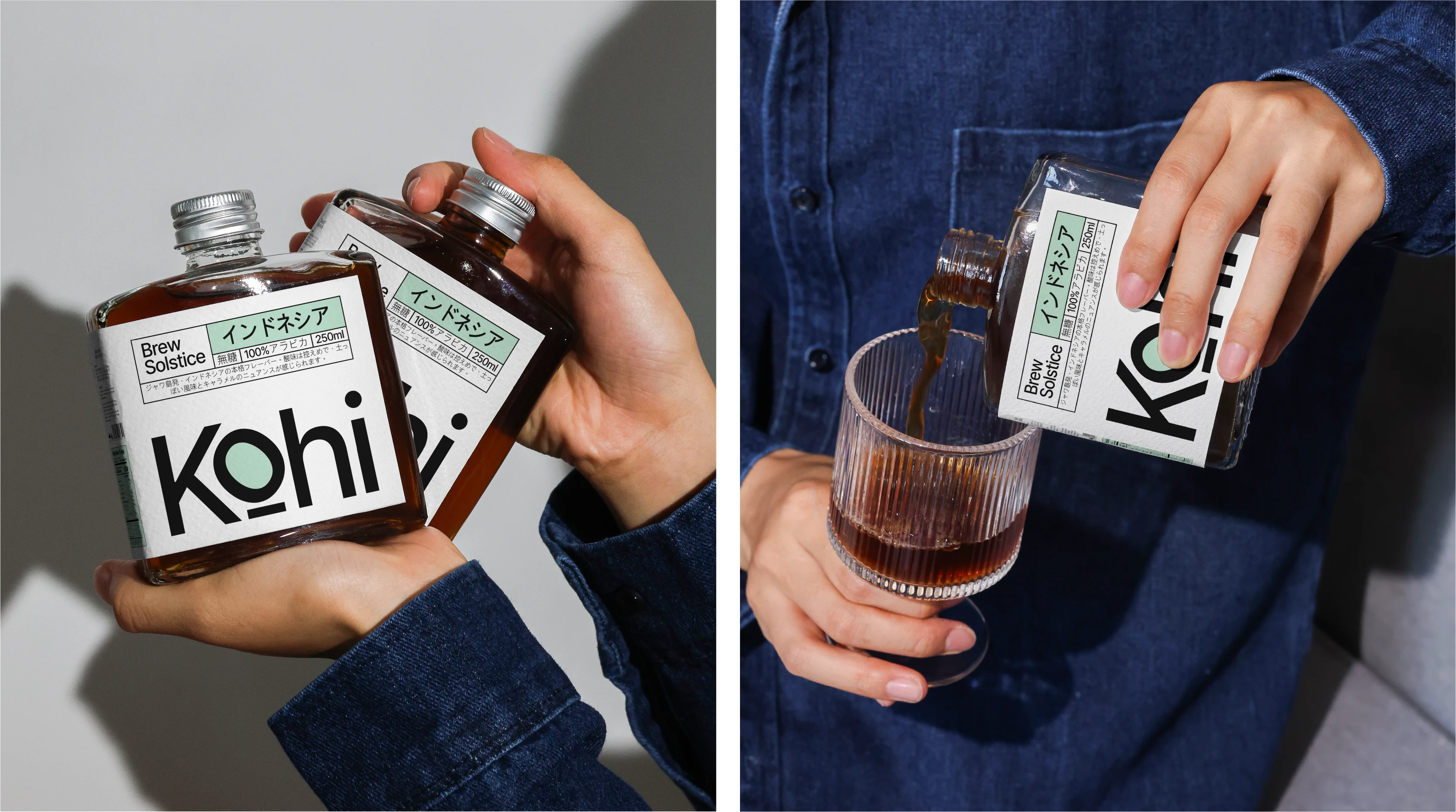
From the menu to labels and loyalty cards, the brand carefully blends Japanese and English to engage both communities, educating and appealing to an international audience. The balance ensures Kohi feels globally approachable without losing its minimalist, Japanese-inspired sophistication.
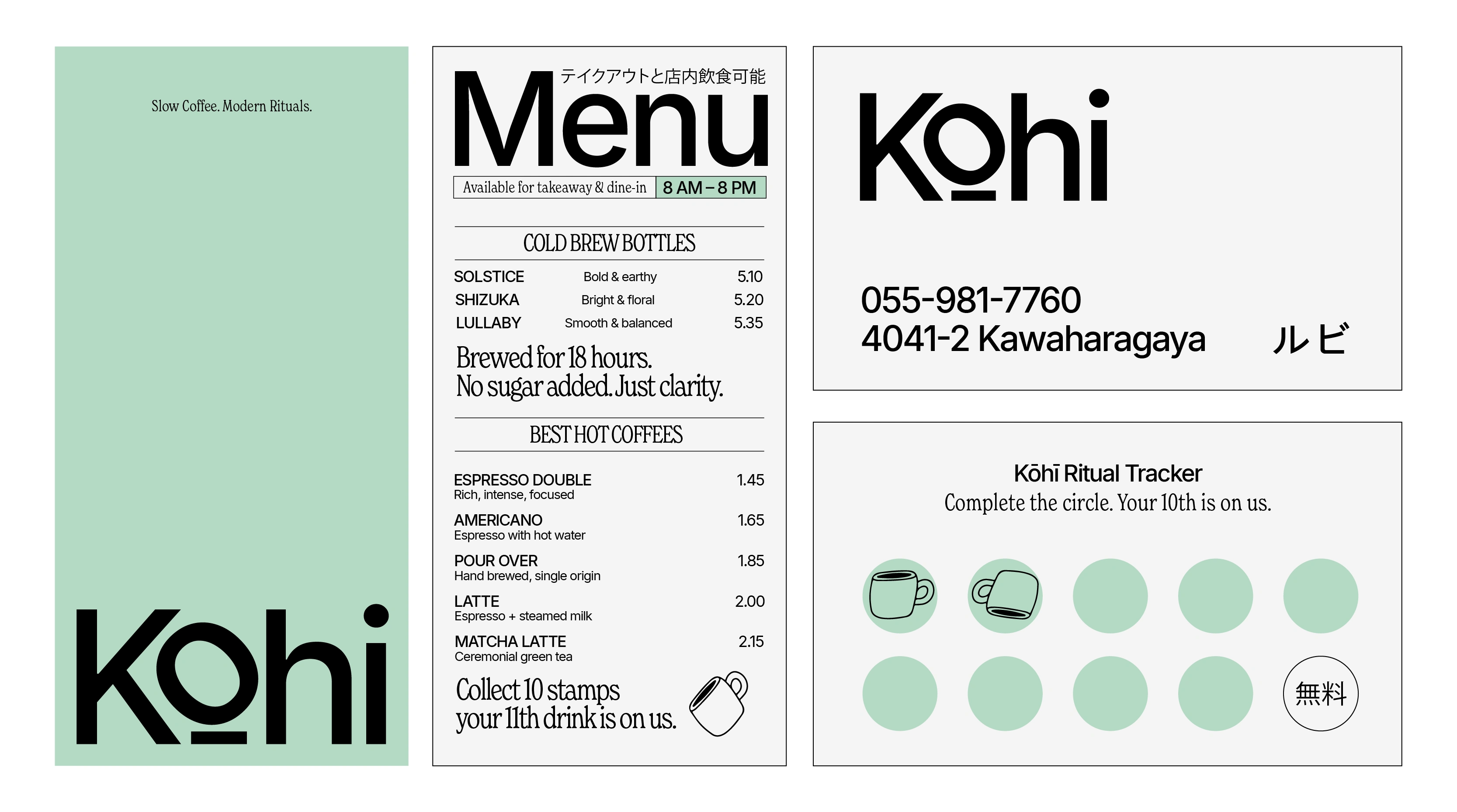
Menu & Loyalty Card
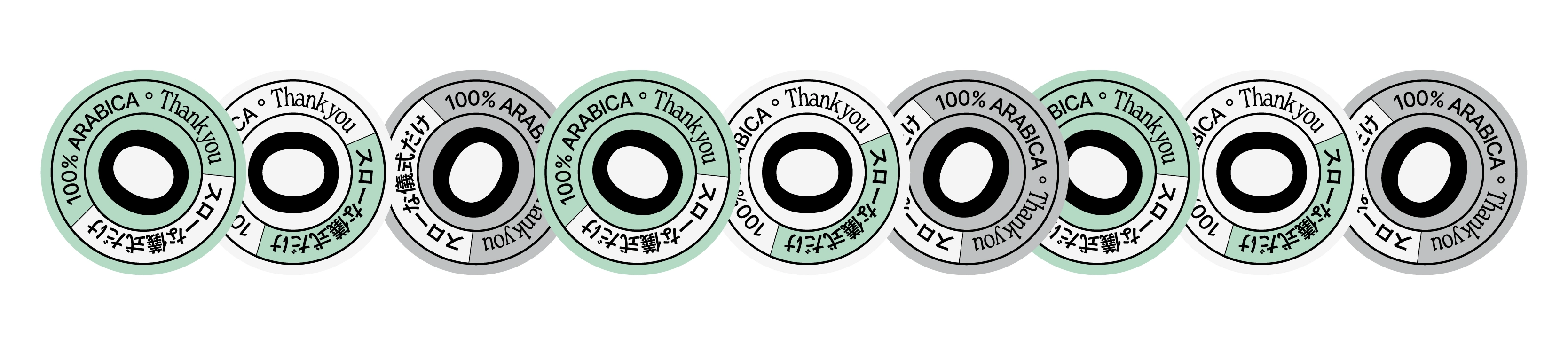
Brand Stickers
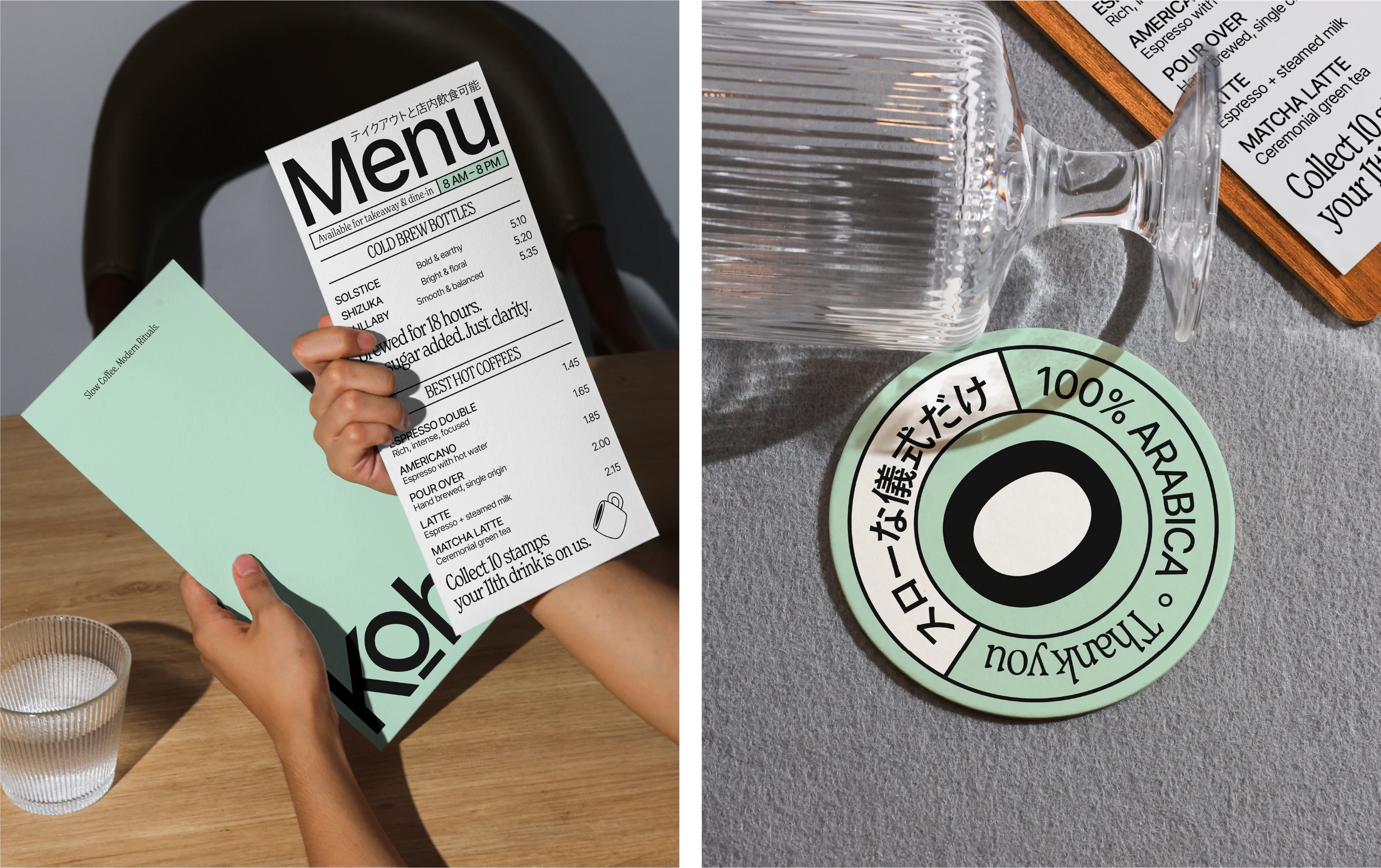
From the coffee bar to social media, Kohi carries the same gentle minimalism.
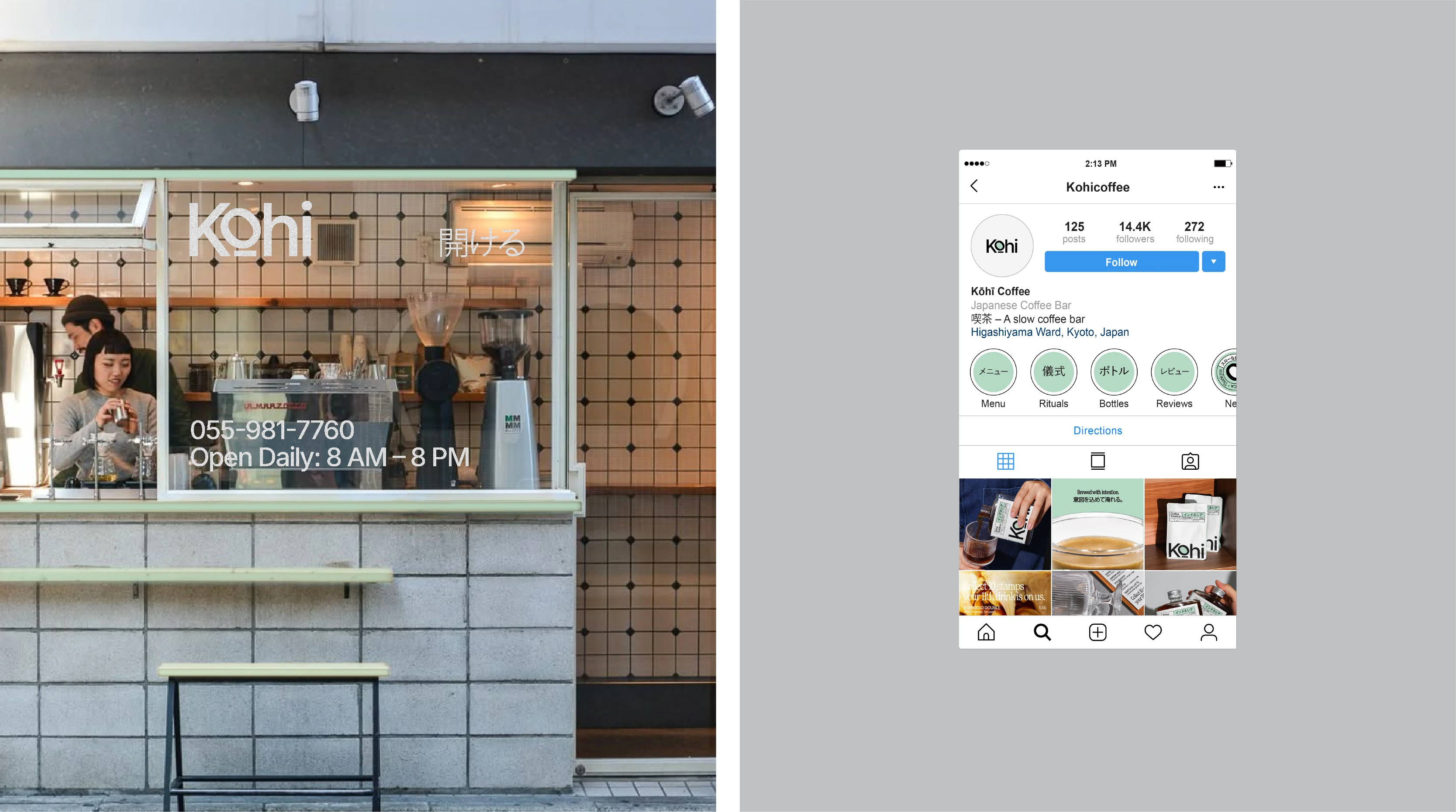
( Left ) Kohi Bar - IG Account ( Right )
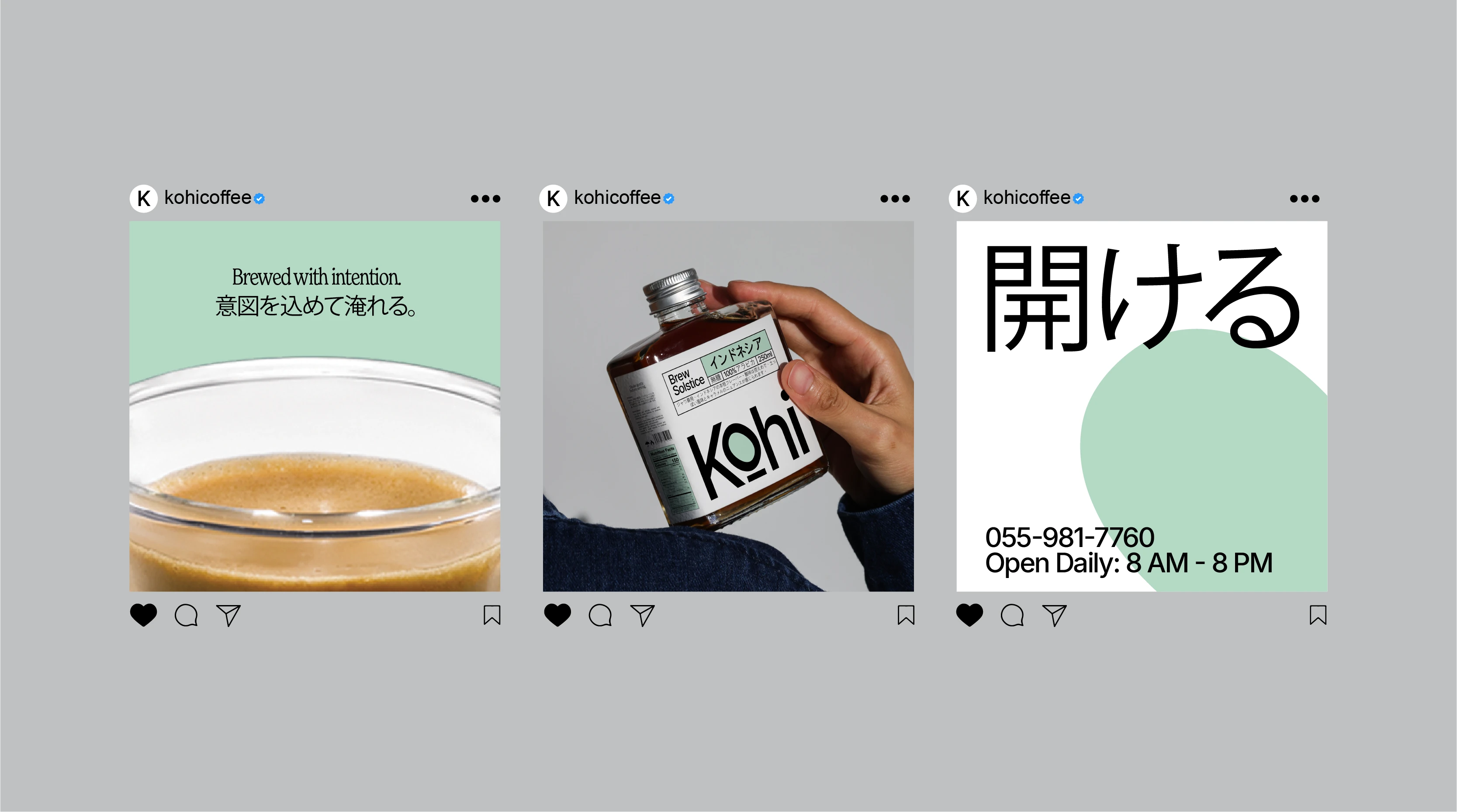
Social Media Posts
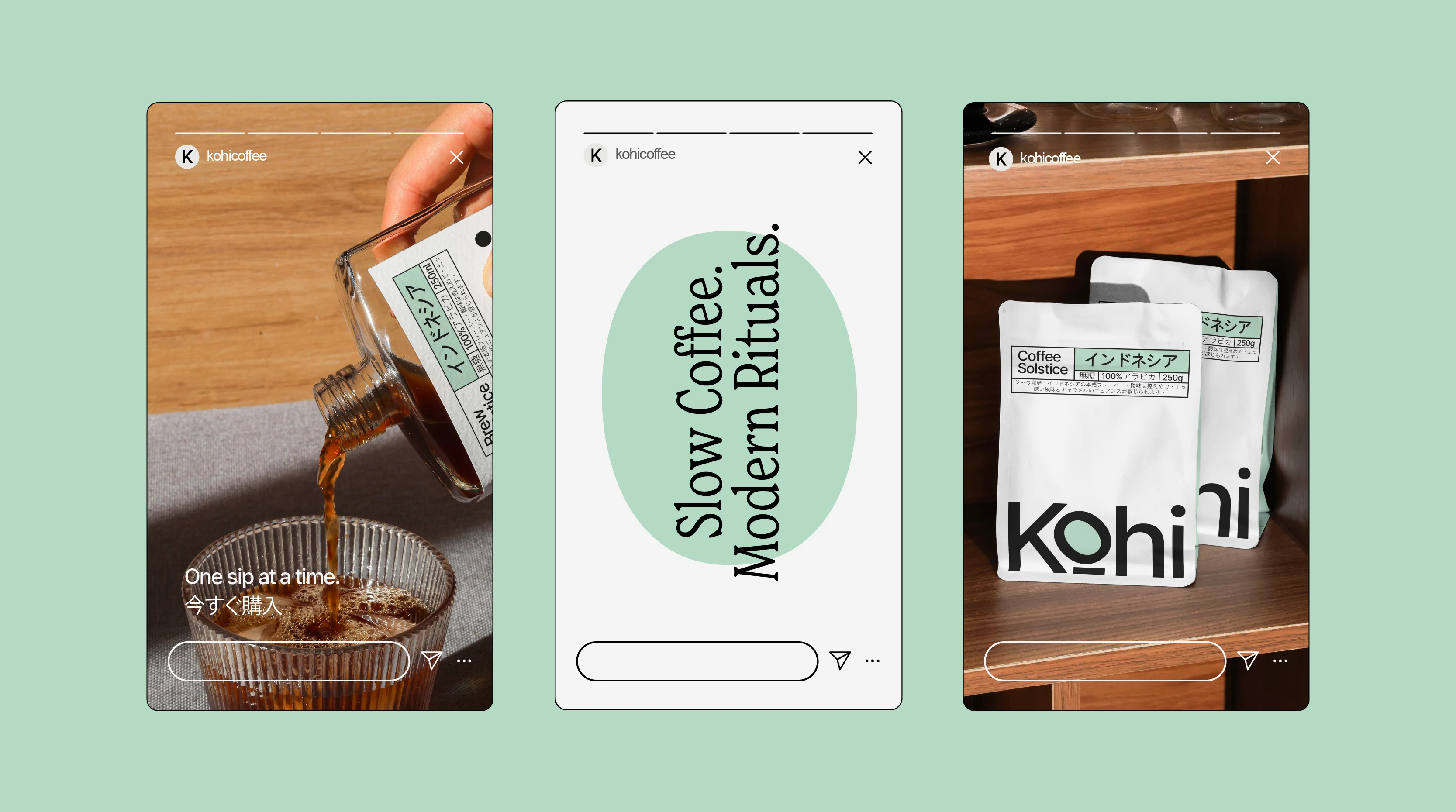
Instagram Stories
0 likes · 19 views · Dec 6, 2025
Developed a minimalist brand identity for a Japanese-inspired coffee bar.


