Prism Multi-Brand Design System

Alexis Blas


Design System: PRISM
The problem
Most multi-brand systems break in the same place. A brand needs a different typeface, a tighter spacing scale, softer corners and suddenly the component library forks. Now you're maintaining four systems that only look like one.
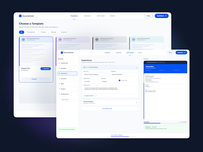
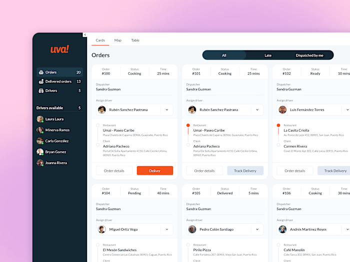
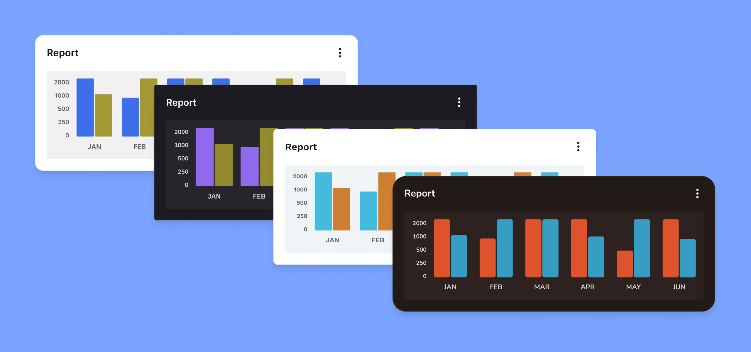
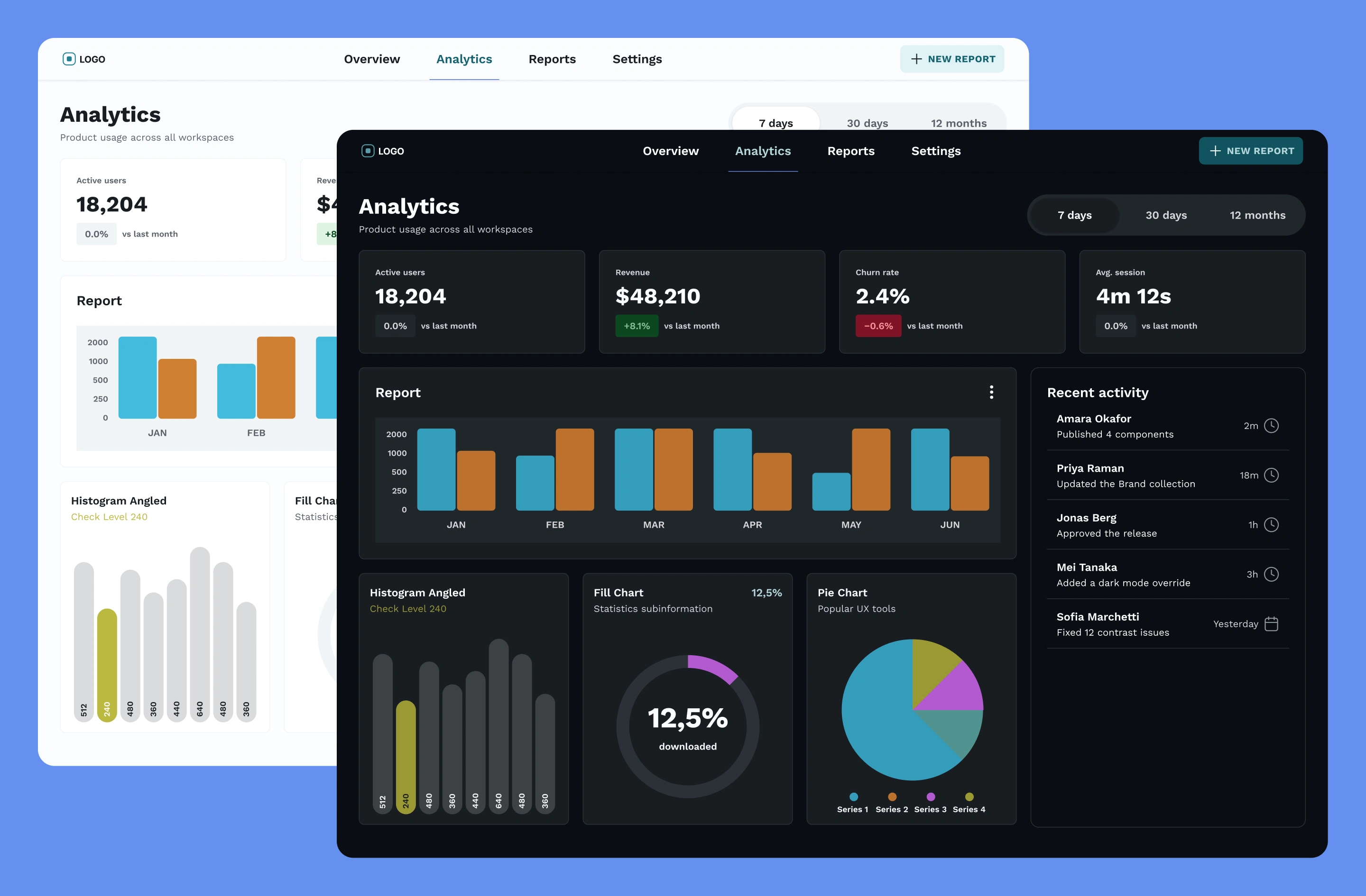
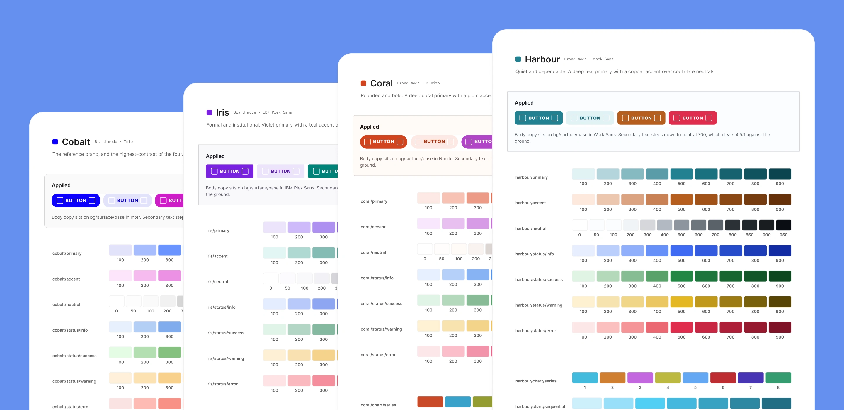
Prism was my answer to that. It's a design system built in Figma where a single component library carries four visually distinct brands, each with its own hue family, neutrals, status ramps, typeface, corner radii, spacing density, motion curves, and validated chart palette. No forks.
How I built it
The system runs on a strict four-layer token chain: Primitives → Brand → Semantic → Components. Semantic tokens alias the Brand layer and nothing else, so switching brands is a mode toggle rather than a redesign. Crucially, brand identity lives beyond color typeface, radius, spacing, and motion are all brand-routed variables. The test of that architecture came when I added two new brands, Coral and Harbour: both shipped with zero component edits.
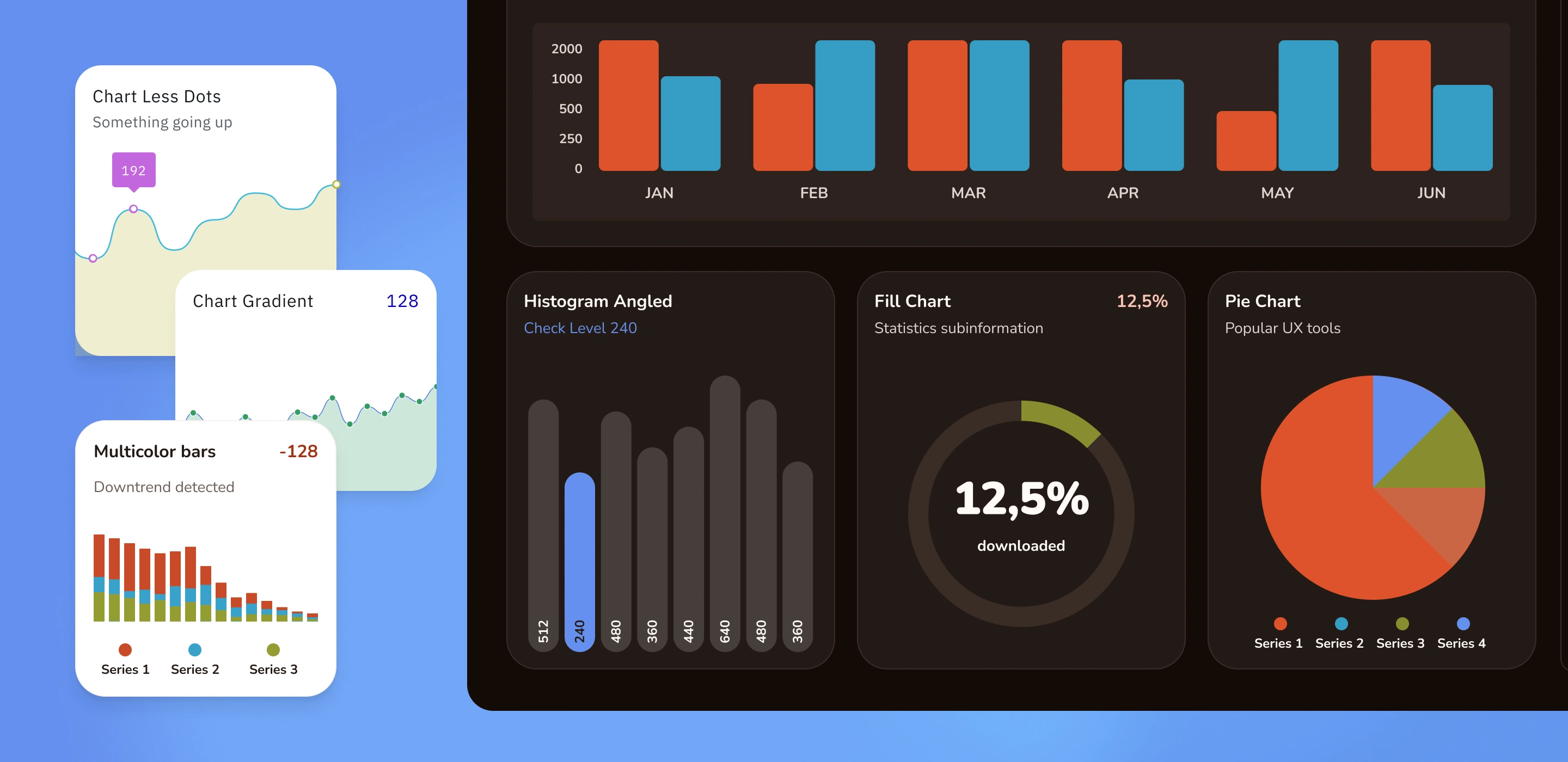
Accessibility was measured, not assumed. Color ramps were generated and validated programmatically instead of picked by eye, and chart palettes were gated on color-blind discriminability under simulated protanopia and deuteranopia before they were allowed into the system.
Outcome
792 variables across 7 collections, 58 documented components, 8 example screens
4 brands × 2 themes — 696 token combinations, 0 unresolved
608 contrast pairings audited, 0 failures (WCAG 2.1 AA)
Design system maturity score: 54 → 99/100
What I learned
The most valuable audit is the one that contradicts your own notes. A full re-audit revealed that a token I'd logged as "two near-misses" was actually failing in all four brands and both themes. The lesson stuck: an audit reporting problems isn't evidence until you've confirmed it also reports the known-good cases as good.
Like this project
Posted Sep 14, 2026
Four brands, one component library, zero forks. A Figma token system where switching brands is a mode toggle not a redesign.
Likes
0
Views
5