Design System: System Thinking at Scale

Alexis Blas


Design System: System Thinking at Scale
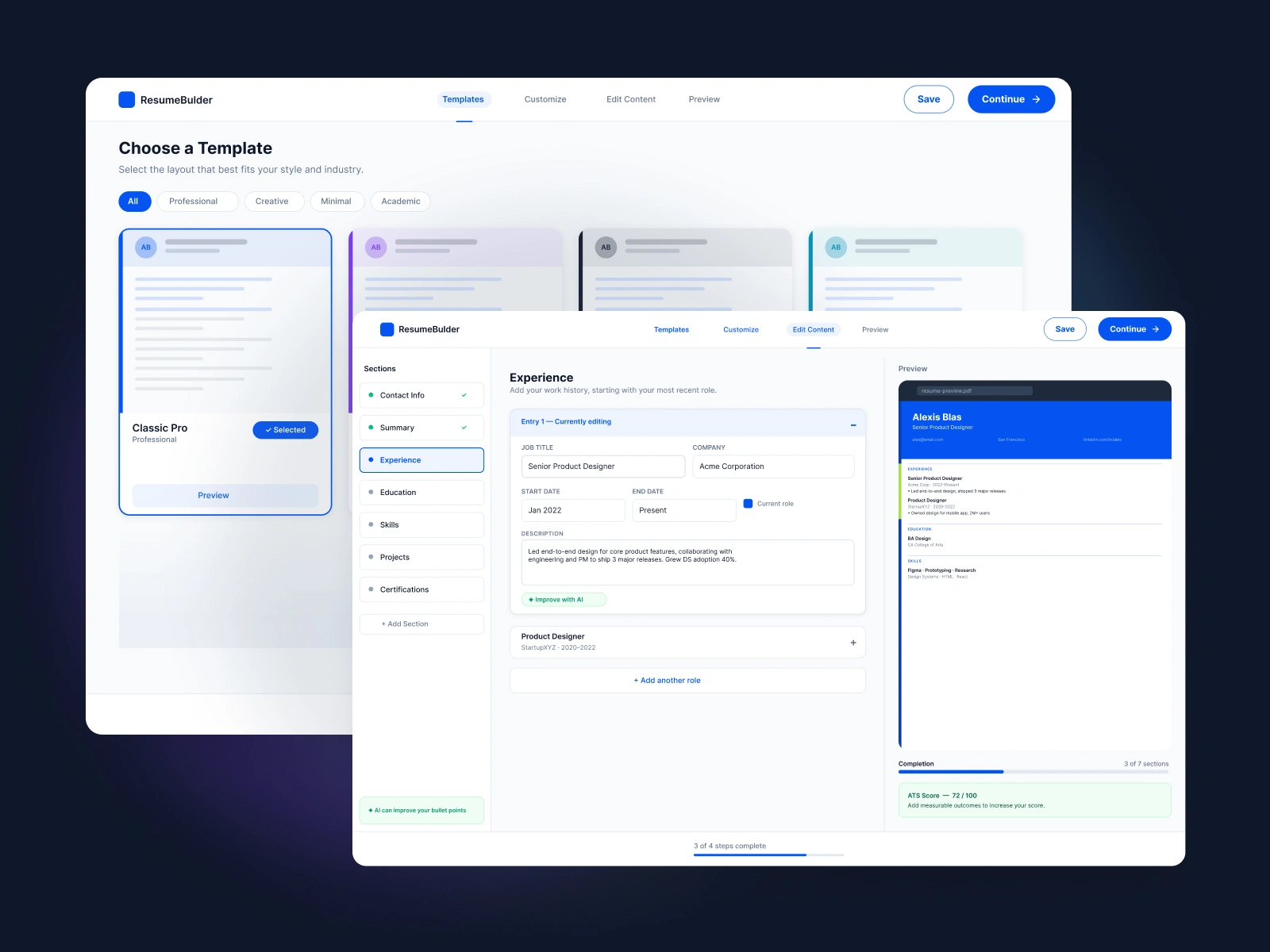
Our flagship resume builder had grown without a shared foundation. Patterns had been rebuilt case by case, so the UI drifted, handoffs broke down, and the design team kept re-solving the same problems. I owned the effort to replace that with a single source of truth.
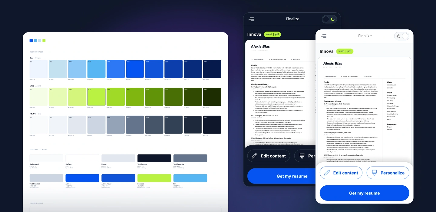
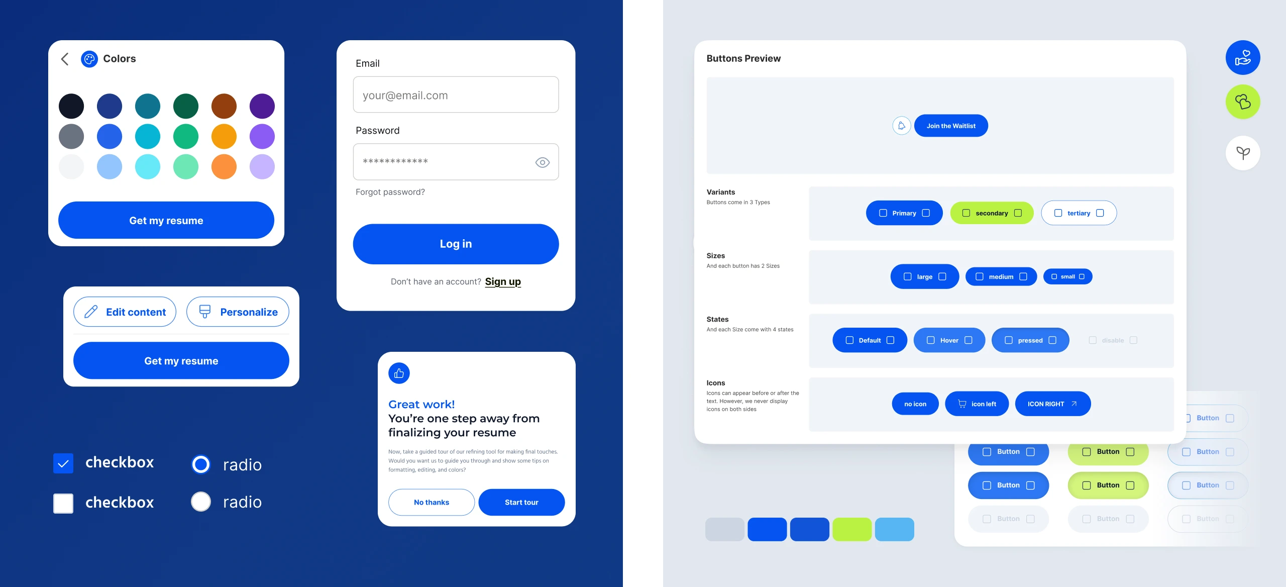
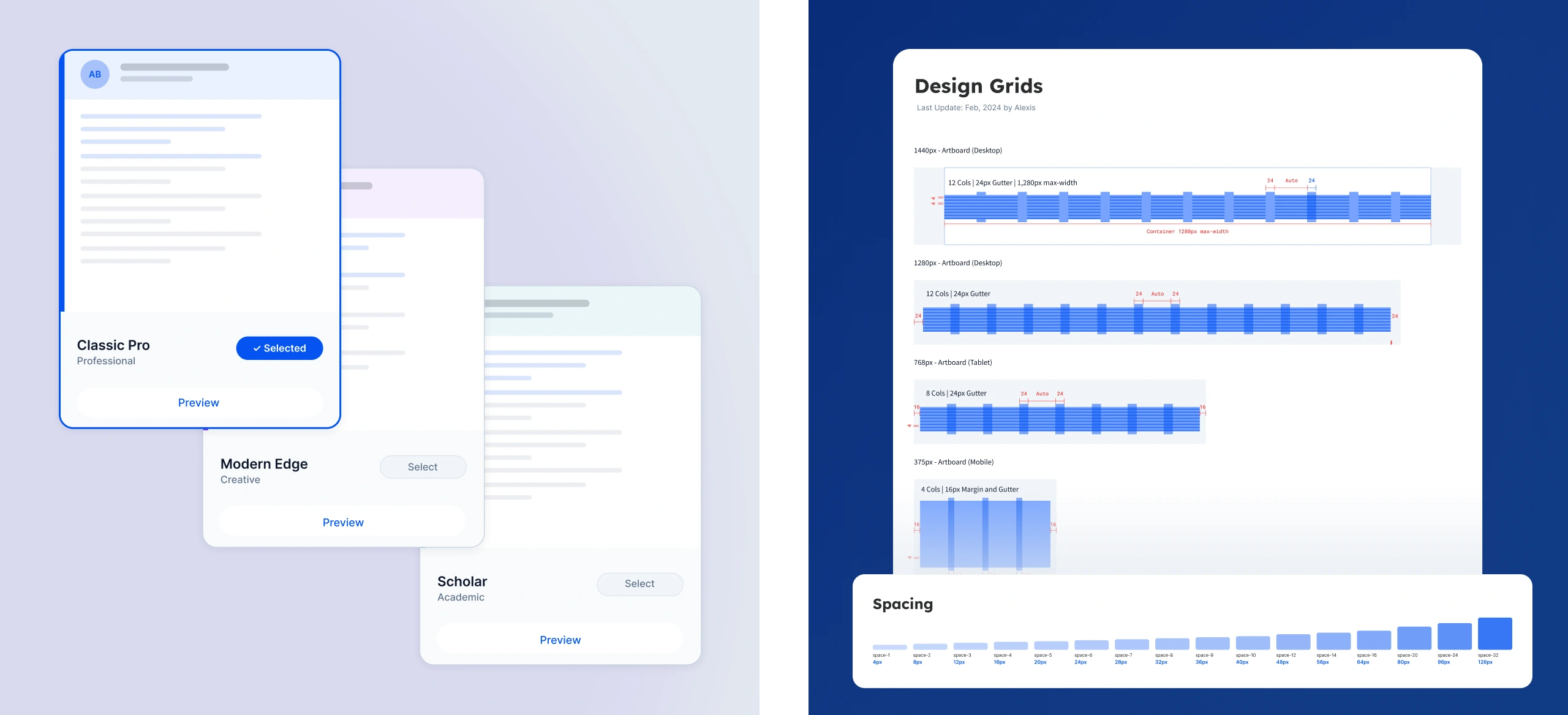
I started with a full audit of the product's design files and live site, cataloging every UI pattern, color, type style, and spacing value. From there I defined the design tokens — color, typography, spacing, elevation — structured in two layers: a global foundation, plus an alias layer that could be re-themed without touching the components. Components were built collaboratively, starting with the highest-frequency patterns and involving PMs and engineers early so naming and structure matched how the code was actually written.
That alias layer is what let the system travel. Once it was stable in the first product, it was implemented across the company's two other resume builder brands — each keeping its own visual identity while sharing the same component library and architecture. Specs got clearer, handoff conversations got shorter, and the gap between design intent and built output narrowed significantly. The hardest part was never the components; it was earning trust from designers who worried a shared system would flatten their brand.
Like this project
Posted Aug 28, 2026
Built one token-based design system for a resume builder, then rolled it out across two more brands — each keeping its own identity.