Cinematic WordPress Website Redesign for Spreadfilms
Lalit Yadav
$3K+ earned
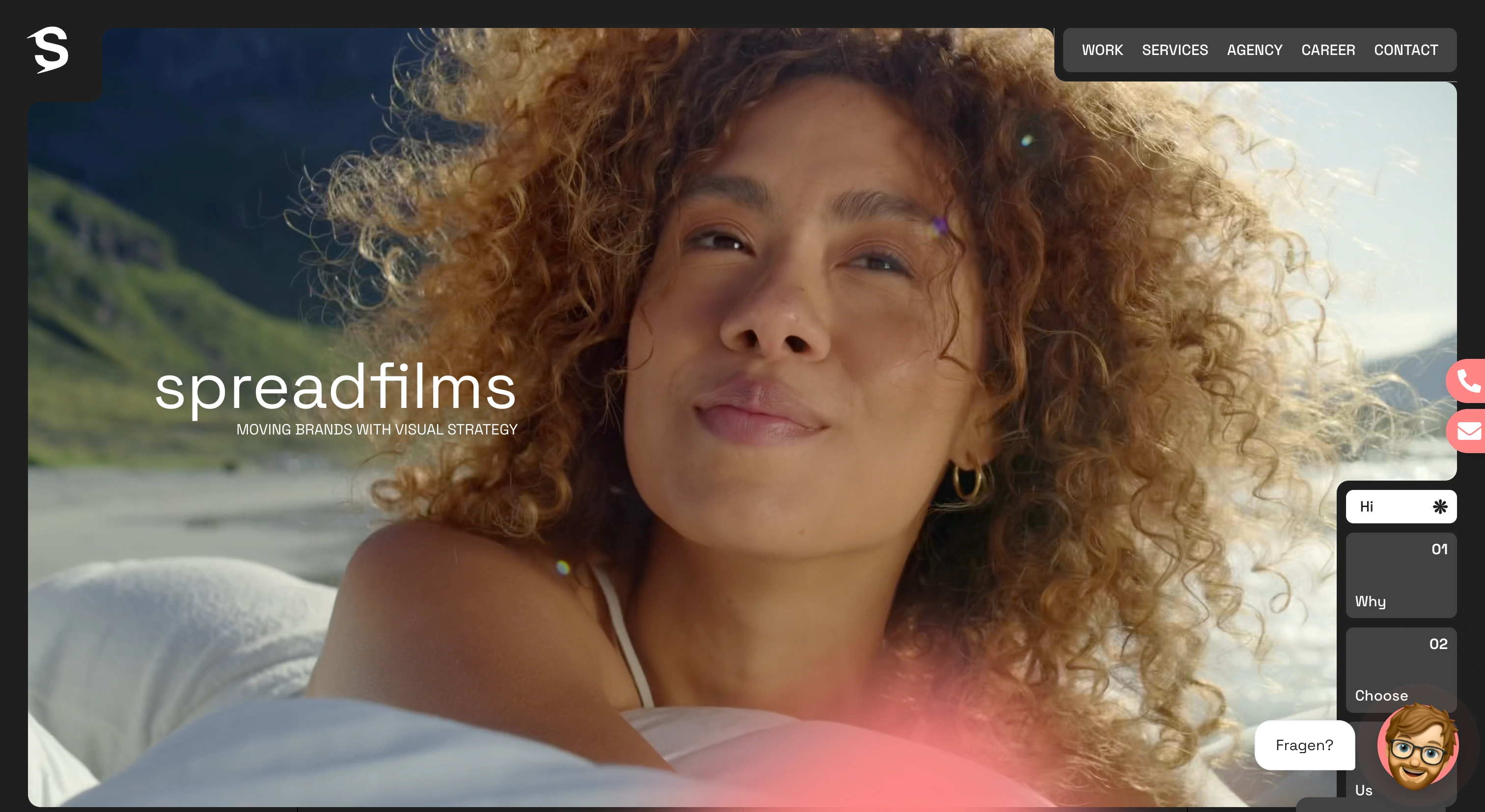
Spreadfilms — Cinematic WordPress Website Redesign Case Study
Overview
Spreadfilms is a creative film production company recognized for cinematic storytelling, premium visuals, and emotionally driven content production.
The objective of the project was to redesign and rebuild the website into a highly immersive digital experience that reflects the company’s cinematic identity while maintaining exceptional performance, responsiveness, and SEO standards.
The platform was developed using WordPress with Elementor, enhanced through GSAP-powered animations and custom JavaScript interactions to create a modern storytelling-driven web experience.
Role
Front-End Developer | WordPress & GSAP Animation Specialist
Responsible for:
• Frontend architecture
• Responsive UI implementation
• Animation engineering
• Performance optimization
• Elementor customization
• SEO optimization
• Interactive experience development
Project Goals
The primary goals of the redesign were:
• Transform the existing website into a cinematic digital experience
• Create immersive scroll-based storytelling interactions
• Improve visual engagement without sacrificing performance
• Enhance mobile responsiveness across all devices
• Improve Core Web Vitals and Lighthouse scores
• Build a scalable Elementor structure for future content updates
• Strengthen SEO and technical optimization
Understanding the Brand
Spreadfilms operates in a highly visual and emotionally driven industry where first impressions are critical.
The website needed to reflect:
• Cinematic storytelling
• Premium production quality
• Creative direction
• Modern visual aesthetics
• Smooth interactive experiences
Rather than building a traditional agency website, the goal was to create an experience that feels emotionally engaging and visually dynamic — similar to the pacing and flow of cinematic content itself.
Challenges
One of the biggest challenges was balancing immersive animations with website performance.
Film production websites often rely heavily on:
• Large visual assets
• Motion effects
• High-resolution imagery
• Interactive transitions
Without proper optimization, these elements can negatively impact:
• Loading speed
• Mobile performance
• SEO rankings
• User experience
Additional challenges included:
• Ensuring smooth animations across devices
• Maintaining responsiveness on mobile and tablets
• Optimizing Elementor-generated structures
• Preventing animation overload
• Improving Core Web Vitals despite media-heavy layouts
• Creating scalable frontend architecture for future updates
Strategy & Approach
The project followed a performance-first cinematic UX strategy.
The objective was to create a visually rich experience without compromising usability or speed.
1. Cinematic User Experience Design
The frontend experience was structured around:
• Smooth storytelling flow
• Scroll-triggered interactions
• Cinematic transitions
• Dynamic section reveals
• Visual pacing and hierarchy
Each section was designed to guide users naturally through the brand narrative.
2. GSAP Animation Engineering
GSAP (GreenSock Animation Platform) was used extensively to create:
• Smooth scroll interactions
• Cinematic transitions
• Parallax-style movement
• Section reveal animations
• Motion-based storytelling effects
Animations were carefully optimized to enhance immersion without creating performance bottlenecks.
3. Elementor-Based Modular Development
The website was developed using Elementor with a modular structure to ensure:
• Easy future content updates
• Reusable layouts
• Scalable design systems
• Simplified maintenance workflows
Custom frontend enhancements were layered on top using:
• JavaScript
• CSS3
• GSAP integrations
Technical Implementation
WordPress Development
The frontend was built on WordPress using:
• Elementor
• Custom theme customization
• Responsive layout systems
• Modular section structures
The architecture focused on balancing design flexibility with long-term scalability.
GSAP Integration
Advanced GSAP animations were implemented for:
• Scroll-triggered motion effects
• Smooth content reveals
• Cinematic transitions
• Interactive storytelling sections
The animation system was engineered to remain lightweight and responsive.
Performance Optimization
Performance optimization was a major focus throughout development.
Optimization strategies included:
Core Web Vitals Optimization
• Reduced layout shifts
• Optimized rendering behavior
• Efficient script loading
Media Optimization
• Lazy loading implementation
• Optimized image compression
• Responsive image delivery
Frontend Optimization
• Minified assets
• Optimized CSS and JavaScript delivery
• Reduced unnecessary Elementor overhead
These optimizations helped improve Lighthouse scores while maintaining visual richness.
SEO Optimization
Technical SEO enhancements included:
• Structured schema implementation
• Semantic HTML structure
• Optimized heading hierarchy
• Metadata optimization
• Image optimization
• Fast-loading architecture
The result was improved search visibility alongside strong user experience metrics.
Responsive Engineering
The website was fully optimized across:
• Desktop
• Laptop
• Tablet
• Mobile devices
Special focus was placed on:
• Touch responsiveness
• Animation behavior on smaller screens
• Responsive typography scaling
• Consistent visual flow
Key Features
Cinematic Scroll Experience
GSAP-powered transitions and interactions create an immersive storytelling journey throughout the site.
Performance-Driven Frontend
Despite heavy visual content and animations, the website maintains strong speed and responsiveness.
Modular Elementor Architecture
Reusable Elementor systems allow scalable updates and efficient long-term maintenance.
SEO & Core Web Vitals Optimization
The platform was optimized to improve:
• Search visibility
• Loading speed
• User engagement
• Lighthouse performance metrics
Results
The final website delivered:
✅ Cinematic and immersive digital experience
✅ Smooth high-performance animations
✅ Improved Core Web Vitals
✅ Enhanced SEO performance
✅ Fully responsive user experience
✅ Scalable WordPress architecture
✅ Stronger visual brand positioning
The redesign successfully transformed Spreadfilms’ digital presence into a premium cinematic experience that aligns with the company’s storytelling expertise and creative production quality.
Technologies Used
• WordPress
• Elementor
• GSAP (GreenSock Animation Platform)
• JavaScript
• HTML5
• CSS3
• Core Web Vitals Optimization
• SEO Optimization Techniques
Final Thoughts
This project demonstrates how cinematic storytelling principles can be translated into high-performance web experiences through the combination of WordPress, GSAP, and modern frontend engineering.
Rather than building a conventional portfolio website, the focus was on crafting an immersive visual experience that communicates emotion, creativity, and production quality while maintaining strong technical performance standards.
Like this project
What the client had to say
Lalit is one of the best partners I know for such projects!
Andreas Ramelsberger, Spreadfilms
Nov 10, 2025, Client
Posted Nov 11, 2025
Delivered a high-performance, animation-rich WordPress website, a creative film production company known for powerful storytelling and visual excellence.
Likes
1
Views
26
Earned
$3K+
Timeline
Aug 27, 2025 - Nov 10, 2025
Clients
Spreadfilms