Brand Rebranding for Babies Come True
Fervor Studio
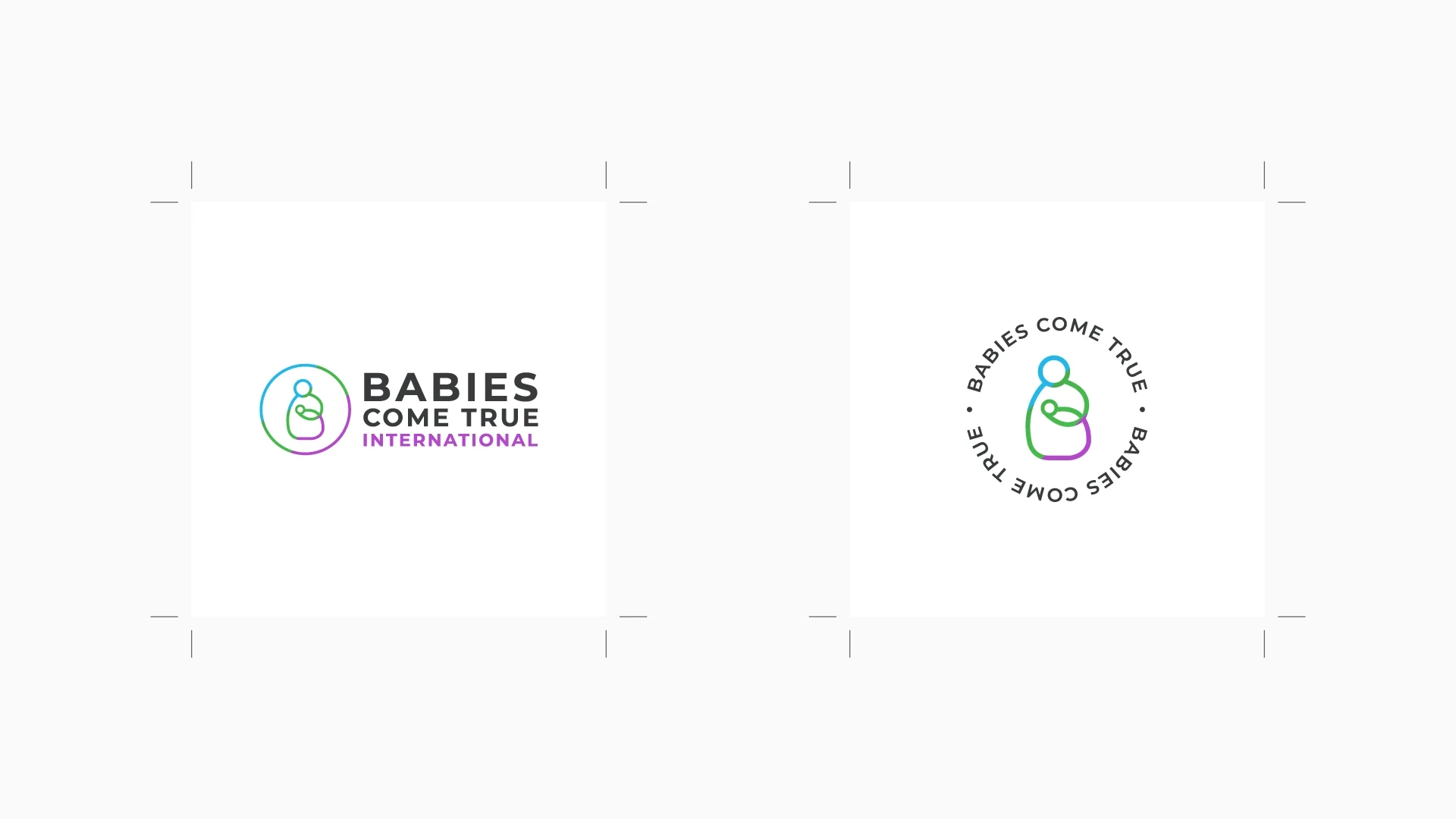
As a Senior Graphic Designer at Babies Come True, one of my first tasks was to propose a rebranding to establish a strong and lasting identity for the brand.
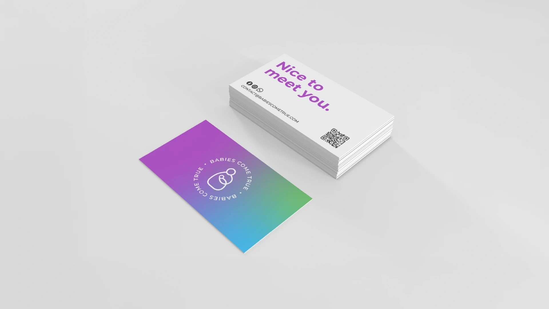
Logo Refinement & Typography
The process began with a logo refinement, selecting a typography that better represents BCT’s values—ensuring clarity, warmth, and approachability.
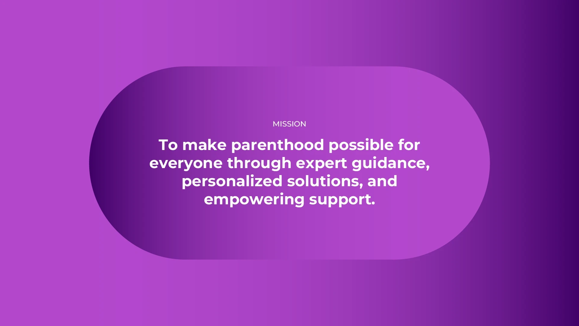
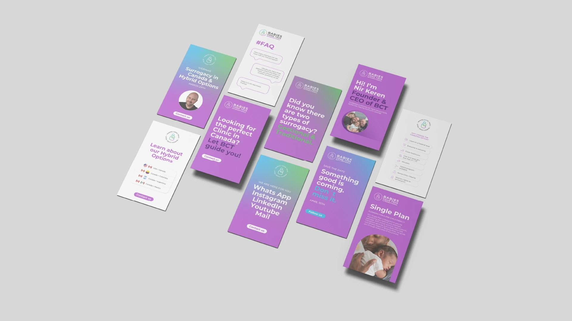
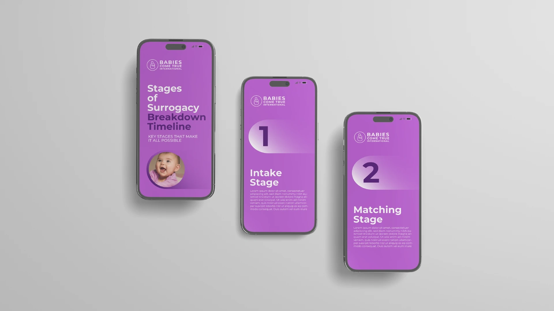
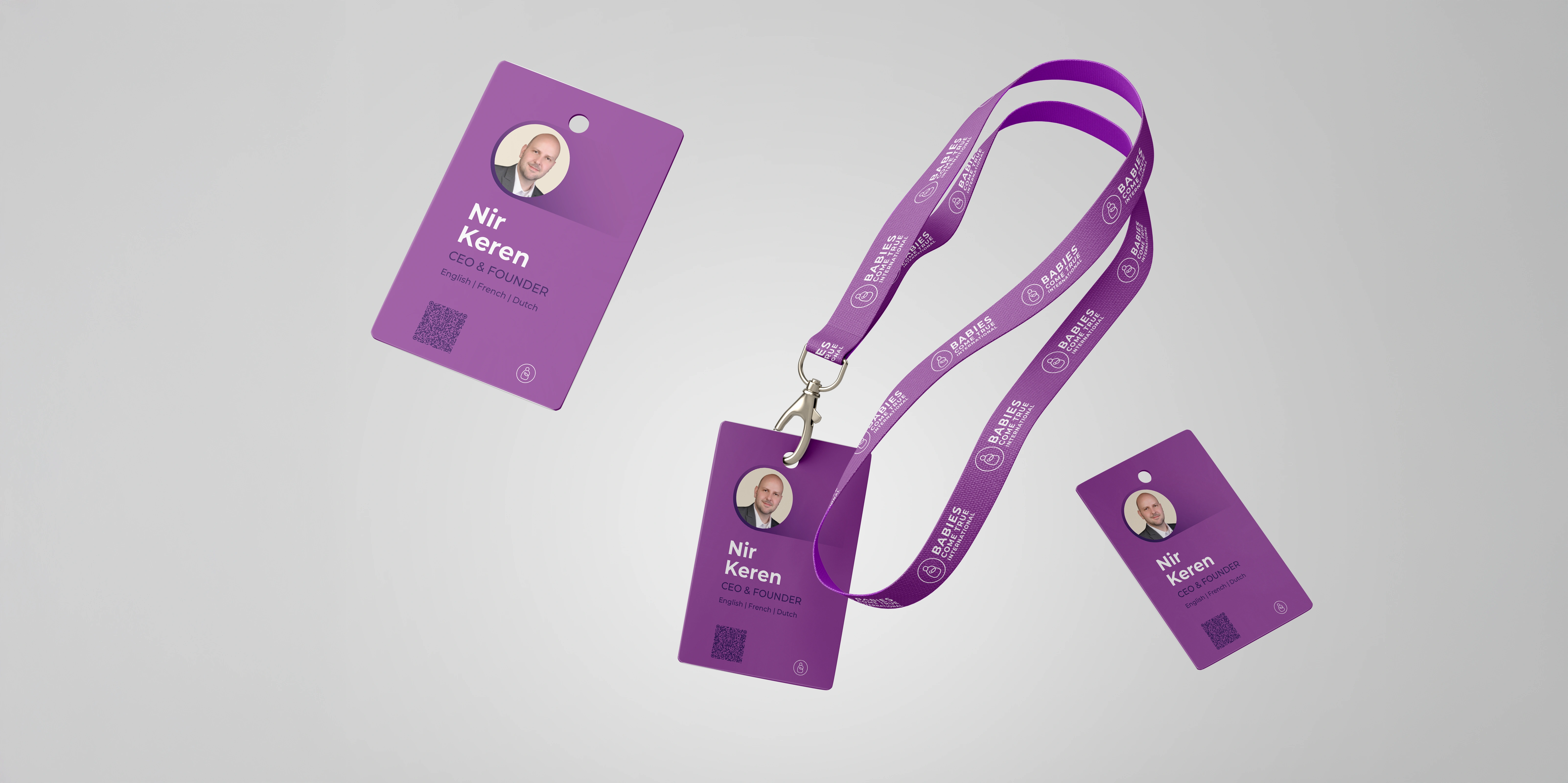
Visual Identity & Color Palette
I developed a cohesive visual system built around a color palette that conveys trust and warmth: purple as the primary color, complemented by green and light blue as accent colors. These choices enhance brand recognition and adaptability across different communication platforms.
Like this project
Posted Jan 13, 2026
I led a rebranding to create a clear, professional identity, fixing inconsistent typography, undefined colors, and the lack of a cohesive visual system.
Likes
0
Views
5
Clients
Babies Come True