Dokoiku Japan - Branding
Akane Yabushita
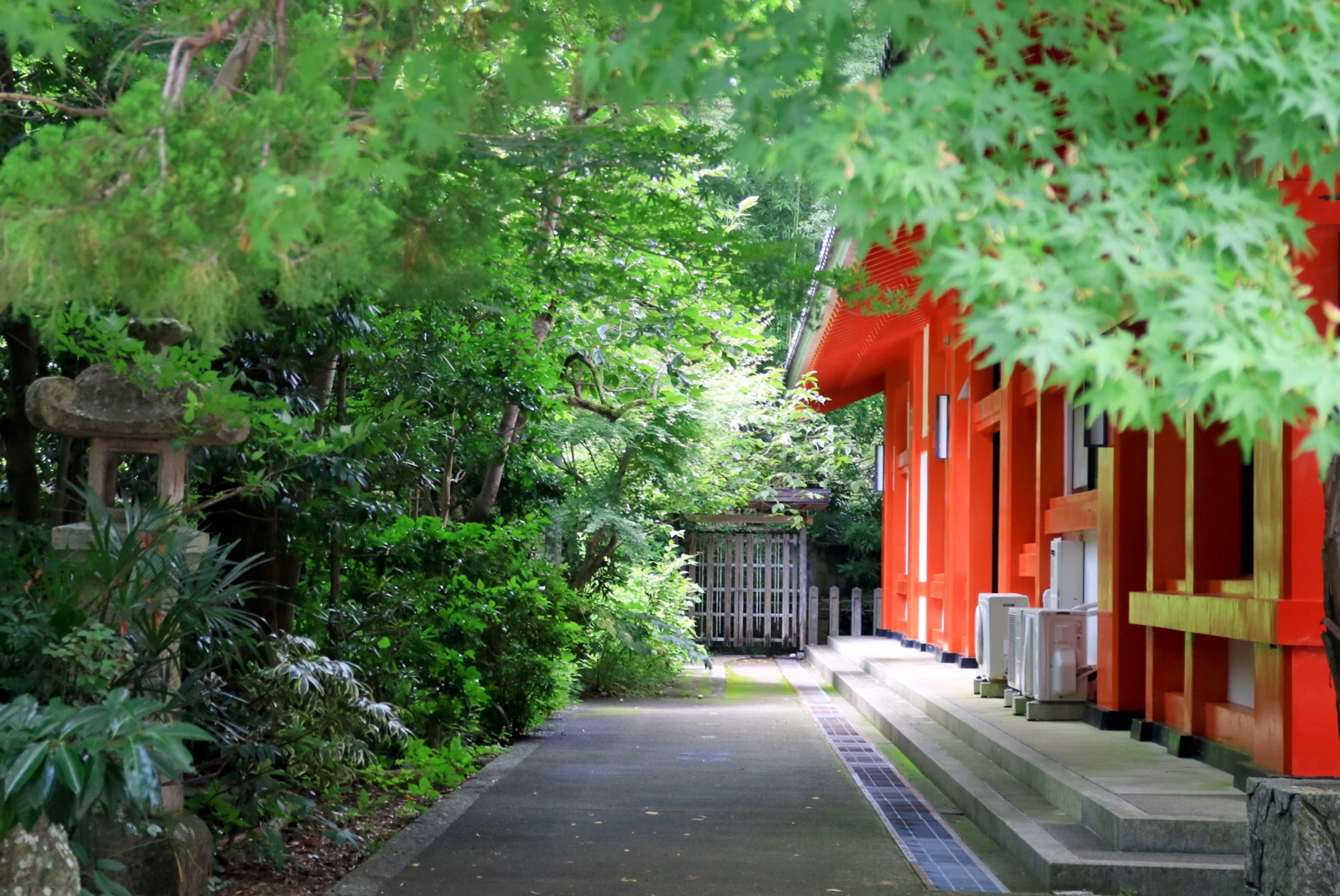
Dokoiku Japan is a new type of travel website aimed at foreign travellers who want to explore hidden gems in Japan, beyond the major tourist destinations and prefer to travel independently. The website primarily focuses on providing comprehensive yet accessible information for travelling in rural areas and other local regions in Japan.
I worked closely with the client, who is an expert in traveling across Japan’s rural areas, from the early stages of brand building. My responsibilities included comprehensive branding (brand naming, logo design, style guide creation), as well as designing the itinerary layout to be incorporated into the WordPress website.
1. Brand Naming
We aimed the naming for brevity and memorability, while avoiding words already used in other Japan travel-related businesses. We wanted to clearly express the concept of the website using a combination of 2 words.
From a long list of relevant words, the combination of “Dokoiku(どこ行く)”, meaning “Where to go” and “Japan(日本)” stood out to us the most. “Dokoiku” is the casual Japanese phrase which is used among friends, and combined with “Japan” suggests the possibility of countless places to visit within Japan. Additionally, this combination of words is catchy and its sound is easy for foreigners to remember. For these reasons, we decided on the brand name as “Dokoiku Japan”.
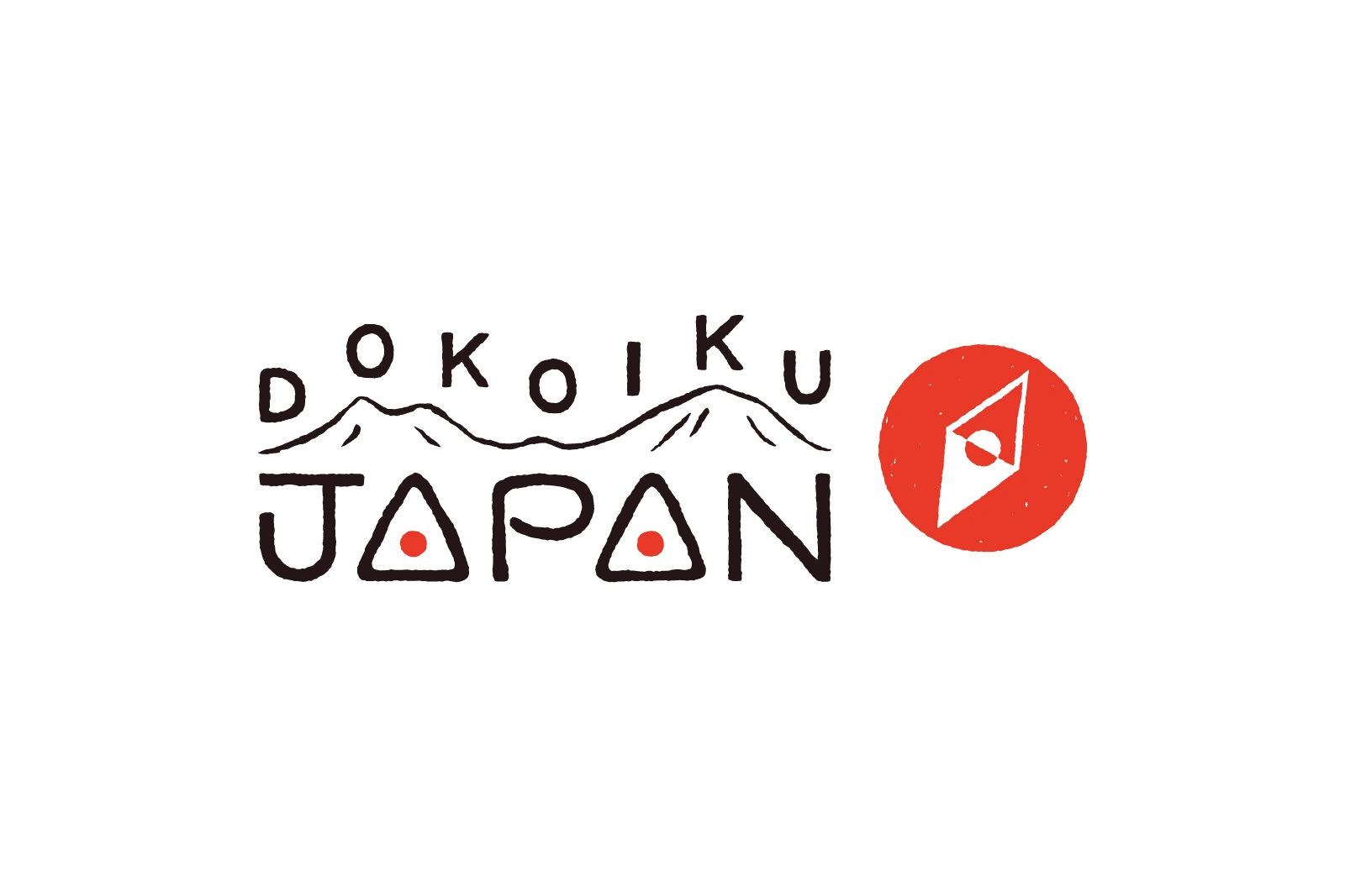
2. Logo Design
The client’s request was to create a logo that embodies the simplicity, a design philosophy representing modern Japan, while also being playful and approachable to foreigners.
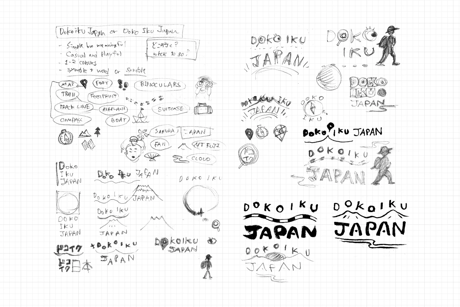
In the draft stage, I presented various ideas using motifs such as Mount Fuji, sunrise, and local train routes. We explored different improvements while seeking the most effective motif to visually represent the brand concept.
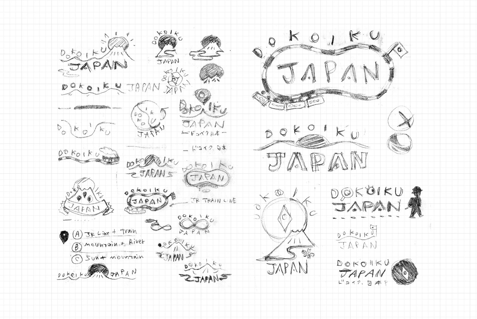
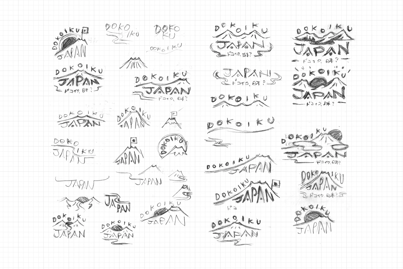
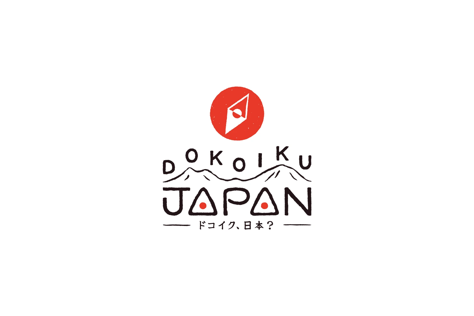
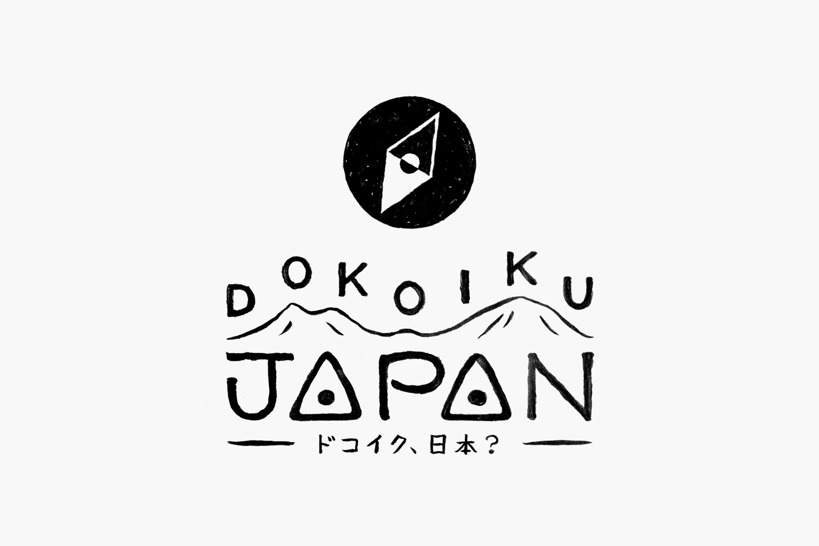
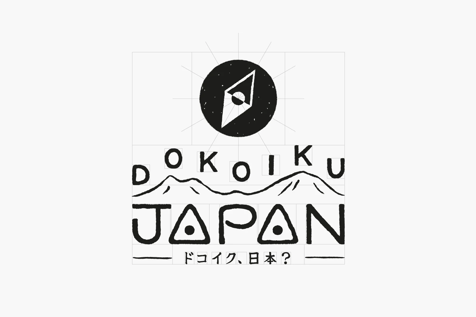
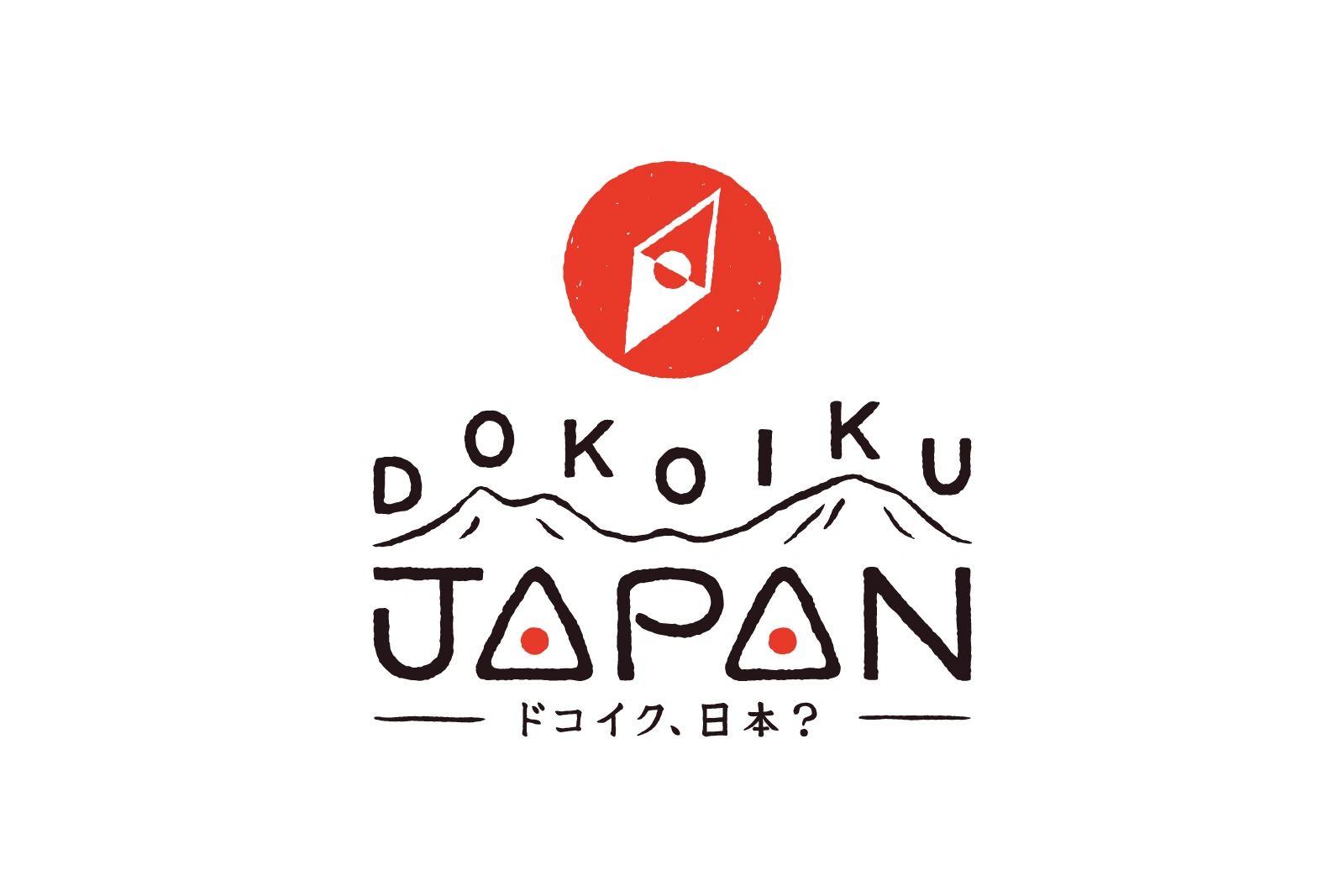
After careful consideration, we settled on a design featuring the gentle mountain range of Japan’s Central Alps, with the letters ‘Dokoiku’ arranged rhythmically like musical notes on top. Additionally, we incorporated a unique design element into the word ‘Japan’, with two ‘A’s resembling onigiri (rice balls). To further indicate the accuracy and authenticity of travel information, we added the brand’s Japanese name, “ドコイク、日本?”, below the logo in small letters.
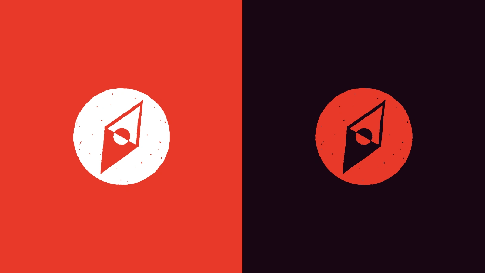
Furthermore, we created a simple icon resembling the Japanese flag and a compass, for use as a browser favicon and for the app icon.
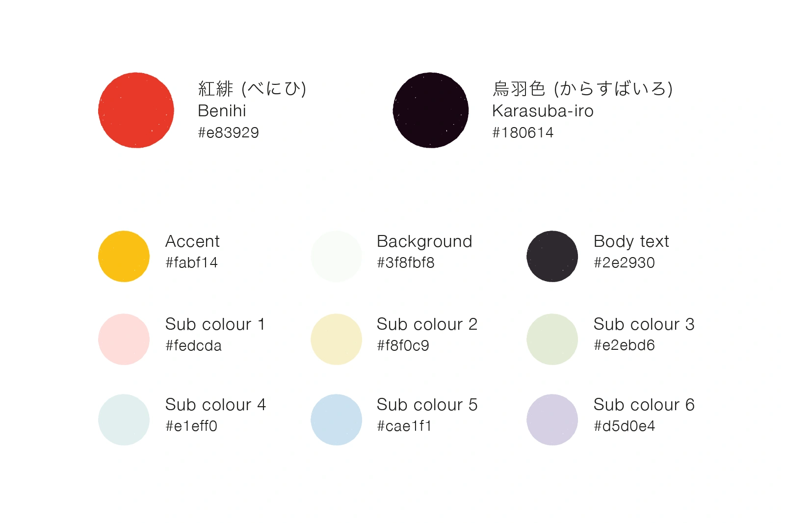
3. Style Guideline and Blog Itinerary Design
The key colour of the brand has set as vermilion, the most prominent colour in Japanese culture. Alongside this, we have selected several complementary colours with more subtle tones, allowing for various styling options within the website.
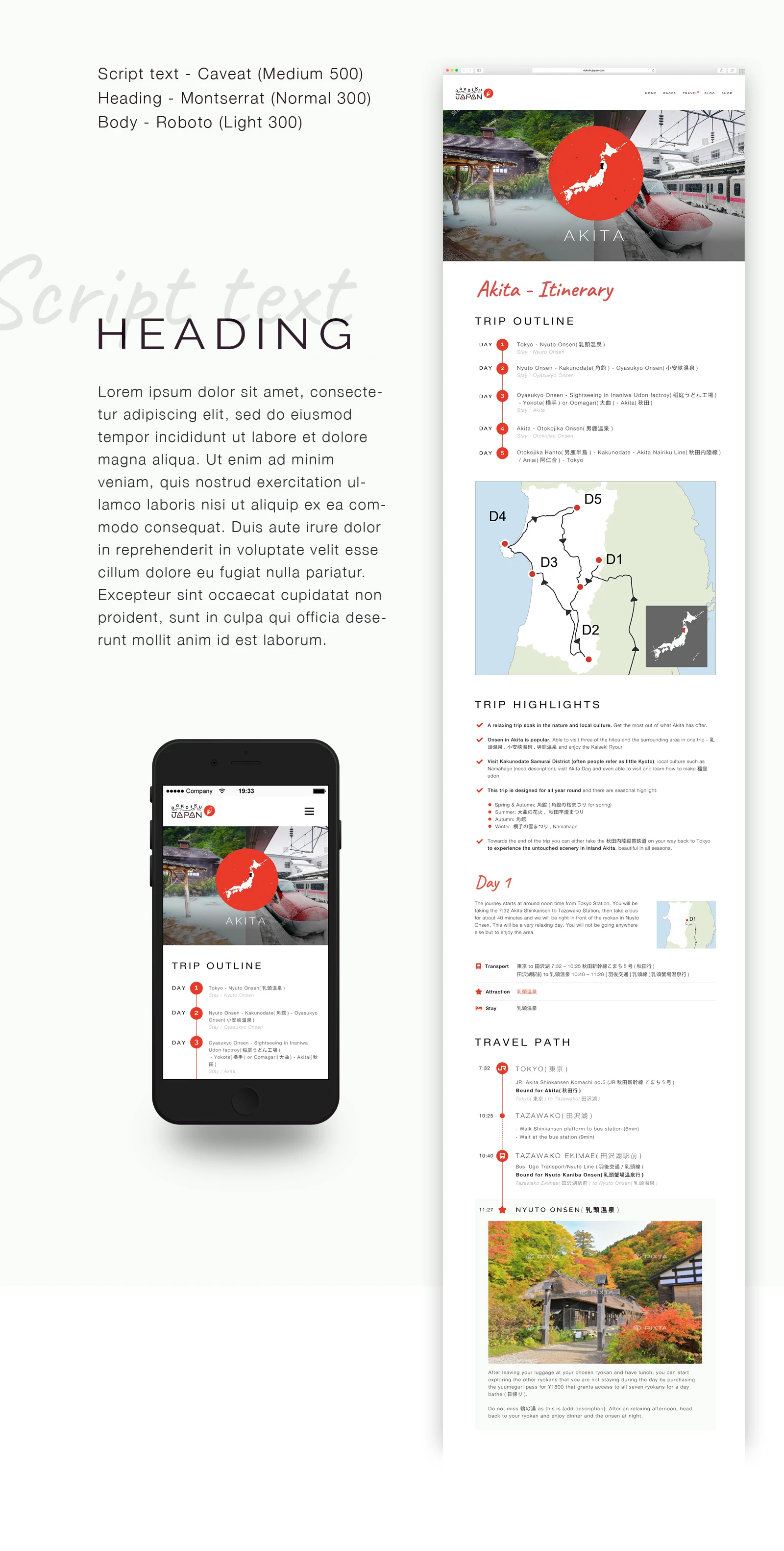
The font used on the website is a highly legible serif typeface, chosen to maintain the brand’s approachability while ensuring a strong sense of trust and reliability.
The design for meticulously crafted itinerary, which designed from a user’s perspective, was customised to fit into the WordPress theme and implemented using code only. With a focus on conveying maximum information with minimal elements, we ensured it was user-friendly and highly informative.
Like this project
Posted Jan 13, 2026
Branding (brand naming, logo design, style guide creation and blog itinerary design) for Dokoiku Japan, a travel website specialised in rural Japan.