Dora Bar - Packaging Design
Akane Yabushita
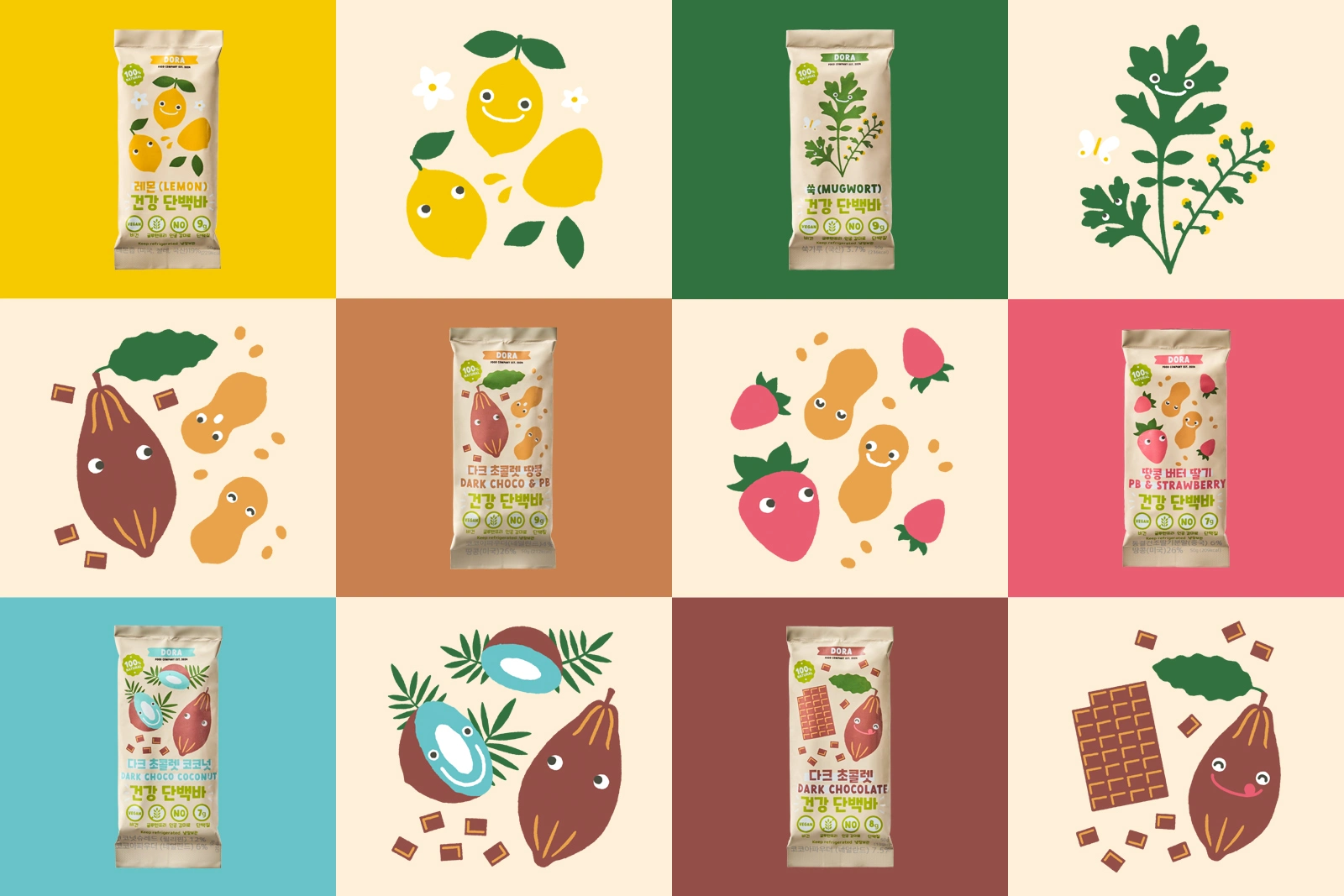
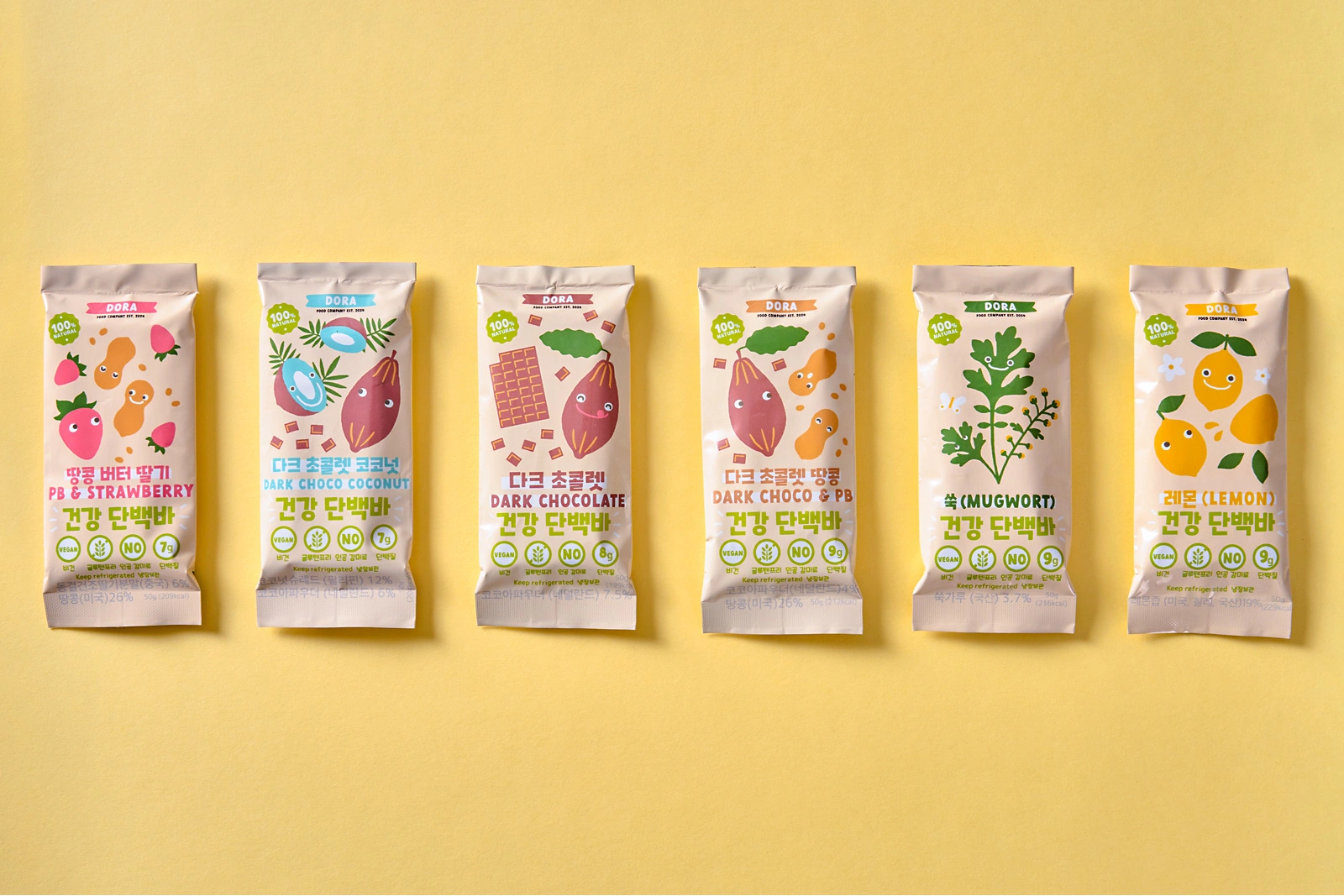
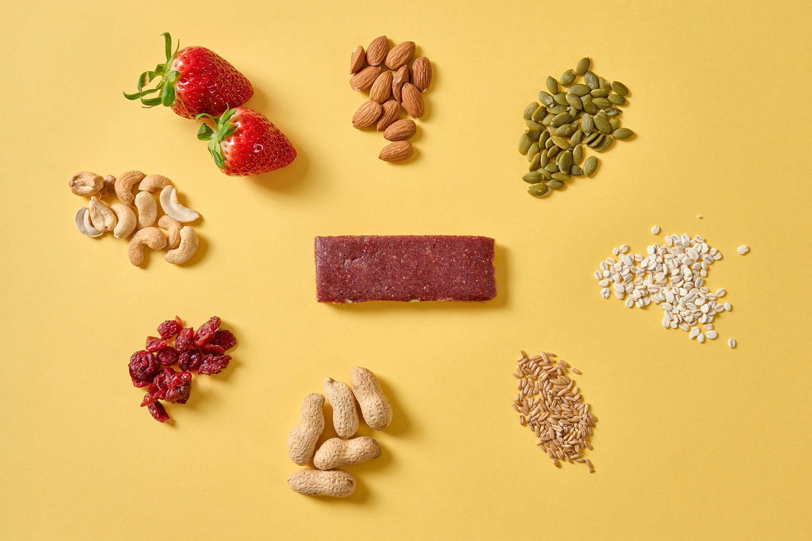
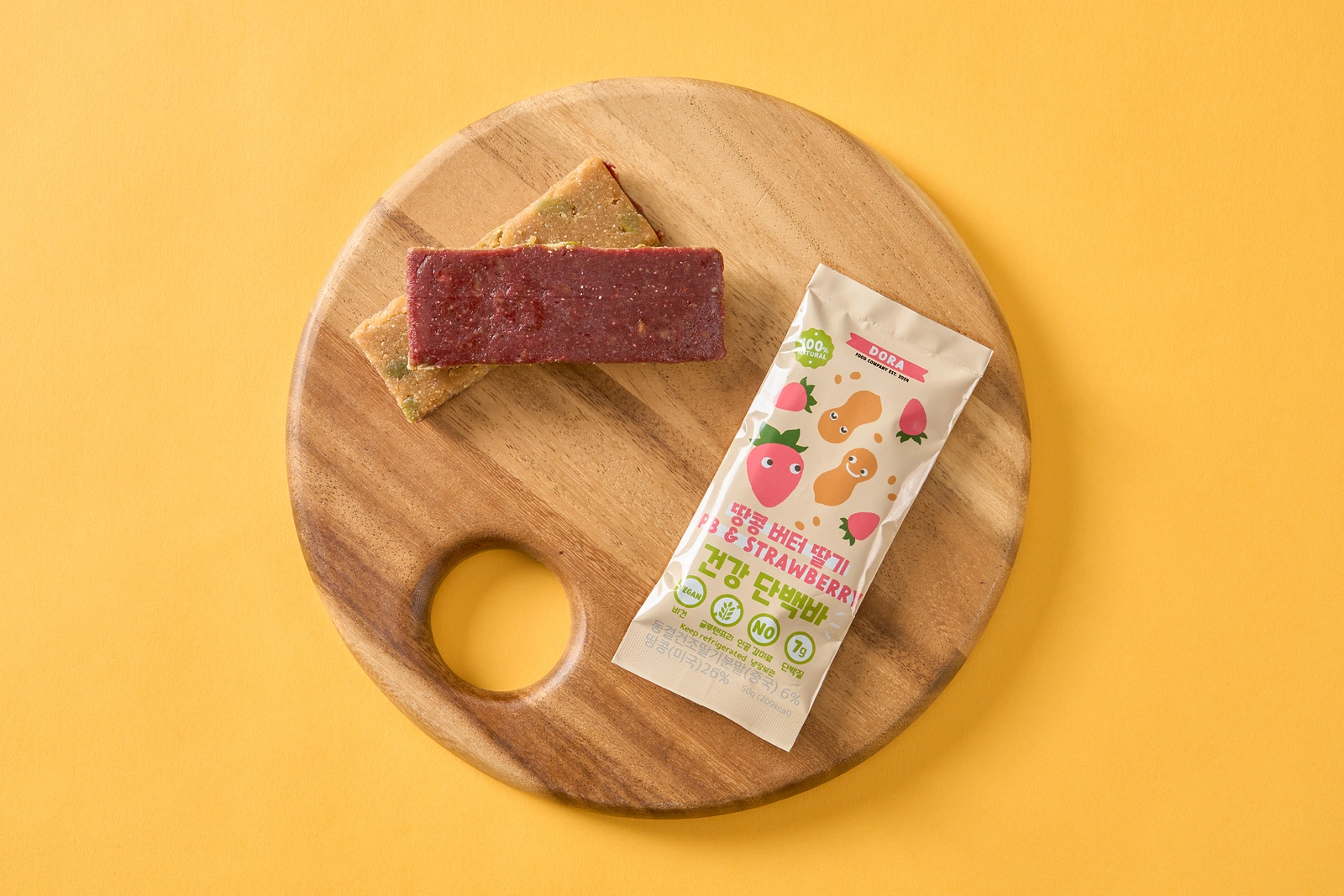
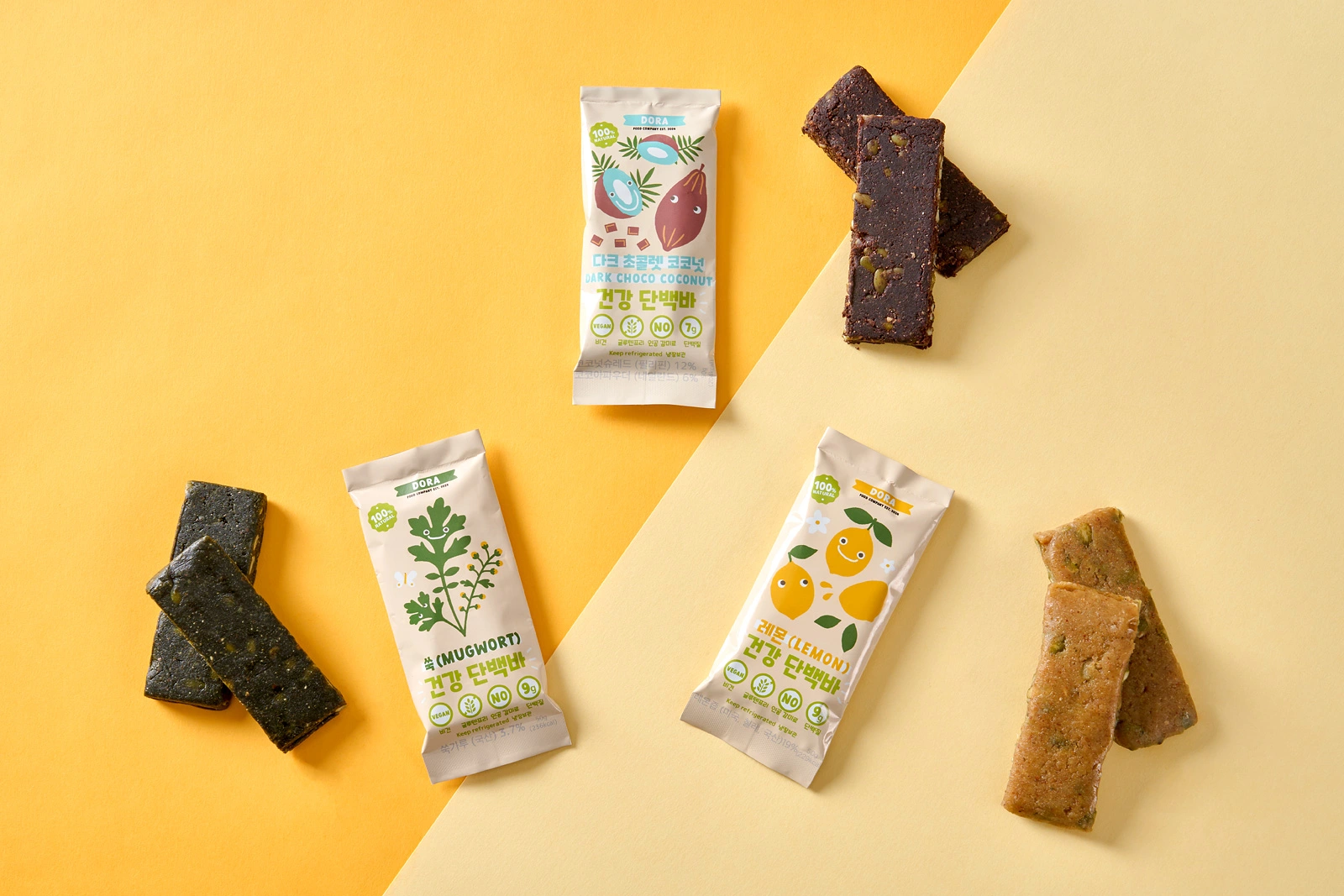
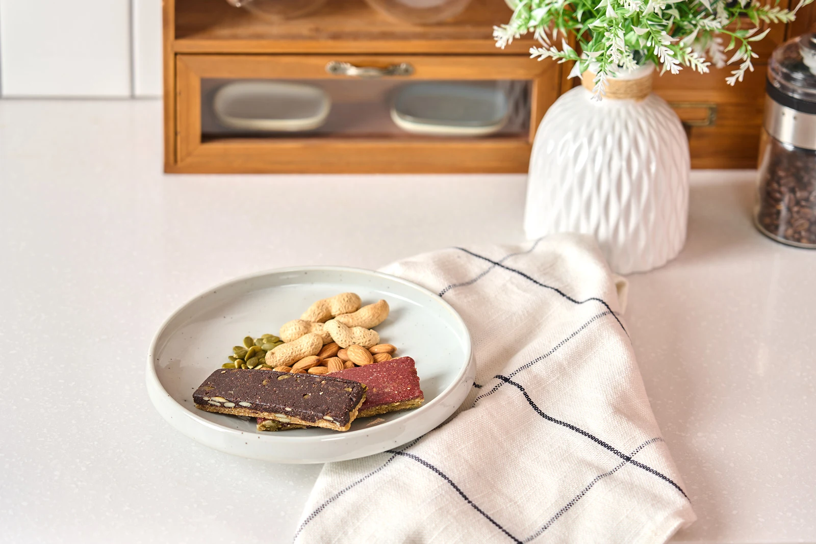
Launched in South Korea, Dora Bar is the new home-made healthy protein bars using 100% natural, plant-based ingredients with no artificial sweeteners or preservatives. I created packaging designs and illustrations for the bar, as well as basic style guide for the brand.
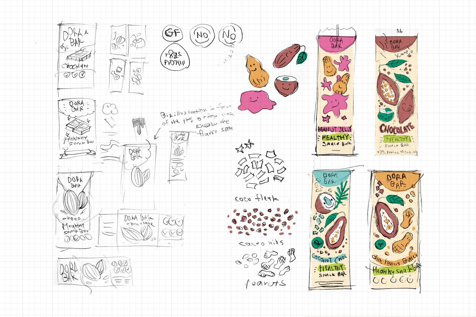
pencil sketch
digital sketch
Project Brief
The inspiration behind these bars came from the client's struggle to find healthy snacks for his young daughter while living in South Korea. Many of the protein bars sold in modern South Korea are filled with artificial sweeteners and preservatives, making it hard for him to find a safe snack for his daughter. Caring for her health, he was determined to fill this gap by creating his own solution.
Packaging and Character Design
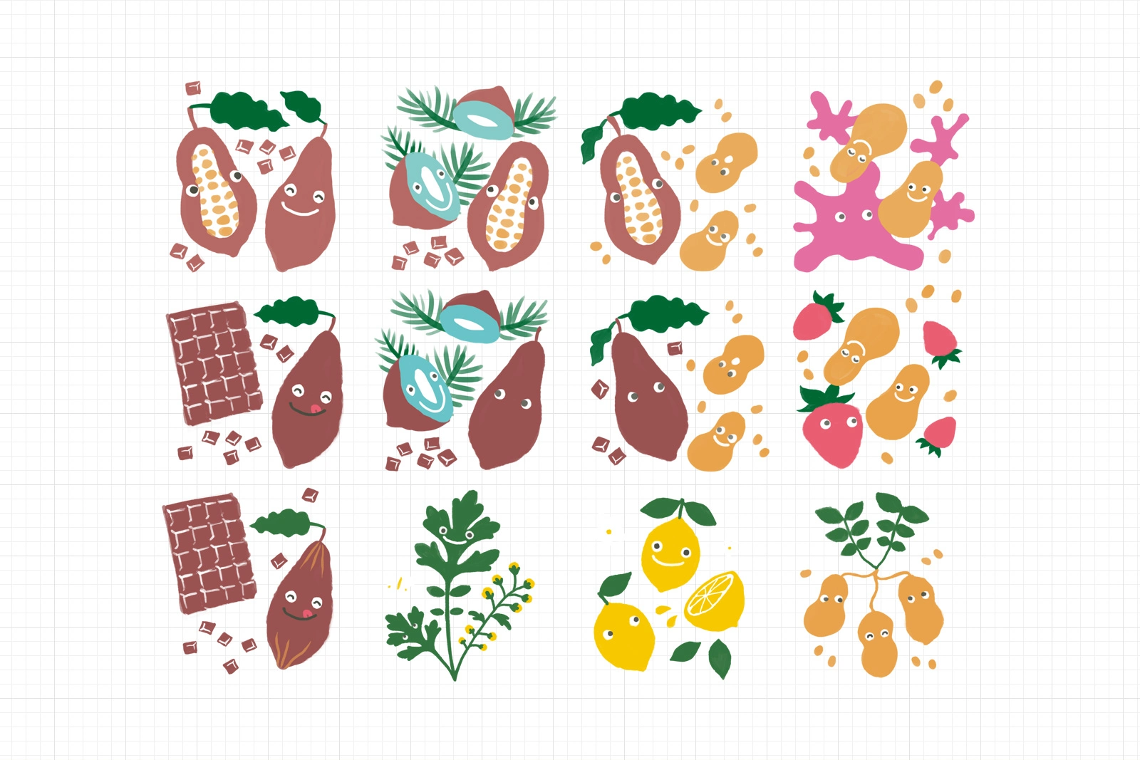
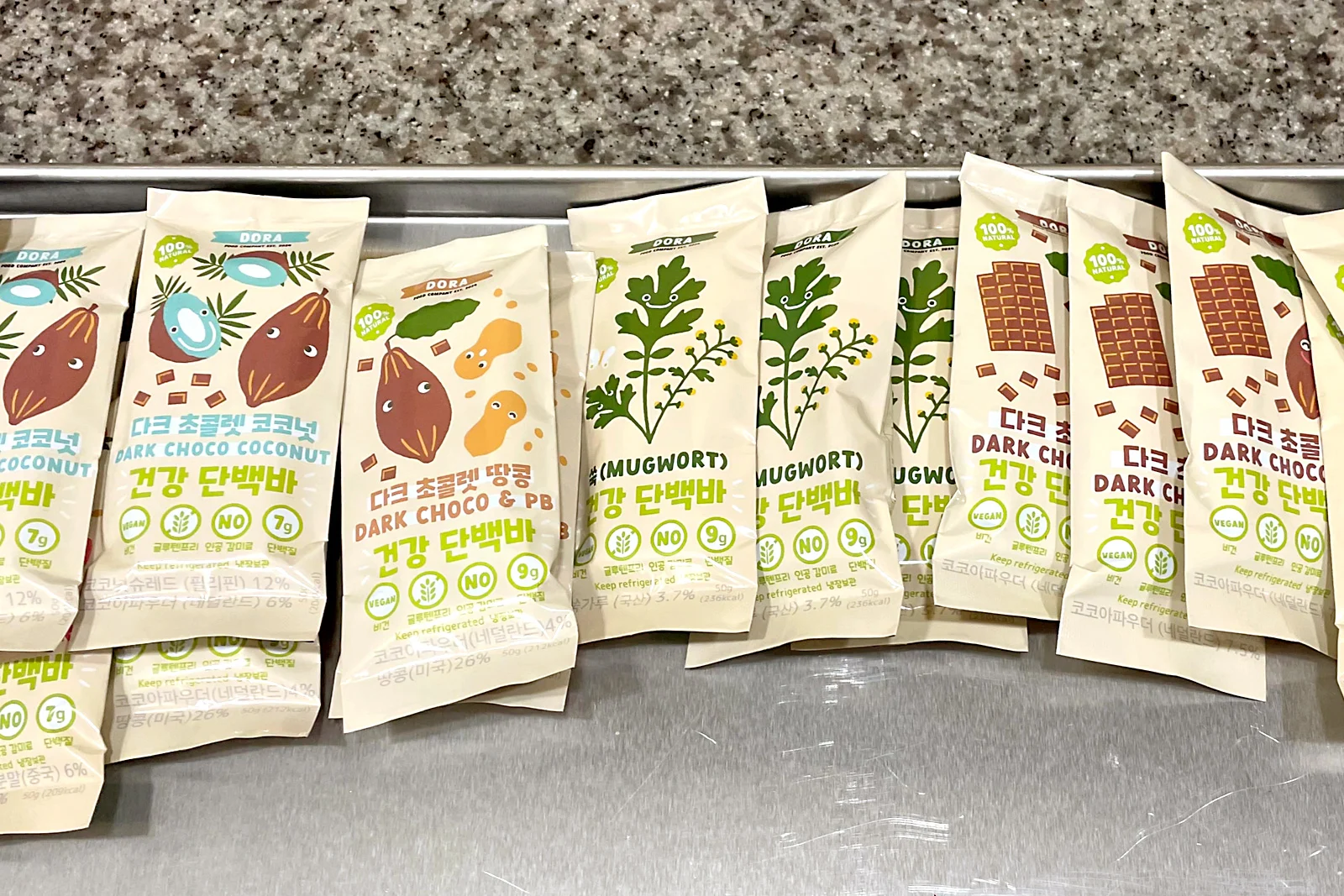
The primal objective of the packaging design for the bar was to appeal to families with young children using friendly and accessible visuals. With this as the core, as well as to drawn interest to the product from children, I created cute characters of the ingredients used in the bars and featured them as the main elements of the packaging.
Those eye-catching, simple illustration makes it easy to communicate about the product to children. Also, the hand-drawn feel of those illustrations reflects the artisanal nature of the bars.
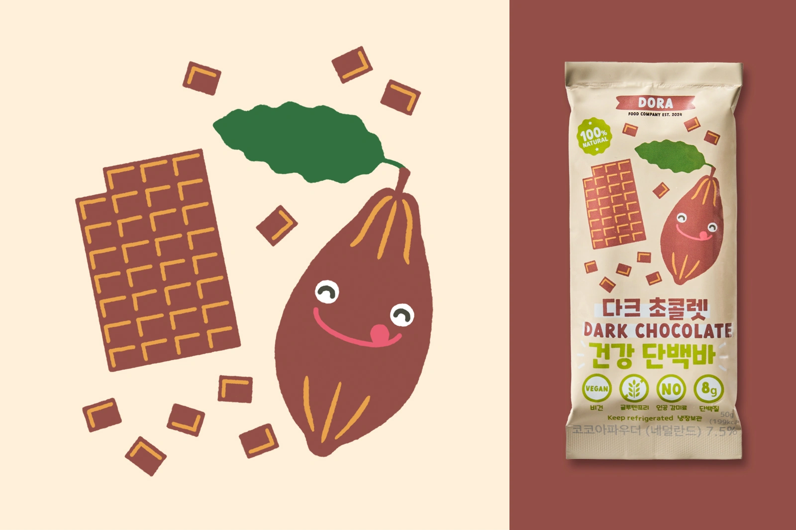
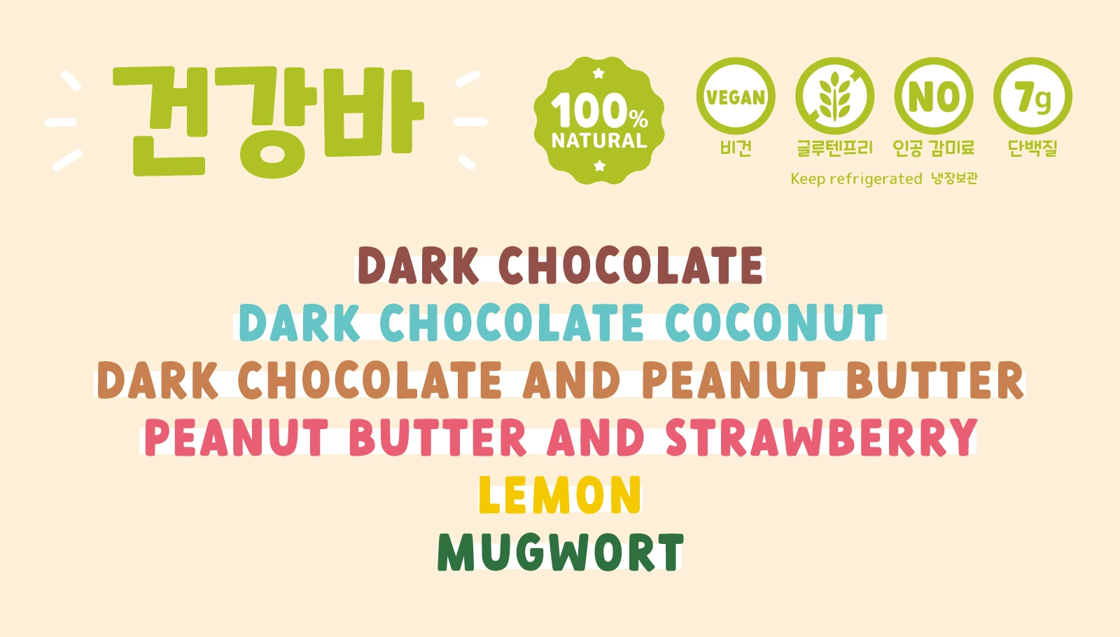
Dark Chocolate flavour
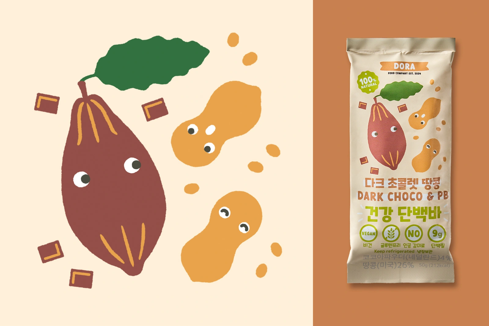
Dark Chocolate and Peanut Butter flavour
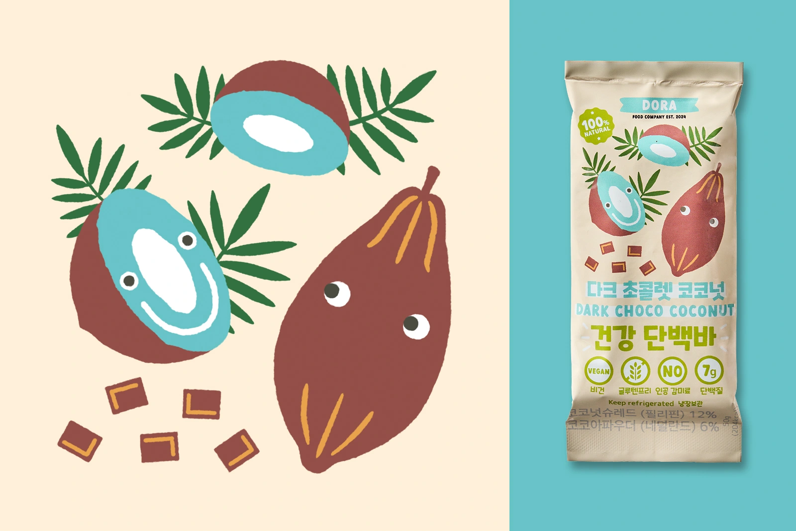
Dark Chocolate and Coconut flavour
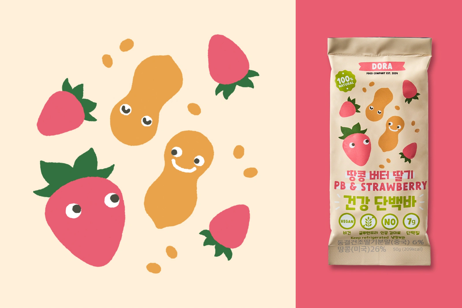
Peanut Butter and Strawberry flavour
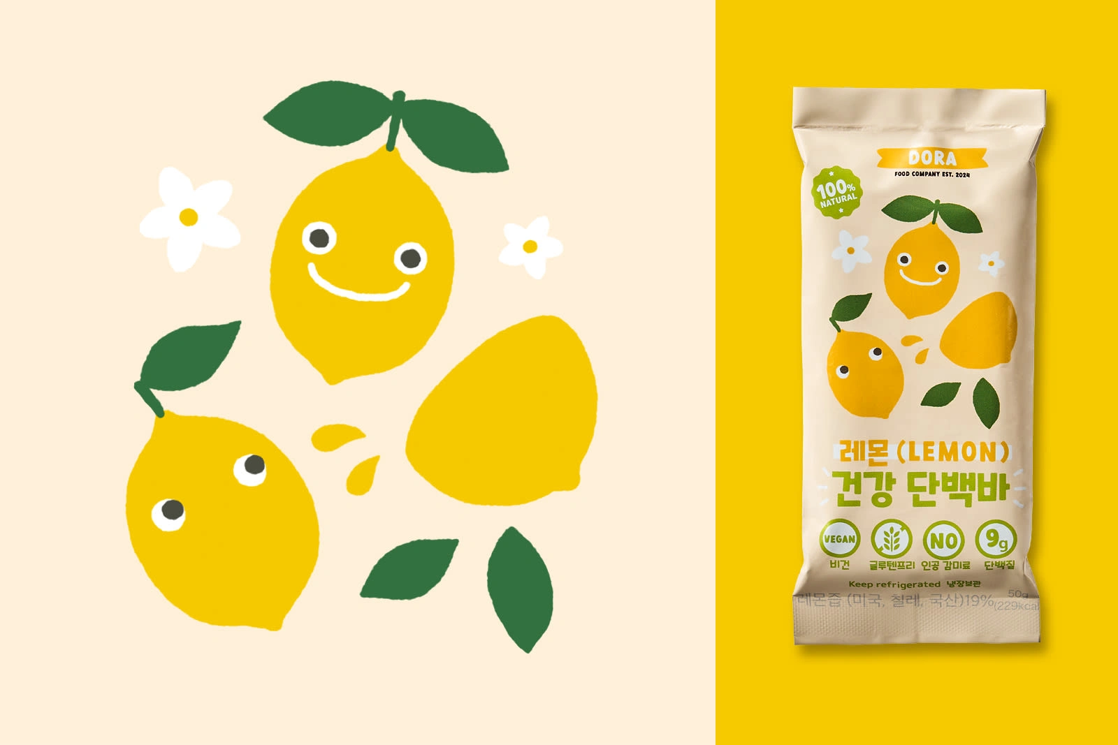
Lemon flavour
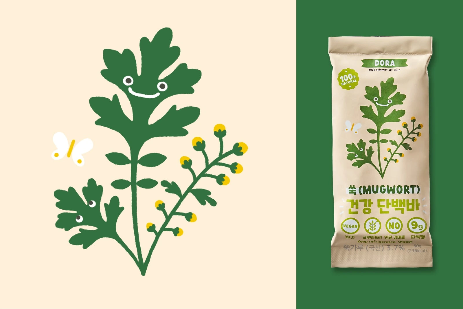
Mugwort flavour
Colour palette and Typography
The colour scheme was designed to match the 6 flavours of the bars. Those are reminiscent of the colours of the rainbow but kept in organic and natural hues that are seen on the ingredients, indicating that these are chemical-free products.
The typography were bold, easy-to-read for children, and has friendly aesthetics with curvy body. Those style remain consistent in both English and Korean font.
Like this project
Posted Jan 13, 2026
Packaging designs and illustrations for Dora Bar in South Korea, home-made healthy protein bars only using 100% natural, plant-based ingredients.