Ondalis - Product Packaging and Identity Design
Akane Yabushita
Ondalis is an Italian organic cosmetic brand established in 2020. Ondalis comitted to produce high-quality products using 100% organic ingredients only, with the packaging that made entirely from recycled or recyclable materials. These environmentally friendly products are sold in small, travel-friendly containers, reflecting the brand’s 3 core values: sustainability, portability and functionality.
I am commissioned to analyse and evaluate their old product packaging, and to create a brand new look with 7 product identities.
Brand Analysis and Evaluation
First, I reviewed and evaluated the brandings that the brand initially adopted, identifying gaps and inconsistencies between its execution and the brand’s core philosophy. Based on these analysis, I started brainstorming potential approaches that would be highly effective and efficient in bridging these gaps and communicating the product more clearly to potential customers.
As a result, we established an entirely new direction: to visualise the brand’s foundation of sustainability through a philosophy of minimalism. By distilling the product’s essence and value into the fewest necessary elements, the aim was to maximise the impact and effectiveness of the message conveyed.
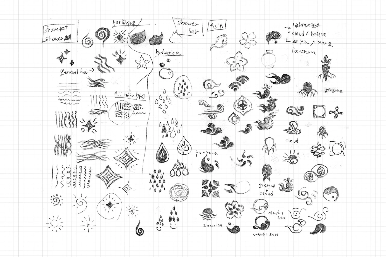
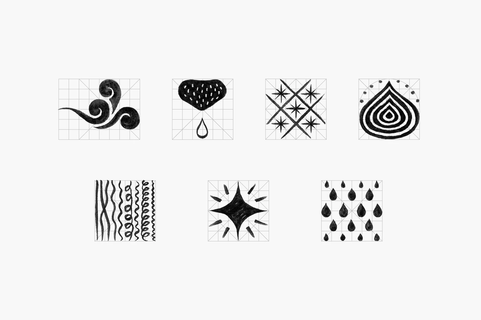
Product identity sketch #1
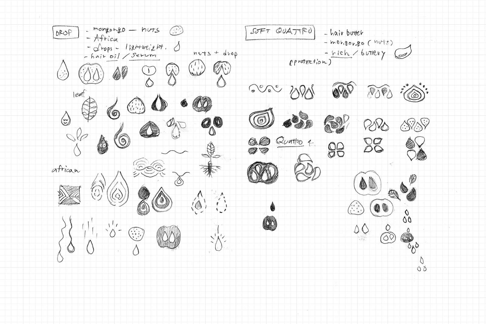
Product identity sketch #2
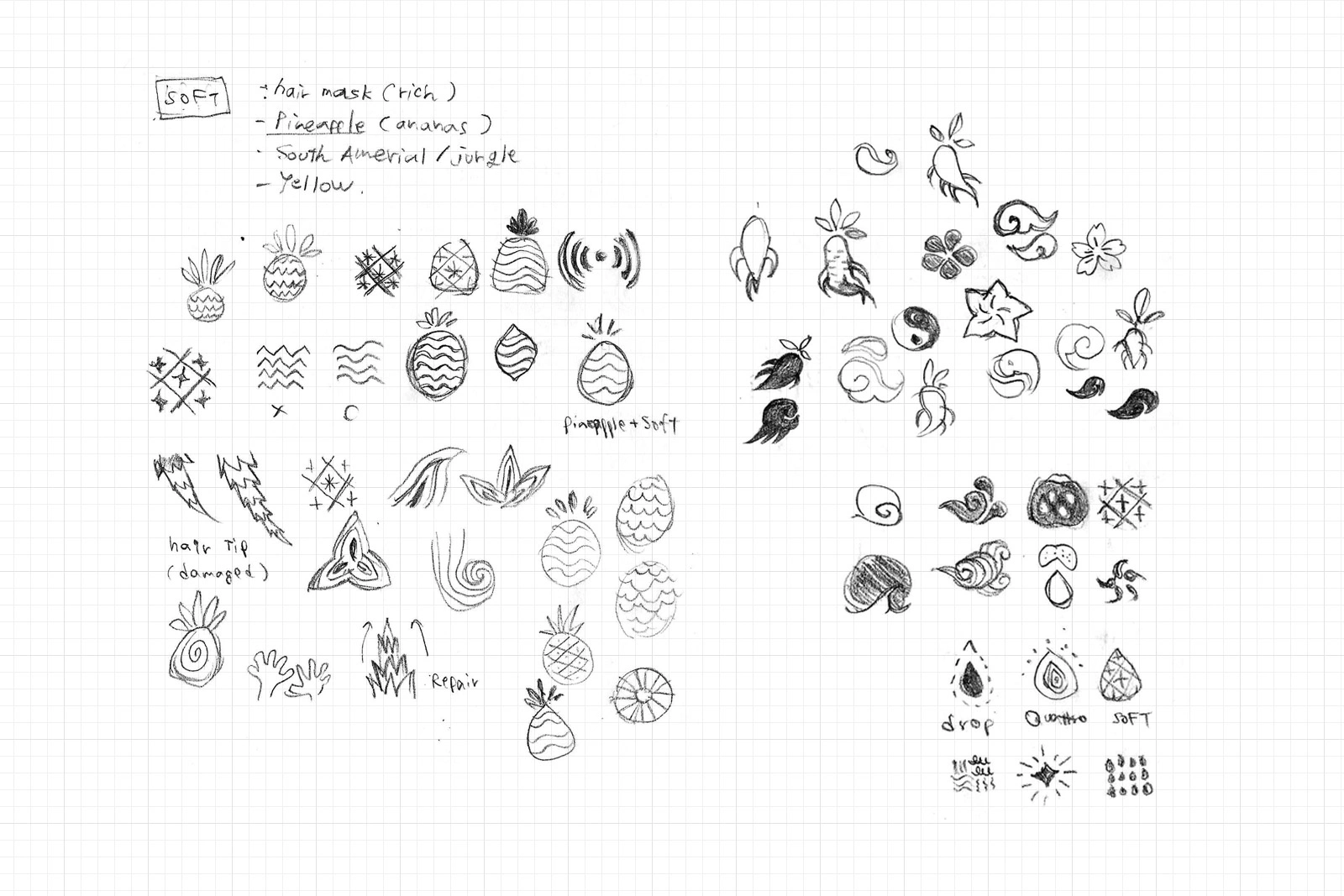
Product identity sketch #3

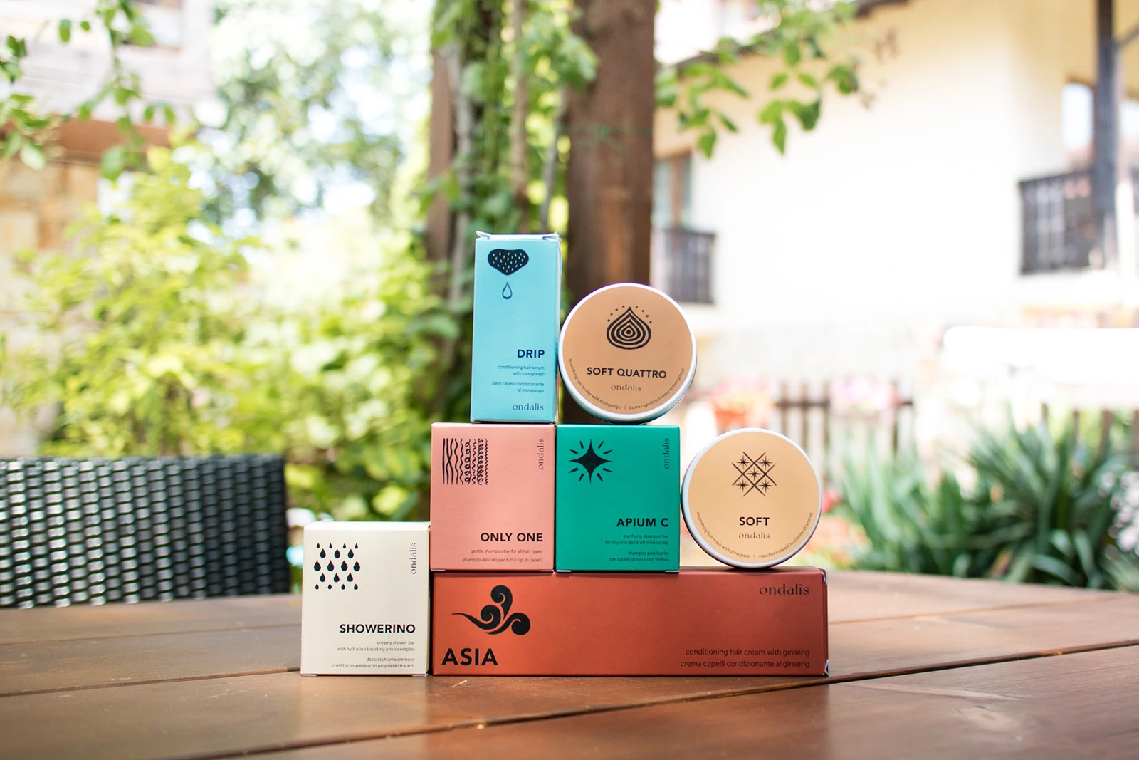
Product Identities and Package Design
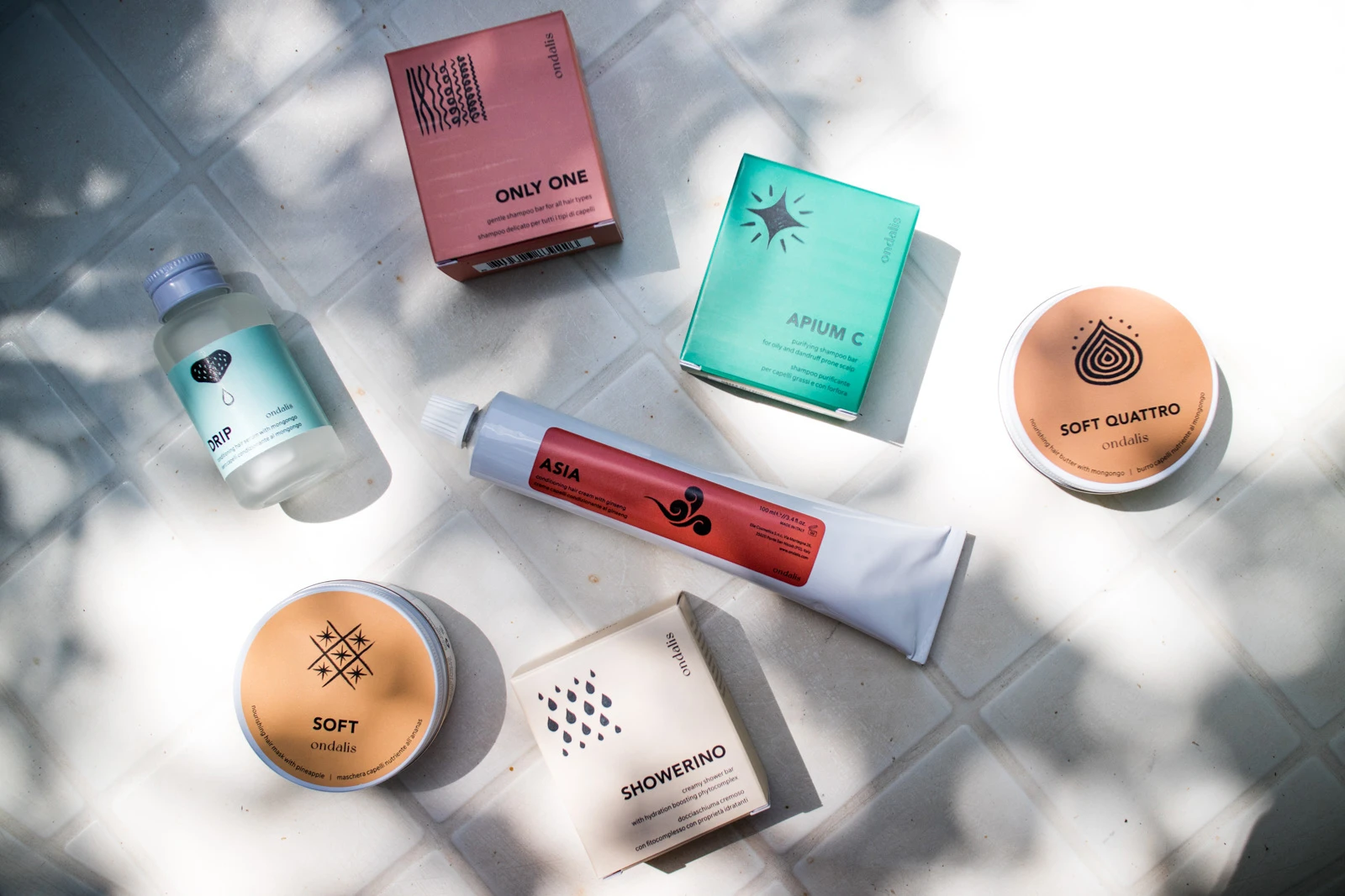
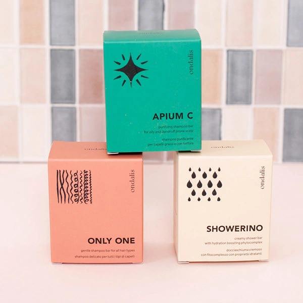
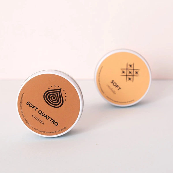
The product packaging design is kept at bare minimum using only single colour. On the front of each package features a simple yet impactful symbol illustration, symbolising the ingredients or functionality of the product.
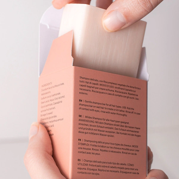
Other packaging elements, such as ingredient list and usage instruction, were organized into a simple layout using a grid layout method.
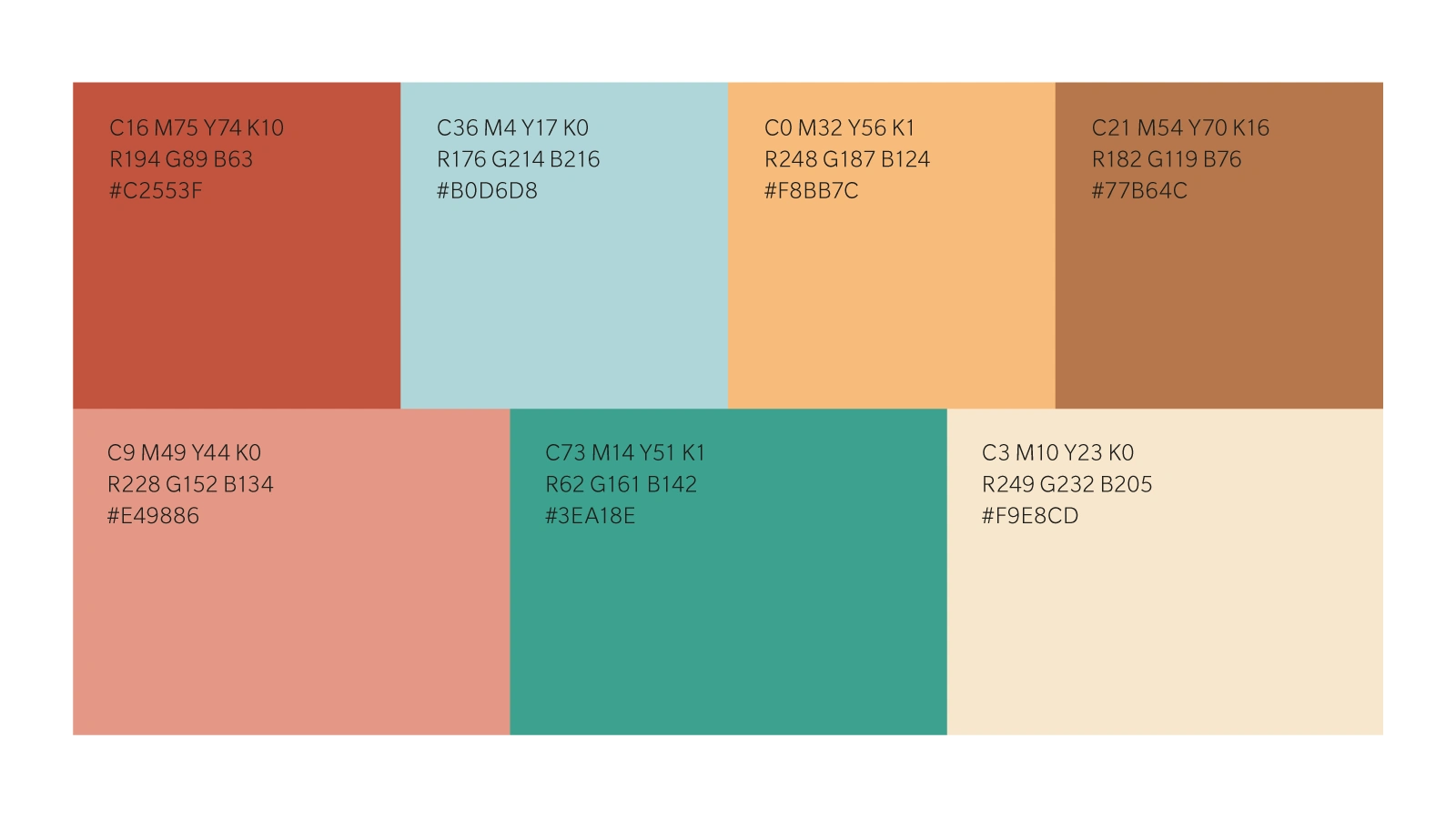
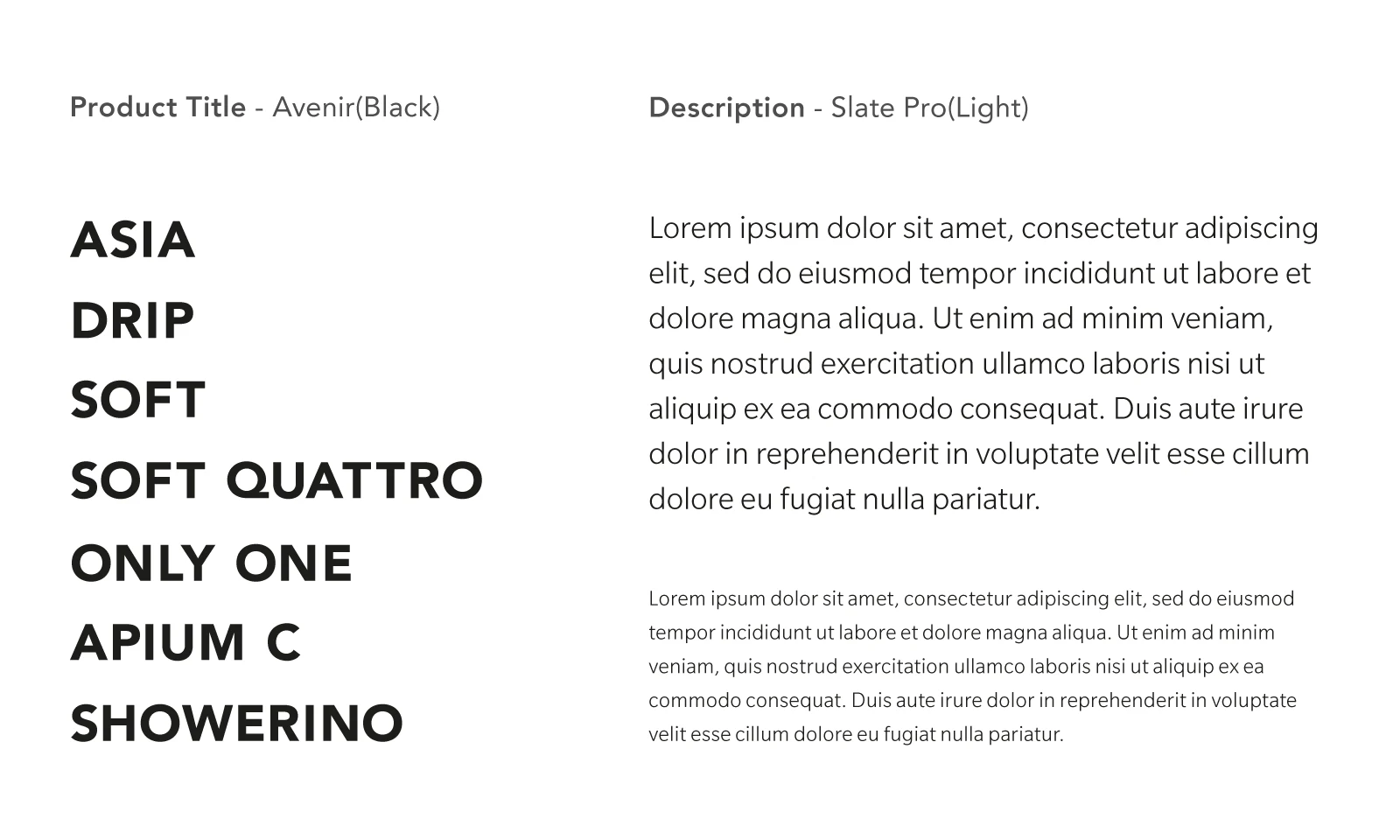
Colour Palette and Typeface
Each product was assigned a key colour from terra-cotta palette of 7 colours, which was extracted from the natural colours that is seen on beautiful Murano and Burano Islands near Venice, where the birthplace of the brand.
For the brand typeface, I picked Avenir for its simplicity and functionality, as well as its excellent legibility even at small sizes on product packaging.
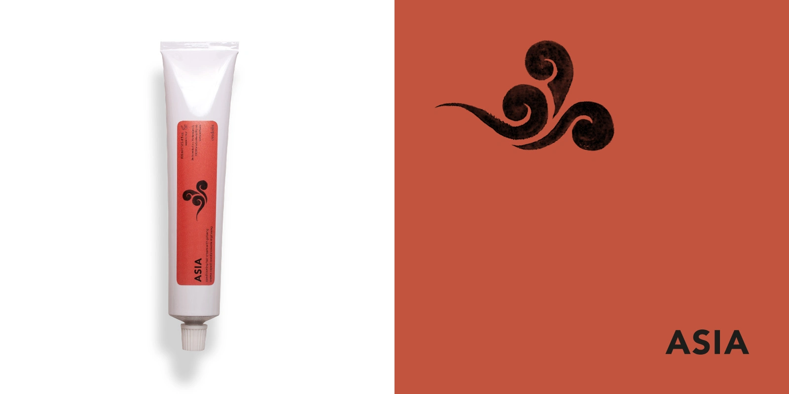
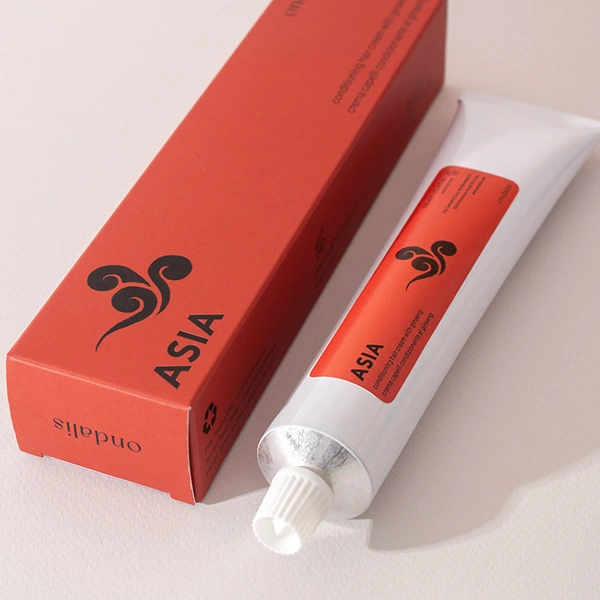
Packaging design for 'Asia'
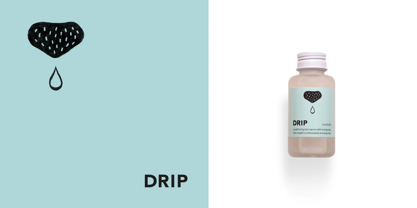
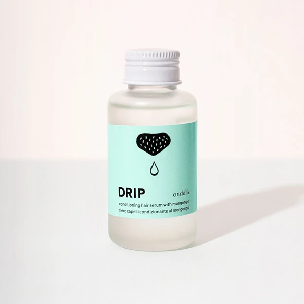
Packaging design for 'Drip'
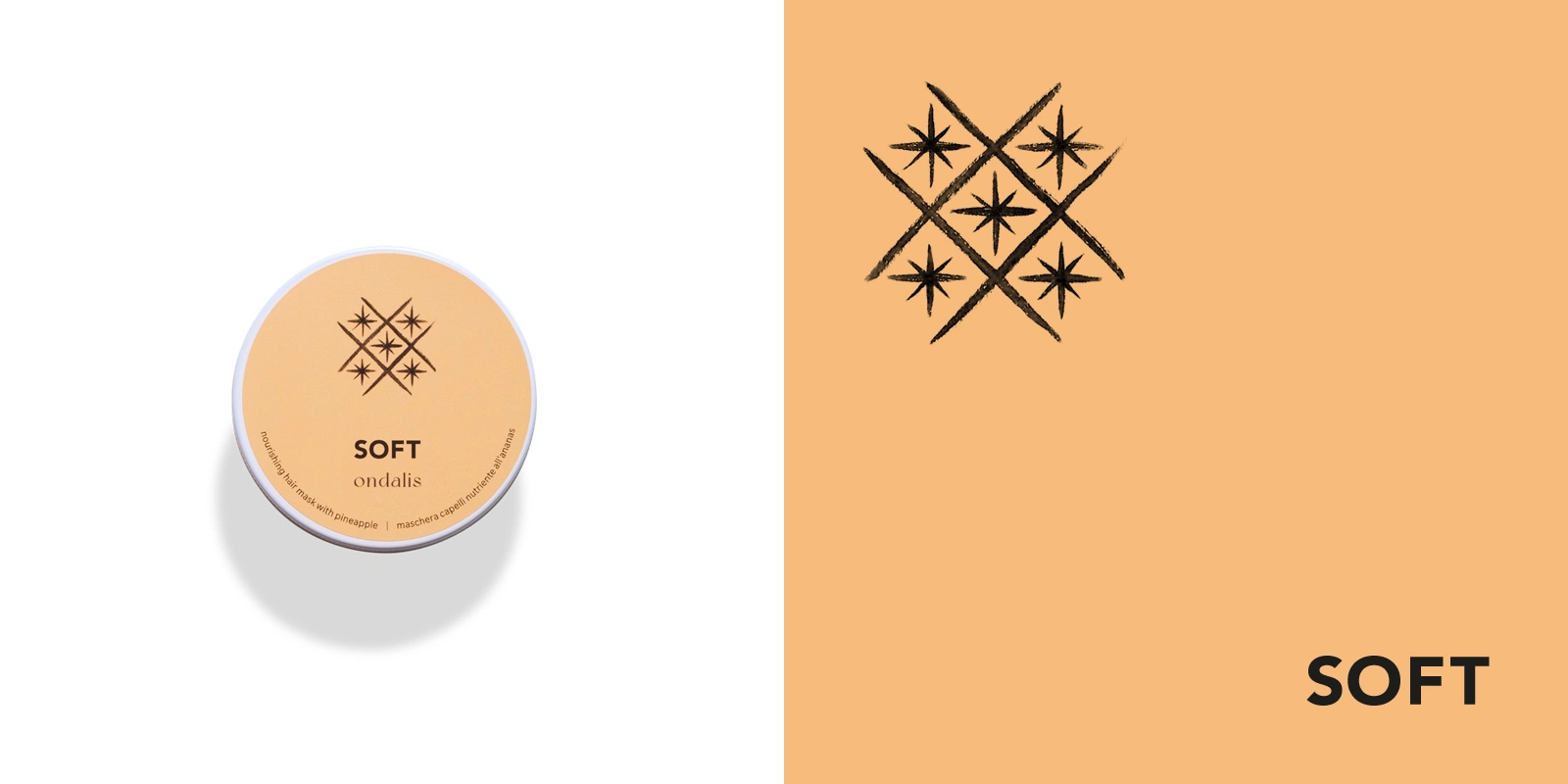
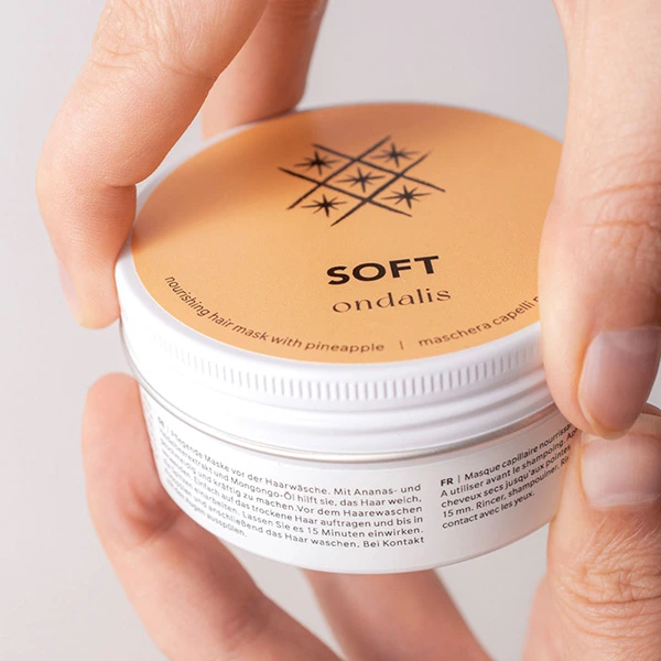
Packaging design for 'Soft'
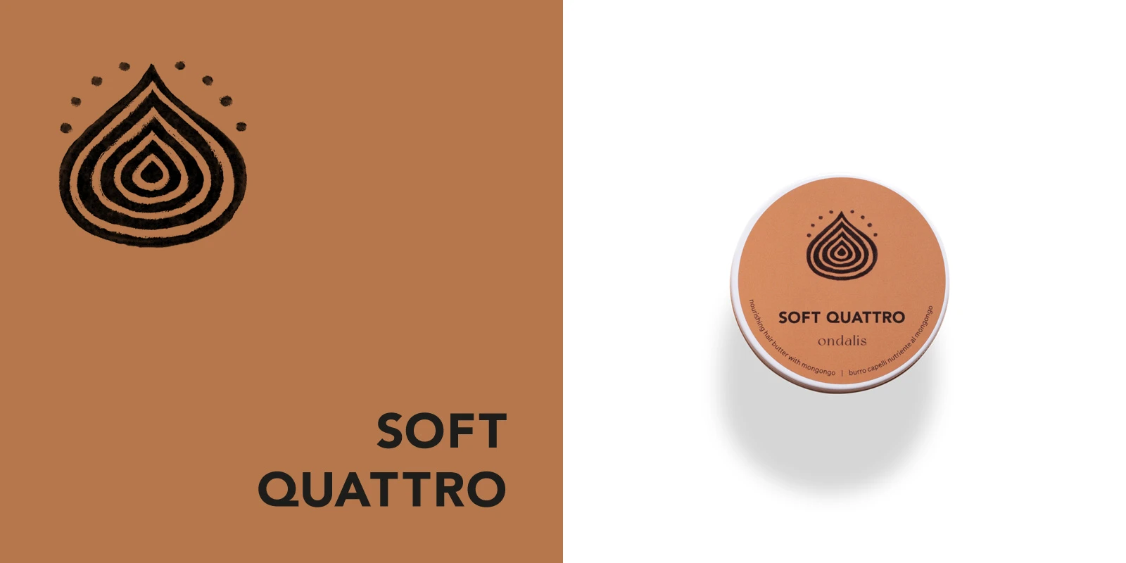
Packaging design for 'Soft Quattro'
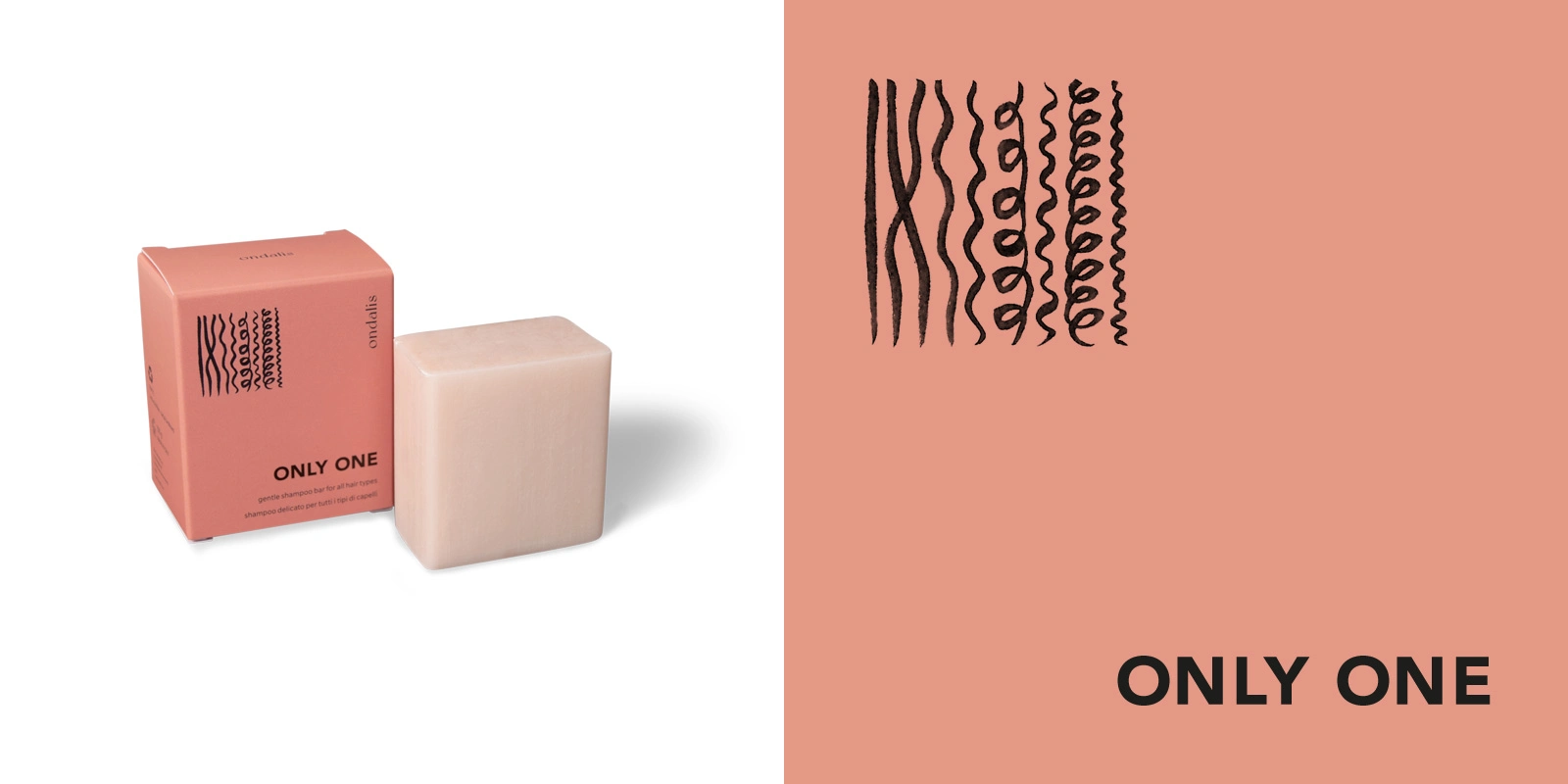
Packaging design for 'Only One'
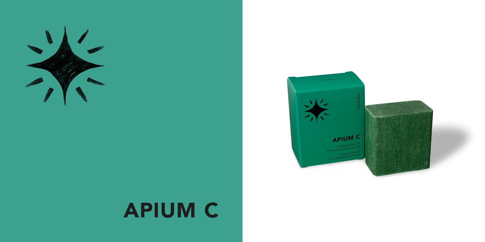
Packaging design for 'Apium C'
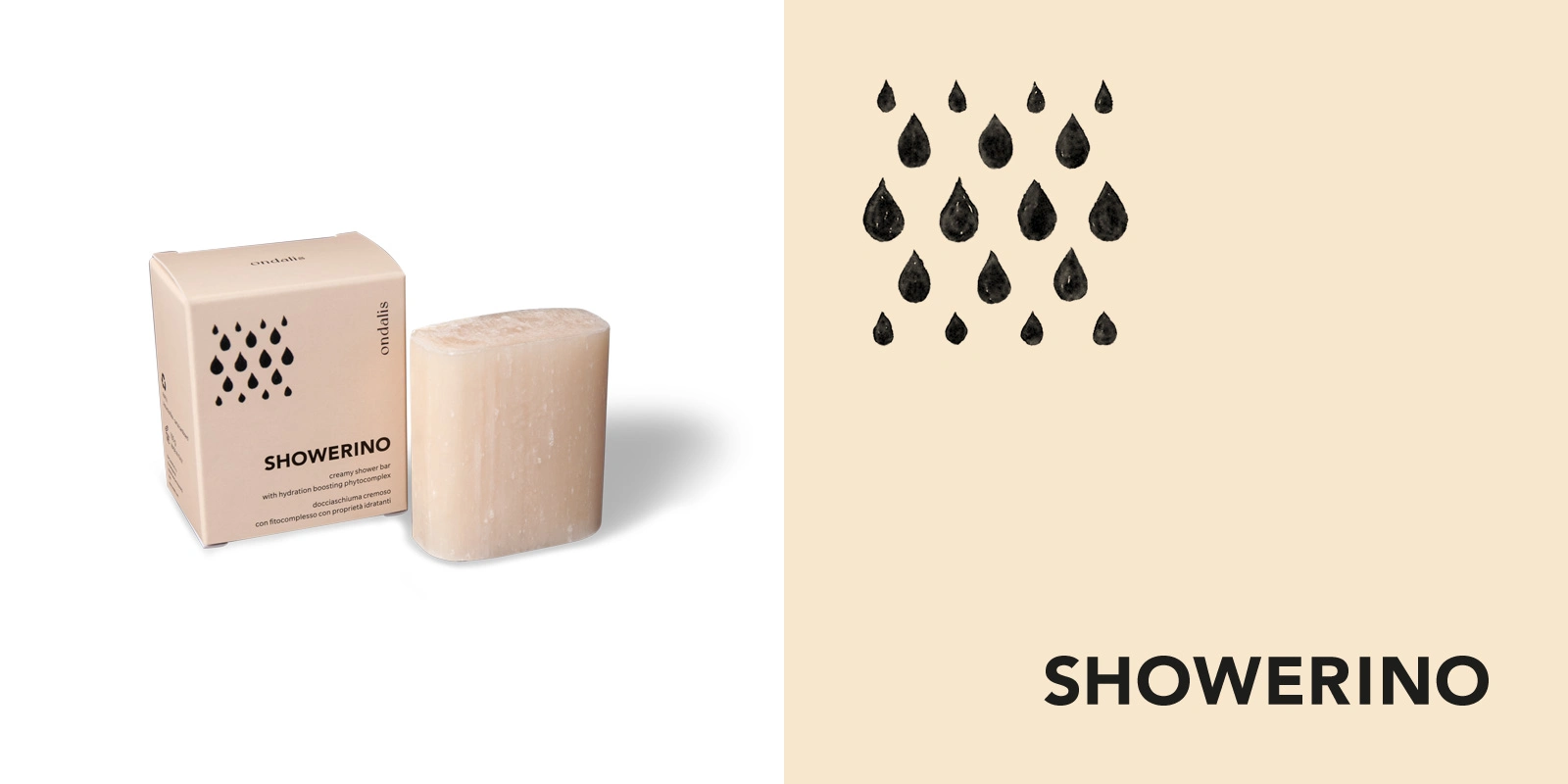
Packaging design for 'Showerino'
Like this project
Posted Jan 12, 2026
Minimalist-style product packaging and identity design for Ondalis, an Italian organic cosmetic brand focuses on sustainability, portability and functionality.