Conversion optimization for a B2C SaaS
Jorge Giraldo

Conversion optimization for a B2C SaaS
An onboarding redesign focused on conversion and activation
⚡️ 4.6x activation increase
⚡️ 2.3x Conversion improvement
⚡️ 47% Support tickets reduction
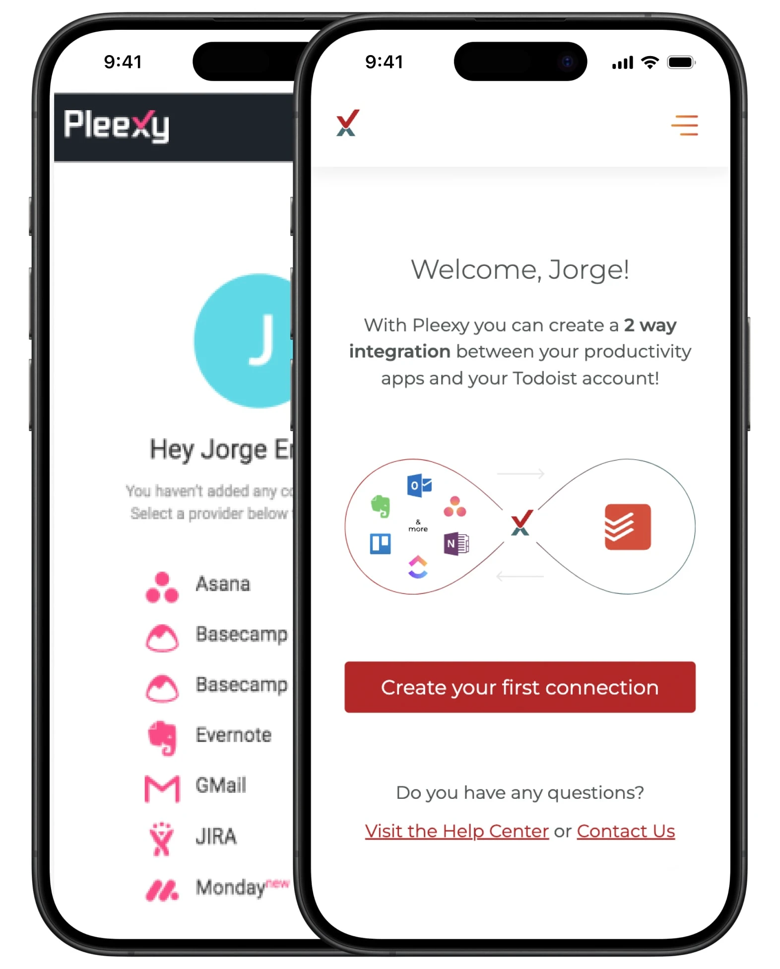
Pleexy transforms scattered tasks into organized action by connecting your task manager with tools like Notion, OneNote, Trello, etc.
The project focused on improving first-session activation with a value-first, low-friction onboarding while maintaining its configuration flexibility.
Problem
A broken onboarding flow
The original onboarding asked users to make too many decisions up‑front, hid the value behind configuration, and broke on smaller screens. As a result, most sessions ended before users connected a single provider.
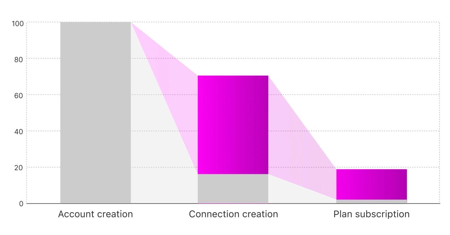
The data showed a significant drop-off during onboarding: out of every 100 users who signed up for Pleexy, only 17 would set up an integration - meaning most never reach the point of experiencing its core value.

Conversion funnel before the project start
Hypothesis
Fixing the onboarding flow will increase conversion
After identifying the onboarding as a key bottleneck in Pleexy’s user funnel, I focused on resolving it first, as this would not only enable more users to experience Pleexy’s value but also improve satisfaction among those who completed the process.
Getting users to experience Pleexy’s value was the top priority, since they were already creating accounts—showing clear interest in the product.
A smooth onboarding experience would increase customer satisfaction, ultimately leading more users to convert.
Research
Combining data and user feedback
The first step was to explore the factors behind the high drop-off rate. We took several approaches: reviewing data from Google Analytics, conducting design heuristics analysis, and interviewing users.
Audited the onboarding flow across desktop and mobile to identify friction: unclear hierarchy, competing CTAs, and configuration-first patterns.
Tracked funnel from signup → integration setup → conversion. Biggest drop occurred before the integration setup, indicating unclear value and missing user guidance.

Old interface
Validation
Iterating with a Figma prototype
To maximize team efficiency, I prioritized browser compatibility fixes for the development team - work they could tackle independently - while I focused on designing a new onboarding flow prototype in Figma. This allowed parallel progress: the devs remained unblocked, and I advanced the onboarding project without delay.
Once the prototype was ready, I ran one-on-one interviews with 3 different user profiles (3 from each - 9 in total):
Current customers
Users who dropped off during onboarding
Task manager users unfamiliar with Pleexy
Their feedback shaped multiple design iterations, leading to a significantly improved onboarding experience.
By running an iterative process with current and potential users, we were able to launch a solution that directly addressed user needs and delivered real value in production.

Iteration cycles
Improvements
Changes introduced to improve conversion
To make things clear and easy, we broke down the creation process into several steps. This give users control and clarity on what’s happening at each stage.
We noticed that most first-time users were accessing Pleexy on their mobile devices, so we optimised the screens to make sure everything looked and worked great on mobile.
Empty state: before & after
Outcome
A smooth onboarding that met the goals
Following the experimentation phase, we implemented the validated improvements and established a 3-month monitoring period to evaluate their business impact.
Conversion improved 2.3x
Onboarding completion improved 4.6x
Support tickets were down 47%
Conversion funnel after changes were introduced
Testimonials
What users say about Pleexy's UX
⭐️ Trustpilot - 4.5/5
Setup in seconds. No credit card for the free trial. Worked first time. This is exactly how integrations should work. I've always held back from integrations as I've tried before with other systems and they we complicated. Not so with this Pleexy... Brilliant - thanks!
⭐️ Capterra - 4.7/5
My team uses Asana but I manage my day with Todoist. I have tried other solutions like Make (formerly Integromat) and Zapier but the price and ease of use for Pleexy make it the clear winner.
⭐️ Customer support
Yes please, I would prefer to use something like Pleexy as it’s very straightforward in contrast to something like Zapier which I simply found too complicated.

Step of the configuration wizard
What I learned
Key takeaways
Small friction points, like unclear CTAs or bad mobile compatibility, can destroy activation.
By listening to users, leveraging analytics, and iterating quickly, the onboarding became a growth lever instead of a bottleneck.
You can visit pleexy.com to try it out yourself, you have a 14-day free trial.
Like this project
Posted Sep 15, 2025
An onboarding redesign focused on conversion and activation ⚡️ 4.6x Activation increase ⚡️ 2.3x Conversion improvement ⚡️ 47% Support tickets reduction
Likes
0
Views
0
Timeline
Mar 1, 2020 - Jun 1, 2020
Clients
Pleexy