Dashboard redesign for an industrial company
Jorge Giraldo
Dashboard redesign for an industrial company
Improving workflows in a water plant with human-centered design
⚡️ 20% Onboarding time improved
⚡️ 30% User satisfaction increased
CABB was in the process of updating their SCADA system (dashboard) and needed to address several usability concerns that their users had raised. The existing system was causing confusion and inefficiencies in daily operations.
As the only designer, I was responsible for understanding user needs, redesigning the interface, and creating a comprehensive design system for future development in a time-constrained project.
Problem
A confusing interface
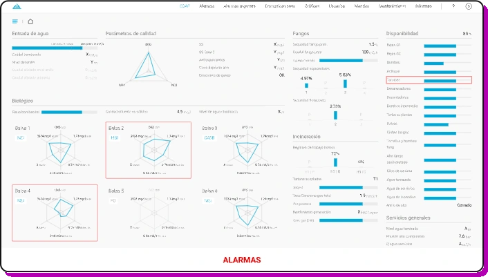
The existing interface was causing significant operational inefficiencies and user frustration among factory operators and managers.
Confusing layout or functionality
Lack of clarity in design
Data visualization/display errors
High-friction onboarding process (discovered during research)
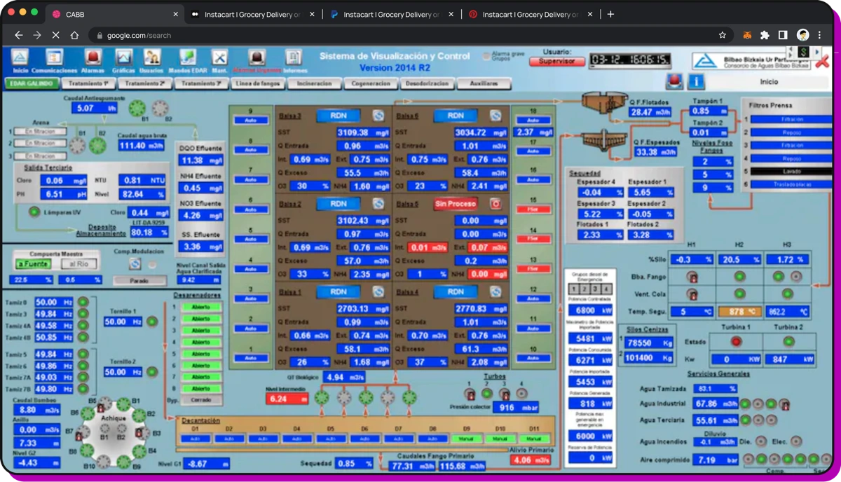
Initial dashboard
Research Goal
Understand the current pain points and design a more intuitive interface that reduces errors and improves operational efficiency.
Research
Understanding user needs through comprehensive research
During the initial discovery phase, we conducted a series of user research activities to better understand our users' needs and challenges:
Site Visit & Process Mapping
Performed a site visit to map and analyze the entire operational process.
Design Thinking Workshop
Organized and facilitated a Design Thinking workshop to explore user needs and co-create solutions.
User Shadowing
Conducted user shadowing in their work environment to gain deeper insights into their behaviors and needs.
Regular Interviews
Held regular one-on-one interviews to get direct feedback and ensure we stayed aligned with user needs.
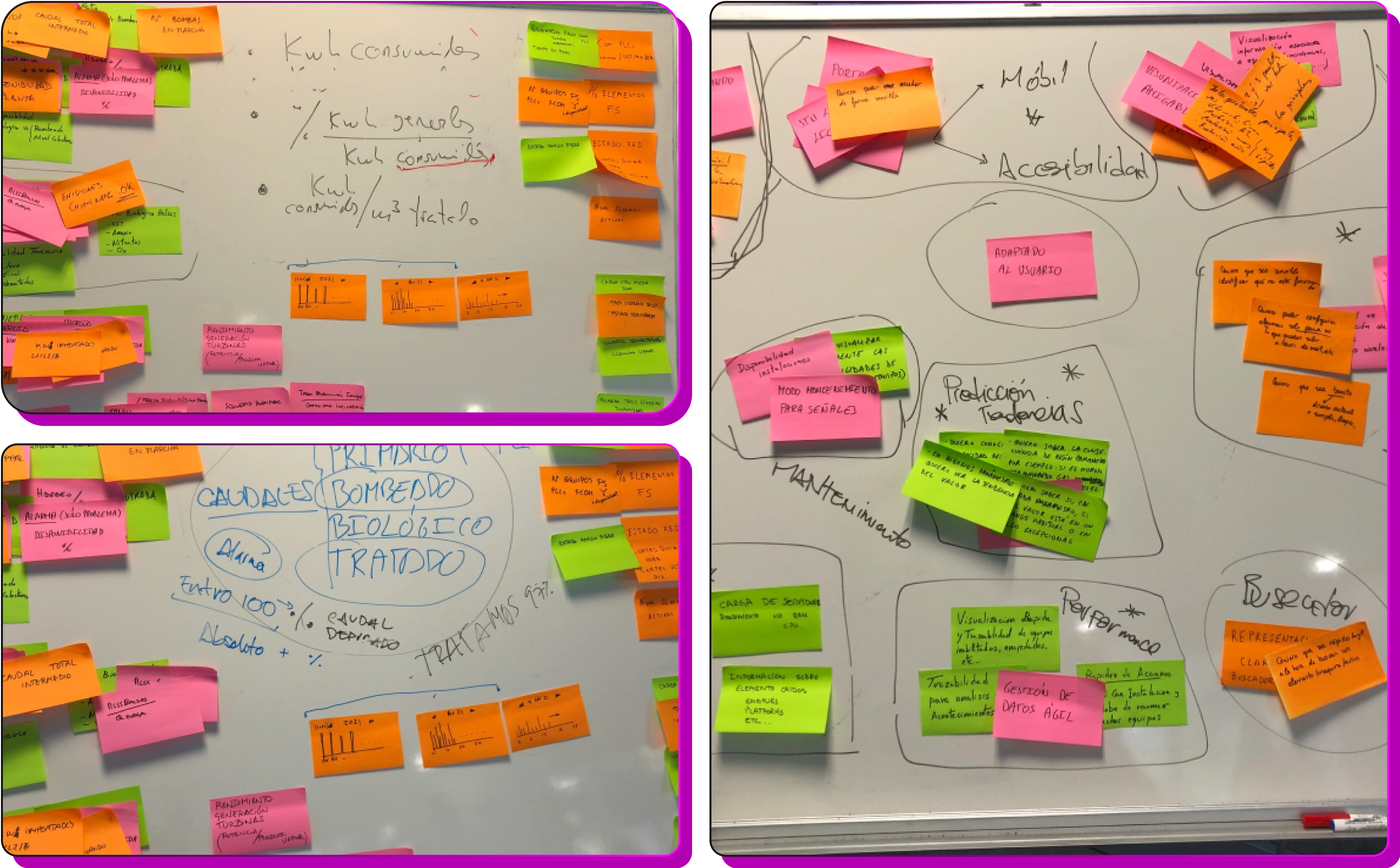
Design thinking exercise with leadership and stakeholders
Hypothesis
Clear information hierarchy will reduce human errors
We believed that by implementing a clear information hierarchy and improving data visualization, we could significantly reduce user errors and plant downtime.
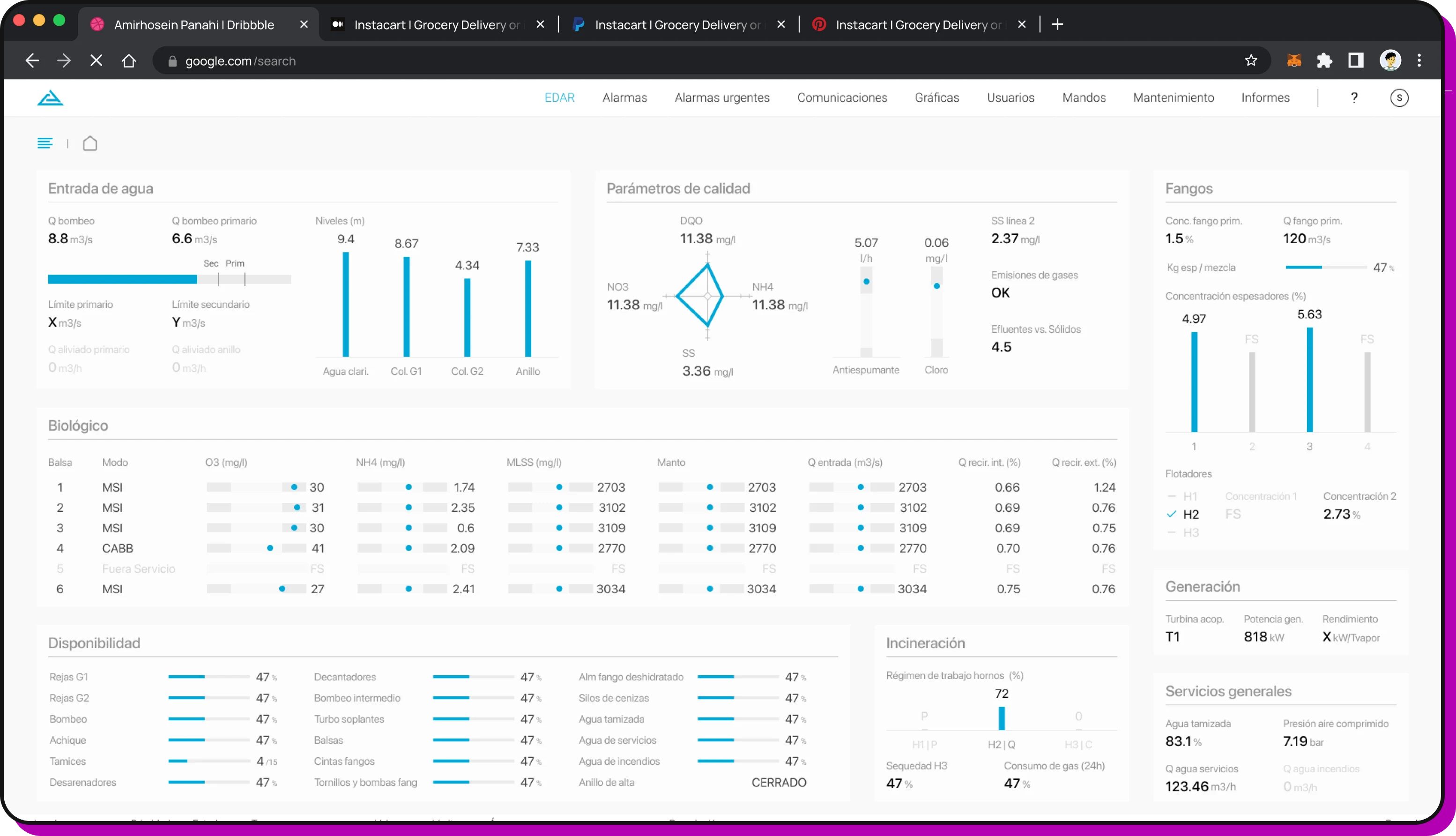
Information Architecture
Restructuring the interface with clear navigation, relevant and accurate data presentation, and logical grouping of related functions.
Visual Design
Improving data visualization with better color coding, typography, and visual feedback.
Process
Weekly iterative feedback process
We implemented a weekly iterative process where I presented my work and received constant feedback. This helped us validate proposals early, keep everyone aligned, speed up the process, and ensure full transparency for all stakeholders.
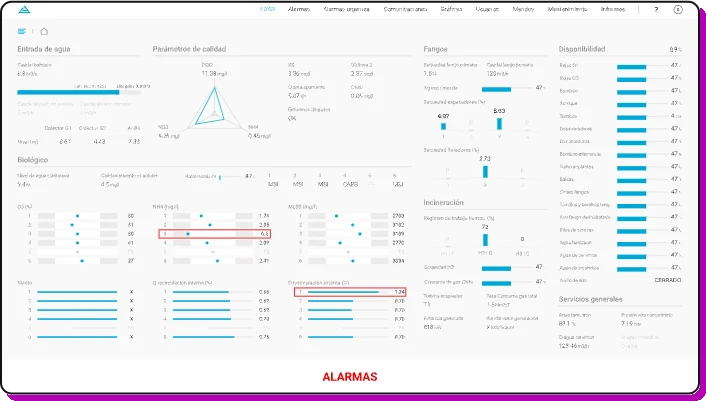
Key improvements
Changes introduced to improve usability
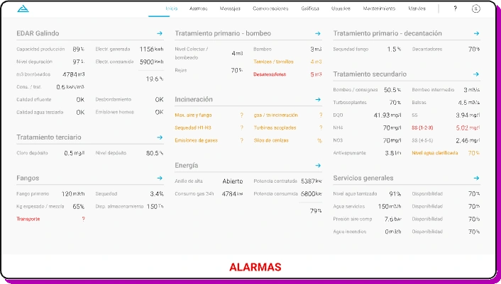
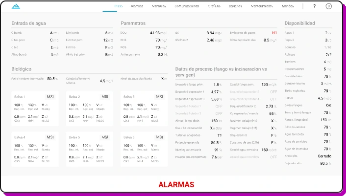
Clear navigation
Restructured the navigation with logical grouping and clear labels
Improved data visualization
Improved charts and visual indicators for system status
Reduced cognitive load
Simplified interface with contextual information and helpful hints
Error prevention
Added confirmation dialogs and validation for critical actions
Outcome
Significant improvements in usability and efficiency
While the company did not track official metrics, my before-and-after survey indicated strong outcomes—users reported a 30% increase in satisfaction and a 20% decrease in onboarding time for new operators.
Final outcome
Improved Usability
Clear information hierarchy and intuitive navigation reduced user confusion and errors.
Better Data Visualization
Enhanced charts and graphs made it easier for operators to understand system status at a glance.
Learnings
Key insights from industrial UX design
Context is everything
Understanding the industrial environment and constraints was crucial for designing effective solutions. Site visits and shadowing provided invaluable insights.
Stakeholder alignment matters
Regular feedback sessions with all stakeholders ensured everyone was aligned and helped prevent costly changes later in the process.
Design systems enable continuity
Creating comprehensive design guidelines and UI components allowed the development team to continue building consistently after my involvement ended.
Like this project
Posted Sep 15, 2025
Improving workflows in a water plant with human-centered design. ⚡️ 20% Onboarding time improvement ⚡️ 30% User satisfaction increase
Likes
0
Views
1
Timeline
Oct 1, 2021 - Apr 1, 2022
Clients
Consorcio de Aguas Bilbao Bizkaia