Aura AI Investor Pitch Deck Design
Rishi Shah
Overview
Aura AI is an enterprise IT automation platform unifying infrastructure and security into a single AI-first control plane. The founding team had a strong product and a clear vision - but only 4 to 5 rough slides and no visual language to take it to investors.
I joined as the sole designer and built the entire deck from the ground up: narrative architecture, visual system, and final production in Figma Slides. From first session to investor-ready deck - 2 weeks.
The Challenge
Enterprise infrastructure is a hard sell to investors who aren't technical. The product needed to feel both powerful and accessible - serious enough for a CIO, clear enough for a VC who's never managed a server in their life.
The founding team needed the deck to answer eight questions without feeling like a checklist:
What's broken in the market. What Aura does. How it works. Why it wins against competitors. How it makes money. How it reaches customers. Where it stands today. How much it needs to get there.
My job was to find the through-line that made all eight feel like one story - and build a visual system that held it together.
My Approach
I ran working sessions across C-level, product, marketing, and sales to surface the real story. Not what everyone thought investors wanted to hear — but what was actually true and defensible.
From those conversations, three things became clear:
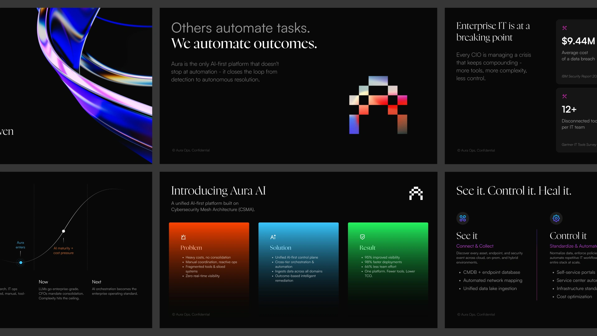
The market problem had great data but no emotional weight. The product had a clean three-part logic - See it, Control it, Heal it - that nobody had articulated visually. And the competitive angle was genuinely strong, but buried in features rather than positioned as a worldview.
I restructured the narrative around a single contrarian idea: others automate tasks, Aura automates outcomes. Everything in the deck flows from that.

Visual System
The deck needed to feel premium and technical without going cold. I built a system around:
Dark editorial foundation - deep black backgrounds with a restrained color palette. Investor decks that try to be colorful usually look startup-casual. This needed to feel like a control room.
Typographic hierarchy - large serif display for headlines (authoritative, editorial), clean sans for body and data (readable, precise). The contrast did a lot of heavy lifting.
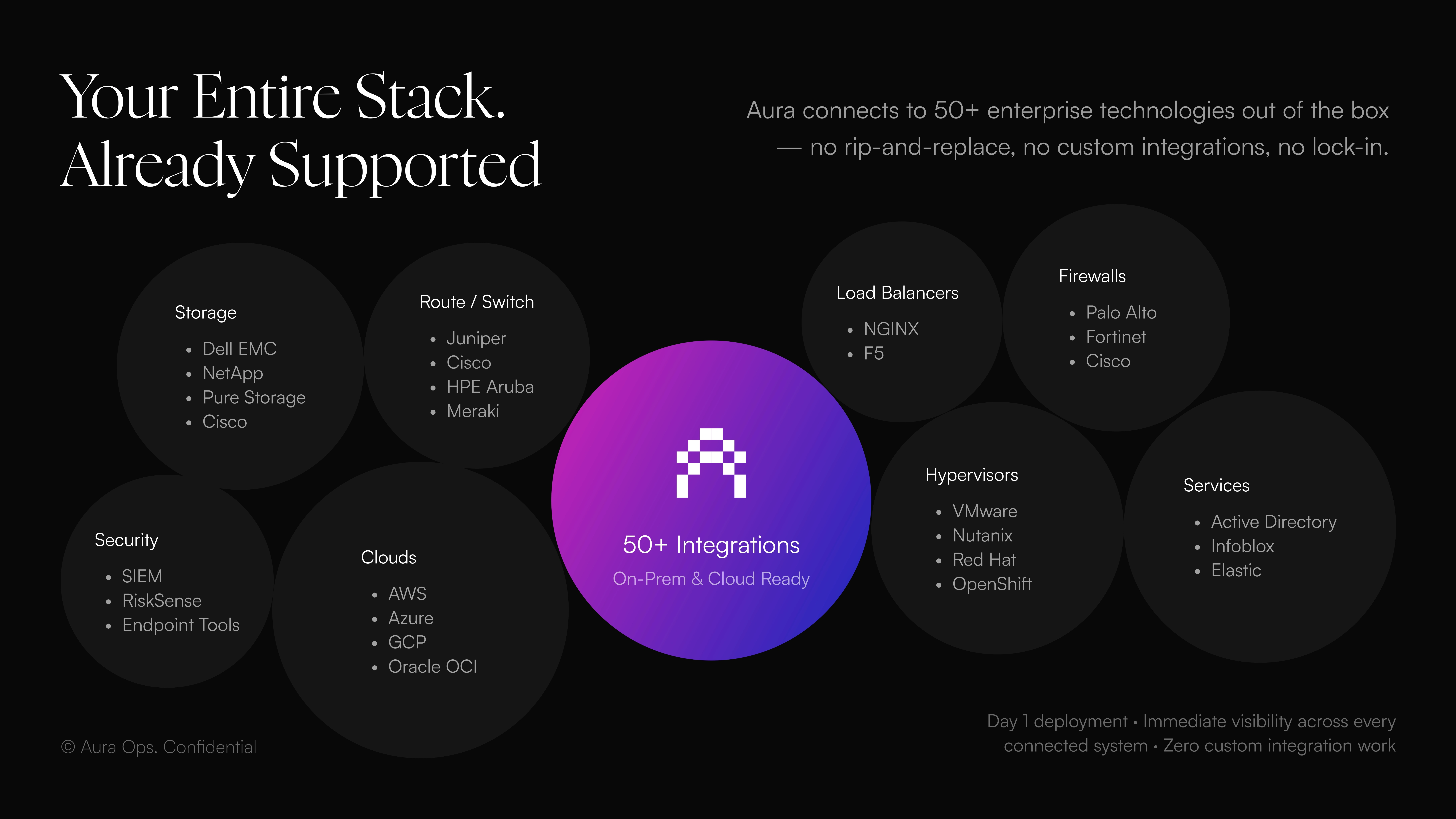
Gradient accents - used specifically for motion, energy, and product visuals. Not decorative. Every gradient in the deck earns its place.
Data-first layouts - stats, comparison tables, and market sizing were designed to be scannable in under 5 seconds. Investors read decks fast. The numbers had to land before they decided to slow down.
Deliverables
18-slide investor pitch deck covering: problem, solution, product architecture, integration ecosystem, before/after workflow comparison, competitive matrix, TAM/SAM/SOM, business model, GTM strategy, roadmap, founding team, and board of advisors.
Fully built in Figma Slides. Handed off as a live editable file plus export-ready PDF.
Like this project
Posted Jun 27, 2026
Designed an investor pitch deck for Aura AI focusing on narrative and visual coherence.